ios vs android设计
重点 (Top highlight)
This article has been written by Artur Abrarov from Redmadrobot. Translated and reposted with permission by Alconost Inc., professional translation and localization company.
这篇文章已被写入由 阿图尔Abrarov 从 Redmadrobot 。 经过 专业翻译和本地化公司 Alconost Inc.的 许可 ,翻译和重新发布。
Adapting an app’s design to another platform is an inextricable part of a mobile app designer’s job. The goal of this process is to organically integrate the app’s design into the user’s patterns for interacting with the target platform. In addition, adaptation simplifies development because it makes it possible to use the platform’s native components.
使应用程序的设计适应另一个平台是移动应用程序设计师不可分割的一部分。 此过程的目标是将应用程序的设计有机地集成到用户的模式中,以便与目标平台进行交互。 此外,适应性简化了开发,因为它可以使用平台的本机组件。
In order to adapt an app’s design properly, you need to follow the platform’s guidelines, i.e. the Human Interface Guidelines (HIG) for iOS and Material Design for Android. You also need to communicate with the developers, ideally getting them involved in the design process as early as possible so they can immediately establish technical restrictions.
为了适当地调整应用程序的设计,您需要遵循平台的准则,即iOS的人机界面准则 (HIG)和Android的Material Design 。 您还需要与开发人员进行交流,理想情况下应尽早让他们参与设计过程,以便他们可以立即建立技术限制。
But what exactly sets design for iOS and Android apart? In this article, I’m going to discuss 32 specific design differences between iOS and Android. They’re divided into four groups: basic differences, differences in navigation and patterns (UX), differences in components (UI), and miscellaneous differences.
但是,究竟是什么使iOS和Android的设计与众不同? 在本文中,我将讨论iOS和Android之间的32种具体设计差异。 它们分为四组:基本差异,导航和模式差异(UX),组件差异(UI)和其他差异。
iOS’s features will appear on the left, and Android’s will appear on the right.
iOS的功能将显示在左侧,而Android的功能将显示在右侧。
基本差异 (Basic Differences)
1.人机界面指南与材料设计 (1. Human Interface Guidelines vs. Material Design)
Almost all the differences in this article are taken from an analysis of these guidelines. On the conceptual level, we can boil them down to the following: HIG is all about flat, light, friendly design, and it comes from a gradual rejection of skeuomorphism. Material has a number of foundational principles: material as a metaphor; bold, graphical, conscious; intentional animation; flexible foundation and cross-platform functionality. If you aren’t familiar with the guidelines, I suggest reading them through before continuing with this article.
本文中的几乎所有差异均来自对这些准则的分析。 从概念上讲,我们可以将其归结为以下内容:HIG的宗旨是扁平,轻巧,友好的设计,它源于对拟态的逐渐拒绝。 材料具有许多基本原则:材料是隐喻;材料是隐喻。 大胆,形象,有意识; 故意动画; 灵活的基础和跨平台功能。 如果您不熟悉这些准则,建议您在继续阅读本文之前通读它们。
2.度量单位:pt vs. dp (2. Units of measurement: pt vs. dp)
iOS app designs are developed in pt, and Android app designs are developed in dp. As a rule, we develop designs in 1x (or mdpi) and upload them to Zeplin. Zeplin displays iOS designs in pt and generates icons and illustrations in 2x and 3x. For Android, designs are displayed in dp and generate graphics in hdpi, xhdpi, xxhdpi, and xxxhdpi.
iOS应用程序设计是在pt中开发的,而Android应用程序设计是在dp中开发的。 通常,我们以1倍(或mdpi)的速度开发设计并将其上传到Zeplin。 Zeplin以pt显示iOS设计,并以2x和3x生成图标和插图。 对于Android,设计以dp显示,并以hdpi,xhdpi,xxhdpi和xxxhdpi生成图形。
3.屏幕尺寸:320pt x 568pt与360dx x 640dp (3. Screen size: 320pt x 568pt vs. 360dp x 640dp)
I prefer designing iOS apps in the lowest possible size: the iPhone 5 SE’s screen size of 320pt х 568pt. I do this to avoid having content display incorrectly on small screens. Some people prefer designing for iPhone 8.
我更喜欢以尽可能小的尺寸设计iOS应用:iPhone 5 SE的屏幕尺寸为320ptх568pt。 我这样做是为了避免内容在小屏幕上显示不正确。 有些人更喜欢为iPhone 8设计。
For Android apps, we have a generally accepted screen size of 360dp х 640dp.
对于Android应用,我们普遍接受的屏幕尺寸为360dpх640dp。
When designing for iOS, I sometimes develop designs for iPhone X (375pt х 812 pt). This is necessary for the developer to understand how to set the margins properly on a screen of this size. When designing for iPhone X, you also need to keep the Safe Area in mind. This is the only area in which you should place content.
在为iOS设计时,有时会为iPhone X(375ptх812 pt)开发设计。 开发人员必须了解如何在这种尺寸的屏幕上正确设置边距。 在为iPhone X设计时,还需要牢记安全区域 。 这是您应放置内容的唯一区域。
4.系统字体:旧金山vs. Roboto (4. System font: San Francisco vs. Roboto)
If you don’t know which font to use, use the system font. For iOS, this is San Francisco. For Android, it’s Roboto.
如果您不知道使用哪种字体,请使用系统字体。 对于iOS,这是San Francisco 。 对于Android,它是Roboto 。
5. Android导航栏 (5. The Android Navigation Bar)
Unlike iOS, Android has a built-in tool for reverse navigation. This is the Android Navigation Bar.
与iOS不同,Android具有用于反向导航的内置工具。 这是Android导航栏 。
It is either physically built into the smartphone or part of the interface. The user can use the arrow to move one step backward chronologically (reverse chronological navigation). Navigation occurs the same way within an app or between apps.
它既可以内置在智能手机中,也可以内置在界面的一部分中。 用户可以使用箭头按时间顺序向后移动一步( 反向按时间顺序导航 )。 导航在应用程序内或应用程序之间以相同的方式发生。
When I was just starting out as a mobile app designer I spent a lot of time tormenting Android developers with the question “why do we need two back buttons?” There’s one in the Navigation Bar at the bottom and one in the Top App Bar when you switch to a daughter page.
当我刚开始做移动应用程序设计师时,我花了很多时间折磨Android开发人员,问一个问题:“为什么我们需要两个后退按钮?” 切换到子页面时,底部的导航栏中有一个,顶部应用程序栏中有一个。
Well, here’s the answer. There are two different kinds of reverse navigation: reverse chronological navigation (performed using the back arrow in the Navigation Bar; we call it “back”)
好吧,这就是答案。 反向导航有两种:反向时间导航(使用导航栏中的后退箭头执行;我们称其为“后退”)
and upward navigation (performed using the arrow at the top of the screen; we call it “up”).
和向上导航(使用屏幕顶部的箭头执行;我们称其为“向上”)。
Imagine we have a path with points A, B, and C, where A is the mother page and B and C are the daughter pages. Now imagine the user goes from A right to C. If they press the back button, they’ll go back to A, but if they press the up button, they’ll go to B, and a second press will take them back to A.
想象一下,我们有一条路径具有点A,B和C,其中A是母页面,而B和C是子页面。 现在,假设用户从A右移到C。如果他们按下“后退”按钮,他们将回到A,但是如果他们按下“向上”按钮,他们将会回到B,而第二次按下会将他们带回到一个。
This is difficult to implement and confusing for the user, so now these two buttons both do the same thing: they take the user “back,” just like on iOS. In other words, if the user goes to C from A, it will take them back to A.
这对于用户来说很难实现并且令人困惑,因此现在这两个按钮都具有相同的作用:就像在iOS上一样,它们使用户“后退”。 换句话说,如果用户从A转到C,它将带他们回到A。
6. The importance of elevation in Material
6.材料中标高的重要性
In principle, iOS has no shadows. As an exception, shadows can be found on the main screen of the App Store and in Health. But all in all, the HIG do not provide for the use of shadows in any way.
原则上,iOS没有阴影。 作为例外,可以在App Store的主屏幕和“运行状况”中找到阴影。 但总而言之,HIG并未以任何方式提供阴影的使用。
In Material, shadows play a large role. They add a third dimension (Z axis) to the interface, which enables every component to have its own specific location along this axis (from 0dp to 24dp). Moreover, this Z axis doesn’t just exist on the conceptual level — developers have an “elevation” parameter they can use to set the position of elements along this axis.
在“材质”中, 阴影起着很大的作用。 它们在界面上添加了第三维(Z轴),这使每个组件都可以沿该轴具有自己的特定位置(从0dp到24dp)。 此外,此Z轴不仅存在于概念级别上,开发人员还具有一个“ elevation”参数,可用于设置元素沿该轴的位置。
Navigation and state changes are accompanied by changes in the components’ elevation. So when designing for Android, we need to take a conscious approach to creating shadows.
导航和状态更改会伴随组件高程的更改。 因此,在为Android设计时,我们需要采取有意识的方法来创建阴影。
7.命名差异 (7. Differences in naming)
There are a lot of differences when it comes to naming. Let’s take a look at five of them.
在命名方面有很多差异。 让我们看看其中的五个。
а) Tab Bar vs. Bottom Navigation Bar
а)标签栏与底部导航栏
This is a bar for top-level navigation within the app. It is statically located at the bottom of the screen on both platforms. In addition to naming, the bars are distinct in terms of their behavior. We’ll take a closer look at this a little later.
这是用于应用程序内顶级导航的栏。 它在两个平台上均静态位于屏幕底部。 除了命名之外,这些条的行为也各不相同。 我们稍后再仔细研究。
b) Navigation Bar vs. Top App Bar
b)导航栏与顶部应用栏
This bar does more or less the same thing on both platforms: it tells the user their current position within the app, allows them to go back to the previous screen, and suggests one or more contextual actions. We’ll talk more about these differences later in the article.
该栏在两个平台上或多或少地具有相同的作用:它告诉用户他们在应用程序中的当前位置,允许他们返回到上一个屏幕,并建议一个或多个上下文操作。 我们将在本文后面详细讨论这些差异。
c) Segmented Controls vs. Tabs
c)分段控件与选项卡
In addition to naming, Android tabs have a number of different features: you can swipe to move from tab to tab, and Material permits us to use them for top-level navigation.
除了命名之外,Android标签还具有许多不同的功能:您可以滑动以在标签之间移动,而Material允许我们将其用于顶层导航。
d) Alerts vs. Dialogs
d)警报与对话框
Interestingly, only one tool for alerting the user is described for iOS: Alerts. On Android, we have three of them: Snackbars, Banners, and Dialogs. Snackbars are intended for low-priority messages and do not require any action. Dialogs block interaction with the interface and require the user to perform an action. Banners halfway between these two — they do not block interaction, but they do require the user to perform an action.
有趣的是,针对iOS仅描述了一种用于警告用户的工具: Alerts 。 在Android上,我们有三个 :小吃店,横幅和对话框。 小吃排旨在用于低优先级的消息,不需要任何操作。 对话框会阻止与界面的交互,并要求用户执行操作。 横幅广告位于这两者之间的中间位置-它们不会阻止交互,但确实需要用户执行操作。
e) Touch ID vs. Android Fingerprint
e)触摸ID与Android指纹
This is just one example of the different naming conventions for the technologies used on these platforms. You need to know them, since, in addition to naming, they have a number of distinctions in terms of the technical features of their implementation. Understanding naming distinctions is the first step toward understanding technological distinctions.
这只是这些平台上使用的技术的不同命名约定的一个示例。 您需要了解它们,因为除了命名之外,它们在实现的技术特征方面还有许多区别。 理解命名差异是理解技术差异的第一步。
导航和模式(UX)的差异 (Differences in Navigation and Patterns (UX))
8.顶级导航方法 (8. Methods of top-level navigation)
Let’s start at the very top. iOS only recommends one method of top-level navigation: via the Tab Bar. On the other hand, Android has three methods: the Navigation Drawer, the Bottom Navigation Bar, and Tabs.
让我们从最顶层开始。 iOS仅建议一种顶级导航方法:通过 标签栏 。 另一方面,Android有三种方法: 导航抽屉 , 底部导航栏 和 标签 。
If there are more than five top-level pages, we use the Navigation Drawer. If there are fewer, we use the Bottom Navigation Bar. Tabs aren’t used for this kind of navigation very often, but this method is also available. However, Material recommends not combining Tabs and the Bottom Navigation Bar because interacting with these components affects the content of the page and the user can get confused.
如果顶层页面超过五个,则使用导航抽屉。 如果数量较少,我们将使用底部导航栏。 标签不是经常用于这种导航,但是这种方法也可以使用。 但是,Material 建议不要将选项卡和底部导航栏组合在一起,因为与这些组件的交互会影响页面的内容,并且用户可能会感到困惑。
9.选项卡栏和底部导航栏的行为差异 (9. Differences in the behavior of the Tab Bar and the Bottom Navigation Bar)
This difference is suggested by Material.
材料建议这种差异。
On iOS, if you go from a mother page to a daughter page, then go to another mother page via the Tab Bar, if you go back to the first mother page, you’ll still be on a daughter page. Everything is much stricter on Android — if you transition via the Bottom Navigation Bar, you’ll always move between mother pages. If you were on a daughter page before this, it will be reset.
在iOS上,如果您从母页面转到子页面,然后通过标签栏转到另一个母页面,如果您返回到第一个母页面,您仍将处于子页面。 Android上的所有功能都更加严格-如果您通过底部导航栏进行转换,则将始终在母页面之间移动。 如果您之前在子页面上,它将被重置。
Our Android developers are convinced that Android’s behavior is incorrect in this regard. If the user transitions via the Bottom Navigation Bar, it should save the open daughter pages like on iOS.
我们的Android开发人员确信,在这方面Android的行为是不正确的。 如果用户通过底部导航栏进行转换,则应像在iOS上那样保存打开的子页面。
10. Android上标签页的特殊行为 (10. Special behavior of tabs on Android)
Unlike Segmented Controls on iOS, Android’s tabs have a special feature: you can move from tab to tab by swiping right and left.
与iOS上的分段控件不同,Android的标签页具有一项特殊功能:您可以通过左右滑动来在标签之间移动。
This is because the tabs’ pages are on the same elevation.
这是因为选项卡的页面位于同一高度。
It’s important to know this because, when using tabs on Android, we shouldn’t add elements with similar gestures (for example, a carousel of pictures or interacting with maps using swipes) to the design.
知道这一点很重要,因为在Android上使用标签页时,我们不应在设计中添加具有相似手势的元素(例如,图片轮播或使用滑动与地图进行交互)。
In general, these two components are not fully interchangeable. Segmented Control is a control method that controls page content. Tabs are a navigational tool. So you should talk to the developers before viewing these components as equivalent during adaptation. Sometimes it can be more correct to replace Android’s tabs with Page Control. It all depends on the context.
通常,这两个组件不能完全互换。 分段控件是一种控制页面内容的控制方法。 标签是一种导航工具。 因此,在适应过程中将这些组件视为等同组件之前,您应该与开发人员联系。 有时,用Page Control替换Android的标签可能更正确。 这完全取决于上下文。
11.子页面的行为差异 (11. Differences in the behavior of daughter pages)
On iOS, daughter pages (not counting modal windows) only appear in one way: the daughter page appears to the right and on top of the mother page with a “slide in” effect. Returning to the mother page occurs with a “slide out” effect.
在iOS上,子页面(不计算模式窗口)仅以一种方式显示:子页面显示在母页面的右侧和顶部,具有“滑入”效果。 返回母页面会产生“滑出”效果。
Material recommends showing the user the hierarchical interconnection between the mother and daughter pages using an intentional animation.
材质建议使用有意动画向用户显示母页面和子页面之间的分层互连。
The component the user interacts with to transition to the daughter page opens and covers the mother page. This way the user understands where they are and where they came from, as well as why this happened and where they will go if they press the back button. This transition occurs using Standard Easing.
用户与之交互以过渡到子页面的组件将打开并覆盖母页面。 通过这种方式,用户可以了解他们的位置和来源,以及发生这种情况的原因以及按下返回按钮后会去到哪里。 此过渡使用标准缓动发生。
12.调用导航抽屉的特殊模式 (12. Special pattern for calling up the Navigation Drawer)
When designing an app with a Navigation Drawer it’s important to remember that this component “takes over” the “edge swipe left to right” gesture. So don’t add any other logic to this gesture.
在设计带有导航抽屉的应用程序时,重要的是要记住,该组件“接管”了“向右滑动从左向右滑动 ”手势。 因此,请勿在此手势中添加任何其他逻辑。
On iOS, this gesture has a conventional pattern of transitioning from a daughter page to the mother page. This pattern has gradually made its way to many Android apps as well.
在iOS上,此手势具有从子页面到母页面过渡的常规模式。 这种模式也逐渐应用到许多Android应用程序中。
13.滚动期间内容的行为 (13. The behavior of content during scrolling)
According to the HIG, content on iOS behaves the following way during scrolling: the Navigation Bar is reduced in width, and the Toolbar disappears. But in general, iOS developers can configure any kind of behavior for content and bars during scrolling.
根据HIG的说法,iOS上的内容在滚动期间的行为如下 :导航栏的宽度减小,而工具栏消失。 但是通常,iOS开发人员可以在滚动过程中为内容和栏配置任何类型的行为。
Material suggests more options for behavior during scrolling. For example, the Bottom Navigation Bar, Search Bar, and Bottom App Bar can disappear during scrolling.
材料为滚动期间的行为提供了更多选项。 例如,底部导航栏,搜索栏和底部应用栏可以在滚动过程中消失。
The Top App Bar can also disappear or move above the primary content.
顶部应用栏也可以消失或移至主要内容上方。
14.不同的搜索行为 (14. Different search behavior)
Interestingly, the HIG relegate searching to bars and call it a Search Bar. In Material, we find searching in the Navigation section, not the Components section. In other words, for Material, search is just another navigation method. On both iOS and Android, search can be statically present on the screen, and, as a rule, it’s fixed to the Navigation Bar/Top App Bar.
有趣的是,HIG将搜索委托给bar并将其称为Search Bar 。 在“材料”中,我们在“ 导航”部分而不是“组件”部分中找到搜索。 换句话说,对于Material而言,搜索只是另一种导航方法。 在iOS和Android上,搜索都可以静态显示在屏幕上,并且通常固定在导航栏/顶部应用栏上。
On both platforms, search can appear in the form of an icon, but on iOS the icon expands into the independent Search Bar component, and on Android it expands within the Top App Bar.
在这两个平台上,搜索都可以以图标的形式出现,但是在iOS上,图标会扩展为独立的搜索栏组件,而在Android上,它会在顶部应用栏内扩展。
One feature of search on iOS is that it can be “hidden” underneath the Navigation Bar and called up with a “swipe down” gesture. The same gesture is typical for refreshing (pull to refresh), so you don’t want to activate search and refresh using the same action.
iOS上的搜索功能之一是,它可以“隐藏”在导航栏下方,并以“向下滑动”手势调出。 刷新(拉动刷新)通常使用相同的手势,因此您不想使用相同的动作来激活搜索和刷新。
组件差异(UI) (Differences in Components (UI))
15. iOS上缺少哪些组件 (15. Which components are absent on iOS)
Many of Android’s native components are absent on iOS. Let’s run through them.
iOS上缺少许多Android本机组件。 让我们遍历它们。
a) Navigation Drawer
a)导航抽屉
In principle, iOS does not recognize burger menus. As we mentioned earlier, iOS only has top-level navigation via the Tab Bar.
原则上,iOS无法识别汉堡菜单。 如前所述,iOS仅通过选项卡栏具有顶级导航。
b) Backdrops
b)背景
Backdrops are, as far as I’m concerned, the most amazing component in Material. As of the writing of this article, Android is still just planning to implement backdrops as a native component. In general, when examining Material’s components, check whether they are available for use yet or not.
就我而言, 背景是Material中最神奇的组件。 在撰写本文时,Android仍在计划将背景幕作为本机组件来实现。 通常,在检查Material的组件时,请检查它们是否可用。
The material itself loves this component. For example, just look at the winners of the Material Design Award 2019.
材料本身喜欢这个组件。 例如,仅查看2019年材料设计奖的获奖者。
c) Banners
c)标语
Banners are not among iOS’s native components. Using a banner, we can communicate important information to the user and suggest actions connected to it.
标语不属于iOS的本机组件。 使用横幅,我们可以将重要信息传达给用户并建议与之相关的操作。
d) Snackbars
d)小吃店
Like banners, Snackbars are not native to iOS. Snackbars are used to give the user brief messages about the results of their actions.
像横幅一样, Snackbars并非iOS固有的。 小吃栏用于向用户提供有关其操作结果的简短消息。
e) Chips
e)筹码
Chips aren’t native iOS components either. They are used for information entry, descriptions, and actions.
芯片也不是本地的iOS组件。 它们用于信息输入,描述和操作。
f) Bottom App Bar
f)底部应用栏
In this case, we can argue that iOS has a component that is similar to the Toolbar. But they’re actually different, and here’s why: a Toolbar is a bar for contextual actions. For example, when editing a list of messages in Messages, a Toolbar appears with the actions “Read all” and “Delete.” On the other hand, the Bottom App Bar is essentially just a Top App Bar that has been moved down along with the same top-level actions, including opening the Navigation Drawer, calling up search, etc. We can also put a FAB in the Bottom App Bar.
在这种情况下,我们可以争辩说iOS具有类似于Toolbar的组件。 但是它们实际上是不同的,这就是原因:工具栏是上下文操作的栏。 例如,当在“消息”中编辑消息列表时,将出现一个工具栏,其中包含“全部读取”和“删除”操作。 另一方面,“底部应用程序栏”实际上只是一个顶部应用程序栏,它与相同的顶级操作一起向下移动,包括打开导航抽屉,调用搜索等。我们也可以将FAB放在底部的应用栏。
g) FABs
g)FAB
No, there are no FABs in iOS either. A FAB is a button for performing the primary action on the screen. For example, in an email app, the FAB will compose a new email.
不,iOS中也没有FAB 。 FAB是用于在屏幕上执行主要操作的按钮。 例如,在电子邮件应用程序中,FAB将撰写新电子邮件。
If you use a FAB for the primary action on the screen in Android, on iOS the primary action should be located at the top, on the right side of the Navigation Bar (see iMessages, for example).
如果在Android屏幕上将FAB用作主要操作,则在iOS上,主要操作应位于导航栏右侧的顶部(例如,请参阅iMessages)。
h) Bottom Navigation Drawer
h)底部导航抽屉
This is another version of the Navigation Drawer that is typical for Android. It is called up by pressing the burger menu button in the Bottom App Bar.
这是Android中典型的导航抽屉的另一个版本 。 通过按底部应用程序栏中的汉堡菜单按钮可以调用它。
i) Side Sheet
i)侧板
Although Material also permits the use of this component in mobile apps, I’d recommend replacing it with a more familiar Bottom Sheet.
尽管Material也允许在移动应用中使用此组件,但我建议您用更熟悉的底部表替换它。
j) Expanding Bottom Sheet
j)展开底页
This very nice-looking Android component is not one of iOS’s native components. An Expanding Bottom Sheet is a surface attached to the bottom of a page. If the user taps this surface, it expands into a full-fledged page.
这个非常漂亮的Android组件不是iOS的本地组件之一。 展开式底页是附着在页面底部的表面。 如果用户点击此表面,它将扩展为完整的页面。
k) Standard Bottom Sheet
k)标准底页
A Standard Bottom Sheet is a variation of the Bottom Sheet, and it is not an iOS component.
标准底表是底表的变体,它不是iOS组件。
16. Android上缺少哪些组件 (16. Which components are absent on Android)
Now let’s take a look at which components cannot be found in the Android library.
现在让我们看一下在Android库中找不到哪些组件。
a) Page Control
a)页面控制
Page Control shows which page the user is on. It is not a native Android component.
页面控件显示用户所在的页面。 它不是本机Android组件。
b) Toolbars
b)工具栏
Toolbars are only seen on iOS.
工具栏仅在iOS上可见。
с) Steppers
с)步进
Steppers are a standard iOS control that is not described in Material. We use them to enter small values such as the number of copies when printing.
步进器是材料中未描述的标准iOS控件。 我们使用它们输入较小的值,例如打印时的份数。
d) Popovers
d)弹窗
A Popover is a popup panel that is used primarily on iPad.
Popover是主要在iPad上使用的弹出面板。
There is one standard application for Popovers on iOS: adjusting text settings in readers or browsers.
iOS上有一个用于Popover的标准应用程序:在阅读器或浏览器中调整文本设置。
17.不同的状态栏 (17. Different Status Bars)
The Status Bar performs the same function on both platforms: it shows the time, battery level, and mobile and Wi-Fi connection levels. These indicators are in different places within the Status Bars, and their general visual styles are also distinct.
状态栏在两个平台上执行相同的功能:它显示时间,电池电量以及移动和Wi-Fi连接电量。 这些指示器位于状态栏中的不同位置,并且它们的一般视觉样式也各不相同。
The Android Status Bar also has a special feature: when an app sends the user a notification, its icon appears in the Status Bar. There’s nothing like this in iOS.
Android状态栏还具有一项特殊功能:当应用向用户发送通知时,其图标将显示在状态栏中。 iOS中没有这样的东西。
18.刷新内容控制与滑动刷新 (18. Refresh Content Control vs. Swipe to refresh)
Refresh is activated via the same “swipe down” gesture on both platforms. However, on iOS Refresh Content Control “bumps” other content downward, whereas Swipe to Refresh moves content up on Android. In addition, iOS’s refresh disappears when content scrolls, but on Android it remains visible.
刷新通过两个平台上相同的“向下滑动”手势来激活。 但是,在iOS上,“ 刷新内容控件 ”会将其他内容“向下”“颠倒”,而“ 滑动至刷新”则在Android上将内容向上移动。 另外,滚动内容时,iOS的刷新消失,但在Android上,刷新仍然可见。
19.不同的控件 (19. Different controls)
The only differences between the platforms’ controls are visual. It’s worth noting that controls are simpler on iOS — checkmarks are used for both radio buttons and checkboxes. These controls have different shapes on Android.
平台控件之间的唯一区别是视觉。 值得注意的是,iOS上的控件更简单-复选标记用于单选按钮和复选框。 这些控件在Android上具有不同的形状。
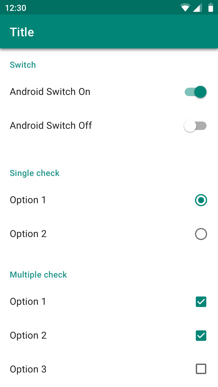
Material also suggests using parent checkboxes when you need to give the user the ability to quickly select all options.
材料还建议您在需要使用户能够快速选择所有选项时使用父级复选框。
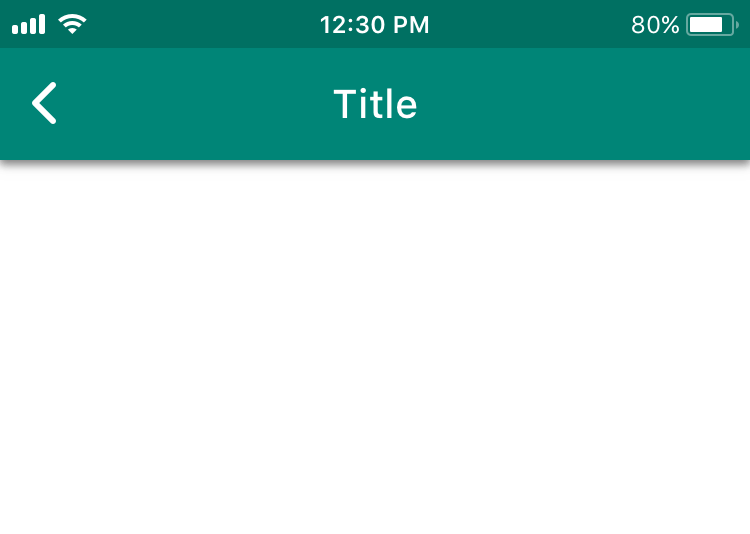
20.不同的后退箭头外观和标题位置 (20. Different back arrow appearance and header position)
On iOS, the arrow doesn’t have a line in the middle of it because on iOS the back arrow is drawn by the previous screen. If the header on the last screen was standard, the header moves left toward the arrow. If the header was wide, it moves up. If the name of the previous page is too long, it is replaced by the word “back.”
在iOS上,箭头中间没有线条,因为在iOS上,后退箭头是由上一个屏幕绘制的。 如果最后一个屏幕上的标题为标准标题,则标题将向左移动。 如果页眉很宽,它将向上移动。 如果上一页的名称太长,则将其替换为“ back”。
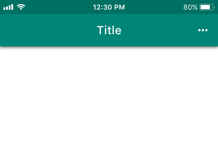
21.“三个点”图标的外观不同 (21. Different appearance of “three dots” icon)
This difference doesn’t appear to be based on anything concrete. We’ll give the platform its due and use the recommended orientation for the three dots. The dots are horizontal on iOS and vertical on Android.
这种差异似乎不是基于任何具体的。 我们将给平台适当的费用,并为三个点使用推荐的方向。 这些点在iOS上为水平,在Android上为垂直。
22.选择器的外观不同 (22. Different appearance of Pickers)
On iOS, date selection is done using a drum. iOS’s drums can also be used for entering any other information. On Android, date Pickers imitate the appearance of a physical calendar.
在iOS上, 日期选择是使用鼓完成的。 iOS的鼓也可用于输入任何其他信息。 在Android上,日期选择器模仿物理日历的外观。
Material also recommends giving users the option to enter dates using an Input Field.
材料还建议为用户提供使用输入字段输入日期的选项。
23.不同的文本字段 (23. Different Text Fields)
The HIG are much less demanding than Material when it comes to Text Fields.
在文本字段方面,HIG的要求比Material要求低得多。
Differences
差异性
On iOS, Labels are located within the entry field and disappear while the text is being entered. Material recommends moving Labels up while the text is being entered.
在iOS上,标签位于输入字段中,并且在输入文本时消失。 材料建议在输入文本时向上移动标签。
Similarity
相似
Both platforms suggest adding a Clear Button when necessary.
两种平台均建议在必要时添加清除按钮。
What else Material requests
材料还有什么要求
Material also recommends highlighting a Label and the bar under the Text Field in a primary color. This helps the user understand that the field is highlighted. Material describes the field’s behavior when a mistake is made during entry. There are two shapes to choose from in Material: Filled and Outlined.
Material还建议以原色突出显示“标签”和“文本字段”下方的栏。 这有助于用户了解该字段已突出显示。 材料描述了在输入过程中出错时字段的行为。 材质中有两种形状可供选择:填充和轮廓。
24.上下文菜单与菜单 (24. Context Menus vs. Menus)
Context Menus appeared in iOS 13. This control offers the user several contextual actions connected to the selected elements. There is an Android element that is somewhat similar to it: Menus.
上下文菜单出现在iOS 13中。此控件为用户提供了一些与所选元素相关的上下文操作。 有一个与之有些相似的Android元素: Menus 。
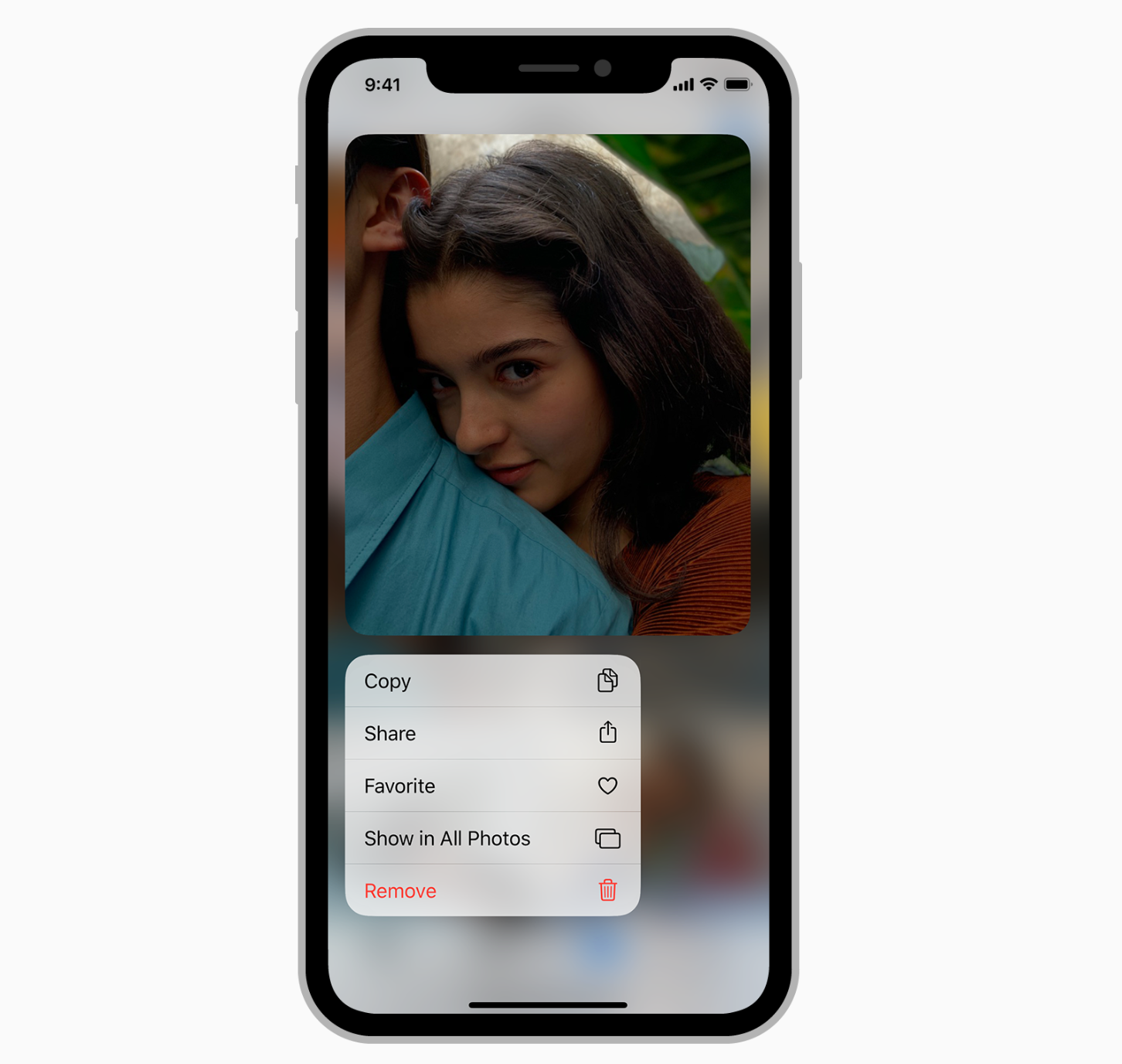
Android Menus are used in the majority of cases — they suggest contextual actions for both the selected element and the entire page as a whole, they are used as an input with multiple options to choose from (drop-down menus), and they are used for editing text. Context Menus are only an iOS component. But Android Menus can be used in mobile or desktop apps.
在大多数情况下,都会使用Android菜单-它们为所选元素和整个页面建议上下文操作,它们被用作具有多个选项的输入(下拉菜单),并且用于编辑文本。 上下文菜单只是一个iOS组件。 但是Android菜单可以在移动或桌面应用中使用。
25.动作视图/活动视图与模式底部 (25. Action View/Activity View vs. Modal Bottom Sheet)
If you use an Action View or Activity View on iOS, on Android it can be partially replaced by Android’s Modal Bottom Sheet component. It also appears in the bottom part of the screen, darkens content, and is closed in similar ways (a button, tapping outside the modal window, or sometimes swiping down). The component’s goal is to offer a choice or contextual actions.
如果您在iOS上使用“动作”视图或“ 活动”视图 ,则在Android上可以部分替换为Android的“ 模态底部表格”组件。 它也出现在屏幕的底部,使内容变暗,并以类似的方式关闭(一个按钮,在模态窗口之外点击或有时向下滑动)。 该组件的目标是提供选择或上下文动作。
26.编辑菜单和文本选择工具栏 (26. Edit Menus vs. Text Selection Toolbar)
In addition to the visual differences between Edit Menus and Text Selection Toolbars, they also have this difference: the user can continue highlighting text by tapping and holding on Android. On iOS, a magnifying glass appears for precisely selecting a place in a word following a tap and hold.
除了“ 编辑菜单”和“ 文本选择工具栏”之间的视觉差异之外,它们还具有以下差异:用户可以通过在Android上点按并按住来继续突出显示文本。 在iOS上,会出现一个放大镜,供您在点击并按住后精确选择单词中的位置。
Android is also different from iOS in that, when additional actions are called up, the Text Selection Toolbar becomes a Menu.
Android与iOS的不同之处还在于,当调用其他操作时,“文本选择工具栏”将成为菜单。
27.分频器大小不同 (27. Different divider size)
On iOS, it’s 0.5pt. On Android, it’s 1dp.
在iOS上为0.5pt。 在Android上为1dp。
其他差异 (Other differences)
28.分接区大小的不同要求 (28. Different requirements for tap zone size)
According to the guidelines, the minimum tap zone size is 44x44pt on iOS and 48x48dp on Android.
根据指导原则,最小分接区域大小在iOS上为44x44pt,在Android上为48x48dp。
29. App Store与Google Play (29. App Store vs. Google Play)
Your iOS app will be downloaded from the App Store. Your Android app will be downloaded from Google Play. To make sure your app is published properly in these stores, you need to adhere to their requirements. The App Store’s requirements can be found here, and Google Play’s can be found here. There are a lot of requirements there, so I recommend studying them prior to release.
您的iOS应用将从App Store下载。 您的Android应用将从Google Play下载。 为了确保您的应用在这些商店中正确发布,您需要遵守它们的要求。 在App Store的要求可以发现, 在这里 ,和谷歌Play的可以找到这里 。 那里有很多要求,所以我建议在发布之前先研究它们。
30. iOS上的特殊模式:撤消和重做 (30. Special pattern on iOS: Undo and Redo)
There is a special pattern on iOS: if the user shakes their smartphone, the app gives them the option to cancel or redo their last action. As a rule, this gesture is used to undo typing.
iOS上有一个特殊的模式 :如果用户摇动智能手机,则应用程序会为他们提供取消或重做其最后一个操作的选项。 通常,此手势用于撤消键入。
31.对品牌发布会的态度 (31. Attitude toward Branded Launches)
Material permits placing the app’s logo on the Launch Screen. The HIG do not recommend using the Launch Screen for marketing purposes and suggest only showing a Placeholder while the app is launching.
材质允许将应用程序的徽标放置在启动屏幕上。 HIG 不建议将“启动屏幕”用于营销目的,建议仅在应用启动时显示一个占位符。
32.其他材料设计主题 (32. Additional Material Design topics)
Material’s website also digs into other topics such as: Data Formats (various kinds of data formats), Data Visualization (proper infographics), Empty States (designing empty states), Offline States (interfaces when there is no internet connection), Accessibility (accessible design), and Bidirectionality (design for reading right to left).
材料的网站也挖掘到其他主题,如:数据格式(各种数据格式 ), 数据可视化 (适当的信息图表), 空状态 (设计空白状态), 离线国 (接口在没有互联网连接), 可访问 (访问设计)和双向性 (从右到左阅读的设计)。
结论 (Conclusion)
Knowing the guidelines increases our awareness. This helps us understand established user patterns and create apps that fit organically into the user’s habits.
了解这些准则可以提高我们的意识。 这有助于我们了解已建立的用户模式,并创建适合用户习惯的应用程序。
The guidelines motivate us to respect the platforms’ native solutions. When adapting a design to another platform, there is always a temptation to duplicate the design without making any changes. This harms the user experience and makes development more difficult. But if we are aware of the differences between native solutions, we can adapt our design properly.
该准则激励我们尊重平台的本机解决方案。 在将设计修改为另一个平台时,总是会在不做任何更改的情况下复制设计。 这会损害用户体验,并使开发更加困难。 但是,如果我们知道本机解决方案之间的差异,则可以适当地调整我们的设计。
And if we want to implement a new custom solution, knowing the guidelines helps us make the case for innovation.
而且,如果我们要实施新的自定义解决方案,那么了解准则将有助于我们提出创新的理由。
In the end, knowing the guidelines and their differences is an important skill for a mobile app designer to have.
最后,了解准则及其差异是移动应用程序设计师必须具备的一项重要技能。
Which other differences are you aware of? Share them in the comments below.
您还知道其他哪些区别? 在下面的评论中分享它们。
您可能还会发现有用: (You might also find useful:)
Sign in with apple announced, or on June 30 your app will turn into a pumpkin
使用宣布的苹果登录,否则6月30日您的应用将变成南瓜
App Localization in Ten Steps
十步实现应用程序本地化
关于翻译 (About the translator)
Alconost is a global provider of localization services for apps, games, videos, and websites into 70+ languages. We also make advertising and educational videos.
Alconost 是 为70多种语言的应用程序,游戏,视频和网站 提供 本地化服务 的全球提供商 。 我们还制作广告和教育 视频 。
翻译自: https://medium.com/@Alconost/ios-vs-android-design-630340a73ee6
http://www.taodudu.cc/news/show-4181297.html
相关文章:
- this java 错误_java异常错误处理
- 2.CPU体系架构-寄存器
- 不懂精简指令集还敢说自己是程序员?
- A micro Lie theory for state estimation in robotics002
- c# 中 event 和 delegate 的区别
- 谷歌中国宣布启用简短域名g.cn
- 全解Google(谷歌)基础设施架构安全设计
- hive日期函数,求日期差等,datediff,date_add,date_sub,add_months
- JS的日期操作:String转date日期格式、求日期差
- 实现sqlite datediff日期时间相减(日期差)的方法
- oracle求两个字段的日期差
- sqlserver中计算日期差
- 【前端笔记】js计算两个日期差多少天
- 使用hutool工具类,计算日期差
- pandas计算excel两列的日期差
- lua 计算日期差值 计算时间戳日期差
- SHELL脚本下获取文件时间转换时间戳,使用时间戳计算日期差
- Python 比较日期字符串与当前日期的日期差
- javascript 日期计算器 推算几天后的日期 计算日期差
- java实现Calendar求两个日期差
- C++ 已知两个时间(年月日)求日期差
- C# DateTime:日期、日期差、时间、时间差
- 计算日期差(C/C++实现)
- js计算日期差
- 使用MySql计算两个日期的时间差函数:TIMESTAMPDIFF
- 商用密码产品认证-智能IC卡
- 升压恒流ic
- 服务器认证信息,认证信息管理系统、服务器、方法和程序
- 加拿大IC VOC和无线产品IC ID认证
- ic卡信息保存在服务器,智能IC卡网络数据安全保密系统
ios vs android设计相关推荐
- ios与android设计适配,IOS与Android UI适配方案
方案一 IOS与Android共用一套效果图 1242*2208 IOS与Android常用的尺寸中,最大尺寸的为i6+的尺寸,即1242*2208px IOS常用尺寸为1242*2208 750* ...
- 干货!iOS 与 Android 的APP 设计差异
了解并适当结合平台规范与优势,才能做到最佳的用户体验.在<最新Android & iOS设计尺寸规范>一文中介绍 APP 设计规范(https://ds.mockplus.cn), ...
- android 模糊查询搜索框_彻底搞懂 iOS 和 Android 的设计差异
设计经验分享 · 不定时更新 ------------------------------------------- 胡桃子 深圳 | UI/UX设计师 唧唧歪歪:设计师在做 app 的时候很少考虑两 ...
- iOS vs. Android,应用设计该如何对症下药?
摘要:从iOS到Android,两大平台应用设计有何不同?又都存在什么样的问题?Android定制性太高,该如何进行UI设计?在CMDN CLUB第28期活动中,咕咚网高级产品经理王磊,从iOS.An ...
- android 布局可大可小,UI设计教程之:ios与android ui适配(将IOS UI转换成Android经验畅谈)...
内容提要:这是UI设计系列教程之ios与android ui适配经验畅谈.文章作者介绍了自己将IOS UI转换成Android经验,包括:不要直接转换.了解单位和组件缩放格式.屏幕尺寸DP和像素的换算 ...
- 相同点安卓和iosui的相同点_学UI设计必要分清iOS和Android的设计区别
原标题:学UI设计必要分清iOS和Android的设计区别 不同平台的设计和开发感觉像是在不同的国家之间旅行.你要做同样的吃吃睡睡看景点的事情,但是这些国家的风俗习惯社会制度会制约你如何吃吃睡睡游览景 ...
- IOS、Android设计规范/商用字体总结——UI设计入门,你想要的都在这!
初入UI 的小朋友们都会很懵设计规范,加上前段时间微软雅黑字体"出事了"!这些其实并不影响一个UI设计师的能力提升,但规范.字体确实UI设计师的工作基础.博主从业以来收集了很多资料 ...
- android和ios适配_针对iOS和Android设计时“并非总是”情况的8个UX设计技巧
android和ios适配 Before going on, I would like to say that everything you read is only based on my UI/U ...
- android与ios ui切图关系,APP-IOS与Android界面设计与切图
做一全套的APP设计,流程是: 1.界面设计:设计IOS界面:设计Android界面. 2.切图:切IOS的2倍图和3倍图:切Android的hdpi,xhdpi,xxhdpi这三个尺寸的图. 3.标 ...
最新文章
- DEBUGnbsp;设置监视点:判断变量值
- 看看人家那后端API接口写得,那叫一个巴适~,再看看我的,像坨屎!
- 不同路径—leetcode62
- 算法训练 字符删除 c语言
- 脚本应用实例_Selenium自动化中无头浏览器的应用
- Navicat Premium 15连接虚拟机上mysql并创建数据库
- Hadoop 调研笔记
- IP地址的分类及子网划分
- Python 列表应用之“简易好友管理系统”
- 计算机驱动程序检测,检测到计算机制造商图形驱动程序对于显卡驱动程序
- 为什么Eclipse Iceoryx使用Helix QAC
- matlab实现jpg图片转gif
- TM7705(AD7705)驱动调试总结-基于stm32f103zet6-填坑日记
- Vue3源码解析04--响应式核心effect
- restTemplate请求设置请求头信息
- npmmirror 中国镜像站,npm设置最新淘宝镜像
- SSM疫情医院管理系统实训项目总结
- 【pytorch】简单BP神经网络用于通用分类任务的代码模板
- 期末入门题库-C#实现
- [转载] 访问共享文件夹,登录失败: 禁用当前的账户 解决方法