美学设计评价_死亡的孩子无法使用的设计美学
美学设计评价
In the popular anime series, Soul Eater, Death the Kid is a Shinigami (Japanese death god) who vanquishes evil with his dual pistols, Liz and Patty. Although he’s strikingly powerful, his battles are often hindered by his obsessive-compulsive need for symmetry; Kid is unable to hurt perfectly symmetrical enemies, unable to focus on a chase when passing beautiful symmetrical objects, and is paralyzed in disgust by the sight of extreme asymmetry.
在流行的动漫系列《噬魂师》中,“小孩子的死神”是Shinigami(日本死神),他用双手枪Liz和Patty战胜了邪恶。 尽管他非常强大,但他的战斗常常因他对对称性的强迫性需求而受阻。 Kid无法伤害完全对称的敌人,无法通过漂亮的对称物体时专注于追赶,并且由于极度不对称而厌恶地瘫痪。
This obsessive-compulsive tendency actually exists in all of us. Something in our brain tells us “Symmetry is good and we must always strive for it!”
这种强迫症倾向实际上存在于我们所有人中。 我们大脑中的某些事情告诉我们“对称性很好,我们必须始终为此努力!”
Throughout my work as a UX designer, I see this over and over again. Without thinking about it, people around me (clients, PMs, developers, etc.) instinctually ask for it in my designs.
在我作为UX设计师的整个工作中,我一遍又一遍地看到这一点。 不用考虑,周围的人(客户,PM,开发人员等)本能地在我的设计中提出要求。
“Can you center align that paragraph?”
“您可以将该段居中对齐吗?”
“Can you expand those input fields to fit the screen?”
“您可以扩展这些输入字段以适合屏幕吗?”
“Can you move this table header to the right to align with the section above?”
“您可以将此表格标题向右移动以与上面的部分对齐吗?”
However, symmetry often makes a poor user experience because our brains expect to scan content in a side-aligned (left-aligned for English readers) manner, like reading a book.
但是,对称通常会带来糟糕的用户体验,因为我们的大脑希望以侧对齐(对于英语阅读者为左对齐)的方式扫描内容,例如看书。
中心对齐与左对齐 (Center alignment vs. left alignment)
Center aligned text is often more visually appealing, but it can make the content difficult to read if there is more than a sentence or two.
居中对齐的文本通常在视觉上更具吸引力,但是如果多于一两个句子,则可能使内容难以阅读。

As represented by the purple arrows above, a user’s vision tends to search for the start of the next line based on the previous starting point.
如上方的紫色箭头所示,用户的视线倾向于基于前一个起点来搜索下一行的起点。
In the center aligned example, the user needs to find and process the start point of the next line. This extra subconscious step not only adds to the cognitive workload, but also feels unnatural.
在居中对齐的示例中,用户需要查找并处理下一行的起点。 这种额外的潜意识步骤不仅增加了认知工作量,而且感觉不自然。
对称与F形 (Symmetry vs. F-shaped)
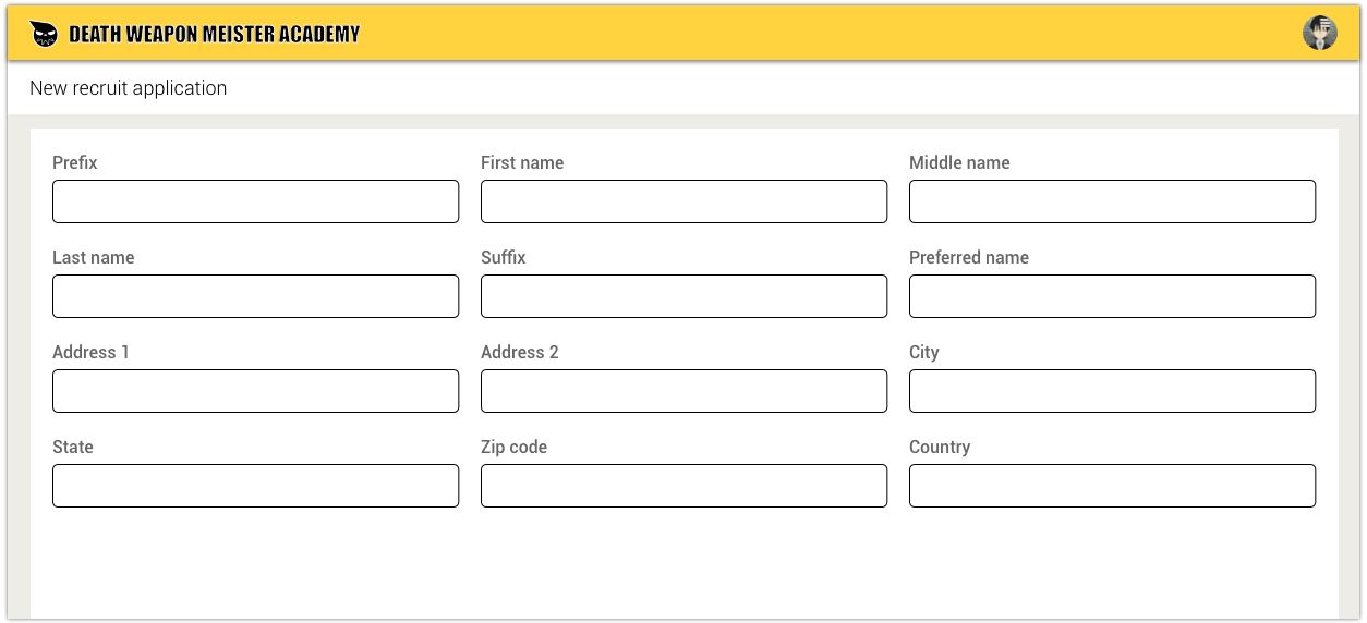
More often than not, forms and tables developed for corporate enterprise software tend to be immensely complicated and long. By default, many enterprise software platforms (ex. Salesforce or Pegasystems) treat these behemoth piles of data with symmetrical multi-column layouts that stretch across the page to “make use of the white space” and to “avoid too much vertical scrolling.”
通常,为公司企业软件开发的表格和表格往往非常复杂且冗长。 默认情况下,许多企业软件平台(例如Salesforce或Pegasystems)使用对称的多列布局处理这些庞然大物的数据,这些布局跨页面延伸以“利用空白”并“避免过多的垂直滚动”。
There is an abundance of research that shows that single column forms are much more usable than multi-column ones mainly because:
有大量研究表明,单列表单比多列表单更有用,主要是因为:
- Multi-column layouts lack a clear sense of direction to lead users. This makes it harder to pick up momentum and adds to the cognitive load to determine the flow of information.多列布局缺乏明确的引导用户的方向感。 这使得更难获得动量,并增加了确定信息流的认知负担。
- The lack of clear direction also causes users to skip fields.缺乏明确的方向还会导致用户跳过字段。
- Users generally do not mind vertical scrolling.用户通常不介意垂直滚动。

Stretching out forms and tables to fit the width of the screen is another common habit.
伸展表格和表格以适合屏幕宽度是另一个常见的习惯。

Although it aesthetically makes sense to add this symmetrical balance to pictures, it forces users to scan more real estate, which wastes time and, again, adds to the cognitive workload.
尽管在图片上添加这种对称的平衡在美学上是有意义的,但它迫使用户扫描更多的不动产,这既浪费时间,又增加了认知工作量。
A more user-friendly design would be to size the input fields according to the amount of data expected (rather than keeping the same size for symmetry’s sake) and to follow the F-shaped reading pattern, which is more similar to reading a book (left-right, up-down).
一种更人性化的设计是根据预期的数据量来调整输入字段的大小(而不是为了对称而保持相同的大小),并遵循F形阅读模式,这与阅读书籍更相似(左右-上下)。

There are many advantages to laying out data this way:
通过这种方式布置数据有很多优点:
- It drives the user’s attention in a clear direction, making it faster and easier to scan.它可以沿清晰的方向吸引用户的注意力,使其扫描更快,更容易。
- The extra white space makes the screen feel less cluttered.多余的白色空间使屏幕显得更整洁。
- Since the data is closer in proximity, there is less distance to scan, which makes less work for the user.由于数据更接近,因此扫描距离更短,这对用户减少了工作量。
强迫症:强迫症设计 (OCD: Obsessive-compulsive design)
By instinct, most people will continue to believe that symmetry feels more correct unless they are asked to actually do side-by-side usability comparisons. Despite successfully convincing clients to change their designs to be less symmetrical and more usable, I find that they have a hard time internalizing this logic.
出于本能,大多数人会继续相信对称性会更正确, 除非要求他们实际进行并行的可用性比较 。 尽管成功说服客户将其设计更改为不太对称且更易用,但我发现他们很难理解这种逻辑。
In conclusion, the obsession with symmetry is an overrated aesthetic that is harmful to both usability and Shinigamis.
总之,对对称性的痴迷是一种高估的美学,对可用性和Shinigamis都有害。
Please don’t harvest my soul, Kid.
小子,请不要收获我的灵魂。
翻译自: https://uxdesign.cc/death-the-kids-unusable-design-aesthetic-260dcc81273e
美学设计评价
http://www.taodudu.cc/news/show-894186.html
相关文章:
- 方法重载_方法
- 同态加法_同态—当旧趋势突然变酷时
- 安全态势感知产品对比_设计中的对比和人的感知
- 人工智能和Adobe Sensei
- 素描的几大基础知识点_2020年让您感到惊奇的5大素描资源
- 排版人员 快速排版_选择排版前应了解的事项
- imessage_重新设计iMessage以获得更好的用户体验— UX案例研究
- 插图 引用 同一行两个插图_插图的目的
- 最少的编码
- 单选按钮步骤流程向导 js_创建令人愉快的按钮的6个步骤
- 护肤产生共鸣_通过以人为本的设计编织共鸣的20个指针
- 谷歌抽屉_Google(最终)会杀死导航抽屉吗?
- sketch钢笔工具_设计工具(Sketch,Adobe XD,Figma和InVision Studio)中奇怪的一项功能
- sketch浮动布局_使用智能布局和调整大小在Sketch中创建更好的可重用符号
- 保持危机感和紧迫感_什么是紧迫的:您需要知道的一切
- ui边框设计图_UI设计形状和对象基础知识:填充和边框
- figma下载_素描vs Figma困境
- 硬币 假硬币 天平_小东西叫硬币
- 检测输入路径是否存在错误_为什么存在用户输入错误
- Baymard Institute:基于UX的最佳实践的光荣的,循证的工具
- 同理心案例及故事分享_神经形态,视觉可及性和同理心
- 菜单窗口_菜单
- 小程序 富文本自适应屏幕_自适应文本:跨屏幕尺寸构建可读文本
- 平面设计师和ui设计师_游戏设计师的平面设计
- a说b说谎b说c说谎说d说_说谎的眼睛及其同伙
- 百度指数可视化_可视化指数
- sketch钢笔工具_Sketch和Figma,不同的工具等于不同的结果
- figma下载_Figma中的动态内容和颜色
- 基于上下文的rpn_构建事物-产品评论视频中基于上下文的情感分析
- 单选按钮设置为被选中状态_为什么要设置错误的按钮状态
美学设计评价_死亡的孩子无法使用的设计美学相关推荐
- :寻找指定和的整数对_寻找时间:如何增加设计的时间
:寻找指定和的整数对 Good design derives from good thinking. And good thinking is highly correlated to how muc ...
- 学习ui设计_如果您想学习UI设计,该怎么办
学习ui设计 There is a question that is always asked when we want to learn something new. 当我们想学习新东西时,总会问一 ...
- figma设计_如何在Figma中构建设计入门套件(第1部分)
figma设计 Figma教程 (Figma Tutorial) Do you like staring at a blank canvas every time you start a new pr ...
- tcp 接收端优雅的写法_如何更优雅地接收设计反馈
tcp 接收端优雅的写法 重点 (Top highlight) It's rare to meet a designer that doesn't take pride in their work. ...
- 产品设计美学案例分析_美学在产品设计中的重要性
产品设计美学案例分析 重点 (Top highlight) In one of my previous jobs, I had really interesting debates with the ...
- web前端项目实例网站_招聘 | 北京 | tSynsth系联设计 建筑设计师 / 室内设计师 / 项目负责人 / WEB前端开发工程师 / 实习生...
关于我们 系联设计(Tuning Synesthesia ,tSynsth, TS)是一支由多元背景的设计师与软件工程师组成的国际团队,致力于想法与过程让设计 "可持续". 系联专 ...
- 数据结构c语言版袁和金答案,_数据结构_课程教学中的案例设计及应用_袁和金.pdf...
_数据结构_课程教学中的案例设计及应用_袁和金 第 16 期 90 2013 年 8 月 25 日 Computer Education G642 袁和金 (华北电力大学 计算机系,河北 保定 071 ...
- 51单片机导盲手杖_超声波测距+DS18B20测温设计
51单片机导盲手杖_超声波测距+DS18B20测温设计 (源码+原理图+PCB+仿真) 原理图PAB:Altium Designer 仿真原版本:proteus 7.8 程序编译器:keil 4/ke ...
- HTML5汽车网页设计成品_学生DW汽车静态网页设计代做_web课程设计网页制作_宽屏大气汽车自驾游网站模板html源码...
HTML5汽车网页设计成品_学生DW汽车静态网页设计代做_web课程设计网页制作_宽屏大气汽车自驾游网站模板html源码 临近期末, 你还在为HTML网页设计结课作业,老师的作业要求感到头大?HTML ...
最新文章
- 成为数据科学家、人工智能和机器学习工程师的自学之路
- Momenta完全无人驾驶首次曝光!城区道路混行无接管,遭遇逆行也不怕,特斯拉Waymo路线二合一...
- c++ 私有内部类_C++类成员的访问权限以及类的封装
- linux:进程之间的通信
- CRM中间件里parent not ok的错误消息如何处理
- POJ 3181 Dollar Dayz DP
- 【动态规划】城市交通
- StringStringBuilder的使用
- css 定位 0302
- OC中给我们提供的一个技术:谓词(NSPredicate).note
- vs2013的mfc开发上位机
- 基于CNN的车牌识别
- dos命令行的四种打开方式
- word里面搜狗输入法突然不见了
- 2022年,程序员如何选择电脑
- Power Apps从入门到放弃教程
- easycode小帮手
- 解决小米miui系统调用系统裁剪图片功能崩溃失败的问题
- Excel用函数把时间戳格式和日期格式相互转换
- linux查看系统版本
热门文章
- c语言用数组写密码程序,想程序高手求助--用C语言来编辑一个输入密码的程序...
- 第10章 Python 数字图像处理(DIP) - 图像分割 基础知识 标准差分割法
- java axmlprinter_安卓xml配置文件解析工具-AXMLPrinter2.jar(androidmanifest.xml 反编译)下载官方最新版-西西软件下载...
- 如何解决ORA-04031错误
- A Web Module That Uses JavaServer Faces Technology: The hello2 Example
- datetime模块日期转换和列表sorted排序
- 通过python 爬取网址url 自动提交百度
- CSS3实现多样的边框效果
- 不安装oracle客户端如何用plsql连接oracle
- C#用Zlib压缩或解压缩字节数组