figma设计_Figma中简单,可重复使用的设计系统
figma设计
Putting together a design system may seem like an unnecessary hassle. It’s often easier to jump straight into designing things without having to worry about styles, components, or libraries. Some might even argue that when it comes to smaller projects, creating a design system takes nearly as much time as designing the entire project, so why bother?
组合设计系统似乎是不必要的麻烦。 直接进入设计事物通常更容易,而不必担心样式,组件或库。 甚至有人可能会争辩说,当涉及到较小的项目时,创建设计系统所花费的时间几乎与设计整个项目所花费的时间一样多,那么为什么要打扰?
While it’s true creating a design system is an additional step in the design process, what’s also true is that, regardless of the size of the project, the first version of your project rarely gets accepted by the client. Depending on the size of the project as well as the severity of the changes, introducing them could take a lot of time.
创建设计系统确实是设计过程中的附加步骤,但同样重要的是,无论项目大小如何,客户都很少接受项目的第一个版本。 根据项目的大小以及变更的严重性,引入这些变更可能会花费很多时间。
So whether you’re designing huge platforms or small e-commerce websites, design systems could save you a lot of time in the long run. Instead of going through each and every view making sure that you’ve applied the new colors or fonts, you could just take a look at your styles and components, introduce all the necessary changes in a few clicks and automatically populate them to the entire project.
因此,无论您是设计大型平台还是小型电子商务网站,从长远来看,设计系统都可以为您节省大量时间。 无需遍历每个视图来确保已应用新的颜色或字体,而只需查看样式和组件,单击几下即可进行所有必要的更改,然后自动将其填充到整个项目中。
Not only does this save you time, but it also allows for more coherent design practices as you limit yourself to only using predefined styles and components.
这不仅可以节省您的时间,而且由于您仅使用预定义的样式和组件,因此还可以实现更一致的设计实践。
Figma gives you the tools to create a simple, easily reusable design system. There are a few ways you could approach this, and I’m going to try and cover all of them. I’d also like to take you through the list of things you’ll need to build your very own basic design system, which you can then modify and grow to best suit your project’s needs.
Figma为您提供了创建简单,易于重用的设计系统的工具。 您可以通过几种方法来解决这个问题,我将尝试涵盖所有这些方法。 我还要向您介绍构建自己的基本设计系统所需的事项,然后可以对其进行修改和扩展,使其最适合您的项目需求。
Technically you could use one of the available ready-made design systems for Figma, but I’d argue this is not a very good idea unless you’re trying to create something in a hurry. I believe it’s always best to put in the time to build your project from the ground up. This will allow you to better understand how each component is created and solve any issues that may arise while working with the design system.
从技术上讲,您可以使用Figma可用的现成的设计系统之一,但是我认为这不是一个好主意,除非您要急着创建一些东西。 我认为,最好花时间从头开始构建您的项目。 这将使您更好地了解如何创建每个组件并解决在使用设计系统时可能出现的任何问题。
Sometimes it can be hard to create a design system without seeing the bigger picture. It’s a good idea to base your design system around an already finished project.
有时,如果不看大图就很难创建设计系统。 将您的设计系统基于已经完成的项目是一个好主意。
The first and most important thing is creating a proper grid for your design system. Depending on what kind of framework you’ll be working with, you could be using different types of grids. The one I personally use most often is the Bootstrap grid. I like to set up my grid to not only help me space around objects horizontally but also vertically. I’m not going to go into why you should be using a grid, as that’s a subject for another article.
首先也是最重要的事情是为您的设计系统创建适当的网格。 根据您将使用的框架类型,可能会使用不同类型的网格。 我个人最常使用的一个是Bootstrap网格。 我喜欢设置网格,不仅可以帮助我水平放置对象,而且可以垂直放置对象。 我不会讨论为什么要使用网格,因为这是另一篇文章的主题。

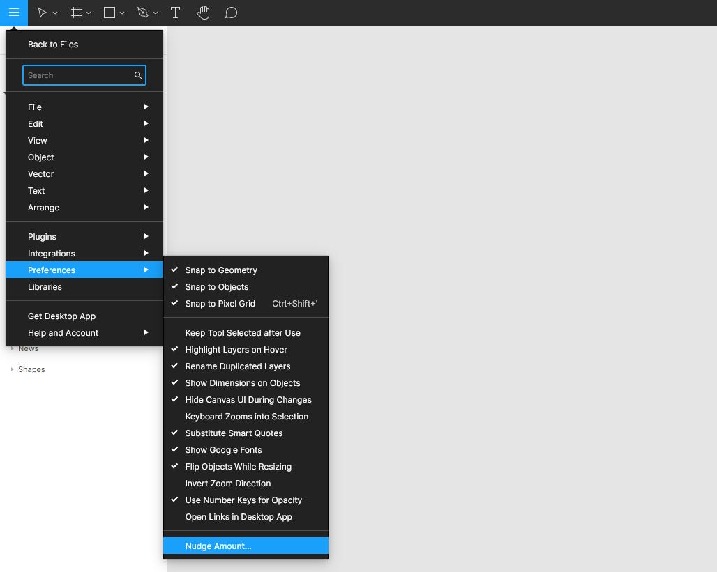
You should turn thus created grid into a style. Now if you haven’t done that already, it’s also a good idea to go into the Figma hamburger menu > Preferences > Nudge Amount and set the values to 1 and 8. This way your keyboard arrow keys in combination with the shift key will allow you to move the objects around while sticking to the grid you’ve just created.
您应该将这样创建的网格转换为样式。 现在,如果您还没有这样做,那么进入Figma汉堡菜单>“偏好设置”>“微移数量”并将值设置为1和8也是一个好主意。这样,您的键盘箭头键与Shift键的组合将允许您可以在移动对象的同时保持刚创建的网格的位置。
The next step is to create a bunch of font styles that we’re going to be using in our project. It’s important to remember to cover all the basics such as several styles for headlines, paragraph texts, hints, captions, and such. Do as many as the kind of projects you’re involved with may necessitate. You might think to yourself: “Hey, why not have the same style for buttons and menus since they use the same font?” Well, you might find yourself in a bit of a pickle if it turns out that you only need to change the font size for your menu elements at a later stage of your project.
下一步是创建将在项目中使用的一堆字体样式。 重要的是要记住涵盖所有基础知识,例如标题的多种样式,段落文本,提示,标题等。 尽可能多地参与您需要参与的项目。 您可能会想:“嘿,为什么按钮和菜单使用相同的字体却没有相同的样式?” 好吧,如果事实证明您只需要在项目的稍后阶段更改菜单元素的字体大小,您可能会感到有点烦。

I like to keep all my font styles displayed in a frame, so I know whether they play well together or not. This kind of setup will be necessary if you decide to duplicate your design system instead of using it as a library for your project, but I’ll get back to that later. Generally this amount of styles should be enough for any kind of average-sized website with a decent amount of text in it.
我喜欢将所有字体样式都显示在一个框架中,因此我知道它们是否可以很好地协同工作。 如果您决定复制设计系统而不是将其用作项目的库,则必须进行这种设置,但是稍后再讲。 通常,对于任何类型的带有中等数量文本的中等大小的网站,此样式数量应足够。
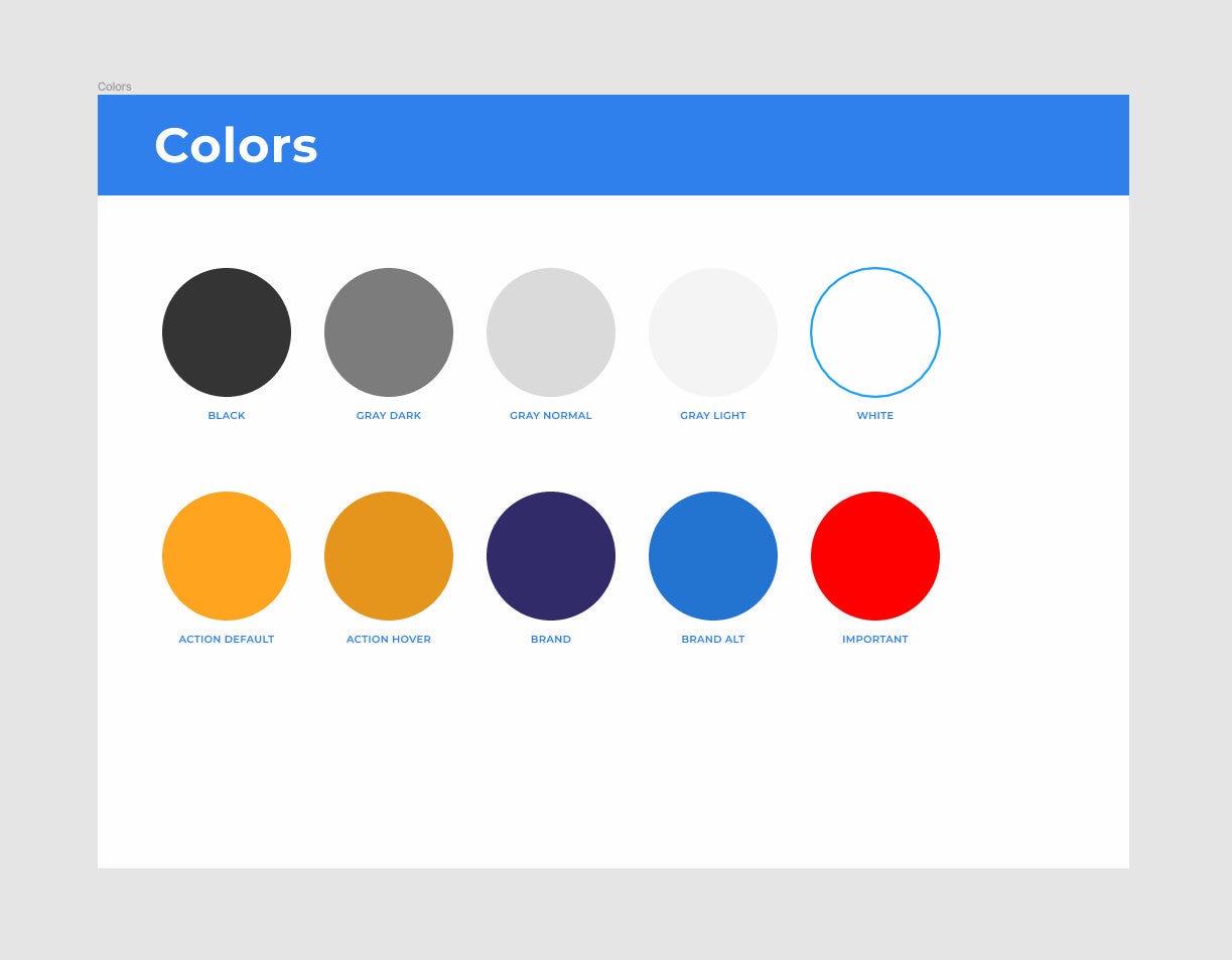
When it comes to colors I usually define styles for the brand colors, the action color, and some grays. You might want to define styles for important, warning, success, error messages, and such as well. Dealing with a strictly defined palette makes not only the design process but also the hand-off much easier.
当谈到颜色时,我通常会为品牌颜色,动作颜色和一些灰色定义样式。 您可能想为重要,警告,成功,错误消息等定义样式。 处理严格定义的调色板不仅使设计过程变得容易,而且使交接变得更加容易。
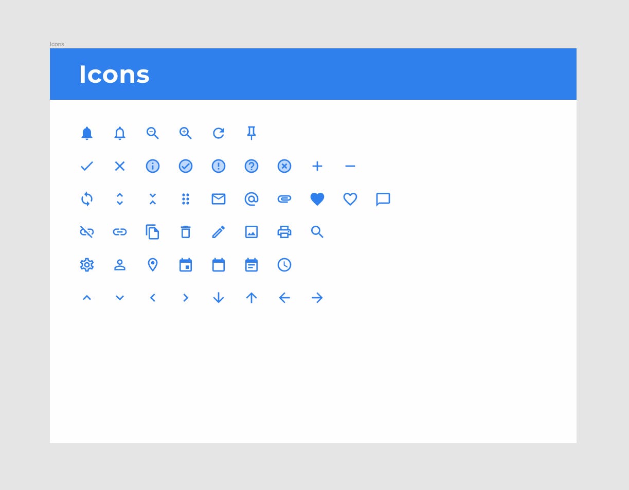
A basic set of often-used icons is also a good idea. I’ve used Google’s Material icons for this example. Even if you‘re tasked with designing your own set you can use these as placeholders in early mockups that are easy to replace at a later time.
一组基本的常用图标也是一个好主意。 在此示例中,我使用了Google的“材质”图标。 即使您要设计自己的集合,也可以在早期的模型中将它们用作占位符,以便以后替换。
Even though there’s a variety of plugins that can automatically generate content for you such as avatars or images, I prefer to create a predefined set of images or avatars as styles, to retain coherence in case I decide to use them as placeholders.
即使有多种插件可以自动为您生成内容(例如头像或图像),我还是希望创建一组预定义的图像或头像作为样式,以保持连贯性,以防万一我决定将它们用作占位符。
It’s not very intuitive, but Figma lets you set up images as color styles that you can later use like any normal color style — to fill a given object using a predefined set of characteristics. What’s even more interesting is that objects can have a lot of fill layers within themselves that interact with each other (this also applies to strokes, effects and so on) and so a group of fill layers all within a single object could be defined as an easily modifiable style. Fill layers can also be moved to front or back and copied between objects. This is an awesome feature that not a lot of people know about.
它不是很直观,但是Figma允许您将图像设置为颜色样式,以后可以像任何常规颜色样式一样使用-使用一组预定义的特征填充给定的对象。 更有意思的是,对象内部可以具有很多相互交互的填充层(这也适用于笔触,效果等),因此可以将单个对象内的一组填充层定义为易于修改的样式。 填充层也可以移到前面或后面,并在对象之间复制。 这是一个很棒的功能,鲜为人知。

You can of course achieve similar effects by setting up images as components, but you can’t use components as fills.
通过将图像设置为组件,您当然可以达到类似的效果,但是不能将组件用作填充。
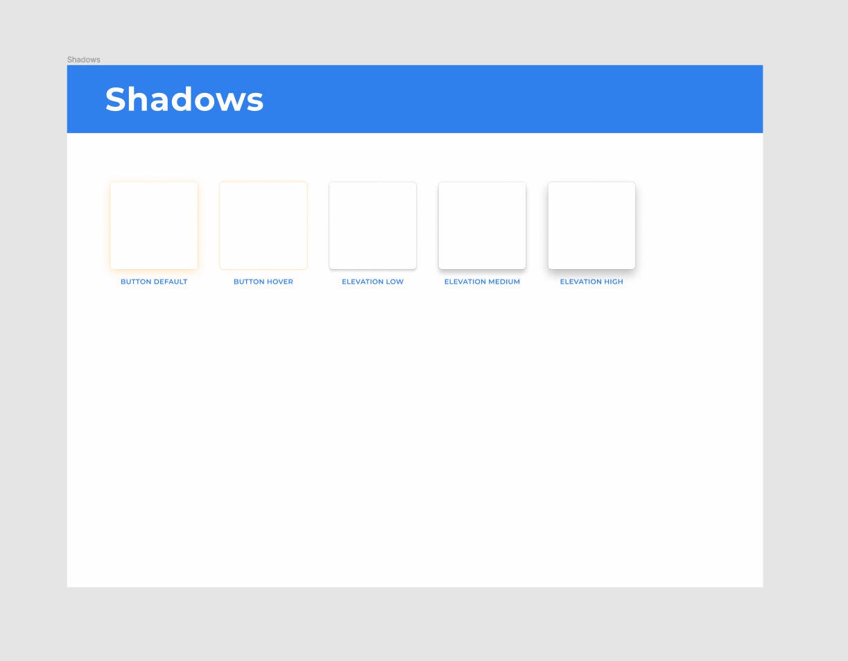
The last step is to create some shadows for your project. For a small design system I wouldn’t bother with an entire complex elevation system, just a couple of different shadow styles should be enough.
最后一步是为您的项目创建一些阴影。 对于小型设计系统,我不会理会整个复杂的高程系统,只需几个不同的阴影样式就足够了。
Once you have all the styles set up this way it’s time to start putting together some components.
一旦以这种方式设置了所有样式,就可以开始组合一些组件了。
Before Auto Layout there was a whole different approach to creating buttons. You’d start with defining shape components that would then serve as button backgrounds through using appropriate constraints. You’d use these shapes across all your components so that if you decided to change your corner-radius, this change would affect all your buttons, images, input fields, and so on. While this technique still has its merits and can still be used in some situations, it won’t work with Figma’s Auto Layout feature.
在“自动布局”之前,有一种完全不同的方法来创建按钮。 您将从定义形状组件开始,然后通过使用适当的约束将其用作按钮背景。 您将在所有组件中使用这些形状,以便如果决定更改角半径,则此更改将影响所有按钮,图像,输入字段等。 尽管此技术仍然有其优点,并且仍可以在某些情况下使用,但它不适用于Figma的“自动布局”功能。
Auto Layout is an amazing feature, but in the case of buttons it’s not always the best solution. Sometimes you need to size your buttons according to a grid. Some of the projects I’ve worked on necessitated both, standard and Auto Layout buttons. Some of them could do without Auto Layout at all. Not one could do without the standard, non-Auto Layout buttons. When creating a small design system such as this one I’d stick with non-Auto Layout buttons.
自动布局是一个了不起的功能,但是对于按钮而言,它并不总是最好的解决方案。 有时您需要根据网格调整按钮的大小。 我从事的一些项目需要标准按钮和自动布局按钮。 他们中的一些人根本不需要自动版图。 没有标准的非自动布局按钮,谁也做不到。 在创建这样的小型设计系统时,我会坚持使用非自动布局按钮。
At this point you actually start using your styles. You can use your Button font style, put it in a frame, fill it with the Action Default style, slap the Button Default effect on it and you’ve got yourself a button. Do this a couple more times to create appropriate styles for different styles.
至此,您实际上开始使用样式了。 您可以使用Button字体样式,将其放在框架中,并用Action Default样式填充,在其上拍上Button Default效果,您便会自己拥有一个按钮。 多做几次,为不同的样式创建合适的样式。

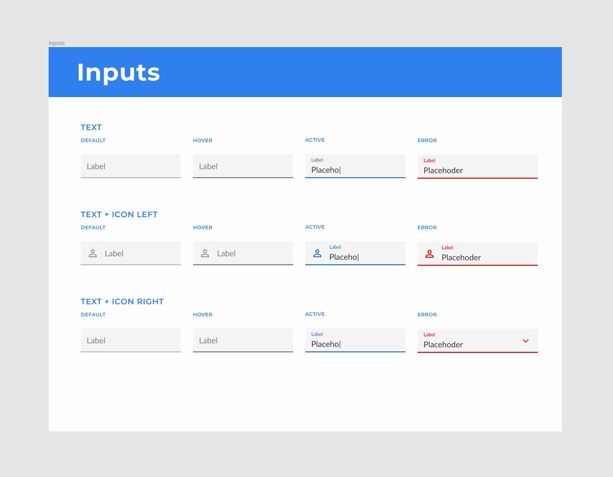
In the case of a simple design system like this one I’d finish up with a set of inputs in different states. Again, you should base their design on the styles you’ve already created.
对于像这样的简单设计系统,我将完成一组处于不同状态的输入。 同样,您应该基于已经创建的样式来设计它们。
At this point you’ve got all the basic ingredients to start working on a new design. Where you go from here should depend on what kind of projects you do most often and what other patterns could be turned into reusable components that often appear in your projects. Often work with e-commerce websites? It’d probably be a good idea to create some product card components, maybe a checkout form.
至此,您已经具备了开始进行新设计的所有基本要素。 您从这里去的位置应取决于您最常执行的项目类型以及哪些其他模式可以转换为经常出现在项目中的可重用组件。 经常与电子商务网站合作吗? 创建一些产品卡组件(可能是结帐表格)可能是一个好主意。
Now there are two ways you can go about reusing your design system for new projects. As with most things in life, each has its pros and cons. Go with whatever is best for your design practices and the type of projects you deal with.
现在,您可以通过两种方法将设计系统重新用于新项目。 与生活中的大多数事物一样,每种事物都有其优点和缺点。 选择最适合您的设计实践和所处理项目类型的项目。
You can do it the way it was intended by Figma. Use the design system you’ve created as a library. This way you get access to the entire design system right away, but any heavy modifications of the components are out of the question obviously. You can only modify the colors and hide their elements. Other than that you’re stuck with what’s in the design system. The same thing goes for all styles. You can add new ones, but can’t modify the originals. It’d actually be a better idea to split the design systems into separate libraries and so you could, for example, use a button library, a gray color library, an elevation library, etc.
您可以按照Figma的预期方式进行操作。 使用您创建为库的设计系统。 通过这种方式,您可以立即访问整个设计系统,但是显然不需要对组件进行任何重大修改。 您只能修改颜色并隐藏其元素。 除此之外,您还无法使用设计系统中的内容。 所有样式都一样。 您可以添加新的,但不能修改原始的。 将设计系统分成单独的库实际上是一个更好的主意,因此您可以使用例如按钮库,灰色库,高程库等。
The second approach and the way I do it is to simply duplicate the entire design system. This way there’s nothing stopping you from modifying all your components. The bad thing about duplicating design systems is the fact that it makes you lose all your styles. You basically need to go through all your fonts, colors, fills, and whatever else you might’ve set up and turn them into styles once again. This isn’t so bad however as it only takes a few minutes and still makes you save a lot of time in the long run.
第二种方法和我做的方法是简单地复制整个设计系统。 这样,您就无法阻止您修改所有组件。 复制设计系统的坏事是它使您失去所有样式的事实。 基本上,您需要遍历所有字体,颜色,填充以及您可能要设置的其他内容,然后再次将它们转换为样式。 但这还算不错,因为它只需要几分钟,从长远来看仍然可以节省很多时间。
Technically a design system is a much more complex structure than what we’ve created so far. But while a complete design system is supposed to include all reusable characteristics and patterns of a design, our basic design system’s goal is to help you kick start your designs.
从技术上讲,设计系统的结构要比我们到目前为止创建的结构复杂得多。 但是,尽管完整的设计系统应该包含设计的所有可重用特征和样式,但我们的基本设计系统的目标是帮助您启动设计。
翻译自: https://uxdesign.cc/simple-reusable-design-system-in-figma-a3a01236a7e3
figma设计
http://www.taodudu.cc/news/show-893879.html
相关文章:
- 访问25%无法访问的人-如何设计可访问性
- 架构师论坛 创业_我在早期创业时作为设计师学到的东西
- qt按钮禁用和激活禁用_为什么试探法只是经验法则:禁用按钮的情况
- 好奇心机制_好奇心问题
- 小程序设计避免犯什么错_新设计师犯下的5种印刷错误以及如何避免
- 移动设备web文字单位_移动设备如何塑造现代Web设计
- hp-ux修改时区方法_UX研究人员可以倡导人类的6种方法
- 为什么张扬的人别人很讨厌_为什么每个人总是讨厌重新设计,即使他们很好
- 学习ui设计_如果您想学习UI设计,该怎么办
- css 字体字体图标_CSS基础知识:了解字体
- mysql下载哪一代版本好_潮一代更好的设计
- 预约清单ui设计_持续交付质量设计所需的UI清单
- 静态创意和动态创意_我在22岁时学到的关于创意指导的知识
- 绝对编码和增量编码_用户体验设计师应该学习编码吗? 绝对
- 完美主义怎么解决_相信我,你不要完美主义
- 为什么ui框架设计成单线程_评估UI设计的备忘单
- css 菜单栏悬停_在CSS中构建悬停菜单
- 一级学科和二级学科_在多学科团队中工作的6个障碍(以及如何解决这些问题)
- lynda ux_如何建立内部UX团队
- 财务软件开发_财务独立对软件开发人员的重要性
- book电子书数据库设计_如何为杀手book的封面设计写出完美的摘要
- 5g的负面影响_设计系统的实施是否会对早期概念产生负面影响?
- 像素/厘米与像素/英寸区别_像素/体素艺术入门指南
- 本土链雷达网_走向本土设计
- pyqt5子窗口跳出主窗口_弹出式窗口与 可用性,转换和跳出率
- 移动硬盘不可用_如何对您的网站执行移动可用性审核
- 开发人员安全行为规则_为开发人员改善生活的7条简单规则
- 反馈页面设计_获得设计反馈的艺术
- 系统设计原则的重要性_设计原则的重要性及其对好的设计的影响
- 有一种爱情叫永不改变_设计就像爱情一样,总是在寻找一种方式
figma设计_Figma中简单,可重复使用的设计系统相关推荐
- 设计心理学中的映射交互设计概念|优漫动游
我们经常会谈到用户体验,其实好的用户体验与设计映射是有很大关系的,今天的设计法则-映射,希望能为你提升产品用户体验度带来一点思考.今天我们来了解一下,设计心理学中的第三个交互设计概念:映射. 同样,这 ...
- figma下载_Figma中的高级图像处理
figma下载 Figma is not exactly suited for image manipulation, and that's completely fine. While it doe ...
- figma下载_Figma中的动态内容和颜色
figma下载 First off, why use dynamic data? 首先,为什么要使用动态数据? It's easy to create and manage long lists of ...
- c语言课程设计之简易计算器,简易计算器课程设计 帮忙写简单计算器课程设计...
帮忙写简单计算器课程设计书繁华若真如一梦,过而无痕多好,人就不必失意,只当醉了一场,醒来仍过平淡的生活. 程序 #include #include //定义atlf函数 #include 简介下的 要 ...
- 计算机网络校园网简单设计与实现,简单校园网的设计与实现.docx
本科课程考查(论文)专用封面 作业(论文)题目: 所修课程名称: 简单校园网的设计与实现 <计算机网络实践> 修课程时间: 2012 年 9 月至 2012 年 12 月 完成作业(论文) ...
- 用于《机械设计课程设计》中的减速箱设计的Python计算程序
Requirement Python 3+ 1. Overview 几乎所有高校的机械类专业都有<机械设计课程设计>课程,课程内容几乎都是设计一个减速箱.可能是一级减速,二级减速等,可能是 ...
- 分布式系统概念和设计-操作系统中的支持和设计
分布式系统概念和设计 操作系统支持 中间件和底层操作系统的关系,操作系统如何满足中间件需求. 中间件需求:访问物理资源的效率和健壮性,多种资源管理策略的灵活性. 任何一个操作系统的目标都是提供一个在物 ...
- 计算机组成原理课程设计——CPU与简单模型机设计
一.设计目的 1.掌握一个简单CPU的组成原理. 2.在掌握部件单元电路的基础上,进一步将其构造一台基本模型计算机. 3.掌握微程序控制器设计. 二.设计任务与要求 设计任务: 用所学知识,设计并构造 ...
- python中扑克牌类设计_python中的图像界面设计(二)
1. Tkinter组件 Tkinter 提供各种的组件(控件),如按钮.标签和文本框,提供一个GUI应用程序使用.这些组件通常被称为控件或者是部件.目前有15中Tkinter的组件.这些组件的简单介 ...
最新文章
- 技术图文:浅析 C# Dictionary实现原理
- 华为服务器故障灯不开机_总有故障灯亮却不知道是怎么回事?详解这些你不认识的故障灯...
- SpringCloud实战5-Feign声明式服务调用
- WebServices应用集成框架ESB(Enterprise Service Bus 企业服务总线)
- 618选购手机正当时,好评率高达99%的手机了解一下!
- 6*6行列式相加的c语言,求行列式的值,用C语言怎么写啊?
- 华为Mate40国行版18点08分开卖:要求12小时内必须卖完
- Linux之SDL2+OpenGL+EGL绘制(十六)
- html session修改,html session
- 【R语言】logistic回归(二)多因素logistic回归
- OFFPIPE 海底管道铺设计算分析软件
- 常见十大量化投资策略
- pytorch-tenor-细节
- Bootstrap系列之导航条(Navbar)
- Words study
- 一个月黑风高的夜晚紧急完成gitlab服务器数据迁移
- 三星note5 android9,史上最快!三星公布新版安卓9.0升级名单:Note FE在内
- 祝妈妈生日快乐的html的代码,祝妈妈生日快乐的朋友圈说说 祝妈妈生日快乐的说说句子...
- 离散数学_九章:关系(2)
- Broadcast Receiver