在Python中使用Seaborn和WordCloud可视化YouTube视频
I am an avid Youtube user and love watching videos on it in my free time. I decided to do some exploratory data analysis on the youtube videos streamed in the US. I found the dataset on the Kaggle on this link
我是YouTube的狂热用户,喜欢在业余时间观看视频。 我决定对在美国播放的youtube视频进行一些探索性数据分析。 我在此链接的Kaggle上找到了数据集
I downloaded the csv file ‘USvidoes.csv’ and the json file ‘US_category_id.json’ among all the geography-wise datasets available. I have used Jupyter notebook for the purpose of this analysis.
我在所有可用的地理区域数据集中下载了csv文件“ USvidoes.csv”和json文件“ US_category_id.json”。 我已使用Jupyter笔记本进行此分析。
让我们开始吧! (Let's get started!)
Loading the necessary libraries
加载必要的库
import pandas as pdimport numpy as npimport seaborn as snsimport matplotlib.pyplot as pltimport osfrom subprocess import check_outputfrom wordcloud import WordCloud, STOPWORDSimport stringimport re import nltkfrom nltk.corpus import stopwordsfrom nltk import pos_tagfrom nltk.stem.wordnet import WordNetLemmatizer from nltk.tokenize import word_tokenizefrom nltk.tokenize import TweetTokenizerI created a dataframe by the name ‘df_you’ which will be used throughout the course of the analysis.
我创建了一个名为“ df_you”的数据框,该数据框将在整个分析过程中使用。
df_you = pd.read_csv(r"...\Projects\US Youtube - Python\USvideos.csv")The foremost step is to understand the length, breadth and the bandwidth of the data.
最重要的步骤是了解数据的长度,宽度和带宽。
print(df_you.shape)print(df_you.nunique())
There seems to be around 40949 observations and 16 variables in the dataset. The next step would be to clean the data if necessary. I checked if there are any null values which need to be removed or manipulated.
数据集中似乎有大约40949个观测值和16个变量。 下一步将是在必要时清除数据。 我检查了是否有任何需要删除或处理的空值。
df_you.info()
We see that there are total 16 columns with no null values in any of them. Good for us :) Let us now get a sense of data by viewing the top few rows.
我们看到总共有16列,其中任何一列都没有空值。 对我们有用:)现在让我们通过查看前几行来获得数据感。
df_you.head(n=5)Now comes the exciting part of visualizations! To visualize the data in the variables such as ‘likes’, ‘dislikes’, ‘views’ and ‘comment count’, I first normalize the data using log distribution. Normalization of the data is essential to ensure that these variables are scaled appropriately without letting one dominant variable skew the final result.
现在是可视化令人兴奋的部分! 为了可视化“喜欢”,“喜欢”,“观看”和“评论计数”等变量中的数据,我首先使用对数分布对数据进行规范化。 数据的规范化对于确保适当缩放这些变量而不会让一个主要变量偏向最终结果至关重要。
df_you['likes_log'] = np.log(df_you['likes']+1)df_you['views_log'] = np.log(df_you['views'] +1)df_you['dislikes_log'] = np.log(df_you['dislikes'] +1)df_you['comment_count_log'] = np.log(df_you['comment_count']+1)Let us now plot these!
现在让我们绘制这些!
plt.figure(figsize = (12,6))plt.subplot(221)g1 = sns.distplot(df_you['likes_log'], color = 'green')g1.set_title("LIKES LOG DISTRIBUTION", fontsize = 16)plt.subplot(222)g2 = sns.distplot(df_you['views_log'])g2.set_title("VIEWS LOG DISTRIBUTION", fontsize = 16)plt.subplot(223)g3 = sns.distplot(df_you['dislikes_log'], color = 'r')g3.set_title("DISLIKES LOG DISTRIBUTION", fontsize=16)plt.subplot(224)g4 = sns.distplot(df_you['comment_count_log'])g4.set_title("COMMENT COUNT LOG DISTRIBUTION", fontsize=16)plt.subplots_adjust(wspace = 0.2, hspace = 0.4, top = 0.9)plt.show()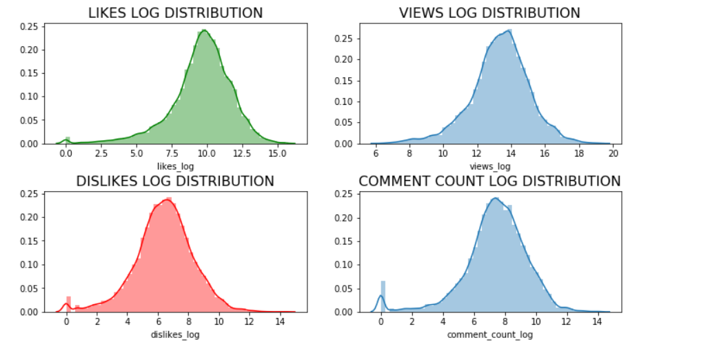
Let us now find out the unique category ids present in our dataset to assign appropriate category names in our dataframe.
现在让我们找出数据集中存在的唯一类别ID,以便在数据框中分配适当的类别名称。
np.unique(df_you["category_id"])
We see there are 16 unique categories. Let us assign the names to these categories using the information in the json file ‘US_category_id.json’ which we previously downloaded.
我们看到有16个独特的类别。 让我们使用先前下载的json文件“ US_category_id.json”中的信息将名称分配给这些类别。
df_you['category_name'] = np.nandf_you.loc[(df_you["category_id"]== 1),"category_name"] = 'Film and Animation'df_you.loc[(df_you["category_id"] == 2), "category_name"] = 'Cars and Vehicles'df_you.loc[(df_you["category_id"] == 10), "category_name"] = 'Music'df_you.loc[(df_you["category_id"] == 15), "category_name"] = 'Pet and Animals'df_you.loc[(df_you["category_id"] == 17), "category_name"] = 'Sports'df_you.loc[(df_you["category_id"] == 19), "category_name"] = 'Travel and Events'df_you.loc[(df_you["category_id"] == 20), "category_name"] = 'Gaming'df_you.loc[(df_you["category_id"] == 22), "category_name"] = 'People and Blogs'df_you.loc[(df_you["category_id"] == 23), "category_name"] = 'Comedy'df_you.loc[(df_you["category_id"] == 24), "category_name"] = 'Entertainment'df_you.loc[(df_you["category_id"] == 25), "category_name"] = 'News and Politics'df_you.loc[(df_you["category_id"] == 26), "category_name"] = 'How to and Style'df_you.loc[(df_you["category_id"] == 27), "category_name"] = 'Education'df_you.loc[(df_you["category_id"] == 28), "category_name"] = 'Science and Technology'df_you.loc[(df_you["category_id"] == 29), "category_name"] = 'Non-profits and Activism'df_you.loc[(df_you["category_id"] == 43), "category_name"] = 'Shows'Let us now plot these to identify the popular video categories!
现在,让我们对它们进行标绘,以识别受欢迎的视频类别!
plt.figure(figsize = (14,10))g = sns.countplot('category_name', data = df_you, palette="Set1", order = df_you['category_name'].value_counts().index)g.set_xticklabels(g.get_xticklabels(),rotation=45, ha="right")g.set_title("Count of the Video Categories", fontsize=15)g.set_xlabel("", fontsize=12)g.set_ylabel("Count", fontsize=12)plt.subplots_adjust(wspace = 0.9, hspace = 0.9, top = 0.9)plt.show()
We see that the top — 5 viewed categories are ‘Entertainment’, ‘Music’, ‘How to and Style’, ‘Comedy’ and ‘People and Blogs’. So if you are thinking of starting your own youtube channel, you better think about these categories first!
我们看到排名前5位的类别是“娱乐”,“音乐”,“操作方法和样式”,“喜剧”和“人与博客”。 因此,如果您想建立自己的YouTube频道,最好先考虑这些类别!
Let us now see how views, likes, dislikes and comments fare across categories using boxplots.
现在,让我们看看使用箱线图,视图,喜欢,不喜欢和评论在不同类别中的表现如何。
plt.figure(figsize = (14,10))g = sns.boxplot(x = 'category_name', y = 'views_log', data = df_you, palette="winter_r")g.set_xticklabels(g.get_xticklabels(),rotation=45, ha="right")g.set_title("Views across different categories", fontsize=15)g.set_xlabel("", fontsize=12)g.set_ylabel("Views(log)", fontsize=12)plt.subplots_adjust(wspace = 0.9, hspace = 0.9, top = 0.9)plt.show()
plt.figure(figsize = (14,10))g = sns.boxplot(x = 'category_name', y = 'likes_log', data = df_you, palette="spring_r")g.set_xticklabels(g.get_xticklabels(),rotation=45, ha="right")g.set_title("Likes across different categories", fontsize=15)g.set_xlabel("", fontsize=12)g.set_ylabel("Likes(log)", fontsize=12)plt.subplots_adjust(wspace = 0.9, hspace = 0.9, top = 0.9)plt.show()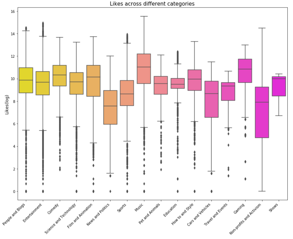
plt.figure(figsize = (14,10))g = sns.boxplot(x = 'category_name', y = 'dislikes_log', data = df_you, palette="summer_r")g.set_xticklabels(g.get_xticklabels(),rotation=45, ha="right")g.set_title("Dislikes across different categories", fontsize=15)g.set_xlabel("", fontsize=12)g.set_ylabel("Dislikes(log)", fontsize=12)plt.subplots_adjust(wspace = 0.9, hspace = 0.9, top = 0.9)plt.show()
plt.figure(figsize = (14,10))g = sns.boxplot(x = 'category_name', y = 'comment_count_log', data = df_you, palette="plasma")g.set_xticklabels(g.get_xticklabels(),rotation=45, ha="right")g.set_title("Comments count across different categories", fontsize=15)g.set_xlabel("", fontsize=12)g.set_ylabel("Comment_count(log)", fontsize=12)plt.subplots_adjust(wspace = 0.9, hspace = 0.9, top = 0.9)plt.show()
Next I calculated engagement measures such as like rate, dislike rate and comment rate.
接下来,我计算了参与度,例如喜欢率,不喜欢率和评论率。
df_you['like_rate'] = df_you['likes']/df_you['views']df_you['dislike_rate'] = df_you['dislikes']/df_you['views']df_you['comment_rate'] = df_you['comment_count']/df_you['views']Building correlation matrix using a heatmap for engagement measures.
使用热图来建立参与度度量的相关矩阵。
plt.figure(figsize = (10,8))sns.heatmap(df_you[['like_rate', 'dislike_rate', 'comment_rate']].corr(), annot=True)plt.show()
From the above heatmap, it can be seen that if a viewer likes a particular video, there is a 43% chance that he/she will comment on it as opposed to 28% chance of commenting if the viewer dislikes the video. This is a good insight which means if viewers like any videos, they are more likely to comment on them to show their appreciation/feedback.
从上面的热图可以看出,如果观众喜欢某个视频,则有43%的机会对其发表评论,而如果观众不喜欢该视频,则有28%的评论机会。 这是一个很好的见解,这意味着如果观众喜欢任何视频,他们就更有可能对它们发表评论以表示赞赏/反馈。
Next, I try to analyse the word count , unique word count, punctuation count and average length of the words in the ‘Title’ and ‘Tags’ columns
接下来,我尝试在“标题”和“标签”列中分析字数 , 唯一字数,标点符号和字的平均长度
#Word count df_you['count_word']=df_you['title'].apply(lambda x: len(str(x).split()))df_you['count_word_tags']=df_you['tags'].apply(lambda x: len(str(x).split()))#Unique word countdf_you['count_unique_word'] = df_you['title'].apply(lambda x: len(set(str(x).split())))df_you['count_unique_word_tags'] = df_you['tags'].apply(lambda x: len(set(str(x).split())))#Punctutation countdf_you['count_punctuation'] = df_you['title'].apply(lambda x: len([c for c in str(x) if c in string.punctuation]))df_you['count_punctuation_tags'] = df_you['tags'].apply(lambda x: len([c for c in str(x) if c in string.punctuation]))#Average length of the wordsdf_you['mean_word_len'] = df_you['title'].apply(lambda x : np.mean([len(x) for x in str(x).split()]))df_you['mean_word_len_tags'] = df_you['tags'].apply(lambda x: np.mean([len(x) for x in str(x).split()]))Plotting these…
绘制这些…
plt.figure(figsize = (12,18))plt.subplot(421)g1 = sns.distplot(df_you['count_word'], hist = False, label = 'Text')g1 = sns.distplot(df_you['count_word_tags'], hist = False, label = 'Tags')g1.set_title('Word count distribution', fontsize = 14)g1.set(xlabel='Word Count')plt.subplot(422)g2 = sns.distplot(df_you['count_unique_word'], hist = False, label = 'Text')g2 = sns.distplot(df_you['count_unique_word_tags'], hist = False, label = 'Tags')g2.set_title('Unique word count distribution', fontsize = 14)g2.set(xlabel='Unique Word Count')plt.subplot(423)g3 = sns.distplot(df_you['count_punctuation'], hist = False, label = 'Text')g3 = sns.distplot(df_you['count_punctuation_tags'], hist = False, label = 'Tags')g3.set_title('Punctuation count distribution', fontsize =14)g3.set(xlabel='Punctuation Count')plt.subplot(424)g4 = sns.distplot(df_you['mean_word_len'], hist = False, label = 'Text')g4 = sns.distplot(df_you['mean_word_len_tags'], hist = False, label = 'Tags')g4.set_title('Average word length distribution', fontsize = 14)g4.set(xlabel = 'Average Word Length')plt.subplots_adjust(wspace = 0.2, hspace = 0.4, top = 0.9)plt.legend()plt.show()
Let us now visualize the word cloud for Title of the videos, Description of the videos and videos Tags. This way we can discover which words are popular in the title, description and tags. Creating a word cloud is a popular way to find out trending words on the blogsphere.
现在让我们可视化视频标题,视频描述和视频标签的词云。 通过这种方式,我们可以发现标题,描述和标签中流行的单词。 创建词云是在Blogsphere上查找流行词的一种流行方法。
Word Cloud for Title of the videos
视频标题的词云
plt.figure(figsize = (20,20))stopwords = set(STOPWORDS)wordcloud = WordCloud( background_color = 'black', stopwords=stopwords, max_words = 1000, max_font_size = 120, random_state = 42 ).generate(str(df_you['title']))#Plotting the word cloudplt.imshow(wordcloud)plt.title("WORD CLOUD for Titles", fontsize = 20)plt.axis('off')plt.show()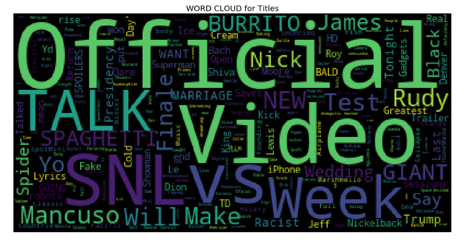
From the above word cloud, it is apparent that most popularly used title words are ‘Official’, ‘Video’, ‘Talk’, ‘SNL’, ‘VS’, and ‘Week’ among others.
从上面的词云中可以看出,最常用的标题词是“ Official”,“ Video”,“ Talk”,“ SNL”,“ VS”和“ Week”等。
2. Word cloud for Title Description
2.标题说明的词云
plt.figure(figsize = (20,20))stopwords = set(STOPWORDS)wordcloud = WordCloud( background_color = 'black', stopwords = stopwords, max_words = 1000, max_font_size = 120, random_state = 42 ).generate(str(df_you['description']))plt.imshow(wordcloud)plt.title('WORD CLOUD for Title Description', fontsize = 20)plt.axis('off')plt.show()
I found that the most popular words for description of videos are ‘https’, ‘video’, ‘new’, ‘watch’ among others.
我发现最受欢迎的视频描述词是“ https”,“ video”,“ new”,“ watch”等。
3. Word Cloud for Tags
3.标签的词云
plt.figure(figsize = (20,20))stopwords = set(STOPWORDS)wordcloud = WordCloud( background_color = 'black', stopwords = stopwords, max_words = 1000, max_font_size = 120, random_state = 42 ).generate(str(df_you['tags']))plt.imshow(wordcloud)plt.title('WORD CLOUD for Tags', fontsize = 20)plt.axis('off')plt.show()
Popular tags seem to be ‘SNL’, ‘TED’, ‘new’, ‘Season’, ‘week’, ‘Cream’, ‘youtube’ From the word cloud analysis, it looks like there are a lot of Saturday Night Live fans on the youtube out there!
热门标签似乎是'SNL','TED','new','Season','week','Cream','youtube'。从词云分析来看,似乎有很多Saturday Night Live粉丝在YouTube上!
I used the word cloud library for the very first time and it yielded pretty and useful visuals! If you are interested in knowing more about this library and how to use it then you must absolutely check this out
我第一次使用词云库,它产生了漂亮而有用的视觉效果! 如果您有兴趣了解有关此库以及如何使用它的更多信息,则必须完全检查一下
This analysis is hosted on my Github page here.
此分析托管在我的Github页面上。
Thanks for reading!
谢谢阅读!
翻译自: https://towardsdatascience.com/visualizing-youtube-videos-using-seaborn-and-wordcloud-in-python-b24247f70228
http://www.taodudu.cc/news/show-997400.html
相关文章:
- 数据结构入门最佳书籍_最佳数据科学书籍
- 多重插补 均值插补_Feature Engineering Part-1均值/中位数插补。
- 客户行为模型 r语言建模_客户行为建模:汇总统计的问题
- 多维空间可视化_使用GeoPandas进行空间可视化
- 机器学习 来源框架_机器学习的秘密来源:策展
- 呼吁开放外网_服装数据集:呼吁采取行动
- 数据可视化分析票房数据报告_票房收入分析和可视化
- 先知模型 facebook_Facebook先知
- 项目案例:qq数据库管理_2小时元项目:项目管理您的数据科学学习
- 查询数据库中有多少个数据表_您的数据中有多少汁?
- 数据科学与大数据技术的案例_作为数据科学家解决问题的案例研究
- 商业数据科学
- 数据科学家数据分析师_站出来! 分析人员,数据科学家和其他所有人的领导和沟通技巧...
- 分析工作试用期收获_免费使用零编码技能探索数据分析
- 残疾科学家_数据科学与残疾:通过创新加强护理
- spss23出现数据消失_改善23亿人口健康数据的可视化
- COVID-19研究助理
- 缺失值和异常值的识别与处理_识别异常值-第一部分
- 梯度 cv2.sobel_TensorFlow 2.0中连续策略梯度的最小工作示例
- yolo人脸检测数据集_自定义数据集上的Yolo-V5对象检测
- 图深度学习-第2部分
- 量子信息与量子计算_量子计算为23美分。
- 失物招领php_新奥尔良圣徒队是否增加了失物招领?
- 客户细分模型_Avarto金融解决方案的客户细分和监督学习模型
- 梯度反传_反事实政策梯度解释
- facebook.com_如何降低电子商务的Facebook CPM
- 西格尔零点猜想_我从埃里克·西格尔学到的东西
- 深度学习算法和机器学习算法_啊哈! 4种流行的机器学习算法的片刻
- 统计信息在数据库中的作用_统计在行业中的作用
- 怎么评价两组数据是否接近_接近组数据(组间)
在Python中使用Seaborn和WordCloud可视化YouTube视频相关推荐
- gdb -iex_如何使用IEX Cloud,Matplotlib和AWS在Python中创建自动更新数据可视化
gdb -iex Python is an excellent programming language for creating data visualizations. Python是用于创建数据 ...
- python中动态气泡图标签_Python可视化-气泡图
气泡图类似散点图,也是表示XY轴坐标之间的变化关系,也可以像彩色散点图给点上色. 区别在于可以通过图中散点的大小来直观感受其所表示的数值大小. 一.数据文件准备 1.PeopleNumber.csv ...
- 【Python】Python中的6个三维可视化工具!
Python拥有很多优秀的三维图像可视化工具,主要基于图形处理库WebGL.OpenGL或者VTK. 这些工具主要用于大规模空间标量数据.向量场数据.张量场数据等等的可视化,实际运用场景主要在海洋大气 ...
- Python中的6个三维可视化工具!
点击上方"小白学视觉",选择加"星标"或"置顶" 重磅干货,第一时间送达 Python拥有很多优秀的三维图像可视化工具,主要基于图形处理库W ...
- 【数据挖掘】使用移动平均预测道琼斯、纳斯达克、标准普尔指数——Python中的基本数据操作和可视化
目录 一.介绍 二.下载数据 三.获取数据 四.分析数据 五.移动平均预测 六.封装函数 最后 一.介绍 移动平均(Moving Average,MA),⼜称移动平均线,简称均线.作为技术分析中⼀种分 ...
- 使用python中you-get库下载你要的视频
Python下你所想you-get介绍 介绍一个超好用的程序,You-Get . 官方网址 文章目录 Python下你所想you-get介绍 简单介绍 安装you-get 安装方法 升级 下载视频 - ...
- 在Python中自然语言处理生成词云WordCloud
了解如何在Python中使用WordCloud对自然语言处理执行探索性数据分析. 最近我们被客户要求撰写关于自然语言处理的研究报告,包括一些图形和统计输出. 什么是WordCloud? 很多时候,您可 ...
- Python中常用的数据分析工具(模块)有哪些?
本期Python培训分享:Python中常用的数据分析工具(模块)有哪些?Python本身的数据分析功能并不强,需要安装一些第三方的扩展库来增强它的能力.我们课程用到的库包括NumPy.Pandas. ...
- 在python中使用matplotlib画简单折线图
live long and prosper 在python中安装matplotlib实现数据可视化(简单折线图) 1.安装matplotlib 在Windows平台上,试用win+R组合键打开命令行窗 ...
最新文章
- CVPR2018论文看点:基于度量学习分类与少镜头目标检测
- python下载网页里面所有的图片-Python批量下载网页图片详细教程
- python显示数据长度_Python使用s来检测数据的长度
- 10个可以简化开发过程的MySQL工具
- 安装telnet_Flask干货:Memcached缓存系统——Memcached的安装
- ubuntu 18.04 显卡驱动
- 漫画:给女朋友介绍什么是 “元宇宙” ?
- vue ---- webpack扩展
- tcp协议和三次握手
- thinkphp与传统php,老生常谈php中传统验证与thinkphp框架(必看篇)
- 过拟合与欠拟合及解决方法
- 洛谷P1345 [USACO5.4]奶牛的电信Telecowmunication(最小割点,最大流) 题解
- WebRTC Native M96音频基础知识介绍--使用Opus
- 删除共享文件凭据脚本
- [YOLOv7/YOLOv5系列算法改进NO.20]Involution新神经网络算子引入网络
- Android旗舰机与苹果,iPhone SE与最强Android旗舰机相比会如何
- [生存志] 第102节 屈原既放赋离骚
- 计算机二级证书有用吗计算机专业,考计算机二级证书有用吗
- android 打开日历功能,Android使用GridView实现日历的简单功能
- Word 2010创建图表的详细操作流程