r语言绘制雷达图_用r绘制雷达蜘蛛图
r语言绘制雷达图
I’ve tried several different types of NBA analytical articles within my readership who are a group of true fans of basketball. I found that the most popular articles are not those with state-of-the-art machine learning technologies, but those with straightforward and meaningful graphs.
我在读者群中尝试了几种不同类型的NBA分析文章,这些文章是一群真正的篮球迷。 我发现最受欢迎的文章不是那些具有最新的机器学习技术的文章,而是那些具有简单明了的图表的文章。
At a certain stage of my career as a data scientist, I realized that delivering the information is more important than showing the fancy models. Perhaps that’s why linear regression is still one of the most popular models in the finance world.
在我作为数据科学家的职业生涯的某个阶段,我意识到提供信息比展示精美的模型更为重要。 也许这就是为什么线性回归仍然是金融界最受欢迎的模型之一的原因。
In this post, I am going to talk about a simple topic. It is how to draw the spider plot, or the radar plot, which is one of the most essential graphs in a comparative analysis. I am implementing the code in R.
在这篇文章中,我将讨论一个简单的话题。 这是绘制蜘蛛图或雷达图的方法 ,它是比较分析中最重要的图之一。 我正在R中实现代码。
数据 (Data)
NBA players’ basic statistics and advanced statistics per game in 2019–2020 NBA playoffs. (from basketball reference)
在2019–2020 NBA季后赛中,NBA球员的每场比赛的基本统计数据和高级统计数据。 ( 参考篮球 )
码 (Code)
Let’s first visualize James Harden’s stats in a spider plot. We only focus on five stats: PTS (points), TRB (total rebounds), AST (assists), STL (steals), and BLK (blocks).
让我们首先在蜘蛛图中形象化詹姆斯·哈登的统计数据。 我们仅关注五项统计数据:PTS(得分),TRB(总篮板),AST(助攻),STL(抢断)和BLK(盖帽)。
df = read.csv("playoff_stats.csv")maxxx = apply(df[,c("PTS.","TRB","AST","STL","BLK")],2,max)minnn = apply(df[,c("PTS.","TRB","AST","STL","BLK")],2,min)In the code of this block, the data was read to a data frame, “df”. And the maximum and minimum values of each column were calculated because these values are useful to define the boundary of the data in the spider plot.
在该块的代码中,数据被读取到数据帧“ df”。 并计算每列的最大值和最小值,因为这些值可用于定义蜘蛛图中数据的边界。
For example, I extracted the stats of James Harden and LeBron James for our analysis.
例如,我提取了James Harden和LeBron James的统计数据进行分析。
df_sel = df[c(3,10),c("PTS.","TRB","AST","STL","BLK")]rownames(df_sel) = c("Harden","Lebron")To define the function of the spider plot, we need to load the fmsb package.
要定义蜘蛛图的功能,我们需要加载fmsb包。
comp_plot = function(data,maxxx,minnn){ library(fmsb) data = rbind(maxxx, minnn, data) colors_border=c( rgb(0.2,0.5,0.5,0.9), rgb(0.8,0.2,0.5,0.9) , rgb(0.7,0.5,0.1,0.9) ) colors_in=c( rgb(0.2,0.5,0.5,0.4), rgb(0.8,0.2,0.5,0.4) , rgb(0.7,0.5,0.1,0.4) ) radarchart( data, axistype=1 , pcol=colors_border , pfcol=colors_in , plwd=4 , plty=1, cglcol="grey", cglty=1, axislabcol="grey", caxislabels=rep("",5), cglwd=0.8, vlcex=0.8) legend(x=0.5, y=1.2, legend = rownames(data[-c(1,2),]), bty = "n", pch=20 , col=colors_in , text.col = "black", cex=1, pt.cex=3)}In the function, “radarchart” is to draw the spider plot, some arguments of which is explained below.
在函数中,“ radarchart”用于绘制蜘蛛图,下面将解释其中的一些参数。
pcol and pfcol define the color of lines and the color to fill, respectively. plwd and plty give the line width and type of the spider plot, respectively. The grid line (or the web) has the color and type defined by cglcol and cglty. I don’t want to put any label in the center of the spider plot, so the caxislabels is given null strings (rep(“”,5)).
pcol和pfcol分别定义线条的颜色和要填充的颜色。 plwd和plty分别给出了蜘蛛图的线宽和类型。 网格线(或网络)的颜色和类型由cglcol和cglty定义。 我不想在蜘蛛图的中心放置任何标签,因此caxislabels给出了空字符串(rep(“”,5))。
Let’s see how Harden’s stats look.
让我们看看哈登的统计数据如何。
comp_plot(df_sel[1,],maxxx,minnn)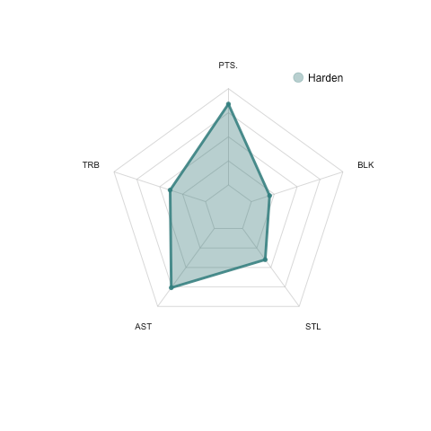
From the plot above, we can see that Harden is not only an excellent scorer (high points) but also a playmaker (high assists). These interpretations are perfectly consistent with the James Harden we know.
从上图可以看出,哈登不仅是出色的得分手(高分),而且是组织者(高助攻)。 这些解释与我们所知的詹姆斯·哈登完全吻合。
To compare the stats between James Harden and LeBron James, let’s input both players’ stats to the function.
为了比较詹姆斯·哈登和勒布朗·詹姆斯之间的数据,我们将两个球员的数据输入到该函数中。
comp_plot(df_sel,maxxx,minnn)We can see that LeBron has got better rebound and assist numbers in the stats comparing to Harden even though his scoring is not as good as Harden.
我们可以看到,勒布朗的得分和助攻数据都比哈登更好,尽管他的得分不如哈登。
Pretty straight forward, right?
很简单吧?
Let’s do a similar comparison between Giannis Antetokounmpo and Kawhi Leonard in their advanced statistics, which include offense box plus/minus (OBPM), defense box plus/minus (DBPM), offense win share (OWS), defense win share (DWS), and true shooting percentage (TS).
让我们在Giannis Antetokounmpo和Kawhi Leonard的高级统计数据中进行类似的比较,其中包括进攻框正负(OBPM),防守框正负(DBPM),进攻赢率(OWS),防守赢率(DWS),和真实拍摄百分比(TS)。
df = read.csv("playoff_stats_adv.csv")maxxx = apply(df[,c("OBPM","DBPM","OWS","DWS","TS.")],2,max)minnn = apply(df[,c("OBPM","DBPM","OWS","DWS","TS.")],2,min)df_sel = df[c(1,3),c("OBPM","DBPM","OWS","DWS","TS.")]rownames(df_sel) = c("Giannis","Kawhi")Let’s see Giannis’s stats first.
首先让我们看看吉安尼斯的统计数据。
comp_plot(df_sel[1,],maxxx,minnn)We can find that Giannis is an all-round star because he has good stats in almost every aspect. No wonder he won his second MVP for the 2019–2020 regular season.
我们可以发现吉安尼斯是全能明星,因为他几乎在各个方面都有出色的数据。 难怪他赢得了2019–2020常规赛第二次MVP。
Next, let’s compare Giannis with Kawhi Leonard in their advanced statistics.
接下来,让我们将Giannis和Kawhi Leonard的高级统计数据进行比较。
comp_plot(df_sel,maxxx,minnn)
We can see that Giannis outperformed Kawhi in all aspects of the advanced stats.
我们可以看到,吉安尼斯在所有高级统计数据方面都胜过了Kawhi。
You can compare any number of players with this simple function, however, I don’t recommend to use a spider plot for the comparison of more than 3 individuals.
您可以使用此简单功能比较任意数量的玩家,但是,我不建议使用蜘蛛图来比较3个以上的玩家。
If you do need to compare a large group of objects, a heatmap could be a better choice for visualization. Here is one of my previous posts of the best heatmap function in R.
如果确实需要比较大量对象,则热图可能是可视化的更好选择。 这是我以前有关R中最佳热图函数的文章之一。
I hope this short article could contribute to your toolkit as a data scientist!
我希望这篇简短的文章可以对您作为数据科学家的工具包有所帮助!
翻译自: https://towardsdatascience.com/draw-a-radar-spider-plot-with-r-4af9693c3237
r语言绘制雷达图
http://www.taodudu.cc/news/show-5047824.html
相关文章:
- 笔记:python中的蜘蛛图
- python如何绘制蜘蛛图_用Python写的图片蜘蛛人代码
- MATLAB绘制雷达图/蜘蛛图
- 蜘蛛图表SpiderChart
- jfreechart学习笔记三 带刻度的蜘蛛图
- 雷达图?蜘蛛图?又一个数据图表可以拿来使了!
- 智能蓝牙防丢器
- 苹果AirTags即将发布,防丢器将迎来大发展
- 防丢器的使用
- android蓝牙防丢失,Android 蓝牙防丢实现(一)
- 蓝牙4.0防丢器开发中遇到的问题
- 防丢器技术支持。
- 无线防丢器设计
- 苹果 AirTag 防丢器震撼发布,让你的物品精确定位,防止丢失
- 蓝牙防丢器距离的计算
- [yueqian_scut]蓝牙防丢器原理、实现与Android BLE接口编程
- 蓝牙4.0 BLE 防丢器
- 解密蓝牙防丢器工作原理,让您避免遗失物品
- 小助手一蓝牙智能防丢器
- 苹果更新“查找”APP,三星发布新款SmartTag Plus,蓝牙防丢器市场暴增
- 蓝牙防丢器原理、实现与Android BLE接口编程
- 蓝牙防丢器实现安卓的BLE接口编程
- 谈一谈 蓝牙防丢器
- android防丢器设计,蓝牙防丢器 安卓代码和附带说明
- 基于蓝牙的防丢器
- [智能硬件] 1、三分钟看懂智能硬件原理——蓝牙防丢器制作教程(包括手机应用)...
- GUID分区与MBR分区
- Java自定义异常封装
- Java自定义异常类以及异常拦截器
- java自定义异常并处理异常
r语言绘制雷达图_用r绘制雷达蜘蛛图相关推荐
- r语言 python 互联网数据分析_对比R语言和Python,教你实现回归分析
变量之间关系可以分为两类: 函数关系:反映了事务之间某种确定性关系 相关关系:两个变量之间存在某种依存关系,但二者并不是一一对应的:反映了事务间不完全确定关系:相关系数(r)可以衡量这种相关关系. r ...
- r语言boxcox异方差_基于R语言进行Box-Cox变换
原标题:基于R语言进行Box-Cox变换 作者简介 作者:吴健中国科学院大学 R语言.统计学爱好者,尤其擅长R语言和Arcgis在生态领域的应用分享 个人公众号:统计与编程语言 Q: 为什么要进行Bo ...
- r语言java环境安装_【R语言入门】R语言环境搭建
说明 R 语言是一个功能十分强大的工具,几乎绝大多数的数据分析工作都可以在 R 中完成,并且拥有很极强的绘图功能支持,能让你手中的数据以各种姿势进行可视化呈现,而且支持 Windows.Mac OS. ...
- r语言数据变量分段_使用R语言实现数据分段
使用R语言实现数据分段 今天跟大家讲讲我工作中用到的数据分段,数据分段一般在什么地方会使用到呢?评分.之前写过一篇<实战: RFM>模型使用,那篇文章就详细介绍了CRM(客户关系管理)分析 ...
- R语言作加权最小二乘_超越谷歌BERT!依图预训练语言理解模型入选NeurIPS
机器之心发布 机器之心编辑部 在本文中,本土独角兽依图科技提出了一个小而美的方案--ConvBERT,通过全新的注意力模块,仅用 1/10 的训练时间和 1/6 的参数就获得了跟 BERT 模型一样的 ...
- r语言 清空mysql表_用R语言做数据清理(详细教程)
数据的清理 如同列夫托尔斯泰所说的那样:"幸福的家庭都是相似的,不幸的家庭各有各的不幸",糟糕的恶心的数据各有各的糟糕之处,好的数据集都是相似的.一份好的,干净而整洁的数据至少包括 ...
- r语言的runmed函数_使用R语言爬取DailyMed药物信息
之前介绍过如何批量爬取NCBI中基因详细信息,今天介绍爬取DailyMed指定药物的数据. 根据指定药物药物及其ID列表(由ID可以获得该药的网页链接)爬取这些药物在DailyMed中的相关信息: D ...
- r语言library什么意思_医学统计与R语言:百分条图与雷达图
微信公众号:医学统计与R语言如果你觉得对你有帮助,欢迎转发 百分条图-输入1: library(ggplot2) 结果1: year 输入2: percentbar <- gather(perc ...
- R语言使用ggplot2包使用geom_boxplot函数绘制基础分组箱图(配置数据点抖动显示jitter)实战
R语言使用ggplot2包使用geom_boxplot函数绘制基础分组箱图(配置数据点抖动显示jitter)实战 目录 R语言使用ggplot2包使用geom_boxplot函数绘制基础分组箱图(配置 ...
- R语言使用ggplot2包使用geom_density()函数绘制密度图(连续色彩、离散色彩、梯度色彩)实战(density plot)
R语言使用ggplot2包使用geom_density()函数绘制密度图(连续色彩.离散色彩.梯度色彩)实战(density plot) 目录 R语言使用ggplot2包使用geom_density( ...
最新文章
- c#读取excel两列数据并绘制xy曲线_EXCEL绘制三Y轴图表
- mysql的innodb数据库引擎详解
- #Pragma编译选项
- 程序员从优秀到卓越的几点建议
- (带后台)苹果安卓APP下载页 app应用下载界面源码
- BAT程序员必备技能调研,你中了几招?
- dedecms文章页面URL路径优化
- 在Javascript中实现类似C#中string.Format的功能
- 使用aspose进行将word转换为图片格式
- 修改RAC中的私网地址导致CRS启动失败
- 量子物理 詹班 计算机,6量子物理作业答案.doc
- 分享32套精美的免费 PSD 网页界面设计素材
- 学堂在线-清华大学-操作系统实验Lab1【练习5-6】
- business,firm, company, corporation, enterprise等区别CentOS(Community Enterprise Operating System)想到
- ros发布节点信息python_ROS Twist和Odometry消息类型使用(Python)
- 面试时被问到职业规划,怎样回答才最加分?
- H5视频之直播流服务搭建(一)
- xss绕过php,php云人才系统多处Xss漏洞(绕过360防护)
- 王凤书肝病专家:转氨酶偏高怎么降下来?
- python中切片是指什么_Python *中的默认切片索引是什么*?