DOJO Dijit布局
Layout with Dijit
Creating dynamic and interactive layouts is a challenge common to any graphical user interface. We have a lot of ability to create layout with HTML and CSS. Where CSS leaves off, Dojo picks up with a set of extensible widgets as a part of Dijit - Dojo's UI framework. In this tutorial, we'll explain how Dijit addresses common layout needs and see how easy it can be to create even complex layouts with just a few flexible widgets.
创建动态、可交互布局对所有图形界面开发者来说都是一种挑战。我们可以使用HTML和CSS创建各种布局。而dojo使用一系列的可扩展的微件而非CSS,组建其Dijit-Dojo的UI框架。在本教程中,我们会讲解Dijit如何定位通用的布局,你会发现使用很少的灵活的微件即可创建复杂布局。
Introducing Layout Management
"Surely CSS is the language of layout? Why is layout a problem that needs solving by JavaScript and fancy widgets?"
"CSS 是布局语言是毫无疑问的?那为什么布局的难题需要靠JavaScript代码和精选的微件来解决?"
Layout widgets don't replace CSS for general purpose placement and flow of content on the page. Instead, they allow precise placement and management of areas of the page where we want to:
布局组件并非要替代CSS。相反的,它能够在我们需要实现以下效果的地方提供对界面区域更精确的管控。
- Respond to resize events
- 响应resize事件
- Provide for user control over layout and how the available space is apportioned
- 为用户组件提供布局,以及控制可用空间的分配。
- Adapt controls and/or contents to the currently available horizontal and vertical space
- 使组件或内容适配可用区域的高或宽
Layout management is the process of actively controlling layout after a page has loaded, and responding to and propagating events, which then drive layout on the page. In Dijit, layout management is accomplished by specialized layout widgets. These are widgets whose primary purpose is to act as a container for one or more content areas or child widgets, and to control the sizing and display of those children.
布局管理在界面加载完成后会主动的控制布局,接收及发出事件,进而控制界面布局。DIJIT中,布局管理是通过布局组件完成的。布局组件的主要用途就是作为 内容区域 或 其他组件的 容器,展现内部组件内容并能控制 内部组件的大小。
Getting Started;
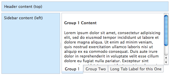
You can manage layout of the entire page, or just a small part of it. For this tutorial, we'll be developing a desktop application-like UI layout, with some controls and content being fixed on the page. It should end up looking like this:
可以控制整个页面的布局,也可以控制页面一个小的区域的布局。在本教程中,我们会创建一个类似 桌面应用 的界面布局。其中包含很多控件和内容。最后的效果如下:
View Complete Demo
Dijit provides a small collection of flexible widgets to meet common layout requirements like this. We'll prepare the ground with some HTML and CSS, then introduce those widgets to build up a typical application layout.
Dijit提供了一个小而灵活的微件集合来实现类似的常用的布局。我们会先列出需要的HTML和CSS,然后介绍使用这些微件构建典型的应用布局。
<!DOCTYPE HTML>
<html lang="en"><head><meta charset="utf-8"><title>Demo: Layout with Dijit</title><link rel="stylesheet" href="style.css" media="screen"><link rel="stylesheet" href="//ajax.googleapis.com/ajax/libs/dojo/1.10.4/dijit/themes/claro/claro.css" media="screen"></head><body class="claro"><div id="appLayout" class="demoLayout"><div class="centerPanel"><div><h4>Group 1 Content</h4><p>Lorem ipsum dolor sit amet, consectetur adipisicing elit, sed do eiusmod tempor incididunt ut labore et dolore magna aliqua. Ut enim ad minim veniam, quis nostrud exercitation ullamco laboris nisi ut aliquip ex ea commodo consequat. Duis aute irure dolor in reprehenderit in voluptate velit esse cillum dolore eu fugiat nulla pariatur. Excepteur sint occaecat cupidatat non proident, sunt in culpa qui officia deserunt mollit anim id est laborum.</p></div><div><h4>Group 2 Content</h4></div><div><h4>Group 3 Content</h4></div></div><div class="edgePanel">Header content (top)</div><div id="leftCol" class="edgePanel">Sidebar content (left)</div></div><!-- load dojo and provide config via data attribute --><script src="//ajax.googleapis.com/ajax/libs/dojo/1.10.4/dojo/dojo.js"data-dojo-config="async: 1, parseOnLoad: 1"></script></body>
</html>
The markup has our top, sidebar and center content wrapped in handy divs, and we've got the Dojo script tag already in place. Also in the <head> we load the Claro theme stylesheet and our page stylesheet. In the <body>, notice the claro class which is necessary to apply the Claro CSS theme to the contents. Omitting it is a common gotcha.
我们添加了标题栏,侧边栏,主区域,都以div形式体现。我们添加了dojo JavaScript 引用。在<head>中引用了Claro以及page样式引用。在<body>标签中,添加了claro样式,通过claro样式渲染界面。该处漏掉是一个常见的错误。
The stylesheet has just a few rules that we'll need as we define the layout:
样式表中包含一些定义布局需要的规则。
html, body {height: 100%;margin: 0;overflow: hidden;padding: 0;
}#appLayout {height: 100%;
}
#leftCol {width: 14em;
}.claro .demoLayout .edgePanel {background-color: #d0e9fc;
}#viewsChart {width: 550px;height: 550px;
}
All demos shown here also include a demo.css file, which contains a few styles for the body, button, and h1 elements. View the source of any of the demos to see the contents of this file.
本教程中的例子同时包含一个demo.css样式文件,其中包含一些body、button、h1的样式。可以通过查看例子的源码来查看demo.css的内容。
To get the desired arrangement and behavior of content regions, we want the layout to fill the viewport. We explicitly set the document and the outermost element to 100% of the viewport height. overflow: hidden is used as we don't want a document scrollbar; scrolling will happen as necessary in the different regions of our layout. We've given the DIV that will become the left column a fixed width in ems. The other fixed regions will derive their size from their initial content.
为了实现想要的布局和效果,我们希望布局填充视图区域。我们将文档和最外层的元素的高定义为100%。添加overflow:hidden 是因为我们不想文档出现滚动条;滚动条在需要的时候会在我们布局的不同的区域出现。我们给要成为左侧边栏的div一个固定的宽度,单位是em。其他固定区域会根据其最初包含的内容设定大小。
Adding Widgets
添加微件
To implement the layout, we'll be using three widget classes from Dijit: dijit/layout/BorderContainer, dijit/layout/TabContainer and dijit/layout/ContentPane.
为了实现布局,我们需要用到Dijit中的三个微件类:dijit/layout/BorderContainer, dijit/layout/TabContainer 和 dijit/layout/ContentPane。
To get started, let's add a require call to load these dependencies.
开始之前我们通过require方法来加载这些依赖项。
<script src="//ajax.googleapis.com/ajax/libs/dojo/1.10.4/dojo/dojo.js"data-dojo-config="async:true, parseOnLoad:true">
</script>
<script>require(["dojo/parser", "dijit/layout/BorderContainer", "dijit/layout/TabContainer","dijit/layout/ContentPane"]);
</script>
Notice in the data-dojo-config attribute in the Dojo script tag we've set parseOnLoad to true. This tells Dojo to run the parser automatically to "widgetize" the elements it finds. Given that we're fully relying on the parser, we have no need for dojo/domReady! or anything like that — we're just loading what we use.
注意Dojo script标签中的data-dojo-config 属性,我们设置parseOnLoad为true。这样,Dojo就会自动将发现的相应元素解析为微件。这样我们完全依赖解析器,不再需要dojo/domReady!或者其他类似功能-我们只需要加载我们需要的模块。
Notice that we have also explicitly loaded the
dojo/parsermodule. This is of monumental importance; despite popular misconception,dojo/parserdoes not load automatically whenparseOnLoadis set totrue, and never has. It happened to "just work" in many cases prior to 1.7 due to how many widgets loadeddijit/_Templated(which loadsdojo/parser).注意我们明确的加载了dojo/parser模块。这是非常重要的;不同于常见的误解,dojo/parser并不会因为parseOnLoad设置为true而自动加载,从来都不会。在Dojo1.7版本之前,有些情况下不显式加载dojo/parser也可以正常执行,那是因为很多微件会加载dijit/_Templated(其中引用了dojo/parser).
The widget classes will now load in the background, and the parser will walk over the DOM. But nothing is actually going to happen yet — we need to create those layout widgets.
微件类会在后台加载,解析器会遍历Dom。不过什么都还不会发生-我们需要创建布局微件。
For this example, we'll be using the markup or declarative way of instantiating the widgets. The data-dojo- attributes on each element provide instruction for the Dojo parser on what widget class to instantiate, and hold the properties to configure the widget instance with.
对于本例来说,我们会使用标签或生命方式来实例化微件。元素上的data-dojo- 属性向解析器表明该元素将要被实例化为哪种微件,并且保存配置微件实例的属性。
<body class="claro"><divid="appLayout" class="demoLayout"data-dojo-type="dijit/layout/BorderContainer"data-dojo-props="design: 'headline'"><divclass="centerPanel"data-dojo-type="dijit/layout/ContentPane"data-dojo-props="region: 'center'"><div><h4>Group 1 Content</h4><p>Lorem ipsum dolor sit amet, consectetur adipisicing elit, sed do eiusmod tempor incididunt ut labore et dolore magna aliqua. Ut enim ad minim veniam, quis nostrud exercitation ullamco laboris nisi ut aliquip ex ea commodo consequat. Duis aute irure dolor in reprehenderit in voluptate velit esse cillum dolore eu fugiat nulla pariatur. Excepteur sint occaecat cupidatat non proident, sunt in culpa qui officia deserunt mollit anim id est laborum.</p></div><div><h4>Group 2 Content</h4></div><div><h4>Group 3 Content</h4></div></div><divclass="edgePanel"data-dojo-type="dijit/layout/ContentPane"data-dojo-props="region: 'top'">Header content (top)</div><divid="leftCol" class="edgePanel"data-dojo-type="dijit/layout/ContentPane"data-dojo-props="region: 'left', splitter: true">Sidebar content (left)</div></div>
</body>
View Demo
The outer appLayout element has been configured as a BorderContainer, and the child divs are each ContentPanes. This gives us a full-screen flexible layout. Go ahead and try resizing your Demo window, to see how the left region stays a fixed width, while the center/right region sizes to fit. You may also notice a handle on the vertical divider, between the left and center regions, which allows you to manually set their relative widths.
最外层的appLayout元素被声明为一个BorderContainer,子div都被声明为ContentPane。这是一个全屏幕的灵活的布局。你可能还注意到一个处理垂直的splitter,在左边栏和中心区域之间,用来手动调节相对宽度。
This is what we mean by dynamic and interactive layout. We'll get to adding in the tab-strip shown in the initial demo, but first let's back up and look a bit closer at the individual layout widgets and their use.
这就是我们所说的动态和交互式布局。我们将会添加最初的例子中展示的tab页,不过在此之前我们还是返回来仔细看一下各个布局微件及其使用。
BorderContainer
带边框容器
If you've used layout managers and containers in other GUI toolkits, dijit/layout/BorderContainer should be pretty familiar to you, and if not we can soon catch you up.
如果你用过其他的图形用户界面工具包中的布局管理器和容器。dijit/layout/BorderContainer 对你来说应该很熟悉,如果没用过,那也不要紧很快就会熟悉。
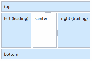
BorderContainer allows you to define a layout subdivided into regions. The center region is always flexible and auto-sized, while the other regions are fixed in size: "top", "bottom", "leading", "trailing", "left" or "right".
All Dijit widgets support internationalization (i18n), so Dijit can't assume left-to-right flow of content and controls on the page. For left-to-right locales, the leading section will be on the left, and the trailing section on the right. For right-to-left locales (e.g. Arabic, Hebrew), it is reversed. That being said, you can use left and right as appropriate to ensure that sections are always on the side of your choosing, regardless of locale. Use what fits your content logically.
BorderContainer允许你定义被分成多个区域的布局。中心区域一般是可以改变大小的,其他区域则的大小则是固定的: "top", "bottom", "leading", "trailing", "left" 或 "right"。所有的Dijit微件都支持国际化,因此Dojo并不假设页面或组件是从左到右顺序的。对于本地化语言从左到右顺序的情况,leading 区域会显示在左边,trailing 区域显示在右边。而对于从右到左的情况(例如:Arabic,Hebrew),正好是相反的。因此,你可以使用left 和 right 来确保区域在你想要的位置,而无论本地化是怎样的。看哪种适合你的逻辑。
Each region is represented by a child widget, as we saw in the App Layout example. All Dijit widgets support the regionproperty, so in principle, you can use any widget in these positions, though clearly some will work better than others. The fixed-size regions (all but center) can have a end-user-moveable divider associated with them by setting a splitterproperty.
每个区域代表一个子微件,像我们看到的App Layout例子,所有的Dijit微件都支持region属性,因此,原则上在这些位子你可以使用任意的微件,固定大小的区域(除center之外的)可以通过设置splitter属性包含一个divider。
When using BorderContainer, the initial sizes of regions are specified in the normal manner using CSS — using rules in a stylesheet or as inline style. Note that although you can set an initial size of say, 50%, it will be converted to px as it renders, so relative proportions in percentage units are not maintained as the BorderContainer is resized. The center region should not be given style height or width; it will always occupy whatever space remains.
使用BorderContainer时,其初始大小使用CSS控制-使用嵌入式CSS或者样式表文件。注意,尽管你可以设置初始大小为百分比样式,如50%,但在渲染时会被转换为px单位的值,因此BorderContainer大小变化时,不会保存相对大小。中心区域不能设置高和宽;它会占据剩余的空间。
Up to now as we've been building our layout, all the regions were ContentPanes - a very general purpose content-loading and content-containing widget, but as we saw in the first App Layout where a TabContainer occupied the center region, that needn't be so. In fact, BorderContainer works quite happily as a region in a BorderContainer. Here's an example of nesting BorderContainers to achieve a more complex layout.
到目前为止我们一直在构建我们的布局,所有的区域都是ContentPane微件-一个一般用途的内容组件-加载和包容-包含微件,不过正如我们在第一个App Layout例子中看到的那样,中心区域是一个TabContainer,使用ContentPane不是必须的。事实上,BorderContainer 就经常用作BorderContainer中的某一区域。下面是一个使用嵌套BorderContainer的例子实现复杂布局的例子。
<div class="demoLayout" style="height: 300px; width: 300px" data-dojo-type="dijit/layout/BorderContainer" data-dojo-props="design: 'headline'"><div class="centerPanel" data-dojo-type="dijit/layout/ContentPane" data-dojo-props="region: 'center'">center</div><div class="demoLayout" style="height: 50%" data-dojo-type="dijit/layout/BorderContainer" data-dojo-props="region: 'top', splitter: true, design: 'headline'"><div class="centerPanel" data-dojo-type="dijit/layout/ContentPane" data-dojo-props="region: 'center'">center</div><div class="edgePanel" data-dojo-type="dijit/layout/ContentPane" data-dojo-props="region: 'bottom'">bottom</div></div><div class="edgePanel" data-dojo-type="dijit/layout/ContentPane" data-dojo-props="splitter: true, region: 'left'">left</div><div class="demoLayout" style="width: 50%" data-dojo-type="dijit/layout/BorderContainer" data-dojo-props="region: 'right', design: 'headline'"><div class="centerPanel" data-dojo-type="dijit/layout/ContentPane" data-dojo-props="region: 'center'">center</div><div class="edgePanel" data-dojo-type="dijit/layout/ContentPane" data-dojo-props="region: 'left'">left</div></div><div class="edgePanel" data-dojo-type="dijit/layout/ContentPane" data-dojo-props="splitter: true, region: 'bottom'">bottom</div>
</div>
View Demo
See the BorderContainer documentation for more details on the different options for BorderContainer and its use.
阅读 BorderContainer 文档 查看BorderContainer的不同选项及其使用的更多细节。
Making the Tabs
A layout widget's job is to layout and display its contents in the space it has available. Most expect their contents to be one or more child widgets. A common requirement is to display only one of those child widgets at once, and treat them as a stack that the user can move through. This maximizes the use of space and also allows for interesting possibilities like not loading content until that entry in the stack is selected. Dijit provides alternatives on this theme, in the form of StackContainer, TabContainer and AccordionContainer.
布局组件的作用是在获得的区域中展示其内容。大多数情况他们包含一个或多个子组件。一种常见的需求是一次只展示一个子组件,将所有子组件作为一个集合,用户可以选择展示某一项。这样最大限度的利用空间并且支持一些有趣的特性比如知道用户选择了相应的项之后才加载其中的内容。Dijit提供了多种候选项:StackContainer, TabContainer 和AccordionContainer。
The layout we are trying to create had each of the different "group" divs displayed as tabbed panels, with a tab strip at the bottom of the center region. This is a common, intuitive UI pattern dating back to analog filing systems. The dijit/layout/TabContainer widget implements this pattern. It represents the child widgets it contains as tabs in the tab strip (the tab controller), and displays their contents one at a time in the remaining space.
我们将要创建的布局包含多组div,每个div会被展示位一个tab页,包含一个tab标题在中心区域的下方。这是一种常见的、直观的用户界面模式可以追溯到模拟文件系统。dijit/layout/TabContainer 也是这种模式。它将子微件展示为一个个的tab页,每次只在显示区展示一个子微件的内容。
<div class="centerPanel"data-dojo-type="dijit/layout/TabContainer"data-dojo-props="region: 'center', tabPosition: 'bottom'"><divdata-dojo-type="dijit/layout/ContentPane"data-dojo-props="title: 'Group 1'"><h4>Group 1 Content</h4><p>Lorem ipsum dolor sit amet, consectetur adipisicing elit, sed do eiusmod tempor incididunt ut labore et dolore magna aliqua. Ut enim ad minim veniam, quis nostrud exercitation ullamco laboris nisi ut aliquip ex ea commodo consequat. Duis aute irure dolor in reprehenderit in voluptate velit esse cillum dolore eu fugiat nulla pariatur. Excepteur sint occaecat cupidatat non proident, sunt in culpa qui officia deserunt mollit anim id est laborum.</p></div><divdata-dojo-type="dijit/layout/ContentPane"data-dojo-props="title: 'Group Two'"><h4>Group 2 Content</h4></div><divdata-dojo-type="dijit/layout/ContentPane"data-dojo-props="title: 'Long Tab Label for this One'"><h4>Group 3 Content</h4></div>
</div>
To make the "group" sections tabs in a TabContainer, we first make the containing element a TabContainer. This widget is itself a child of the BorderContainer, so it still needs the region property. TabContainer provides a number of options for configuring how the tabs and their content are displayed; here we indicate we want the tab-strip at the bottom by setting the tabPosition property. TabContainer is another container widget - it manages child widgets - so we need to wrap each of our section blocks in a suitable widget. They don't need to do anything fancy, so a ContentPane is a good choice. Notice that each provides a "title" property. The title is what TabContainer uses as the label in the corresponding tab it creates for each child widget.
为了展示TabContainer,我们首先将容器元素设置为TabContainer。这个微件本事也是BorderContainer的子微件,因此需要添加一个region属性。TabContainer包含很多选项用来配置标签页标题和内容如何显示;本例中我们通过设置tabPosition来表明我们希望tab标签展示在下方。TabContainer也是一个容器微件-它被用来管理子微件-因此我们需要将每个tab页中的内容放到合适的微件中。他们不需要多华丽,ContentPane就够了。注意每个tab页都有一个“title”属性。TabContainer 会将title属性作为tab页的标题。
View Demo
StackContainer and Friends
StackContainer 和朋友们
The result completes our layout, but to understand how to vary this recipe and make your own layouts - and even your own layout widgets - we need to look under the hood a little. TabContainer is actually a sub-class of dijit/layout/StackContainer; it borrows most of its functionality from StackContainer (which in turn is an extension of dijit/layout/_LayoutWidget.) Where TabContainer is specific about how the panels of content should be arranged and represented, StackContainer is a more general-purpose widget. There is no intrinsic controller to provide UI to navigate the stack of child widgets, but dijit/layout/StackController is available as a simple example. Here's how our layout looks if we swap out the TabContainer for the StackContainer, and put the controller widget in a new bottom region. To get everything to line up, we've also changed the BorderContainer to use the sidebar design layout here.
以上已经完成了我们的布局,但是为了更好的理解如何改变布局及创建自己的布局-甚至创建自定义的布局微件-我们需要再深入一点。TabContainer其实是dijit/layout/StackContainer的一个子类;它从StackContainer集成了绝大部分功能(StackContainer 的父类是dijit/layout/_LayoutWidget)。相对于TabContainer 具体设置了其子面板具体如何安排及展现,StackContainer 是一个更通用的微件。没有固定的controller来提供界面浏览StackContainer子微件,但是dijit/layout/StackController可用做简单示例。下面是我们将TabContainer 替换为StackContainer,并且将controller微件放在新增的bottom区域的效果。为了整齐,我们也将BorderContainer 替换为侧边栏布局。
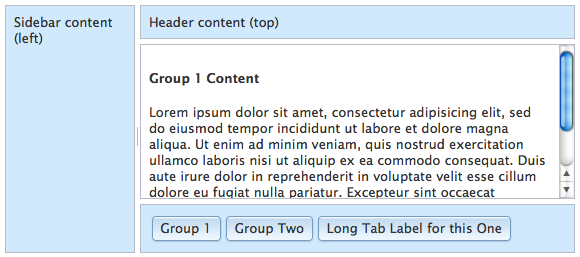
StackContainer Demo
Dijit also provides a dijit/layout/AccordionContainer that drops in as easily, and in dojox/layout there are other StackContainer subclasses that may fit your requirements. Similarly, our vanilla ContentPane can be replaced with a dojox/layout/ExpandoPane to provide for collapsible panels in a layout. As always, it's worth familiarizing yourself with the options provided to you before you start thinking about customizing.
Dijit 还提供了一个dijit/layout/AccordionContainer 微件,用起来也很简单,在dojox/layout中还有其他的StackContainer 的子类可能符合你的需求。类似的,ContentPane可以被替换为dojox/layout/ExpandoPane 以提供可折叠的布局面板。同样的,熟悉在开始考虑自定义之前熟悉各种配置是很有必要的。
Startup and Resize
So far we've been happily assembling layouts in markup, and leaning on the Dojo parser to coordinate instantiation and the startup sequence for us. That gets you a long way and might be all you ever need to really know about layout with Dijit. However, if you need to create and insert widgets programmatically, that voodoo won't do. We need to understand a bit more about how and when layout happens.
到目前为止,我们一直在使用标签设置布局,依赖Dojo 解析器为我们处理实例化及启动的顺序。这会妨碍你掌握Diji布局的核心知识。不过,如果你能通过编码方式创建及嵌套微件,就没问题了。我们来更深入一些的了解布局作用的原理。
Let's review. We know that:
复习一下。我们知道:
- Creating widgets involves a sequence of well defined steps
- 创建微件包含一些列的预定义步骤
- Layout is intrinsically linked to the measurement of available space
- 布局与可用空间的测量有着内在的联系
- A widget's
domNodecan't be guaranteed to be in the DOM untilstartuphappens - 微件的domNode属性直到微件调用startup后才能确保在Dom中存在。
- Layout widgets actively lay out their child widgets
- 布局微件会自动布局它们的子微件。
When creating widgets programmatically, we have to complete the sequence by calling the startup method. This step includes anything that can only happen once a widget is in the DOM - which includes measurement and sizing. Layout widgets will call startup on their children, so it's sufficient to start the ball rolling from the top-most widget.
By definition, all layout widgets have a resize method. This method gets called during startup, and also whenever there's a change that might require adjustment of dimensions - such as a window resize, or adding a new child widget. Like startup, resize also propagates down a hierarchy, allowing each widget in a layout to adjust, and pass along new dimensions to its children.
当使用代码创建微件时,我们需要调用startup方法来完成微件初始化序列。这个步骤包含了所有需要在微件添加到界面之后执行一次的内容-其中包括量测和大小分配。布局微件会调用子微件的startup方法,这样就能够从顶层微件启动逐层调用startup的机制。
按照定义,每个不微件都有一个resize方法。这个方法会在startup过程中调用,在需要调整尺寸的变化发生时也会调用-例如页面大小改变,或者新增子微件。像startup方法一样,resize方法也会逐层传递调用,使得布局中的每个微件都可以调整大小,并且向子微件传递自身的尺寸。
With this in mind, lets look at some code. Here's the basic outline:
了解了这些,我们再来看一些代码。下面是基本的轮廓。
<head><script src="//ajax.googleapis.com/ajax/libs/dojo/1.10.4/dojo/dojo.js"data-dojo-config="async:1"></script><script>require(["dijit/registry", "dijit/layout/BorderContainer","dijit/layout/TabContainer", "dijit/layout/ContentPane", "dojo/domReady!"],function(registry, BorderContainer, TabContainer, ContentPane){// create the main appLayout BorderContainer创建appLayout BorderContainer// create the TabContainer创建TabContainer// create the BorderContainer edge regions创建BorderContainer 侧边栏});</script>
</head>
<body class="claro"><div id="appLayout" class="demoLayout"></div>
</body>
Here we've omitted parseOnLoad, which defaults to false; the gloves are off. Instead, we use dojo/domReady! which will wait for the DOM to load.
这里我们去掉了parseOnLoad设置,该设置默认为false;魔术手套去掉了。作为替代,我们使用dojo/domReady!来等待Dom加载完成。
// create the BorderContainer and attach it to our appLayout div创建BorderContainer 将其绑定appLayout div
var appLayout = new BorderContainer({design: "headline"
}, "appLayout");// create the TabContainer 创建TabContainer
var contentTabs = new TabContainer({region: "center",id: "contentTabs",tabPosition: "bottom","class": "centerPanel"
});// add the TabContainer as a child of the BorderContainer 将TabContainer 作为BorderContainer 的子元素
appLayout.addChild( contentTabs );// create and add the BorderContainer edge regions 创建并添加BorderContainer 侧边栏
appLayout.addChild(new ContentPane({region: "top","class": "edgePanel",content: "Header content (top)"})
);
appLayout.addChild(new ContentPane({region: "left",id: "leftCol", "class": "edgePanel",content: "Sidebar content (left)",splitter: true})
);// Add initial content to the TabContainer 为TabContainer添加初始内容
contentTabs.addChild(new ContentPane({href: "contentGroup1.html",title: "Group 1"})
);// start up and do layout 启动并分配布局
appLayout.startup();
View Demo
Each widget is instantiated with the equivalent properties we were defining before in the data-dojo-props attributes. Rather than the implicit containment we get from the markup, each widget is explicitly added to its parent using its addChildmethod.
每个微件都使用之前我们定义在 data-dojo-props 中的值进行了实例化。不同于标签方式的隐式包含,每个微件都通过显式的调用addChild方法添加到父微件上。
Notice that only when all the widgets are added does the startup method of the appLayout get called. Until startup happens, addChild simply registers the widget as a child. After startup, addChild represents a potential layout change, so it would trigger resize on the parent, and all other children.
注意,只有所有的微件都添加之后,appLayout的startup方法才会调用。在startup方法之前,调用addChild方法只是将微件注册为一个子微件,startup方法之后,调用addChild则会导致布局变化,会触发父微件的resize事件,以及其他兄弟微件的resize事件。
We can see this in action, by adding a new child after the layout is rendered. Here's a quick function to test that:
我们可以在布局渲染完成后向其中添加一个新的子微件来测试。下面的是一个简单的测试用例:
function addTab(name) {var pane = new ContentPane({title: name,content: "<h4>" + name + "</h4>"});// add the new pane to our contentTabs widget为Tab页添加新的paneregistry.byId("contentTabs").addChild(pane);
}
View Demo
Conclusion
We've looked at the building blocks Dijit provides to create dynamic layouts and how they can be snapped together using the declarative markup style, as well as creating them programmatically. This approach allows you the full range of options for how you define and assemble your UIs. You'll find the same flexibility as we explore more of Dijit. We can multiply our options further by creating our own layout widgets, building on the infrastructure Dijit provides. These are topics for future tutorials.
总结:
我们学习了Dijit创建动态的布局基础内容,以及通过标签及编码方式实现布局。这为我们定义和装配界面提供了充分的选择范围。深入了解Dijit之后你会发现其他内容同样灵活。我们可以基于Dijit提供的框架创建自定义的布局微件来进一步丰富我们的选择范围。这些内容会出现在后续教程中。
DOJO Dijit布局相关推荐
- Dojo 1.5 发布说明
Dojo 1.5已经发布了,让我们来看看它都加了些什么新东东~ 本文翻译自: https://www.dojotoolkit.org/reference-guide/releasenotes/1.5. ...
- 地理信息系统(GIS)系列——Dojo 基础
1.Dojo 简介 Dojo 简介 Dojo 是一个 JavaScript 实现的开源 DHTML 工具包.它是在几个项目捐助基础上建立起来的(nWidgets,f(m),Burstlib).Dojo ...
- web前端之dojo(用javascript语言实现的开源DHTML工具包)
web前端之dojo(用javascript语言实现的开源DHTML工具包) 一.开始Dojo开发 1.Dojo Toolkit 简介 Dojo 于 2004 年创建,使开发 DHTML 和 Java ...
- Dojo学习笔记(三):类化JavaScript
dojo/_base/declare模块是Dojo Toolkit中创建类的基础.declare支持多重继承,这使得开发者能够编写更加灵活的代码并避免代码多次重写.Dojo.Dijit和Dojox模块 ...
- [译] Dojo 工具包参考手册
说明: 此文翻译并非完全按照原文进行逐字逐句翻译.期间会删除一些笔者认为无须介绍的部分, 或加上一些需要说明的部分. 原文介绍可以参考: http://dojotoolkit.org/referenc ...
- 关于dojo的build系统
我们都知道,dojo可以通过build来提升应用系统的加载效率和用户使用感受,可是到底自己的应用系统应该怎样 build,却有点糊涂,后面是我们在开发 RIAEasy 时编写的一个 build pro ...
- 格式化信息窗口内容—ArcGIS API for JavaScript
InfoTemplate类用于定义一个信息窗口的内容和标题模板.如果您使用的是2.2或更高版本的API,则可以使用字符串或函数定义内容和标题.如果版本低于2.2,你只能使用字符串. 调整信息窗口大小 ...
- arcgis api for js地图符号的使用(使用Draw绘制图形)
api里面用来在地图上绘制图形的工具位于 esri/toolbars/draw模块,同时还需要搭配esri/graphic模块以及点.线.面的样式相关的模块. draw 模块用来绘图,之所以还要用到g ...
- 地理信息系统(GIS)系列——ArcGIS API for JavaScript 3.9(1)
Visual Studio 智能提示配置:将以下 JavaScript 文件引入项目中 arcgis_js_v39_sdk\arcgis_js_api\sdk\jshelp\jsapi_vsdoc12 ...
- arcgis for javascript 帮助
JS API3.4的要求 à(1) IE9或以上版本 否则dijit1.8.3不匹配 1.如何发布ArcgisJavascript API应用 0.准备工作: (1).有web应用: (2).有js ...
最新文章
- 微软MCITP系列课程(二七)管理域和林信任
- 排序算法学习——冒泡排序
- 随机地址生成器_随机连接神经网络性能超过人工设计!何恺明等人发布新研究...
- 【UVA - 11729】Commando War (贪心,时间调度问题)
- WPF中显示任意目录的图片或其他资源文件
- SQL中的join连接
- Happy Necklace
- 一些不错 Java 实践推荐!建议熟读并背诵默写全文
- 易语言服务器卡密验证,想写一个关于辅助登录卡密的软件。 问题:易语言如何会做一个输入正确卡密才可以登入界面的...
- 清明节到五一的加班感触
- w7计算机显卡,win7系统怎么更新电脑显卡驱动
- Open vSwitch(OVS)相关问题
- 如何优雅的编写前端代码
- Tekton task入门上
- 2022年成都市中等职业学校师生技能大赛【真题】
- 字符串最长对称 java_求字符串最长对称字符串的长度(转何海涛博客)
- 第七章:混合策略与混合策略纳什均衡
- 双指针、BFS与图论
- 多线程有几种实现方法,都是什么?优劣点?
- 信通院首批可信算力服务评测发布,曙光智算通过!
热门文章
- 网页三栏布局五种实现方式(左中右)
- js使用双层for循环实现倒三角形、正三角形
- Unknown host 'dl.google.com'. You may need to adjust the proxy settings in Gradle.
- Istio入坑指南(二) Istio的安装与简单的使用
- 苹果微信更新不了最新版本_微信登录不了,微信提示版本过低,请升级最新版本的解决办法...
- c语言练习----渔夫打鱼晒网
- 基于Elastic Search的搜索广告召回方案
- 帝国cms如何安装php模板,帝国CMS整站源码通用安装教程
- PHP毕业设计项目作品源码选题(13)学校排课和选课系统毕业设计毕设作品开题报告
- BGP带宽是什么意思