棒棒糖 宏_棒棒糖图表
棒棒糖 宏
AKA: lollipop plot
又名:棒棒糖情节
WHY: a lollipop chart (LC) is a handy variation of a bar chart where the bar is replaced with a line and a dot at the end. Just like bar graphs, lollipop plots are used to make comparisons between different items or categories. They are also used for ranking or for showing trends over time. We compare only one numerical variable per item or category. They are not suitable for relationships, distribution, or composition analysis.
为什么 :棒棒糖图(LC)是条形图的一种方便的变体,其中条形图的末尾用线和点代替。 就像条形图一样,棒棒糖图用于在不同项目或类别之间进行比较 。 它们还用于排名或显示一段时间内的趋势 。 每个项目或类别我们仅比较一个数值变量。 它们不适用于关系,分布或组成分析。
LCs are preferred to bar charts when you have to display a large number of similar high values. In that case with a standard bar plot, you may get a cluttered chart and experience an optical effect called a Moiré pattern (#1). Fig. 1 shows a bar chart on the left and a lollipop chart on the right side. Both are based on the same data but it is evident that the minimalist alternative of the lollipop results in a more attractive and clear visualization.
当您必须显示大量相似的高值时,LC优于条形图。 在这种情况下,使用标准条形图,您可能会得到混乱的图表并体验到一种称为莫尔图案 (#1)的光学效果。 图1在左侧显示条形图,在右侧显示棒棒糖图。 两者都是基于相同的数据,但是很明显,棒棒糖的极简主义替代方案可以使视觉效果更具吸引力和清晰感。
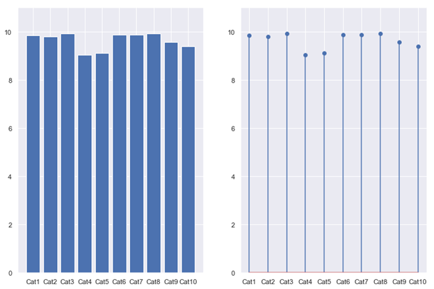
The Moiré effect is a visual perception that occurs when viewing a set of lines or bars that is superimposed on another set of lines or bars, where the sets differ in relative size, angle, or spacing. Moiré patterns are those dark bands you see when looking through layered fences or when taking a picture of a TV or a computer screen. Even though the Moiré effect can produce interesting and beautiful geometric patterns, they should be avoided in data visualization tasks so as not to confuse the audience.
莫尔效应是一种视觉效果,当查看重叠在另一组线或条上的一组线或条时,该组线或条的相对大小,角度或间距不同。 莫尔条纹是通过分层的栅栏或电视机或计算机屏幕拍照时看到的暗带。 尽管莫尔效应可以产生有趣而美丽的几何图案,但在数据可视化任务中应避免使用它们,以免引起听众的困惑。
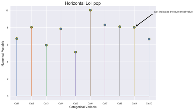
HOW: lollipop charts are two-dimensional with two axes: one axis shows categories or a time series, the other axis shows numerical values. Those numerical values are indicated by the position of the dot at the end of the line. A vertically oriented LC displays the categorical variable on the y-axis whilst a horizontally oriented LC displays it on the x-axis. Figure 2 shows a schematic diagram of a horizontal LC where the dots at the end of the thin lines indicate the numerical value for each category. With Matplotlib, you must use the stem function to draw a horizontal lollipop. The stem function plots vertical lines from a baseline to the y-coordinate and places a marker at the top (#2).
HOW:棒棒糖图表是带有两个轴的二维图:一个轴显示类别或时间序列,另一个轴显示数值。 这些数值由点在行尾的位置表示。 垂直方向的LC在y轴上显示类别变量,而水平方向的LC在x轴上显示类别变量。 图2显示了水平LC的示意图,其中细线末端的点表示每个类别的数值。 使用Matplotlib时 ,必须使用主干功能绘制水平棒棒糖。 干功能绘制从基线到y坐标的垂直线,并将标记放在顶部(#2)。
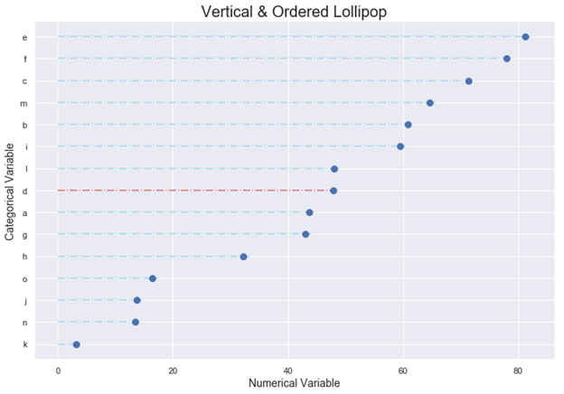
LCs are a nice alternative for rankings. The standard procedure is to arrange the categories in decreasing order and represent them vertically. With Matplotlib, you must use in combination the functions hlines and plot to draw a vertical lollipop. hlines draw horizontal lines at each y from the scalars xmin to xmax (#3). There are several possible markers for the function plot but we suggest using the classic circle symbol, as shown in the figures of this article.
LC是排名的不错选择。 标准程序是按降序排列类别并垂直表示它们。 使用Matplotlib时 ,必须结合使用hlines和plot功能绘制垂直棒棒糖。 hlines在标量xmin到xmax (#3)的每个y处绘制水平线。 该功能图可能有几种标记,但是我们建议使用经典的圆形符号,如本文中的图所示。
You must always start the numerical axis at 0: if the lines are truncated, the actual value is not properly reflected. Remember that our sight is very sensitive to differences in length when trying to compare data. We inevitably distort the visual if we modify the baseline. If one of the variables is time (years, months, days, hours), always set it on the horizontal axis. Time always runs from left to right and never from top to bottom.
您必须始终将数字轴从0开始:如果直线被截断,则不能正确反映实际值。 请记住,在尝试比较数据时,我们的视线对长度的差异非常敏感。 如果我们修改基线,不可避免地会扭曲视觉效果。 如果变量之一是时间(年,月,日,小时),请始终在水平轴上进行设置。 时间总是从左到右,而不是从上到下。
LCs are equivalent to bar charts, but this equivalence is only valid for standard bar charts; do not try to extend it to Stacked, Clustered, or Overlapping Bar Graphs (#4, #5).
LC等效于条形图,但是这种等效仅对标准条形图有效; 不要尝试将其扩展到堆积,聚集或重叠的条形图(#4,#5)。
LCs were the subject of an interesting debate, both on a theoretical and conceptual level, between two data visualization heavyweights: Stephen Few and Albert Cairo (#6). Few through the sarcastic title “Lollipop Charts: “Who Loves You, Baby?” claimed that “LCs were inspired by the same thing that has inspired so many silly graphs: a desire for cuteness and novelty”. He added that the main problem with LCs was that: “The center of the circle at the end of the lollipop marks the value, but the location of the center is difficult to judge, making it imprecise compared to the straight edge of a bar, and half of the circle extends beyond the value that it represents, making it inaccurate”.
在两个数据可视化重量级人物: Stephen Few和Albert Cairo (#6)之间,LC在理论和概念上都引起了有趣的争论。 讽刺的标题“棒棒糖排行榜:“谁爱你,宝贝?” 声称“ LC的灵感来自启发了许多愚蠢图表的同一事物:对可爱和新颖的渴望”。 他补充说,液相色谱的主要问题是:“棒棒糖末端的圆心标记了该值,但是中心位置很难判断,与条形的直边相比,它不精确,圆的一半超出了它所代表的值,因此不准确。”
For his part, Cairo came out in defense of the charts indicating that: “I believe that lollipops have their uses. Bar graphs with more than, say, 8 or 9 bars, often look busy and clunky. Lollipop graphs may solve that problem by increasing the amount of white space in between bars significantly.” He proposed as a solution to reduce the size of the circles or even mark the numerical value with the upper point of the circle instead.
就开罗而言,他捍卫了图表,表明:“我相信棒棒糖有其用途。 条形图超过8个或9个,通常看起来很忙且笨拙。 棒棒糖图可以通过大大增加条形图之间的空白空间来解决该问题。” 他提出了一种解决方案,以减小圆的大小,甚至用圆的上点标记数值。
Eli Holder in a very interesting article published in Nightingale (#7) with the title: “Settling the Debate: Bars vs. Lollipops (vs. Dot Plots)” described an experiment to shed some light about: “How do lollipop charts affect readers’ comprehension? How much of our epistemic responsibility are we sacrificing for a playful aesthetic?” Finally, he concluded that the results of the experiments show no significant differences between Bar and Lollipop graphs and they led to roughly equal accuracy and equal response times. In the end, LCs provide a nice minimalistic visualization of the data and they should be used exactly in the same situation than a bar graph.
Eli Holder在Nightingale(#7)上发表的一篇非常有趣的文章中,标题为:“解决辩论:酒吧与棒棒糖(vs.点图)”,该实验揭示了一些有关以下内容的实验:“棒棒糖图表如何影响读者理解力? 为了一种有趣的审美观,我们牺牲了多少认知责任?” 最后,他得出结论,实验结果表明Bar和Lollipop图之间没有显着差异,并且导致大致相等的精度和相等的响应时间。 最后,LC提供了很好的数据的简约可视化,应该在与条形图完全相同的情况下使用它们。
棒棒糖讲故事 (Storytelling with Lollipops)
1.- Fuel Consumption with the mtcars dataset: Human activities have increased carbon dioxide emissions (CO2) and other greenhouse gases (GHC), driving up temperatures. Most man-made emissions of CO2 come from burning fossil fuels. GHG emissions from transportation account for about 28 percent of total U.S. greenhouse gas emissions, making it the largest contributor of the USA (#8). The United States Environmental Protection Agency had developed a national program for GHG and fuel economy standards for light-duty vehicles (passenger cars and trucks).
1.- mtcars数据集的燃料消耗 :人类活动增加了二氧化碳排放量(CO2)和其他温室气体(GHC),从而提高了温度。 大多数人为排放的二氧化碳来自燃烧化石燃料。 运输产生的温室气体排放量约占美国温室气体总排放量的28%,是美国的最大贡献者(排名第8)。 美国环境保护署已经制定了一项针对轻型车辆(客车和卡车)的温室气体和燃油经济性标准的国家计划。
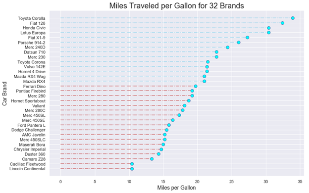
Previous studies on fuel consumption were based on Motor Trend Car Road Tests through the mtcars dataset. Data were extracted from the 1974 Motor Trend US magazine, and comprises fuel consumption and 10 aspects of automobile design and performance for 32 automobiles (1973–74 models). The following LC indicates miles traveled per gallon consumed for 32 car brands. Blue dash-dotted lines on the top correspond to those vehicles whose consumption was lower than the average (20.09 mpg) while the red dash-dotted lines correspond to those vehicles whose consumption was higher than the average. Clearly, a lollipop chart is better than a bar graph for comparing such a large number of different categories.
先前的油耗研究基于mtcars数据集的Motor Trend汽车路测 。 数据摘自1974年《美国汽车趋势》杂志,其中包括油耗以及32辆汽车(1973–74年型号)的汽车设计和性能的10个方面。 以下LC表示32个汽车品牌每加仑消耗的行驶里程。 顶部的蓝色虚线表示那些消耗量低于平均值(20.09 mpg)的车辆,而红色虚线表示那些消耗量高于平均值的车辆。 显然,棒棒糖图表比条形图更好地比较了如此众多的不同类别。
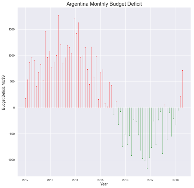
2.Argentina´s Government Budget: A Government Budget is an itemized accounting of the payments received by government (taxes and other fees) and the payments made by government (purchases and transfer payments). A budget deficit occurs when a government spends more money than it takes in. The opposite of a budget deficit is a budget surplus.
2. 阿根廷政府预算 :政府预算是对政府收到的付款(税款和其他费用)和政府付款(购买和转移付款)的逐项核算。 当政府的支出超过收入时,就会出现预算赤字。与预算赤字相反的是预算盈余。
Argentina grapples with one of the world’s highest inflation rates due to its recurrent government budget deficit. The next figure shows the country´s monthly budget deficit for the 2012–2018 period. Now, a lollipop chart allows us to follow the budget pattern over an extended period of time in an aesthetically pleasing way. As stated above, time runs from left to right on the horizontal axis.
由于政府经常性预算赤字,阿根廷努力应对世界上通货膨胀率最高的国家之一。 下图显示了该国2012-2018年期间的每月预算赤字。 现在,棒棒糖图表可让我们以美观的方式在很长一段时间内遵循预算模式。 如上所述,时间在水平轴上从左到右。
IN SUMMARY: used exactly in the same situation than a standard bar chart, lollipop charts encode numerical values in the same way: the length of the lines and the location of the dots at the end of the lines are equivalent to the length or height of horizontal or vertical rectangular bars. Lollipop Charts are preferred to bar charts when you are dealing with a large number of similar numerical values.
总结:在与标准条形图完全相同的情况下使用,棒棒糖图以相同的方式对数值进行编码:线条的长度和线条末端的点的位置等于线条的长度或高度水平或垂直矩形条。 当您处理大量相似的数值时,棒棒糖图表优于条形图。
If you find this article of interest, please read my previous:
如果您发现这篇文章感兴趣,请阅读我以前的文章:
“Bubble Charts, Why & How, Storytelling with Bubbles”
“气泡图,为什么和如何,用气泡讲故事”
“Parallel Coordinates Plots, Why & How, Storytelling with Parallels”
“平行坐标图,为什么和如何,平行讲故事”
#1: https://en.wikipedia.org/wiki/Moir%C3%A9_pattern
#1: https : //en.wikipedia.org/wiki/Moir%C3%A9_pattern
#2: https://matplotlib.org/3.1.1/gallery/lines_bars_and_markers/stem_plot.html
#2: https : //matplotlib.org/3.1.1/gallery/lines_bars_and_markers/stem_plot.html
#3: https://matplotlib.org/3.1.1/api/_as_gen/matplotlib.pyplot.hlines.html
#3: https : //matplotlib.org/3.1.1/api/_as_gen/matplotlib.pyplot.hlines.html
#4: Darío Weitz, “Stacked Bar Graphs, Why & How, Storytelling & Warnings”https://towardsdatascience.com/stacked-bar-graphs-why-how-f1b68a7454b7
#4:DaríoWeitz,“堆叠条形图,为什么和如何操作,讲故事和警告” https://towardsdatascience.com/stacked-bar-graphs-why-how-f1b68a7454b7
#5: Darío Weitz, “Clustered & Overlapped Bar Charts, Why & How”https://towardsdatascience.com/clustered-overlapped-bar-charts-94f1db93778e
#5:DaríoWeitz,“成组的和重叠的条形图,为什么和如何做”, https://towardsdatascience.com/clustered-overlapped-bar-charts-94f1db93778e
#6: Stephen Few, “Lollipop Charts: “Who Loves You, Baby?https://www.perceptualedge.com/blog/?p=2642
#6:Stephen Few,“棒棒糖排行榜:”谁爱你,宝贝? https://www.perceptualedge.com/blog/?p=2642
#7: Eli Holder, https://medium.com/nightingale/bar-graphs-vs-lollipop-charts-vs-dot-plots-experiment-ba0bd8aad5d6
#7:Eli Holder, https ://medium.com/nightingale/bar-graphs-vs-lollipop-charts-vs-dot-plots-experiment-ba0bd8aad5d6
#8: https://www.epa.gov/transportation-air-pollution-and-climate-change/carbon-pollution-transportation
#8: https : //www.epa.gov/transportation-air-pollution-and-climate-change/carbon-pollution-transportation
翻译自: https://towardsdatascience.com/lollipop-charts-2f748b90f6f0
棒棒糖 宏
http://www.taodudu.cc/news/show-997425.html
相关文章:
- nlp自然语言处理_不要被NLP Research淹没
- 时间序列预测 预测时间段_应用时间序列预测:美国住宅
- 经验主义 保守主义_为什么我们需要行动主义-始终如此。
- python机器学习预测_使用Python和机器学习预测未来的股市趋势
- knn 机器学习_机器学习:通过预测意大利葡萄酒的品种来观察KNN的工作方式
- python 实现分步累加_Python网页爬取分步指南
- 用于MLOps的MLflow简介第1部分:Anaconda环境
- pymc3 贝叶斯线性回归_使用PyMC3估计的贝叶斯推理能力
- 朴素贝叶斯实现分类_关于朴素贝叶斯分类及其实现的简短教程
- vray阴天室内_阴天有话:第1部分
- 机器人的动力学和动力学联系_通过机器学习了解幸福动力学(第2部分)
- 大样品随机双盲测试_训练和测试样品生成
- 从数据角度探索在新加坡的非法毒品
- python 重启内核_Python从零开始的内核回归
- 回归分析中自变量共线性_具有大特征空间的回归分析中的变量选择
- python 面试问题_值得阅读的30个Python面试问题
- 机器学习模型 非线性模型_机器学习:通过预测菲亚特500的价格来观察线性模型的工作原理...
- pytorch深度学习_深度学习和PyTorch的推荐系统实施
- 数据库课程设计结论_结论:
- 网页缩放与窗口缩放_功能缩放—不同的Scikit-Learn缩放器的效果:深入研究
- 未越狱设备提取数据_从三星设备中提取健康数据
- 分词消除歧义_角色标题消除歧义
- 在加利福尼亚州投资于新餐馆:一种数据驱动的方法
- 近似算法的近似率_选择最佳近似最近算法的数据科学家指南
- 在Python中使用Seaborn和WordCloud可视化YouTube视频
- 数据结构入门最佳书籍_最佳数据科学书籍
- 多重插补 均值插补_Feature Engineering Part-1均值/中位数插补。
- 客户行为模型 r语言建模_客户行为建模:汇总统计的问题
- 多维空间可视化_使用GeoPandas进行空间可视化
- 机器学习 来源框架_机器学习的秘密来源:策展
棒棒糖 宏_棒棒糖图表相关推荐
- python画棒棒糖程序_论文画图神器!25个常用Matplotlib图的Python代码,收藏收藏!...
作者:zsx_yiyiyi 编辑:python大本营 大家好,今天要分享给大家25个Matplotlib图的汇总,在数据分析和可视化中非常有用,文章较长,可以马起来慢慢练手. # !pip insta ...
- python棒棒糖代码_(python matplotlib)如何更改棒棒糖图中每个棒棒糖的颜色(斧杆)...
我使用ax.stem在python中绘制棒棒糖图.然而,我发现很难给每个棒棒糖指定不同的颜色 as shown here 如您所见,我有两个类别"GWP"和"FDP&qu ...
- python画棒棒糖程序_用python 画几个简单图案
from random importchoice # random 的choice方法能够在你给出的结果里随机选择一个importmatplotlib.pyplot as plt # 引入matplo ...
- 用python turtle画棒棒糖源代码_【自学Python】DAY 4 绘画大师——turtle库(超详细)
自学Python DAY 4 目录turtle库介绍 turtle库使用 turtle的实例(源代码分享) 库我之前发的百科已经详细的介绍了,不知道的点击下方链接查看!博文-宇辰:[Python百科] ...
- 标题在图表上_用图表说话——漫谈商务图表的设计理念
前言 当今世界,数据无处不在,而图表可以帮助我们理解数据.洞悉数据背后的真相,让我们更好地适应这个数据驱动的世界. 图表,是语言的一种重要形式.它借助于各种可视化的组件,通过展示数据间的对比,来达到传 ...
- origin三元相图_扩增子图表解读7三元图:三组差异数量和关系
点击上方蓝色「宏基因组」关注我们!专业干货每日推送! 背景介绍(Introduction) 宏基因组学 宏基因组学目前的主要研究方法包括:16S/ITS/18S扩增子.宏基因组.宏转录组和代谢组,其中 ...
- 引用另一模板的宏_生信人值得拥有的编程模板Shell
前言 "工欲善其事必先利其器",生信工程师每天写代码.搭流程,而且要使用至少三门编程语言,没有个好集成开发环境(IDE,Integrated Development Environ ...
- excel打印宏_使用Excel宏打印发票
excel打印宏 There is a sample file on my Contextures site, in which you can enter invoice details, then ...
- UE4函数、宏、事件图表的区别,UBT\UHT的简单了解,GamePlay框架的简单了解
Timeline:可以用在事件图表,不可以用在函数和宏里面 delay:可以用在事件图表和宏,不可以用在函数里面 宏可以有多个执行节点,函数最多只能有一个执行节点 UBT在VS中编译中会使用到,三个步 ...
最新文章
- HDU 1155 Bungee Jumping
- python字典的键可以用列表吗_python字典多键值及重复键值的使用方法(详解)
- matlab学习日记,MATLAB学习笔记---DAY1
- win7 安装openssh_Win732位旗舰版老友纯净版安装OpenSSH的方法
- geek_Ask How-To Geek:营救受感染的PC,安装无膨胀iTunes和驯服疯狂的触控板
- docker 部署Python项目 以及dockerfile文件的编写
- Relu神经网络输出预测全为0或1,对所有输入样本的预测概率也相同
- C++ 基本数据类型 的 字节数
- 6、Actor,Stage的学习
- asm冗余 oracle_oracle 11.2.0.1 rac 修改asm磁盘组的冗余模式(redundancy mode)为normal
- Android 系统(78)--应用安装时间长
- 【回文串3】LeetCode 125. Valid Palindrome
- Mac OS10.12 编译Android源码8.1
- 超级计算机有什么特点,计算机的特点有哪些
- 如何开启任务计划程序
- 前端技术-HTML页面的加载
- 浙大计算机实验室详细推介
- latex CJK 中文字体的显示问题
- Office PowerPoint 计时器
- python培训班靠谱吗-Python培训机构哪家好?如何选择靠谱的Python培训机构?