ux和ui_设计社交餐厅策展应用程序— UX / UI案例研究
ux和ui
Sabor, which translates from “taste” or “flavor” in Spanish, is a concept for an iOS app designed to provide users with honest, reliable and relatable restaurant recommendations from friends and family. It is a social restaurant curation application that connects similar people — allowing them to easily recommend a restaurant, get recommendations for any cuisine, and keep track of the places they love to eat.
Sabor(西班牙语)翻译为“味道”或“风味”,是iOS应用程序的概念,旨在为用户提供来自亲朋好友的诚实,可靠和相关的餐厅推荐。 这是一个社交餐厅管理应用程序,可将相似的人联系在一起-允许他们轻松推荐餐馆,获得任何美食的推荐,并跟踪他们喜欢吃饭的地方。
The Problem: We communicated with over 130 people who made it clear that they put little faith in online recommendation and review platforms. Instead, they put far more weight on recommendations from friends or family. This can be attributed to people’s lack of trust in online reviews, frustration with online review platforms from outdated information or an overload of notifications, and the high barrier to sharing a review. People also indicated they have a problem of not knowing the best people to ask for recommendations amongst their social circles, but they desire shared experiences with their friends who have similar tastes and demographics. Lastly, people like to be able to easily see key information such as where a place is and how convenient it is to get there when they receive a recommendation from anyone.
问题:我们与130多人进行了交流,他们明确表示他们对在线推荐和评论平台不信任。 相反,他们更加重视朋友或家人的推荐。 这可能归因于人们对在线评论的不信任,过时的信息使在线评论平台受挫或通知过多,以及共享评论的障碍很大。 人们还表示,他们有一个问题,就是不认识社交网络中最优秀的人来寻求建议,但他们希望与具有相似品味和人口统计特征的朋友分享经验。 最后,人们希望能够轻松地看到关键信息,例如当收到任何人的推荐时,地点在哪里以及到达那里的方便程度。
Our Solution: Sabor is designed to address these problems in a personal and efficient manner. We created an experience that gives users a place to start new discussions with friends about different restaurants in any area, and also quickly share recommendations with low friction and maintain a location-based wishlist. Users have a personal stake in the application by allowing them to build their catalog of restaurants in an easy-to-navigate map view.
我们的解决方案: Sabor旨在以个人有效的方式解决这些问题。 我们创造了一种体验,使用户能够与朋友就任何区域的不同餐厅展开新的讨论,并能以低摩擦快速分享推荐并维持基于位置的心愿单。 通过允许用户在易于导航的地图视图中建立餐厅目录,用户对应用程序具有个人利益。
The Team: Alex Schumacher and I worked as a team over the last three weeks of our Georgia Tech UX/UI Design bootcamp to present an MVP proposal. We both were UX/UI Designers and worked side by side through each step of the design process from research to high fidelity prototyping.
团队: Alex Schumacher和我在佐治亚州技术UX / UI设计训练营的最后三个星期中以团队的形式提出了MVP提案。 我们都是UX / UI设计师,并从设计到高保真原型的设计过程的每个步骤并肩工作。
Timeline: 3 Weeks
时间表: 3周
Tools: Miro, Figma, R Studio, Mapsicle, Angle, Google Drive, Google Forms, Google Docs, Trello, Zoom, Wireframing, Prototyping, User Scenarios, User Flow, Usability Testing
工具: Miro,Figma,R Studio,Mapsicle,Angle,Google Drive,Google Forms,Google Docs,Trello,Zoom,线框图,原型,用户场景,用户流程,可用性测试
我们设计了什么 (What We Designed)
我们如何到达那里 (How We Got There)

总览 (Overview)
Before even beginning the project, when Alex and I first decided to work together, we knew we wanted to place a heavy emphasis on the discovery phase. As the restaurant review industry is already fairly crowded, doing so would allow us to really dive into the existing industry problems and produce data-backed solutions. We started the three-week project with interview and survey planning by creating carefully crafted questions to be able to extract meaningful qualitative and quantitative insight. We constructed an affinity diagram to be able to organize people’s responses into actionable problems. We then used this insight to define the “people problems” (Thanks for showing us this term, Zack), and how we know that they are problems based on our research.
甚至在开始项目之前,当我和亚历克斯最初决定合作时,我们就知道我们想着重于发现阶段 。 由于饭店评论行业已经相当拥挤,因此这将使我们能够真正深入研究现有的行业问题并提供数据支持的解决方案。 我们通过创建精心设计的问题开始了为期三周的项目,进行了访谈和调查计划,从而能够提取有意义的定性和定量见解。 我们构建了一个亲和图 ,可以将人们的React组织成可行的问题。 然后,我们利用这种见解来定义“人员问题” (感谢您向我们展示这个术语, Zack ),以及根据我们的研究我们如何知道它们是问题 。
From these “people problems,” we established our target audience as well as our business and product goals. Lastly in the definition phase, we determined success metrics that would be used if we decided to ship Sabor.
通过这些“人员问题”,我们确定了目标受众以及我们的业务和产品目标 。 最后,在定义阶段,我们确定了决定发布Sabor时将使用的成功指标 。
To brainstorm, we spent 30 minutes jotting down anything we could think of that our users might like about existing platforms or want in a new one. We also jotted down some bigger picture ideas that may be useful to help frame a solution. We then created a feature prioritization matrix to decide which of our ideas would have the highest impact on our users and therefore we should focus on for our Minimum Viable Product (MVP). Lastly, we created user scenarios for both of our target users to illustrate how and why they might use our app.
为了集思广益,我们花了30分钟记录下所有我们认为用户可能喜欢的平台或想要的新平台。 我们还记下了一些更大的构想,这些构想可能有助于制定解决方案。 然后,我们创建了功能优先级排序矩阵,以确定我们的哪些想法会对用户产生最大的影响,因此我们应该关注最小可行产品(MVP)。 最后,我们为两个目标用户创建了用户方案,以说明他们如何以及为何使用我们的应用程序。
We created an initial wireframe/low fidelity prototype by implementing the features we decided had a high impact on our users. High impact features were determined by taking into consideration our goals and the “people problems.”
我们通过实施我们认为对用户产生重大影响的功能,创建了初始线框/低保真度原型 。 通过考虑我们的目标和“人员问题”来确定高影响力功能。
We conducted usability testing on five users to help us determine our success in the low fidelity prototype and where we can improve in the high fidelity prototype.
我们对五个用户进行了可用性测试 ,以帮助我们确定我们在低保真度原型中的成功以及在高保真度原型中可以改进的地方。
Lastly, with the categorized user feedback, we created the high fidelity prototype using our UI Style Guide. Our goal was to implement as many changes as we could to accommodate the feedback without adding too many features to the MVP.
最后,根据分类的用户反馈,我们使用《 UI样式指南》创建了高保真原型 。 我们的目标是在不增加MVP太多功能的情况下,进行尽可能多的更改以适应反馈。
发现 (Discovery)
竞争对手分析 (Competitor Analysis)
Our first step was seeing what‘s already out there. While this industry is very expansive, we decided to focus on four key players: Yelp, Google Maps, The Infatuation, and Foursquare. We researched online and sifted through dozens of app store reviews and summarized the pros and cons below:
我们的第一步是查看那里已经有什么。 尽管这个行业非常广阔,但我们决定专注于四个主要参与者:Yelp,Google Maps,Infatuation和Foursquare。 我们在网上进行了调查,并筛选了数十个应用商店评论,并总结了以下利弊:

原型角色 (Proto Persona)
Next, we decided who we thought our users would be. We both discussed issues we’ve had in the past when it comes to finding restaurants, and so we combined our opinions into one, completely biased, proto persona: Daniel Crenshaw. Daniel Crenshaw is a 27 year old from Atlanta, GA who loves being social and hanging out with friends. He doesn’t consider himself a foodie, but he enjoys being the one who recommends trendy activities and places. Daniel sometimes has problems finding new places to try, especially when he’s not in areas he is familiar with. He sometimes looks up reviews online but they aren’t very reliable and don’t really reflect his demographic or tastes. He sees cool experiences on his friends’ Instagram or Snapchat stories, but doesn’t know where they are. If he does find these places, he doesn’t know what to get that he knows he’ll enjoy. His goals are to find new places to try that he will enjoy and be able to keep track of places he has been to for future reference.
接下来,我们确定了我们认为用户会是谁。 我们俩都讨论了过去在寻找餐厅时遇到的问题,因此我们将我们的观点组合成一个完全有偏见的原型角色:Daniel Crenshaw。 丹尼尔·克伦肖(Daniel Crenshaw)今年27岁,来自乔治亚州亚特兰大,喜欢社交和与朋友聚会。 他不认为自己是美食家,但他很乐于推荐时尚活动和地点。 丹尼尔有时会在寻找新的尝试方面遇到困难,尤其是在他不熟悉的领域时。 他有时会在网上查找评论,但评论不是很可靠,也无法真正反映出他的人口统计信息或口味。 他在朋友的Instagram或Snapchat故事中看到了很酷的经历,但不知道他们在哪里。 如果他确实找到了这些地方,他不知道会得到什么,他知道自己会喜欢。 他的目标是找到可以尝试的新地方,并能够追踪到他去过的地方以供将来参考。

研究计划 (Research Plan)
Using Daniel Crenshaw as an ideal target user, we constructed a research plan to gain more insight into what the problems are when it comes to food recommendation apps. We focused on the following topics:
我们使用Daniel Crenshaw作为理想的目标用户,制定了一项研究计划,以更深入地了解食品推荐应用程序中存在的问题。 我们专注于以下主题:
- How do people currently go about finding new restaurants?人们现在如何寻找新餐厅?
- How do they choose to what to eat on any particular night?他们如何选择特定夜晚的食物?
- The last time a person tried a new restaurant, how did they discover it and decide on it?一个人最后一次尝试新餐厅时,他们是如何发现并决定的?
- How do people recommend a restaurant to others? When do they give unsolicited recommendations and when are they asked for their opinions?人们如何向他人推荐餐厅? 他们什么时候提出主动建议,什么时候征求他们的意见?
- What issues exist with current food recommendation platforms?当前的食品推荐平台存在哪些问题?
- What do people feel is missing from these platforms?人们觉得这些平台缺少什么?
- What do other platforms do that draws people to them?还有哪些其他平台可以吸引人们呢?
Questions 1–4 have a purpose of getting us to understand the underlying thought process that goes into deciding on a new restaurant and sharing great restaurants with others. Our goal is to be able to incorporate this thought process into the experience that we create.
问题1-4的目的是使我们了解决定新餐厅和与他人共享好餐厅所涉及的基本思维过程 。 我们的目标是能够将这种思考过程纳入我们创造的体验中。
Questions 5–7 are more targeted towards the current industry. Here, we want to understand what problems exist in the current, more widely used platforms, and uncover the pros and cons of them to gauge where there is space in the industry to grow.
问题5–7更针对当前行业 。 在这里,我们想了解当前使用更广泛的平台中存在哪些问题,并找出它们的优缺点,以评估行业中有哪些地方可以增长。
面试 (Interview)
We conducted ten (10) interviews to get qualitative data. The interview was broken down into three parts: introduction questions, thought process questions, and current industry questions. Our purpose was to address the above research questions and gain insight into how people currently go about finding new restaurants and what issues they have, if any.
我们进行了十(10)次访谈,以获取定性数据。 访谈分为三个部分: 简介问题,思考过程问题和当前行业问题 。 我们的目的是解决上述研究问题,并深入了解人们当前如何寻找新餐厅以及他们有什么问题(如果有)。
The introduction questions were ice breaker questions to get an understanding of who our users were. We asked about hobbies, typical week/weekend, and how they socialize with friends.
简介问题是破冰船问题,以了解我们的用户是谁。 我们询问了爱好,典型的一周/周末以及他们如何与朋友社交。
The thought process questions are exactly as they sound — we had a goal of understanding the steps that people take to recommend a restaurant, receive a recommendation, and decide on a restaurant. We also hoped to understand how they use current applications/other means to find restaurants, and what was missing from their current way of doing these things.
思考过程中的问题完全符合他们的想法 -我们的目标是理解人们推荐餐厅,接受推荐以及决定餐厅的步骤。 我们还希望了解他们如何使用当前的应用程序/其他方式查找餐馆,以及他们目前做这些事情的方式所缺少的东西。
Lastly, the current industry questions dove further into what current apps/websites they use and why. Here, we looked for pain points that users have, why they have them, and potential ways to work around or mitigate these issues. We also gauged the interviewees’ opinions on the credibility of existing food review websites and apps and the desire for a more community-based platform.
最后, 当前的行业问题进一步深入到他们目前使用哪些应用程序/网站以及原因。 在这里,我们寻找用户遇到的痛点,他们为什么拥有这些痛点以及解决或缓解这些问题的潜在方法。 我们还评估了受访者对现有食品评论网站和应用程序的信誉以及对基于社区的平台的渴望的看法。
调查 (Survey)
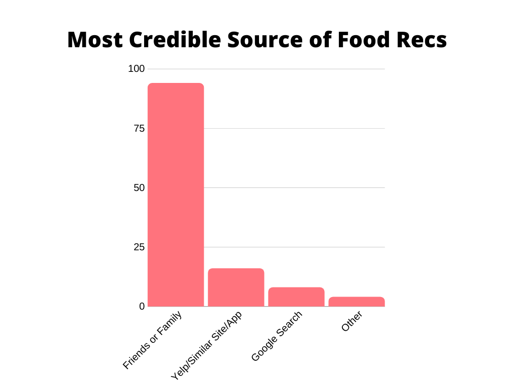
The survey was created to gather quantitative data, and we recorded 122 responses. We used the survey to gather certain information like how often people will eat out/order in as opposed to cooking, gauge interest in trying new places to eat, and determine who people find to be their most credible source of food recommendations, amongst other things. We wanted to understand what motivated people to share reviews or recommend a restaurant.
该调查的创建是为了收集定量数据,我们记录了122条回答。 我们使用该调查收集了某些信息,例如人们会多久外出吃饭/点菜而不是做饭,衡量对尝试新饮食场所的兴趣,并确定谁是他们最可靠的食物推荐来源,等等。 。 我们想了解促使人们分享评论或推荐餐厅的动机。
The last section of the survey was fourteen (14) Likert Scale questions. Here we asked users to rate their agreeability with statements such as “I value information from online food recommendations MORE than a friend’s recommendation” and “I think that online food recommendation sites and apps are credible and trustworthy.” We also wanted to know who posted reviews, and what they thought was important when recommending a restaurant. These questions also helped us understand people’s perception of online reviews.
调查的最后一部分是十四(14)个李克特量表问题。 在这里,我们要求用户使用“我比在线食品推荐更重视信息,而不是朋友的推荐”和“我认为在线食品推荐网站和应用程序可信且值得信赖”等表述来评价他们的同意程度。 我们还想知道谁发表了评论,以及他们在推荐餐厅时认为重要的事情。 这些问题还帮助我们了解了人们对在线评论的看法。
Below is the age distribution of the 122 survey respondents. We recognize that these age groups may not be representative of a random population, because the biggest three categories are my age group, Alex’s age group, and both of our parents’ age groups (thank you for sharing our survey on Facebook, Mom!).
以下是122位受访者的年龄分布。 我们认识到这些年龄段可能无法代表随机人群,因为最大的三个类别是我的年龄段,亚历克斯的年龄段以及父母双方的年龄段(感谢您在Facebook上分享我们的调查,妈妈!) 。
亲和图 (Affinity Diagram)
The next step was creating an affinity diagram in Miro by breaking down all of the interview response points and open-ended survey responses into their own post-it notes, and refactoring them to extract user insights. We only included eight (8) of the interviews in the affinity diagram because two of the interviews were conducted later on to collect more information. As you can see below, there are a lot of categories that we discovered from grouping the post-its and iterating. While we decided to move to the next step because of time constraints, we were able to extract six (6) overarching user insights that we framed as our “people problems.”
下一步是在Miro中创建亲和图,方法是将所有访谈答复点和开放式调查答复分解为自己的便笺,然后将其重构以提取用户见解。 我们仅在亲和图中包含八(8)个访谈,因为稍后进行了两个访谈以收集更多信息。 正如您在下面看到的,通过对便利贴进行分组和迭代,我们发现了很多类别。 由于时间限制,我们决定移至下一步,但我们能够提取六(6)个总体用户见解,这些见解被我们称为“人员问题”。

什么是“人员问题”? (What are the “people problems”?)
The six “people problems” that we decided to focus on for our app, Sabor, are:
我们决定针对我们的应用程序Sabor重点关注的六个“人员问题”是:
Lack of Trust. “I do not trust random online reviews. I assign a lot more weight to friends’ reviews.”
缺乏信任。 “我不信任随机的在线评论。 我对朋友的评价给予了更多的重视。”
Recommendation Friction. “The barrier for recommending a place is high to the point where taking action seems pointless.”
建议摩擦。 “推荐地点的障碍到采取行动似乎毫无意义的地步。”
Who knows what? “I don’t know which friends have been where, but I still want their input.”
谁知道 “我不知道哪个朋友去过哪里,但我仍然希望他们的投入。”
Shared Experiences. “If my friend has eaten at restaurant X but not Y, all else equal, I would choose to eat at X to have that shared experience.”
共享的经验。 “如果我的朋友在X餐厅吃饭而不是Y餐厅,那么其他条件都一样,我会选择在X餐厅吃饭以分享共同的经验。”
Spatial Awareness. “I want to know where things are. At the end of the day, it really comes down to the location of a place and its convenience.”
空间意识。 “我想知道事情在哪里。 归根结底,这实际上取决于一个地方的位置及其便利。”
Notification Overload. “I do not like receiving so many notifications. I rarely ever respond to them and they get annoying.”
通知超载。 “我不喜欢收到这么多通知。 我很少回应他们,他们变得烦人。”
我们怎么知道 这些是问题吗? (How do we know these are problems?)
缺乏信任 (Lack of Trust)
- Only 10% of survey respondents value online reviews and opinions more than friend or family recommendations.只有10%的调查受访者对在线评论和意见的评价高于对朋友或家人的推荐。
- Only 41% of survey respondents said that online reviews are credible or trustworthy.只有41%的受访者表示在线评论是可信或可信赖的。
- Interviewees mentioned they want to veer away from bigger platforms because they are often fake (businesses pay people to leave positive reviews) or extremely polar — often from one bad experience.受访者表示,他们希望偏离更大的平台,因为它们通常是假的(企业付钱给人们留下正面评价)或极度两极分化的-常常来自一种糟糕的经历。
- Interviewees do not believe just anyone should be able to share their opinions online because they aren’t food critics. They also do not like these reviews because they come from people who more likely than not have different tastes.受访者不相信任何人都可以在网上分享他们的观点,因为他们不是食品评论家。 他们也不太喜欢这些评论,因为它们来自很有可能具有不同品味的人。
推荐摩擦 (Recommendation Friction)
80% of survey respondents will not review a restaurant online unless the experience was really, really bad or really, really good.
80%的调查受访者不会在线点评餐厅,除非体验确实非常差或非常好。
- Interviewees in general said they did not post reviews because it felt too out of their way and they are lazy. Also, they felt as if their reviews “just get lost in a sea of reviews” and don’t matter.受访者普遍表示,他们没有发表评论,因为感觉太过分了,而且很懒。 而且,他们觉得自己的评论“只是迷失在评论的海洋中”,并不重要。
- People often lack a good incentive to post a review for a restaurant unless they had a really bad or really good experience.人们通常没有很好的动机去为餐厅发表评论,除非他们有非常糟糕或非常好的经历。
Here, you can see that for every sizable age group except for 45–64 (and 35–44, but we had far fewer data points here), more respondents have never posted a review. We will come back to this point when we create our two user personas.
在这里,您可以看到,除了45-64岁(和35-44岁,但这里的数据点少得多)之外的每个年龄段,更多的受访者从未发表过评论。 当我们创建两个用户角色时,我们将回到这一点。
谁知道 (Who knows what?)
- 96% of survey respondents said they would recommend a restaurant to a friend.96%的调查受访者表示,他们会将餐厅推荐给朋友。
- 98% of survey respondents said they will try a restaurant based friend or family recommendations. One guy said he wouldn’t.98%的调查受访者表示,他们将尝试根据餐馆的朋友或家人推荐。 一个人说他不会。
- The issue that interviewees mentioned is that they don’t know which of their friends have been to what places. They also do not know who the right person/people to ask would be, so it’s not easy to figure out who to get the best recommendations from.受访者提到的问题是,他们不知道哪个朋友去过哪里。 他们也不知道应该问谁是合适的人,因此要弄清楚从谁那里得到最好的建议并不容易。
- With that all being said, as you can see below, an overwhelming majority of survey respondents said their preferred way of finding new restaurants they enjoy is through word of mouth. *Keep in mind this data was pulled from a checkbox question, so that is why the total tally of responses exceeds 122.综上所述,正如您在下面看到的那样,绝大多数调查受访者表示,他们更喜欢通过口口相传找到自己喜欢的新餐厅。 *请记住,此数据是从复选框问题中提取的,因此这就是为什么响应总数总计超过122。
共同的经验 (Shared Experiences)
- People prefer recommendations from friends and family over a random person because they know their friends and family have similar tastes.人们更喜欢朋友和家人的推荐,而不是随便的人,因为他们知道朋友和家人的口味相似。
- People like to go to places that they know other people with similar demographics and tastes will also go to.人们喜欢去他们知道其他人口统计学和品味相似的人也会去的地方。
- People like to be able to get recommendations from others in their social circle. This allows them to relate more to the experience someone is sharing with them and trust that it might be something they will enjoy.人们喜欢能够从社交圈中的其他人那里获得推荐。 这使他们可以更多地与某人与他们分享的经验联系起来,并相信这可能是他们会喜欢的东西。
- Below, you can see that when people were asked which source of food recommendations they found to be the most credible, almost 100 out of 122 people said friends or family. We believe this has to do with shared experiences, in that there is a better understanding of tastes and preferences with the people you are close to and therefore people will receive better and more tailored recommendations from friends or family even if it’s not intentional.在下面,您可以看到有人被问到最可靠的食物推荐来源时,在122个人中有近100个人说是朋友或家人。 我们认为,这与共享的经验有关,因为与亲近的人可以更好地了解自己的口味和喜好,因此,即使不是故意的,人们也会从朋友或家人那里收到更好,更个性化的建议。
空间意识 (Spatial Awareness)
- Interviewees mentioned that location is an essential factor in deciding where to go.受访者提到地点是决定去哪里的重要因素。
- They also want to be able to keep track of the places they go to.他们还希望能够跟踪他们去的地方。
- Survey respondents and interviewees mentioned they like to have access to a map, general price, and friends’ opinions on any particular restaurant.受访者和受访者表示,他们希望可以在任何特定餐厅使用地图,一般价格以及朋友的意见。
- People want to be able to compare recommended places to ones they’ve been to.人们希望能够将推荐的地点与他们去过的地方进行比较。
通知超载 (Notification Overload)
Interviewees mentioned they do not like receiving the “did you just eat here?” or “remember to leave a review” notifications.
受访者说,他们不喜欢收到“您刚刚在这里吃饭吗?” 或“记住留下评论”通知。
- They want to be able to have a functioning app without relying on notifications. They need another incentive to engage with the app.他们希望能够有一个功能正常的应用程序,而不必依赖通知。 他们需要另一种动机来参与该应用程序。
附加见解 (Additional Insight)
A few more points worth mentioning that we found through interviews and the survey:
我们通过访谈和调查发现的其他几点值得一提:
The first decision people often make is deciding on a cuisine. For example, “I’m craving Chinese food, where should I get it?”
人们经常做出的第一个决定是决定要吃什么。 例如, “我想吃中国菜,我应该去哪里买?”
- People mentioned they would like a peer-to-peer system where they can easily and effortlessly recommend and keep track of restaurants.人们提到他们希望有一个点对点系统,可以轻松,轻松地推荐并跟踪餐厅。
- People want to be able to organize and find restaurants by cuisine.人们希望能够通过美食来组织和查找餐馆。
- Many places are often indistinguishable from one another. People want a way to get information on the unique aspects of each to make a decision. They can do this through more personal recommendations.许多地方往往彼此无法区分。 人们想要一种获取有关每个方面的信息的方法来做出决定。 他们可以通过更多个人建议来做到这一点。
定义 (Definition)
Now that we’ve established what problems need to be addressed, we can determine our target users, our goals for meeting the needs of our target users, and our key performance indicators (success metrics). Based on the insight we extracted from the research phase, we have two users for whom we will be designing Sabor:
现在,我们已经确定了需要解决的问题,我们可以确定目标用户,满足目标用户需求的目标以及关键绩效指标(成功指标)。 根据我们从研究阶段中获得的见识,我们将为两个用户设计Sabor:
目标受众1:时尚千禧一代 (Target Audience 1: The Trendy Millennial)
The first target user is Percy Robbins, a 25 year old millennial who loves to stay up to date on the latest trends and technology. Get to know Percy:
第一位目标用户是25岁的千禧一代Percy Robbins ,他喜欢随时了解最新趋势和技术。 了解珀西:
He likes finding new places to eat with friends using minimal effort.
他喜欢用最小的努力找到与朋友吃饭的新地方。
He wants to make quick decisions based on key information presented clearly to him.
他希望根据清楚呈现给他的关键信息做出快速决策 。
He wants to go to places that he knows similar people enjoy. “Similar” means similar tastes and age and maybe even socioeconomic status.
他想去他知道类似的人喜欢的地方 。 “相似”是指相似的口味和年龄,甚至可能具有社会经济地位。
A problem he has is that he doesn’t think anyone online cares about his opinions.
他的问题在于, 他认为没有人在线上关心他的观点。
Another problem he has is a hard time finding trendy places instead of just touristy spots.
他遇到的另一个问题是很难找到时髦的地方,而不仅仅是旅游景点。
Here is a deeper dive into Percy’s persona:
以下是对Percy角色的更深入了解:

目标受众2:社交潮一代 (Target Audience 2: The Social Boomer)
The second target user is Sarah Gardener, a 49 year old social boomer who enjoys patronizing local businesses and sharing great experiences with friends and family. Get to know Sarah:
第二个目标用户是49岁的社交潮一代人Sarah Gardener ,他喜欢光顾本地企业,并与朋友和家人分享美好的经验。 了解莎拉:
She wants to be able to make informed decisions.
她希望能够做出明智的决定。
She likes to know where places are for reference.
她喜欢知道哪里可以参考。
She is not as tech-savvy as Percy, so she needs an easy-to-use interface.
她不像Percy那样精通技术,因此她需要一个易于使用的界面。
She loves sharing with her friends.
她喜欢与朋友分享。
She gets frustrated with fake online reviews and outdated information.
她对虚假的在线评论和过时的信息感到沮丧。
She never wants to waste time or money on a bad decision.
她从来不想浪费时间或金钱去做一个错误的决定。
Here is a deeper dive into Sarah’s persona:
以下是对莎拉角色的更深入了解:

目标 (Goals)
With these two target users in mind, we came up with three (3) business goals and five (5) product goals to guide us through creating an experience.
考虑到这两个目标用户,我们提出了三(3)个业务目标和五(5)个产品目标,以指导我们创建体验。
业务目标 (Business Goals)
- To foster a 100% peer-to-peer food recommendation app where there is no room for fake reviews or sponsored content.在没有假评论或赞助内容的空间的情况下,培育100%对等食品推荐应用程序。
- To provide users with trustworthy and effortless reviews by connecting people with similar tastes and demographics.通过将具有相似品味和人口统计特征的人们联系起来,为用户提供值得信赖且毫不费力的评论。
To create an experience that is not another messaging app
创建不是另一个消息传递应用程序的体验
产品目标 (Product Goals)
To quickly ask friends for restaurant recommendations.
快速向朋友询问餐厅推荐。
To provide a low friction way for users to recommend a restaurant.
为用户提供推荐餐厅的低摩擦方式 。
To present key information such as location, general price, favorite dishes, and ambience in an easily interpretable manner.
以易于理解的方式显示关键信息,例如位置,一般价格,喜欢的菜肴和氛围。
To catalog recommendations by cuisine and add restaurants and recommendations to a map.
要按美食分类推荐 ,并将餐厅和推荐添加到地图。
To incentivize users to use the app with minimal push notifications.
激励用户使用带有最少推送通知的应用程序。
我们如何知道我们是否成功? (How Will We Know if We Are Successful?)
If we are successful in achieving these goals for our MVP proposal, each of the defined “people problems” will have been addressed. Further, if we were to ship Sabor, a few ways we would be able to measure our success are:
如果我们能够成功实现MVP提案中的这些目标,那么每个定义的“人员问题”都将得到解决。 此外,如果我们要运送Sabor,我们可以通过以下几种方法来衡量我们的成功:
- A monthly upward trend in the number of users用户数量呈逐月上升趋势
- A consistent upward trend in new interactions on a week-to-week basis每周新互动中的持续上升趋势
- A consistent upward trend of new restaurants cataloged by users on a week-to-week basis用户按周分类的新餐厅的持续上升趋势
These trends would be an indicator that the problems we’ve addressed have been satisfied.
这些趋势将表明我们已解决的问题已得到满足。
构想 (Ideation)
The next phase is the Ideation phase, and is where we did most of our brainstorming for the initial prototype. Our goal here was to decide which features will be in our proposed MVP and how our target users will use the app.
下一阶段是构思阶段,这是我们为初始原型进行大部分头脑风暴的地方。 我们的目标是确定建议的MVP中将包含哪些功能,以及我们的目标用户将如何使用该应用。
“我喜欢,我想要,如果呢?” (“I like, I want, What if?”)
To achieve this goal, we first did a brainstorming activity where we jotted down any idea we could think of that our target users may like about existing apps, may want in a new app, as well as broader ideas we could implement. Below is the result of our 30 minute brainstorming session which will be used to construct our feature prioritization matrix.
为了实现此目标,我们首先进行了头脑风暴活动,其中记录了我们可以想到的,目标用户可能喜欢现有应用程序,可能想要使用新应用程序的任何想法,以及我们可以实施的更广泛的想法。 以下是我们30分钟的头脑风暴会议的结果,该结果将用于构建我们的功能优先级排序矩阵。

功能优先级 (Feature Prioritization)
Taking these ideas from our brainstorming session, we organized them into a feature prioritization matrix. The x-axis represents the impact on the users as it relates to our target users’ needs, and the y-axis is the priority of a particular feature for our MVP as it relates to our goals. Here is the result:
从我们的头脑风暴会议中汲取这些想法,我们将它们组织到了功能优先级排序矩阵中。 x轴代表与目标用户需求相关的对用户的影响,y轴代表与目标相关的MVP特定功能的优先级。 结果如下:
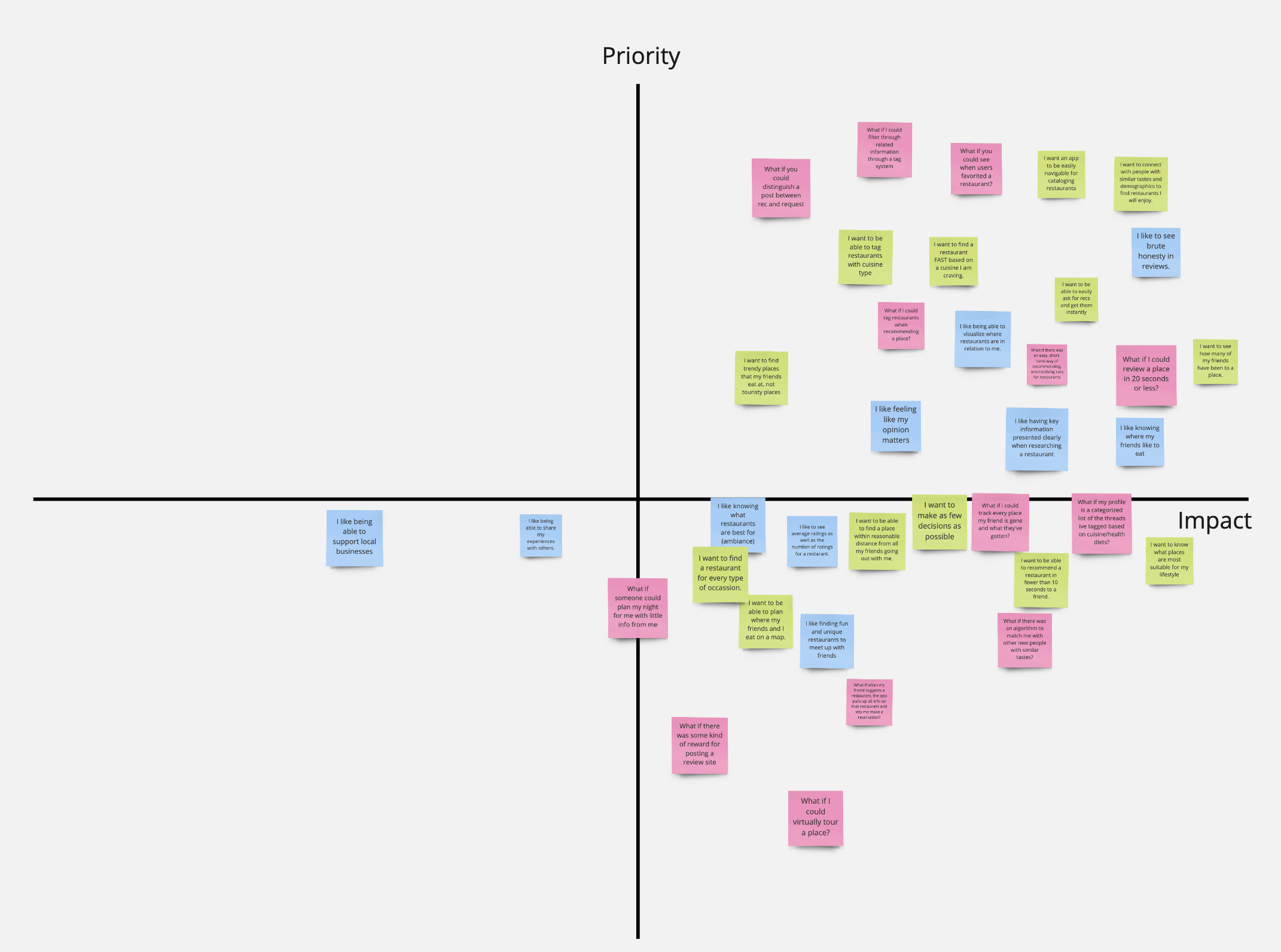
Some of the other features we decided to include are:
我们决定包括的其他一些功能包括:
- Having key information presented clearly when looking for a restaurant寻找餐厅时清楚地显示关键信息
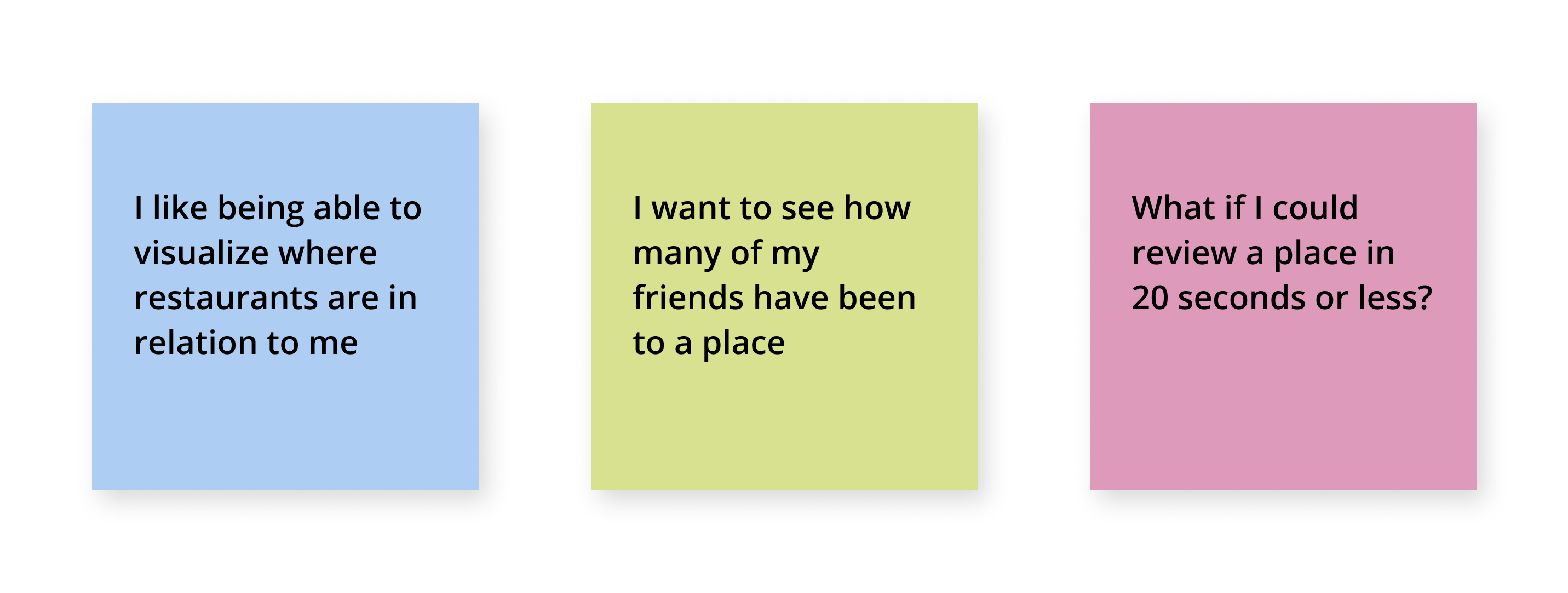
- Being able to visualize where restaurants are in relation to me能够想象餐馆与我之间的关系
- Being able to easily ask for recommendations and get them instantly能够轻松地提出建议并立即获得建议
- Tagging restaurants by cuisine type按美食类型标记餐厅
- Seeing which friends have favorited and/or reviewed which restaurants查看哪些朋友最喜欢和/或查看哪些餐厅
- Being able to easily navigate through restaurants and cuisines能够轻松浏览餐厅和美食
- Having a short-hand way of recommending and receiving recommendations for restaurants快速推荐和接收餐厅推荐的方法
用户方案 (User Scenarios)
Lastly in the ideation phase, we came up with a user scenario for both Percy Robbins and Sarah Gardener. These scenarios reflect one way they could use Sabor based on their needs. (Please enjoy my new cartooning skills, courtesy of Udemy).
最后,在构思阶段,我们为Percy Robbins和Sarah Gardener提出了一个用户场景。 这些场景反映了他们可以根据自己的需求使用Sabor的一种方式。 (感谢Udemy的帮助,请享受我的新漫画风格)。


低保真原型 (Low Fidelity Prototype)
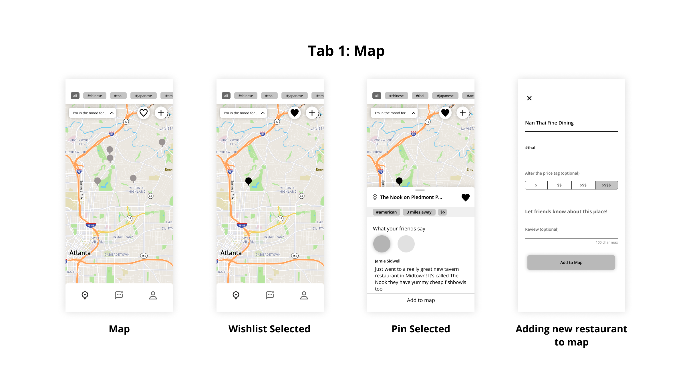
Our initial user flow for deciding on a restaurant is shown in the image below. The app was organized to have three tabs from left to right: a map to catalog restaurants a user has been to as well as restaurants on their wishlist, an inquiry tab to ask questions and get quick recommendations, and a profile tab to manage settings, friends, and to logout.
下图显示了我们用于决定餐厅的初始用户流程。 该应用的组织结构从左到右包含三个标签:一个地图,用于对用户曾经去过的餐厅以及其愿望清单上的餐厅进行分类;一个查询标签,用于询问问题并获得快速建议;一个配置文件标签,用于管理设置,朋友,并注销。

Map Tab: Our reasoning for making the user flow as such is that when a user opens the app, they can see new recommendations from friends right there on the map. They can see which ones they like and add them to their wishlist. A user would open the app to decide where to eat, so they can look through places they already know. Another reason for having the map is that it gives users a personal stake in the app. It will incentivize the users to return without sending too many push notifications to remind them to open the app. Allowing users to build their map will have them invested in the app and therefore want to continue to find new restaurants to add to it (similar to Untappd’s model). The data for the map can be drawn from the Google Maps API as we just need name and location; the rest is user input. A future improvement here is to gamify the map and have achievements and goals such as “reviewing a restaurant in ten (10) different states” or becoming a global eater by “trying fifteen (15) different cuisines,” etc.
地图标签:我们之所以要吸引用户,是因为当用户打开应用程序时,他们可以在地图上看到好友的新推荐。 他们可以查看自己喜欢的商品并将其添加到愿望清单。 用户可以打开该应用程序来决定吃饭的地方,以便他们可以浏览他们已经知道的地方。 拥有地图的另一个原因是,它为用户提供了应用程序中的个人权益 。 它将激励用户返回而不发送太多推送通知来提醒他们打开应用程序。 允许用户建立自己的地图将使他们投资该应用程序,因此希望继续寻找要添加到其中的新餐厅(类似于Untappd的模型)。 可以从Google Maps API提取地图数据,因为我们只需要名称和位置即可; 其余的是用户输入。 这里的未来改进是将地图游戏化,并取得一些成就和目标,例如“在十(10)个不同州审查餐厅”或通过“尝试十五(15)种不同美食而成为全球美食者”等。
Inquiry Tab: If they want to find something new, they can go to the second tab to ask their friends or browse other inquiries that have been posted. Then, if they like anything they see there, they can favorite it and try it out. This user flow does not include responding to an inquiry, but that would just appear as a response button when a user taps on a specific inquiry.
查询标签:如果他们想找到新的东西,他们可以转到第二个标签询问朋友或浏览其他已发布的查询。 然后,如果他们喜欢在那里看到的任何东西,则可以将其收藏并尝试一下。 该用户流不包括对查询的响应,但是当用户点击特定的查询时,它将仅显示为响应按钮。
Profile Tab: The last tab we have is the profile tab, but we don’t focus our usability testing tasks on the profile for the sake of the project’s scope — for now. The profile is where you can add/view friends as well as update settings and logout. For our MVP proposal, we do not have a major focus on friend’s profiles.
配置文件选项卡:最后一个选项卡是配置文件选项卡,但是出于项目范围的考虑,我们暂时不将可用性测试任务集中在配置文件上。 在个人资料中,您可以添加/查看朋友以及更新设置和注销。 对于我们的MVP提案,我们并不主要关注朋友的个人资料。


低保真原型的可用性测试 (Usability Testing on Low Fidelity Prototype)
After we finished our low fidelity prototype, it was time to test it out and see where we can make improvements. We came up with seven (7) scenarios for the usability testing that covered the main functionalities of the app. We asked five (5) people who fit in one of the target audiences to complete the following tasks to the best of their ability. The tasks were related to each primary function of the app, including: asking friends for a recommendation for any cuisine, finding general information about a recommended restaurant, responding to a friend’s inquiry, adding a restaurant to your map, filtering the map by cuisine, adding a map to your wishlist, and finding what friends say about a restaurant on your wishlist.
在完成低保真度原型之后,是时候对其进行测试,看看可以在哪里进行改进了。 我们提出了七(7)个方案进行可用性测试 涵盖了应用程序的主要功能。 我们邀请五(5)位适合目标受众群体之一的人尽其所能完成以下任务。 这些任务与应用程序的每个主要功能相关,包括:向朋友询问任何美食的建议,查找有关推荐餐厅的一般信息,回复朋友的询问,在地图上添加餐厅,按美食过滤地图,在您的愿望清单中添加地图,并在您的愿望清单中找到朋友对餐厅的评价。
测试反馈 (Testing Feedback)
Alex and I compiled the feedback from the usability testing and categorized it all by page as well as more general comments relating to the overall app.
Alex和我汇总了可用性测试的反馈,并按页面将其归类,以及与整个应用程序有关的更一般的评论。
总体 (Overall)
- We should switch the map and the discussion page. The discussion page is really the primary function of the app as seen earlier in the user scenarios. Having the map as the primary page was our way of incorporating new recommendations easily, but we will have to find a new way to do that.我们应该切换地图和讨论页面。 讨论页面实际上是该应用程序的主要功能,如先前在用户场景中所示。 以地图为主要页面是我们轻松整合新建议的方法,但是我们将必须找到一种新的方法来做到这一点。
- Also, we are now calling it the “Discussion” page instead of the “Inquiry” page, per a user’s suggestion.此外,根据用户的建议,我们现在将其称为“讨论”页面,而不是“查询”页面。
- Some buttons were at the top of the screen, so we will be moving important buttons to be within thumb’s reach.一些按钮位于屏幕顶部,因此我们将重要的按钮移到拇指可及的范围内。
- We will be getting rid of the hashtag in front of cuisine tags. It did not add much value.我们将摆脱美食标签前面的主题标签。 它并没有增加太多价值。
地图标签 (Map Tab)
- The map should include the name of the restaurants under their pin.地图上应在餐厅别针下方标明餐厅名称。
- We will add an “X” button to the cards when they are expanded to have a more clear way to close out of them.当卡片扩展时,我们将在卡片上添加一个“ X”按钮,以更清晰地关闭它们。
- Also, we will make the expanded restaurant info pages take up the full screen and not half of the screen.此外,我们将使展开的餐厅信息页面占据整个屏幕,而不是整个屏幕的一半。
- We should add the number of favorites a particular restaurant has.我们应该添加特定餐厅拥有的最爱数量。
- Leaving a review should not be optional because they are short anyway and will improve the experience of the app.进行审核不应是可选的,因为它们总之会缩短,并会改善应用程序的体验。
- We should make the cuisine filter easier to reach.我们应该使美食过滤器更容易达到。
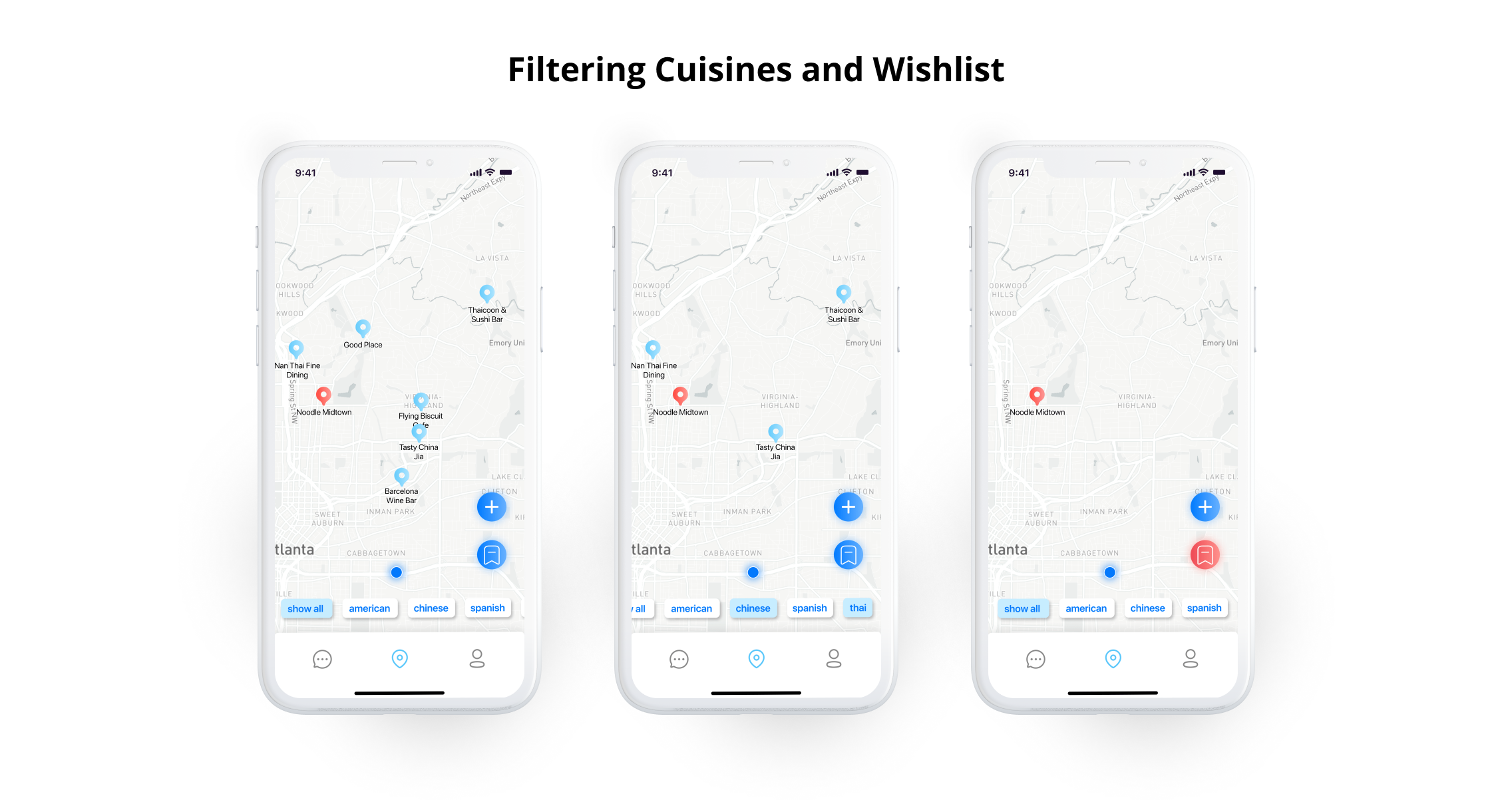
- The wishlist button is currently a heart, but that was confusing to some. Maybe change it to a bookmark or star.心愿单按钮目前是一颗心脏,但是这使某些人感到困惑。 也许将其更改为书签或星号。
讨论标签 (Discussion Tab)
- When responding to an inquiry, users wanted to be able to access their catalog to just tap something they’ve already written a review for. This will make recommending a place to friends even faster.在答复查询时,用户希望能够访问他们的目录以仅点击他们已经为其撰写评论的内容。 这样可以更快地向朋友推荐一个地方。
- Like the map page, the add to wishlist/favorites button should include how many users have favorited a place.就像地图页面一样,“添加到愿望清单/收藏夹”按钮应包括有多少用户收藏了一个地方。
- We will change button text from “Share Inquiry” to “Ask Question” for clarity.为了清楚起见,我们将按钮文本从“共享查询”更改为“询问问题”。
- We will change “Friends Inquiries” and “My Inquiries” to “All Discussions” and “My Posts.”我们将“朋友查询”和“我的查询”更改为“所有讨论”和“我的帖子”。
- A user wants to be able to filter by cuisine on this page.用户希望能够在此页面上按美食过滤。
用户界面样式指南 (UI Style Guide)
Before moving to the high fidelity prototype, we came up with our style guide. We recognize that many current food recommendation platforms incorporate some sort of red, and at the same time many social platforms incorporate the color blue. As we wanted this app to have a social ambience, we decided to make our color palette consist primarily of blues and grays while using red for selected states for the wishlist. We wanted to have a clean and modern interface that would be easy to navigate, so the majority of the app is white.
在转向高保真原型之前,我们提出了样式指南。 我们认识到,目前许多食品推荐平台都包含某种红色,与此同时,许多社交平台都包含了蓝色。 当我们希望该应用具有社交氛围时,我们决定使调色板主要由蓝色和灰色组成,同时将红色用于愿望清单的选定状态。 我们希望拥有一个易于浏览的简洁现代界面,因此该应用程序的大部分为白色。
For the typeface, we decided to go with the default for iOS, SF Pro Display, and tried to follow the iOS guidelines for font sizes, though we adjusted the sizes when necessary. We thought using the default iOS typeface would help us achieve the clean and modern look that we are going for. The buttons all have a slight monochromatic gradient to also provide a modern aesthetic.
对于字体,我们决定使用iOS的默认字体SF Pro Display,并尝试遵循iOS的字体大小准则,不过我们会在必要时进行调整。 我们认为使用默认的iOS字体将帮助我们获得我们想要的干净现代的外观。 所有按钮均具有轻微的单色渐变,以提供现代美感。

高保真原型 (High Fidelity Prototype)
Taking into consideration the feedback from usability testing, we created our high fidelity prototype. We also updated the user flow to represent these changes. While it may seem like a less intuitive flow, this is actually what the users who we spoke to preferred. They were thrown off-guard when the map was presented as the first screen, so this will allow them to see the discussions page right away and take immediate action. Also, the introduction of the new “Welcome Back” page is our way of allowing the user to see new recommendations and select ones they like before even entering the main screens of the app. The reason for including this page is because we originally had the new recommendations on the map which was the home page, but we want users to be able to see what they’ve missed right away.
考虑到可用性测试的反馈,我们创建了高保真原型。 我们还更新了用户流程以表示这些更改。 尽管看起来好像不太直观,但实际上这是我们与之交谈的用户的首选。 当地图作为第一个屏幕出现时,他们措手不及,因此这将使他们可以立即查看讨论页面并立即采取行动。 另外,引入新的“ Welcome Back”页面是我们允许用户甚至在进入应用程序主屏幕之前就可以查看新推荐并选择喜欢的推荐的方式。 之所以要包含此页面,是因为我们最初在主页上的地图上有了新的建议,但是我们希望用户能够立即看到他们错过的内容。

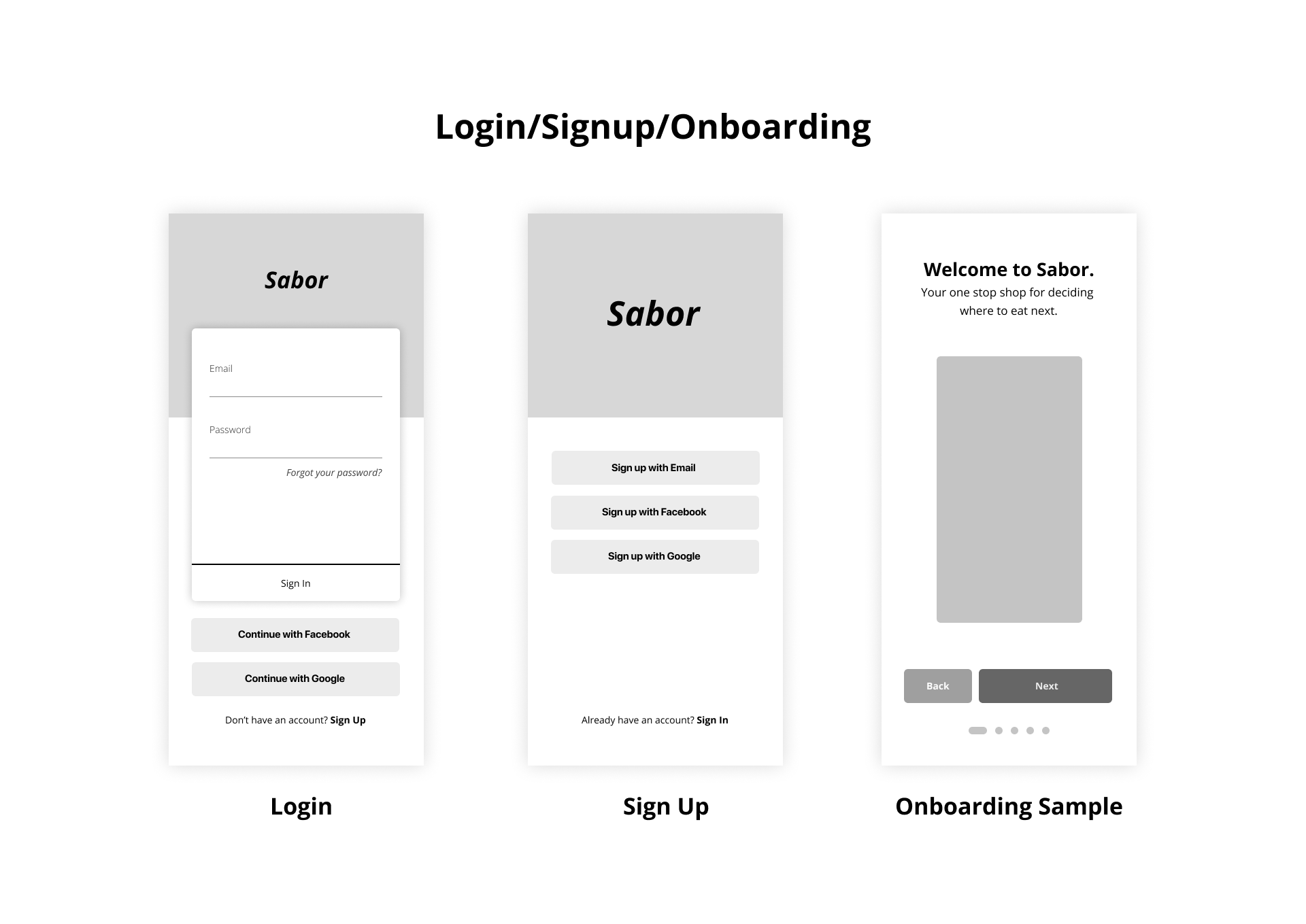
登录流程 (Login Process)
For the login process, we made a few changes:
对于登录过程,我们进行了一些更改:
- We changed the layout to be less cluttered.我们更改了布局以减少混乱。
- We separated the login process into separate email and password pages.我们将登录过程分为单独的电子邮件和密码页面。
- We added the “Welcome Back” page to show new recommendations since a user last visited the app.我们添加了“欢迎回来”页面,以显示自用户上次访问该应用以来的新建议。

入职流程 (Onboarding Process)
For the sake of avoiding redundancy, I do not show the sign up process here. It is similar to the login process, but we also ask for the user’s first and last name. Within the onboarding screens, we request access to users location, access to contacts to improve the experience of adding friends, and we request the ability to send push notifications. For the onboarding process, we made the following changes:
为了避免冗余,在此不显示注册过程。 它类似于登录过程,但是我们也要求用户的名字和姓氏。 在入门屏幕中,我们请求访问用户位置,访问联系人以改善添加朋友的体验,并且我们请求发送推送通知的功能。 对于入职过程,我们进行了以下更改:
- We rearranged onboarding screens to reflect the new user flow我们重新安排了入职屏幕,以反映新的用户流
- We added high fidelity mockups to onboarding screens我们在入门级屏幕上添加了高保真模型
- We also added a blank state for the discussion page if you do not have any friends yet如果您还没有任何朋友,我们还为讨论页面添加了空白状态

开始新的讨论 (Starting a New Discussion)
To start a new discussion, we made the following changes:
为了开始新的讨论,我们进行了以下更改:
- We moved the “+” button to be within thumb’s reach我们将“ +”按钮移到了拇指可以触及的范围内
- We changed “Share Inquiry” to “Ask Question” for more clarity.为了更清楚,我们将“共享查询”更改为“询问问题”。
- You can now select your current location instead of having to search for a city. This saves some time for the user.现在,您可以选择当前位置,而不必搜索城市。 这为用户节省了一些时间。
- When searching for a cuisine, users will begin to type in a desired cuisine and it will present options that the user may select. A future improvement here could be to add multiple cuisine filters to request a broader range of restaurants, such as “American” and “seafood” or “Spanish” and “tapas”.在搜索美食时,用户将开始输入所需的美食,并且它将显示用户可以选择的选项。 未来的改进可能是添加多个美食过滤器,以请求更多种类的餐厅,例如“美式”和“海鲜”或“西班牙式”和“西班牙小吃”。

推荐/加入收藏 (Favoriting a Recommendation/Adding to Wishlist)
To favorite a recommended restaurant and add it to your wishlist, we made the following changes:
为了收藏推荐的餐厅并将其添加到您的愿望清单,我们进行了以下更改:
- We changed the heart icon to be a bookmark for more clarity. As mentioned before, users did not completely understand what the heart did.为了更清晰起见,我们将心脏图标更改为书签。 如前所述,用户并没有完全了解心脏的作用。
- We now display the number of users who have favorited a recommendation and therefore have added it to their wishlist.现在,我们显示已收藏推荐并将其添加到心愿单的用户数。

回应讨论 (Responding to a Discussion)
For responding to a discussion, we made the following changes:
为了回应讨论,我们进行了以下更改:
- Changed “Recommend a Restaurant” button text to “Respond” for more clarity. One user said that he thought “Recommend a Restaurant” was completely separate from the discussion itself.为了更清晰,将“推荐餐厅”按钮的文字更改为“回复”。 一位用户说,他认为“推荐餐厅”与讨论本身完全分开。
- We made it so you can now recommend a restaurant you’ve been to with three taps. One to tap “Respond,” one to tap “Choose a restaurant from your catalog,” and one to tap the restaurant you’d like to recommend. This is great because you can provide a restaurant with your personal review with three taps.我们做到了,因此您现在只要三按一下,就可以推荐您去过的餐厅。 一个点击“ Respond”,一个点击“从目录中选择一家餐馆”,另一个点击您想要推荐的餐馆。 这很棒,因为您可以通过三下水龙头为餐厅提供个人评论。

按美食过滤和切换心愿单 (Filtering by Cuisine and Toggling Wishlist)
Now onto the map tab. First, these are the changes we made to filtering by cuisine or displaying wishlist restaurants:
现在进入地图标签。 首先,这些是我们对按美食过滤或显示愿望清单餐厅所做的更改:
- We moved the “+” and wishlist button to the bottom right of the screen to be within thumbs reach, making the action easier to perform.我们将“ +”和“愿望清单”按钮移到了屏幕的右下角,以使其触手可及,从而使操作更容易执行。
- We also moved the cuisine filters down to the bottom of the screen just above the tab bar so you can easily scroll through it with your thumb and select the cuisines you’d like.我们还将美食过滤器向下移动到了标签栏上方的屏幕底部,因此您可以用拇指轻松滚动浏览并选择所需的美食。
- We added the names of restaurants under the pins for a smoother map experience我们在图钉下添加了餐厅名称,以提供更流畅的地图体验
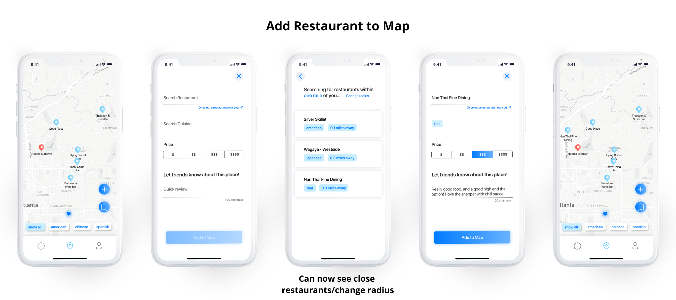
在地图上添加餐厅 (Add a Restaurant to Your Map)
For adding a new restaurant to your map, these are the changes we made:
为了在地图上添加新餐厅,这些是我们所做的更改:
- Again, we moved the “+” button to the bottom right of the screen to be within thumb’s reach.再次,我们将“ +”按钮移到屏幕的右下角,以使拇指触手可及。
- You can now select a restaurant within a user-specified radius to reduce the time of adding a place to map. It autofills the restaurant and cuisine entries when you select a restaurant.现在,您可以在用户指定的半径内选择一家餐馆,以减少添加地图地点的时间。 选择餐厅时,它将自动填充餐厅和美食条目。
- Reviews are now required, but no longer than 100 characters. The gains from doing so outweigh the cost of time, per the users we tested. It will make a more seamless flow throughout the entire app and provide more information. Users suggested they would be fine doing it because it will be useful for them when they are building their map catalog as well.现在需要评论,但不能超过100个字符。 The gains from doing so outweigh the cost of time, per the users we tested. It will make a more seamless flow throughout the entire app and provide more information. Users suggested they would be fine doing it because it will be useful for them when they are building their map catalog as well.
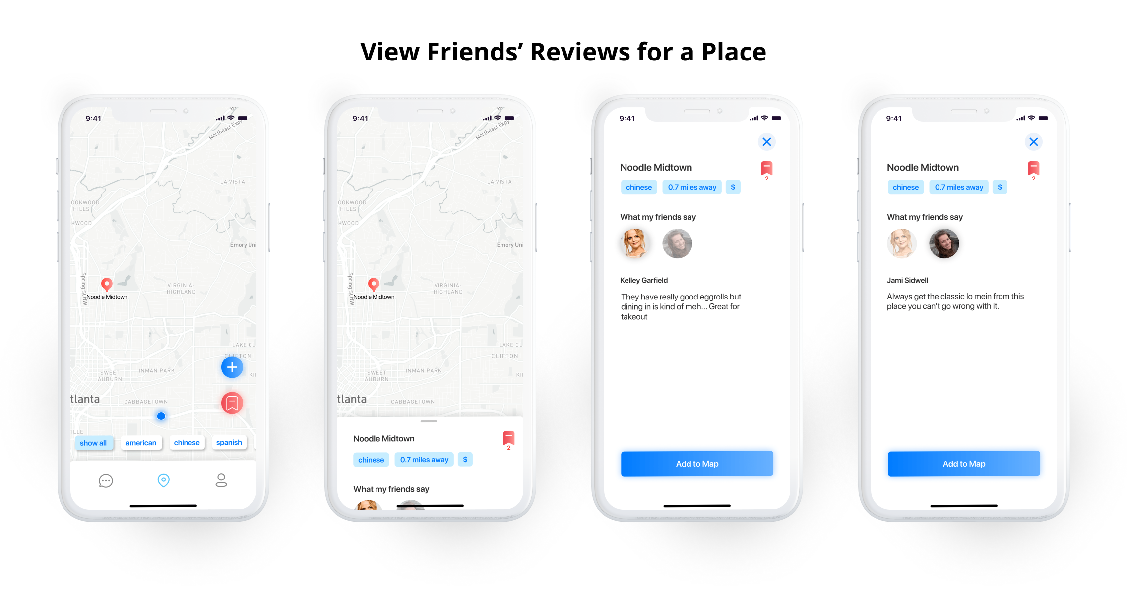
See Friends' Reviews for a Restaurant (See Friends’ Reviews for a Restaurant)
Lastly, this is how we improved the information presentation for a particular restaurant:
Lastly, this is how we improved the information presentation for a particular restaurant:
- You can now see how many others have added a restaurant to their map or wishlist.You can now see how many others have added a restaurant to their map or wishlist.
- We changed “What your friends say” to “What my friends say” for a more personal feel and clarity.We changed “What your friends say” to “What my friends say” for a more personal feel and clarity.
- We made the restaurant information screen full-page instead of half of a page as it was in the low fidelity prototype. This made things feel less cluttered.We made the restaurant information screen full-page instead of half of a page as it was in the low fidelity prototype. This made things feel less cluttered.
- We added a “X” button to more clearly close the full-screen page since dragging up/down was not intuitive to some users.We added a “X” button to more clearly close the full-screen page since dragging up/down was not intuitive to some users.
结论思想 (Concluding Thoughts)
To wrap up, Alex and I are extremely satisfied with how the high fidelity prototype turned out. Given more time, we may keep this project going and eventually ship it on the App Store. With some improvements, we truly believe it can be a useful way to find and share restaurants. For now, I want to reflect on this three-week journey so I can move forward as a better designer.
To wrap up, Alex and I are extremely satisfied with how the high fidelity prototype turned out. Given more time, we may keep this project going and eventually ship it on the App Store. With some improvements, we truly believe it can be a useful way to find and share restaurants. For now, I want to reflect on this three-week journey so I can move forward as a better designer.
What We Did Well (What We Did Well)
Like I said at the beginning of this case study, we really wanted to place a heavy emphasis on the research phase. We feel that we succeeded in doing so. We obtained very useful quantitative and qualitative data through our carefully crafted interview and survey questions.
Like I said at the beginning of this case study, we really wanted to place a heavy emphasis on the research phase. We feel that we succeeded in doing so. We obtained very useful quantitative and qualitative data through our carefully crafted interview and survey questions.
Second, we believe we did a solid job identifying the “people problems.” This was an extremely important step because it defined how we would be proceeding with the project. Being able to nail down the problems we were trying to solve helped shape our goals and our experience in its entirety.
Second, we believe we did a solid job identifying the “people problems.” This was an extremely important step because it defined how we would be proceeding with the project. Being able to nail down the problems we were trying to solve helped shape our goals and our experience in its entirety.
Third, we were able to create stories for two different target users and explain their goals and needs as it related to the “people problems”. We did our best to make sure there were no gaps in our user personas and that each aspect made complete sense in relation to their overall character.
Third, we were able to create stories for two different target users and explain their goals and needs as it related to the “people problems”. We did our best to make sure there were no gaps in our user personas and that each aspect made complete sense in relation to their overall character.
Fourth, we responded well to the usability testing feedback. We took the time to go through each test and extract the primary pain points, categorize them, and prioritize them in order to implement the changes in our high fidelity prototype.
Fourth, we responded well to the usability testing feedback. We took the time to go through each test and extract the primary pain points, categorize them, and prioritize them in order to implement the changes in our high fidelity prototype.
Lastly, we did well to implement a map feature despite the limiting prototyping abilities. We used Mapsicle which gave us the benefit of zooming in on where we wanted the map to show, but there is no way to navigate around a map in Figma which limited the experience in our prototype.
Lastly, we did well to implement a map feature despite the limiting prototyping abilities. We used Mapsicle which gave us the benefit of zooming in on where we wanted the map to show, but there is no way to navigate around a map in Figma which limited the experience in our prototype.
Where We Could Improve (Where We Could Improve)
Because time was of the essence, we had to leave out some steps of the process in order to complete the project. One mistake was leaving out sketching during brainstorming. This would have saved us a good amount of time, as we had to fiddle around with the low fidelity prototype which took up enough time to have covered the sketching portion. Moving forward, I will take more time to produce rough sketches so I can get early feedback and not waste time prototyping things that will never make it to the MVP.
Because time was of the essence, we had to leave out some steps of the process in order to complete the project. One mistake was leaving out sketching during brainstorming. This would have saved us a good amount of time, as we had to fiddle around with the low fidelity prototype which took up enough time to have covered the sketching portion. Moving forward, I will take more time to produce rough sketches so I can get early feedback and not waste time prototyping things that will never make it to the MVP.
Another area where more time could have been spent is on the feature prioritization matrix. We found ourselves frequently revisiting it to add or adjust or remove features that should go into our proposed MVP. If more time was spent discussing each feature that went onto the matrix, we could have saved time later on. It is also important to discuss these features because considering how each one will impact the user in relation to their needs is important for providing an adequate solution.
Another area where more time could have been spent is on the feature prioritization matrix. We found ourselves frequently revisiting it to add or adjust or remove features that should go into our proposed MVP. If more time was spent discussing each feature that went onto the matrix, we could have saved time later on. It is also important to discuss these features because considering how each one will impact the user in relation to their needs is important for providing an adequate solution.
Third, we did not have enough time to do a second round of usability testing to improve our high fidelity prototype. We could have had enough time for this round if we had better planning. Fortunately, we responded well to our first round of usability testing, but it is definitely something we would have liked to have done to be able to nail down the user input fields/processes.
Third, we did not have enough time to do a second round of usability testing to improve our high fidelity prototype. We could have had enough time for this round if we had better planning. Fortunately, we responded well to our first round of usability testing, but it is definitely something we would have liked to have done to be able to nail down the user input fields/processes.
Lastly, in terms of our user interface, we could have done a more consistent job with spacing in general and sizing. We followed iOS guidelines for button and text sizing; however, the card elements may sometimes have had inconsistent padding or margin which should always be a focus especially when handing-off a prototype to developers. We understand this importance and if we are to move forward with the project, more time and care will be spent making a polished design system to reference.
Lastly, in terms of our user interface, we could have done a more consistent job with spacing in general and sizing. We followed iOS guidelines for button and text sizing; however, the card elements may sometimes have had inconsistent padding or margin which should always be a focus especially when handing-off a prototype to developers. We understand this importance and if we are to move forward with the project, more time and care will be spent making a polished design system to reference.
Moving Forward/Future Improvements (Moving Forward/Future Improvements)
Moving forward, we would like to work on the things discussed above, and focus on future improvements and implementations of useful features. We are especially excited about this project because of its potential. Some of the features we will consider implementing in the future are:
Moving forward, we would like to work on the things discussed above, and focus on future improvements and implementations of useful features. We are especially excited about this project because of its potential. Some of the features we will consider implementing in the future are:
- Filtering the discussion section by cuisineFiltering the discussion section by cuisine
- Direct messaging people who post a review to request more information. We will be careful with this one because remember, one of our goals is to avoid making a messaging app.Direct messaging people who post a review to request more information. We will be careful with this one because remember, one of our goals is to avoid making a messaging app.
- Incorporating the ability to create new cuisine categories or add multiple cuisines to a restaurantIncorporating the ability to create new cuisine categories or add multiple cuisines to a restaurant
- Incorporating tags that are for ambience/event instead of just cuisineIncorporating tags that are for ambience/event instead of just cuisine
- Adding a reservation and menu featureAdding a reservation and menu feature
- Finding where the locals eat by searching within a specified radius and having more professional suggestions without interrupting the primary experienceFinding where the locals eat by searching within a specified radius and having more professional suggestions without interrupting the primary experience
- Using analytics to suggest new people who we know have similar tastes to a userUsing analytics to suggest new people who we know have similar tastes to a user
- Implementing a list view of the mapImplementing a list view of the map
- Enabling users to swipe left and right through restaurants on their map.Enabling users to swipe left and right through restaurants on their map.
- And much, much more!还有更多!
Thank you for taking the time to read this case study. As a newcomer in this industry, it is important for me to be able to document each step of the process in detail and justify all of my decisions. I would love to hear your feedback, both positive and negative. Have a nice day!
Thank you for taking the time to read this case study. As a newcomer in this industry, it is important for me to be able to document each step of the process in detail and justify all of my decisions. I would love to hear your feedback, both positive and negative. 祝你今天愉快!
翻译自: https://uxdesign.cc/designing-a-social-restaurant-curation-app-a-ux-ui-case-study-6c24c5505dee
ux和ui
http://www.taodudu.cc/news/show-893948.html
相关文章:
- 模板缓冲_模板缓冲以及如何使用它可视化体积相交
- b端 ux 设计思维_借助系统思维从视觉设计过渡到UX
- figma下载_Figma的自动版式实用
- lottie 动画_使用After Effects和Lottie制作网络动画而不会损失质量
- 模式匹配 怎么匹配减号_如何使您的应用导航与用户的思维模式匹配
- ux的重要性_颜色在UX中的重要性
- element-ui表单_每日UI挑战强加-登录表单(分步教程)
- shields 徽标_徽标不够用时如何设计应用程序图标
- zoom 用户被锁定_重新考虑Zoom的用户体验
- ui设计看的书_5本关于UI设计的书
- 案例研究设计与方法-罗伯_旭进口重新设计-用户体验案例研究
- axure rp 创建弹框_如何在Axure RP 9中创建交换机
- 界面设计语言_使用任何语言设计界面的提示
- hp-ux锁定用户密码_UX设计101:提出正确的问题-规划和促进用户访谈
- mac基本操作技巧_6个基本设计技巧
- stack smash_扶手椅VGUX:Super Smash Bros.Ultimate
- 全库模式 用户模式 表模式_暗模式,亮模式和用户的故事
- ios 刷新遮罩遮罩_在Adobe XD中进行遮罩的3种方法
- 图像标注技巧_保护互联网上图像的一个简单技巧
- ar软件测试工具_如何为用户测试制作快速的AR原型
- 未来ui设计的发展趋势_2025年的未来UI趋势?
- CSSyphus:烦躁不安的烦恼设计指南。
- 类从未使用_如果您从未依赖在线销售,如何优化您的网站
- 程序详细设计之代码编写规范_我在不编写任何代码的情况下建立了一个设计策划网站
- 图书漂流系统的设计和研究_研究在设计系统中的作用
- 西里尔字符_如何设计西里尔字母Њ(Nje),Љ(Lje),Ћ(Tshe)和Ђ(Dje)
- 最新ui设计趋势_10个最新且有希望的UI设计趋势
- 404 错误页面_如何设计404错误页面,以使用户留在您的网站上
- 公网对讲机修改对讲机程序_更少的对讲机,对讲机-更多专心,专心
- ui设计基础_我不知道的UI设计的9个重要基础
ux和ui_设计社交餐厅策展应用程序— UX / UI案例研究相关推荐
- ux和ui_设计更好的结帐体验-UX / UI案例研究
ux和ui Plated Cuisine is a food ordering and delivery app for Plated Cuisine Restaurant founded and m ...
- ux和ui_首先要做的— UX / UI案例研究
ux和ui 休息一下! (Get some rest!) After four weeks of four-day design sprints each week, I welcomed the o ...
- aws社交app案例_重新设计社交体验共享应用,并获得案例研究
aws社交app案例 In early 2017, I decided to transition my career from business strategy/analytics to UX d ...
- python设计图形界面执行exe程序_Python开发案例:设计启动工具箱,显示图形界面的方式...
本文的文字及图片来源于网络,仅供学习.交流使用,不具有任何商业用途,版权归原作者所有,如有问题请及时联系我们以作处理. 以下文章来源于云+社区,作者 用户2870857 转载地址 https://bl ...
- ux和ui_从UI切换到UX设计
ux和ui I still remember those days, when I was a soon-to-be graphic design graduate who started to qu ...
- 谷歌maps菜单语言设置_Google Maps:拯救未来之路— UX案例研究
谷歌maps菜单语言设置 I have a lousy sense of direction, so Google Maps has always been my right-hand app. On ...
- ux和ui_糟糕的UI与UX番茄酱模因
ux和ui At face value, this meme appears to be a quick and easy tool for educating the general public ...
- UX用户体验设计十大重要原则 上
在UI设计中什么是最重要的?没错就是用户体验设计无疑了.但是提到用户体验设计很多小伙伴就迷茫不知所措了,今天胡老师给大家分解总结出了UX用户体验设计十条重要原则,并通过示例进行了简单的定义.学会这些内 ...
- 小程序的ui应该怎么设计?
UI设计中小程序的设计是很多UI设计师在工作中会碰到的,一款好的小程序设计页面,会带来效果很好的用户体验,下面小编就为大家详细的分享一下具体小程序的ui应该怎么设计? UI设计培训分享:小程序的ui应 ...
最新文章
- vim+快捷键+常用+命令
- ArcGIS为面要素生成邻接矩阵
- LeetCode Regular Expression Matching(.和*通配符匹配)
- 天勤数据结构:树与二叉树(图解二叉树的三种遍历方式执行流程,超详细)
- 真格量化——GFTD策略
- python的网络应用_python 网络编程的应用模块
- 在C#中利用Keep-Alive处理Socket网络异常断开的方法 (转)
- html 超链接嵌套,嵌套的超链接区域,HTML源中没有嵌套的链接元素
- 数据分析 超市条码_阜康市超市存包柜人脸识别 - 阜康办公、文教
- 计算机终端mac是什么,苹果Mac OS终端是什么,Mac OS终端的作用是什么?
- Mybatis-Plus报错:Invalid bound statement (not found)
- 2021年,普通人,如何快速合法地赚到你人生的第一桶金?
- An error has occured.See the log file
- windows下rainbond 安装unable to find image locally docker errot response from daemon
- 毕业设计之 ---基于大数据分析的航空公司客户价值分析
- [解疑]图像、矩阵的二维空间变换
- gz, bz2, bz, Z, tgz, zip, rar, lha, rpm等格式的解压
- JavaScript笔试知识点整理
- Compiling a Compiler
- 树莓派无法连接远程计算机,如何从树莓派远程连接到Windows PC