ROC 曲线/准确率、覆盖率(召回)、命中率、Specificity(负例的覆盖率)
欢迎关注博主主页,学习python视频资源
![]()
sklearn实战-乳腺癌细胞数据挖掘(博主亲自录制视频教程)
https://study.163.com/course/introduction.htm?courseId=1005269003&utm_campaign=commission&utm_source=cp-400000000398149&utm_medium=share
![]()
统计项目联系QQ:231469242
用条件概率理解混合矩阵容易得多
sensitivity:真阳性条件下,测试也是阳性
specificity:真阴性条件下,测试也是阴性
FALSE positive:真阴性条件下,测试却是阳性
FALSE negative:真阳性条件下,测试却是阴性
![]()
混淆矩阵图谱
![]()
Excel绘制ROC
![]()
![]()
![]()
![]()
![]()
准确度 (ACC, accuracy)ACC = (TP + TN) / (P + N)即:(真阳性+真阴性) / 总样本数
敏感性sensitivity=召回率recall
精准率precision=阳性预测率
敏感性和假阳性率呈现正比例
敏感性和准确性(阳性预测率)呈现反比例
ROC和PRC曲线说明:敏感性(召回率)不是越高越好,敏感性太高,假阳性率也会上升。(会损失掉一些好客户)
敏感性太高,阳性预测率(准确率)会下降。(机器学习改善)
2.2 P-R曲线
在P-R曲线中,Precision为横坐标,Recall为纵坐标。在ROC曲线中曲线越凸向左上角约好,在P-R曲线中,曲线越凸向右上角越好。P-R曲线判断模型的好坏要根据具体情况具体分析,有的项目要求召回率较高、有的项目要求精确率较高。P-R曲线的绘制跟ROC曲线的绘制是一样的,在不同的阈值下得到不同的Precision、Recall,得到一系列的点,将它们在P-R图中绘制出来,并依次连接起来就得到了P-R图。两个分类器模型(算法)P-R曲线比较的一个例子如下图所示:

链接:https://www.zhihu.com/question/30643044/answer/48955833
来源:知乎
著作权归作者所有。商业转载请联系作者获得授权,非商业转载请注明出处。
<img src="https://pic4.zhimg.com/50/3378a75e33245f6e0aac33717b19512c_hd.jpg" data-rawwidth="800" data-rawheight="600" class="origin_image zh-lightbox-thumb" width="800" data-original="https://pic4.zhimg.com/3378a75e33245f6e0aac33717b19512c_r.jpg">
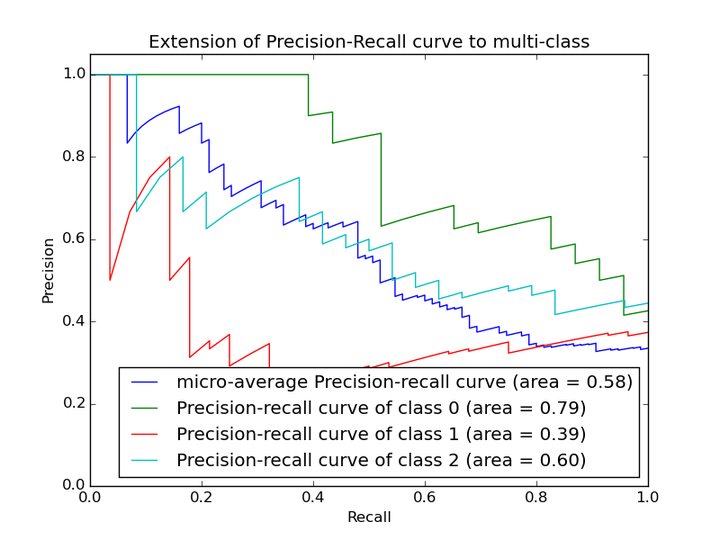 以上两个指标用来判断模型好坏,图有些不恰当。。。但是有时候模型没有单纯的谁比谁好(比如图二的蓝线和青线),那么选择模型还是要结合具体的使用场景。
下面是两个场景:
1. 地震的预测
对于地震的预测,我们希望的是RECALL非常高,也就是说每次地震我们都希望预测出来。这个时候我们可以牺牲PRECISION。情愿发出1000次警报,把10次地震都预测正确了;也不要预测100次对了8次漏了两次。
2. 嫌疑人定罪
基于不错怪一个好人的原则,对于嫌疑人的定罪我们希望是非常准确的。及时有时候放过了一些罪犯(recall低),但也是值得的。
对于分类器来说,本质上是给一个概率,此时,我们再选择一个CUTOFF点(阀值),高于这个点的判正,低于的判负。那么这个点的选择就需要结合你的具体场景去选择。反过来,场景会决定训练模型时的标准,比如第一个场景中,我们就只看RECALL=99.9999%(地震全中)时的PRECISION,其他指标就变得没有了意义。
如果只能选一个指标的话,肯定是选PRC了。可以把一个模型看的一清二楚。
链接:https://www.zhihu.com/question/30643044/answer/48955833
来源:知乎
著作权归作者所有。商业转载请联系作者获得授权,非商业转载请注明出处。
<img src="https://pic4.zhimg.com/50/3378a75e33245f6e0aac33717b19512c_hd.jpg" data-rawwidth="800" data-rawheight="600" class="origin_image zh-lightbox-thumb" width="800" data-original="https://pic4.zhimg.com/3378a75e33245f6e0aac33717b19512c_r.jpg">
以上两个指标用来判断模型好坏,图有些不恰当。。。但是有时候模型没有单纯的谁比谁好(比如图二的蓝线和青线),那么选择模型还是要结合具体的使用场景。
下面是两个场景:
1. 地震的预测
对于地震的预测,我们希望的是RECALL非常高,也就是说每次地震我们都希望预测出来。这个时候我们可以牺牲PRECISION。情愿发出1000次警报,把10次地震都预测正确了;也不要预测100次对了8次漏了两次。
2. 嫌疑人定罪
基于不错怪一个好人的原则,对于嫌疑人的定罪我们希望是非常准确的。及时有时候放过了一些罪犯(recall低),但也是值得的。
对于分类器来说,本质上是给一个概率,此时,我们再选择一个CUTOFF点(阀值),高于这个点的判正,低于的判负。那么这个点的选择就需要结合你的具体场景去选择。反过来,场景会决定训练模型时的标准,比如第一个场景中,我们就只看RECALL=99.9999%(地震全中)时的PRECISION,其他指标就变得没有了意义。
如果只能选一个指标的话,肯定是选PRC了。可以把一个模型看的一清二楚。

false positive=黑色竖线右边绿色像素面积/蓝色像素总面积
Closely related to sensitivity and specificity is the Receiver-Operating-
Characteristic (ROC) curve. This is a graph displaying the relationship between the
true positive rate (on the vertical axis) and the false positive rate (on the horizontal
find the predictor which best discriminates between two given distributions: ROC
curves were first used duringWWII to analyze radar effectiveness. In the early days
of radar, it was sometimes hard to tell a bird from a plane. The British pioneered
using ROC curves to optimize the way that they relied on radar for discriminating
between incoming German planes and birds.
Take the case that we have two different distributions, for example one from
the radar signal of birds and one from the radar signal of German planes, and
we have to determine a cut-off value for an indicator in order to assign a test
result to distribution one (“bird”) or to distribution two (“German plane”). The only
parameter that we can change is the cut-off value, and the question arises: is there
an optimal choice for this cut-off value?
The answer is yes: it is the point on the ROC-curve with the largest distance to
the diagonal (arrow in Fig.7.10).3
Fig.
ROC 曲线是根据一系列不同的二分类方式(分界值或决定阈),以真阳性率(灵敏度)为纵坐标,假阳性率(1-特异度)为横坐标绘制的曲线。传统的诊断试验评价方 法有一个共同的特点,必须将试验结果分为两类,再进行统计分析。ROC曲线的评价方法与传统的评价方法不同,无须此限制,而是根据实际情况,允许有中间状 态,可以把试验结果划分为多个有序分类,如正常、大致正常、可疑、大致异常和异常五个等级再进行统计分析。因此,ROC曲线评价方法适用的范围更为广泛。
主要作用
编辑
3.两种诊断方法的统计学比较。两种诊断方法的比较时,根据不同的试验设计可采用以下两种方法:①当两种诊断方法分别在不同受试者身上进行时,采用成组比较法。②如果两种诊断方法在同一受试者身上进行时,采用配对比较法
ROC曲线指受试者工作特征曲线 / 接收器操作特性曲线(receiver operating characteristic curve), 是反映敏感性和特异性连续变量的综合指标,是用构图法揭示敏感性和特异性的相互关系,它通过将连续变量设定出多个不同的临界值,从而计算出一系列敏感性和 特异性,再以敏感性为纵坐标、(1-特异性)为横坐标绘制成曲线,曲线下面积越大,诊断准确性越高。在ROC曲线上,最靠近坐标图左上方的点为敏感性和特 异性均较高的临界值。
ROC曲线的例子
考虑一个二分问题,即将实例分成正类(positive)或负类(negative)。对一个二分问题来说,会出现四种情况。如果一个实例是正类并且也 被 预测成正类,即为真正类(True positive),如果实例是负类被预测成正类,称之为假正类(False positive)。相应地,如果实例是负类被预测成负类,称之为真负类(True negative),正类被预测成负类则为假负类(false negative)。
FN:漏报,没有正确找到的匹配的数目;
TN:正确拒绝的非匹配对数;
列联表如下表所示,1代表正类,0代表负类。
| 预测 | ||||
| 1 | 0 | 合计 | ||
| 实际 | 1 | True Positive(TP) | False Negative(FN) | Actual Positive(TP+FN) |
| 0 | False Positive(FP) | True Negative(TN) | Actual Negative(FP+TN) | |
| 合计 | Predicted Positive(TP+FP) | Predicted Negative(FN+TN) | TP+FP+FN+TN |
从列联表引入两个新名词。其一是真正类率(true positive rate ,TPR), 计算公式为TPR=TP/ (TP+ FN),刻画的是分类器所识别出的 正实例占所有正实例的比例。另外一个是假正类率(false positive rate, FPR),计算公式为FPR= FP / (FP + TN),计算的是分类器错认为正类的负实例占所有负实例的比例。还有一个真负类率(True Negative Rate,TNR),也称为specificity,计算公式为TNR=TN/ (FP+ TN) = 1-FPR。

其中,两列True matches和True non-match分别代表两行Pred matches和Pred non-match分别代表匹配上和预测匹配上的
FPR = FP/(FP + TN) 负样本中的错判率(假警报率)
TPR = TP/(TP + TN) 判对样本中的正样本率(命中率)
ACC = (TP + TN) / P+N 判对准确率
在一个二分类模型中,对于所得到的连续结果,假设已确定一个阀值,比如说 0.6,大于这个值的实例划归为正类,小于这个值则划到负类中。如果减小阀值,减到0.5,固然能识别出更多的正类,也就是提高了识别出的正例占所有正例 的比类,即TPR,但同时也将更多的负实例当作了正实例,即提高了FPR。为了形象化这一变化,在此引入ROC,
ROC曲线和它相关的比率
(a)理想情况下,TPR应该接近1,FPR应该接近0。
ROC曲线上的每一个点对应于一个threshold,比如Threshold最大时,TP=FP=0,对应于原点;Threshold最小时,TN=FN=0,对应于右上角的点(1,1)
(b)随着阈值theta增加,TP和FP都减小,TPR和FPR也减小,ROC点向左下移动;
Receiver Operating Characteristic,翻译为"接受者操作特性曲线",够拗口的。曲线由两个变量1-specificity 和 Sensitivity绘制. 1-specificity=FPR,即假正类率。Sensitivity即是真正类率,TPR(True positive rate),反映了正类覆盖程度。这个组合以1-specificity对sensitivity,即是以代价(costs)对收益 (benefits)。
此外,ROC曲线还可以用来计算“均值平均精度”( 下表是一个逻辑回归得到的结果。将得到的实数值按大到小划分成10个个数 相同的部分。
| Percentile | 实例数 | 正例数 | 1-特异度(%) | 敏感度(%) |
| 10 | 6180 | 4879 | 2.73 | 34.64 |
| 20 | 6180 | 2804 | 9.80 | 54.55 |
| 30 | 6180 | 2165 | 18.22 | 69.92 |
| 40 | 6180 | 1506 | 28.01 | 80.62 |
| 50 | 6180 | 987 | 38.90 | 87.62 |
| 60 | 6180 | 529 | 50.74 | 91.38 |
| 70 | 6180 | 365 | 62.93 | 93.97 |
| 80 | 6180 | 294 | 75.26 | 96.06 |
| 90 | 6180 | 297 | 87.59 | 98.17 |
| 100 | 6177 | 258 | 100.00 | 100.00 |
其 正例数为此部分里实际的正类数。也就是说,将逻辑回归得到的结 果按从大到小排列,倘若以前10%的数值作为阀值,即将前10%的实例都划归为正类,6180个。其中,正确的个数为4879个,占所有正类的 4879/14084*100%=34.64%,即敏感度;另外,有6180-4879=1301个负实例被错划为正类,占所有负类的1301 /47713*100%=2.73%,即1-特异度。以这两组值分别作为x值和y值,在excel中作散点图。
http://www.labdd.com/a/xueshujiaoliu/jyfx/30326_2.html
作者:北京大学第三医院临床流行病中心 王晓晓
来源: 中华检验医学杂志 www.labdd.com
受试者工作特征曲线(receiver operating characteristiccurve,ROC曲线),是医学科研工作者非常熟悉的一种曲线图,常用来决定最佳诊断点。那么ROC曲线来自何方、有什么讲究么?让我们聊一聊ROC曲线的前世今生。 检验地带网
大家仔细看看ROC英文第一个单词“receiver”,就会理解最初它的翻译是“接收者操作特征曲线”,首先是由第二次世界大战中的电子工程师和雷达工程师发明并最先使用的。那时雷达兵(信号接收者)的任务就是每天盯着雷达显示器,观察屏幕上是否出现代表敌方飞行物的光点。显示屏上出现光点有两种可能性,一种可能是雷达探测到了敌机的行踪,另一种可能是有鸟类或其他非军事飞行物从雷达探测区域经过。在第一种情况下,如果雷达兵及时发出警报,通知高炮部队或空军拦截,就是“击中”,而如果这时雷达兵没有把显示屏上的光点判断为信号,就是“漏报”;在后一种情况下如果雷达兵却把它当作敌机(信号)看待,就是“虚报”,如果这时雷达兵正确地把它判断为其他飞行物(噪音),那就是“正确排除”。
我们都能理解,人不犯错误几乎是不可能的,更何况是通过简单的亮点判断敌机,为了评估雷达兵判断的正确与否,我们可以列出如下四格表。
|
雷达兵 的判断 |
实际目标 www.labdd.com |
|
|
敌机 |
飞鸟 检验地带网 |
|
|
敌机 |
击中 |
虚报 检验地带网 |
|
飞鸟 |
漏报 |
正确排除 www.labdd.com |
针对此四格表,我们可以计算击中率、虚报率、漏报率、正确排除率。如何找到一个最佳的临界点使得“击中率”和“正确排除率”同时达到最佳效果?我们都希望理论上达到100%的“击中率”和“正确排除率”,那么谁最接近这个点(ROC曲线左上角顶点),谁的工作业绩也就最好。 检验地带网
看到这里大家是不是觉得很眼熟,感觉与诊断试验结果判定非常相似。没错,当时采用的描述和判断雷达兵的工作业绩一种图形工具,这就是ROC曲线。后来医学工作者把它引入到诊断研究中,并且改用了“受试者工作特征曲线”这个翻译。
一般情况下,我们诊断某种疾病是由行业内公认的检验方法(金标准)来判断的,但往往这些所谓的金标准存在有创性、操作复杂、价钱昂贵等缺点。为此,我们也在寻找替代的简单易行的检验方法,但我们同时要求替代的检验方法具有一定的分辨能力。于是,我们寻找经过金标准确定的患病和无病,然后再用替代的检验方法进行再诊断,诊断结果和金标准相比无疑会出现4种情况。
|
某检测 方法 |
金标准 |
|
|
患病 |
无病 |
|
|
阳性 检验地带网 |
真阳性 www.labdd.com |
假阳性 |
|
阴性 |
假阴性 |
真阴性 |
这个四格表衍生的各种指标:真阳性率(敏感度)、假阳性率、假阴性率、真阴性率(特异度)等等都是评估替代检验方法鉴别患病和无病的能力。通常情况下我们以敏感度为纵坐标,1-特异度为横坐标绘制曲线,制作ROC曲线。
一、ROC曲线的解读
ROC曲线其实是N组二维坐标的点(敏感度,1-特异度)绘制的曲线,曲线上每一点均表示某种检验方法或者某种临界值下的敏感度和1-特异度,我们一般认为左上角对应的检验方法或临界值具有较高的诊断价值,因为其兼具较高的敏感度和特异度。在这里,认真的读着也许会感慨左上角的说法有些含糊,所谓的“曲线左上角”至少可以找出3种判断方式:(1)曲线与斜率为1的斜线的切点;(2)曲线与经过(0,1)和(1,0)两点直线的交点;(3)曲线上与(0,1)点绝对距离最近的点。从数学上讲,由于ROC曲线并非规则曲线,这3个点未必永远合一。 www.labdd.com
在实际应用中,SPSS会给出不同界值下的敏感度和1-特异度,最重要一点就是要结合临床实际进行选择。如果不是特殊情况,一般以约登指数(Youden index)暨(灵敏度+特异度-1)最大时所对应的点为最佳诊断界值。
二、可以在一个坐标系下同时绘制多条ROC曲线吗?
有时候我们需要比较多种检验方法的诊断价值,目前我们是将每一种检验方法分别与选定的金标准进行比较,这样可以绘制多条ROC曲线,为方便比较,我们可以将多条ROC曲线绘制在同一坐标图内。SPSS即可实现这一目的。
聪明的读者会问,如果两条差不多的曲线肉眼难以分辨诊断效能,又该如何呢?这时我们引入新的工具——ROC曲线下方的面积(ROC area under the curve,ROC AUC)。我们很容易就可以总结出ROC AUC的几个特点:因为是在1x1的方格里求面积,AUC必在0~1之间;AUC值越大的曲线,诊断效能越高;当ROC AUC=0.5时,相当于抛硬币猜正反面。所以我们常见的医学论文里,ROC AUC一般介于0.5~1.0(50%~100%)之间。认真的读者还会追问“难道不会出现<0.5的ROC AUC么?”会有的,这个时候你把诊断方法的结果反过来判断就行了,ROC AUC依然变得>0.5。
对于ROC AUC的判断,有些作者会认为某种检测方法的ROC AUC在0.5~0.7时有较低准确性,ROC AUC在0.7~0.9时有一定准确性,ROC AUC>0.9时有较高准确性。 www.labdd.com
三、对角线必须画出来吗?
对角线表示所选的替代检验方法跟随机猜测一样(ROC AUC=0.5),毫无诊断价值。所以,一般我们以对角线作为参照线,对角线以上认为有诊断价值,对角线及对角线以下则无诊断价值。但对角线并非必须出现在ROC曲线,因为没有对角线,也不影响我们对ROC曲线的解读。
四、ROC曲线横纵坐标必须一致吗?
我们目之所及的ROC曲线好像都是绘制在正方形坐标图内,必须是正方形吗,长方形不可以吗?是这样的,ROC曲线的横纵坐标(敏感度和1-特异度)有着基本相同的内涵,均是四格表衍生而来的指标,倘若我们将ROC曲线绘制在长方形坐标图内,我们的参照线便不是醒目如北斗七星的对角线,反而不利于我们解读ROC曲线。另外,我们知道敏感度和特异度取值范围均在0~1,是需要封口的,不同于以往的无限延长的坐标轴,再加上常说的曲线下面积也是限制在1x1的方格里,所以我们建议ROC曲线周边4条为实线。
(收稿日期:2014年9月)
(本文编辑:唐栋)
后记
也许是离开学校太久的原因,我(本文编辑)有个疑问,为何横坐标是1-特异度,而不是特异度。恐怕最开始这样设计的人一定有特殊的原因。但是翻遍多本教科书都没找到答案。我有幸和中国人民大学中国调查与数据中心胡以松博士进行了探讨,在胡博士的帮助下终于找到了答案,特意补充在这里,分享给大家。
胡以松博士:其实回到一开始雷达兵的那个故事,我们就会发现ROC曲线最早的应用更加关注“真阳性率”(敏感度)和“假阳性率”(1-特异度),毕竟军方更关心是雷达预测的“敌机”究竟是真是假,所以才会有今天大家常见的ROC曲线坐标系。推荐一篇早期的文献,也许读者能更好的理解这一点[1]。“Thus the ROC curve issimply a plot of the intuitive trade-off between sensitivity and specificity,with the horizontal axis flipped for historical reasons. The original aim of ROC analysis was to focus on positive test results, both true positive andfalse positive.”
https://en.wikipedia.org/wiki/Receiver_operating_characteristic
Receiver operating characteristic

In statistics, a receiver operating characteristic curve, or ROC curve, is a graphical plot that illustrates the performance of a binary classifier system as its discrimination threshold is varied. The Total Operating Characteristic (TOC) expands on the idea of ROC by showing the total information in the two-by-two contingency table for each threshold. ROC gives only two bits of relative information for each threshold, thus the TOC gives strictly more information than the ROC.
The ROC curve is created by plotting the true positive rate (TPR) against the false positive rate (FPR) at various threshold settings. The true-positive rate is also known as sensitivity, recall or probability of detection[1] in machine learning. The false-positive rate is also known as the fall-out or probability of false alarm[1] and can be calculated as (1 − specificity). The ROC curve is thus the sensitivity as a function of fall-out. In general, if the probability distributions for both detection and false alarm are known, the ROC curve can be generated by plotting the cumulative distribution function (area under the probability distribution from − ∞ {\displaystyle -\infty } 
ROC analysis provides tools to select possibly optimal models and to discard suboptimal ones independently from (and prior to specifying) the cost context or the class distribution. ROC analysis is related in a direct and natural way to cost/benefit analysis of diagnostic decision making.
The ROC curve was first developed by electrical engineers and radar engineers during World War II for detecting enemy objects in battlefields and was soon introduced to psychology to account for perceptual detection of stimuli. ROC analysis since then has been used in medicine, radiology, biometrics, and other areas for many decades and is increasingly used in machine learning and data mining research.
The ROC is also known as a relative operating characteristic curve, because it is a comparison of two operating characteristics (TPR and FPR) as the criterion changes.[2]
Contents
- 1 Basic concept
- 2 ROC space
- 3 Curves in ROC space
- 4 Further interpretations
- 4.1 Area under the curve
- 4.2 Other measures
- 5 Detection error tradeoff graph
- 6 Z-score
- 7 History
- 8 ROC curves beyond binary classification
- 9 See also
- 10 References
- 11 Further reading
Basic concept
A classification model (classifier or diagnosis) is a mapping of instances between certain classes/groups. The classifier or diagnosis result can be a real value (continuous output), in which case the classifier boundary between classes must be determined by a threshold value (for instance, to determine whether a person has hypertension based on a blood pressure measure). Or it can be a discrete class label, indicating one of the classes.
Let us consider a two-class prediction problem (binary classification), in which the outcomes are labeled either as positive (p) or negative (n). There are four possible outcomes from a binary classifier. If the outcome from a prediction is p and the actual value is also p, then it is called a true positive (TP); however if the actual value is n then it is said to be a false positive (FP). Conversely, a true negative (TN) has occurred when both the prediction outcome and the actual value are n, and false negative (FN) is when the prediction outcome is n while the actual value is p.
To get an appropriate example in a real-world problem, consider a diagnostic test that seeks to determine whether a person has a certain disease. A false positive in this case occurs when the person tests positive, but does not actually have the disease. A false negative, on the other hand, occurs when the person tests negative, suggesting they are healthy, when they actually do have the disease.
Let us define an experiment from P positive instances and N negative instances for some condition. The four outcomes can be formulated in a 2×2 contingency table or confusion matrix, as follows:
| predicted condition | |||||
| total population | prediction positive | prediction negative | Prevalence = Σ condition positive/Σ total population | ||
|
true condition |
condition positive |
True Positive (TP) |
False Negative (FN) (type II error) |
True Positive Rate (TPR), Sensitivity, Recall, Probability of Detection = Σ TP/Σ condition positive | False Negative Rate (FNR), Miss Rate = Σ FN/Σ condition positive |
|
condition negative |
False Positive (FP) (Type I error) |
True Negative (TN) | False Positive Rate (FPR), Fall-out, Probability of False Alarm = Σ FP/Σ condition negative | True Negative Rate (TNR), Specificity (SPC) = Σ TN/Σ condition negative | |
| Accuracy = Σ TP + Σ TN/Σ total population | Positive Predictive Value (PPV), Precision = Σ TP/Σ prediction positive | False Omission Rate (FOR) = Σ FN/Σ prediction negative | Positive Likelihood Ratio (LR+) = TPR/FPR | Diagnostic Odds Ratio (DOR) = LR+/LR− | |
| False Discovery Rate (FDR) = Σ FP/Σ prediction positive | Negative Predictive Value (NPV) = Σ TN/Σ prediction negative | Negative Likelihood Ratio (LR−) = FNR/TNR | |||
ROC space

The contingency table can derive several evaluation "metrics" (see infobox). To draw a ROC curve, only the true positive rate (TPR) and false positive rate (FPR) are needed (as functions of some classifier parameter). The TPR defines how many correct positive results occur among all positive samples available during the test. FPR, on the other hand, defines how many incorrect positive results occur among all negative samples available during the test.
A ROC space is defined by FPR and TPR as x and y axes, respectively, which depicts relative trade-offs between true positive (benefits) and false positive (costs). Since TPR is equivalent to sensitivity and FPR is equal to 1 − specificity, the ROC graph is sometimes called the sensitivity vs (1 − specificity) plot. Each prediction result or instance of a confusion matrix represents one point in the ROC space.
The best possible prediction method would yield a point in the upper left corner or coordinate (0,1) of the ROC space, representing 100% sensitivity (no false negatives) and 100% specificity (no false positives). The (0,1) point is also called a perfect classification. A random guess would give a point along a diagonal line (the so-called line of no-discrimination) from the left bottom to the top right corners (regardless of the positive and negative base rates). An intuitive example of random guessing is a decision by flipping coins. As the size of the sample increases, a random classifier's ROC point migrates towards the diagonal line. In the case of a balanced coin, it will migrate to the point (0.5, 0.5).
The diagonal divides the ROC space. Points above the diagonal represent good classification results (better than random), points below the line represent poor results (worse than random). Note that the output of a consistently poor predictor could simply be inverted to obtain a good predictor.
Let us look into four prediction results from 100 positive and 100 negative instances:
| A | B | C | C′ | ||||||||||||||||||||||||||||||||||||
|---|---|---|---|---|---|---|---|---|---|---|---|---|---|---|---|---|---|---|---|---|---|---|---|---|---|---|---|---|---|---|---|---|---|---|---|---|---|---|---|
|
|
|
|
||||||||||||||||||||||||||||||||||||
| TPR = 0.63 | TPR = 0.77 | TPR = 0.24 | TPR = 0.76 | ||||||||||||||||||||||||||||||||||||
| FPR = 0.28 | FPR = 0.77 | FPR = 0.88 | FPR = 0.12 | ||||||||||||||||||||||||||||||||||||
| PPV = 0.69 | PPV = 0.50 | PPV = 0.21 | PPV = 0.86 | ||||||||||||||||||||||||||||||||||||
| F1 = 0.66 | F1 = 0.61 | F1 = 0.22 | F1 = 0.81 | ||||||||||||||||||||||||||||||||||||
| ACC = 0.68 | ACC = 0.50 | ACC = 0.18 | ACC = 0.82 |
Plots of the four results above in the ROC space are given in the figure. The result of method A clearly shows the best predictive power among A, B, and C. The result of B lies on the random guess line (the diagonal line), and it can be seen in the table that the accuracy of B is 50%. However, when C is mirrored across the center point (0.5,0.5), the resulting method C′ is even better than A. This mirrored method simply reverses the predictions of whatever method or test produced the C contingency table. Although the original C method has negative predictive power, simply reversing its decisions leads to a new predictive method C′ which has positive predictive power. When the C method predicts p or n, the C′ method would predict n or p, respectively. In this manner, the C′ test would perform the best. The closer a result from a contingency table is to the upper left corner, the better it predicts, but the distance from the random guess line in either direction is the best indicator of how much predictive power a method has. If the result is below the line (i.e. the method is worse than a random guess), all of the method's predictions must be reversed in order to utilize its power, thereby moving the result above the random guess line.
Curves in ROC space

In binary classification, the class prediction for each instance is often made based on a continuous random variable X {\displaystyle X} 


For example, imagine that the blood protein levels in diseased people and healthy people are normally distributed with means of 2 g/dL and 1 g/dL respectively. A medical test might measure the level of a certain protein in a blood sample and classify any number above a certain threshold as indicating disease. The experimenter can adjust the threshold (black vertical line in the figure), which will in turn change the false positive rate. Increasing the threshold would result in fewer false positives (and more false negatives), corresponding to a leftward movement on the curve. The actual shape of the curve is determined by how much overlap the two distributions have. These concepts are demonstrated in the Receiver Operating Characteristic (ROC) Curves Applet.
Further interpretations
Sometimes, the ROC is used to generate a summary statistic. Common versions are:
- the intercept of the ROC curve with the line at 45 degrees orthogonal to the no-discrimination line - the balance point where Sensitivity = Specificity
- the intercept of the ROC curve with the tangent at 45 degrees parallel to the no-discrimination line that is closest to the error-free point (0,1) - also called Youden's J statistic and generalized as Informedness[3]
- the area between the ROC curve and the no-discrimination line - Gini Coefficient
- the area between the full ROC curve and the triangular ROC curve including only (0,0), (1,1) and one selected operating point (tpr,fpr) - Consistency[4]
- the area under the ROC curve, or "AUC" ("Area Under Curve"), or A' (pronounced "a-prime"),[5] or "c-statistic".[6]
- d' (pronounced "d-prime"), the distance between the mean of the distribution of activity in the system under noise-alone conditions and its distribution under signal-alone conditions, divided by their standard deviation, under the assumption that both these distributions are normal with the same standard deviation. Under these assumptions, it can be proved that the shape of the ROC depends only on d'.
However, any attempt to summarize the ROC curve into a single number loses information about the pattern of tradeoffs of the particular discriminator algorithm.
Area under the curve
When using normalized units, the area under the curve (often referred to as simply the AUC) is equal to the probability that a classifier will rank a randomly chosen positive instance higher than a randomly chosen negative one (assuming 'positive' ranks higher than 'negative').[7] This can be seen as follows: the area under the curve is given by (the integral boundaries are reversed as large T has a lower value on the x-axis)
-
A = ∫ ∞ − ∞ TPR ( T ) FPR ′ ( T ) d T = ∫ − ∞ ∞ ∫ − ∞ ∞ I ( T ′ > T ) f 1 ( T ′ ) f 0 ( T ) d T ′ d T = P ( X 1 > X 0 ) {\displaystyle A=\int _{\infty }^{-\infty }{\mbox{TPR}}(T){\mbox{FPR}}'(T)\,dT=\int _{-\infty }^{\infty }\int _{-\infty }^{\infty }I(T'>T)f_{1}(T')f_{0}(T)\,dT'\,dT=P(X_{1}>X_{0})}

where X 1 {\displaystyle X_{1}} 

It can further be shown that the AUC is closely related to the Mann–Whitney U,[8][9] which tests whether positives are ranked higher than negatives. It is also equivalent to the Wilcoxon test of ranks.[9] The AUC is related to the Gini coefficient ( G 1 {\displaystyle G_{1}} 

-
G 1 = 1 − ∑ k = 1 n ( X k − X k − 1 ) ( Y k + Y k − 1 ) {\displaystyle G_{1}=1-\sum _{k=1}^{n}(X_{k}-X_{k-1})(Y_{k}+Y_{k-1})}
[10]
In this way, it is possible to calculate the AUC by using an average of a number of trapezoidal approximations.
It is also common to calculate the Area Under the ROC Convex Hull (ROC AUCH = ROCH AUC) as any point on the line segment between two prediction results can be achieved by randomly using one or other system with probabilities proportional to the relative length of the opposite component of the segment.[11] Interestingly, it is also possible to invert concavities – just as in the figure the worse solution can be reflected to become a better solution; concavities can be reflected in any line segment, but this more extreme form of fusion is much more likely to overfit the data.[12]
The machine learning community most often uses the ROC AUC statistic for model comparison.[13] However, this practice has recently been questioned based upon new machine learning research that shows that the AUC is quite noisy as a classification measure[14] and has some other significant problems in model comparison.[15][16] A reliable and valid AUC estimate can be interpreted as the probability that the classifier will assign a higher score to a randomly chosen positive example than to a randomly chosen negative example. However, the critical research[14][15] suggests frequent failures in obtaining reliable and valid AUC estimates. Thus, the practical value of the AUC measure has been called into question,[16] raising the possibility that the AUC may actually introduce more uncertainty into machine learning classification accuracy comparisons than resolution. Nonetheless, the coherence of AUC as a measure of aggregated classification performance has been vindicated, in terms of a uniform rate distribution,[17] and AUC has been linked to a number of other performance metrics such as the Brier score.[18]
One recent explanation of the problem with ROC AUC is that reducing the ROC Curve to a single number ignores the fact that it is about the tradeoffs between the different systems or performance points plotted and not the performance of an individual system, as well as ignoring the possibility of concavity repair, so that related alternative measures such as Informedness[3] or DeltaP are recommended.[19] These measures are essentially equivalent to the Gini for a single prediction point with DeltaP' = Informedness = 2AUC-1, whilst DeltaP = Markedness represents the dual (viz. predicting the prediction from the real class) and their geometric mean is the Matthews correlation coefficient.[3]
Other measures
In engineering, the area between the ROC curve and the no-discrimination line is sometimes preferred (equivalent to subtracting 0.5 from the AUC), and referred to as the discrimination.[citation needed] In psychophysics, the sensitivity index d' (d-prime), ΔP' or DeltaP' is the most commonly used measure[20] and has a direct monotonic relationship with the discrimination. The discrimination is equal also to Informedness, deskewed WRAcc and Gini Coefficient in the single point case (single parameterization or single system).[3] These measures all have the advantage that 0 represents chance performance whilst 1 represents perfect performance, and −1 represents the "perverse" case of full informedness used to always give the wrong response.[21]
These varying choices of scale are fairly arbitrary since chance performance always has a fixed value: for AUC it is 0.5, but these alternative scales bring chance performance to 0 and allow them to be interpreted as Kappa statistics. Informedness has been shown to have desirable characteristics for Machine Learning versus other common definitions of Kappa such as Cohen Kappa and Fleiss Kappa.[3][22]
Sometimes it can be more useful to look at a specific region of the ROC Curve rather than at the whole curve. It is possible to compute partial AUC.[23] For example, one could focus on the region of the curve with low false positive rate, which is often of prime interest for population screening tests.[24] Another common approach for classification problems in which P ≪ N (common in bioinformatics applications) is to use a logarithmic scale for the x-axis.[25]
Detection error tradeoff graph
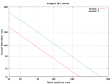
An alternative to the ROC curve is the detection error tradeoff (DET) graph, which plots the false negative rate (missed detections) vs. the false positive rate (false alarms) on non-linearly transformed x- and y-axes. The transformation function is the quantile function of the normal distribution, i.e., the inverse of the cumulative normal distribution. It is, in fact, the same transformation as zROC, below, except that the complement of the hit rate, the miss rate or false negative rate, is used. This alternative spends more graph area on the region of interest. Most of the ROC area is of little interest; one primarily cares about the region tight against the y-axis and the top left corner – which, because of using miss rate instead of its complement, the hit rate, is the lower left corner in a DET plot. Furthermore, DET graphs have the useful property of linearity and a linear threshold behavior for normal distributions.[26] The DET plot is used extensively in the automatic speaker recognition community, where the name DET was first used. The analysis of the ROC performance in graphs with this warping of the axes was used by psychologists in perception studies halfway the 20th century, where this was dubbed "double probability paper".[citation needed]
Z-score
If a standard score is applied to the ROC curve, the curve will be transformed into a straight line.[27] This z-score is based on a normal distribution with a mean of zero and a standard deviation of one. In memory strength theory, one must assume that the zROC is not only linear, but has a slope of 1.0. The normal distributions of targets (studied objects that the subjects need to recall) and lures (non studied objects that the subjects attempt to recall) is the factor causing the zROC to be linear.
The linearity of the zROC curve depends on the standard deviations of the target and lure strength distributions. If the standard deviations are equal, the slope will be 1.0. If the standard deviation of the target strength distribution is larger than the standard deviation of the lure strength distribution, then the slope will be smaller than 1.0. In most studies, it has been found that the zROC curve slopes constantly fall below 1, usually between 0.5 and 0.9.[28] Many experiments yielded a zROC slope of 0.8. A slope of 0.8 implies that the variability of the target strength distribution is 25% larger than the variability of the lure strength distribution.[29]
Another variable used is d' (d prime) (discussed above in "Other measures"), which can easily be expressed in terms of z-values. Although d' is a commonly used parameter, it must be recognized that it is only relevant when strictly adhering to the very strong assumptions of strength theory made above.[30]
The z-score of an ROC curve is always linear, as assumed, except in special situations. The Yonelinas familiarity-recollection model is a two-dimensional account of recognition memory. Instead of the subject simply answering yes or no to a specific input, the subject gives the input a feeling of familiarity, which operates like the original ROC curve. What changes, though, is a parameter for Recollection (R). Recollection is assumed to be all-or-none, and it trumps familiarity. If there were no recollection component, zROC would have a predicted slope of 1. However, when adding the recollection component, the zROC curve will be concave up, with a decreased slope. This difference in shape and slope result from an added element of variability due to some items being recollected. Patients with anterograde amnesia are unable to recollect, so their Yonelinas zROC curve would have a slope close to 1.0.[31]
History
The ROC curve was first used during World War II for the analysis of radar signals before it was employed in signal detection theory.[32] Following the attack on Pearl Harbor in 1941, the United States army began new research to increase the prediction of correctly detected Japanese aircraft from their radar signals.[citation needed]
In the 1950s, ROC curves were employed in psychophysics to assess human (and occasionally non-human animal) detection of weak signals.[32] In medicine, ROC analysis has been extensively used in the evaluation of diagnostic tests.[33][34] ROC curves are also used extensively in epidemiology and medical research and are frequently mentioned in conjunction with evidence-based medicine. In radiology, ROC analysis is a common technique to evaluate new radiology techniques.[35] In the social sciences, ROC analysis is often called the ROC Accuracy Ratio, a common technique for judging the accuracy of default probability models. ROC curves are widely used in laboratory medicine to assess diagnostic accuracy of a test, to choose the optimal cut-off of a test and to compare diagnostic accuracy of several tests.
ROC curves also proved useful for the evaluation of machine learning techniques. The first application of ROC in machine learning was by Spackman who demonstrated the value of ROC curves in comparing and evaluating different classification algorithms.[36]
ROC curves beyond binary classification
The extension of ROC curves for classification problems with more than two classes has always been cumbersome, as the degrees of freedom increase quadratically with the number of classes, and the ROC space has c ( c − 1 ) {\displaystyle c(c-1)} 

Given the success of ROC curves for the assessment of classification models, the extension of ROC curves for other supervised tasks has also been investigated. Notable proposals for regression problems are the so-called regression error characteristic (REC) Curves [41] and the Regression ROC (RROC) curves.[42] In the latter, RROC curves become extremely similar to ROC curves for classification, with the notions of asymmetry, dominance and convex hull. Also, the area under RROC curves is proportional to the error variance of the regression model.
https://www.ncbi.nlm.nih.gov/books/NBK22319/
ROC analysis provides a systematic tool for quantifying the impact of variability among individuals' decision thresholds. The term receiver operating characteristic (ROC) originates from the use of radar during World War II. Just as American soldiers deciphered a blip on the radar screen as a German bomber, a friendly plane, or just noise, radiologists face the task of identifying abnormal tissue against a complicated background. As radar technology advanced during the war, the need for a standard system to evaluate detection accuracy became apparent. ROC analysis was developed as a standard methodology to quantify a signal receiver's ability to correctly distinguish objects of interest from the background noise in the system.
For instance, each radiologist has his or her own visual clues guiding them to a clinical decision as whether the pattern variation of a mammogram indicates tissue abnormalities or just normal variation. The varying decisions make up a range of decision thresholds.
SENSITIVITY AND SPECIFICITY DEPEND ON INDIVIDUAL READER'S DECISION THRESHOLDS
Sensitivity and specificity are the most commonly used measures of detection accuracy. Both depend upon the decision threshold used by individual readers, and thus vary with each reader's determination of what to call a positive test and what to call a negative test. Measures of sensitivity and specificity alone are insufficient to determine the true performance of a diagnostic technology in clinical practice.
For example, cases are classified as normal or abnormal according to a specific reader's interpretation bias. As the decision point for identifying an abnormal result is shifted to the left or right, the proportions of true positives and true negatives change. Thus, the relationship reveals the tradeoff between sensitivity and specificity. For instance, using an enriched set of data with 100 exams that includes 10 true cancers, if a reader correctly identifies 8 cancers while missing 2 cancers (a sensitivity rating of 0.8 or 80 percent) of the 90 true negatives, the reader only correctly identified only 72 as normal (a specificity of 0.8 or 80 percent). However, a reader with more stringent criteria for an abnormal test may have a higher false-negative rate, increasing the number of missed cancers and decreasing the number of false alarms. For example, using the same distribution of 100 cases, the reader would correctly identify 6 cancers (a sensitivity of 0.7 or 70 percent). However, the reader would now correctly identify 85 true negatives as normal (a specificity of 0.94 or 94 percent). The opposite effect could also be obtained for a reader with less stringent criteria. Such a reader would have a higher false-positive rate but would find more cancers. Therefore, this example shows that these measures that depend on the true-positive rate and true-negative rate respectively are reader specific. In the case of interpreting mammograms, different radiologists with different decision thresholds can affect the clinical outcome in the assessment of non-obvious mammograms.
ROC CURVES ARE NECESSARY TO CHARACTERIZE DIAGNOSTIC PERFORMANCE
The ROC curve maps the effects of varying decision thresholds, accounting for all possible combinations of various correct and incorrect decisions.4 A ROC curve is a graph of the relationship between the true-positive rate (sensitivity) and the false-positive rate (1-specificity) (see Figure C-1). For example, a ROC curve for mammography would plot the fraction of confirmed breast cancer cases (true positives) that were detected against the fraction of false alarms (false positives). Each point on the curve might represent another test, for instance each point would be the result of a different radiologist reading the same set of 20 mammograms. Alternatively, each point might represent the results of the same radiologist reading a different set of 20 mammograms.
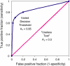
FIGURE C-1
Receiver operating characteristic (ROC) graph of a varying decision threshold compared with a “useless test.” The three decision thresholds discussed in the previous section are represented on this graph. The best-fit curve drawn through (more...)
The ROC curve describes the overall performance of the diagnostic modality across varying conditions. Sources of variation for these conditions can include different radiologist's decision thresholds, different amounts of time between interpreting mammograms, or variation within cases due to the inherent imprecision of breast compression. ROC analysis allows one to average the effect of different conditions on accuracy. Therefore, the area under the ROC curve can be viewed as the diagnostic accuracy of the technology.
There is often ambiguity in comparing diagnostic modalities when one has only a single sensitivity-specificity pair measure on one modality and a single sensitivity-specificity pair measured on a competing modality.5
Since there is no unique decision threshold used by radiologists, there is no reason to single out specificity and sensitivity values. Radiologists adjust their decision thresholds as a function of context and available information, such as whether a patient is known to be at high risk for breast cancer, the presence of signs or symptoms, or the likelihood of being sued for a missed cancer.
There are many situations in which relying on single estimates of specificity and sensitivity would distort the ranking of competing systems. Different sensitivity-specificity pairs on the ROC curve can arise from many ambiguities beyond variability among radiologists, such as patient variation, use of different machines, and different image processing software.
The ROC approach can be used to accurately compare breast cancer diagnostic tests. The ROC plot provides a visual representation of the accuracy of a detection test, incorporating not only the intrinsic features of the test, but also reader variability.
Figure C-2 shows an example of how ROC curves were used to analyze the value of a computer-assisted detection (CAD) system.3 The curves represent the accuracy, in terms of sensitivity and specificity, of a modality across the varying conditions of the study. At a true-positive fraction of 80 percent, radiologists who used CAD outperformed those who did not use CAD in terms of sensitivity and specificity. Nevertheless, data based on a single decision threshold are insufficient to rank competing systems, because they fail to account for the various decision thresholds that will be applied using the modality. The area under the ROC curve is the best way to rank competing systems, because it integrates the essential measures of sensitivity, specificity, and decision threshold. Figures C-3 and C-4 demonstrate the ability of ROC curves to differentiate the benefits and limitations of two tests over a range of conditions that may occur in clinical practice. The greater area under the ROC curve in the example indicates that computer-assisted mammography increases a radiologist's ability to correctly identify neoplastic breast tissue, as well as to avoid false alarms.
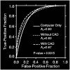
FIGURE C-2
Example of ROC curve analysis for computer-assisted detection. A comparison of the ROC curves for computer only, without CAD, and with CAD, show the value of ROC curves in evaluating diagnostic technologies. The area under the curves, corresponding to (more...)
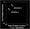
FIGURE C-3
Comparison of two diagnostic modalities without ROC curves. Without the help of ROC curves it is difficult to reach a conclusion as to which modality is more accurate. SOURCE: Adapted from Metz C. Methodologic Issues. Fourth National Forum on Biomedical (more...)
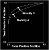
FIGURE C-4
Comparison of two diagnostic modalities utilizing ROC curves. After drawing ROC curves it is easy to see that modality B is better. Modality B achieves a higher true-positive fraction at the same false-positive fraction as modality A. Modality B also (more...)
MULTIPLE-READER MULTIPLE-CASE ROC
The findings of clinical studies are insignificant unless the results can be applied to some sort of clinical use. Therefore, in the case of breast cancer diagnostic modalities, the reader in the study must represent all radiologists and the case set must also closely resemble all mammograms that can be generated in the clinic. It may be impossible to exactly replicate the full variability of mammography findings in clinics nationwide. However, clinical studies that incorporate more case variation to measure the diagnostic accuracy of a modality will have significantly more clinical value than studies based on little case variation.
Variability in cancer detection tests has two main components, reader variability and case-sample variability. The first was described in the discussion of ROC analysis. The latter results from subtle differences in mammograms that, when spanning the continuum from definitely revealing cancer to definitely not revealing cancer, may influence a reader's decision. Methodological solutions to account for these sources of variability can maximize the amount of information that can be gathered from data sets.
The combination of ROC analysis and a study design with multiple readers and multiple cases provides a possible solution to the components of variance. In multiple-reader multiple-case (MRMC) ROC analysis, all readers interpret every mammogram in the case set. The readers in a study represent the diverse readership that might use a specific technology. The representative case-set population allows one to generalize the findings to the diverse breast cancer cases that may appear in nationwide clinics. This allows for significant findings to be generalized to widespread clinical practice.
The MRMC study design has several advantages over the collection of single-reader ROC analyses because MRMC analysis provides a quantitative measure of the performance of a diagnostic test across a population of readers with varying degrees of skill. Even though having more than one reader increases variability in the measurement, MRMC studies can be designed so that the statistical power of differences between competing modalities will be greater than if only one reader's interpretation is used.1 When using MRMC methodology, statistical models can be used to account for both case variability and reader variability. The results of a study in which readers interpret different mammogram case sets cannot account for case-sample variation. Therefore, single-reader studies can only be generalized to the cases that each reader interpreted. Conversely, the results of an MRMC study can be generalized to all radiologists as well as all mammograms.6
The practical result of MRMC methodology is saving time and money. The concept of design of pivotal studies using results from pilot MRMC studies offers an opportunity for the development of imaging technology assessment with some degree of coherence and continuity. MRMC studies during the research phase of imaging system development can provide the information to design and size studies for the demonstration of safety and effectiveness required for Food and Drug Administration (FDA) approval.6 MRMC methods yield more information per case, which translates into smaller sample sizes for trials. Reducing the size of trials makes it easier to recruit patients. Smaller trials also require less money. This procedure can also be used to help design clinical trials by estimating the size of future studies. For instance, the FDA approval of the first digital mammography technology was based on only 44 breast cancers across 5 readers in a pilot study using the MRMC paradigm. The results of this study can be generalized to a pivotal trial of 200 cancers and 6 readers, or 78 cancers with 100 readers.7 According to the 2001 FDA guidance on digital mammography systems, ROC estimates that take into account uncertainties are an essential part of a clinical study. The FDA also presents several methodologies that have been used in the past to measure uncertainties in ROC estimates; however, it is noted that MRMC methodology is the only approach that accounts for reader and case variability.2 As a result, through November 2002, all successful submissions to the FDA of a system for digital mammography utilized the MRMC ROC paradigm.
REFERENCES
- 1.
-
Beiden SV, Wagner RF, Doi K, Nishikawa RM, Freedman M, Lo SC, Xu XW. Independent versus sequential reading in ROC studies of computer-assist modalities: analysis of components of variance. Acad Radiol. 2002;9(9):1036–1043. [PubMed]
- 2.
-
Center for Devices and Radiological Health. Washington, DC: Food and Drug Administration; 2001. Premarket Applications for Digital Mammography Systems; Final Guidance for Industry and FDA.
- 3.
-
Giger M. Workshop on New Technologies for the Early Detection and Diagnosis of Breast Cancer. Washington, DC: Institute of Medicine of the National Academies; 2003. Computer Assisted Diagnosis.
- 4.
-
Metz CE. Basic principles of ROC analysis. Semin Nucl Med. 1978;8(4):283–298. [PubMed]
- 5.
-
Wagner RF, Beiden SV. Independent versus sequential reading in ROC studies of computer-assist modalities: analysis of components of variance. Acad Radiol. 2003;10(2):211–212. author reply 212. [PubMed]
- 6.
-
Wagner RF, Beiden SV, Campbell G, Metz CE, Sacks WM. Assessment of medical imaging and computer-assist systems: lessons from recent experience. Acad Radiol. 2002;9(11):1264–1277. [PubMed]
- 7.
-
Wagner R. Fourth National Forum on Biomedical Imaging in Oncology. Bethesda, MD: National Cancer Institute; 2003. CDRH Research Perspectives.
ROC Curves in Python and R
Ever heard people at your office talking about AUC, ROC, or TPR but been too shy to ask what the heck they're talking about? Well lucky for you we're going to be diving into the wonderful world of binary classification evaluation today. In particular, we'll be discussing ROC curves.
ROC curves are a great technique that have been around for a while and is still one of the tried and true industry standards. So sit back, relax, and get ready to dive into a world of 3 letter acronyms!
What is it?
Receiving Operating Characteristic, or ROC, is a visual way for inspecting the performance of a binary classifier (0/1). In particular, it's comparing the rate at which your classifier is making correct predictions (True Positives or TP) and the rate at which your classifier is making false alarms (False Positives or FP). When talking about True Positive Rate (TPR) or False Positive Rate (FPR) we're referring to the definitions below:
You might have heard of True Positives and True Negatives referred to as Sensitivity and Specificity. No matter what you call it, the big point here is we're measuring the trade off between the rate at which you can correctly predict something, with the rate at which you make an embarrassing blunder and predict something that doesn't happen.
Don't let your classifier embarrass you.
A brief history primer
ROC curves were first used during WWII to analyze radar effectiveness. In the early days of radar, it was sometimes hard to tell a bird from a plane. The British pioneered using ROC curves to optimize the way that they relied on radar for detecting incoming German planes.

ROC curves: the basics
Sound confusing? Let's go over a few simple rules for reading an ROC curve. To do this, I'm going to present some "pre-canned" charts that will show extreme situations that should make it easier to understand what other ROC curves are "saying".
Guessing
The first example is the simplest: a diagonal line. A diagonal line indicates that the classifier is just making completely random guesses. Since your classifier is only going to be correct 50% of the time, it stands to reason that your TPR and FPR will also be equal.

Often times, ROC charts will include the random ROC curve to provide the user with a benchmark for what a naive classifier would do. Any curves above the line are better than guessing, while those below the line...well you're better off guessing.
A Perfect Classifier
We know what a totally random classifier looks like, but what about a PERFECT classifier--i.e. something that makes every prediction correctly. Well if you're lucky enough to have a perfect classifier, then you'll also have a perfect trade-off between TPR and FPR (meaning you'll have a TPR of 1 and an FPR of 0). In that case, your ROC curve looks something like this.

Worse than guessing
So we know what a random classifier looks like and what a perfect classifier looks like, but what about a bad classifier? A bad classifier (i.e. something that's worse than guessing) will appear below the random line. This, my friend, is absolute garbage. Throw it away...now!

Better than guessing
A much more interesting activity is attempting to decipher the difference between an "OK" and a "Good" classifier. The chart below shows an example of a very mediocre classifier. Context is everything of course, but there's not much lift here. In addition, be very wary of lines that dip or are very geometric looking. I've found that in practice, this can mean that there's an irregularity with your data, or you're making a very bad assumption in your model.

Pretty good
Ahh this is looking a little better. Below you can see a nice "hump shaped" (it's a technical term) curve that's continually increasing. It sort of looks like it's being yanked up into that top left (the perfect) spot of the chart.

Area under the curve (AUC)
So it turns out that the "hump shaped-ness" actually has a name: AUC or Area Under the Curve. One can't really give an overview of ROC curves without mentioning AUC. The good news is it's exactly what it sounds like--the amount of space underneath the ROC curve. You can think of the AUC as sort of a holistic number that represents how well your TPR and FPR is looking in aggregate.
To make it super simple:
- AUC=0 -> BAD
- AUC=1 -> GOOD
So in the context of an ROC curve, the more "up and left" it looks, the larger the AUC will be and thus, the better your classifier is. Comparing AUC values is also really useful when comparing different models, as we can select the model with the high AUC value, rather than just look at the curves.

Calculating an ROC Curve in Python
scikit-learn makes it super easy to calculate ROC Curves. But first things first: to make an ROC curve, we first need a classification model to evaluate. For this example, I'm going to make a synthetic dataset and then build a logistic regression model using scikit-learn.
fromsklearn.datasets importmake_classification fromsklearn.linear_model importLogisticRegressionX,y =make_classification(n_samples=10000,n_features=10,n_classes=2,n_informative=5)Xtrain=X[:9000]Xtest=X[9000:]ytrain =y[:9000]ytest =y[9000:]clf =LogisticRegression()clf.fit(Xtrain,ytrain)Ok, now that we have our model we can calculate the ROC curve. Pretty easy--from scikit-learn import roc_curve, pass in the actual y values from our test set and the predicted probabilities for those same records.
The results will yield your FPR and TPR. Pass those into a ggplot and BAM! You've got yourself a nice looking ROC curve.
fromsklearn importmetrics
importpandas aspd fromggplot import*preds =clf.predict_proba(Xtest)[:,1]fpr,tpr,_ =metrics.roc_curve(ytest,preds)df =pd.DataFrame(dict(fpr=fpr,tpr=tpr))ggplot(df,aes(x='fpr',y='tpr'))+\ geom_line()+\ geom_abline(linetype='dashed')
Finally to calculate the AUC:
auc =metrics.auc(fpr,tpr)ggplot(df,aes(x='fpr',ymin=0,ymax='tpr'))+\ geom_area(alpha=0.2)+\ geom_line(aes(y='tpr'))+\ ggtitle("ROC Curve w/ AUC=%s"%str(auc)) We get 0.900. Recalling from earlier, AUC is bounded between 0 and 1, so this is pretty good.
Calculating an ROC Curve in R
Making ROC curves in R is easy as well. I highly recommend using the ROCR package. It does all of the hard work for you and makes some pretty nice looking charts.
For the model, we're going to build a classifier that uses a logistic regression model to predict if a record from the diamonds dataset is over $2400.
library(ggplot2)diamonds$is_expensive <-diamonds$price >2400is_test <-runif(nrow(diamonds))>0.75train <-diamonds[is_test==FALSE,]test <-diamonds[is_test==TRUE,]summary(fit <-glm(is_expensive ~carat +cut +clarity,data=train))Using ROCR, making the charts is relatively simple.
library(ROCR)prob <-predict(fit,newdata=test,type="response")pred <-prediction(prob,test$is_expensive)perf <-performance(pred,measure ="tpr",x.measure ="fpr")# I know, the following code is bizarre. Just go with it.auc <-performance(pred,measure ="auc")auc <-auc@y.values[[1]]roc.data <-data.frame(fpr=unlist(perf@x.values),tpr=unlist(perf@y.values),model="GLM")ggplot(roc.data,aes(x=fpr,ymin=0,ymax=tpr))+geom_ribbon(alpha=0.2)+geom_line(aes(y=tpr))+ggtitle(paste0("ROC Curve w/ AUC=",auc))
Closing Thoughts
Well that about does it for ROC curves. For more reading material, check out these resources below:
- UGA: Receiver Operating Characteristic Curves
- Intro to ROC Curves
- The Area Under an ROC Curve
- ROC curves and Area Under the Curve explained (video)
准确率、覆盖率(召回)、命中率、Specificity(负例的覆盖率)
1、准确率、覆盖率(召回)、命中率、Specificity(负例的覆盖率)
先看一个混淆矩阵:
| 实际\预测 | 1 | 0 | |
|---|---|---|---|
| 1(正例) |
a |
b(弃真) |
a+b |
| 0(负例) | c(取伪) | d | c+d |
| a+c | b+d | a+b+c+d |
准确率=正确预测的正反例数/总数 = (a+d) / a+b+c+d
覆盖率(召回) = 正确预测到的正例数/实际正例总数 = a / (a+b)
命中率 = 正确预测到的正例数/预测正例总数 = a / (a + c)
负例的覆盖率=正确预测到的负例个数/实际负例总数 = d / (c+d)
2、ROC(Receiver Operating Characteristic) 、AUC(Area Under the ROC Curve)
上述的评估标准(准确率、召回率)也有局限之处:
举个例子:测试样本中有A类样本90个,B 类样本10个。分类器C1把所有的测试样本都分成了A类,分类器C2把A类的90个样本分对了70个,B类的10个样本分对了5个。则C1的分类精度为 90%,C2的分类精度为75%。但是,显然C2更有用些。
为了解决上述问题,人们从医疗分析领域引入了一种新的分类模型performance评判方法——ROC分析。
概念:
召回率TPR(True Positive Rate) =TP/(TP+FN) = a / (a+b)
取伪率FPR(False Positive Rate) = FP/(FP+TN) = c / (c+d)
ROC空间将取伪率(FPR)定义为 X 轴,召回率(TPR)定义为 Y 轴。
ROC理解:
不难发现,这两个指标之间是相互制约的。如果某个医生对于有病的症状比较敏感,稍微的小症状都判断为有病,那么他的第一个指标应该会很高,但是第二个指标也就相应地变高。最极端的情况下,他把所有的样本都看做有病,那么第一个指标达到1,第二个指标也为1。

我们可以看出,左上角的点(TPR=1,FPR=0),为完美分类,也就是这个医生医术高明,诊断全对。
点A(TPR>FPR),医生A的判断大体是正确的。中线上的点B(TPR=FPR),也就是医生B全都是蒙的,蒙对一半,蒙错一半;下半平面的点C(TPR<FPR),这个医生说你有病,那么你很可能没有病,医生C的话我们要反着听,为真庸医。
上图中每个阈值,会得到一个点。现在我们需要一个独立于阈值的评价指标来衡量这个医生的医术如何,也就是遍历所有的阈值,得到ROC曲线。

曲线距离左上角越近,证明分类器效果越好。
AUC理解:
虽然,用ROC curve来表示分类器的performance很直观好用。可是,人们总是希望能有一个数值来标志分类器的好坏。于是Area Under roc Curve(AUC)就出现了。
顾名思义,AUC的值就是处于ROC curve下方的那部分面积的大小。通常,AUC的值介于0.5到1.0之间,较大的AUC代表了较好的performance。
AUC的物理意义
假设分类器的输出是样本属于正类的socre(置信度),则AUC的物理意义为,任取一对(正、负)样本,正样本的score大于负样本的score的概率。
计算AUC:
第一种方法:AUC为ROC曲线下的面积,那我们直接计算面积可得。面积为一个个小的梯形面积之和。计算的精度与阈值的精度有关。
第二种方法:根据AUC的物理意义,我们计算正样本score大于负样本的score的概率。取N*M(M为正样本数,N为负样本数)个二元组,比较score,最后得到AUC。时间复杂度为O(N*M)。
第三种方法:与第二种方法相似,直接计算正样本score大于负样本的概率。我们首先把所有样本按照score排序,依次用rank表示他们,如最大score的样本,rank=n(n=N+M),其次为n-1。那么对于正样本中rank最大的样本,rank_max,有M-1个其他正样本比他score小,那么就有(rank_max-1)-(M-1)个负样本比他score小。其次为(rank_second-1)-(M-2)。最后我们得到正样本大于负样本的概率为
![]()
时间复杂度为O(N+M)。
对于第三种方法,这里给出例子:

对于训练集的分类,训练方法1和训练方法2分类正确率都为80%,但明显可以感觉到训练方法1要比训练方法2好。因为训练方法1中,5和6两数据分类错误,但这两个数据位于分类面附近,而训练方法2中,将10和1两个数据分类错误,但这两个数据均离分类面较远。
AUC正是衡量分类正确度的方法,将训练集中的label看两类{0,1}的分类问题,分类目标是将预测结果尽量将两者分开。将每个0和1看成一个pair关系,团中的训练集共有5*5=25个pair关系。
分别对于每个训练结果,按照第二列降序排列:
在训练方法1中,与10相关的pair关系完全正确(负样本的score都低于10的score),同样9、8、7的pair关系也完全正确,但对于6,其pair关系(6,5)关系错误,而与4、3、2、1的关系正确,故其auc为(25-1)/25=0.96;
对于训练方法2,其6、7、8、9的pair关系,均有一个错误,即(6,1)、(7,1)、(8,1)、(9,1),对于数据点10,其正任何数据点的pair关系,都错误,即(10,1)、(10,2)、(10,3)、(10,4)、(10,5),故方法2的auc为(25-4-5)/25=0.64,因而正如直观所见,分类方法1要优于分类方法2。
3、Lift
首先,给出以下名词解释:
- 正例的比例Pi1 = (a+b) / (a+b+c+d) ;
- 预测成正例的比例 Depth = (a+c) / (a+b+c+d) ;
- 正确预测到的正例数占预测正例总数的比例 PV_plus = a / (a+c) ;
- 提升值 Lift = (a / (a+c) ) / ((a+b) / (a+b+c+d)) = PV_plus / Pi1
Lift衡量的是,与不利用模型相比,模型的预测能力“变好”了多少。不利用模型,我们只能利用“正例的比例是 (a+b) / (a+b+c+d) ”这个样本信息来估计正例的比例(baseline model),而利用模型之后,我们不需要从整个样本中来挑选正例,只需要从我们预测为正例的那个样本的子集(a+c)中挑选正例,这时预测的准确率为a / (a+c)。
显然,lift(提升指数)越大,模型的运行效果越好。如果a / (a+c)就等于(a+b) / (a+b+c+d)(lift等于1),这个模型就没有任何“提升”了(套一句金融市场的话,它的业绩没有跑过市场)。
threshold 阈值
In signal detection theory, a receiver operating characteristic (ROC), or simply ROC curve, is a graphical plot which illustrates the performance of a binary classifier system as its discrimination threshold is varied.
问题在于“as its discrimination threashold is varied”。如何理解这里的“discrimination threashold”呢?我们忽略了分类器的一个重要功能“概率输出”,即表示分类器认为某个样本具有多大的概率属于正样本(或负样本)。通过更深入地了解各个分类器的内部机理,我们总能想办法得到一种概率输出。通常来说,是将一个实数范围通过某个变换映射到(0,1)区间3。
假如我们已经得到了所有样本的概率输出(属于正样本的概率),现在的问题是如何改变“discrimination threashold”?我们根据每个测试样本属于正样本的概率值从大到小排序。下图是一个示例,图中共有20个测试样本,“Class”一栏表示每个测试样本真正的标签(p表示正样本,n表示负样本),“Score”表示每个测试样本属于正样本的概率4。

接下来,我们从高到低,依次将“Score”值作为阈值threshold,当测试样本属于正样本的概率大于或等于这个threshold时,我们认为它为正样本,否则为负样本。举例来说,对于图中的第4个样本,其“Score”值为0.6,那么样本1,2,3,4都被认为是正样本,因为它们的“Score”值都大于等于0.6,而其他样本则都认为是负样本。每次选取一个不同的threshold,我们就可以得到一组FPR和TPR,即ROC曲线上的一点。这样一来,我们一共得到了20组FPR和TPR的值,将它们画在ROC曲线的结果如下图:

当我们将threshold设置为1和0时,分别可以得到ROC曲线上的(0,0)和(1,1)两个点。将这些(FPR,TPR)对连接起来,就得到了ROC曲线。当threshold取值越多,ROC曲线越平滑。
其实,我们并不一定要得到每个测试样本是正样本的概率值,只要得到这个分类器对该测试样本的“评分值”即可(评分值并不一定在(0,1)区间)。评分越高,表示分类器越肯定地认为这个测试样本是正样本,而且同时使用各个评分值作为threshold。我认为将评分值转化为概率更易于理解一些。
样本阴性和阳性比例相差太大时,不适合看ROC
既然已经这么多评价标准,为什么还要使用ROC和AUC呢?因为ROC曲线有个很好的特性:当测试集中的正负样本的分布变化的时候,ROC曲线能够保持不变。在实际的数据集中经常会出现类不平衡(class imbalance)现象,即负样本比正样本多很多(或者相反),而且测试数据中的正负样本的分布也可能随着时间变化。下图是ROC曲线和Precision-Recall曲线5的对比:

在上图中,(a)和(c)为ROC曲线,(b)和(d)为Precision-Recall曲线。(a)和(b)展示的是分类其在原始测试集(正负样本分布平衡)的结果,(c)和(d)是将测试集中负样本的数量增加到原来的10倍后,分类器的结果。可以明显的看出,ROC曲线基本保持原貌,而Precision-Recall曲线则变化较大。
Reference:
- 分类模型的性能评估——以SAS Logistic回归为例(2): ROC和AUC
- AUC(Area Under roc Curve )计算及其与ROC的关系
- ROC曲线与AUC
- 逻辑回归模型(Logistic Regression, LR)基础
python风控评分卡建模和风控常识
https://study.163.com/course/introduction.htm?courseId=1005214003&utm_campaign=commission&utm_source=cp-400000000398149&utm_medium=share
![]()
转载于:https://www.cnblogs.com/webRobot/p/6803747.html
ROC 曲线/准确率、覆盖率(召回)、命中率、Specificity(负例的覆盖率)相关推荐
- 分类器MNIST交叉验证准确率、混淆矩阵、精度和召回率(PR曲线)、ROC曲线、多类别分类器、多标签分类、多输出分类
本博客是在Jupyter Notebook下进行的编译. 目录 MNIST 训练一个二分类器 使用交叉验证测量精度 混淆矩阵 精度和召回率 精度/召回率权衡 ROC曲线 多类别分类器 错误分析 多标签 ...
- 机器学习算法评价指标 recall(召回率)、precision(精度)、F-measure(F值)、ROC曲线、RP曲线
机器学习中算法评价指标总结 recall(召回率).precision(精度).F-measure.ROC曲线.RP曲线 在机器学习.数据挖掘.推荐系统完成建模之后,需要对模型的效果做评价. 业内目前 ...
- 【机器学习入门】(13) 实战:心脏病预测,补充: ROC曲线、精确率--召回率曲线,附python完整代码和数据集
各位同学好,经过前几章python机器学习的探索,想必大家对各种预测方法也有了一定的认识.今天我们来进行一次实战,心脏病病例预测,本文对一些基础方法就不进行详细解释,有疑问的同学可以看我前几篇机器学习 ...
- 【深度学习笔记】ROC曲线 vs Precision-Recall曲线
ROC曲线的优势 ROC曲线有个很好的特性:当测试集中的正负样本的分布变化的时候,ROC曲线能够保持稳定.在实际的数据集中经常会出现类不平衡现象,而且测试数据中的正负样本的分布也可能随着时间变化.下图 ...
- 混淆矩阵、准确率、召回率、ROC曲线、AUC
混淆矩阵.准确率.召回率.ROC曲线.AUC 假设有一个用来对猫(cats).狗(dogs).兔子(rabbits)进行分类的系统,混淆矩阵就是为了进一步分析性能而对该算法测试结果做出的总结.假设总共 ...
- 机器学习的评价指标:准确率(Precision)、召回率(Recall)、F值(F-Measure)、ROC曲线等
在介绍指标前必须先了解"混淆矩阵": 混淆矩阵 True Positive(真正,TP):将正类预测为正类数 True Negative(真负,TN):将负类预测为负类数 Fals ...
- 机器学习的模型评价指标:准确率(Precision)、召回率(Recall)、F值(F-Measure)、ROC曲线等
用手写数字识别来作为说明. 准确率: 所有识别为"1"的数据中,正确的比率是多少. 如识别出来100个结果是"1", 而只有90个结果正确,有10个实现是非& ...
- auc计算公式_图解机器学习的准确率、精准率、召回率、F1、ROC曲线、AUC曲线
机器学习模型需要有量化的评估指标来评估哪些模型的效果更好. 本文将用通俗易懂的方式讲解分类问题的混淆矩阵和各种评估指标的计算公式.将要给大家介绍的评估指标有:准确率.精准率.召回率.F1.ROC曲线. ...
- 机器学习:准确率(Precision)、召回率(Recall)、F值(F-Measure)、ROC曲线、PR曲线
增注:虽然当时看这篇文章的时候感觉很不错,但是还是写在前面,想要了解关于机器学习度量的几个尺度,建议大家直接看周志华老师的西瓜书的第2章:模型评估与选择,写的是真的很好!! 以下第一部分内容转载自:机 ...
最新文章
- Tech UP——EGO北京分会成立啦
- php service原理,轻松搞懂WebService工作原理
- npm和yarn的区别,我们该如何选择?
- Java_质数_两种解法(时间对比)
- CTreeCtrl展开树形所有节点
- dz手机版空白显示index.php,关于Discuz x3.3页面空白解决方法
- 【写作技巧】中文摘要及关键词的撰写
- 在Ruby on Rails中对nil v。空v。空白的简要解释
- 所有锁的unlock要放到try{}finally{}里,不然发生异常返回就丢了unlock了
- ES6、7学习笔记(尚硅谷)-5-箭头函数
- Linux环境安装之Ant
- JAVA中MD5加密解密(MD5工具类)
- 每天一练:html简单文字排版
- ATSC制数字电视机顶盒研究
- 一道逻辑推理题---猜卡片的颜色和数字
- 关于jupyter的故障重启(学习笔记)
- Duplicate entry ‘XXX‘ for key ‘XXX.PRIMARY‘解决方案。
- 如何将文字转图片?手把手教你转换
- CCF-CSP认证 历届第一题
- STM32+雷龙SD NAND(贴片SD卡)完成FATFS文件系统移植与测试