Unity2017.1官方UGUI文档翻译——Visual Components
Visual Components
With the introduction of the UI system, new Components have been added that will help you create GUI specific functionality. This section will cover the basics of the new Components that can be created.
随着UI系统的介绍,我们将引入新的组件来帮助你创建特定功能的GUI。这一节会包含可以被创建的基础组件
Text
文字
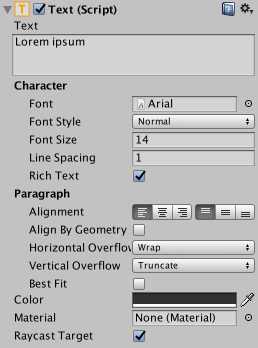
The Text component, which is also known as a Label, has a Text area for entering the text that will be displayed. It is possible to set the font, font style, font size and whether or not the text has rich text capability.
There are options to set the alignment of the text, settings for horizontal and vertical overflow which control what happens if the text is larger than the width or height of the rectangle, and a Best Fit option that makes the text resize to fit the available space.
Text组件,也可以叫做Label,有一个Text区域可以输入用于显示的文字。可以设置字体、字形、字体大小还有是否支持富文本
这里还可以设置字体的对齐,设置水平和垂直方向超过宽高后应该如何处理,BestFit设置可以让文字调整大小适配到可用空间
Image
图像
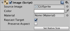
An Image has a Rect Transform component and an Image component. A sprite can be applied to the Image component under the Target Graphic field, and its colour can be set in the Color field. A material can also be applied to the Image component. The Image Type field defines how the applied sprite will appear, the options are:
一个图像有RectTransform组件和Image组件。一个精灵可以被应用到Image组件的 Target Graphic(感觉应该改成SourceImage?)字段,颜色可以在Color字段中设置。材质也可以应用到Image组件。Image Type字段定义了应用的精灵怎么显示,设置如下:
Simple - Scales the whole sprite equally.
- 简单-直接拉伸整个精灵
Sliced - Utilises the 3x3 sprite division so that resizing does not distort corners and only the center part is stretched.
- 切片(九宫格)-拆分成3*3的格子,角落的保持不变,拉伸中间的格子填充满
Tiled - Similar to Sliced, but tiles (repeats) the center part rather than stretching it. For sprites with no borders at all, the entire sprite is tiled.
- 平铺-和切片很像,但是中间的格子重复平铺而不是拉伸,对于没有边框的精灵,整个精灵都被平铺。
Filled - Shows the sprite in the same way as Simple does except that it fills in the sprite from an origin in a defined direction, method and amount.
- 填充-从origin位置到定义的方向、方法、数量的地方,像正常的方式去显示(比loading条,那个条可以显示到定义的百分比,剩余的不显示)
The option to Set Native Size, which is shown when Simple or Filled is selected, resets the image to the original sprite size.
在Simple或者Filed被选中的时候,设置本地大小的设置才会出现,重置图片到原始精灵的大小
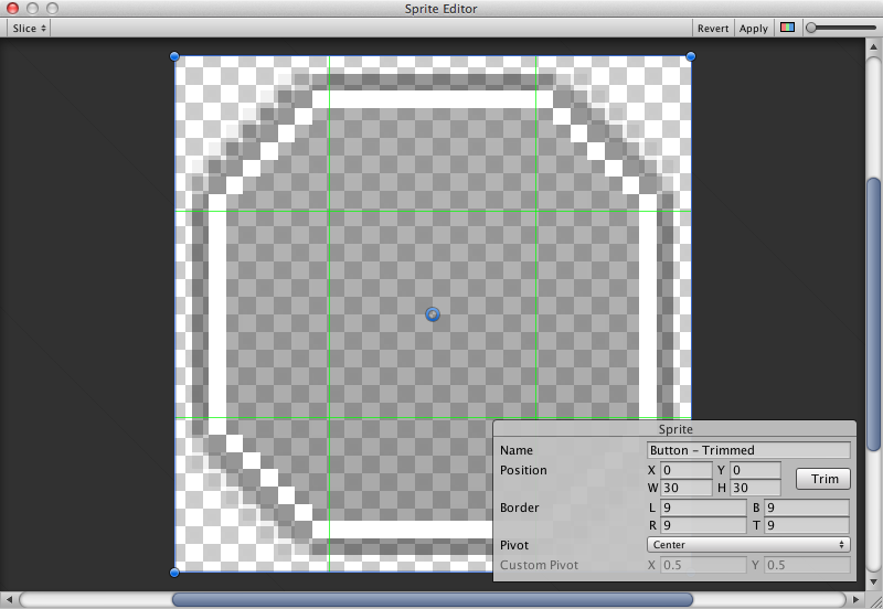
Images can be imported as UI sprites by selecting Sprite( 2D / UI) from the ‘Texture Type’ settings. Sprites have extra import settings compared to the old GUI sprites, the biggest difference is the addition of the sprite editor. The sprite editor provides the option of 9-slicing the image, this splits the image into 9 areas so that if the sprite is resized the corners are not stretched or distorted.
在Texture Type设置中选择Sprite( 2D / UI) 可以把图片导入为UI sprite。相对于以前的GUI sprite,Sprite有额外的导入设置,最大的不同是增加了sprite编辑器。sprite编辑器提供了9宫格的设置,这把图片切分成9块,这意味着如果调整了sprite的大小,边角部分不会被拉伸和扭曲
Raw Image
生图片(原始图片)
The Image component takes a sprite but Raw Image takes a texture (no borders etc). Raw Image should only be used if necessary otherwise Image will be suitable in the majority of cases.
Image组件使用Sprite,然而Raw Image使用Texture(没有边界等)。Raw Image只有在必要的时候采用,不然Image适合使用在大多数情况
Mask
遮罩
A Mask is not a visible UI control but rather a way to modify the appearance of a control’s child elements. The mask restricts (ie, “masks”) the child elements to the shape of the parent. So, if the child is larger than the parent then only the part of the child that fits within the parent will be visible.
Mask不是一个可见的UI但是是一个修改子元素的表现的方法。mask限制了子元素在父元素的形状之内。如果子元素比父元素要大,那么子元素只有在父元素内的部分会显示
Effects
特效
Visual components can also have various simple effects applied, such as a simple drop shadow or outline. See the Effects reference page for more information.
可视组件也可以应用各种各样的简单特效,比如简单阴影和描边。请看特效介绍页面得到更多信息
转载于:https://www.cnblogs.com/SolarWings/p/7775156.html
Unity2017.1官方UGUI文档翻译——Visual Components相关推荐
- Unity2017.1官方UGUI文档翻译——Auto Layout
Auto Layout 自动布局 The Rect Transform layout system is flexible enough to handle a lot of different ty ...
- Unity2017.1官方UGUI文档翻译——Scrollbar
Scrollbar 滚动条 The Scrollbar control allows the user to scroll an image or other view that is too lar ...
- TiDB 官方设计文档翻译(三)
这个系列共三篇译文: TiDB 官方设计文档翻译(一) TiDB 官方设计文档翻译(二) TiDB 官方设计文档翻译(三) 原文: https://pingcap.github.io/blog ...
- TiDB 官方设计文档翻译(二)
这个系列共三篇译文: TiDB 官方设计文档翻译(一) TiDB 官方设计文档翻译(二) TiDB 官方设计文档翻译(三) 原文: https://pingcap.github.io/blog ...
- TiDB 官方设计文档翻译(一)
TiDB是新兴的NEWSQL数据库,由国内的PINGCAP团队研发. 有关于TiDB的架构.部署和运维,官方有中文的文档,链接是: https://github.com/pingcap/docs- ...
- Unity-2017.2官方实例教程Roll-a-ball(一)
声明: 本文系转载,由于Unity版本不同,文中有一些小的改动,原文地址:http://www.jianshu.com/p/6e4b0435e30e Unity-2017.2官方实例教程Roll-a- ...
- 数字类 default 0和 default 0_全方位的数字规划工具Visual Components 4.0 数字化工厂仿真软件...
Visual Components 是全方位的数字规划工具.无论从制程规划.生产到营销都能够整合在同一个平台上作业,有助于内部的技术沟通及外部营销.此外,Visual Components 整合了物流 ...
- Android官方技术文档翻译——Gradle 插件用户指南(5)
昨晚把第五章未译完的几句话攻克了.只是第六章没怎么译,明后天又是周末,假设周一前第六章翻译完的话,周一再发第六章. 本文译自Android官方技术文档<Gradle Plugin User Gu ...
- Visual Components 4.5安装手册
Visual Components 4.5 安装包 链接:https://pan.baidu.com/s/1goAuEVe1yP1H18PkU_dQTw 提取码:tuun --来自百度网盘超级会员 ...
最新文章
- 在CentOS 6.8 x86_64上安装nghttp2最新版及让curl具有http2特性
- 京东王笑松:7FRESH是“无界零售”理论的业务践行
- highCharts使用中问题总结
- 计算机开机时间停在上次关机,怎么在电脑开机的时候查看上次关机前的操作
- 【朋友圈精选】web前端招聘面试的10个小分享
- python海龟交易策略_Python的海龟交易法
- REMIX 本地环境搭建指南
- [转载] Python-类变量,成员变量,静态变量,类方法,静态方法,实例方法,普通函数
- python安装pyaudio_关于python:PyAudio不会安装
- java文件传输实验分析_Java实验报告(实验五)
- vue项目中常用解决跨域的方法
- 数学建模(三)SARS的传播(03年A题)
- Anaconda 换源后失败
- web应用F12查看报错(前后端bug判断、2XX/3XX/4XX/5XX常见状态码解析)
- Python实现手机号自动判断男女性别
- 【现控理论】(一、系统的传递函数矩阵)----学习笔记
- Windows资源管理器占用CPU过高
- CV10 图像模糊(均值、高斯、中值、双边滤波)
- 癌细胞自噬调控肿瘤发生与发展的研究进展(2021年5月)
- [PHP面试题]跳槽面试必背-自己最近5年的整理(二)