如何使用ArcGIS在Power BI中创建地理地图
介绍 (Introduction)
This is the fourth article of a series dedicated to discovering geographic map tools in Power BI.
这是致力于在Power BI中发现地理地图工具的系列文章的第四篇。
In the ToC below the article you can find out references to the previous article and the project’s goal.
在文章下面的目录中,您可以找到对上一篇文章和项目目标的引用。
So, this time I want to introduce another visual that goes beyond the simple concept of mapping as it provides tools and features for spatial analysis: ArcGIS.
因此,这一次,我想介绍另一种超越简单映射概念的视觉效果,因为它提供了用于空间分析的工具和功能: ArcGIS 。
什么是GIS? (What is a GIS?)
A GIS (Geographical Information System) is a computer-based tool that analyzes, stores, manipulates and visualizes geographic information on a map. GIS main purpose is to show correlation among spatial data, analyze spatial information, query geographic data and show the results in form of reports, maps, tables or any other output is suitable for you.
GIS(地理信息系统)是一种基于计算机的工具,可以分析,存储,操纵和可视化地图上的地理信息。 GIS的主要目的是显示空间数据之间的相关性,分析空间信息,查询地理数据并以报告,地图,表格或任何其他适合您的输出形式显示结果。
GIS analysis can be used in various fields of activity as it is powerful and flexible enough to address many needs in different disciplines. Just to mention few examples: business, public and private transport, education, natural hazards assessment, public health, resources optimization…
GIS分析功能强大且足够灵活,可以满足不同学科的许多需求,因此可以用于各种活动领域。 仅举几个例子:商业,公共和私人交通,教育,自然灾害评估,公共卫生,资源优化……
用于Power BI的ArcGIS Maps (ArcGIS Maps for Power BI)
ArcGIS is the software developed by Esri (Environmental System Research Institute), for creating and using maps, performing spatial analysis, sharing and discovering geographic information.
ArcGIS是由Esri (环境系统研究所)开发的软件,用于创建和使用地图,执行空间分析,共享和发现地理信息。
Since September 2016 the Power BI team in cooperation with Esri released a visual that allows using ArcGIS Maps in Power BI.
自2016年9月以来,Power BI团队与Esri合作发布了可在Power BI中使用ArcGIS Maps的图像 。
Recently the visual came into General Availablity, so it can also be used in PowerBI Service (www.powerbi.com).
最近,该图像已进入通用范围 ,因此也可以在PowerBI Service(www.powerbi.com)中使用。
The visual includes a set of map tools that let you use powerful spatial capabilities going beyond the simple representation. For instance, you can change the map theme, make area-based selections, add layers with demographic data, etc. Going forward in the explanation, you’ll got the right feeling on how you can “Take Your Map Visualizations to the Next Level”.
视觉效果包括一组地图工具,可让您使用除简单表示之外的强大空间功能。 例如,您可以更改地图主题,进行基于区域的选择,添加包含人口统计数据的图层等。在进行解释时,您将对如何“将地图可视化效果提升到一个新水平 ”有正确的感觉。 ”。
To start with demo, as usual we need some data. Download the same .csv dataset with 50 world’s busiest airports we used in the first article. You can find at the end of the article.
要开始演示,像往常一样,我们需要一些数据。 下载与我们在第一篇文章中使用的50个世界上最繁忙的机场相同的.csv数据集。 您可以在文章末尾找到。
Once downloaded, start Power BI open a new report and click Get Data > Text/CSV. Select the location for the dataset and then in the dialog click Load to import it. For this dataset we need to perform the same transformation as in the first article How to create geographic maps using Power BI – Filled and bubble maps. ArcGIS is capable of geocode many kinds of geographic attributes such as addresses, cities, postal codes, etc. but it’s preferable to retrieve coordinates when available, for having a perfect matching with locations.
下载后,启动Power BI打开一个新报告,然后单击获取数据 > 文本/ CSV 。 选择数据集的位置,然后在对话框中单击“ 加载”以将其导入。 对于此数据集,我们需要执行与第一篇文章如何使用Power BI-填充地图和气泡地图创建地理地图相同的转换。 ArcGIS可以对多种地理属性(例如地址,城市,邮政编码等)进行地理编码,但最好在可用时检索坐标,以与位置完美匹配。
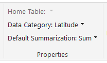
Select the field Latitude then in the menu bar click Modeling > Data Category > Latitude
选择字段纬度,然后在菜单栏中单击建模>数据类别>纬度
Repeat the same steps for the field Longitude.
对“ 经度 ”字段重复相同的步骤。
Notice the globe sign beside the fields’ name.
注意字段名称旁边的地球符号。
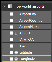
It means that Power BI marked the two fields as containing geographic coordinates.
这意味着Power BI将这两个字段标记为包含地理坐标。
The second group of data is the “List of busiest airport by passenger traffic” from Wikipedia, we already used in the first article. You can either refer to the article for data handling or download the ready-made dataset “passengers traffic statistics 2016.csv” at the end of the article.
第二组数据是Wikipedia中的“按客运量列出最繁忙的机场列表”,我们已经在第一篇文章中使用过。 您可以参考本文进行数据处理,也可以在文章末尾下载现成的数据集“ 旅客交通统计数据2016.csv ”。
Once downloaded and imported the dataset, one step more is needed in order to have some data to display.
一旦下载并导入了数据集,则需要多一步才能显示一些数据。
Switch from report view to Relationship
从报告视图切换到关系
Power BI tries to establish a connection between the two datasets and suggests the ICAO code as common key.
Power BI尝试在两个数据集之间建立连接,并建议将ICAO代码作为通用密钥。
This could work for us, although I prefer the standard three-letters IATA code. So double click on the connection’s yellow line and in the Edit Relationship dialog select the IATA field from both datasets, then click OK. Don’t forget to save your file and get back to the report page.
尽管我更喜欢标准的三字母IATA代码,但这可能对我们有用。 因此,双击连接的黄线,然后在“ 编辑关系”对话框中,从两个数据集中选择IATA字段,然后单击“确定”。 不要忘记保存文件并返回报告页面。
Now that we have some data, let’s see the visual in action. Click on the ArcGIS map icon
现在我们有了一些数据,让我们看一下视觉效果。 单击ArcGIS地图图标
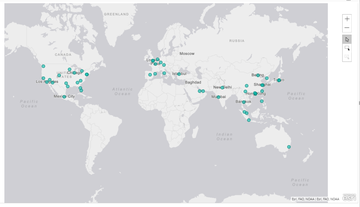
Drag and drop Latitude and Longitude from “Top_world_airports” into the respective boxes; a simple world maps shows up where the points represent the airports location.
将“ 经度和纬度 ”从“ Top_world_airports ” 拖放到相应的框中; 会显示一个简单的世界地图,这些点代表机场的位置。
If you don’t have the coordinates, you can insert your data into the Location box, as it is a relevant geographic attribute that ArcGIS is capable of geocoding (a country, a city, a zip code, etc.). As mentioned before, my advice is to try to always use the pair Latitude/Longitude. If they aren’t available, be sure that your values are correctly categorized in Power BI.
如果没有坐标,则可以将数据插入“ 位置”框中,因为它是ArcGIS可以进行地理编码的相关地理属性(国家,城市,邮政编码等)。 如前所述,我的建议是尝试始终使用纬度/经度对。 如果它们不可用,请确保在Power BI中将您的值正确分类。
Bear in mind that this map is powered by Esri and is therefore totally different from Bing’s map. It offers much more features and capabilities that we’re going to explore.
请记住,此地图由Esri提供支持,因此与Bing的地图完全不同。 它提供了更多我们将要探索的特性。
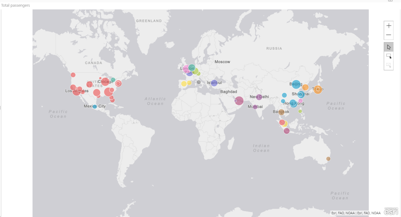
If you want to have evidence of the relative amount of traffic for each airport, drop the Total passengers value into the Size box. Every bubble gets a different size according to the value, as we’ve seen for bubble maps visual. But there’s much more. For instance, you can visually cluster the data by category. Drag the Country field and drop it into the Color bucket. The bubbles color changes for every country making it easy to identify each of them at a glance.
如果要获得每个机场相对交通量的证据,请将“ 旅客总数”值放入“ 大小”框中。 正如我们在可视化气泡图中看到的那样,每个气泡都会根据值得到不同的大小。 但是还有更多。 例如,您可以直观地按类别对数据进行聚类。 将“ 国家/地区”字段拖放到“ 颜色”桶中。 每个国家/地区的气泡颜色都会发生变化,因此一眼就能识别出每个气泡。
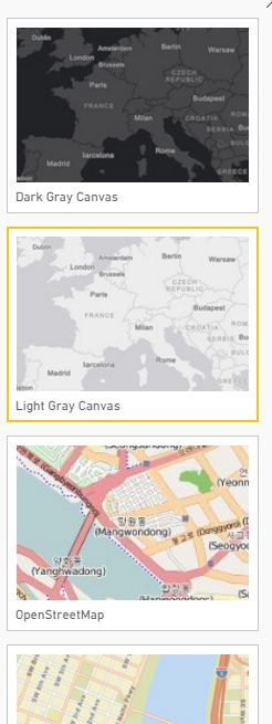
The default basemap is based on a light grey canvas, but there are other backgrounds available. Select the visual, click the ellipse (…) on the upper right side and select Edit
默认底图基于浅灰色画布,但还有其他背景可用。 选择视觉效果,单击右上角的椭圆(…),然后选择“ 编辑”
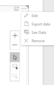
This command opens the map’s editor where you can set up many settings for customization or spatial analysis.
此命令将打开地图的编辑器,您可以在其中设置许多用于自定义或空间分析的设置。
Click on Basemap
点击底图
Map theme

地图主题
- Location only -> Small points on the same size and color 仅位置 ->具有相同大小和颜色的小点
- Heat map -> color gradient showing the relative density of points on a map, ranging from cold colors (low density) to hot (high density). Especially useful when the points are close together or overlapping. 热图 ->颜色梯度,显示了图上点的相对密度,范围从冷色(低密度)到热色(高密度)。 当这些点靠近或重叠时特别有用。
- Size -> points of the same color and different size according to the measure, in our example 大小 ->根据度量,相同颜色和不同大小的点,在我们的示例中为“ Total passengers. 总乘客”。
- Color -> points of the same size and different color according to the category, in our example 颜色 ->根据类别(在我们的示例Country. Country中) ,具有相同大小和不同颜色的点。
- Size & Color -> points of different sizes and colors according to measure and category, as we set up in the example 大小和颜色 ->根据度量和类别,不同大小和颜色的点,如我们在示例中设置的
- Clustering -> another visualization mode when points are very close and it’s hard to distinguish the exact location. Points are grouped together into a circle which shows the number of occurrences in the area. 聚类 ->当点非常接近并且很难区分确切位置时的另一种可视化模式。 点被分组为一个圆圈,该圆圈显示了该区域中出现的次数。
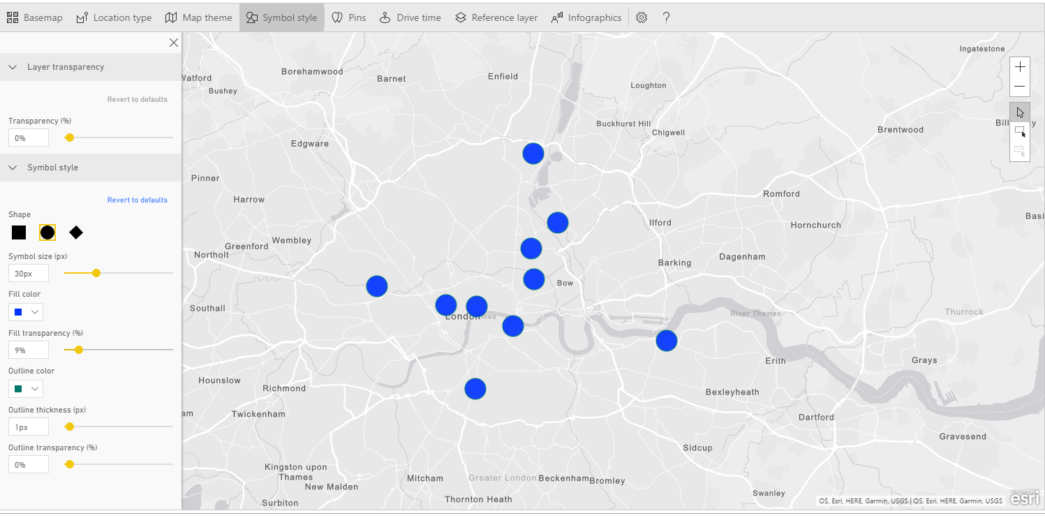
The Symbol style menu lets customize the look of the map markers: dimension, shape, transparency, etc. It is worth spending a word about Classification type, i.e. the way ArcGIS creates clusters from your data.
使用“ 符号样式”菜单可以自定义地图标记的外观:尺寸,形状,透明度等。值得一提的是有关分类类型的信息 ,即ArcGIS根据数据创建聚类的方式。
You can choose the classification type, the number of classes in which every measure falls, and the relative dimension for your bubbles by setting up graphically the minimum and maximum size.
您可以通过图形化设置最小和最大大小来选择分类类型,每种度量所属的类数以及气泡的相对尺寸。
Pins
别针
Let’s say you’re a sports enthusiast and you want to go London to visit some “sports temples”: Wembley for football, Twickenham for rugby and Wimbledon for tennis.
假设您是一名体育迷,并且想去伦敦参观一些“体育圣殿”:温布利(Wmbley)足球,特威克纳姆(Twickenham)橄榄球和温布尔登(Wimbledon)网球。
As you know, London is served by many airports. Which one is best located with respect to your destinations? Here’s where ArcGIS can help you.
如您所知,伦敦有许多机场。 就您的目的地而言,哪个位置最合适? 这是ArcGIS可以为您提供帮助的地方。
First of all, let’s place the airports on a map. I prepared a small dataset with London airports name and coordinates. You can download it from the bottom of the article. Import the dataset in Power BI as usual as Text/CSV. Then, select the Latitude field got to Modeling > Data Category > Latitude. Do the same for Longitude.
首先,让我们在地图上放置机场。 我准备了一个包含伦敦机场名称和坐标的小型数据集。 您可以从文章底部下载它。 像往常一样,将Text和CSV中的数据集导入Power BI中。 然后,选择纬度字段,进入建模>数据类别>纬度 。 对经度执行相同的操作。
Now plot the points on the map. Click on the ArcGIS visual and an empty rectangle shows up on the canvas. Drag and drop Latitude and Longitude from the dataset to their respective boxes and you’ll have the airports on the map. Add Airport to Location, just for having the airport’s name as well.
现在在地图上绘制点。 单击ArcGIS视觉对象,画布上将显示一个空矩形。 将纬度和经度从数据集中拖放到其各自的框中,您将在地图上看到机场。 将Airport添加到Location ,只是为了获得机场名称。
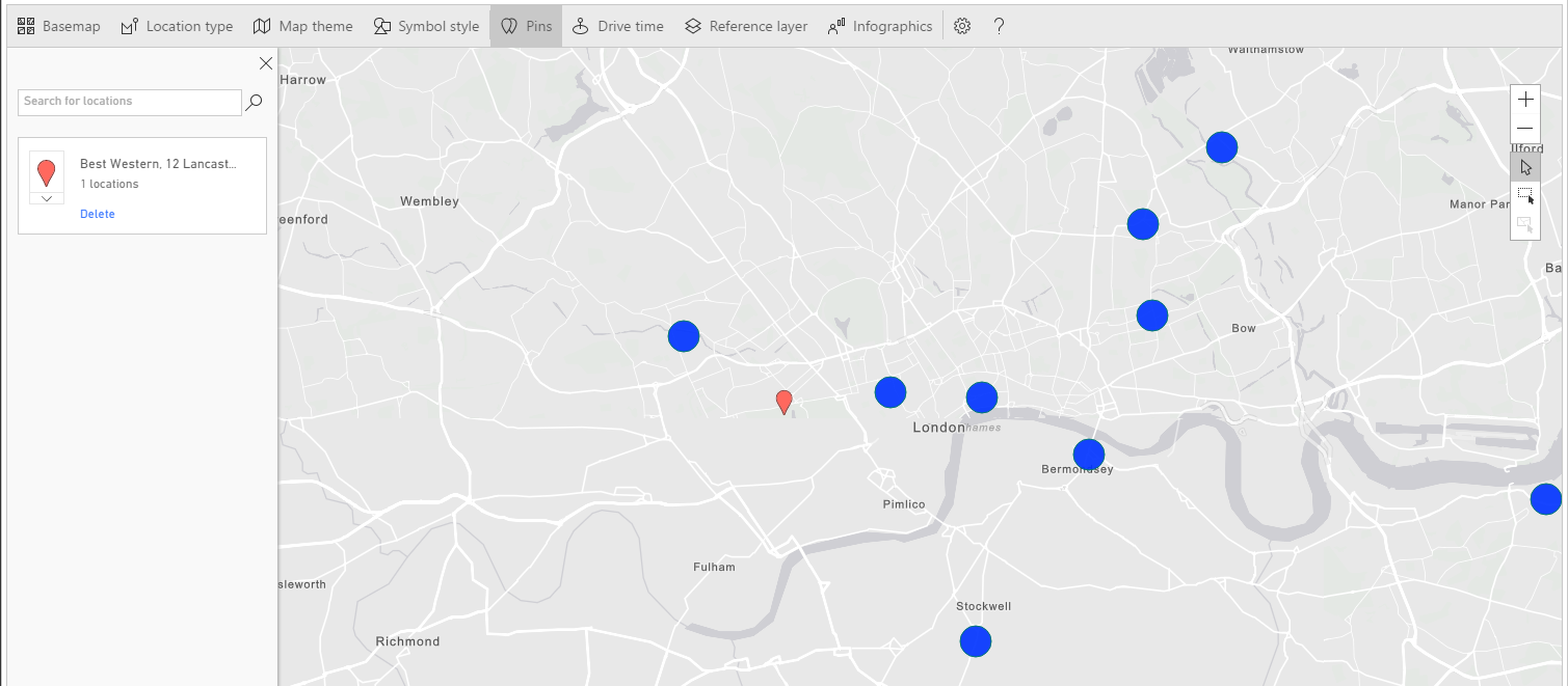
But the points are too small; we want to make them bigger. Click Edit and in the map’s menu select Symbol style. set the Symbol size to 30px. The next step is to add the relevant points on the map, in order to have a visual comparison. In the map’s menu select Pins. With this feature you can find some POI (points of interest) and place them as markers on the map.
但是要点太小了。 我们想要使它们更大。 点击修改,然后在地图菜单中选择符号样式 。 将符号大小设置为30px。 下一步是在地图上添加相关点,以便进行视觉比较。 在地图菜单中,选择Pins 。 使用此功能,您可以找到一些POI(兴趣点)并将其作为标记放置在地图上。
In the box Search for locations
在“ 搜索位置 ”框中
Write Wimbledon and the combo suggests you some results: the right one is “Wimbledon Park Tennis Court, Home Park Road, London, England, SW19 7, GBR”. Select it from the dropdown and you’ll see a red marker placed on the map. Do the same search for
写下温布尔登,该组合会为您建议一些结果:正确的是“温布尔登公园网球场,英国伦敦Home Park Road,SW19 7,GBR”。 从下拉列表中选择它,您会在地图上看到一个红色标记。 进行相同的搜索
- Twickenham Rugby Ground, Rugby Road, Twickenham Middlesex, England, TW1 1 GBR Twickenham橄榄球场,橄榄球路,Twickenham Middlesex,英格兰,TW1 1 GBR
- Wembley Stadium, Olympic Way, Wembley, Middlesex, England, HA9 0, GBR 温布利球场,奥林匹克之路,温布利,米德尔塞克斯,英格兰,HA9 0,GBR
The final outcome is a map with three markers showing the position of our destinations compared to airports. Turns out that the closest airport to all sites is Heathrow, which should be our first choice when planning the trip.
最终结果是一张带有三个标记的地图,显示了我们的目的地相对于机场的位置。 事实证明,离所有站点最近的机场是希思罗机场,这应该是我们计划行程的首选。
With the Drive time
随着开车时间
To continue with the previous example, after visiting sporting spots, you are tired and thirsty. What’s better than visiting a brewery to get some rest and taste a good craft beer?
继续前面的示例,在参观了运动场之后,您感到疲倦和口渴。 有什么比拜访啤酒厂休息一下并品尝优质的精酿啤酒更好的了?
The file LondonBrewery.txt lists some breweries in London and surroundings. How many of them fall within a driving distance of 30 minutes or a radius of 3 km?
文件LondonBrewery.txt列出了伦敦及其周围的一些啤酒厂。 在30分钟的行驶距离或3公里的半径内,有多少个落入?
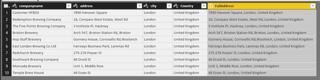
Let’s start getting some data. Import the file LondonBrewery.txt as Txt/CSV. Note that the file has a custom pipe symbol as delimiter. While importing select Edit, we have to make some changes. Power BI opens the file in the Query Editor. In the Home ribbon select Use First Rows as Headers. The file is made of four columns: companyname, address, city and Country. In order to pass geographical location to ArcGIS, we need to gather all infos in one single column. Click Add Column > Custom Column. In the dialog Add Custom Colom rename the column as FullAddress. In the Custom column formula box enter the following formula:
让我们开始获取一些数据。 将文件LondonBrewery.txt导入为Txt / CSV。 请注意,该文件有一个自定义管道符号作为分隔符。 在导入选择Edit时 ,我们必须进行一些更改。 Power BI在查询编辑器中打开文件。 在主页功能区中,选择“ 使用第一行作为标题” 。 该文件由四列组成:公司名称,地址,城市和国家 。 为了将地理位置传递给ArcGIS,我们需要将所有信息收集到一列中。 单击添加列>自定义列 。 在“添加自定义Colom”对话框中,将该列重命名为FullAddress 。 在“ 自定义列公式”框中,输入以下公式:
[address] & “, ” & [city] & “, ” & [Country]
[地址]&“,”&[城市]&“,”&[国家/地区]
This creates a new column with the full address for every row in the dataset.
这将为数据集中的每一行创建一个具有完整地址的新列。
Save your changes. Then click Home > Close & Apply. Create a new page in your report and click the ArcGIS visual. This time we don’t have coordinates, but addresses to pass to the geocoding engine. If the address is properly formatted, ArcGIS can geocode it. Drag and drop FullAddress into Location. Some points are plotted onto the map. Just for knowing the brewery name, drag and drop companyname into Tooltips.
保存您的更改。 然后单击主页>关闭并应用 。 在报告中创建一个新页面,然后单击ArcGIS visual。 这次我们没有坐标,但是有地址要传递给地理编码引擎。 如果地址格式正确,ArcGIS可以对其进行地理编码。 将FullAddress拖放到Location中 。 一些点被绘制到地图上。 只是知道啤酒厂的名字,拖放到公司名称 工具提示 。
The points are too small. We want to enlarge them and to change the default color. Click Edit > Symbol style and set the dimension to 30px. Then on Fill color set the color you want. I’ve chosen a deep blue, with no transparency.
积分太小。 我们要放大它们并更改默认颜色。 单击编辑>符号样式,然后将尺寸设置为30px。 然后在“ 填充颜色”上设置所需的颜色。 我选择了深蓝色,没有透明度。
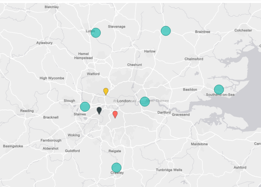
Now we got destinations; what is the starting point? Suppose, for instance, that you’re based in a Best Western hotel in Lancaster Gate. Select Pins on the map’s menu and start typing Best Western Lancaster Gate. ArcGIS should find for you the following address: “Best Western, 12 Lancaster Gate, London, England, W2 3, GBR”. Select the hotel and a red marker appears on your map.
现在我们到了目的地。 起点是什么? 例如,假设您住在兰开斯特门的Best Western酒店。 在地图菜单上选择Pins ,然后开始输入Best Western Lancaster Gate。 ArcGIS应该为您找到以下地址:“ Best Western,兰开斯特门12号,伦敦,英国,W2 3,GBR”。 选择酒店,地图上会出现一个红色标记。
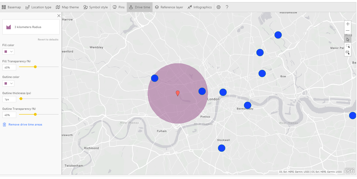
This in the starting point. Select the menu item Drive Time, and then select the marker on the map. When one point is selected the menu on the left changes.
这是起点。 选择菜单项“驱动器时间”,然后在地图上选择标记。 选择一个点后,左侧菜单会更改。
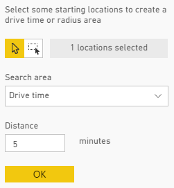
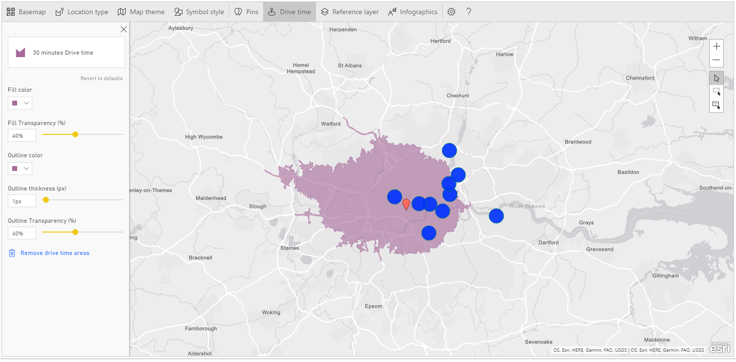
You can choose among Drive time or Radius. Write 30 instead of 5 in the white box and press OK. ArcGIS displays a filled area representing all the streets within a 30 minutes driving distance from the starting point. As you can see, some breweries are inside the highlighted zone, some aren’t. This gives us a clear understanding of accessibility for the sites, based not only on their spatial location, but also on journey calculation.
您可以选择行驶时间或半径 。 在白框中写30,而不是5,然后按OK。 ArcGIS将显示一个填充区域,代表距离起点30分钟车程内的所有街道。 如您所见,有些啤酒厂在突出显示的区域内,而有些则不在。 这不仅使我们可以根据站点的空间位置,而且还基于旅程计算,可以清楚地了解站点的可访问性。
The other available option is about geographic distance. Click Remove drive time areas to reset the map and select again the red marker.
另一个可用的选项是关于地理距离。 点击删除行驶时间区域以重置地图,然后再次选择红色标记。
This time choose a radius of 3 kilometers (note you have many options as measure unit) and press OK. Note the different outcome. This is the circumference around your starting point inside the set radius.
这次选择半径为3公里(请注意,您有很多选择作为度量单位),然后按OK 。 注意不同的结果。 这是在设定半径内围绕起点的周长。
According to the type of analysis you’re performing, you can prefer one or the other visualization.
根据您执行的分析类型,您可以选择一个或另一个可视化。
Another powerful feature of ArcGIS is Reference Layer
ArcGIS的另一个强大功能是参考层
Open a new Power BI Desktop report, or add a new page to an existing one. Click on the ArcGIS visual and add it to the canvas. Drag and drop the following fields into the visual’s boxes:
打开一个新的Power BI Desktop报告,或将一个新页面添加到现有页面。 单击ArcGIS visual,然后将其添加到画布。 将以下字段拖放到视觉效果的框中:
Dataset Top_world_airports:
Latitude > Latitude
Longitude > Longitude
Dataset passengers traffic statistic 2016
Total passengers > size
Country > Color
数据集Top_world_airports :
纬度 >纬度
经度 >经度
数据集2016年旅客流量统计
乘客总数 >人数
国家 >颜色
For a better understanding of the example, filter the map only for USA. Scroll down the Filters menu, expand Country and check the voice United States.
为了更好地理解此示例,请仅过滤美国地图。 向下滚动“ 过滤器”菜单,展开“ 国家/地区”并检查语音“美国” 。
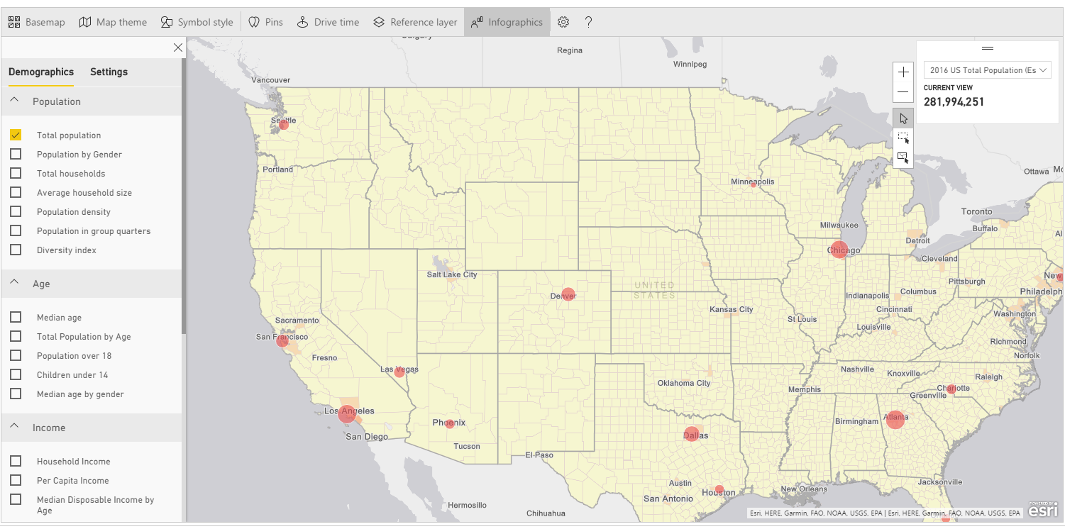
Now edit the visual and click on Reference Layer. It shows up a lateral frame with two options: Demographic and ArcGIS. Demographic refers to a series of ready-made layers from Esri with data such as income, population, density, education etc.
现在编辑视觉效果,然后单击“ 参考层” 。 它显示了带有两个选项的横向框架: 人口统计和ArcGIS 。 人口统计是指Esri提供的一系列现成的图层,其中包含诸如收入,人口,密度,教育程度等数据。
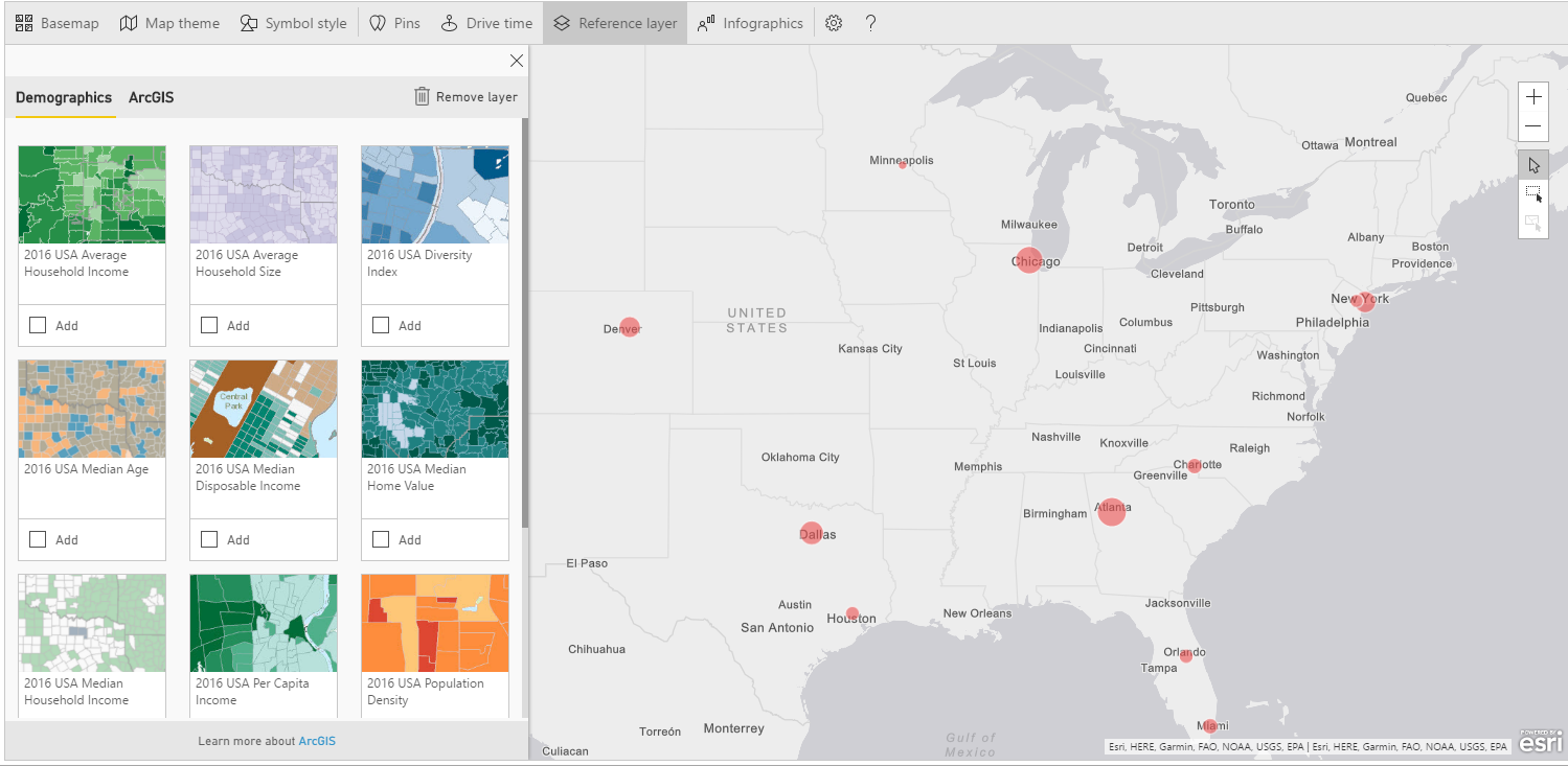
Let’s say we want to compare the number of passengers to the population distribution to get evidence of any correlation. Scroll the layers until the one called “2016 USA Population Density” and click Add.
假设我们想将乘客数量与人口分布进行比较,以获得任何相关性的证据。 滚动图层,直到被称为“ 2016 USA人口密度 ”的图层,然后单击“ 添加” 。
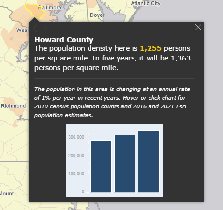
A new layer is added to the map showing population density for every county in USA. Color ranges from yellow (lower density) to dark orange (higher density). By clicking on a single county, you get population related data.
地图上将添加一个新图层,以显示美国每个县的人口密度。 颜色范围从黄色(较低的密度)到深橙色(较高的密度)。 通过单击一个县,您可以获得与人口有关的数据。
If you zoom into the airports surrounding areas (i.e. New York), you can actually see that the counties are darker, showing a direct correlation between airport traffic and population.
如果放大到周围地区的机场(即纽约),实际上可以看到各县都比较暗,表明机场客流量与人口之间有着直接的联系。
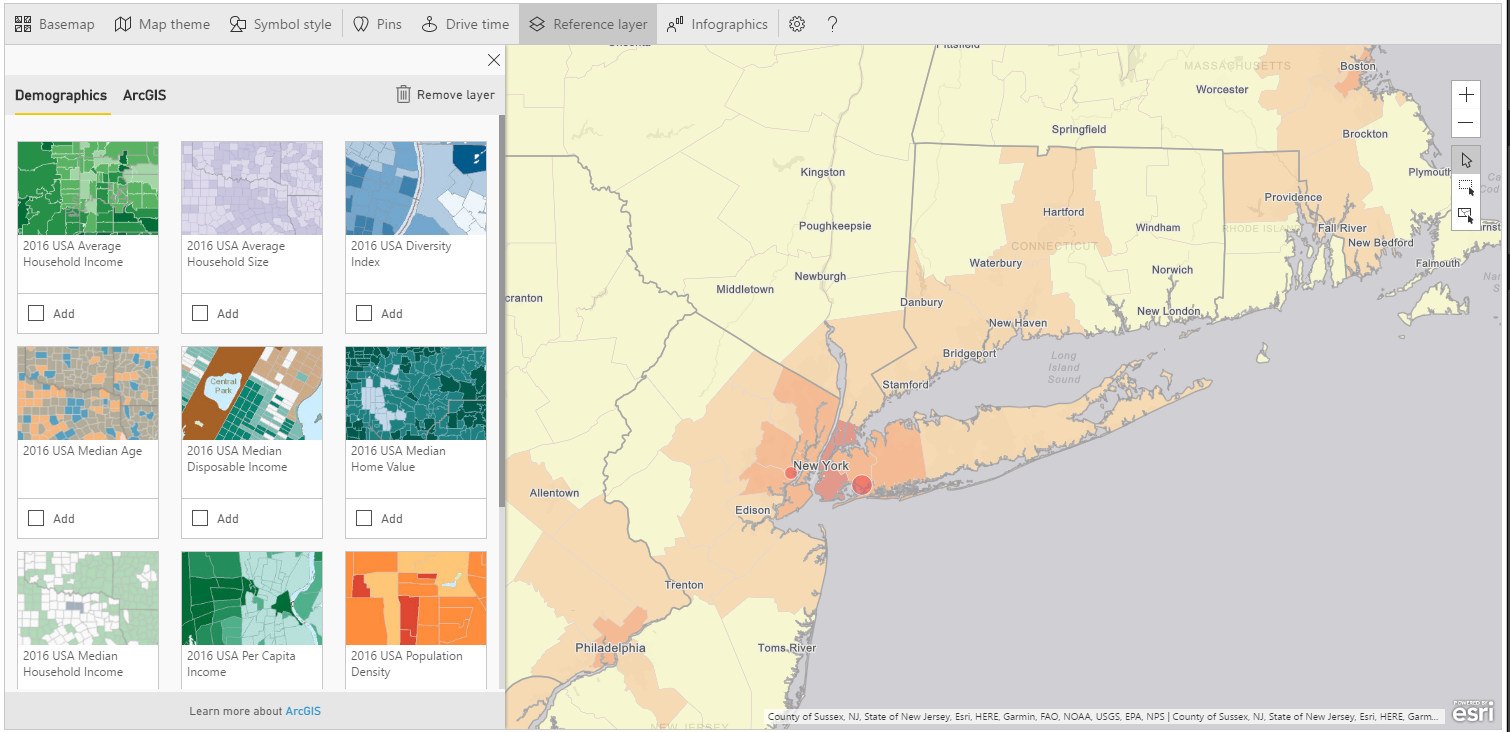
More or less, we have got the same outcome adding the “2016 USA Average Household Income” layer, from which we can see that wealth is mainly distributed around big cities.
或多或少,我们在添加“ 2016美国平均家庭收入 ”这一层时得到了相同的结果,从中我们可以看到,财富主要分布在大城市周围。
Take into account that you can display only a layer at time. Furthermore, built-in data are available only for USA. If you wish to add a different layer you can turn to ArcGIS Community and Reference Layers.
考虑到您一次只能显示一个图层。 此外,内置数据仅适用于美国。 如果要添加其他图层,则可以转到ArcGIS社区和参考图层。
To delete a layer simply click Remove Layer
要删除图层,只需单击“ 删除图层”
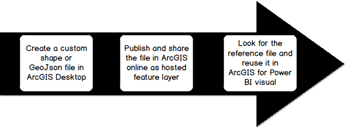
The other Reference Layer’s option ArcGIS allows you to search for publicly shared feature layers on ArcGIS Online. These are layers created by users and made available for the community by publishing them on ArcGIS Online. Custom reference layers can contain any kind of geographical information in any format (shape file, GeoJson, etc.). If you aim to add more than two layers to your visualization, this is the only way. But, of course, you must be capable of manipulating files using a GIS tools (ArcGIS Desktop, QGIS….).
另一个参考图层选项ArcGIS可让您在ArcGIS Online上搜索公开共享的要素图层。 这些是由用户创建的图层,可通过在ArcGIS Online上发布将其提供给社区。 自定义参考图层可以包含任何格式的任何地理信息(形状文件,GeoJson等)。 如果要在可视化中添加两个以上的层,这是唯一的方法。 但是,当然,您必须能够使用GIS工具(ArcGIS Desktop,QGIS…。)来处理文件。
Once you’ve created the layer, you can import it into ArcGIS Online and share it. Another downside is that you need an ArcGIS account and you have to pay for it.
创建图层后,可以将其导入到ArcGIS Online中并进行共享。 另一个缺点是,您需要一个ArcGIS帐户,并且必须为此付费。
If you want to try, you can sign up for a free 60 days demo. Once the period is expired, the account becomes unavailable unless it is turned into a paid subscription.
如果您想尝试,可以免费注册60天的演示。 期限到期后,除非变成付费订阅,否则该帐户将不可用。
Just to give you a quick recap, these are the steps for creating a custom reference layer.
为了让您快速回顾一下,以下是创建自定义参考图层的步骤。
For the demo of the custom reference layer, let’s move to Europe. Create a new report with the same settings as below:
有关自定义参考层的演示,请转到欧洲。 使用以下相同的设置创建一个新报告:
Dataset Top_world_airports:
Latitude > Latitude
Longitude > Longitude
Dataset passengers traffic statistic 2016
Total passengers > size
Country > Color
数据集Top_world_airports :
纬度 >纬度
经度 >经度
数据集2016年旅客流量统计
乘客总数 >人数
国家 >颜色
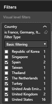
And filter for European countries: France, Germany, Italy, Spain, The Netherlands, Turkey, United Kingdom.
并针对欧洲国家/地区过滤:法国,德国,意大利,西班牙,荷兰,土耳其,英国。
Edit the map click Reference Layer > ArcGIS. You’ll be prompted to a search window.
编辑地图,单击参考图层> ArcGIS 。 系统将提示您进入搜索窗口。
If you write some words and click the lens, you’ll get the layers that match your search as output. Type for example, river, train, volcanoes.
如果您写一些字并单击镜头,您将获得与搜索相匹配的图层作为输出。 输入例如河流,火车,火山。
For this demo, we want to compare the amount the population along with airports passengers, so search for the following layer: Demography_of_Europe_1
对于此演示,我们想将人口数量与机场乘客进行比较,因此搜索以下图层: Demography_of_Europe_1
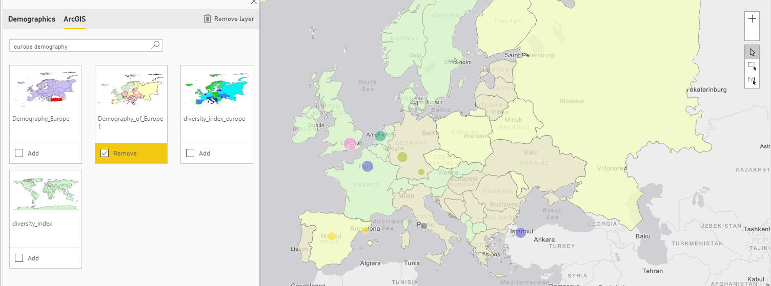
Add the layer to the map; as in the previous example you can get demographics info by clicking on each country. Even in this case we can found out a direct correlation between population and passengers.
将图层添加到地图; 如上例所示,您可以通过单击每个国家来获取人口统计信息。 即使在这种情况下,我们也可以发现人口与乘客之间的直接关系。
The last item in the menu bar for ArcGIS visual is Infographics. Basically, it consists of “cards” placed on a map to display some kind of info. If you click on the voice, you can see all the available data.
ArcGIS visual菜单栏中的最后一项是Infographics 。 基本上,它由放置在地图上以显示某种信息的“卡片”组成。 如果单击语音,则可以看到所有可用数据。
To test the operation of Infographic, filter again USA as country in the report. Then try to add an infographic “Total population” for instance. White windows shows up in the upper right corner with the Total population number.
为了测试信息图表的运行,请在报告中再次过滤美国作为国家。 然后尝试添加一个图表“例如总人口 ”。 右上角显示白色窗口,显示总人口数。
Note that infographics is responsive and interacts with the map itself. The number displayed in the card changes according to your selection. Try to zoom in or out into the maps and see how the Total population varies to display only data for the highlighted area.
请注意,信息图表是响应式的,并与地图本身进行交互。 卡中显示的数字根据您的选择而变化。 尝试放大或缩小地图,查看总人口如何变化以仅显示突出显示区域的数据。
You can even add more infographics to you map by simply selecting and deselecting each one.
只需选择和取消选择每个图表,您甚至可以向地图添加更多图表。
Unfortunately, this feature is available only with data for USA. If you change the map’s focus to another area, you won’t be able to see any data.
不幸的是,此功能仅适用于美国的数据。 如果将地图的焦点更改到另一个区域,则将看不到任何数据。
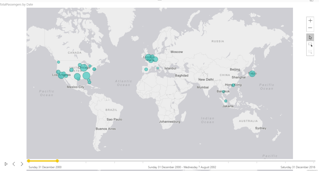
The last feature, Time, performs a time analysis of the map, showing the evolution of a certain measure over the time. For this demo, download and import the dataset airport_passengers_time.csv: Get Data > TXT/CSV > Load.
最后一个功能Time可以对地图进行时间分析,以显示特定度量随时间的变化。 对于此演示,下载并导入数据集airport_passengers_time.csv : 获取数据> TXT / CSV>加载 。
The dataset contains the number of passengers for the world’s busiest airports ranging from 2000 to 2016. The source is as usual Wikipedia. I’ve added a Date set by default to the end of every year (31/12/2000, 31/12/2001, …) as ArcGIS requires a date/time format field for time analysis.
数据集包含2000年至2016年全球最繁忙机场的乘客数量。来源与往常一样是Wikipedia。 我已将默认设置的日期添加到每年的年底(2000年12月31日,2001年12月31日,…),因为ArcGIS需要使用日期/时间格式字段进行时间分析。
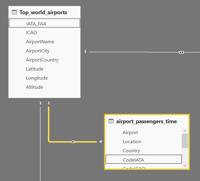
Join the airports’ code to the dataset Top_world_airports in order of getting coordinates for every airport.
将机场代码加入数据集Top_world_airports中,以获取每个机场的坐标。
Go to Relationships and set the following relationship:
转到关系并设置以下关系:
Top_world_airports/IATA_FAA -> airport_passengers_time/CodeIATA
Top_world_airports / IATA_FAA-> airport_passengers_time / CodeIATA
Create a new report, click on ArcGIS visual and add the following fields:
创建一个新报告,单击ArcGIS visual并添加以下字段:
Dataset Top_world_airports:
Latitude > Latitude
Longitude > Longitude
Dataset airport_passengers_time
Total passengers > Size
Date > Time
数据集Top_world_airports :
纬度 >纬度
经度 >经度
数据集airport_passengers_time
乘客总数 >大小
日期 >时间
ArcGIS adds a timeline at the bottom of your map, with interval dates at every end.
ArcGIS将在地图底部添加一个时间轴,在每个末端都带有间隔日期。
You can either move the yellow slider over the control, or click play for continuous animation. The map rolls by the years showing a clear shift of traffic volumes from Western countries (USS, Europe) to Asia.
您可以将黄色滑块移到控件上,也可以单击“播放”以连续播放动画。 该地图按年份滚动显示,显示出从西方国家(USS,欧洲)到亚洲的流量明显转移。
By default, ArcGIS divides the time frame into 10 intervals. Drag the handles at the end of the slider if you want to change the visible intervals.
默认情况下,ArcGIS将时间范围划分为10个间隔。 如果要更改可见间隔,请拖动滑块末端的手柄。
结语 (Wrap up)
ArcGIS takes maps visualization in Power BI a leap forward. It is the visual you should rely on for drawing maps, based on industry leader cartography. Furthermore, you can perform some spatial analysis for a better understanding of your data and for revealing relationships and patterns that can help stakeholders to make the right decisions.
ArcGIS使Power BI中的地图可视化向前迈进了一步。 基于行业领导者制图,这是您绘制地图所依赖的视觉效果。 此外,您可以执行一些空间分析,以更好地了解您的数据并揭示可以帮助利益相关者做出正确决策的关系和模式。
参考资料 (References)
- What is GIS? 什么是GIS?
- Geographic Information System 地理信息系统
- Announcing ArcGIS Maps for Power BI by Esri (Preview) 通过Esri宣布Power BI的ArcGIS Maps(预览)
- ArcGIS Maps for Power BI is now Generally Available on PowerBI.com PowerBI.com现已全面提供ArcGIS Maps for Power BI
- Power BI and Esri ArcGIS Power BI和Esri ArcGIS
- ArcGIS Maps for Power BI 1 适用于Power BI 1的ArcGIS Maps
- ArcGIS Maps for Power BI 2 用于Power BI 2的ArcGIS Maps
- List of busiest airports by passenger traffic 按旅客流量列出最繁忙的机场
资料下载 (Downloads)
- Top_world_airports.csv Top_world_airports.csv
- passengers traffic statistics 2016.csv 旅客流量统计2016.csv
- LondonAirports.txt 伦敦机场.txt
- LondonBrewery.txt LondonBrewery.txt
- airport_passengers_time.csv airport_passengers_time.csv
目录 (Table of contents)
| How to create geographic maps using Power BI – Filled and bubble maps |
| How to create geographic maps in Power BI using built-in shape maps |
| How to create geographic maps in Power BI using custom shape maps |
| How to create geographic maps in Power BI using ArcGIS |
| How to create geographic maps in Power BI using R |
| Customized images with Synoptic Panel |
| MapBox |
| Geocoding |
| 如何使用Power BI创建地理地图-填充地图和气泡地图 |
| 如何使用内置形状图在Power BI中创建地理图 |
| 如何使用自定义形状图在Power BI中创建地理图 |
| 如何使用ArcGIS在Power BI中创建地理地图 |
| 如何使用R在Power BI中创建地理地图 |
| 使用Synoptic Panel定制图像 |
| 地图框 |
| 地理编码 |
翻译自: https://www.sqlshack.com/create-geographic-maps-power-bi-using-arcgis/
如何使用ArcGIS在Power BI中创建地理地图相关推荐
- power bi 创建空表_如何使用R在Power BI中创建地理地图
power bi 创建空表 介绍 (Introduction) This is the fifth article of a series dedicated to discovering geogr ...
- power bi自定义地图_如何使用自定义形状图在Power BI中创建地理图
power bi自定义地图 介绍 (Introduction) This is the third article of a series dedicated to discovering geogr ...
- power bi形状地图_如何使用内置形状图在Power BI中创建地理图
power bi形状地图 Introduction 介绍 This is the second article of a series dedicated to discovering geograp ...
- Power BI中创建父子层级二:父级单独产生值
一.父子层级 在数据分析中,经常会遇到父子层级问题,通常来说,父子层级又可以分为两种情况,一种为图1,江苏中烟的销量就是南京品牌和苏烟品牌的销量之和,南京品牌的销量就是南京(硬红)和南京(炫赫门)的销 ...
- power bi 地图_如何使用Power BI创建地理地图-填充地图和气泡地图
power bi 地图 该项目 (The project) This is the first article of a series dedicated to discovering geograp ...
- power bi 中计算_Power BI中的期间比较
power bi 中计算 Just recently, I've come across a question on the LinkedIn platform, if it's possible t ...
- Power BI中计算同比、环比
财务需求中经常要求计算数据的同比.环比,下面介绍如何在Power BI 中创建用来计算同比和环比的度量值(SSAS模型中同理)... 现金表中有金额,时间(时间需要连续的年月日格式),计算同比.环比. ...
- power bi函数_在Power BI中的行上使用聚合函数
power bi函数 Aggregate functions are one of the main building blocks in Power BI. Being used explicitl ...
- power bi指标呈现_在Power BI中使用关键绩效指标
power bi指标呈现 In this article, we will learn Key Performance Indicators usage in Power BI and solve a ...
- power bi dax_M语言和Power BI中的DAX之间的差异
power bi dax Microsoft Power BI supports two different languages, M language and DAX (Data Analysis ...
最新文章
- 《构建高可用Linux服务器》样书
- c# list 求交使用注意点
- CVPR 2018 目标跟踪相关论文
- And Then There Was One POJ - 3517(变形约瑟夫环+规律)
- wp8.1 Study11:APP里文件读写和使用XML和Json序列化
- 访问php文件显示500错误,nginx 访问.php文件正常,访问.html文件500错误
- Vue 中 export及export default的区别
- 解决MYSQL不报错误详细信息的问题 Can‘t find error-message file
- Java-面向对象(基础知识)
- 编码器及编码器在SMART200中的使用
- 应用程序错误(0xc0000135)
- 不同网段共享文件服务器,不同局域网如何共享文件
- 基于微信小程序的评分小程序
- 在html中如何使div在页面中居中显示
- linux内核和发行版本的关系,简述Linux内核和Linux发行版的区别
- 编译原理_P1004
- 亲测centos下mysql安装,不行锤我
- python 二维列表获取其中元素_Python中二维列表如何获取子区域元素的组成
- python获取路由器信息_python 3.5实现检测路由器流量并写入txt的方法实例
- html中音频文件放在JS哪里,javascript – 将音频文件保存在rails中