在CSS布局中让Floats轻拂
If you’re new to CSS layouts, you’d be forgiven for thinking that using CSS floats in imaginative ways is the height of skill. If you have consumed as many CSS layout tutorials as you can find, you might suppose that mastering floats is a rite of passage. You’ll be dazzled by the ingenuity, astounded by the complexity, and you’ll gain a sense of achievement when you finally understand how floats work.
如果您不熟悉CSS布局,那么您会以为以想象力的方式使用CSS浮点数是技巧的高度,这是可以原谅的。 如果您已经阅读了许多CSS布局教程,那么您可能会认为掌握浮点数是一种习惯。 当您最终了解花车的工作原理时,您会被其独创性,复杂性所震惊,并且会获得成就感。
Don’t be fooled. You’re being brainwashed.
不要上当。 你被洗脑了。
The Danger Signs
危险迹象
I spotted this rule in a CSS reset file:
我在CSS重置文件中发现了此规则:
address, blockquote, center, dir, div, fieldset, pre,
dd, dt, frameset,li, h1, h2, h3, h4, h5, h6, dl,
ol, ul, form, table {
float: left;
}
This is a sign that the CSS author is a follower of the one true layout; a believer in the magic of floats. Followers believe they’ve found the only layout technique they’ll ever need. Enshrined into CSS frameworks everywhere, using one of these is equivalent to deciding that you’ll never need to learn another CSS layout technique.
这表明CSS作者是一个真正布局的追随者。 信奉花车魔术的人。 追随者认为,他们已经找到了他们唯一需要的布局技术。 随处都包含在CSS框架中,使用其中之一等效于决定您永远不需要学习其他CSS布局技术。
The truth is using floats for layout was the best kludge anyone could come up with six years ago with the limited CSS support available at the time. Here we are in 2011, browser CSS capabilities are leaping ahead and the floating crowd are still coding CSS like it’s 2005. Floated layouts are strangling CSS innovation.
事实是,使用浮动进行布局是六年前任何人都可以想到的最好的选择,当时可用CSS支持有限。 到了2011年,浏览器CSS的功能正在突飞猛进,流动人群像2005年一样仍在编写CSS。浮动布局阻碍了CSS的创新。
CSS layouts that rely on floated elements are overly complex, brittle, demand tortuous thinking, create a raft of odd problems that require nonsensical rules, are unfriendly to beginners, and—in most situations—are simply not required.
依赖于浮动元素CSS布局过于复杂,脆弱,需要曲折的思维,产生大量需要无意义规则的奇特问题,对初学者不友好,并且在大多数情况下根本不需要。
The Ironic Clearfix
具有讽刺意味的Clearfix
The bugbear of floated layouts is the need to clear floats. When you have a stack of floated elements they are taken out of the document flow, and their container element collapses. If you want that container to properly surround its floating children (I call them floaters) you’ll need to clear those floats.
浮动布局的烦人之处在于需要清除浮动。 如果有一堆浮动元素,它们将从文档流中取出,并且它们的容器元素会折叠。 如果您希望该容器正确围绕其浮动子项(我称它们为浮动子),则需要清除这些浮动。
The methods for doing this are varied and depend upon the specific layout requirements. If you have a group of floaters within a containing element, and you need that element to extend to full height, then float the container too. The most popular technique, however, is to apply a clearfix: add an element that will refuse to yield to the floaters.
进行此操作的方法多种多样,并取决于特定的布局要求。 如果包含元素中有一组浮动对象,并且需要将该元素扩展到最大高度,则也要浮动容器。 但是,最流行的技术是应用clearfix:添加一个将拒绝屈服于float的元素。
The original clearfix was to add a block element after all the floaters with the rule clear: both; like so:
最初的clearfix是在所有float后面添加一个规则为clear: both;的block元素clear: both; 像这样:
<div></div>.clearfix { clear: both; }The need to add structural markup for no real semantic purpose was annoying enough to inspire people to seek another solution.
没有真正的语义目的添加结构标记的必要性足以使人们激发寻求另一种解决方案的兴趣。
This is the height of clear fix technology:
这是清除修复技术的最高水平:
.clearfix:before, .clearfix:after { content: "020"; display: block; height: 0; overflow: hidden; }
.clearfix:after { clear: both; }
.clearfix { zoom: 1; }
You simply add the class clearfix to your container element and let the magic happen. It’s so progressive, it’s even included in the HTML5 Boilerplate project.
您只需将类clearfix添加到您的容器元素中,就可以使魔术发生。 它是如此进步,甚至包括在HTML5 Boilerplate项目中 。
I find it more than a little ironic that the only browsers that support this method—that support the :before and :after pseudo elements and generated content—support almost all of the CSS2.1 spec (plus some of the CSS3 spec) and so have no need for kludges like floated layouts anyway. We’re talking about IE8-and-above-level browsers here.
具有讽刺意味的是,唯一支持此方法的浏览器(支持:before和:after伪元素和生成的内容)支持几乎所有CSS2.1规范(以及某些CSS3规范),因此无论如何,都不需要像浮动布局这样的污点。 我们在这里谈论的是IE8及更高级别的浏览器。
The Real Problem
真正的问题
We’ve had a decade where the only choices for layout have been inline or block display, and floated or absolute positioning. Creating a layout is really the combination of many small, simple layout tasks. These tasks have often been made needlessly complex by using floats to position elements. The ingenuity required to solve this introduced complexity has become a benchmark for CSS prowess.
我们已经有十年了,唯一的布局选择是内联或块显示,浮动或绝对定位。 创建布局实际上是许多小的,简单的布局任务的组合。 通过使用浮点数来定位元素,常常使这些任务变得不必要地复杂。 解决这种引入的复杂性所需的独创性已成为CSS实力的基准。
Why not stop using floats and remove the complexity instead?
为什么不停止使用浮点数而去掉复杂度呢?
Here’s a collection of CSS properties and values that have been avoided in the past due to boring compatibility issues, but are now widely enough supported that we can begin to use them in our CSS layouts. There are no floats in any of these examples and I hope by exploring the possibilities I might convince you to stop and think before automatically reaching for your toolkit of float-based kludges.
这里是一些CSS属性和值的集合,这些属性和值由于无聊的兼容性问题而在过去得到了避免,但是现在得到了足够广泛的支持,我们可以开始在CSS布局中使用它们。 这些示例中都没有浮点数,我希望通过探索各种可能性,使我说服您在自动获取基于浮点数的kLudges工具包之前停下来思考。
Display: inline-block;
显示:内联块;
Inline-block is a value for the display property that lets you consistently apply properties like margins, padding, width, height, and vertical-align while remaining an inline element. It’s incredibly useful in any situation where you want to align block elements horizontally in rows.
Inline-block是display属性的一个值,它使您可以在保留内联元素的同时,一致地应用margin , padding , width , height和vertical-align类的属性。 在要在行中水平对齐块元素的任何情况下,它都非常有用。
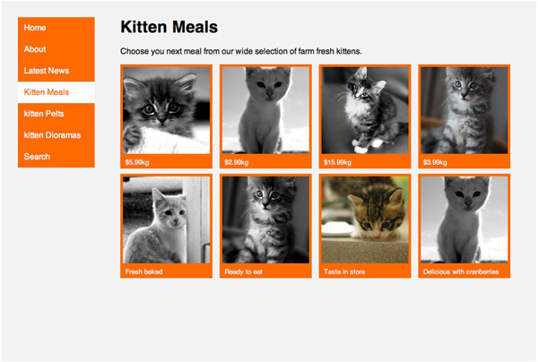
A mainstay of blogs everywhere is the use of an unordered list for the navigation menu. Turning that list horizontal would normally require you to float all the menu items left or right, then deal with the height of the containing element, and any clearing problems. All of these problems are nullified by applying display: inline-block; to all the li elements. If you want to make the anchor elements fill up the space, apply display: block; to them.
到处都是博客的主要Struts,是在导航菜单中使用了无序列表。 将列表水平翻转通常会要求您向左或向右浮动所有菜单项,然后处理包含元素的高度以及任何清除问题。 通过应用display: inline-block;可以消除所有这些问题display: inline-block; 所有的李元素。 如果要使锚元素填充空间,请应用display: block; 给他们。
Here’s some example HTML for a simple menu:
这是一些简单菜单HTML示例:
<div class="nav">
<ul>
<li><a href="home">Home</a></li>
<li><a href="about">About</a></li>
<li><a href="news">Latest News</a></li>
<li><a href="meals">Kitten Meals</a></li>
<li><a href="pelts">kitten Pelts</a></li>
<li><a href="dioramas">kitten Dioramas</a></li>
<li><a href="search">Search</a></li>
</ul>
</div>
Next we apply equally simple CSS:
接下来,我们应用同样简单CSS:
.nav > ul > li {
display: inline-block;
}
.nav > ul > li a:link, .nav > ul > li a:visited {
display: block;
}
After some cosmetic styles are added we have a horizontal menu:
添加了一些装饰样式后,我们有了一个水平菜单:

You may have spotted the fact that the list marker is no longer visible. That’s because list items have a display value of list-item by default; changing the display value has also removed the list marker.
您可能已经发现列表标记不再可见。 这是因为默认情况下,列表项的display值为list-item ; 更改display值也删除了列表标记。
The inline-block elements will also respond to the vertical-align property. So if you have elements of differing dimensions you can create different effects like so:
inline-block元素也将响应vertical-align属性。 因此,如果您拥有尺寸不同的元素,则可以创建不同的效果,如下所示:
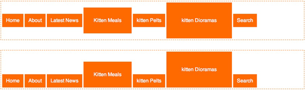
The top menu uses vertical-align: middle; and the bottom menu uses vertical-align: bottom;.
顶部菜单使用vertical-align: middle; 底部菜单使用vertical-align: bottom; 。
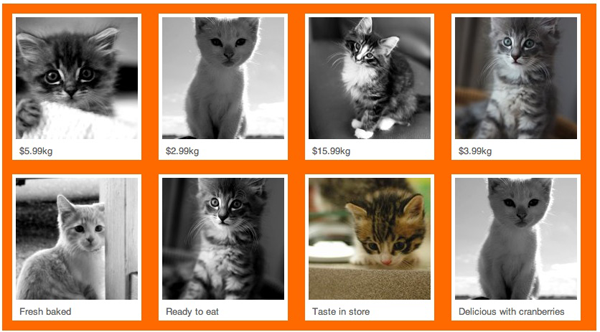
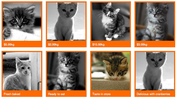
Here’s another example that uses inline-block to create a 2D grid of elements. What I like about using inline-block in this way is that the elements wrap so nicely for different browser widths. Once again the HTML and CSS are simple:
这是另一个使用inline-block创建2D元素网格的示例。 我喜欢以这种方式使用inline-block的原因是,对于不同的浏览器宽度,元素包装得如此好。 HTML和CSS再次很简单:
<ul>
<li class="product"><img src="..."><p>$5.99kg</p></li>
<li class="product"><img src="..."><p>$2.99kg</p></li>
<li class="product"><img src="..."><p>$15.99kg</p></li>
<li class="product"><img src="..."><p>$3.99kg</p></li>
<li class="product"><img src="..."><p>Fresh baked</p></li>
<li class="product"><img src="..."><p>Ready to eat</p></li>
<li class="product"><img src="..."><p>Taste in store</p></li>
<li class="product"><img src="..."><p>Delicious with cranberries</p></li>
</ul>
li.product {
display: inline-block;
...
}With the addition of some cosmetic styles and appropriate widths the effect is complete:
通过添加一些装饰样式和适当的宽度,效果可以完成:
If you use media queries you can make sure that the containing element width is set to an optimal value to avoid any orphans on the last row. It’s just like laying tiles. Check out the example in the code archive if you’d like to see this in action.
如果您使用媒体查询,则可以确保将包含元素的宽度设置为最佳值,以免在最后一行出现任何孤儿。 就像铺瓷砖一样。 如果您想了解一下实际操作,请查看代码档案中的示例。
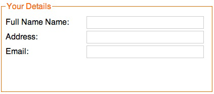
Inline-block is also helpful with form presentation. It’s a great way to apply a consistent width to your labels without using structural markup:
Inline-block也有助于表单显示。 这是在不使用结构标记的情况下将一致的宽度应用于labels的好方法:
<fieldset>
<legend>Your Details</legend>
<label for="name">Full Name:</label><input type="text" value="" />
<label for="address">Address:</label><input type="text" name="address" value="" />
<label for="email">Email:</label><input type="text" name="email" value="" />
</fieldset>
Apply display: inline-block; to the label and input elements, apply an appropriate width to the fieldset element:
应用display: inline-block; 在label和input元素上,将适当的宽度应用于fieldset元素:
label {
display: inline-block;
width: 10em;
}
input[type="text"] {
display: inline-block;
width: 20em;
}
fieldset {
width: 30em;
}
The result is a nicely formatted form:
结果是格式良好的形式:
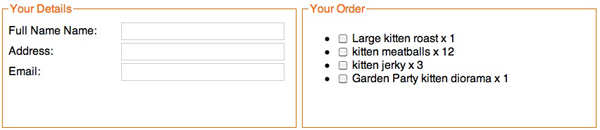
If you apply display: inline-block; to multiple fieldset elements you can align them horizontally, like so:
如果您应用display: inline-block; 到多个fieldset元素,您可以将它们水平对齐,如下所示:
Box-sizing: border-box
装箱尺寸:边框
Box-sizing is actually a CSS3 property, but is supported by all browsers except IE6 and 7. By applying a box-sizing value of border-box to a block element, the browser will include the padding and border widths into the total width of the element; shrinking the content space in the process. This is exactly how IE5 used to work. The problem with the now-standard way of calculating element width—the sum of the element width, padding, border width, and margin—is that you can’t specify a width of 100% and then apply padding or borders because that would increase the element width past 100%. Box-sizing: border-box; is the answer.
Box-sizing实际上是一个CSS3属性,但通过除IE6和7的所有浏览器所支持通过施加box-sizing的值border-box的块元件,浏览器将包括填充和边缘宽度到的总宽度元素 在此过程中缩小内容空间。 这正是IE5过去的工作方式。 现在标准的元素宽度计算方法(元素宽度,填充,边框宽度和边距之和)的问题在于,您不能指定100%的宽度,然后再应用填充或边框,因为那样会增加元素宽度超过100%。 Box-sizing: border-box; 就是答案。
You can happily apply a width of 100% to an element (or the widths of two or more adjacent elements that total 100%) and also add padding and borders without worrying that the elements will grow past 100%. Very handy for fluid layouts.
您可以愉快地将100%的宽度应用于元素(或两个或多个相邻元素的宽度总计为100%),还可以添加填充和边框,而不必担心元素会超过100%。 对于流体布局非常方便。
An important note: depending on the browser version you may need to use the vendor-specific prefixes -moz-box-sizing for Gecko-based browsers, and -webkit-box-sizing for webkit-based browsers. Firefox 3.6 and Chrome 10 appear to support the property without the vendor prefix but Safari 5 still needs it.
重要说明:根据浏览器版本,您可能需要使用供应商特定的前缀-moz-box-sizing用于基于Gecko的浏览器),以及-webkit-box-sizing用于基于Webkit的浏览器)。 Firefox 3.6和Chrome 10似乎支持不带供应商前缀的属性,但Safari 5仍需要它。
Min-height
最小高度
Here’s a common layout situation: two columns; one for the main content and one for complementary content. The HTML might look like this:
这是一种常见的布局情况:两列; 一种是主要内容,另一种是补充内容。 HTML可能如下所示:
<div class="wrapper">
<div class="content">
... main content here
</div>
<div class="nav">
... navigation menu and complementary content here
</div>
</div>
We then apply the following CSS to arrange the columns.
然后,我们应用以下CSS来排列列。
.wrapper {
padding: 2em;
max-width:  980px;
margin: 0 auto;
position: relative;
min-height: 40em;
}
.nav {
position: absolute;
width: 150px;
top: 2em;
background-color: #FF6A00;
}
.content {
margin-left: 200px;
}
The content column is full width, but we add extra margin on the left hand side to accommodate the menu. The menu is then positioned using absolute or fixed positioning. In the past the main drawback of this method was when the complementary column was longer than the main column.
内容栏为全角,但我们在左侧添加了额外的边距以容纳菜单。 然后使用绝对或固定定位来定位菜单。 过去,这种方法的主要缺点是互补色谱柱比主色谱柱长。
Because the complementary column is positioned absolutely it’s out of the document flow and the container element will collapse to the height of the shorter content column. In these times of widespread compatibility for the min-height property, we can easily avoid this problem and apply a min-height value on the containing element; enough to make sure it surround the complementary column.
因为互补列的位置绝对正确,所以它不在文档流中,并且容器元素将折叠到较短内容列的高度。 在这些与min-height属性广泛兼容的时代,我们可以轻松避免此问题,并将min-height值应用于包含元素; 足以确保它包围互补柱。
Here’s the result:
结果如下:
If you want the column on the other side, no need to adjust the markup, just adjust the CSS values.
如果您希望将列放在另一侧,则无需调整标记,只需调整CSS值即可。
.nav {
position: absolute;
width: 150px;
top: 2em;
right: 2em;
background-color: #FF6A00;
}
.content {
margin-right: 200px;
}
Other CSS properties that are useful for layout, but have traditionally been avoided include position: fixed;, max-width, min-width, and max-height. You should take another look at these properties as well because browser support is extensive these days.
其他对布局有用CSS属性,但传统上避免使用这些属性,包括position: fixed; , max-width , min-width和max-height 。 您还应该再看看这些属性,因为这些天浏览器支持广泛。
For example, if you choose fixed positioning for the complementary column, it’ll stay fixed to the viewport, while the rest of the page scrolls. You can see this effect on simplebits.com.
例如,如果您为补充列选择固定位置,它将保持固定在视口,而页面的其余部分将滚动。 您可以在simplebits.com上看到这种效果。
Display: table
显示:表
With the arrival of IE8 all browsers support table-related value for the display property. This allows us to apply the layout behavior of tables, rows and cells to any HTML elements. For alignment into columns or rows, these display values are the quick and easy solution.
随着IE8的到来,所有浏览器都为display属性支持与表相关的值。 这使我们可以将表,行和单元格的布局行为应用于任何HTML元素。 为了对齐到列或行,这些display值是快速简便的解决方案。
There’s often quick resistance to anything table-related mentioned in the same breath as CSS layouts. In fact some web professionals are so outraged at the suggestion of using display: table;, you’d think we’re killing kittens.
通常,对于与CSS布局同时出现的任何与表相关的东西,通常都具有快速的抵抗力。 实际上,某些网络专业人员对使用display: table;的建议感到非常愤怒display: table; ,您可能会认为我们正在杀死小猫。
Table-based display values are unrelated to using HTML-tables for layout. The debates have come and gone. They’re boring now. Let’s move on.
基于表的display值与使用HTML表进行布局无关。 辩论来了又去了。 他们现在很无聊。 让我们继续。
All the previous examples using display: inline-block; can also be achieved using display: table; and related values. Here’s our navigation menu again, but this time each menu item is displaying like a table cell instead of an inline-block.
前面的所有示例都使用display: inline-block; 也可以使用display: table; 和相关值。 这又是我们的导航菜单,但是这次每个菜单项都显示为一个表格单元,而不是一个内联块。

The HTML is the same and the CSS only requires a couple of simple changes:
HTML相同,而CSS仅需要几个简单的更改:
.nav > ul {
display: table;
border-spacing: 0.25em;
}
.nav > ul > li {
display: table-cell;
}
You might notice that there’s no element playing the part of the table row. There’s no need: browsers makeup the missing parts of the table structure using anonymous elements. You might also notice that because we’re applying the table display behavior to the ul element, we can also apply table-related style properties like border-spacing.
您可能会注意到,没有任何元素在表行的一部分中发挥作用。 不需要:浏览器使用匿名元素来弥补表结构中缺失的部分。 您可能还会注意到,因为我们将表显示行为应用于ul元素,所以我们还可以应用与表相关的样式属性,例如border-spacing 。
Our new menu bar has one big behavior difference to its inline-block-based cousin. Because it acts like a table with a single row, those menu items no longer wrap. Instead, if the browser window becomes narrower, they’ll bunch up—each cell’s width will be reduced just like a HTML table. It’s worth keeping in mind when choosing your layout method; sometimes you may want elements to wrap, sometimes not. The choice is yours.
我们的新菜单栏与基于inline-block的表亲在行为上有很大不同。 因为它的作用就像是具有一行的表,所以这些菜单项不再包装。 相反,如果浏览器窗口变窄,它们会聚在一起-每个单元格的宽度将像HTML表一样减小。 选择布局方法时要牢记; 有时您可能想包装元素,有时则不需要。 这是你的选择。
If we want to make a fixed, equidistant grid of elements, CSS tables come to the rescue. This is a modification to the previous grid example, except this time we’ll need to adjust the HTML. We’ll use multiple ul elements and each one will become a table row:
如果我们想制作一个固定的等距网格,可以使用CSS表。 这是对上一个网格示例的修改,除了这次我们需要调整HTML。 我们将使用多个ul元素,每个元素将成为一个表格行:
<div class="content">
<ul>
<li class="product"><img src="..."><p>$5.99kg</p></li>
<li class="product"><img src="..."><p>$2.99kg</p></li>
<li class="product"><img src="..."><p>$15.99kg</p></li>
<li class="product"><img src="..."><p>$3.99kg</p></li>
</ul>
<ul>
<li class="product"><img src="..."><p>Fresh baked</p></li>
<li class="product"><img src="..."><p>Ready to eat</p></li>
<li class="product"><img src="..."><p>Taste in store</p></li>
<li class="product"><img src="..."><p>Delicious with cranberries</p></li>
</ul>
</div>
Here’s the CSS:
这是CSS:
.content {
display: table;
border-spacing: 1em;
}
.content > ul {
display: table-row;
}
li.product {
display: table-cell;
width:  170px;
}
Here’s your perfect grid:
这是您的理想网格:
Of course it’s trivial to achieve our two-column layout using display: table;:
当然,使用display:table ;:实现我们的两列布局很简单。
.nav {
display: table-cell;
width: 150px;
padding-right: 50px;
}
.content {
display: table-cell;
}
Equal height columns, without the need to specify a min-height value, with a minimum of fuss. Of course to adjust the position of the complementary column we’d have to change the order in the HTML source. It’s a slight downside you have to consider when choosing to use display: table;.
高度相等的列,无需指定min-height值,而只需大惊小怪。 当然,要调整互补列的位置,我们必须更改HTML源代码中的顺序。 选择使用display: table;时,必须考虑一点缺点display: table; 。
Equal height columns is particularly useful when you want to include vertical borders between columns. Using display: table; has an added bonus in this situation: the border-collapse property. Take, for example, a typical three column footer you might find on a WordPress-powered site:
当您想在列之间包括垂直边框时,等高列特别有用。 使用display: table; 在这种情况下有一个额外的好处: border-collapse属性。 例如,在WordPress驱动的网站上可能会发现一个典型的三列页脚:
<ul>
<li class="widget-container">
...footer column content
</li>
<li class="widget-container">
...footer column content
</li>
<li class="widget-container">
...footer column content
</li>
</ul>
Here’s the end result; equal height columns with a single pixel vertical border on the columns.
这是最终结果; 等高的列,列上具有单个像素垂直边框。
Once again the CSS is simple:
CSS再次很简单:
.footer {
display: table;
border-collapse: collapse;
width: 100%;
}
.footer > li {
display: table-cell;
width: 33.3%;
padding: 1em;
border-left: 1px solid #FF6A00;
border-right: 1px solid #FF6A00;
}
One small caveat: the border-collapse property has to be set on the element to which you’ve added the display: table; property.
一个小警告:必须在添加display: table;的元素上设置border-collapse属性display: table; 属性。
Finally, here’s a trick CSS tables can perform effortlessly, that other techniques struggle with: vertical alignment. Here’s what we want to achieve; perfect centering of a block element:
最后,这是CSS表可以轻松执行的技巧,而其他技术则难以解决:垂直对齐。 这是我们想要实现的目标; 块元素的完美居中:
We’ll need an element to be the table and one to be the single cell. For this example we’ll co-opt the html and body elements in order to center a div element. The rest is easy:
我们需要一个元素作为表,一个元素作为单个单元格。 在此示例中,我们将选择html和body元素,以便将div元素居中。 其余的很简单:
html {
width: 100%;
height:  100%;
display: table;
}
body {
display: table-cell;
vertical-align: middle;
}
body > div {
width: 300px;
margin: 0 auto;
}
Aren’t Floats Good for Something?
漂浮不有益吗?
Defenders of the floated layout are quick to point out the strengths of their technique. Here are the often cited benefits:
浮动布局的辩护者会Swift指出他们的技术优势。 以下是经常提到的好处:
Source Order Independence
源顺序独立
As I mentioned above, dependence upon HTML source order for the columns when using display: table; is a common criticism. But I question the implication that floated layouts are indeed independent of source order, the belief that they are the only way to achieve source order independence, and the notion that source order independence is even important.
正如我上面提到的,使用display: table;时要依赖于HTML源顺序display: table; 是一种普遍的批评。 但是我质疑浮动布局确实独立于源顺序的含义,相信它们是实现源顺序独立性的唯一方法,以及源顺序独立性甚至很重要的观念。
First let’s clarify something: pure CSS layouts are pure fiction. All current CSS layout methods rely on the document flow to some extent. CSS lacks a way to describe a layout that is completely independent of the order of the markup, although it may gain one in the near future.
首先让我们澄清一下:纯CSS布局是纯小说。 当前所有CSS布局方法在某种程度上都依赖于文档流。 CSS缺乏一种描述布局的方法,该布局完全不依赖于标记的顺序,尽管它可能会在不久的将来成为现实。
Claims of source order independence usually only mean that you can reorder columns. With a simple CSS change left becomes right and right becomes left. Headers, footers and the content within columns are usually still in display order. But, how often is this column-switching ability put to real use? This ability is only possible in specific circumstances and the markup and CSS have to be constructed with this ability in mind. If this ability is actually required for a specific reason, it may be worth all the trouble. If you only use it to prove that it can be done, then is all the added complexity and brittleness worth a slight decrease in source order dependence?
声明源顺序独立性通常仅意味着您可以对列进行重新排序。 通过简单CSS更改,左变为右,右变为左。 页眉,页脚和列中的内容通常仍按显示顺序显示。 但是,这种列切换功能多久才能投入使用? 仅在特定情况下才可以使用此功能,并且在构造标记和CSS时必须牢记此功能。 如果实际上出于某种特定原因需要此功能,那么所有麻烦都值得。 如果仅使用它来证明它是可以完成的,那么所有增加的复杂性和脆弱性是否值得在源顺序依赖性方面稍有减少?
The only real way to position elements without regard to source order is to use the position values fixed or absolute. The min-height layout demo above is an example. Also, if you use display: inline-block; to horizontally align block elements, you can use a combination of positive and negative margin values to reorder the elements visually without changing the source order.
唯一的真正的方式来定位元素,不考虑源顺序是使用position值fixed或absolute 。 上面的min-height布局演示是一个示例。 另外,如果使用display: inline-block; 要水平对齐块元素,可以使用正和负margin值的组合在视觉上重新排列元素,而无需更改源顺序。
If you remain unconvinced that the source order issue is a red herring, consider that, as this 465 Berea St article points out, the Web Content Accessibility Guidelines clearly recommend that HTML source order should match the display order. Consider also that the rise of HTML5 makes the source order issue a moot point. HTML5 provides explicitly semantic elements. The order in which you place them in the source will make no difference to the indexing of your content. The article element will contain the article content, the header element will contain the header content, and the aside element will contain the complementary content.
如果您仍然不确定源顺序问题是一条红色的鲱鱼,请考虑一下,正如这篇465 Berea St文章所指出的那样,《 Web内容可访问性指南》明确建议HTML源顺序应与显示顺序相匹配 。 还考虑HTML5的兴起使源顺序成为一个争论点。 HTML5提供了明确的语义元素。 将它们放置在源中的顺序不会对内容的索引产生任何影响。 article元素将包含文章内容, header元素将包含标题内容, aside元素将包含补充内容。
Browser Compatibility
浏览器兼容性
IE 6 and 7 compatibility are frequently used as a yoke to reign in unbridled enthusiasm for new layout techniques. If you’re still clinging to the idea that one stylesheet should work everywhere, on all browsers, the concept of responsive design should destroy that notion for good. With so many web-enabled devices you need to customize the experience for these devices anyway.
IE 6和7的兼容性经常被用作对新的布局技术无限热情的控制。 如果您仍然坚持一个样式表应该在所有浏览器上都可以运行的想法,那么响应式设计的概念应该彻底摧毁这一概念。 拥有这么多启用Web的设备,您仍然需要自定义这些设备的体验。
With the release of IE9 it’s time to put these old clunkers out to pasture. Treat IE6 and 7 like the least capable mobile devices and use conditional comments to provide a minimal experience. If you’re using the advanced clearfix rule I mentioned at the beginning of this article, but lack an alternative stylesheet for IE6 and 7, you’re already ignoring the browser compatibility issue.
随着IE9的发布,是时候将这些旧的旧玩具放牧了。 将IE6和7视为功能最差的移动设备,并使用条件注释来提供最少的体验。 如果您使用的是我在本文开头提到的高级clearfix规则,但是缺少IE6和7的替代样式表,则您已经忽略了浏览器兼容性问题。
There’ll Always be Floats
永远有浮标
Of course floats are useful in some situations. There will always be a need to float an element so that other page content flows around it. There’s just no need to always press them into the service of a complicated layout.
当然,浮点数在某些情况下很有用。 总是需要浮动一个元素,以便其他页面内容在该元素周围流动。 无需总是将它们压入复杂布局的服务中。
Is That It?
是吗?
You might be thinking “Is that it? It seems very simple and obvious.” I agree! That’s the whole point. The floating crowd would have you believe that the only way to build advanced CSS layouts is through complicated stacks of floated elements. That’s not true any more. We now have a stack of easy-to-use properties available. Combine some or all of the above methods into a single layout and you’ll be able to do whatever you want without floats.
您可能会想:“是吗? 看起来非常简单明显。” 我同意! 这就是重点。 浮动人群会让您相信构建高级CSS布局的唯一方法是通过复杂的浮动元素堆栈。 这不再是真的。 现在,我们提供了一堆易于使用的属性。 将上述部分或全部方法组合到一个布局中,就可以在不使用浮点数的情况下做任何想要的事情。
I watch my kids play Little Big Planet 2, and see them create their own worlds from scratch. I want them to see the web in the same way: like a playground. When layouts are simple to create, making tools that generate CSS layouts will be easy too. People will no longer need to code by hand.
我看着孩子们玩《小大星球2》,看到他们从头开始创造自己的世界。 我希望他们以相同的方式浏览网络:就像操场一样。 如果布局易于创建,那么生成CSS布局的工具也将很容易。 人们将不再需要手工编码。
Browsers have come leaps and bounds since the bad old days. Spurred on by the adoption of Ajax and now HTML5 and CSS3, browser makers are working harder than ever. We have to keep this momentum going, use the new technology as much as possible. These experiences give people a reason to upgrade their browsers, browser-makers a reason to keep developing, and tool-makers a reason to create better, easier-to-use tools. We have to explore the boundaries, develop new techniques, and boot those old, cherished layout recipes out the door. They’re holding us back.
自从糟糕的过去以来,浏览器就突飞猛进。 在采用Ajax以及现在HTML5和CSS3的推动下,浏览器制造商比以往任何时候都更加努力。 我们必须保持这种势头,尽可能多地使用新技术。 这些经验使人们有理由升级他们的浏览器,使浏览器制造商有理由继续发展,而工具制造商有理由创造更好,更易于使用的工具。 我们必须探索边界,开发新技术,并把那些古老的,珍贵的布局配方推向门外。 他们阻止了我们。
The Future
未来
CSS3 layout is set to provide far more exciting layout controls. But, we’ll have to wait a few more years before these standards have widespread support. To me it feels as if a large segment of the web industry is standing still, waiting around until CSS3 layout standards are fully supported. Why wait? Much easier layout methods are available right now.
CSS3布局被设置为提供更多令人兴奋的布局控件。 但是,在这些标准得到广泛支持之前,我们将不得不再等几年。 对我来说,感觉好像Web行业的大部分都停滞不前,等到CSS3布局标准得到完全支持。 干嘛要等? 现在可以使用更简单的布局方法。
All the source code for the examples in this article is available on GitHub.
GitHub上提供了本文示例的所有源代码。
No kittens were actually harmed in the making of this article.
实际上,在撰写本文时,没有小猫受到伤害。
翻译自: https://www.sitepoint.com/give-floats-the-flick-in-css-layouts/
在CSS布局中让Floats轻拂相关推荐
- css布局中的居中问题
css布局中的居中问题 作者:阿捷 2004-7-5 14:35:49 #sample{ HEIGHT:240px;WIDTH:400px; BACKGROUND: url(http://www.w3 ...
- DIV CSS布局中绝对定位和浮动用法
转自:http://developer.51cto.com/art/201009/223337_1.htm 你对DIV CSS布局中绝对定位和浮动的概念及使用是否熟悉,这里和大家分享一下,CSS中,实 ...
- php中的文字排版问题,CSS布局中常用的文字排版相关属性详解
本篇文章给大家带来的内容是关于CSS布局中常用的文字排版相关属性详解,有一定的参考价值,有需要的朋友可以参考一下,希望对你有所帮助. CSS布局中常用的文字排版相关属性详解 一.设定文字字体.颜色.大 ...
- div css布局中CSS图片大小自动按比例等比例缩小图片不变形解决技巧
div css布局中CSS图片大小自动按比例等比例缩小图片不变形解决技巧 在DIV CSS布局中对于图片列表或图片排版时,图片不是固定宽度高度大小,但图片占位是固定宽度高度,这个时候如果使用CSS固定 ...
- div css布局中CSS图片大小自动按比例等比例缩小图片不变形解决技巧(转)
本人对前端处理不是很牛,所以转载这文章.原文地址:http://www.divcss5.com/wenji/w632.shtml DIV CSS布局中对于图片列表或图片排版时,图片不是固定宽度高度大小 ...
- html设置布局颜色设置,css布局中置背景颜色
css机关中不论是设置装备摆设后台色调照常布景图片,都是运用background来完成.这里CSS5为大家通俗简单颠末图文教程让各人驾驭css bac千克round配景花式. 一.语法与结构 1.语法 ...
- html布局文字设置,div css布局中css中文字体设置
在HTML网页结构中,会用到中文字,而中文字有得多中笔墨体,有的开发者在自身电脑中下载并安装不少摩登字体.而这些中文字体CSS设置装备摆设提倡? 1.不克不及随意CSS设置装备摆设本人安装中笔墨体 假 ...
- CSS布局中应用BFC的例子
2019独角兽企业重金招聘Python工程师标准>>> BFC是啥? BFC(Block Formatting Context),"块状格式化上下文".简单地说, ...
- [存档]Div+Css布局中经常使用的小技巧合集
CSS网页布局开发中,会有很多小技巧,这里再扩展一下您所想要得到的知识,相信您会有很多收获! 一.ul标签在Mozilla中默认是有padding值的,而在IE中只有margin有值. 二.同一个的c ...
最新文章
- 【原创】Cookie应用(二)
- jQuery实现王者手风琴案例
- iOS应用数据持久化(一)
- Vue学习(vuex)-学习笔记
- flink更新flink-shaded-hadoop-3-uber
- 一企业彻底实现金融风险数字化,节约人力超4000小时
- 02 | 日志系统:一条SQL更新语句是如何执行的? 笔记(转)
- 【java】java 并发编程 BlockingQueue 和 BlockingDeque
- 浅谈 标准的代号和编号
- day02:关于惯性导航工具箱的学习与使用:use of the progen
- 九.类的进化(魔法方法、特性和迭代器)
- html类名定义规则_好程序员分享Java语言中的标识符规则
- 【ICEPAK】手把手教你热仿真
- 求四边形最大内接矩形,一种不规则多边形的最大内接矩形的快速近似求解方法与流程...
- 交通大数据干货总结(1)
- 计算机发展史观后感50字,《计算机:一部历史》读后感_1300字
- USB接口不同颜色的作用
- 妙控鼠标灵敏度太低怎么办
- Adobe2022更新,打开photoshop总是提示需要访问钥匙串秘钥怎么解决?
- 数组操作 push()