element-ui表单_每日UI挑战强加-登录表单(分步教程)
element-ui表单
A step by step journey to create a good design from the daily UI challenge
一步步走,从日常的UI挑战中创建出色的设计
内容 (Content)
- Introduction介绍
- Result demo结果演示
- Prerequisite先决条件
- Step by step guide逐步指南
- Conclusion结论
介绍 (Introduction)
The “Daily UI Challenge” (https://www.dailyui.co/) is a challenge for UI/UX designers. They provide a different type of UI elements every week (like sign-in, user profile, search etc) and designer on the challenge attempt to create their own version. Many of the designs are very inspiring and creative.
“每日UI挑战”( https://www.dailyui.co/ )对UI / UX设计师来说是一个挑战。 他们每周都会提供不同类型的UI元素(例如登录,用户个人资料,搜索等),挑战者将尝试创建自己的版本。 许多设计都非常具有启发性和创造性。
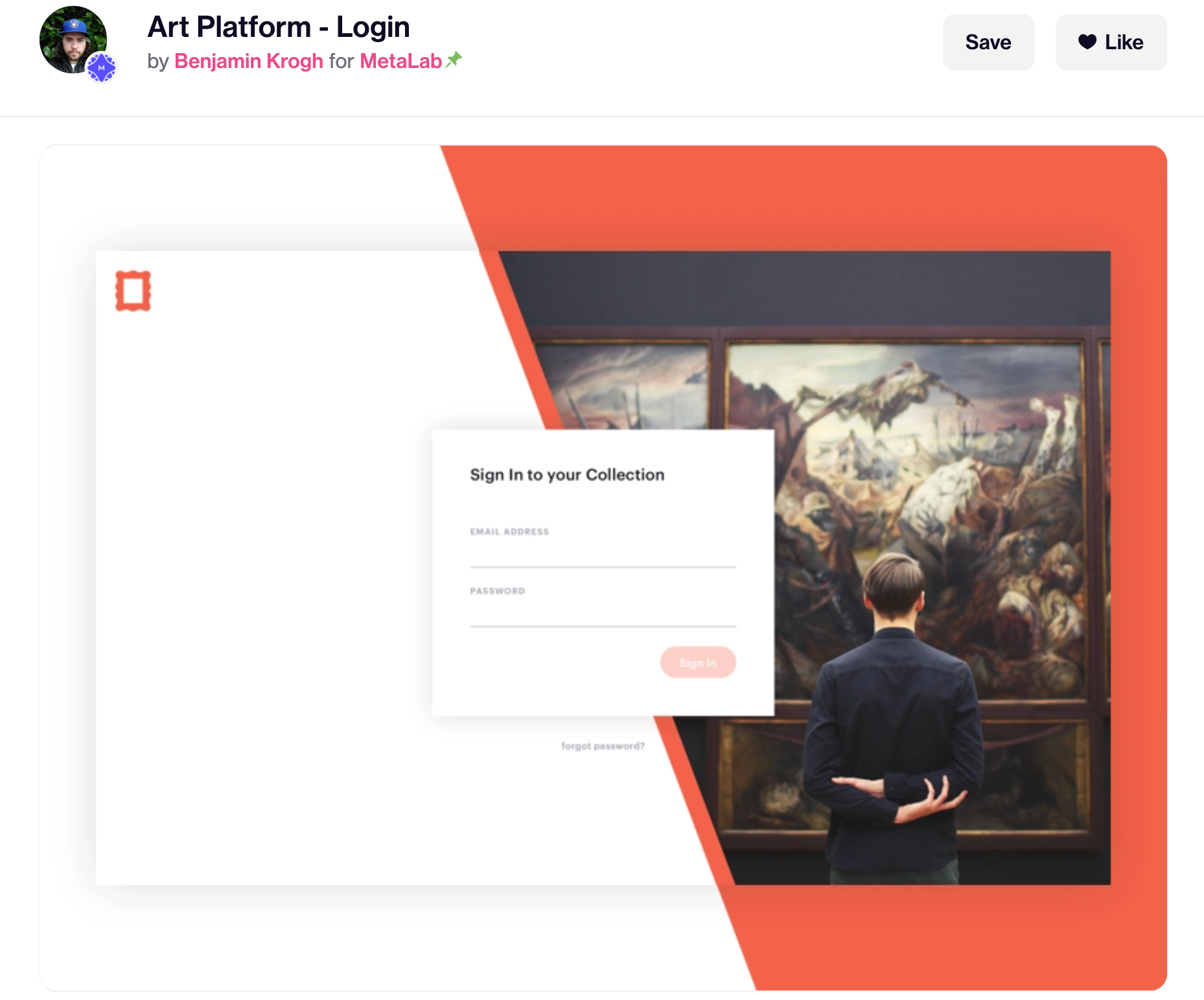
In this article, I will pick one interesting example for “Sign in” form and try to actually implement it in code. The example I picked is “Art Platform — login” by Benjamin Krogh (https://dribbble.com/shots/3270775-Art-Platform-Login)
在本文中,我将为“登录”表单选择一个有趣的示例,并尝试在代码中实际实现它。 我选择的示例是Benjamin Krogh的“艺术平台-登录”( https://dribbble.com/shots/3270775-Art-Platform-Login )
Note like this is usually further explanation
像这样的笔记通常是进一步的解释
结果演示 (Result demo)
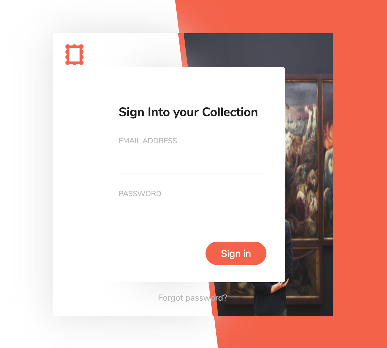
This is the final result I created in codepen:
这是我在Codepen中创建的最终结果:
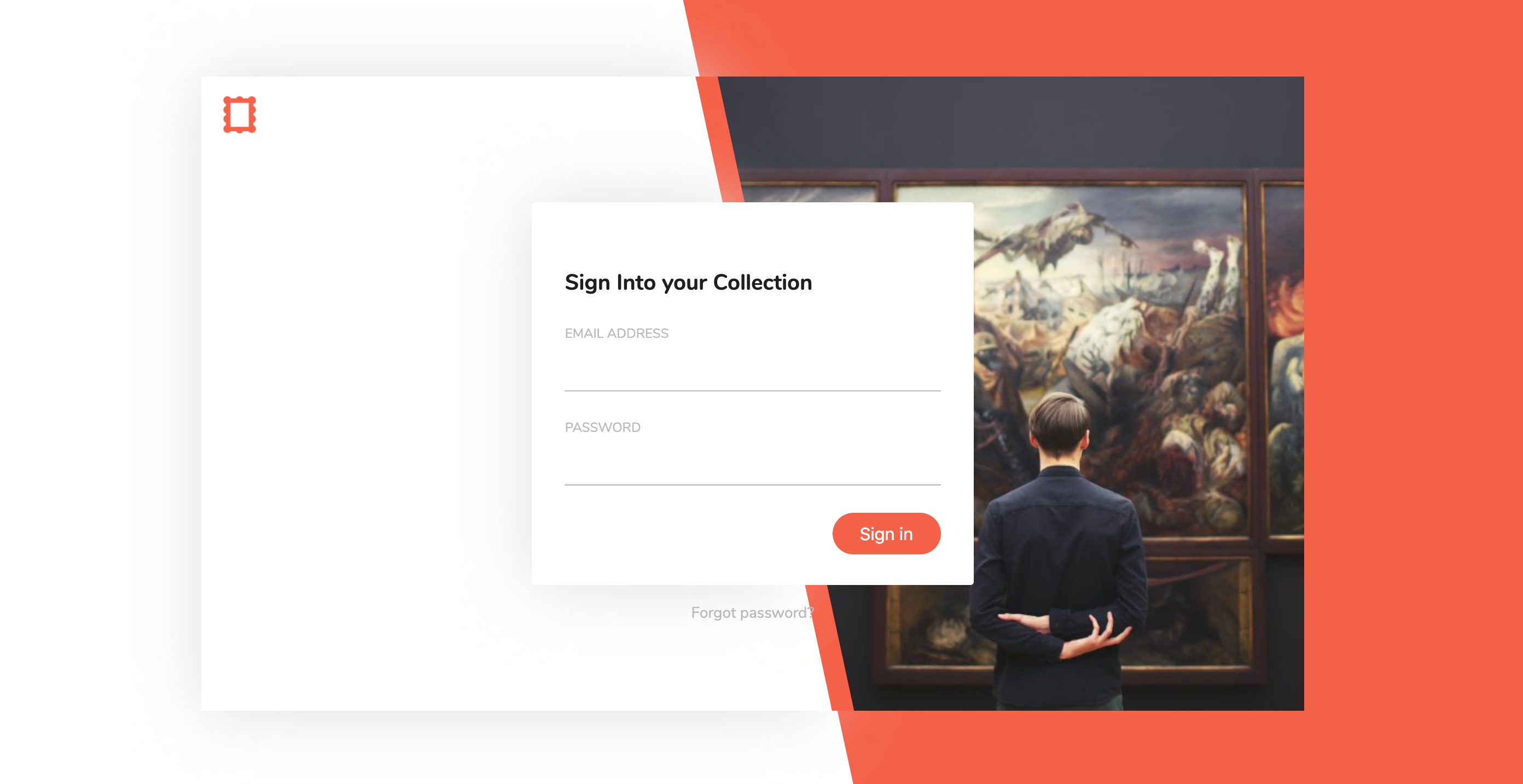
Codepen: https://codepen.io/josephwong2004/full/NWGBRJQ
Codepen: https ://codepen.io/josephwong2004/full/NWGBRJQ
先决条件 (Prerequisite)
Basic HTML, CSS and SCSS/SASS
基本HTML,CSS和SCSS / SASS
逐步指南 (Step by step guide)
Step 1: Create a quick draft
第1步:创建快速草稿
The first thing I do is to quickly draft the design myself, and break it down to different elements in coding.
我要做的第一件事是自己快速起草设计,并将其分解为编码中的不同元素。
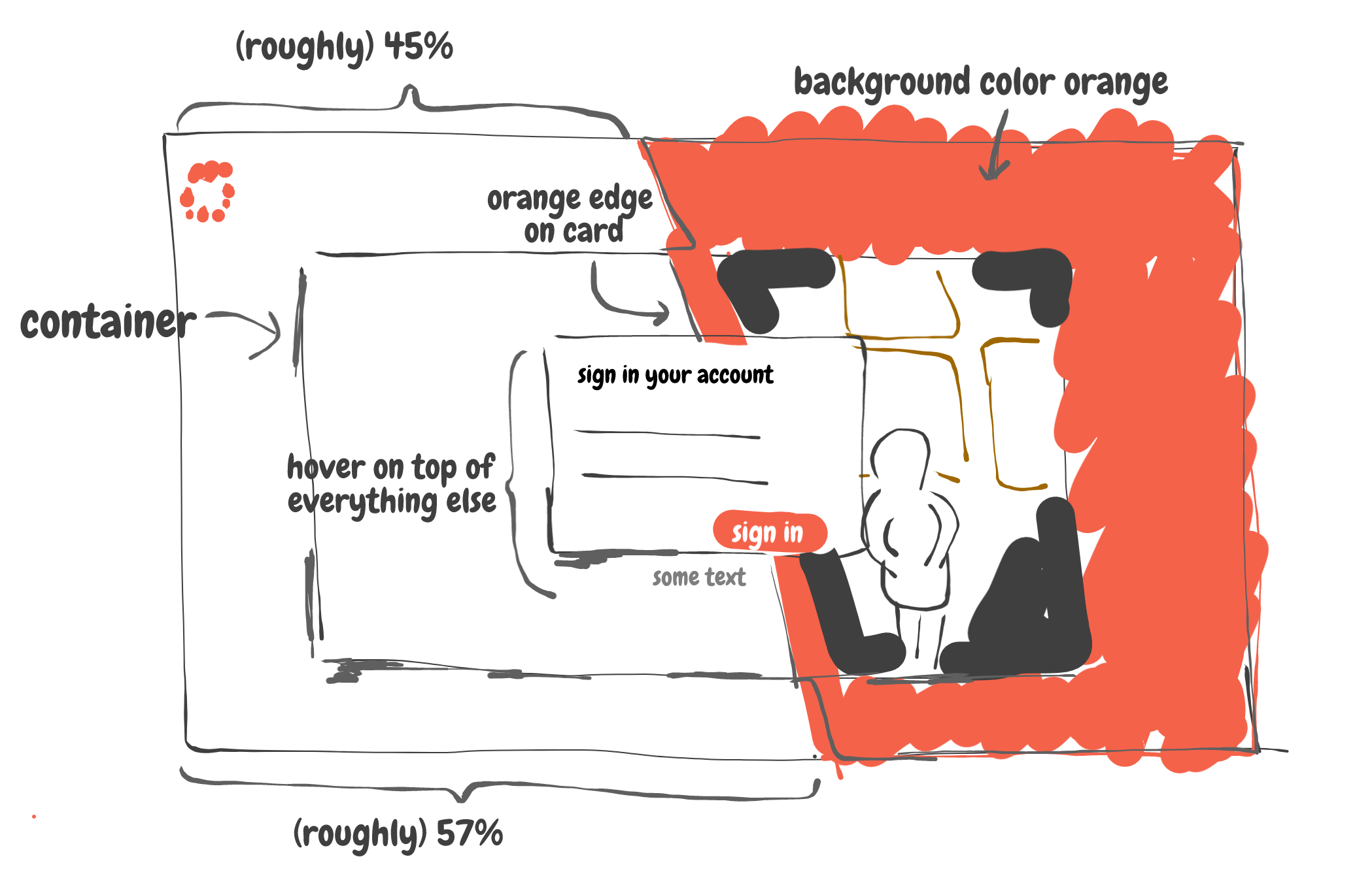
The first thing I notice is the different hierarchy level of the design. From bottom to top:
我注意到的第一件事是设计的不同层次结构级别。 从下到上:
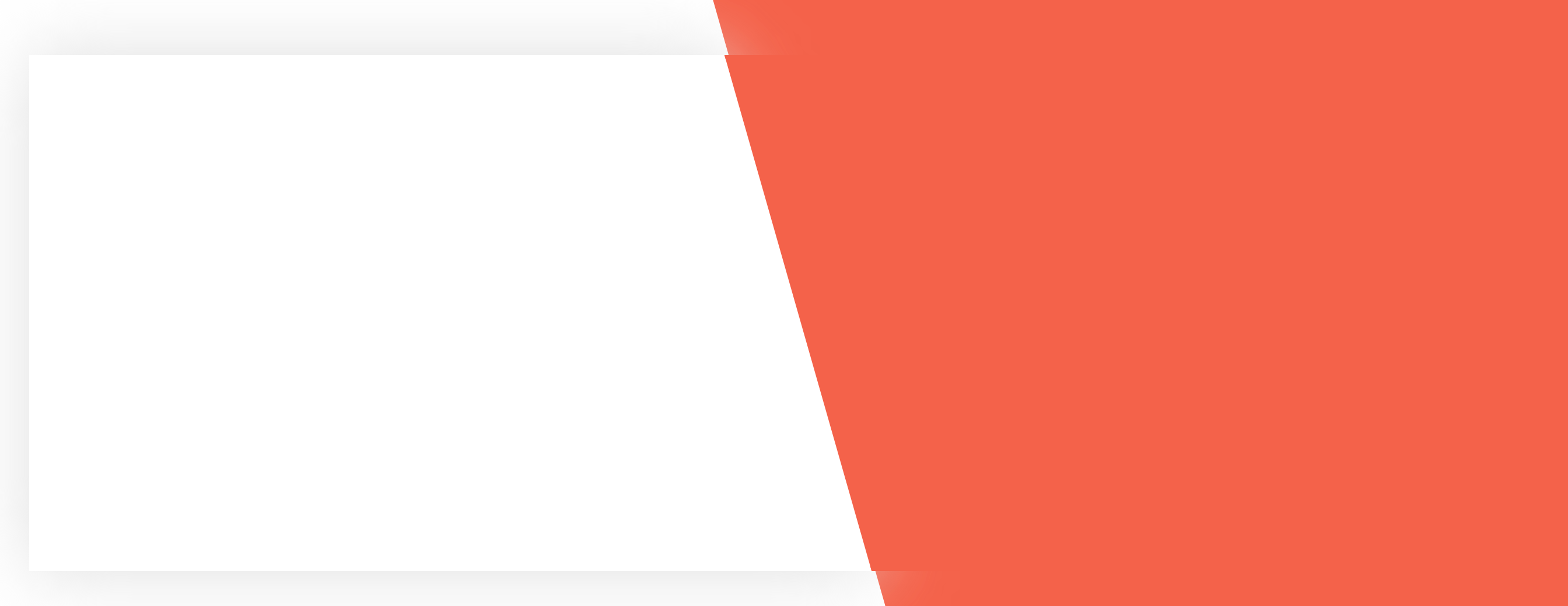
- Background with white and orange split color白色和橙色拆分颜色的背景
- Container for the “card” like shape, holding the image. Also, it has an orange edge像“卡片”一样的形状的容器,用于保存图像。 而且,它有一个橙色的边缘
- Pop up sign in form弹出登录表单
I have some personal interpretation here as well. I assume the orange in the background and the orange on the card is separated. Although it is not that obvious in the original design, I believe since the card is “lifted”, the orange edge part should be lifted as well. Making it extend a bit from the background.
我在这里也有一些个人解释。 我假设背景中的橙色和卡上的橙色是分开的。 尽管在原始设计中并没有那么明显,但我相信由于卡是“提起”的,因此橙色边缘部分也应该提起。 使它从背景开始延伸一点。
Step 2: Make the background
步骤2:制作背景
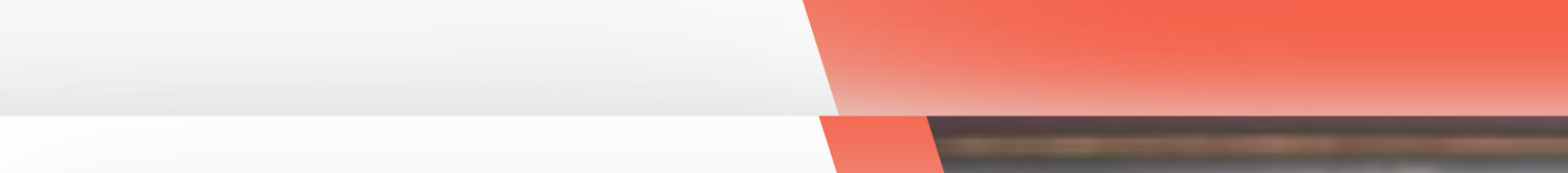
We will create the design of the three different hierarchy one by one. Starting with the background. We will need to make it split between white and orange. My solution is to use a div with white background, and a “before” element with clip-path for the orange part.
我们将一个一个地创建三个不同层次的设计。 从背景开始。 我们需要将其分为白色和橙色。 我的解决方案是使用具有白色背景的div和橙色部分的带有剪切路径的“ before”元素。
On second thought after completing the whole thing, I should have just use background
linear-gradientfor the same effect. It is a more elegant way and we don’t need to have a “before” element just for background color.在完成整个过程后,再三考虑,我应该只使用背景
linear-gradient来达到相同的效果。 这是一种更优雅的方法,我们不需要仅将背景色设置为“ before”元素。If you are interested: https://stackoverflow.com/questions/25958315/use-linear-gradient-in-css-to-split-div-in-2-colors-but-not-in-equal-halves
如果您有兴趣: https : //stackoverflow.com/questions/25958315/use-linear-gradient-in-css-to-split-div-in-2-colors-but-not-in-equal-halves
So let jump into the html and css.
因此,让我们跳入html和CSS。
HTML (it is just one line for the background):
HTML(背景仅一行):
SCSS:
SCSS:
There’s a lot of things in the SCSS, but most of them are just setting up for future use. Like the color, font, and helper mixin.
SCSS中有很多东西,但是其中大多数只是为了将来使用而设置。 像颜色,字体和辅助混合。
One thing I discover about clip path (not sure if it is browser specific issue) is that sometimes it show a tiny white border around the clipped area when two div are overlapping. Therefore you can see my $path actually exceed 100% and 0% as a workaround.
我发现有关剪切路径的一件事(不确定是不是浏览器特定的问题)是,当两个div重叠时,有时在剪切区域周围会显示一个细小的白色边框。 因此,您可以看到我的$ path实际上超过100%和0%作为解决方法。
So pretty simple, we have our background with two-color split. The next step is to create the card container.
非常简单,我们将背景分为两色。 下一步是创建卡容器。
Step 2: Create the card container
步骤2:建立卡片盒
Okay, This part is very similar to the background. We basically need to create the same thing, just with smaller width and height and a box-shadow around.
好的,这部分与背景非常相似。 我们基本上需要创建相同的东西,只是宽度和高度更小,周围有一个盒子阴影。
One tricky thing about it is that, if you are only using a box-shadow (say in light grey color) on the whole card container, when the grey shadow got projected to the background, you will see that on the white background part, you get a dark shadow, while on the orange background part, you get a white shadow instead. This is what I am talking about:
一件棘手的事情是,如果您只在整个名片盒上使用盒子阴影(用浅灰色表示),那么当灰色阴影投射到背景上时,您会在白色背景部分看到它,您会得到一个深色阴影,而在橙色背景部分上,您将获得白色阴影。 这就是我在说的:
From the original design, there are no “white shadow” on the orange part of the card. Therefore, I assume there are no shadow at all on that part. To only apply shadow on the “white part” of the card, I used a clip-path and filter: drop-shadow since clip-path and box-shadow doesn’t work together.
从原始设计来看,卡的橙色部分没有“白色阴影”。 因此,我认为该部分完全没有阴影。 为了仅在卡的“白色部分”上施加阴影,我使用了剪切路径和filter: drop-shadow因为剪切路径和box-shadow不能同时使用。
This is the code for the card container part:
这是卡容器部分的代码:
HTML:
HTML:
You can see I have a container-shadow class. That is what I talk about for dropping shadow on the white part
您可以看到我有一个容器阴影类。 这就是我要在白色部分上投影的目的
SCSS:
SCSS:
One good thing about having mixin for clip-path is I can easily modify and experiment with the “clip” until it is perfect for me. Having a mixin greatly simplify this process.
对于剪辑路径使用mixin的一件好事是,我可以轻松修改并尝试使用“剪辑”,直到它对我来说是完美的。 使用mixin可以大大简化此过程。
For the container-shadow, we need two element, a parent and a child to apply drop shadow. The parent is just the same size as container, while the child (after element) is clipped
对于容器阴影,我们需要两个元素,即父元素和子元素来应用阴影。 父容器的大小与容器大小相同,而子容器(在元素之后)被裁剪
And the result look like so:
结果看起来像这样:
It looks a bit weird look since we don’t have the image added. Let do that next.
由于我们没有添加图片,因此看上去有些奇怪。 接下来让我们做。
Step 3: Fill in the image and icon
步骤3:填写图片和图标
Next, we need to fill in the image and the icon. It took me some time to find the original image (the man looking at the painting). With google search by image for a similar photo, I finally got the original size of it. And for the icon, it will be far too blurry if I just clip it out from the design. So I used photoshop to create a similar one.
接下来,我们需要填写图像和图标。 我花了一些时间才能找到原始图像(那个看着画作的人)。 谷歌通过图像搜索类似的照片,我终于得到了它的原始大小。 对于图标来说,如果我只是将其从设计中裁剪出来的话,那就太模糊了。 所以我用photoshop来创建一个类似的。
With the image asset ready, we can fill up the card:
准备好图像资产后,我们可以填充卡片:
HTML:
HTML:
SCSS:
SCSS:
Not much to talk about here. We are just reusing the clip path mixin again on the image. Again, the final clip percentage is just by empiricism (with trial and error).
这里没有太多要谈论的。 我们只是在图像上再次使用了剪切路径混合。 同样,最终片段的百分比只是凭经验(带有反复试验)。

Step 4: Create the sign up form
第4步:创建注册表单
Last but not least (actually the most important part), we have to create the sign-in form UI. The form is lifted on the container using box-shadow. Again, we face the same problem that the shadow color looks different when dropped on the light background and the dark background (the image). Therefore, we will apply the same technique to drop-shadow only on the light part.
最后但并非最不重要的一点(实际上是最重要的部分),我们必须创建登录表单UI。 使用盒子阴影将表格抬到容器上。 同样,我们面临同样的问题,即当阴影颜色放在浅色背景和深色背景(图像)上时,阴影颜色看起来会有所不同。 因此,我们将仅在较轻的部分上将相同的技术应用于阴影。
The input part is very simple. Although without specification of how the input reacts on focus, I can only assume it myself. I make the border line orange and make the button darker on hover.
输入部分非常简单。 尽管没有说明输入如何聚焦,我只能自己假设。 我将边界线设置为橙色,并在悬停时使按钮变暗。
The sign-in form part of the code look like so.
代码的登录表单部分看起来像这样。
HTML:
HTML:
SCSS:
SCSS:
It may look like there is a lot of style, but breaking them down one by one, there are no fancy property. I am just trying to capture the UI element in the design and make them look similar.
看起来好像有很多风格,但是将它们一一分解,就没有花哨的属性。 我只是试图捕获设计中的UI元素,并使它们看起来相似。
And this is the final result. Hope you like it!
这是最终结果。 希望你喜欢!
结论 (Conclusion)
It is a very interesting exercise to copy UI and try to implement it yourself as precisely as possible. I have made a lot of mistakes (like not using background color and linear gradient for the orange background split) and learn a great deal doing this exercise.
复制UI并尝试自己尽可能精确地实现UI是一个非常有趣的练习。 我犯了很多错误(例如不对橙色背景拆分使用背景色和线性渐变),并且在进行此练习时学到了很多东西。
One thing you may notice on the codepen is, this design I made doesn’t scale well on responsive. The image just keeps scaling down on resize. A completely new design might be a need for a different size.
您可能会在Codepen上注意到一件事,即我所做的此设计在响应式上的伸缩性不佳。 图像只是不断缩小以调整大小。 全新的设计可能需要不同的尺寸。
But overall, I like this design a lot. Feel free to leave a comment if you like this article!
但总体而言,我非常喜欢这种设计。 如果您喜欢这篇文章,请随时发表评论!
翻译自: https://levelup.gitconnected.com/daily-ui-challenge-impose-sign-in-form-step-by-step-tutorial-cef28f5a1b5f
element-ui表单
http://www.taodudu.cc/news/show-893941.html
相关文章:
- shields 徽标_徽标不够用时如何设计应用程序图标
- zoom 用户被锁定_重新考虑Zoom的用户体验
- ui设计看的书_5本关于UI设计的书
- 案例研究设计与方法-罗伯_旭进口重新设计-用户体验案例研究
- axure rp 创建弹框_如何在Axure RP 9中创建交换机
- 界面设计语言_使用任何语言设计界面的提示
- hp-ux锁定用户密码_UX设计101:提出正确的问题-规划和促进用户访谈
- mac基本操作技巧_6个基本设计技巧
- stack smash_扶手椅VGUX:Super Smash Bros.Ultimate
- 全库模式 用户模式 表模式_暗模式,亮模式和用户的故事
- ios 刷新遮罩遮罩_在Adobe XD中进行遮罩的3种方法
- 图像标注技巧_保护互联网上图像的一个简单技巧
- ar软件测试工具_如何为用户测试制作快速的AR原型
- 未来ui设计的发展趋势_2025年的未来UI趋势?
- CSSyphus:烦躁不安的烦恼设计指南。
- 类从未使用_如果您从未依赖在线销售,如何优化您的网站
- 程序详细设计之代码编写规范_我在不编写任何代码的情况下建立了一个设计策划网站
- 图书漂流系统的设计和研究_研究在设计系统中的作用
- 西里尔字符_如何设计西里尔字母Њ(Nje),Љ(Lje),Ћ(Tshe)和Ђ(Dje)
- 最新ui设计趋势_10个最新且有希望的UI设计趋势
- 404 错误页面_如何设计404错误页面,以使用户留在您的网站上
- 公网对讲机修改对讲机程序_更少的对讲机,对讲机-更多专心,专心
- ui设计基础_我不知道的UI设计的9个重要基础
- vue路由匹配实现包容性_包容性设计:面向老年用户的数字平等
- 见证开户_见证中的发现
- facebook有哪些信息_关于Facebook表情表情符号的所有信息
- react动画库_React 2020动画库
- 线框模型_进行计划之前:线框和模型
- 工作经验教训_在设计工作五年后获得的经验教训
- 中文排版规则_非设计师的5条排版规则
element-ui表单_每日UI挑战强加-登录表单(分步教程)相关推荐
- 登录滑块验证表单_如何构建双滑块登录和注册表单
登录滑块验证表单 Some of you might already know but for those who don't, I'm starting a Weekly Coding Challe ...
- 使用qt设计登录界面初学者_初学者素描:设计登录表单界面
使用qt设计登录界面初学者 由Bohemian Coding的好伙伴制作的Sketch是界面设计的出色程序. 本入门级教程将向您介绍使用Sketch进行设计. 您将不需要任何程序经验,只需要一些空闲时 ...
- angular js创建表单_如何优雅的使用 Angular 表单验证
随便说说,这一节可以跳过 去年参加 ngChine 2018 杭州开发者大会的时候记得有人问我: Worktile 是什么时候开始使用 Angular 的,我说是今年(2018年) 3 月份开始在新模 ...
- elementui 按钮 表单_仿ElementUI实现一个Form表单的实现代码
使用组件就像流水线上的工人:设计组件就像设计流水线的人,设计好了给工人使用. 一. 目标 仿 ElementUI 实现一个简单的 Form 表单,主要实现以下四点: Form FormItem Inp ...
- mysql分表组件_利用Sharding-Jdbc组件实现分表
看到了当当开源的Sharding-JDBC组件,它可以在几乎不修改代码的情况下完成分库分表的实现.摘抄其中一段介绍: Sharding-JDBC直接封装JDBC API,可以理解为增强版的JDBC驱动 ...
- mysql表空间_浅谈mysql中各种表空间(tablespaces)的概念
mysql中,会涉及到各种表空间的概念,虽然,很多方面这些概念和Oracle有相似性,但也有很多不同的地方,初学者很容易被这些概念弄的晕头转向,从而,混淆这些概念的区别和理解,下面,就简要介绍和说明一 ...
- 会签 数据库表设计_关于OA流程相关数据表的设计
一.前言 近期有些同学问起流程的表设计,终于有时间能写下博客,并整理下之前所发布的文章. 之前的文章讲到的表设计,没有给全且还存在漏洞,在这里向各位同学表示歉意.这是我个人最新领悟的一些流程思维,欢迎 ...
- 阿里云 mysql 分表分库_阿里云DRDS分库分表
以下大部分内容非原创,整理自阿里云官方文档 单库单表 建一张单库单表,不做任何拆分. CREATE TABLE single_tbl( id int, name varchar(30), primar ...
- php将excel数据导入mysql表中_【PHP】将EXCEL表中的数据轻松导入Mysql数据表
在网络上有不较多的方法,在此介绍我已经验证的方法. 方法一.利用EXCEL表本身的功能生成SQL代码 ①.先在"phpmyadmin"中建立数据库与表(数据库:excel,数据表: ...
最新文章
- 2.1.1 正则化基本介绍
- php的toast,使用toast组件实现提示用户忘记输入用户名或密码功能
- 数据库事务、存储过程、函数以及触发器之间的区别和联系
- html菜单栏用户点击完自动收缩,几个不错的自动收缩菜单导航效果
- java可选参数_Java可选
- 智学网登录不了java_智学网登录不上怎么办?智学网app无法登录解决方法介绍...
- 从零开始Unity引擎学习
- 自考 软件工程专业 07028 软件测试 总结
- N沟道MOSFET所需的高于电池的电源电压
- 在图3-30 中,某学院的以太网交换机有三个接口分别和学院三个系的以太网相连,另外三个接口分别和电子邮件服务器、万维网服务器以及一个连接互联网的路由器相连。图中的A,B和C都是100Mbit/s以太网
- AIR开发ios游戏总结
- mathtype试用期到后继续使用
- 漫谈程序员(十二)IT程序猿之猿体是革命的本钱
- Python mechanize 的一点说明
- Python实现手机号码归属地查询功能
- 解决vue在IE11读取缓存的问题
- javqhc木马的清除方法
- 魔众文库系统 v2.5.0 批量上传,支持腾讯万象文档,重复检测
- 快速加速计算机的方法,如何让电脑提速50%以上?这三招就够了!
- 虚拟主播神器Facerig