python导入excel加入折线图_Python之openpyxl插入折线图方法
其实在openpyxl中也是可以用来做折线图的,是不是很有意思呢?今天就让我们一起来试试吧。
代码如下:
import os
import openpyxl
from datetime import date
from openpyxl import Workbook
from openpyxl.chart import (
Series,
LineChart,
Reference,
)
def add_line_chart(title, wss, min_col, min_row, max_col, max_row):
c1 = LineChart()
c1.title = title # 图的标题
c1.style = 12 # 线条的style
c1.y_axis.title = 'percent' # y坐标的标题
if 'IDC' not in title:
c1.x_axis.number_format = 'd-mmm' # 规定日期格式 这是月,年格式
c1.x_axis.majorTimeUnit = "Months" # 规定日期间隔 注意days;Months大写
c1.x_axis.title = "Date" # x坐标的标题
data = Reference(wss, min_col=min_col, min_row=min_row, max_col=max_col, max_row=max_row) # 图像的数据 起始行、起始列、终止行、终止列
c1.add_data(data, titles_from_data=True, from_rows=True)
dates = Reference(wss, min_col=2, min_row=1, max_col=max_col)
c1.set_categories(dates)
wss.add_chart(c1, "A6") # 将图表添加到 sheet中
def save_data_to_excel(file_name, target_sheet_name):
select_cursor = connect.cursor()
select_sql = "select phone_company, record_date, record_percent from phone_statistics where record_company = '%s'" % target_sheet_name
if target_sheet_name == "IDC":
select_sql = "select phone_company, record_q, record_percent from phone_statistics where record_company = '%s'" % target_sheet_name
select_cursor.execute(select_sql, ())
data_dic = {}
all_date = {}
all_phone_company = {}
for item in select_cursor:
if target_sheet_name == "IDC":
data_dic[item[0] + '_' + item[1]] = item[2]
else:
if type(item[1]) == str:
data_dic[item[0] + '_' + item[1]] = item[2]
else:
data_dic[item[0] + '_' + item[1].strftime("%Y-%m-%d")] = item[2]
all_date[item[1]] = 1
all_phone_company[item[0]] = 1
if os.path.exists(file_name):
wb = openpyxl.load_workbook(file_name)
else:
wb = Workbook()
try:
wb.remove_sheet(wb['Sheet'])
except Exception as e:
pass
try:
wb.remove_sheet(wb[target_sheet_name])
except Exception as e:
pass
try:
sheet = wb[target_sheet_name]
except Exception as e:
sheet = wb.create_sheet()
start_date_index = 'B'
for each_date in all_date.keys():
if target_sheet_name == "IDC":
sheet['%s1' % start_date_index] = each_date
else:
if type(each_date) == str:
sheet['%s1' % start_date_index] = each_date
else:
sheet['%s1' % start_date_index] = each_date.strftime("%Y-%m-%d")
start_date_index = chr(ord(start_date_index) + 1)
start_name_index = 2
for each_name in all_phone_company.keys():
sheet['A%d' % start_name_index] = each_name
start_name_index += 1
start_date_index = 'B'
start_name_index = 2
for each_date in all_date.keys():
for each_name in all_phone_company.keys():
if target_sheet_name == "IDC":
key = each_name + '_' + each_date
if key in data_dic:
sheet['%s%d' % (start_date_index, start_name_index)] = data_dic[key]
else:
if type(each_date) == str:
key = each_name + '_' + each_date
else:
key = each_name + '_' + each_date.strftime("%Y-%m-%d")
if key in data_dic:
sheet['%s%d' % (start_date_index, start_name_index)] = data_dic[key]
start_name_index += 1
start_date_index = chr(ord(start_date_index) + 1)
start_name_index = 2
sheet.title = target_sheet_name
sheet.column_dimensions['A'].width = 20
start_date_index = 'B'
for each_date in all_date.keys():
sheet.column_dimensions[start_date_index].width = 13
start_date_index = chr(ord(start_date_index) + 1)
add_line_chart(target_sheet_name.upper() + "'s Phone Statistics", sheet, 1, 2, len(all_date.keys()) + 1,
min(15, len(all_phone_company.keys()) + 1))
wb.save(file_name)
pass
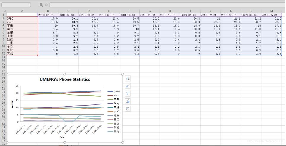
成果:
补充知识:python plotly line chart 折线图
# 1 折线图数据
# trace1 - 基本格式
# trace2 - 更多参数
trace1 = go.Scatter(
x = x1,
y = y2,
)
trace2 = go.Scatter(
x = x2,
y = y2,
mode = 'lines', # 模式:lines 线,markers 点。可用“+”相连
name = 'line2', # 折线名,显示于图例
connectgaps = True # 连接缺失点两端 默认False
line = dict(
color = ('rgb(205, 12, 24)'), # 颜色
width = 4, #线宽
dash = 'dash') # 虚线: dash 一一,dot ···,dashdot 一·一
)
)
# 2 打包数据
data = [trace1,trace2]
# 3 格式
layout = dict(title = '折线',
xaxis = dict(title = '时间'), # 横轴坐标
yaxis = dict(title = '数量'), # 总轴坐标
legend=dict(x=1.1,y=1) # 图例位置
)
# 4 打包数据+格式
fig = dict(data=data, layout=layout)
# 5 画图
py.iplot(fig, filename='styled-line')
以上这篇openpyxl 插入折线图的方法已经分享给大家了,更多Python学习推荐:PyThon学习网教学中心
python导入excel加入折线图_Python之openpyxl插入折线图方法相关推荐
- python导入excel类库_Python中使用第三方库xlutils来追加写入Excel文件示例
Python中使用第三方库xlutils来追加写入Excel文件示例 目前还没有更好的方法来追写Excel,lorinnn在网上搜索到以及之后用到的方法就是使用第三方库xlutils来实现了这个功能, ...
- python打开excel数据库_使用python导入excel文件中的mssql数据库数据
我试图用python导入excel文件中的mssql数据库数据.我的数据在excel表格中的顺序不正确.e. g它显示第1列数据,然后是第3列,第2列,然后是第4列,依此类推. 我使用以下脚本:imp ...
- python导入excel数据到mysql
python导入excel数据到mysql 使用多线程,目前大概一分钟写入1w条 环境介绍 windows10-x64 python3.6.5-x64 Excel2016 MySql5.7.18 需要 ...
- 使用python导入Excel作图
使用python导入Excel作图 使用Excel数据作图: import pandas as pd import numpy as np import matplotlib.pyplot as pl ...
- Python导入Excel到Mysql数据库
一.简介 Python导入Excel到Mysql数据库 自动创建ID为自增. 根据Excel表格表头自动生成数据库字段. 二.使用方法 修改configure配置即可. import pandas a ...
- python获取excel某一列所有值-Python读取Excel一列并计算所有对象出现次数的方法...
第一种方法 import pandas as pd from collections import Counter data = '参赛信息.xlsx' data = pd.read_excel('参 ...
- python导入excel散点图_Python 写excel文件并插入散点图
这两天做小实验,需要分析结果,当然需要些图表.实验的算例少说也有几十个,一个个导入excel,太烦了.幸好,本人是个程序员. google了下,python写excel文件的方法不少,最后我选定了xl ...
- python导入excel模块_python如何导入excel
Python语言如何来读取excel文件,分为以下几个操作步骤: (1)首先安装python官方Excel库-->xlrd 首先我们要读取excel要用到xlrd模块,官网安装先上官网安装. 导 ...
- python导入excel数据-Python导入数值型Excel数据并生成矩阵操作
riginal_Data 因为程序是为了实现对纯数值型Excel文档进行导入并生成矩阵,因此有必要对第五列文本值进行删除处理. Import_Data import numpy as np impor ...
- 用python处理excel的基本语法_Python对Excel操作详解
Python对Excel操作详解 文档摘要: 本文档主要介绍如何通过python对office excel进行读写操作,使用了xlrd.xlwt和xlutils模块.另外还演示了如何通过Tcl tco ...
最新文章
- 数据库基础笔记(MySQL)2 —— 基础查询
- @property、@sythesize以及Ivar和@dynamic讲解(下)
- 【编程】位(bit)、字节(byte)和字(word)的区别
- path.join 和 path.resolve的区别
- 2000服务器文件共享,Win2000 Server实现对共享文件的监控
- 统计进仓和出仓数量随时间变化的剩余数量流程图
- Android开发笔记(八十五)手机数据库Realm
- UVa140 - Bandwidth
- 2015 ICCV论文《Joint Fine-Tuning in Deep Neural Networks for Facial Expression Recognition》
- 超全Inventor 3d模型素材网站整理
- 初识AvalonDock
- 树型拓扑计算机网络的缺点是,计算机网络拓扑的优缺点 -电脑资料
- Debug显示不支持opengl4,是双显卡未设置独立显卡模式
- CVPR 2019 论文汇总(按方向划分,0514 更新中)-转载
- Getting in Shape
- python使用tkinter库,封装操作excel为GUI程序
- 某省住房和城建网的AES加密
- ESP在百度百科的阐述
- obs-studio 绿幕抠图
- Linux安装搜狗输入法(for ubuntu)