css flexbox模型_如何将Flexbox后备添加到CSS网格
css flexbox模型
I shared how to build a calendar with CSS Grid in the previous article. Today, I want to share how to build a Flexbox fallback for the same calendar.
在上一篇文章中,我分享了如何使用CSS Grid构建日历。 今天,我想分享如何为同一日历构建Flexbox后备广告。
如何提供支持 (How to provide support)
Generally, there are three ways to provide support when it comes to CSS.
通常,涉及CSS时,可以通过三种方式提供支持。
First method: Write fallback code. Overwrite fallback code.
第一种方法:编写后备代码。 覆盖后备代码。
.selector {property: fallback-value;property: actual-value;
}
Second method: Write fallback code. Overwrite fallback code in CSS Feature Queries (@supports). Reset properties inside @supports if you need.
第二种方法:编写后备代码。 覆盖CSS功能查询( @supports )中的后备代码。 如果需要,请在@supports内重置属性。
.selector {property: fallback-value;
}@supports (display: grid) {property: actual-value;
}
Third method: Write everything in @supports.
第三种方法:在@supports编写所有@supports 。
@supports not (display: grid) {.selector {property: fallback-value;}
}@supports (display: grid) {.selector {property: actual-value;}
}
These three methods are listed in order of decreasing-complexity. (If you need to overwrite code, it's more complicated). This means writing everything in @supports is the simplest of the three.
这三种方法按复杂度递减的顺序列出。 (如果您需要覆盖代码,则更为复杂)。 这意味着用@supports编写所有@supports是这三个中最简单的。
How you choose to support your project depends on browser support for:
选择支持项目的方式取决于浏览器对以下方面的支持:
- The feature功能
- The fallback feature后备功能
- Support for Feature Queries支持功能查询
检查支持 (Checking for support)
The best place to check for support is caniuse. Here, I see that support for CSS Grid is decent. Browsers I have to worry about are:
寻求支持的最佳地点是caniuse 。 在这里,我看到对CSS Grid的支持是不错的。 我要担心的浏览器是:
- Opera Mini: 1.42% global usageOpera Mini:1.42%的全球使用量
- Android Browsers 2.1 to 4.4.4: 0.67% global usageAndroid浏览器2.1至4.4.4:全球使用率为0.67%
- Blackberry browser: 0.02% global usage (Not gonna worry about this one).黑莓浏览器:0.02%的全球使用率(不用担心这一点)。
Support for the fallback (Flexbox) is also good.
对后备(Flexbox)的支持也很好。
But we have a problem: Flexbox fallback wouldn't work for Android 2.1 to 4.3 (it doesn't support wrapping). Global usage for Android 2.1 to 4.3 is 0.37%.
但是我们有一个问题:Flexbox后备广告在Android 2.1到4.3上不起作用(它不支持换行)。 Android 2.1至4.3的全球使用率为0.37%。
Here, I have to decide:
在这里,我必须决定:
- Is providing Flexbox fallback for Opera Mini (1.42%), Android 4.4.4 (0.3%), and Blackberry (0.02%) worth the effort?为Opera Mini(1.42%),Android 4.4.4(0.3%)和Blackberry(0.02%)提供Flexbox后备功能值得吗?
- Should I change fallback from Flexbox to an older feature to support Android 2.1 to 4.3 (another 0.37%)?我是否应该将Flexbox的后备功能更改为较旧的功能,以支持Android 2.1到4.3(另一个0.37%)?
Let's assume, for this project, I decide that Flexbox fallback is sufficient. I'm not going to worry about Android 2.1 to 4.3.
让我们假设,对于这个项目,我认为Flexbox后备就足够了。 我不会担心Android 2.1至4.3。
Next, I want to check whether browsers support CSS Feature Queries.
接下来,我要检查浏览器是否支持CSS功能查询。
Here, I see:
在这里,我看到:
- Opera Mini supports Feature QueriesOpera Mini支持功能查询
- Android 4.4.4 supports Feature QueriesAndroid 4.4.4支持功能查询
- Blackberry browser doesn't support Feature QueriesBlackberry浏览器不支持功能查询
- IE 11 does't support Feature QueriesIE 11不支持功能查询

确定如何编写后备代码 (Deciding how to write fallback code)
Earlier, I mentioned there are three ways to write fallback code for CSS:
之前,我提到了为CSS编写后备代码的三种方法:
- Write fallback code. Overwrite fallback code.编写后备代码。 覆盖后备代码。
Write fallback code. Overwrite fallback code in
@supports.编写后备代码。 覆盖
@supports后备代码。Write everything in
@supports.将所有内容写在
@supports。
If I write everything inside @supports, I can provide support for:
如果我在@supports内编写所有@supports ,则可以提供以下支持:
- Opera Mini (1.43%)Opera Mini(1.43%)
- Android 4.4.4 (0.3%)Android 4.4.4(0.3%)
But I lose support for:
但是我对以下方面失去支持:
- IE 11 (2.3%)IE 11(2.3%)
- Blackberry (0.02%)黑莓(0.02%)
I do not want to forsake the 2.3% of IE users, which means Method 3 (write everything in @supports) is out.
我不想放弃2.3%的IE用户,这意味着方法3(将所有内容写在@supports )已经淘汰了。
If I use Method 2 (Write fallback code. Overwrite fallback code in @supports), I can provide support for:
如果我使用方法2(写回退代码。覆盖@supports回退代码),则可以提供以下支持:
- IE 11 (2.3%)IE 11(2.3%)
- Opera Mini (1.43%)Opera Mini(1.43%)
- Android 4.4.4 (0.3%)Android 4.4.4(0.3%)
- Blackberry browser (0.02%)黑莓浏览器(0.02%)
That's everything I need. That's why I'm gonna go with Method 2.
这就是我所需要的。 这就是为什么我要使用方法2。
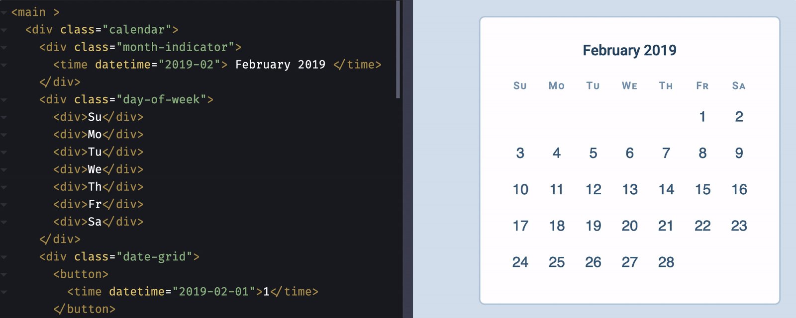
Note: If you want to code along, you can use demo from my previous article as the starting point.
注意:如果要一起编码,则可以使用上一篇文章中的演示作为起点。
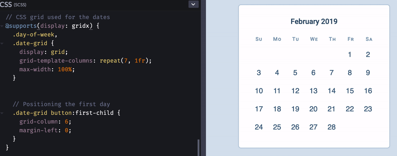
禁用网格代码 (Disabling Grid code)
First, we park the CSS Grid code under @supports (like we discussed above).
首先,我们将CSS Grid代码停放在@supports下(就像我们上面讨论的那样)。
@supports (display: grid) {.day-of-week,.date-grid {display: grid;grid-template-columns: repeat(7, 1fr);}.date-grid button:first-child {grid-column: 6;}
}
We can disable the CSS Grid code by setting display to an invalid value (not grid). This disables the entire block of code.
我们可以通过将display设置为无效值(不是grid )来禁用CSS Grid代码。 这将禁用整个代码块。
(Thank Rachel Andrew for this neat trick. I believe I learned it from her ?).
(感谢Rachel Andrew的巧妙技巧。我相信我从她那里学到了吗?)。
@supports (display: gridx) {/*...*/
}
编写Flexbox代码 (Writing Flexbox code)
We need to build the same seven-column grid with Flexbox. The first thing we need to do is acknowledge that Flexbox and Grid work differently. We won't be able to get a perfect replica, but we can get close.
我们需要使用Flexbox构建相同的七列网格。 我们需要做的第一件事是确认Flexbox和Grid的工作方式不同。 我们将无法获得完美的复制品,但我们可以接近。
The first thing is set display to flex.
首先将display设置为flex 。
.day-of-week,
.date-grid {display: flex;
}
We need the buttons in .date-grid to wrap, so we set flex-wrap to wrap.
我们需要包装.date-grid的按钮,所以我们将flex-wrap设置为wrap 。
.date-grid {flex-wrap: wrap;
}
We need to replicate the seven-column grid. An easy way to do this is calculate the width of the grid according to the width of each button. Here, I have already set each button to 4.5ch. This means the width of the grid should be 7 x 4.5ch.
我们需要复制七列网格。 一种简单的方法是根据每个按钮的宽度计算网格的宽度。 在这里,我已经将每个按钮设置为4.5ch。 这意味着网格的宽度应为7 x 4.5ch 。
(We can use CSS Calc to do the math for us).
(我们可以使用CSS Calc为我们做数学运算)。
.day-of-week,
.date-grid {max-width: calc(4.5ch * 7);
}
We need the elements in .day-of-week to spread out across the available width. One simple way is to set justify-content to space-between.
我们需要.day-of-week的元素分布在可用宽度上。 一种简单的方法是将justify-content设置justify-content space-between 。
.day-of-week {justify-content: space-between;
}
Here, we can see that elements in .day-of-week extend past the grid. This extension happens because we let Flexbox calculate flex-basis for us. If we want every element in .day-of-week to be have the same width, we need to set flex-basis ourselves.
在这里,我们可以看到.day-of-week中的元素延伸到网格之外。 之所以发生这种扩展,是因为我们让Flexbox为我们计算了flex-basis 。 如果我们希望.day-of-week每个元素都具有相同的宽度,则需要自己设置flex-basis 。
In this case, the easiest way is to set flex-basis to the width of one grid item (or 4.5ch). Note: I adjusted font-size of each item in .day-of-week to 0.7em (for visual aesthetics). We have to account for this change.
在这种情况下,最简单的方法是将flex-basis设置为一个网格项的宽度(或4.5ch )。 注意:我将每个项目在.day-of-week font-size调整为0.7em (出于视觉美感)。 我们必须考虑到这一变化。
.day-of-week > * {flex-basis: calc(4.5ch / 0.7);
}
Finally, we need to push the 1 February to Friday. (Five columns). Since column is 4.5ch, we simply push it by 4.5ch x 5.
最后,我们需要将2月1日推到星期五。 (五列)。 由于4.5ch ,我们只需将其推入4.5ch x 5 。
(Again, we can use CSS Calc to help us with this).
(同样,我们可以使用CSS Calc来帮助我们)。
.date-grid button:first-child {margin-left: calc(4.5ch * 5);
}
修复CSS网格版本 (Fixing the CSS Grid version)
We can reactivate the CSS Grid code and make any necessary changes now.
我们现在可以重新激活CSS Grid代码并进行任何必要的更改。
@supports (display: grid) {/* ... */
}
Here, we see some values fly far out to the right. This happens because we added margin-left to the first grid item. We need to reset the added margin.
在这里,我们看到一些值向右飞走。 发生这种情况是因为我们向第一个网格项添加了margin-left 。 我们需要重置增加的保证金。
@supports (display: grid) {/* ... */.date-grid button:first-child {grid-column: 6;margin-left: 0;}
}
Another thing: We can remove max-width because we don't need it in the CSS Code. (Even though this doesn't affect the CSS Code, we still want to remove it. Always better to have less properties).
另一件事:我们可以删除max-width因为CSS代码中不需要它。 (即使这不会影响CSS代码,我们仍然希望将其删除。总是最好减少属性)。
@supports (display: grid) {.day-of-week,.date-grid {display: grid;grid-template-columns: repeat(7, 1fr);max-width: initial;}/* ... */
}
Here's the visual difference between the Flexbox and CSS Grid versions. Not too bad!
这是Flexbox和CSS Grid版本之间的视觉差异。 还不错!
一件事有趣 (One fun thing)
CSS Grid is cool because it follows writing direction. We can easily change the flow from left-to-right to right-to-left.
CSS Grid很酷,因为它遵循书写方向。 我们可以轻松地将流程从左到右更改为从右到左。
Note: I don't know if calendars are read from right to left in rtl languages. I just thought it'll fun to mention this ?).
注意:我不知道日历是否以rtl语言从右到左读取。 我只是觉得提到这个会很有趣?)。
Our code for CSS Grid supports this behaviour naturally. If you want to support the same behaviour with Flexbox, you need to use CSS Logical Properties.
我们CSS Grid代码自然支持此行为。 如果要使用Flexbox支持相同的行为,则需要使用CSS逻辑属性 。
Since support for CSS Logical Properties is not-so-great, we need to provide fallback for it. (Best way is to through Method 1: Write fallback; overwrite fallback).
由于对CSS逻辑属性的支持不太好,因此我们需要为其提供备用。 (最好的方法是通过方法1:写回退;覆盖回退)。
.date-grid button:first-child {margin-left: calc(4.5ch * 5);margin-inline-start: calc(4.5ch * 5);
}@supports (display: grid) {/* ... */.date-grid button:first-child {grid-column: 6;margin-left: 0;margin-inline-start: 0;}
}
That's it! Here's a Codepen for the final code:
而已! 这是最终代码的Codepen:
See the Pen Building a Calendar with CSS Grid (and fallback with Flexbox) by Zell Liew (@zellwk) on CodePen.
请参阅CodePen上的Zell Liew( @zellwk ) 撰写的 使用CSS网格构建日历(以及使用Flexbox进行后退 )的笔 。
Thanks for reading. This article was originally posted on my blog. Sign up for my newsletter if you want more articles to help you become a better frontend developer.
谢谢阅读。 本文最初发布在我的博客上 。 如果您想要更多的文章来帮助您成为更好的前端开发人员,请注册我的时事通讯 。
翻译自: https://www.freecodecamp.org/news/how-to-add-flexbox-fallback-to-css-grid/
css flexbox模型
css flexbox模型_如何将Flexbox后备添加到CSS网格相关推荐
- css flexbox模型_完整CSS课程-包括flexbox和CSS网格
css flexbox模型 Learn CSS in this complete 83-part course for beginners. Cascading Style Sheets (CSS) ...
- css flexbox模型_代码简介:CSS Flexbox有点像旅行
css flexbox模型 Here are three stories we published this week that are worth your time: 这是我们本周发布的三个值得您 ...
- HTML盒子模型制作个人名片,网页设计基础 CSS盒子模型 第4章 CSS盒子模型_教学设计.doc...
博学谷--让IT教学更简单,让IT学习更有效 PAGE 12 PAGE 1 <HTML+CSS+JavaScript网页制作案例教程> 教学设计 课程名称: HTML+CSS+JavaSc ...
- css表格布局_布局秘密武器#1:CSS表格属性
css表格布局 Right now, Flexbox is arguably THE hot new thing for layout building. Flexbox's almost mirac ...
- css flexbox模型_通过Flexbox Froggy游戏自学CSS Flexbox
过去,我们只介绍了flexbox及其工作原理. 但是实际上将flexbox应用于您的工作流程可能会遇到挑战,因为它是CSS规范中如此复杂的补充. 使用Flexbox Froggy,您可以通过有趣的涉及 ...
- vux flexbox使用_指南针与Flexbox结合使用入门
vux flexbox使用 There is no doubt that flexbox is an effective solution for laying out web pages. Howe ...
- css盒子模型_说说css盒子模型
什么是盒模型 引用MDN官方的解释: 当对一个文档进行布局(lay out)的时候,浏览器的渲染引擎会根据标准之一的 CSS 基础框盒模型(CSS basic box model),将所有元素表示为一 ...
- CSS基础学习-8.CSS盒子模型_标准盒子9.CSS怪异盒子
怪异盒模型 box-sizing:content-box;/*正常盒模型,默认值*/ box-sizing:border-box:/*怪异盒模型,固定了盒子的大小,无论是否添加内边距还是边框,盒子的大 ...
- css盒子模型输出对联,网页设计基础 CSS盒子模型 第4章 CSS盒子模型_补充案例.doc...
博学谷--让IT教学更简单,让IT学习更有效 PAGE 18 第4章 补充案例 [案例4-1] 顶部导航栏1 一.案例描述 考核知识点 边框的复合属性.背景颜色 练习目标 灵活运用边框的复合属性. 掌 ...
最新文章
- 【Away3D代码解读】(四):主要模块简介
- CAMB, CosmoMC的安装和使用
- RESTful API浅谈
- SVN在centos5.4的安装步骤:
- 数据结构(严蔚敏)之六——链式队列c语言实现
- 高性能交易系统设计原理
- Docker入门到实践
- easyui中dialog的常犯错误
- java数组怎样插入元素,Java如何在给定位置将元素插入数组?
- 如何绘制逻辑图 — 1. 逻辑图构成的三元素
- ANSI C标准预定义宏
- 三大运营商将上线 5G 消息;苹果谷歌联手,追踪 30 亿用户;jQuery 3.5.0 发布 | 极客头条...
- 心电图系统服务器与存储系统,心电图网络信息化管理系统
- html5 回合制网页游戏,盘点史上最流行的十款回合制网页游戏
- 【预测模型】BP神经网络的预测
- 如何解决控件附件上传时超大附件无法上传的问题
- excel学习-批量填充单元格
- 2021年金属非金属矿山(露天矿山)安全管理人员考试报名及金属非金属矿山(露天矿山)安全管理人员证考试
- 香蕉树上第一根芭蕉——关于C语言中链表(动态链表静态链表)使用说明
- Kotlin使用高阶函数实现多方法回调