css表格布局_布局秘密武器#1:CSS表格属性
css表格布局
Right now, Flexbox is arguably THE hot new thing for layout building. Flexbox’s almost miraculous abilities to adapt to the available space has left many of us wide-eyed with possibility.
目前, Flexbox可以说是布局构建的热门新事物。 Flexbox几乎可以适应可用空间的奇迹般的功能使我们许多人大开眼界。
Nevertheless, it can’t solve all your layout problems, and moreover, it brings with it some compatibility issues with legacy browsers. There simply is no bulletproof ‘polyfill’ (fallback for older browsers) for Flexbox — currently I'm only aware of a polyfill for the 2009 version of IE: Flexie.
但是,它不能解决您所有的布局问题,而且还带来了与旧版浏览器的一些兼容性问题。 Flexbox根本没有防弹的“ polyfill”(旧浏览器的后备)-目前,我仅知道2009版IE: Flexie的polyfill 。
In many cases I've found simpler solutions using the often-ignored CSS table displays properties. These CSS properties are widely supported by all relevant browsers (note this excludes IE6 & 7), and can elegantly solve several major and small layout headaches.
在许多情况下,我发现了使用通常被忽略的CSS表显示属性的简单解决方案。 这些CSS属性得到所有相关浏览器的广泛支持 (请注意,这不包括IE6和7),并且可以很好地解决几个主要的和小的布局难题。
In case you're not 100% familiar with this technique, changing a DIVs display property can make it behave like a table or a table element.
如果您不是100%熟悉此技术,则更改DIVs display属性可以使其表现得像表或表元素。
等等什么 表格布局? 不好吗? (Wait what? Tables for layout? Isn’t that bad?)
Perhaps the hottest web design topics of the early 2000's was the debate over using HTML table code as a layout tool. That was a hack and is still bad practice.
也许在2000年代初期最热门的Web设计主题是关于使用HTML表代码作为布局工具的争论。 那是一个骇客,仍然是不好的做法。
Instead here we're using perfectly meaningful HTML (i.e. DIVs, SECTIONs, HEADERs, etc) and simply borrowing some useful table presentation know-how from CSS. This is precisely what CSS was designed to do, so don't feel that this is a hack or patch. It’s not.
取而代之的是,我们在这里使用的是完全有意义HTML(即DIV,SECTION,HEADER等),并且只是从CSS借用了一些有用的表表示专有技术。 这正是CSS设计的目的,所以不要认为这是黑客或补丁。 不是。
使用“ display:table-cell” (Using 'display:table-cell')
In the sample below, clicking the top button you can change the display property of the three colored DIVs from block to table-cell:
在下面的示例中,单击顶部按钮,可以将三个彩色DIV的显示属性从block更改为table-cell :
See the Pen Display table #1 by Massimo Cassandro (@massimo-cassandro) on CodePen.
见笔显示表#1由马西莫卡桑德罗( @马西莫-卡桑德罗 )上CodePen 。
You can see how the DIVs can be horizontally arranged without requiring any float property, and that you can also access some typical table rules (just like vertical-align).
您可以看到如何在不需要任何float属性的情况下水平排列DIV,还可以访问一些典型的表规则(就像vertical-align )。
If you need some spacing, note that the classic CSS margin property doesn't have any effect on table cells: instead use border-spacing instead (it must be applied to the container table element). You can find some commented lines within the Codepen, if you want to play with those rules.
如果需要一些间距,请注意经典CSS margin属性对表格单元格没有任何影响:请改用border-spacing (必须将其应用于容器table元素)。 如果您想使用这些规则,可以在Codepen中找到一些注释行。
This technique can be very useful to solve a lot of problems that prove difficult to crack other ways.
该技术对于解决许多难以用其他方式破解的问题可能非常有用。
I've picked out three simple cases where the table display properties are really valuable.
我选择了三种简单的情况,其中表显示属性确实很有价值。
But first let's look at them:
但是首先让我们看一下它们:
| display property | renders as |
|---|---|
| table, inline-table | table |
| table-column | col |
| table-column-group | colgroup |
| table-row-group | tbody |
| table-header-group | thead |
| table-footer-group | tfoot |
| table-row | tr |
| table-cell | td |
| table-caption | caption |
| 显示属性 | 呈现为 |
|---|---|
| 表,内联表 | 表 |
| 表格栏 | 关口 |
| 表列组 | 同事 |
| 表行组 | 身体 |
| 表头组 | Thead |
| 表脚组 | foot |
| 表行 | TR |
| 表格单元 | d |
| 表标题 | 标题 |
For a really comprehensive guide to tables and CSS take a look at CSS Tricks: A Complete Guide to the Table Element.
有关表格和CSS的真正综合指南,请参阅CSS技巧:表格元素的完整指南 。
情况1。等高框 (Case 1. Equal height boxes)
I think this is one of the most frequent issues I've deal with: there are some floated boxes with unknown content and you have to make all them with equal height.
我认为这是我处理过的最常见的问题之一:有些漂浮的盒子内容不明,您必须使它们的高度相等。
I know, flexbox can easily solve this problem, but tables rules can do it too.
我知道,flexbox可以轻松解决此问题,但是表规则也可以解决。
Simply apply the display: table (or table-row) property to the container and the display: table-cell property to inner boxes. Take care to remove any float property (otherwise the table-cell property doesn't take effect).
只需将display: table (或table-row )属性应用于容器,将display: table-cell属性应用于内部框。 请小心删除所有float属性(否则table-cell属性不会生效)。
HTML: (HTML:)
<div id="wrapper">
<div id="div1"></div>
<div id="div2"></div>
<div id="div3"></div>
</div>
CSS: (CSS:)
#wrapper {
display: table;
}
#wrapper div {
display:table-cell;
}
See the Pen Equal height boxes by Massimo Cassandro (@massimo-cassandro) on CodePen.
见笔等高盒由马西莫卡桑德罗( @马西莫-卡桑德罗 )上CodePen 。
案例2.简单的旧式布局 (Case 2. Simple old-style layout)
This one is a more outdated example, but I think you might need to deal with it, as I did recently.
这是一个过时的示例,但我认为您可能需要像最近那样处理它。
Some months ago I received a graphic layout very similar to the scheme below. It needed to be compatible with IE8, and I found that the best way was to use CSS table rules:
几个月前,我收到了与以下方案非常相似的图形布局。 它需要与IE8兼容,我发现最好的方法是使用CSS表规则:
See the Pen table display #3: old-style layout by Massimo Cassandro (@massimo-cassandro) on CodePen.
请参阅CodePen上的Pen 表显示#3: Massimo Cassandro( @ massimo-cassandro )的旧式布局 。
案例3.内容编排的响应式布局 (Case 3. Responsive layout with content choreography)
The previous example leads us to a new topic: is it possible to build a responsive layout with CSS table rules?
前面的示例将我们引向一个新主题:是否可以使用CSS表规则构建响应式布局?
Not only is possible, but we can also perform some content choreography tasks.
不仅可能,而且我们还可以执行一些内容编排任务。
We have already seen how changing the display property from block totable-cell of two divs can change their arrangement from vertical to horizontal.
我们已经看到了如何将显示属性从两个div的block更改为table-cell如何将其排列从垂直更改为水平。
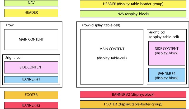
Add to this the fact that an element with the table-header-group property is brought to the top of a table layout. In the same way, table-footer-group elements are brought to the bottom and so on. This can be unexpectedly useful when reformatting responsive layouts.
除此之外,具有table table-header-group属性的元素被带到表布局的顶部。 同样,将table-footer-group元素放到底部,依此类推。 重新格式化响应式布局时,这可能出乎意料的有用。
In the pen below, the header element exchanges his position with the nav element on window resize, simply changing its display property to table-header-group.
在下面的笔中, header元素与窗口调整大小上的nav元素交换位置,只需将其display属性更改为table-header-group 。
HTML: (HTML:)
<div id="wrapper">
<nav></nav>
<header></header>
<!-- rest of code -->
</div>
CSS: (CSS:)
#wrapper, header {
display: block; /* we don't really need this rule, since it is the default */
}
@media (min-width: 48em) {
#wrapper {
display: table;
}
header {
display: table-header-group;
}
}
A similar behavior occurs for the footerand the #banner2 div.
footer和#banner2 div也会发生类似的行为。
Here is a scheme of the layout: on the left the default, mobile version, and on the right the desktop version:
这是布局方案:左侧为默认移动版本,右侧为桌面版本:
And this is a running demo:
这是一个正在运行的演示:
See the Pen `display: table` layout by Massimo Cassandro (@massimo-cassandro) on CodePen.
看到笔`显示:table`布局由马西莫卡桑德罗( @马西莫-卡桑德罗 )上CodePen 。
For more info about this argument, take also a look at:
有关此参数的更多信息,请参见:
CSS stacking with display:table
CSS与display:table堆叠
The Anti-hero of CSS Layout – "display:table"
CSS布局的反英雄–“ display:table”
结论 (Conclusion)
CSS table display properties are an under-rated and valuable solution for both big and little layout challenges.
CSS表格显示属性是针对大小布局挑战而被低估且有价值的解决方案。
While I may not personally choose to use them to build complex layouts, they can certainly solve many difficult problems related to portions of the layout.
尽管我可能不会亲自选择使用它们来构建复杂的布局,但它们肯定可以解决与布局的各个部分有关的许多难题。
翻译自: https://www.sitepoint.com/solving-layout-problems-css-table-property/
css表格布局
css表格布局_布局秘密武器#1:CSS表格属性相关推荐
- html css 布局_创建有吸引力HTML CSS动漫主题网站布局
html css 布局 Creating an Attractive HTML CSS Anime Theme Website Layout Today I will like to product ...
- css宋体代码_前端开发必备的CSS命名规范与常用CSS代码集合
编辑 | web前端开发 来源 | web前端开发 我们在用html+css进行网页的排版布局时,经常会遇到CSS命名,如果是在团队多人协作开发时,团队里都会有自己的命名规范与要求. 但如果是自己在个 ...
- css就近原则_细品100道CSS知识点(上)「干货满满」
作者:hh_phoebe 转发链接:https://juejin.im/post/5ee0cf335188254ec9505381 目录 细品100道CSS知识点(上)[干货满满]本篇 细品100道C ...
- css 图片居中_你需掌握的CSS知识都在这了(长文建议收藏,文末有福利)
1.CSS盒模型,在不同浏览器的差异 css 标准盒子模型 css盒子模型 又称为框模型(Box Model),包含了元素内容(content).内边距(padding).边框(border).外边距 ...
- poi 设置word表格颜色_办公软件小课堂 Word表格的设置
你是否还在为考证烦恼?是否不知从何学起?学习部每周的办公软件小课堂!这里总有你想要的! 本周给大家整理的是 Word表格的设置 01 插入选择卡→表格 02 文本转表格 步骤1:选中要转换成表格的文本 ...
- ext grid 重新布局_如何让你的 CSS Grid 布局有良好的可访问性
稿件来源:阿里云开发者社区(点击下面"了解更多"查看原文) CSS Grid 可以将元素放入有行和列的网格中,从而让创建二维布局成为可能.有了它,你可以自定义网格的任何形态,例如网 ...
- java 界面线性布局_布局Layouts之LinearLayout线性布局
从Hello world!开始,我们一直都是在一种布局下学习的,当然,对于基础内容的学习,还是没有任何问题的!但-- 在Android开发中UI设计也是十分重要的,当用户使用一个App时,最先感受到的 ...
- php生成图片表格自动换行_实用的财务做账表格,点击即可一键生成报表,并自动结转...
自从做了会计,不是在加班就是在加班的路上,加班大部分的时间就是在做excel表格,太累人了! 今天,小编特意分享这财务人员最需要的财务记账表格,基础数据录入之后,点击即可一键生成财务报表,并自动结转, ...
- css 倒三角_【译】改善 CSS 的 10 个最佳实践
CSS 看起来是一种非常直接且不易犯错的语言.只需要添加规则以对网站进行样式设置就可以了,对吗?对于只需要几个 CSS 文件的小型站点,可能是这种情况.但是在大型程序中,这样可能会使样式迅速失控.如何 ...
最新文章
- IOS APP配置.plist汇总(转自coolweather )
- mysql游标遍历中sql语句出现异常_MySQL中的异常处理,游标
- HTML5——section,article,aside
- java jar metainf_java – 从生成的jar文件中排除META-INF / maven文件夹
- pandas中DataFrame对象to_csv()方法中的encoding参数
- ceq c matlab,求一个函数MATLAB的编程,求大神指教。
- npm+node+cordova+ionic 版本匹配
- 计算机网络体系结构及协议
- Apache OpenOffice-java调用时的问题总结
- Flex Builder4.7 与 MyEclipse2013集成 64位
- 使用CLion的C语言开发环境配置
- vue获取微信登陆权限_vue微信授权登录
- 美赛数模论文之表的格式
- 女生适合做产品经理吗?
- Sai 2 打开文件显示没有注册类的解决方法
- 哪些专业不建议跨考计算机
- android 球面 旋转 坐标系,天球坐标系和地球坐标系-GPS定位原理及应用-电子发烧友网站...
- unity实现吸附功能的效果
- Google Android Developer
- 论文阅读笔记:(2022) Delving into the Devils of Bird‘s-eye-view Perception: A Review, Evaluation and Recipe