线框模型_进行计划之前:线框和模型
线框模型
Before we start developing something, we need a plan about what we’re doing and what is the expected result from the project. Same as developing a website, we need to create a mockup before we start developing (coding) because it will cost so much if in the development the design changed frequently.
在开始开发某些东西之前,我们需要一个关于我们正在做的事情以及该项目的预期结果的计划。 与开发网站相同,我们需要在开始开发(编码)之前创建一个模型,因为如果在开发中频繁更改设计,那么它将花费很多。
When creating the plan, we need to follow the procedure that needs to be done if we want it to be organized. Just like that, when we’re creating a mockup we can’t just directly designing the home page or another page, but we need a lower-level design which is the wireframe.
在创建计划时,如果我们希望将其组织起来,则需要遵循需要执行的过程。 就像这样,当我们创建模型时,我们不仅可以直接设计主页或其他页面,还需要线框这样的低层设计。
There’s plenty of application that providing the canvas for design the wireframe, one of the most popular is wireframe.cc.
有很多应用程序可以提供用于设计线框的画布,其中最流行的一种是wireframe.cc 。
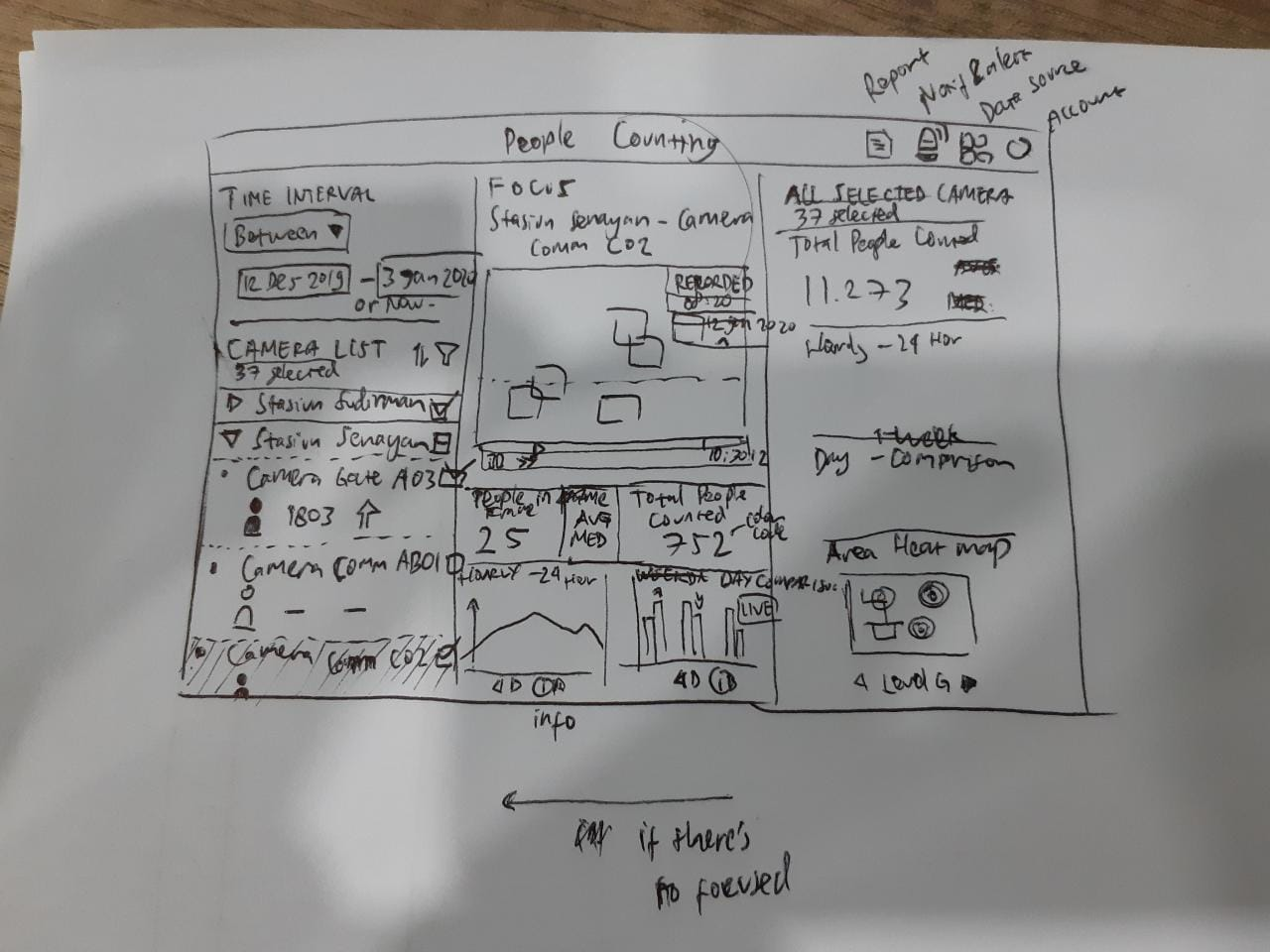
But for our project, we decided to create the wireframe based on a hard-copy or using a paper. Take a look at our first wireframe design below.
但是对于我们的项目,我们决定基于硬拷贝或使用纸来创建线框。 看看下面我们的第一个线框设计。
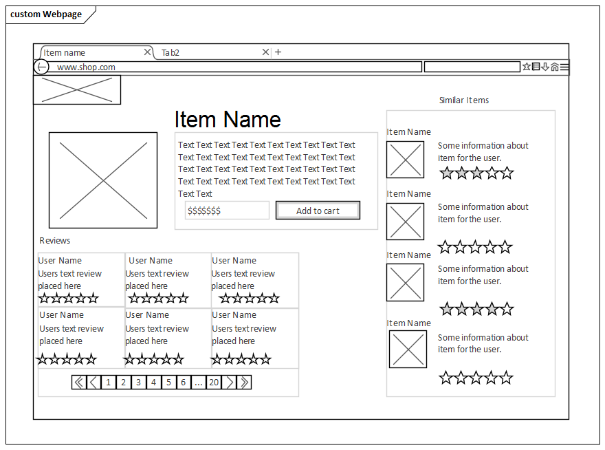
After designing the wireframe and already sure about the placement, we can start developing the mockup. There’s also plenty of app or websites that provide tools for creating the mockup, like Figma, Sketch, and Adobe Xd. For developing our mockup we use Figma because of a few reasons which are Figma can be accessed using our browser (Adobe Xd need to be installed if we want to use it) or using their apps in any operation system (Sketch only can be used in Apple ecosystem).
设计完线框并确定布局后,我们可以开始开发模型。 也有很多应用程序或网站提供用于创建模型的工具,例如Figma,Sketch和Adobe Xd。 为了开发模型,我们使用Figma的原因有很多,可以使用我们的浏览器(如果要使用Adobe Xd,则必须安装Adobe Xd)或在任何操作系统中使用它们的应用程序来访问Figma(仅可在以下版本中使用Sketch)苹果生态系统)。

When we creating the mockup, there are a few rules that we need to implement if we want to maintain the user experience, called Neilsen’s 10 Usability Heuristics that developed by Jakob Nielsen with Rolf Molich.
创建模型时,如果要维护用户体验,需要执行一些规则,这些规则称为Jails Nielsen和Rolf Molich共同开发的Neilsen的10 Usability Heuristics。

尼尔森的10种可用性启发式 (Nielsen’s 10 Usability Heuristic)
There are 10 rules that pointed out and I will try to explain it with the example of how our project group implementing it.
指出了10条规则,我将尝试以我们的项目组如何实施的示例进行解释。
系统状态的可见性 (Visibility of system status)
The system should always keep users informed about what is going on, through appropriate feedback within reasonable time.
系统应始终在合理的时间内通过适当的反馈使用户知道发生了什么。
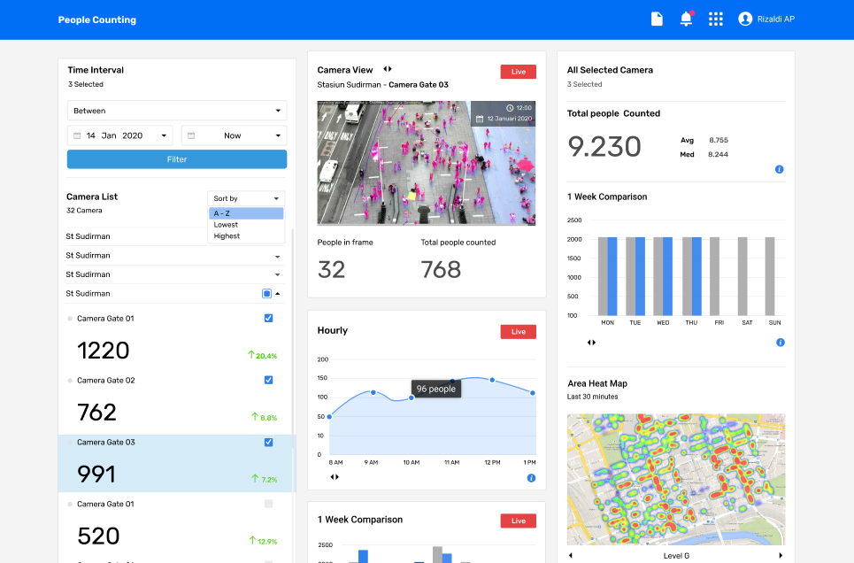
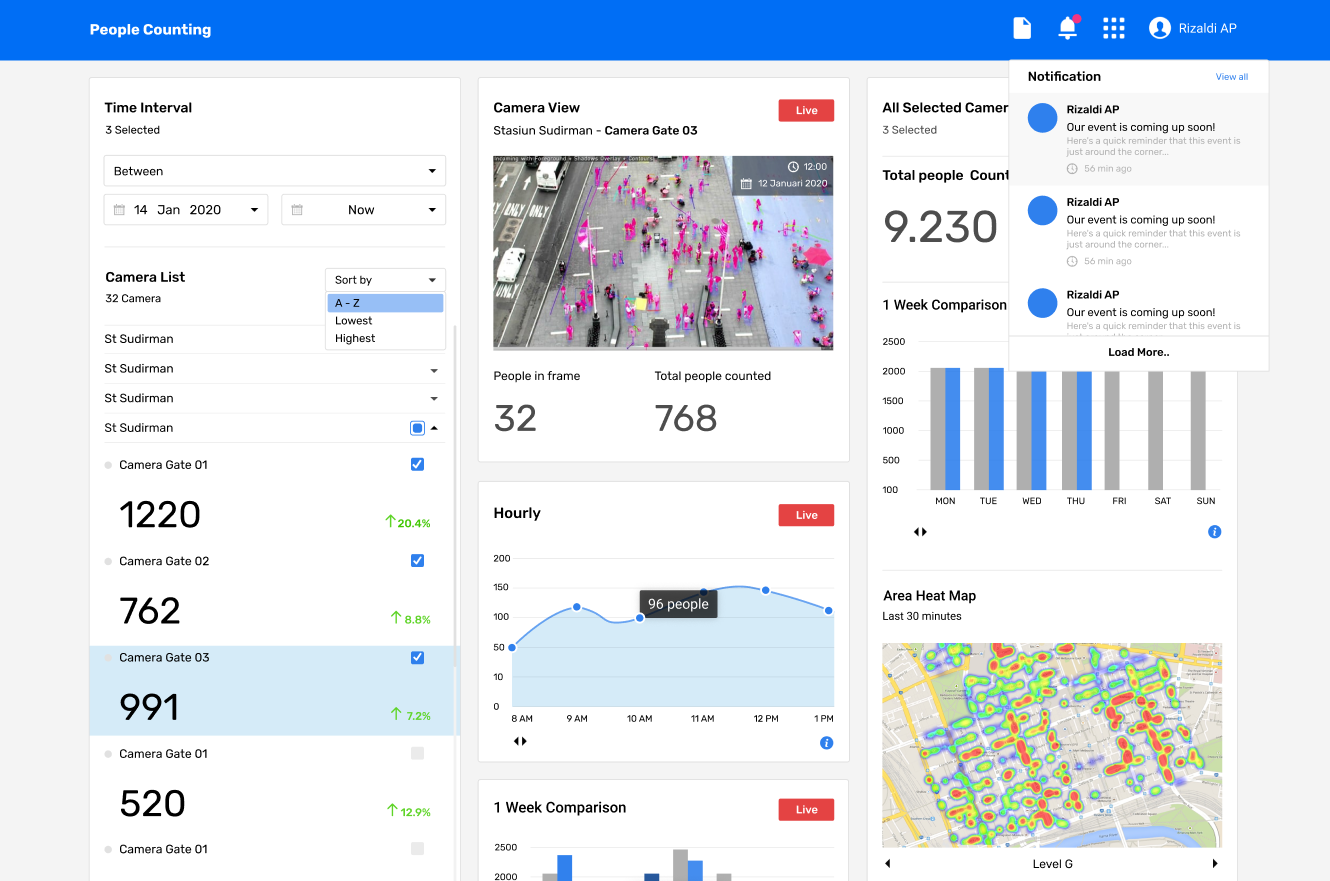
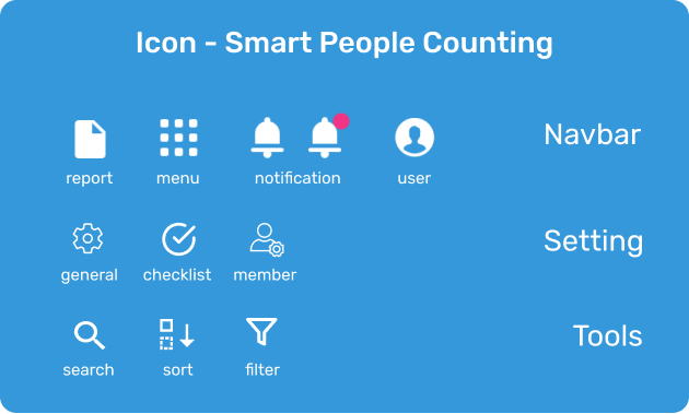
Our homepage is a dashboard where users can easily get as many as the information they wanted. We also provide the notification at the navigation bar just in case the user missing some important information. If there is something important shows up, the notification icon will be added with the red-dot in the top-right icon so the user will easily recognized the event.
我们的主页是一个仪表板,用户可以在其中轻松获取所需的信息。 我们还在导航栏上提供了通知,以防用户丢失某些重要信息。 如果出现重要的事情,通知图标将在右上方的图标中添加红点,以便用户轻松识别该事件。
系统与现实世界之间的匹配 (Match between system and the real world)
The system should speak the users’ language, with words, phrases and concepts familiar to the user, rather than system-oriented terms. Follow real-world conventions, making information appear in a natural and logical order.
系统应该使用用户熟悉的单词,短语和概念来讲用户的语言,而不是面向系统的术语。 遵循现实世界的惯例,使信息以自然和逻辑的顺序出现。
We trying to use the icon to representing what actual the feature comparing to the real world. Take a look a the report icon, in the real world we will have the report by a bunch of paper and it’s already represented by the report icon (file icon). Another example is the notification, it represents by a bell because in the real world we will easily recognize the bell sound as a notification if there’s something happen.
我们试图使用该图标来表示与真实世界相比实际的功能。 看一下报告图标,在现实世界中,我们将用一堆纸来获得报告,并且该报告已经由报告图标(文件图标)表示。 另一个示例是通知,它由铃铛表示,因为在现实世界中,如果发生任何事情,我们很容易将铃铛声音识别为通知。
用户控制和自由 (User control and freedom)
Users often choose system functions by mistake and will need a clearly marked “emergency exit” to leave the unwanted state without having to go through an extended dialogue. Support undo and redo.
用户经常错误地选择系统功能,并且需要明确标记的“紧急出口”以离开不需要的状态,而无需进行长时间的对话。 支持撤消和重做。
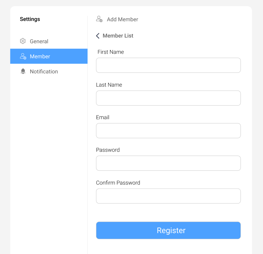
User needs to know where they are and want quick access for undoing what they have done. As an example, if the user going to homepage and clicked the wrong button, it will be easier if on that page has the back button to go to the previous page. In our project, we trying to implement it in add member form in the setting page. To make user navigation easier, we provide the back button with the title of the previous page so the user will know what it will do if they pressed the button.
用户需要知道他们在哪里,并希望快速访问以撤消所做的工作。 例如,如果用户转到主页并单击了错误的按钮,则在该页面上具有返回按钮可转到上一页会更容易。 在我们的项目中,我们尝试在设置页面中以添加成员的形式实现它。 为了使用户导航更加容易,我们为后退按钮提供了上一页的标题,以便用户知道按下按钮后将执行的操作。
一致性和标准 (Consistency and standards)
Users should not have to wonder whether different words, situations, or actions mean the same thing.
用户不必怀疑不同的词语,情况或动作是否意味着同一件事。
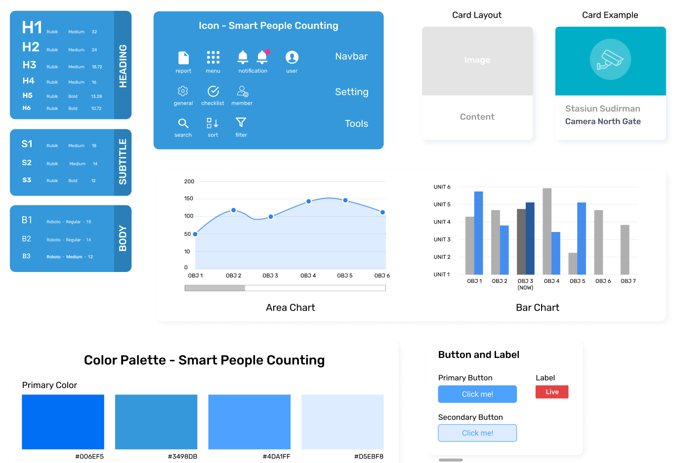
For maintaining our consistency in design and implementation, we build the design guidelines first before we started the project. It helps us to save time or even made a component that can be reused by other components because we already have a big picture of the result before we start the development. Here’s our guidelines snapshot or for the full version and also the implementation, you can check it on my post “Stay Consistent, Stay In The Guideline” in my profile.
为了保持设计和实施的一致性,我们在开始项目之前首先构建设计准则。 它可以帮助我们节省时间甚至制作一个可以被其他组件重用的组件,因为在开始开发之前我们已经对结果有了一个全面的了解。 这是我们的准则快照或完整版本以及实现的快照,您可以在我的个人资料中的“保持一致,遵守准则 ”一文中进行检查。
错误预防 (Error prevention)
Even better than good error messages is a careful design which prevents a problem from occurring in the first place. Either eliminate error-prone conditions or check for them and present users with a confirmation option before they commit to the action.
精心设计的系统甚至比良好的错误消息更好,它可以防止问题从一开始就发生。 消除容易出错的条件,或者检查条件,并在用户执行操作之前向其提供确认选项。
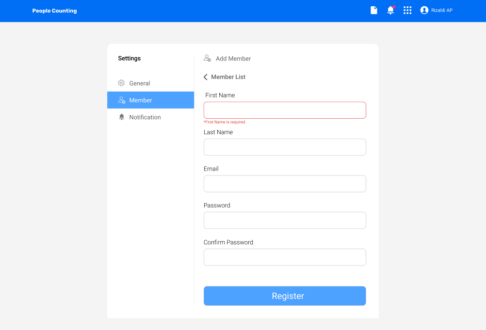
We can prevent some errors to minimize the resource but it has to be as informative as possible so the user can know where is the error causes. The example of our implementation for this point is when the admin trying to add a new member to the setting page. The user will be given a form that all the field needed to be filled and if there’s some field that admin forgot to fill the field will be colored with red and shows the error message which is that field is needed to be filled.
我们可以防止一些错误以最大程度地减少资源,但是它必须尽可能多地提供信息,以便用户可以知道错误的原因。 关于这一点,我们的实现示例是当管理员尝试向设置页面添加新成员时。 将为用户提供一个表格,其中需要填写所有字段,如果有一些管理员忘记填写的字段将被涂成红色,并显示错误消息,那就是该字段需要填写。
认可而不是回忆 (Recognition rather than recall)
Minimize the user’s memory load by making objects, actions, and options visible. The user should not have to remember information from one part of the dialogue to another. Instructions for use of the system should be visible or easily retrievable whenever appropriate.
通过使对象,操作和选项可见,最大程度地减少用户的内存负载。 用户不必记住从对话的一部分到另一部分的信息。 该系统的使用说明应适当可见或易于检索。
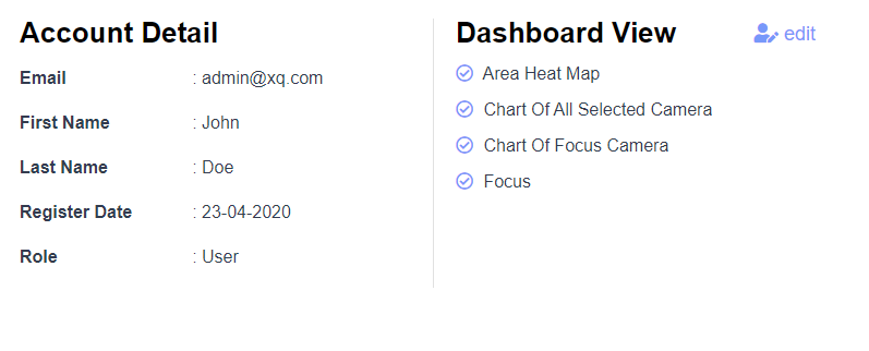
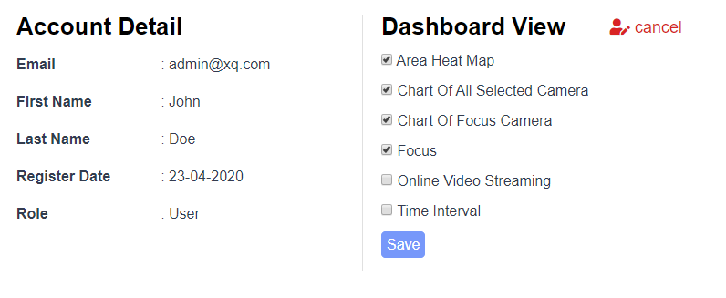
Saving the state of user definitely will raise the user experience when using our product because they didn’t need to remember all the steps that they already have done. For our project, we implement this point by creating a setting page for change user accessibility for the data. If we click the edit button, it will show the list possible for the accessibility and will automatically save the data without reloading the page if the user clicks the save button.
保存用户状态无疑会提高使用我们产品时的用户体验,因为他们不需要记住他们已经完成的所有步骤。 对于我们的项目,我们通过创建一个设置页面来实现这一点,以更改数据的用户可访问性。 如果单击编辑按钮,它将显示可能的辅助功能列表,并且如果用户单击保存按钮,则将自动保存数据而无需重新加载页面。
使用的灵活性和效率 (Flexibility and efficiency of use)
Accelerators — unseen by the novice user — may often speed up the interaction for the expert user such that the system can cater to both inexperienced and experienced users. Allow users to tailor frequent actions.
新手用户看不见的加速器通常可以加快专家用户的交互速度,从而使系统可以同时满足没有经验的用户和有经验的用户。 允许用户调整频繁的操作。
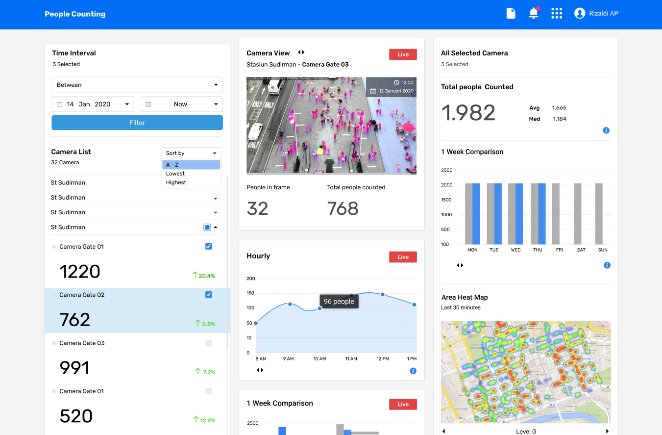
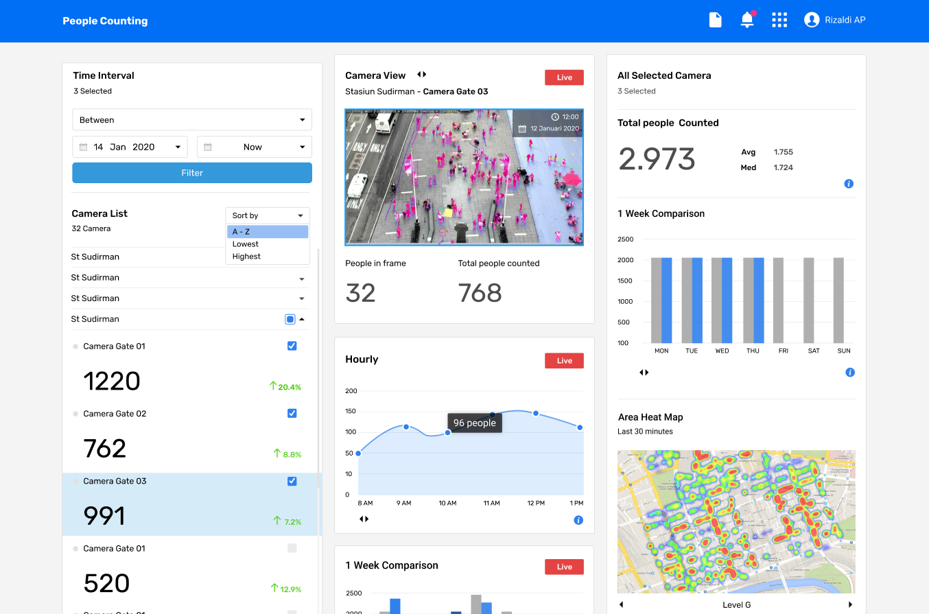
In our project, we trying to give as many features as we can with the good interface so any kind of user can use the website. Take a look at our dashboard in the left and right columns. The right column will show the camera data selected from the left column if it’s checkbox is checked. It doesn’t need a request to server again because we already got all the data when processing the page for the first time and we just need to use some function to do the calculation on the component file. When the user hits the checkbox icon on the left column it will directly call a function to do the calculation and also updating the right column. It’s easier to understand by novice users or even expert users.
在我们的项目中,我们试图通过良好的界面提供尽可能多的功能,以便任何类型的用户都可以使用该网站。 看看我们在左侧和右侧栏中的信息中心。 如果选中此复选框,则右列将显示从左列中选择的摄像机数据。 它不需要再次请求服务器,因为在第一次处理页面时我们已经获得了所有数据,我们只需要使用一些函数就可以对组件文件进行计算。 当用户单击左列的复选框图标时,它将直接调用函数进行计算并更新右列。 新手甚至专业用户都更容易理解。
美学和简约设计 (Aesthetic and minimalist design)
Dialogues should not contain information which is irrelevant or rarely needed. Every extra unit of information in a dialogue competes with the relevant units of information and diminishes their relative visibility.
对话中不应包含无关紧要或很少需要的信息。 对话中每增加一个信息单元都会与相关信息单元竞争,从而降低其相对可见度。
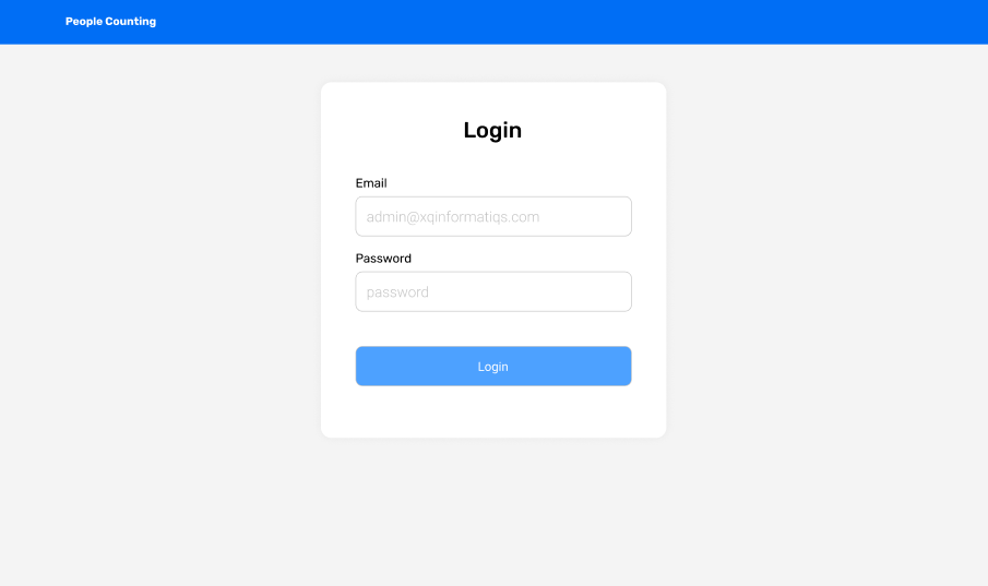
We’re trying to keep the interface as simple as possible with still trying to maximizing the information given. The dashboard is full of information because we want to make user navigation easier to access all the information needed on one page but still we try to minimize the design or the text that doesn't necessarily. Another example for this point is the login page, where we just show a card containing a login form consist of email, password, and also login button. It’s simple, still consistent with the guidelines, and also easy to understand.
我们正在尝试使界面尽可能简单,同时仍在尝试使给定的信息最大化。 仪表板中充满了信息,因为我们希望使用户导航更容易访问一页上所需的所有信息,但是我们仍然尝试尽量减少不必要的设计或文本。 关于这一点的另一个示例是登录页面,我们仅显示一张包含登录表单的卡片,该表单包含电子邮件,密码和登录按钮。 它很简单,仍然符合准则,也很容易理解。
帮助用户识别,诊断错误并从错误中恢复 (Help users recognize, diagnose, and recover from errors)
Error messages should be expressed in plain language (no codes), precisely indicate the problem, and constructively suggest a solution.
错误消息应使用简单的语言(无代码)表示,准确指示问题并建设性地提出解决方案。
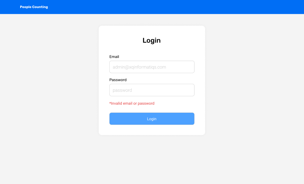
With all the prevention before, there will be still an error that will be occurred after processed on the backend server. In this case, the error information is needed to pass to the user so they will know what kind of error happens and what caused the error. Take an example of our login system, if the user fills the email and password the frontend system will not detect any error, but after it sent a request to the backend server for authentication and the credential given is invalid, we will give the notification on the form so the user knows what happens and retrying to fills the email and password correctly.
通过前面的所有预防措施,在后端服务器上进行处理后仍然会出现错误。 在这种情况下,需要将错误信息传递给用户,以便他们知道发生了哪种错误以及导致错误的原因。 以我们的登录系统为例,如果用户填写了电子邮件和密码,则前端系统将不会检测到任何错误,但是在它向后端服务器发送请求进行身份验证并且给定的凭据无效之后,我们将在表单,以便用户知道会发生什么,然后尝试正确填写电子邮件和密码。
帮助和文档 (Help and documentation)
Even though it is better if the system can be used without documentation, it may be necessary to provide help and documentation. Any such information should be easy to search, focused on the user’s task, list concrete steps to be carried out, and not be too large.
即使可以在没有文档的情况下使用系统会更好,但可能仍需要提供帮助和文档。 任何此类信息都应该易于搜索,着眼于用户的任务,列出要执行的具体步骤,并且不要太大。
All the lists of what users can do or even a simple error handling are needed to be documented and can be easily accessed by the users. But until this point, we still not implement the FAQ page because our client has set the prioritize features that needed to complete first. But in the end, after all the features implemented well, I think FAQ is one of the most pages needed because it can guide our users to use our website properly.
用户可以做的所有列表甚至是简单的错误处理都需要记录在案,并且用户可以轻松访问。 但是直到现在,我们仍然没有实现FAQ页面,因为我们的客户已经设置了需要先完成的优先功能。 但是最后,在所有功能都实现好之后,我认为常见问题解答是所需的最多页面之一,因为它可以指导我们的用户正确使用我们的网站。
结论 (Conclusion)
It seems to be fun when creating the wireframe and mockup but actually there are many things to be considered when we chose a design. User experiences are important because who will be using our website are the user. We need to make it user-oriented for providing the best user experience but also still keep the design as the product branding.
创建线框和模型时,这似乎很有趣,但是实际上,当我们选择一种设计时,要考虑很多事情。 用户体验很重要,因为将要使用我们网站的是用户。 我们需要使其面向用户,以提供最佳的用户体验,但同时仍要保持设计与产品的品牌相同。
翻译自: https://medium.com/@aryodh/planning-before-doing-wireframe-and-mockup-43d8941565a2
线框模型
http://www.taodudu.cc/news/show-893913.html
相关文章:
- 工作经验教训_在设计工作五年后获得的经验教训
- 中文排版规则_非设计师的5条排版规则
- ux设计_声音建议:设计UX声音的快速指南
- sans serif_Sans和Serif相遇可爱
- sql 避免除0错误_设计简历时避免这3个常见的UX错误
- 如何编写数据库可视化界面_编写用于数据可视化的替代文本
- reloaddata 跳动_纸跳动像素
- 利益相关者软件工程_改善开发人员团队与非技术利益相关者之间交流的方法
- 响应式网格项目动画布局_响应式网格及其实际使用方式:常见的UI布局
- 时间轴ui设计_我应该在UI设计上花更多时间吗?
- 移动端分步注册_移动应用程序的可用性测试:分步指南
- 插图 引用 同一行两个插图_提出食物主题中的插图
- 脸部细微表情识别_您可以仅使用面部表情来控制字体吗?
- 用户体验设计师能为seo做_用户体验设计师可以从产品设计历史中学到什么
- orton效果_如何使图片发光:Orton效果
- hp-ux锁定用户密码_UX设计101:用户研究-入门需要了解的一切
- extjs6 引入ux_关于UX以及如何摆脱UX的6种常见误解
- illustrator下载_Illustrator笔工具练习
- 怎么更好练习数位板_如何设计更好的仪表板
- hp-ux锁定用户密码_我们如何简化925移动应用程序的用户入门— UX案例研究
- 微信公众号无需二次登录_您无需两次解决问题-您需要一个设计系统
- 视觉工程师面试指南_选择正确视觉效果的终极指南
- 问题反馈模板_使用此模板可获得更好,更有价值的UX反馈
- iofd:文件描述符_文字很重要:谈论设计时18个有意义的描述符
- 数据可视化 信息可视化_可视化哲学的黎明
- 重口味动漫_每种口味的图标样式
- 从头开始vue创建项目_我正在以设计师的身份开始一个被动的收入项目。 从头开始。...
- 英国文化影响管理风格_文化如何影响用户体验
- element ui 空格_空格是您的UI朋友。 大量使用它。
- qt 设计师缩放_重新设计缩放体验
线框模型_进行计划之前:线框和模型相关推荐
- python ctm 关联主题模型_面向特定划分的主题模型的设计与实现
面向特定划分的主题模型的设计与实现 * 周凯文,杨智慧,马会心,何震瀛,荆一楠 + ,王晓阳 [摘 要] 利用主题模型对文本数据进行处理.分析在如今的数据挖掘领域应用 十分广泛,其中 LDA ( la ...
- 不等距双杆模型_气体中的变质量模型
点击蓝字 关注我们 气体中的变质量模型 物理专辑 力学专辑 电学专辑 十年高考真题专辑 物理模型 人船模型 等时圆模型 物理动态图 电表的改装 替代法测电阻 2020物理备考 人拉船模型 物理计算题的 ...
- 做面板数据分位数回归模型_面板数据门限回归模型
来源 | 数量经济学综合整理 转载请联系 进行回归分析,一般需要研究系数的估计值是否稳定.很多经济变量都存在结构突变问题,使用普通回归的做法就是确定结构突变点,进行分段回归.这就像我们高中学习的分段函 ...
- transformer模型_【经典精读】Transformer模型深度解读
文字长度: ★★★★★ 阅读难度: ★★☆☆☆ 原创程度: ★★★★☆ Transformer是2017年的一篇论文<Attention is All You Need>提出的一种模型架构 ...
- python股票交易模型_如何用Python建模GGM模型并对股票估值?
内容首发 乐学偶得(http://lexueoude.com) 公众号: 乐学Fintech 用代码理解分析解决金融问题 首先我们快速了解一下什么是GGM模型. GGM模型又叫做"戈登增长模 ...
- 不等距双杆模型_搜索中的深度匹配模型(下)
由于知乎字数限制,单篇文章字数限制不超过5万字,这篇文章主要为上一篇的延续 前文链接: 搜索中的深度匹配模型 4.3 match function模型总结 5.搜索中query和doc的相关性匹配模型 ...
- 逆幂律模型_【微微出品】加速模型一起聊聊Peck、Lawson、MILHDBK217
在环境试验中,针对某些测试时间比较长的试验, 往往会选择通过加速应力的方式,缩短试验时间,节约试验经费,达到想要的试验结果,这种试验被称为加速试验或加速寿命试验(Accelerated Life Te ...
- 用python做股票智能投顾模型_如何用Python建模GGM模型并对股票估值?
内容首发 乐学偶得(http://lexueoude.com) 公众号: 乐学Fintech 用代码理解分析解决金融问题 首先我们快速了解一下什么是GGM模型. GGM模型又叫做"戈登增长模 ...
- 星形和雪花模型_星型模型和雪花型模型比较
每个数据仓库都包含一个或者多个事实数据表.事实数据表可能包含业务销售数据,如现金登记事务所产生的数据,事实数据表通常包含大量的行.事实数据表的主要特点是包含数字数据(事实),并且这些数字信息可以汇总, ...
最新文章
- Excel如何设置单元格行高,办公入门
- springmvc 将大写转小写_Excel – 快速设置大小写中文数字顺序编号,拖动自动增序...
- pr扫光转场插件_2020年最新pr转场特效:300套模板+200集视频教程+插件,送你参考...
- ERROR: This virtual machine appears to be in use
- java算法----0至9这十个数组成两个三位数和一个四位数
- Gradle task
- Linux下快速搭建DNS服务器
- 【初级01】java JVM核心技术(1):字节码、类加载器、GC机制
- Delphi Android menu,Delphi菜单组件TMainMenu使用方法详解
- 人生的意义,在于不断地超越自己
- 微信html5视频播放器,解决微信h5页面视频播放问题实例
- 尊重孩子 梅兰芳“宠溺有道”
- 爬取 48048 条评论,解读 9.3 分的「毒液」是否值得一看?
- Oracle分区表详解,分区表创建,分区表按日期划分
- 部署IIS网站HTTPS访问
- 3D数学基础——欧拉角与万向节死锁
- web player html5源码,GitHub - WEBHH/DanmuPlayer: Html5弹幕视频播放器插件
- 俄国防部组建信息作战部队 应对西方网络-心理攻击
- Ping 请求找不到主机 eeee.dev5.bbbbbbb/eeeeeee/。请检查该名称,然后重试。
- 什么是DDos攻击,如何有效缓解DDos攻击?