R语言绘制heatmap热图
From:http://bbsunchen.iteye.com/blog/1271580
介绍如何使用 R 绘制 heatmap 的文章。
今天无意间在Flowingdata看到一篇关于如何使用 R 来做 heatmap 的文章(请移步到这里)。虽然 heatmap 只是 R 中一个很普通的图形函数,但这个例子使用了2008-2009赛季 NBA 50个顶级球员数据做了一个极佳的演示,效果非常不错。对 R 大致了解的童鞋可以直接在 R console 上敲
?heatmap
直接查看帮助即可。
没有接触过 R 的童鞋继续围观,下面会仔细介绍如何使用 R 实现 NBA 50位顶级球员指标表现热图:
关于 heatmap,中文一般翻译为“热图”,其统计意义wiki上解释的很清楚:
A heat map is a graphical representation of data where the values taken by a variable in a two-dimensional map are represented as colors.Heat maps originated in 2D displays of the values in a data matrix. Larger values were represented by small dark gray or black squares (pixels) and smaller values by lighter squares.
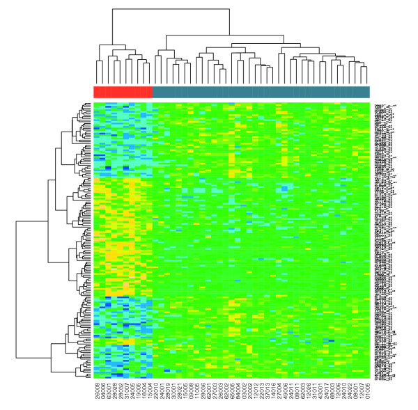
下面这个图即是Flowingdata用一些 R 函数对2008-2009 赛季NBA 50名顶级球员指标做的一个热图(点击参看大图):

先解释一下数据:
这里共列举了50位球员,估计爱好篮球的童鞋对上图右边的每个名字都会耳熟能详。这些球员每个人会有19个指标,包括打了几场球(G)、上场几分钟(MIN)、得分(PTS)……这样就行成了一个50行×19列的矩阵。但问题是,数据有些多,需要使用一种比较好的办法来展示,So it comes, heatmap!
简单的说明:
比如从上面的热图上观察得分前3名(Wade、James、Bryant)PTS、FGM、FGA比较高,但Bryant的FTM、FTA和前两者就差一些;Wade在这三人中STL是佼佼者;而James的DRB和TRB又比其他两人好一些……
姚明的3PP(3 Points Percentage)这条数据很有意思,非常出色!仔细查了一下这个数值,居然是100%。仔细回想一下,似乎那个赛季姚明好像投过一个3分,并且中了,然后再也没有3p。这样本可真够小的!
最后是如何做这个热图(做了些许修改):
Step 0. Download R
R 官网:http://www.r-project.org,它是免费的。官网上面提供了Windows,Mac,Linux版本(或源代码)的R程序。
Step 1. Load the data
R 可以支持网络路径,使用读取csv文件的函数read.csv。
读取数据就这么简单:
nba<- read.csv("http://datasets.flowingdata.com/ppg2008.csv", sep=",")
Step 2. Sort data
按照球员得分,将球员从小到大排序:
nba <- nba[order(nba$PTS),]
当然也可以选择MIN,BLK,STL之类指标
Step 3. Prepare data
把行号换成行名(球员名称):
row.names(nba) <- nba$Name
去掉第一列行号:
nba <- nba[,2:20] # or nba <- nba[,-1]
Step 4. Prepare data, again
把 data frame 转化为我们需要的矩阵格式:
nba_matrix <- data.matrix(nba)
Step 5. Make a heatmap
# R 的默认还会在图的左边和上边绘制 dendrogram,使用Rowv=NA, Colv=NA去掉
heatmap(nba_matrix, Rowv=NA, Colv=NA, col=cm.colors(256), revC=FALSE, scale='column')
这样就得到了上面的那张热图。
Step 6. Color selection
或者想把热图中的颜色换一下:
heatmap(nba_matrix, Rowv=NA, Colv=NA, col=heat.colors(256), revC=FALSE, scale="column", margins=c(5,10))
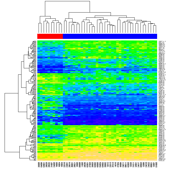
Bioinformatics and Computational Biology Solutions Using R and Bioconductor 第10章的
例子:
Heatmaps, or false color images have a reasonably long history, as has the
notion of rearranging the columns and rows to show structure in the data.
They were applied to microarray data by Eisen et al. (1998) and have
become a standard visualization method for this type of data.
A heatmap is a two-dimensional, rectangular, colored grid. It displays
data that themselves come in the form of a rectangular matrix. The color
of each rectangle is determined by the value of the corresponding entry
in the matrix. The rows and columns of the matrix can be rearranged
independently. Usually they are reordered so that similar rows are placed
next to each other, and the same for columns. Among the orderings that
are widely used are those derived from a hierarchical clustering, but many
other orderings are possible. If hierarchical clustering is used, then it is
customary that the dendrograms are provided as well. In many cases the
resulting image has rectangular regions that are relatively homogeneous
and hence the graphic can aid in determining which rows (generally the
genes) have similar expression values within which subgroups of samples
(generally the columns).
The function heatmap is an implementation with many options. In particular,
users can control the ordering of rows and columns independently
from each other. They can use row and column labels of their own choosing
or select their own color scheme.
> library("ALL")
> data("ALL")
> selSamples <- ALL$mol.biol %in% c("ALL1/AF4",
+ "E2A/PBX1")
> ALLs <- ALL[, selSamples]
> ALLs$mol.biol <- factor(ALLs$mol.biol)
> colnames(exprs(ALLs)) <- paste(ALLs$mol.biol,
+ colnames(exprs(ALLs)))
>library("genefilter")
> meanThr <- log2(100)
> g <- ALLs$mol.biol
> s1 <- rowMeans(exprs(ALLs)[, g == levels(g)[1]]) >
+ meanThr
> s2 <- rowMeans(exprs(ALLs)[, g == levels(g)[2]]) >
+ meanThr
> s3 <- rowttests(ALLs, g)$p.value < 2e-04
> selProbes <- (s1 | s2) & s3
> ALLhm <- ALLs[selProbes, ]
>library(RColorBrewer)
> hmcol <- colorRampPalette(brewer.pal(10, "RdBu"))(256)
> spcol <- ifelse(ALLhm$mol.biol == "ALL1/AF4",
+ "goldenrod", "skyblue")
> heatmap(exprs(ALLhm), col = hmcol, ColSideColors = spcol)
最后,可以
>help(heatmap) 查找帮助,看看帮助给提供的例子
也可以看这的例子:
http://www2.warwick.ac.uk/fac/sci/moac/students/peter_cock/r/heatmap/
|
Using R to draw a Heatmap from Microarray Data |
|
|
[c] The first section of this page uses R to analyse an Acute lymphocytic leukemia (ALL) microarray dataset, producing a heatmap (with dendrograms) of genes differentially expressed between two types of leukemia. There is a follow on page dealing with how to do this from Python using RPy. The original citation for the raw data is "Gene expression profile of adult T-cell acute lymphocytic leukemia identifies distinct subsets of patients with different response to therapy and survival" by Chiaretti et al. Blood 2004. (PMID: 14684422) The analysis is a "step by step" recipe based on this paper, Bioconductor: open software development for computational biology and bioinformatics, Gentleman et al. 2004. Their Figure 2 Heatmap, which we recreate, is reproduced here: Heatmaps from R Assuming you have a recent version of R (from The R Project) and BioConductor (see Windows XP installation instructions), the example dataset can be downloaded as the BioConductor ALL package. You should be able to install this from within R as follows: > source("http://www.bioconductor.org/biocLite.R")
> biocLite("ALL")
Running bioCLite version 0.1 with R version 2.1.1
...
Alternatively, you can download the package by hand from here or here. If you are using Windows, download ALL_1.0.2.zip (or similar) and save it. Then from within the R program, use the menu option "Packages", "Install package(s) from local zip files..." and select the ZIP file. On Linux, download ALL_1.0.2.tar.gz (or similar) and use sudo R CMD INSTALL ALL_1.0.2.tar.gz at the command prompt. With that out of the way, you should be able to start R and load this package with the library and data commands: > library("ALL")
Loading required package: Biobase
Loading required package: tools
Welcome to Bioconductor
Vignettes contain introductory material. To view,
simply type: openVignette()
For details on reading vignettes, see
the openVignette help page.
> data("ALL")
If you inspect the resulting ALL variable, it contains 128 samples with 12625 genes, and associated phenotypic data. > ALL
Expression Set (exprSet) with
12625 genes
128 samples
phenoData object with 21 variables and 128 cases
varLabels
cod: Patient ID
diagnosis: Date of diagnosis
sex: Gender of the patient
age: Age of the patient at entry
BT: does the patient have B-cell or T-cell ALL
remission: Complete remission(CR), refractory(REF) or NA. Derived from CR
CR: Original remisson data
date.cr: Date complete remission if achieved
t(4;11): did the patient have t(4;11) translocation. Derived from citog
t(9;22): did the patient have t(9;22) translocation. Derived from citog
cyto.normal: Was cytogenetic test normal? Derived from citog
citog: original citogenetics data, deletions or t(4;11), t(9;22) status
mol.biol: molecular biology
fusion protein: which of p190, p210 or p190/210 for bcr/able
mdr: multi-drug resistant
kinet: ploidy: either diploid or hyperd.
ccr: Continuous complete remission? Derived from f.u
relapse: Relapse? Derived from f.u
transplant: did the patient receive a bone marrow transplant? Derived from f.u
f.u: follow up data available
date last seen: date patient was last seen
We can looks at the results of molecular biology testing for the 128 samples: > ALL$mol.biol
[1] BCR/ABL NEG BCR/ABL ALL1/AF4 NEG NEG NEG NEG NEG
[10] BCR/ABL BCR/ABL NEG E2A/PBX1 NEG BCR/ABL NEG BCR/ABL BCR/ABL
[19] BCR/ABL BCR/ABL NEG BCR/ABL BCR/ABL NEG ALL1/AF4 BCR/ABL ALL1/AF4
...
[127] NEG NEG
Levels: ALL1/AF4 BCR/ABL E2A/PBX1 NEG NUP-98 p15/p16
Ignoring the samples which came back negative on this test (NEG), most have been classified as having a translocation between chromosomes 9 and 22 (BCR/ABL), or a translocation between chromosomes 4 and 11 (ALL1/AF4). For the purposes of this example, we are only interested in these two subgroups, so we will create a filtered version of the dataset using this as a selection criteria: > eset <- ALL[, ALL$mol.biol %in% c("BCR/ABL", "ALL1/AF4")]
The resulting variable, eset, contains just 47 samples - each with the full 12,625 gene expression levels. This is far too much data to draw a heatmap with, but we can do one for the first 100 genes as follows: > heatmap(exprs(eset[1:100,]))
According to the BioConductor paper we are following, the next step in the analysis was to use the lmFit function (from the limma package) to look for genes differentially expressed between the two groups. The fitted model object is further processed by the eBayes function to produce empirical Bayes test statistics for each gene, including moderated t-statistics, p-values and log-odds of differential expression. > library(limma)
> f <- factor(as.character(eset$mol.biol))
> design <- model.matrix(~f)
> fit <- eBayes(lmFit(eset,design))
If the limma package isn't installed, you'll need to install it first: > source("http://www.bioconductor.org/biocLite.R")
> biocLite("limma")
Running bioCLite version 0.1 with R version 2.1.1
...
We can now reproduce Figure 1 from the paper. > topTable(fit, coef=2)
ID M A t P.Value B
1016 1914_at -3.076231 4.611284 -27.49860 5.887581e-27 56.32653
7884 37809_at -3.971906 4.864721 -19.75478 1.304570e-20 44.23832
6939 36873_at -3.391662 4.284529 -19.61497 1.768670e-20 43.97298
10865 40763_at -3.086992 3.474092 -17.00739 7.188381e-18 38.64615
4250 34210_at 3.618194 8.438482 15.45655 3.545401e-16 35.10692
11556 41448_at -2.500488 3.733012 -14.83924 1.802456e-15 33.61391
3389 33358_at -2.269730 5.191015 -12.96398 3.329289e-13 28.76471
8054 37978_at -1.036051 6.937965 -10.48777 6.468996e-10 21.60216
10579 40480_s_at 1.844998 7.826900 10.38214 9.092033e-10 21.27732
330 1307_at 1.583904 4.638885 10.25731 1.361875e-09 20.89145
The leftmost numbers are row indices, ID is the Affymetrix HGU95av2 accession number, M is the log ratio of expression, A is the log average expression, t the moderated t-statistic, and B is the log odds of differential expression. Next, we select those genes that have adjusted p-values below 0.05, using a very stringent Holm method to select a small number (165) of genes. > selected <- p.adjust(fit$p.value[, 2]) <0.05
> esetSel <- eset [selected, ]
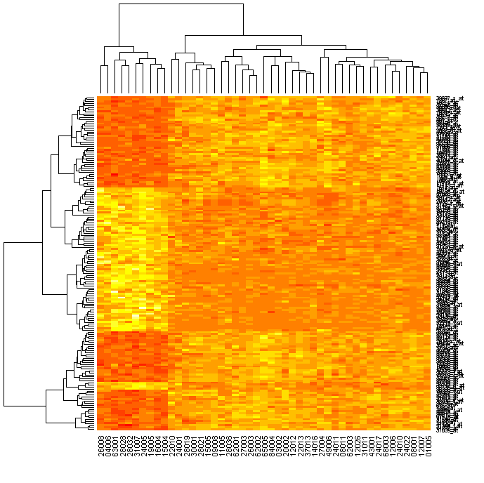
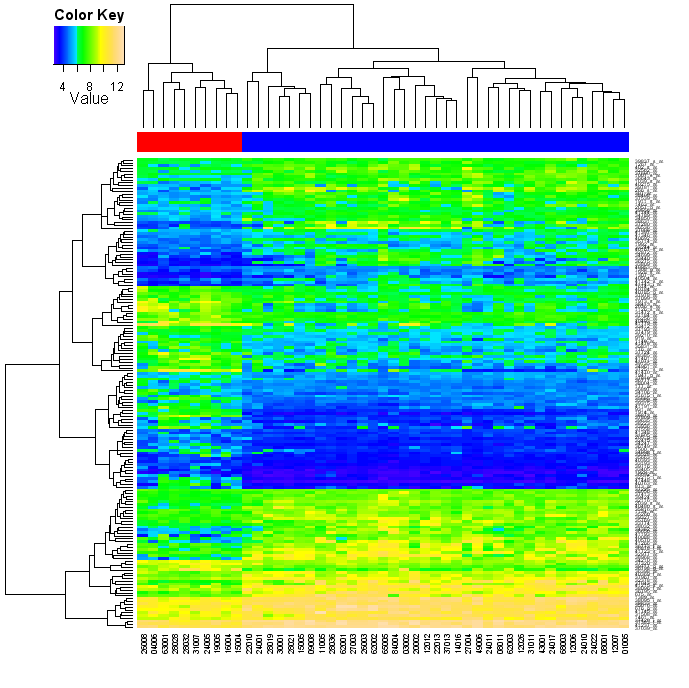
The variable esetSel has data on (only) 165 genes for all 47 samples . We can easily produce a heatmap as follows (in R-2.1.1 this defaults to a yellow/red "heat" colour scheme): > heatmap(exprs(esetSel))
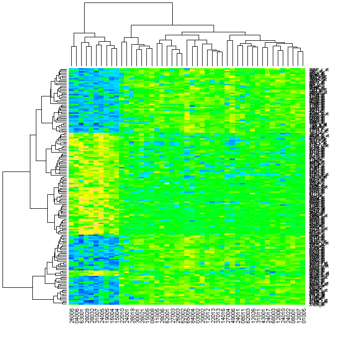
If you have the topographical colours installed (yellow-green-blue), you can do this: > heatmap(exprs(esetSel), col=topo.colors(100))
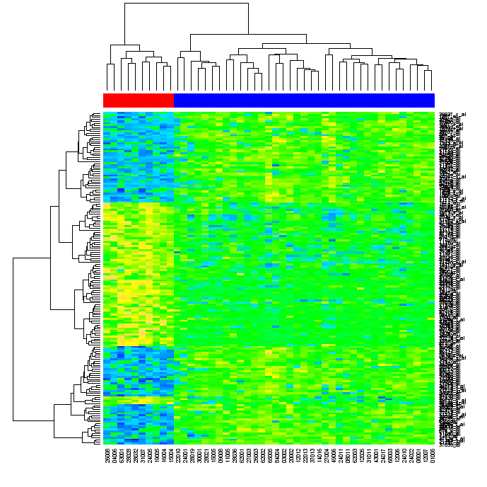
This is getting very close to Gentleman et al.'s Figure 2, except they have added a red/blue banner across the top to really emphasize how the hierarchical clustering has correctly split the data into the two groups (10 and 37 patients). To do that, we can use the heatmap function's optional argument of ColSideColors. I created a small function to map the eselSet$mol.biol values to red (#FF0000) and blue (#0000FF), which we can apply to each of the molecular biology results to get a matching list of colours for our columns: > color.map <- function(mol.biol) { if (mol.biol=="ALL1/AF4") "#FF0000" else "#0000FF" }
> patientcolors <- unlist(lapply(esetSel$mol.bio, color.map))
> heatmap(exprs(esetSel), col=topo.colors(100), ColSideColors=patientcolors)
Looks pretty close now, doesn't it: To recap, this is "all" we needed to type into R to achieve this: library("ALL")
data("ALL")
eset <- ALL[, ALL$mol.biol %in% c("BCR/ABL", "ALL1/AF4")]
library("limma")
f <- factor(as.character(eset$mol.biol))
design <- model.matrix(~f)
fit <- eBayes(lmFit(eset,design))
selected <- p.adjust(fit$p.value[, 2]) <0.05
esetSel <- eset [selected, ]
color.map <- function(mol.biol) { if (mol.biol=="ALL1/AF4") "#FF0000" else "#0000FF" }
patientcolors <- unlist(lapply(esetSel$mol.bio, color.map))
heatmap(exprs(esetSel), col=topo.colors(100), ColSideColors=patientcolors)
Heatmaps in R - More Options One subtle point in the previous examples is that the heatmap function has automatically scaled the colours for each row (i.e. each gene has been individually normalised across patients). This can be disabled using scale="none", which you might want to do if you have already done your own normalisation (or this may not be appropriate for your data): heatmap(exprs(esetSel), col=topo.colors(75), scale="none", ColSideColors=patientcolors, cexRow=0.5)
You might also have noticed in the above snippet, that I have shrunk the row captions which were so big they overlapped each other. The relevant options are cexRow and cexCol. So far so good - but what if you wanted a key to the colours shown? The heatmap function doesn't offer this, but the good news is that heatmap.2 from the gplots library does. In fact, it offers a lot of other features, many of which I deliberately turn off in the following example: library("gplots")
heatmap.2(exprs(esetSel), col=topo.colors(75), scale="none", ColSideColors=patientcolors,
key=TRUE, symkey=FALSE, density.info="none", trace="none", cexRow=0.5)
By default, heatmap.2 will also show a trace on each data point (removed this with trace="none"). If you ask for a key (using key=TRUE) this function will actually give you a combined "color key and histogram", but that can be overridden (with density.info="none"). Don't like the colour scheme? Try using the functions bluered/redblue for a red-white-blue spread, or redgreen/greenred for the red-black-green colour scheme often used with two-colour microarrays: library("gplots")
heatmap.2(exprs(esetSel), col=redgreen(75), scale="row", ColSideColors=patientcolors,
key=TRUE, symkey=FALSE, density.info="none", trace="none", cexRow=0.5)
Heatmaps from Python So, how can we do that from within Python? One way is using RPy (R from Python), and this is discussed on this page. P.S. If you want to use heatmap.2 from within python using RPy, use the syntax heatmap_2 due to the differences in how R and Python handle full stops and underscores. What about other microarray data? Well, I have also documented how you can load NCBI GEO SOFT files into R as a BioConductor expression set object. As long as you can get your data into R as a matrix or data frame, converting it into an exprSet shouldn't be too hard. |

R语言绘制heatmap热图相关推荐
- R语言绘制相关性热图
1. ggplot2包ggplot函数绘制相关性热图 ### 1. ggplot2包ggplot函数绘制相关性热图 rm(list = ls()) head(mtcars[,1:6]) #查看前六行六 ...
- R 语言绘制环状热图
作者:佳名 来源:简书 - R 语言文集 1. 读取并处理基因表达数据 这是我的基因表达量数据: 图 Fig 1 > myfiles <- list.files(pattern = &qu ...
- r语言绘制精美pcoa图_R语言绘制交互式热图
热图 通过热图可以简单地聚合大量数据,并使用一种渐进的色带来优雅地表现,最终效果一般优于离散点的直接显示,可以很直观地展现空间数据的疏密程度或频率高低.但也由于很直观,热图在数据表现的准确性并不能保证 ...
- 【R语言】——聚类热图行列分组信息注释热图2
上一期"[R语言]--聚类热图绘制(pheatmap)"介绍了R语言pheatmap包绘制聚类热图的基础代码,本期介绍当需要同时在热图上显示分组情况时,可利用pheatmap包构建 ...
- R语言绘制核密度图实战(Kernel Density Plot)
R语言绘制核密度图实战(Kernel Density Plot) 目录 R语言绘制核密度图实战(Kernel Density Plot) #仿真数据
- R语言绘制气泡矩阵图
R语言绘制气泡矩阵图 示例图 之前在一些文章中看到过气泡矩阵的表达方法,该图形表达的意思就是不同样本中不同物种的丰度分布情况,气泡越大则是代表物种的相对丰度(或者说16S得到的绝对丰度)越大,在这个例 ...
- r语言绘制精美pcoa图_如何绘制精美的PCoA图形?
原标题:如何绘制精美的PCoA图形? 今天我们来分享干货--PCoA图形的代码.继PCA.火山图.热图等代码后,基迪奥的程序猿又整理出PCoA代码.具体往期我们分享过的代码贴,可以在文末查看哦. 什么 ...
- 使用R语言绘制心形图
今天七夕,正好看到高等数学的心形线,想到心形线的函数应该可以用R语言来绘制,就尝试了一下. 心形线的参数方程为: 其中r是半径,t为弧度. 有了参数方程之后,我们的作图就变得简单了,其基本思路是:首先 ...
- 使用R语言绘制地图,图审号地图:2019年中国地图-审图号GS(2019)1822号为基础制作的矢量shp 地图数据
下面介绍用R语言如何绘制: 1 加载数据 · 以民政部网站数据为例,利用R语言如何下载数据和绘制地图.民政部数据的API为http://xzqh.mca.gov.cn/data/,全国边界矢量为qua ...
最新文章
- python使用imbalanced-learn的ClusterCentroids方法进行下采样处理数据不平衡问题
- 2018 icpc 徐州现场赛G-树上差分+组合数学-大佬的代码
- dockone上2015.08 Docker有价值文章
- 去除SAP中的一些特殊字符
- php校园开源,基于 Laravel 5.5 开发的开源校园管理系统 —— Unifiedtransform
- 如何调整Loadrunner中Vuser的数量限制
- hdu 3999The order of a Tree
- python模板语言_django的模板语言
- java.lang.IllegalThreadStateException 线程运行报错
- Spark算子:RDD行动Action操作(2)–take、top、takeOrdered
- rtf文件怎么打开_什么是RTF文件(以及如何打开一个文件)?
- 光纤猫可做无线打印服务器吗,光猫自带的天线,这些天线都有什么用呢?是无线功能吗?...
- 服务器2008系统安全狗,win2008 r2 服务器安全设置之安全狗设置图文教程
- 解决mysql报Lock wait timeout exceeded; try restarting transaction的问题
- 【内容详细、源码详尽】MySQL极简学习笔记
- caj在线阅读_2个免费CAJ转PDF的方法,而且不限页数和大小
- 「首席架构师精选」精选绘图软件
- SQL SERVER中LEAD和LAG函数
- python绘制地图线路_python pyecharts绘制地图
- 数据库----MySQL