文本字段和表单设计-UI组件系列
重点 (Top highlight)
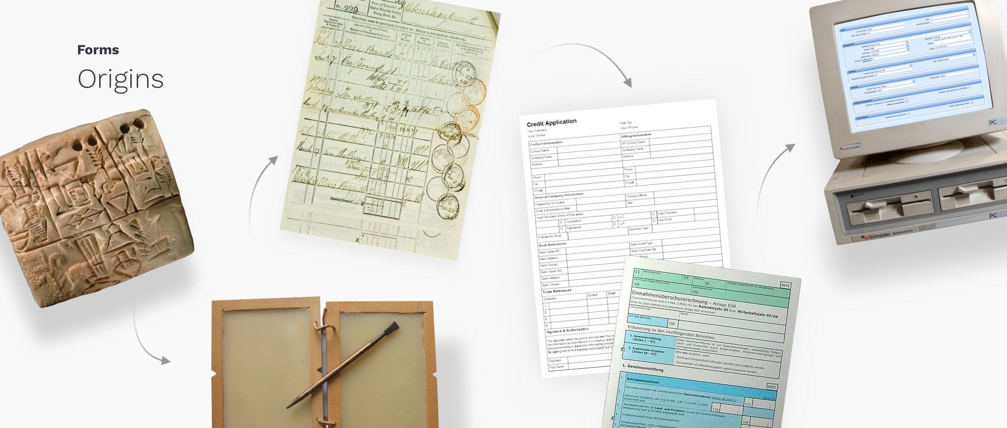
Forms have existed for a significant amount of time, greatly simplifying the task of drafting complaints and various other legal pleadings. With the advance of information and its processing, means to gather the data are also evolving. As printed forms were here for years we can learn a few tips from their design.
表格已经存在了相当长的时间,大大简化了起草投诉和其他各种法律诉状的任务。 随着信息及其处理的进步,收集数据的手段也在不断发展。 由于印刷表格已存在多年,因此我们可以从其设计中学到一些技巧。
文字栏位剖析 (Text field anatomy)
Text fields allow users to enter text into a UI. They typically appear in forms and dialogs. Text field component design should provide a clear affordance for interaction, making the fields discoverable in layouts, efficient to fill in, and accessible.
文本字段允许用户在UI中输入文本。 它们通常显示在表单和对话框中。 文本字段组件设计应为交互提供明确的承受能力,使字段在布局中可发现,可高效填充且可访问。
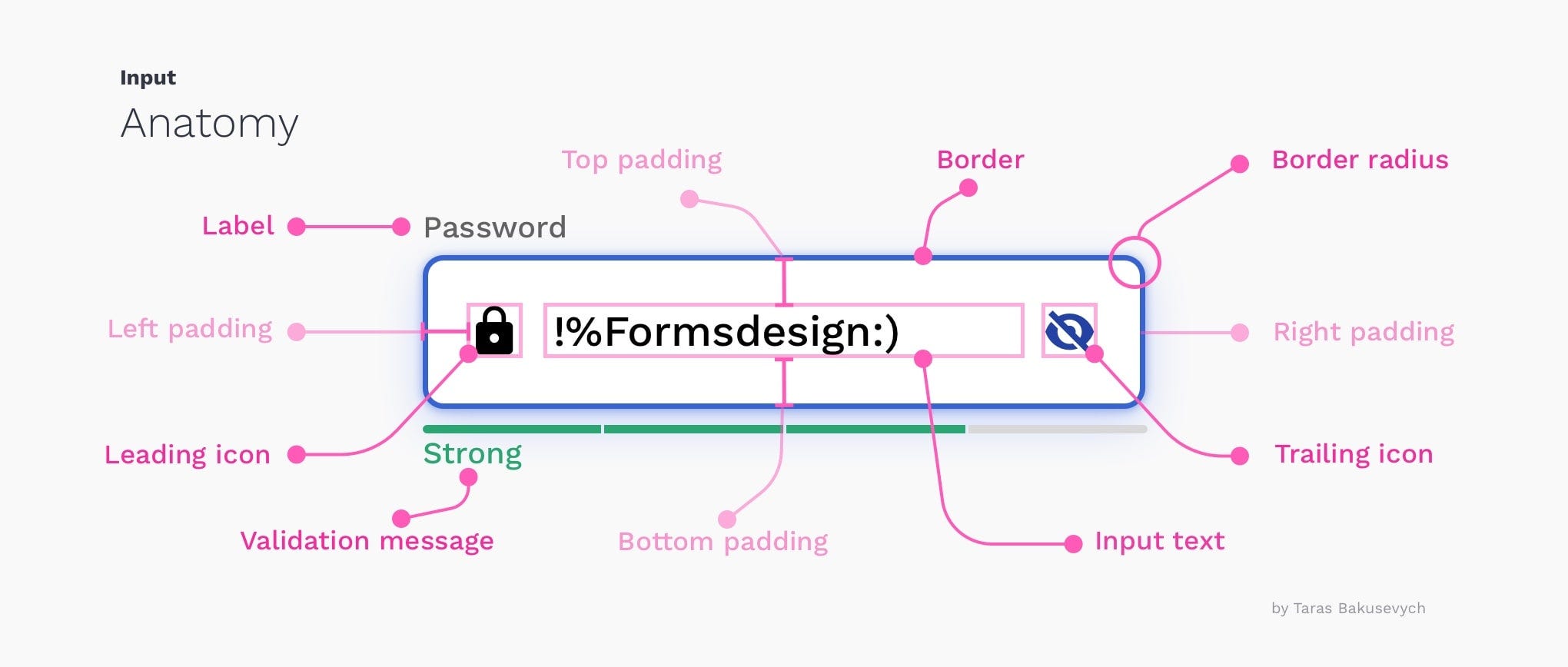
Here are key elements of the basic Text field:1. Container — interactable input area 2. Input text — entered into the text field3. Label Text — tell users what information belongs in a given form field4. Placeholder text — is a description or example of the information required that is replaced with input text after users provide it5. Helper or Validation text(optional) — provides additional context or validation message 6. Leading icon(optional) — describe the type of input a text field requires7. Trailing icon(optional) — additional control for entered text, like clear, hide/show, etc
以下是基本Text字段的关键元素: 1 。 容器 -可交互输入的区域2. 输入文本 -输入到文本字段3中。 标签文本 -告诉用户哪些信息属于给定的表单字段4。 占位符文本 -是对所需信息的描述或示例,在用户提供输入信息后将其替换为输入文本5。 Helper或Validation文本(可选) -提供其他上下文或验证消息6。 前导图标(可选) -描述文本字段要求的输入类型7。 尾随图标(可选) —用于输入文本的附加控件,例如清除,隐藏/显示等
文字栏位类型 (Text field types)
Most of them are based on basic text fields that were modified to better handle specific types of information, like the credit card numbers. Here are just a few examples of input types that are most commonly used throughout UIs we creating:
它们大多数基于基本文本字段,这些文本字段已被修改以更好地处理特定类型的信息,例如信用卡号。 以下是我们创建的整个UI中最常用的输入类型的一些示例:
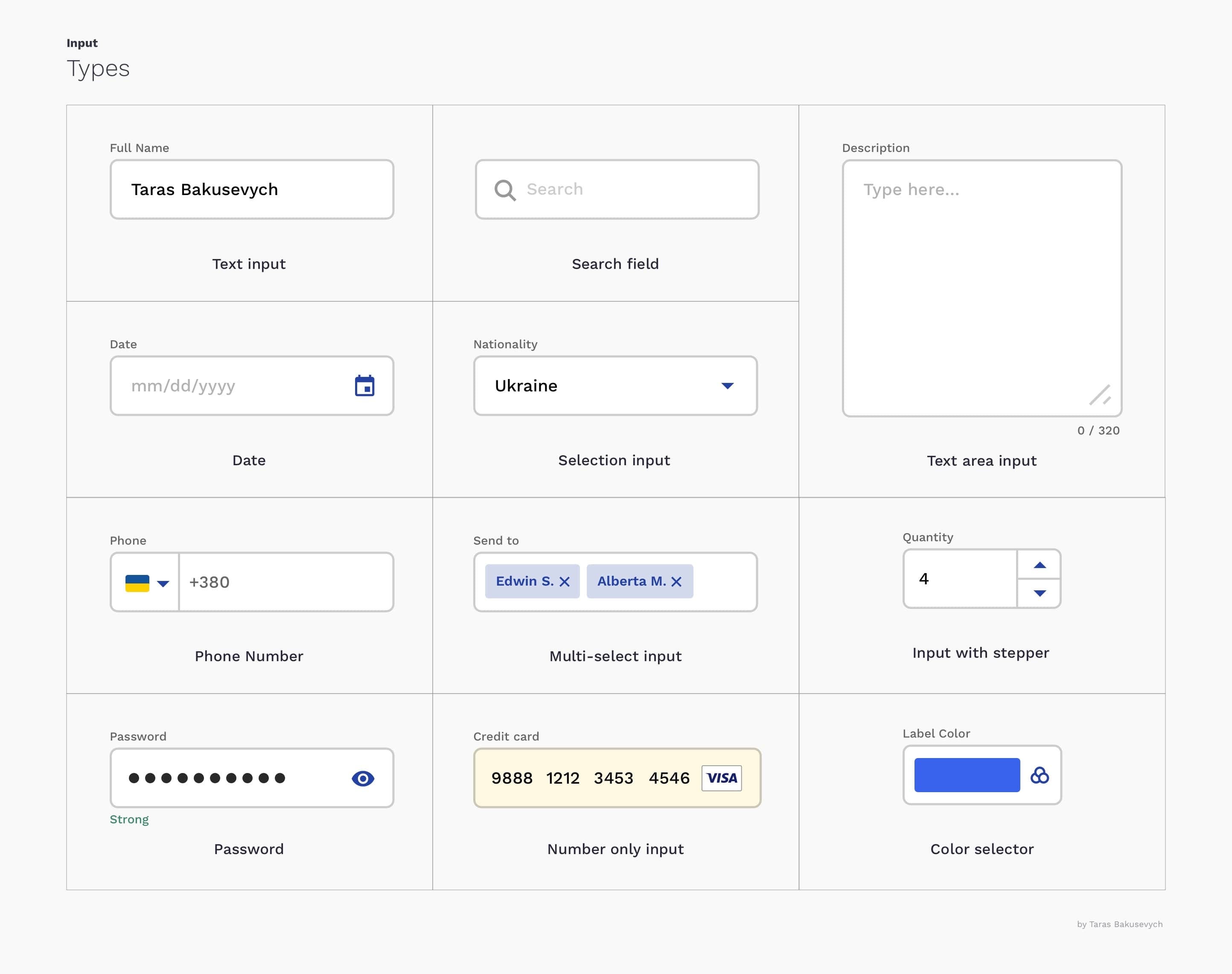
(We specifically are not talking about few input types like checkboxes and radio buttons as we will cover them later in the series)
( 我们专门不是在讨论几种输入类型,例如复选框和单选按钮,因为我们将在本系列的后面部分介绍它们 )
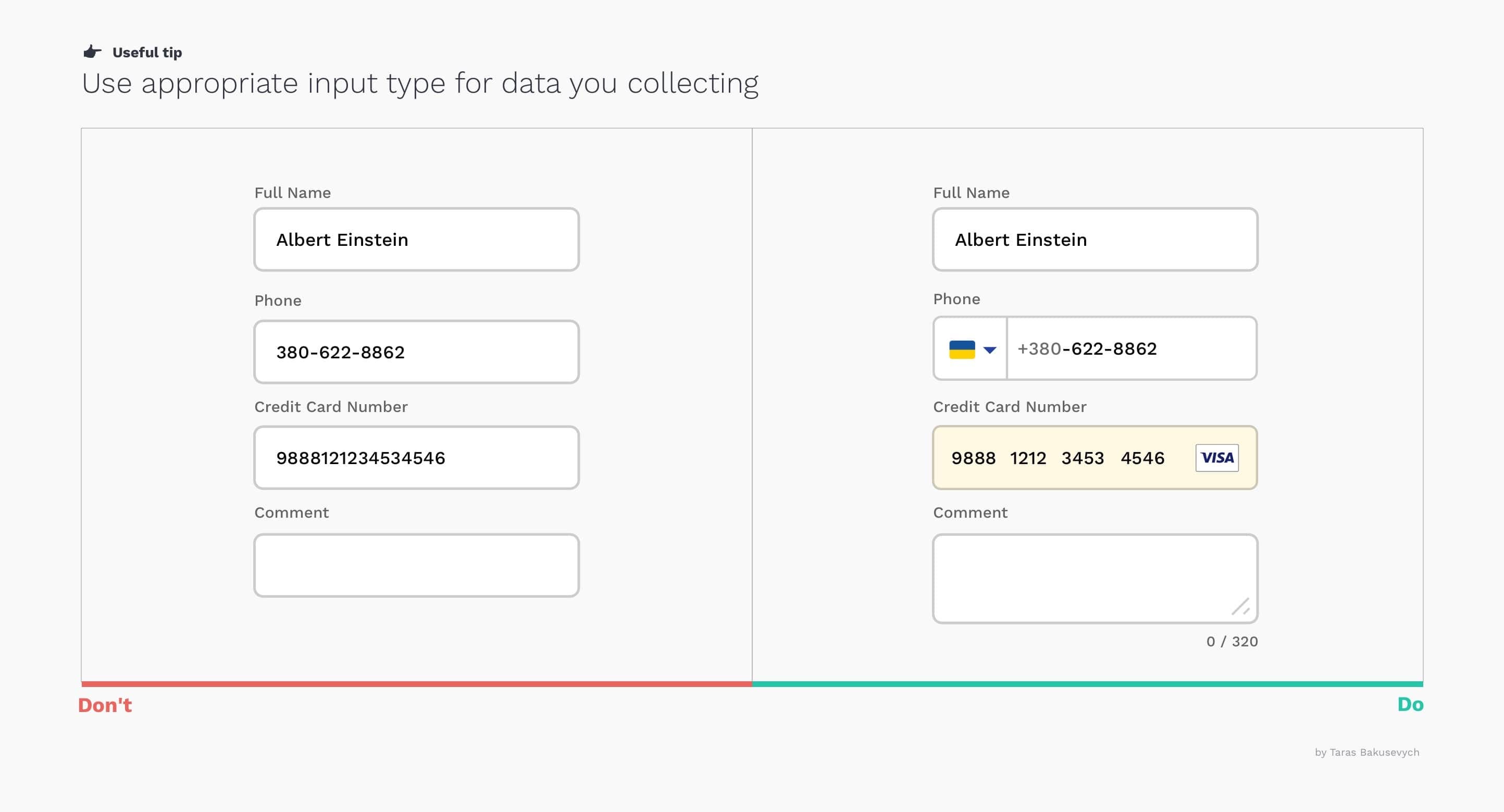
使用适当的输入类型来收集数据 (Use appropriate input type for data you collecting)
Providing the right type of the text field for requested data will help users enter information in the right format and avoid mistakes, making the process as easy and efficient as possible.
为请求的数据提供正确的文本字段类型将有助于用户以正确的格式输入信息并避免错误,从而使该过程尽可能简单高效。
文本字段必须根据状态和用户交互来更改其外观 (Text fields have to change their appearance based on state and user interactions)
This can be done by providing visual cues that will communicate the state of the text field. Input text fields can have one of the following states: inactive, hover, disabled, focused, validation, error. All states should be clearly differentiated from one another, and consistent throughout the whole form and application. Better to follow best practices to not challenge formed user mental models.
这可以通过提供视觉提示来传达文本字段的状态来完成。 输入文本字段可以具有以下状态之一:不活动,悬停,禁用,集中,验证,错误。 所有州应清楚地区分,并在整个表格和申请中保持一致。 最好遵循最佳实践,以不挑战形成的用户思维模型。

选择最佳的文本字段样式 (Choosing the best text field style)
Usually, you will have three main options for label positioning: top, left, and right-aligned. The best style for you will depend on key goals and sizes of the form, components library, and platform you design for. All of them have some advantages and disadvantages.
通常,您将有三个主要的标签定位选项:顶部,左侧和右侧对齐。 最适合您的样式将取决于表单的主要目标和大小,组件库以及为其设计的平台。 它们都有优点和缺点。
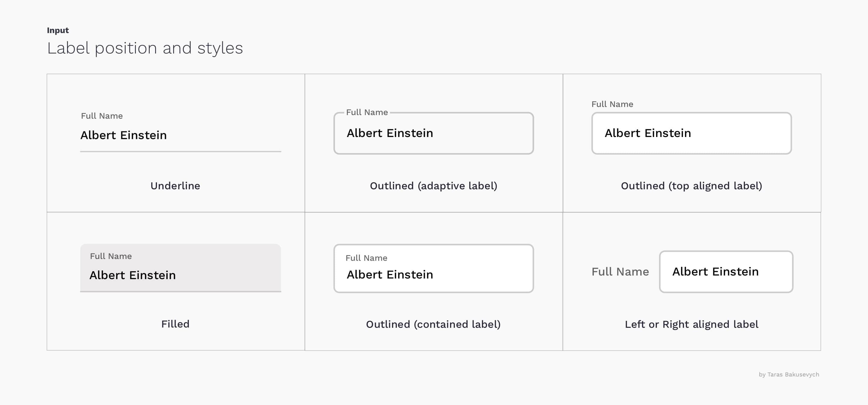
Underline input popularized with original Material design guidelines are not the best option. There were already revised based on the large Evolution of Material Design’s study that I recommend you to check out. Interestingly enough the same study showed that users prefer inputs with rounded corners.
原始材料设计指南中流行的下划线输入不是最佳选择。 我已经根据大型的材料设计演变研究进行了修订,我建议您检查一下。 有趣的是,同一项研究表明,用户更喜欢带有圆角的输入。
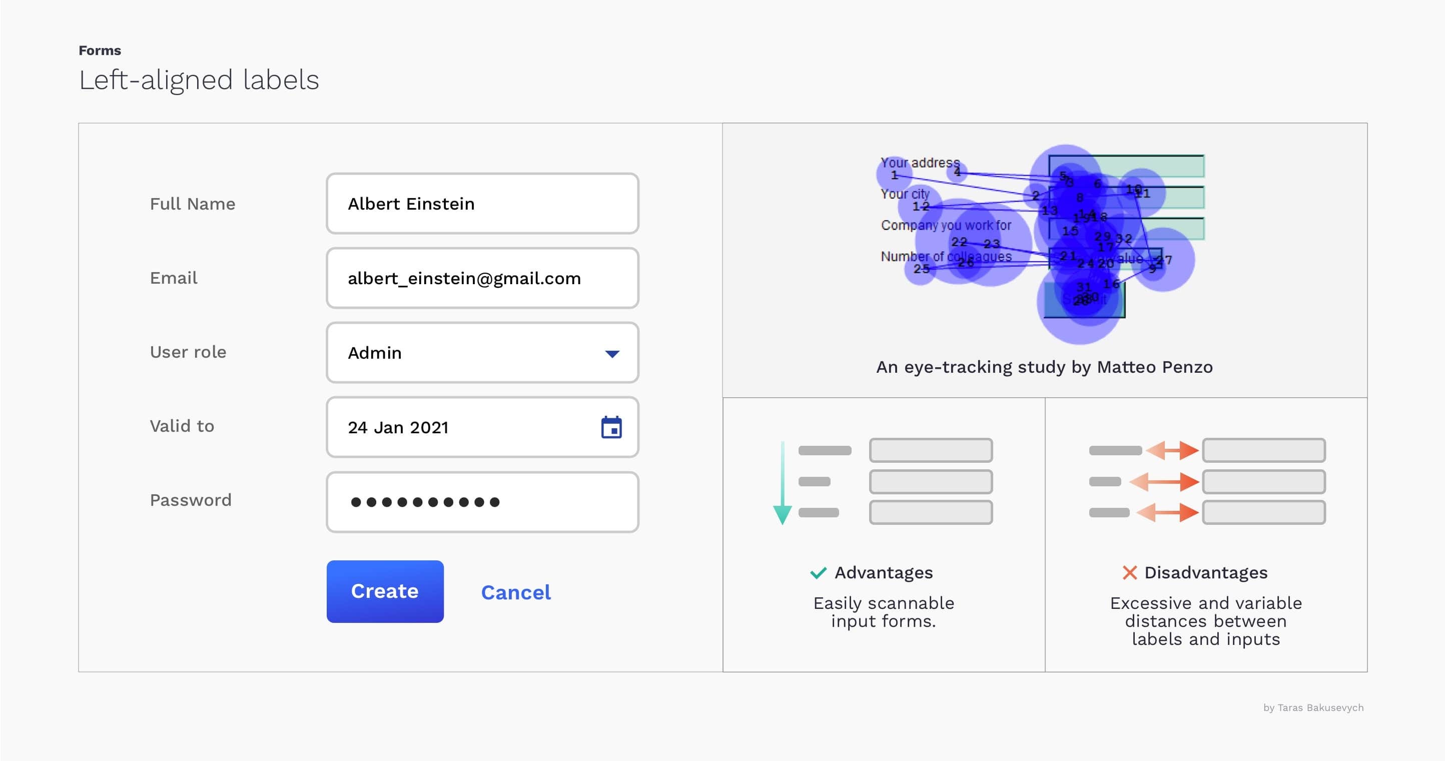
左对齐标签 (Left-aligned labels)
A good choice when the data requested is unfamiliar for users
当用户不熟悉所请求的数据时,这是一个不错的选择
Advantages: Easily scalable labels, good use of vertical space
优点:易于缩放的标签,充分利用垂直空间
Disadvantages: Excesisbe and variable distance between labels and corresponding inputs increase completion time
缺点:标签和相应输入之间的距离过长和可变距离会增加完成时间
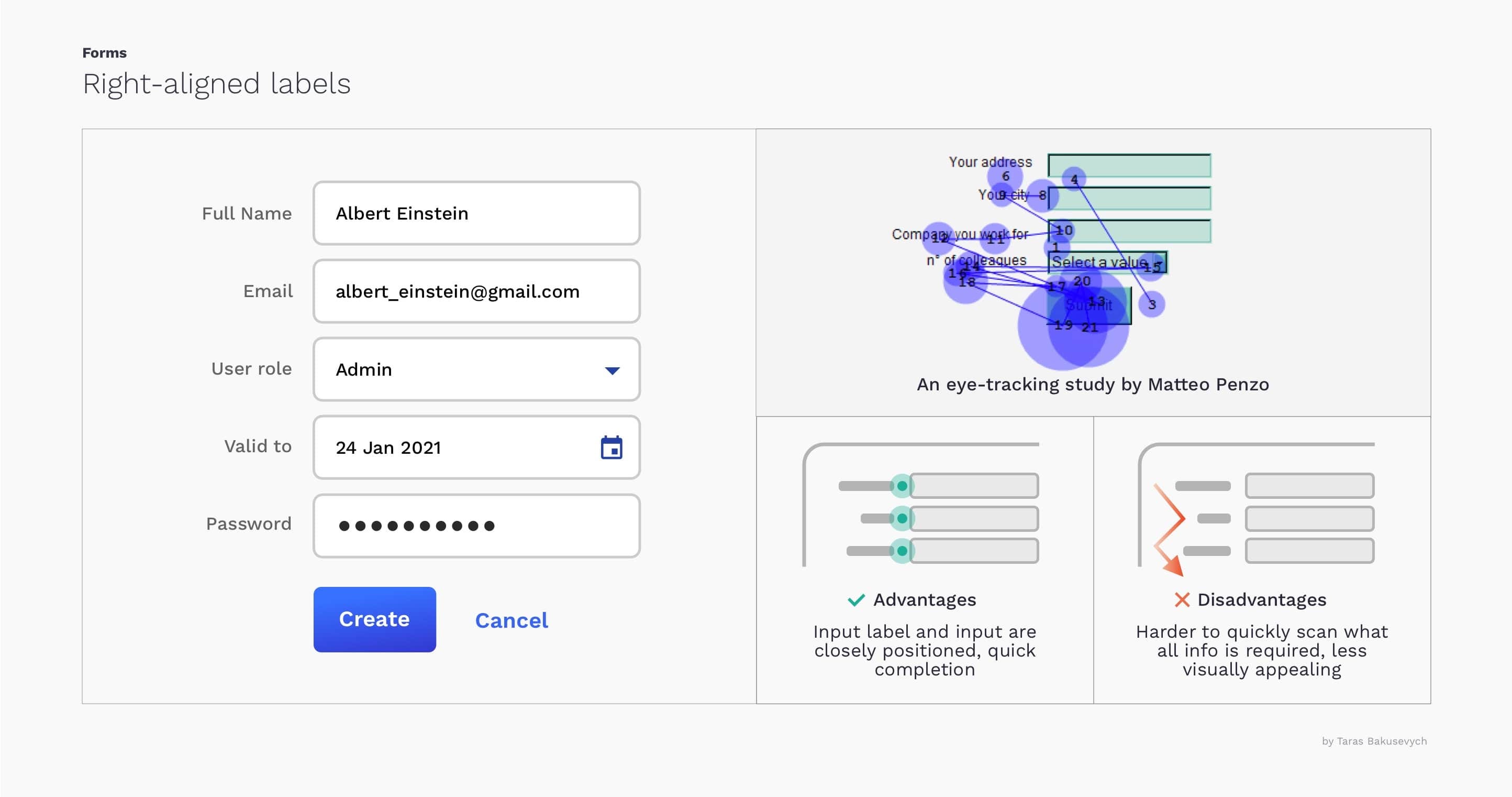
右对齐标签 (Right-aligned labels)
Have nearly twice faster completion time vs left-aligned labels
与左对齐的标签相比,完成时间快将近两倍
Advantages: Text field labels and input are closely positioned that limits number of eye movements resulting in fast completion time
优点:文本字段标签和输入位置紧密,限制了眼睛的运动次数,从而缩短了完成时间
Disadvantages: Harder to quickly scan the form and understand what all information is required
缺点:难以快速扫描表格并了解所需的所有信息
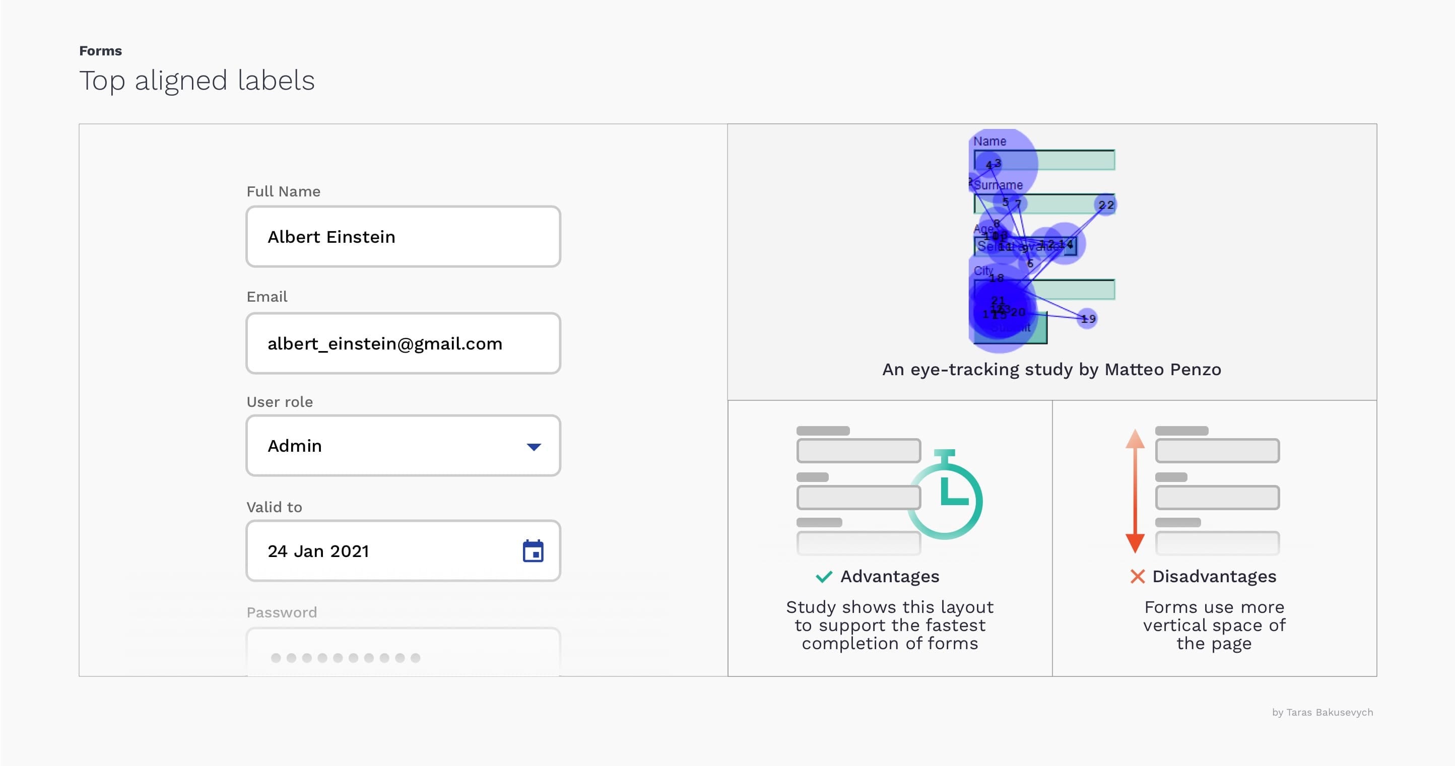
顶部对齐的标签 (Top aligned labels)
Fastest completion time and all-around best choice for the majority of the cases. Work well on mobile as they don't require a lot of horizontal space
在大多数情况下,最快的完成时间和全面的最佳选择。 在移动设备上效果很好,因为它们不需要大量的水平空间
Advantages: Allow users to capture input label and input text with one single eye movement, fastest completion time
优点:允许用户单眼移动即可捕获输入标签和输入文本,最快的完成时间
Disadvantages: Require more vertical space
缺点:需要更多垂直空间
You can learn more on this topic “Best practices for form design- by Luke Wroblewski” and in “ Label Placement in Forms — by Mateo Penzo”
您可以在以下主题“ Luke Wroblewski的表单设计最佳实践”和“ Matteo Penzo的表单中标签放置 ”中了解更多信息。
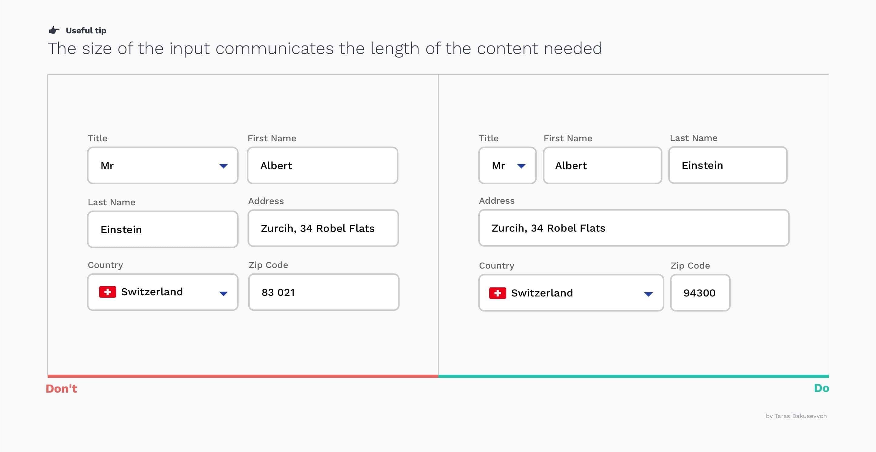
文本字段的长度应与预期的用户输入成比例 (Length of text field should be proportional to the expected user input)
Using identical input length for all text fields in your forms will make them visually pleasing but will be harder to complete.
为表单中的所有文本字段使用相同的输入长度会使它们在视觉上令人愉悦,但很难完成。
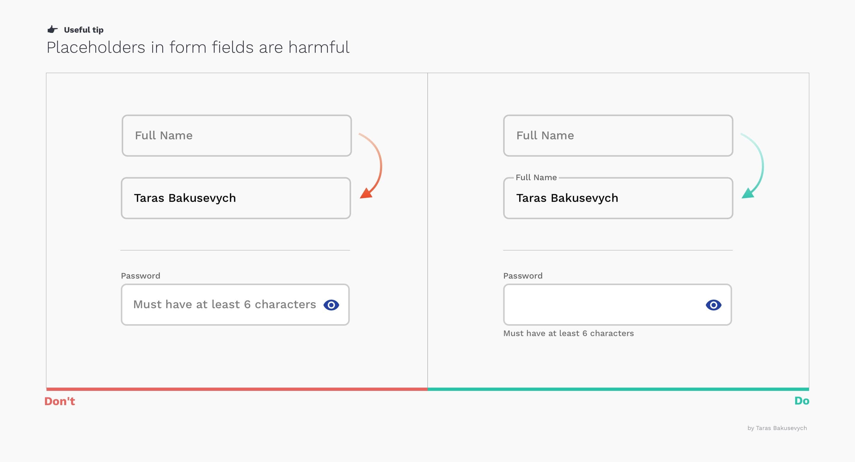
占位符不能替代标签 (Placeholders are not replacements for labels)
Disappearing placeholder text strains users’ short-term memory. Without labels, users cannot check all information they provided before submitting a form. If you want a very minimalist form design you can use the Material design floating labels approach.
消失的占位符文本会拉长用户的短期记忆。 没有标签,用户将无法在提交表单之前检查他们提供的所有信息。 如果您需要极简的表单设计,则可以使用“材料设计”浮动标签方法。
Placeholder text inside the form can sometimes confuse users, better to use hint text outside the field.
表单内的占位符文本有时会使用户感到困惑,最好在字段外使用提示文本。
帮助用户填写表格 (Help users fill in forms)
Help resolve partial queries with Auto-Complete. This happens within the input box where you type and you can press either enter or “right-arrow-key” to accept it.
使用自动完成功能帮助解决部分查询。 这个 会在您输入的输入框中发生,您可以按Enter或“右箭头键”接受它。
S earch a virtually unbounded list for related keywords and phrases with Auto-Suggest. This list appears as a multiple suggestion list in the form of the drop-down.
使用Auto-Suggest搜索几乎无边界的相关关键字和短语列表。 这个 列表以下拉形式显示为多个建议列表。
Pre-fill fields and use smart defaults. Often you can easily detect a user’s country and the city by IP or geolocation. And based on most common scenarios and analytics you can define what should be selected by default. E-Commerce is an exception, don't preselect any preferences related to purchasing like size or color.
预填充字段并使用智能默认值。 通常,您可以通过IP或地理位置轻松检测用户所在的国家和城市。 根据最常见的方案和分析,您可以定义默认情况下应选择的内容。 电子商务是一个例外,请勿预先选择与购买相关的任何偏好,例如尺寸或颜色。
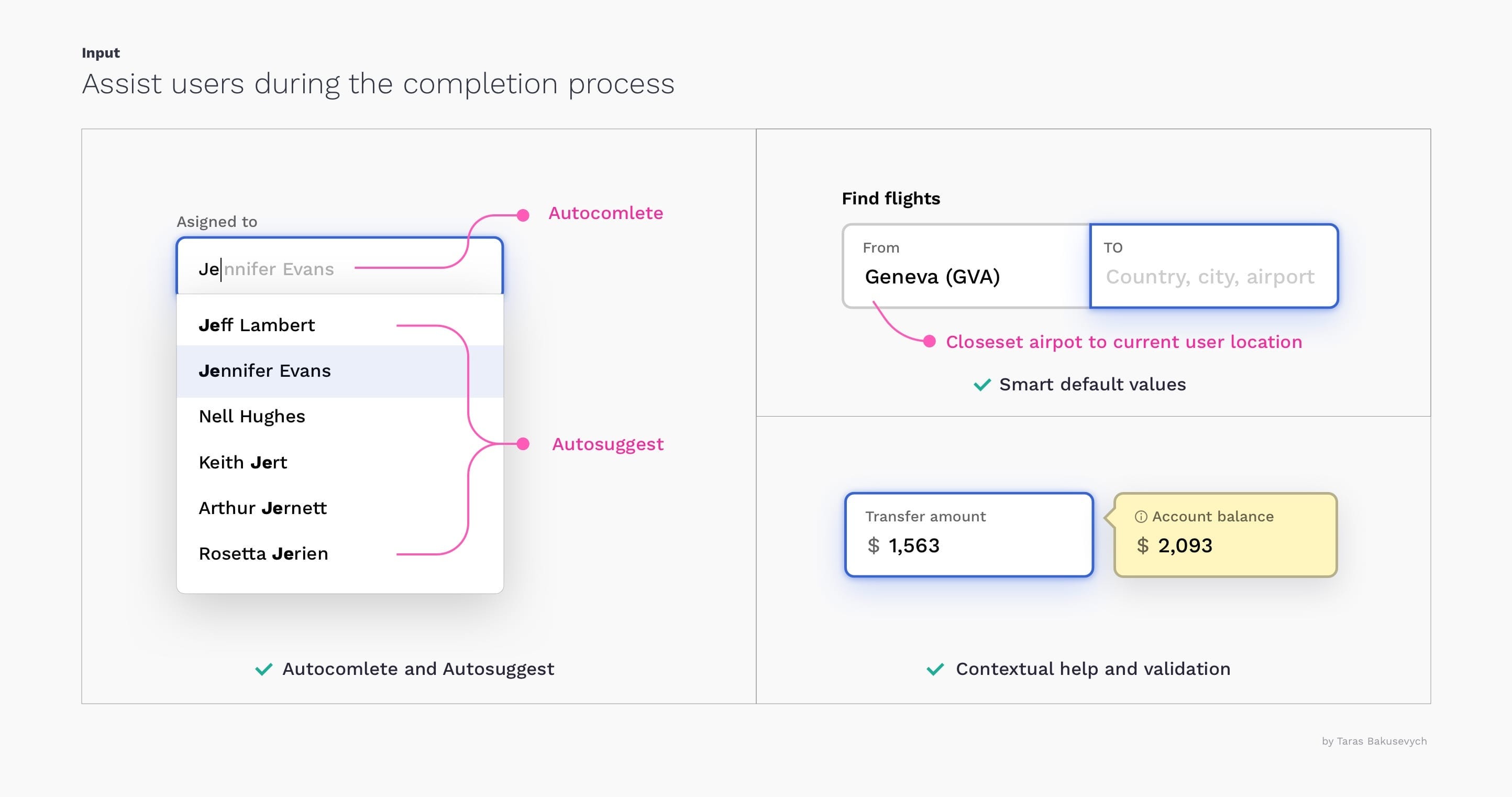
Provide contextual information. If you know that in order to make the right decision or avoid mistakes users will need some additional information like an account balance when making a transfer, don’t hesitate to present it.
提供上下文信息。 如果您知道为了做出正确的决定或避免错误,用户在进行转帐时将需要一些其他信息,例如帐户余额,请随时提出。
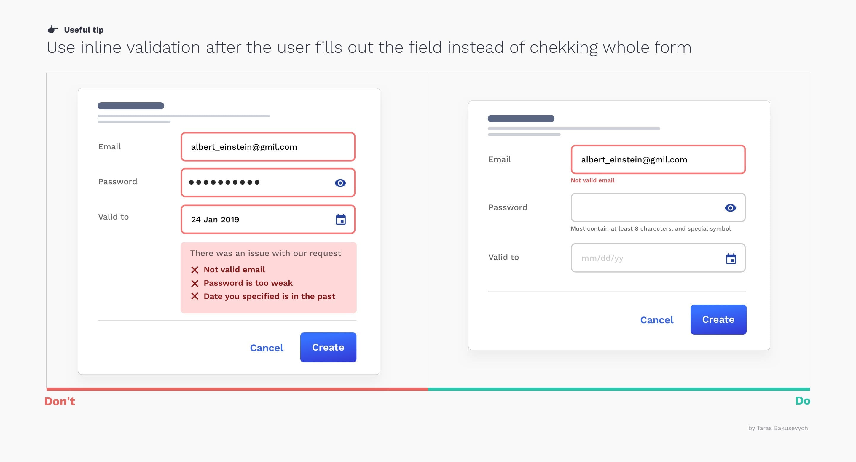
使用内联验证 (Use inline validation)
”Live inline validation” is where the validity of the user’s inputs are checked live as the user progresses through the form, as opposed to checking the inputs in a lump sum when the user submits the form. Implement it correctly to not do more harm:
“实时在线验证”是在用户浏览表单时实时检查用户输入的有效性,而不是在用户提交表单时一次性检查输入。 正确实施它不会造成更多危害:
Display validation messages close to the input and all together
显示靠近输入的验证消息 ,并一起显示
Don't shout on users, error messages should tell users how to fix the problem instead of blaming them
不要大喊大叫 ,错误消息应该告诉用户如何解决问题,而不是责怪他们
Avoid “premature validation” when the field is marked as invalid before they have finished typing
避免在现场进行“ 过早验证” 在他们完成输入之前被标记为无效
Consider using “positive validation” it can add a sense of delight and progression
考虑使用“积极验证” ,可以增加一种愉悦感和进步感
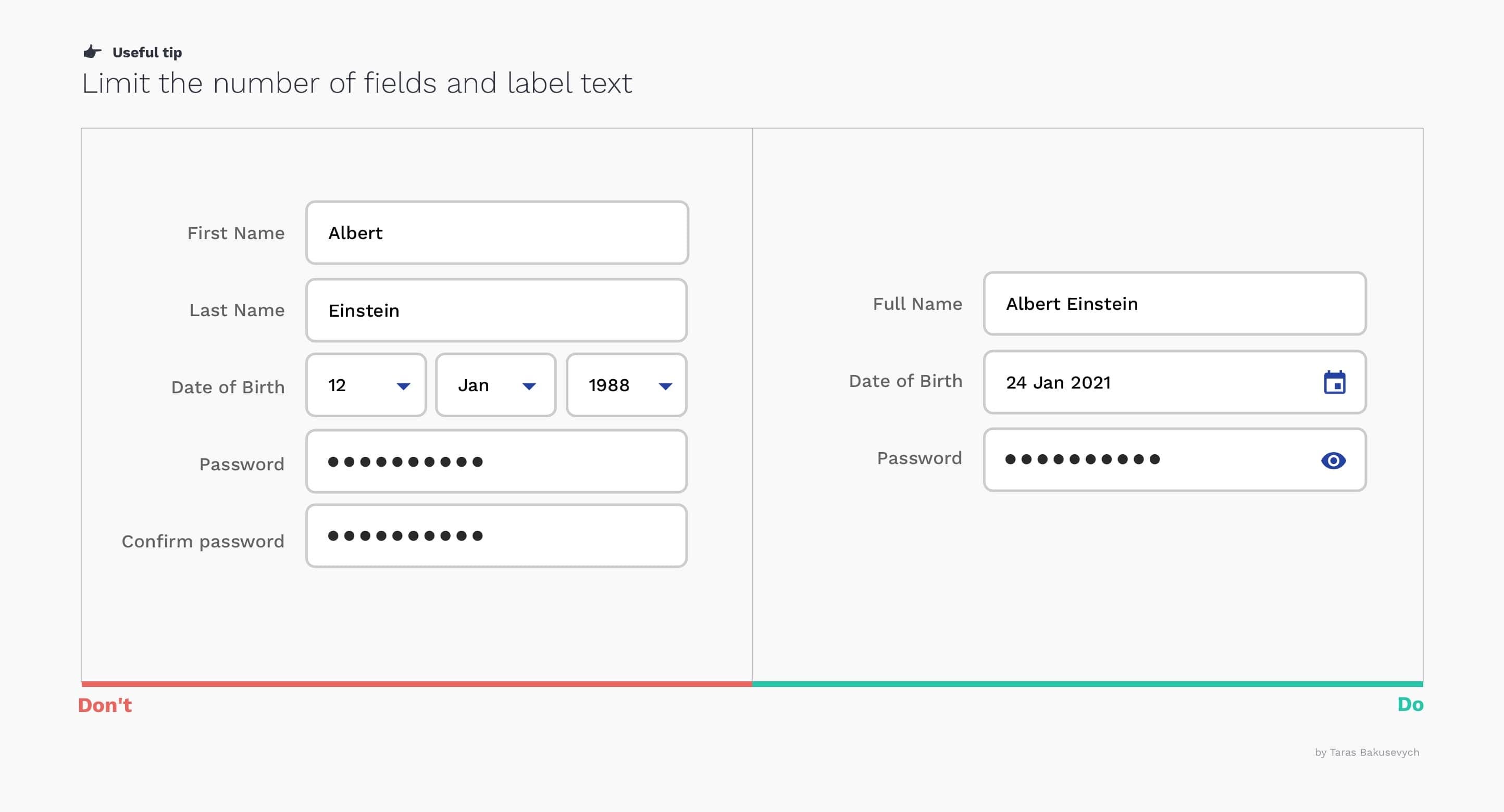
减少字段数 (Reduce the number of fields)
It will remove the visual and cognitive load, and look much simpler.
它将消除视觉和认知负担,并且看起来更简单。
- Don’t break text like Full name and Date into multiple fields不要将全名和日期之类的文本分成多个字段
- Don't ask for the same info multiple times不要多次询问相同的信息
- Work with labels and hints copy to shorten it as much as possible使用标签和提示复制以尽可能地缩短它
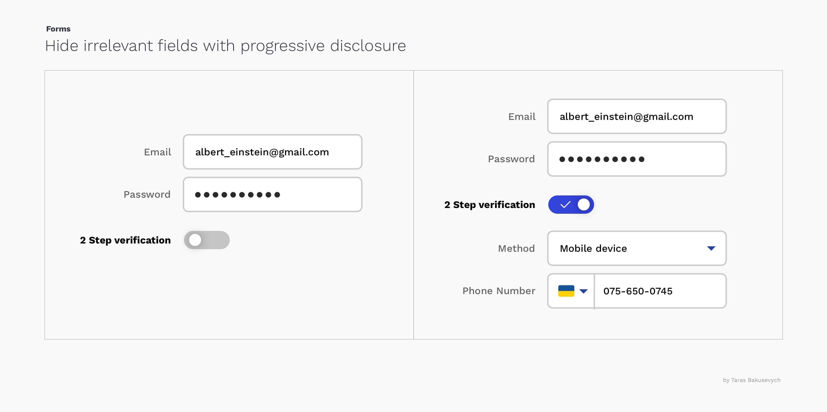
隐藏不相关的字段 (Hide irrelevant fields)
By disclosing information progressively, we reveal only the essentials and help users manage the complexity only when they need to.
通过逐步公开信息,我们仅揭示要点,并帮助用户仅在需要时才管理复杂性。
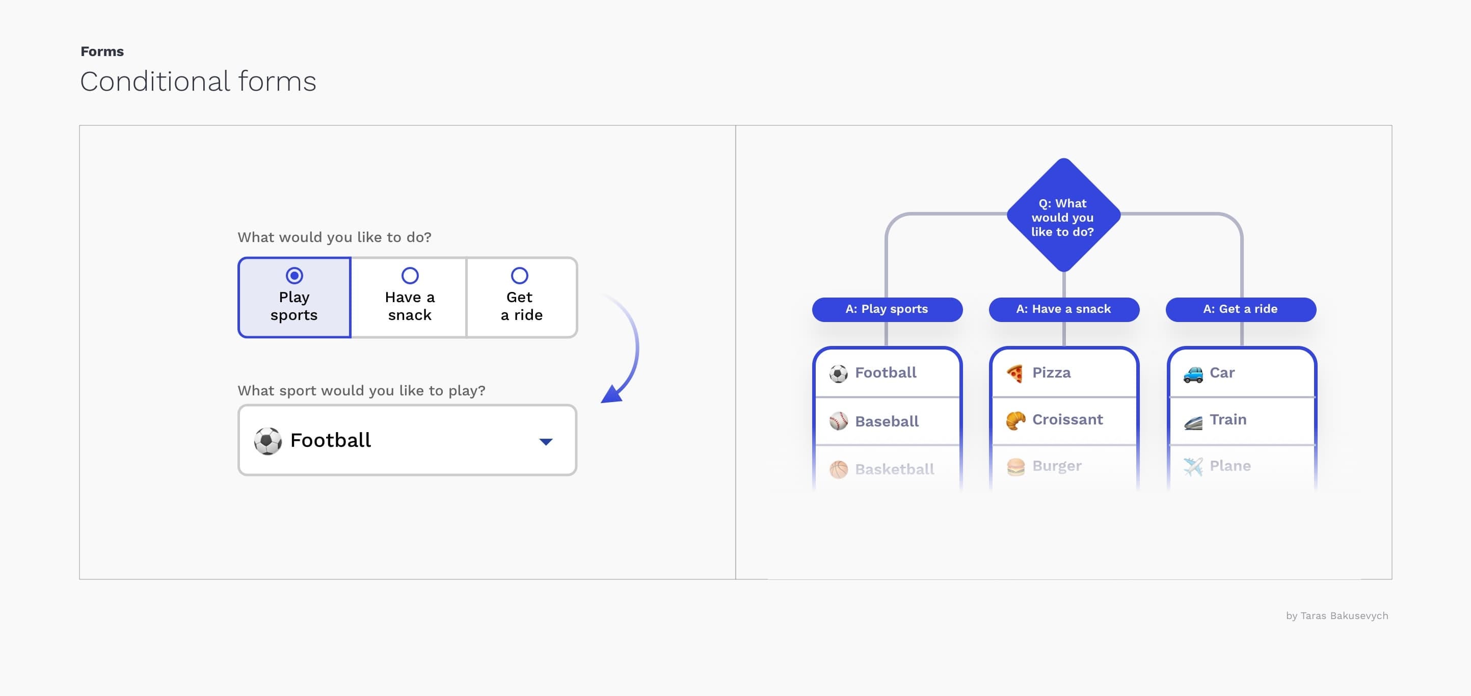
使用条件逻辑 (Use conditional logic)
Conditional logic allows automatically show or hide fields and skip pages in a form, based on visitor answers. This approach not only will reduce the number of fields but also make the fill-in process more personalized and conversation-like.
条件逻辑允许根据访问者的答案自动显示或隐藏字段,并以表格形式跳过页面。 这种方法不仅可以减少字段数,而且可以使填写过程更具个性化和对话性。
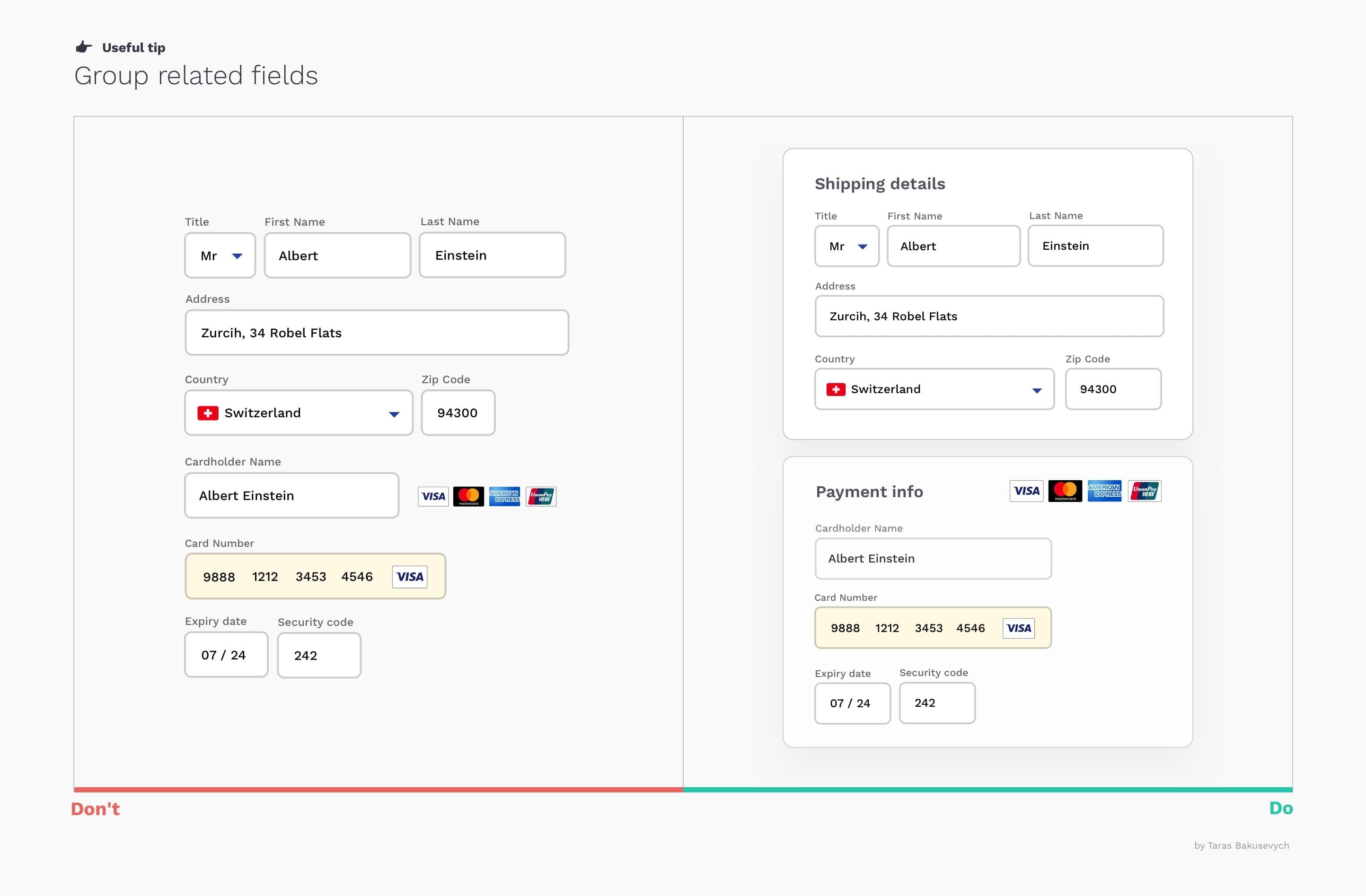
组相关领域 (Group related fields)
One of the easiest ways to simplify complex forms is to start grouping related fields. There are multiple principles of grouping in Gestalt psychology that help items feel related: Proximity, Similarity, Continuity, Closure, and Connectedness. Grouping dozens of unstructured fields into few manageable sets will significantly increase form usability.
简化复杂表格的最简单方法之一就是开始对相关字段进行分组。 格式塔心理学中有多种分组原则,可以使项目感觉相关:接近度,相似度,连续性,闭合性和连通性。 将数十个非结构化字段分组为几个可管理的集合将显着提高表单的可用性。
避免使用多个列布局 (Avoid using multiple column layouts)
One column layout creates a clear path to completion for the user. Consequences of using a multi-column form layout include users skipping fields where they actually have data to input, inputting data into the wrong fields, or simply coming to a halt that can lead to abandonment.
一列布局为用户创建了一条清晰的完成路径。 使用多列表单布局的后果包括用户跳过他们实际要输入数据的字段,将数据输入到错误的字段中,或者只是停下来可能导致放弃。

将复杂的表格分为几个简单的步骤 (Break complex forms into a few simple steps)
Sometimes even after removing everything unnecessary, some forms can get huge. Breaking up the huge tasks into a series of smaller looks much easier and motivates them to carry out the process to the end.
有时即使删除了所有不必要的内容,某些表格也会变得很大。 将大型任务分解为一系列较小的任务看起来容易得多,并促使他们将过程执行到最后。
Display the steps and visually communicate progress user makes, this gives more satisfaction and motivates to move forward
显示步骤并以视觉方式传达用户的进度 ,这可以提高满意度并激发前进的动力
Don’t granulate the form, too many steps will not help, just annoy users
不要细化表格 ,太多的步骤将无济于事,只会惹恼用户
Carry on a summary of key information provide to reduce anxiety and need to have review step in the end
对关键信息进行总结以减轻焦虑,最后需要进行复查
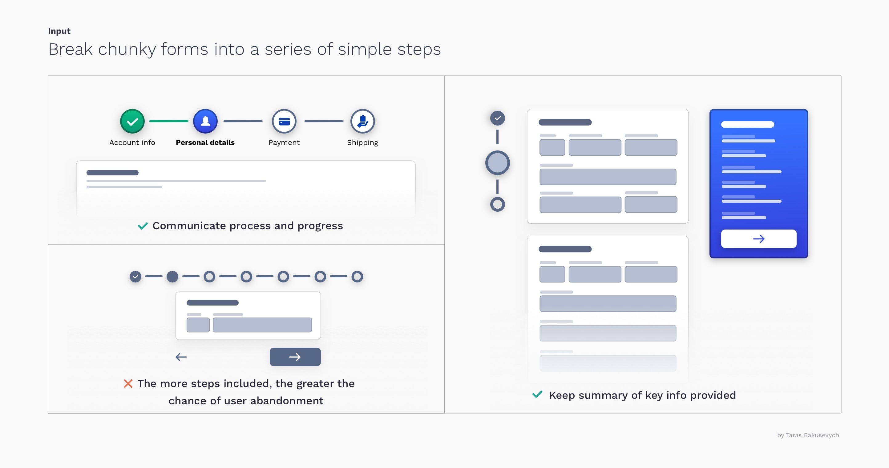
最小化向导外导航的能力 (Minimize the ability to navigate outside of the wizard)
If the form is large enough to break into multiple steps, it deserves a separate clearly focused space to work with it. Exposing general navigation or any links that will disrupt the process will just create confusion. I would also advise against multi-step forms in small Pop-Ups.
如果表单足够大,可以分成多个步骤,则应为它分配一个单独的清晰聚焦的空间。 公开常规导航或任何会破坏该过程的链接只会造成混乱。 我也建议不要在小型弹出窗口中使用多步骤表单。

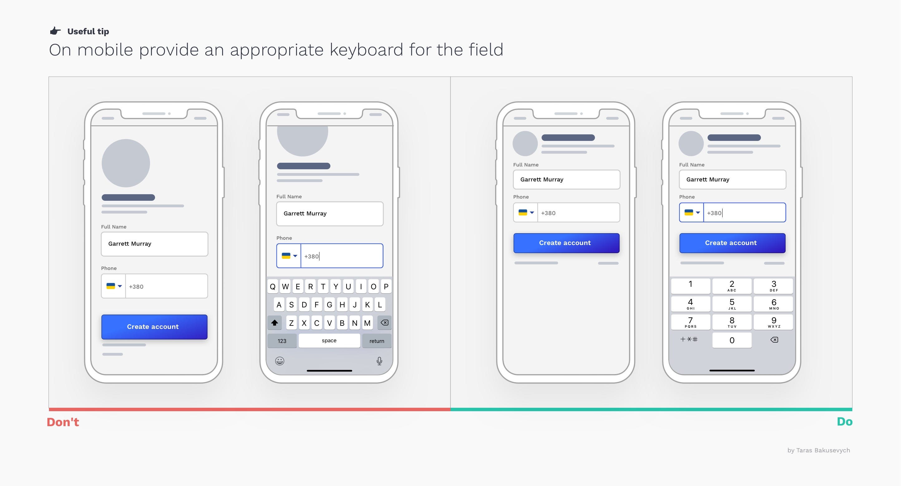
显示适当的键盘类型 (Show the appropriate keyboard type)
Android or iOS provides several different keyboard types, each designed to facilitate a different type of input. To streamline data entry, the keyboard displayed when editing a text field should be appropriate to the type of content in the field. Be conscious of where the keyboard will appear. To not introduce scroll needlessly, position your text fields in the upper area.
Android或iOS提供了几种不同的键盘类型,每种类型的键盘都旨在促进不同类型的输入。 为了简化数据输入,在编辑文本字段时显示的键盘应适合该字段中的内容类型。 注意键盘将出现的位置。 为了避免不必要地引入滚动,请将文本字段放在上方区域。
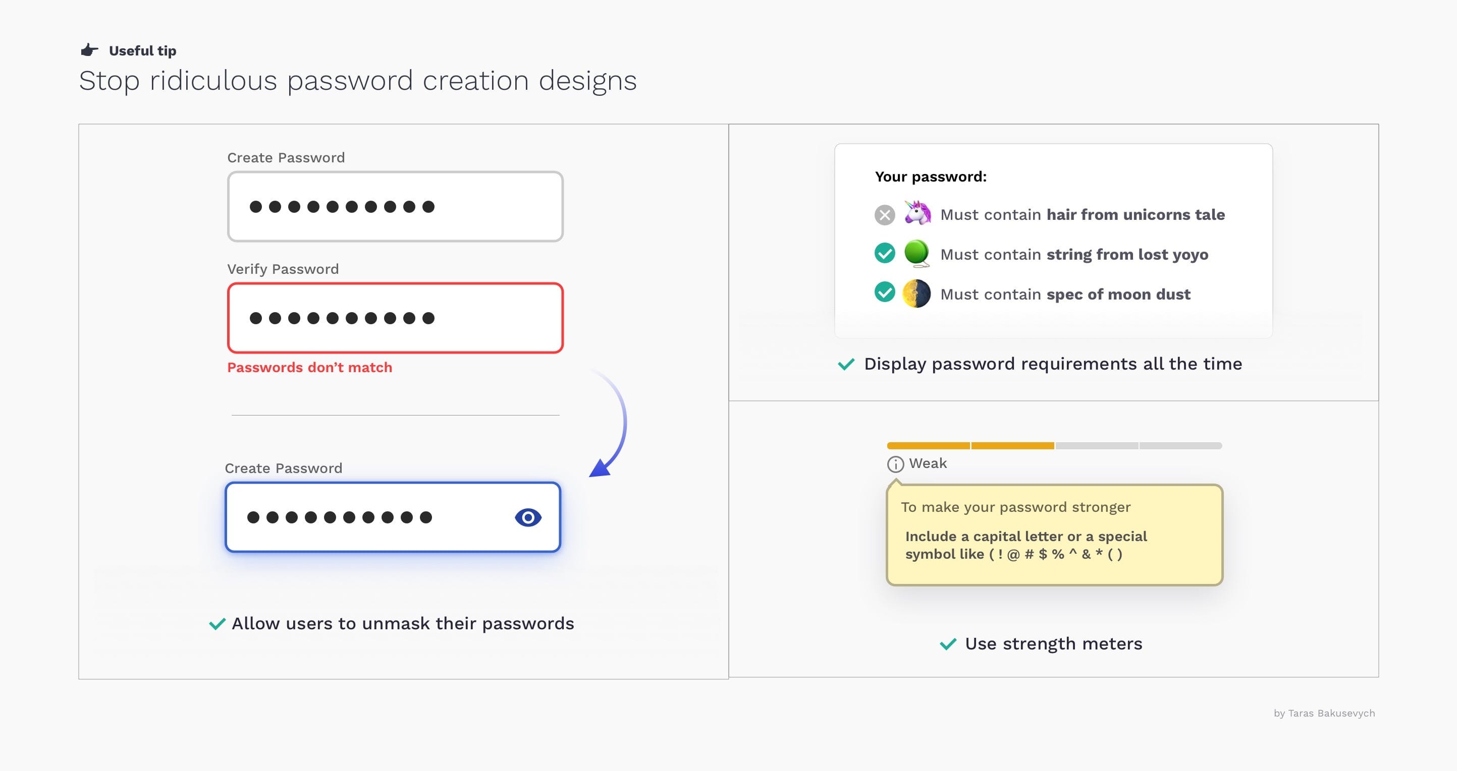
停止荒谬的密码创建设计 (Stop ridiculous password creation designs)
Allow users to unmask their password instead of asking them to enter it 2 times, It will also work better for password generating apps
允许用户取消隐藏密码,而不是要求他们输入两次密码,这对于生成密码的应用程序也将更有效
Display password requirements all the time, and indicate users' progress towards meeting all the criteria. Try to simplify requirements for the user.
始终显示密码要求 ,并指示用户在满足所有条件方面的进度。 尝试简化对用户的要求。
Use strength meters encourage users to create stronger passwords
使用强度表鼓励用户创建更强的密码
您可能还喜欢 (You may also like)
Components series — a detailed look on the components we use every day and how best to design them.
组件系列-详细介绍我们每天使用的组件以及如何最好地设计它们。
翻译自: https://uxdesign.cc/text-fields-forms-design-ui-components-series-2b32b2beebd0
http://www.taodudu.cc/news/show-894038.html
相关文章:
- 阿拉伯语排版设计_针对说阿拉伯语的用户的测试和设计
- 火焰和烟雾的训练图像数据集_游戏开发者是烟雾和镜子的大师
- 全球 化 化_全球化设计
- 手动创建线程池 效果会更好_创建更好的,可访问的焦点效果
- eazy ui 复选框单选_UI备忘单:单选按钮,复选框和其他选择器
- 初级中级高级_初级职位,(半)高级职位
- figma下载_迁移至Figma
- 微服务负载均衡实现高可用_使用负载平衡实现大容量可用性
- tcp 接收端优雅的写法_如何更优雅地接收设计反馈
- 文案写作软件_11种可改善网站用户体验的文案写作技术
- web开发集成数字证书_每个数字设计师都应该知道的Web开发的七个原则
- figma设计_Figma与Adobe XD:我们如何选择下一个设计工具
- figma设计_如何在Figma中构建设计入门套件(第1部分)
- saej1929_(1929年-2020年)
- 不要重新发明轮子_是否重新发明轮子
- shields 徽标_符号,标志,文字标记:徽标类型的综合指南
- 设计师更高效_如何丢掉我的工作使我成为一名更好的设计师
- figma设计_如何在Figma中构建设计入门套件(第二部分)
- unity vr 交互_基于手动的VR / MR交互,用于删除实体
- 同态加密应用_重新设计具有同态性的银行应用
- netflix_Netflix播放按钮剖析
- 猎鹰spacex_SpaceX:简单,美观的界面是未来
- ui设计师常用的设计工具_2020年应该使用哪个UI设计工具?
- lynda ux_UX心态
- pico8 掌机_使用Pico-8构建自己的复古游戏
- 数据挖掘 点击更多 界面_6(更多)技巧,可快速改善用户界面
- 设计模式_设计
- 模仿不再受宠若惊
- word文本样式代码样式_使用文本样式表达创建真相来源
- hp-ux_UX中的格式塔-或-为什么设计师如此讨厌间距
文本字段和表单设计-UI组件系列相关推荐
- 驰骋工作流引擎表单设计控件-字段类控件(2)
2019独角兽企业重金招聘Python工程师标准>>> Technorati Tags: 开源工作流引擎, 驰骋.net工作流引擎, 开源表单引擎, ccform, ccflow, ...
- ui界面表单设计素材模板,实用可临摹
表单是界面设计中重要组件之一,在表单页中用户往往需要填写不同的信息来完成操作. 01 布 局 一个合格的表单,从一个好的布局开始.在信息选项较多时,有的设计师会倾向于,把表单设计成为两列.这样的做法虽 ...
- 移动UI设计-表单设计
移动UI设计-表单设计 登入表单 注册表单 核对表单 计算表单 搜索表单 多步骤表单 长表单
- form generator ——Element UI表单设计及代码生成器
form generator Element UI表单设计及代码生成器,可将生成的代码直接运行在基于Element的vue项目中. 网站地址:https://mrhj.gitee.io/form-ge ...
- B端页面——详细表单设计流程
一.什么是表单? 表单设计是B端产品设计的基础页面,想要做好表单设计首先要搞清楚表单的应用场景. 表单是用户采集数据信息的核心场景,同时又通过表单向用户展示数据信息,简而言之表单是用户与数据库之间的桥 ...
- react-sortablejs 实现自定义表单设计
一.业务需求描述 1. 能够拖动表单组件(不限制样式)到指定区域后,渲染成指定的组件 2. 能支持自定义标签名和属性,以及默认值 3. 能实现可支持预览.可排序.可编辑等功能 4. 能通过JSON数据 ...
- 3个表单设计的最佳技巧
以下内容由Mockplus团队翻译整理,仅供学习交流,Mockplus是更快更简单的原型设计工具 本文简述了设计师.商人甚至每个人对表单设计的一点想法. 表单是我们日常生活的一部分,但说实话,填写表单 ...
- 碎片数据收集利器-结构化动态表单设计思路
本文基于面向基本公共卫生的业务系统设计经验,抽象出一套适合大型ERP系统的表单业务数据模型,目标是最大限度保留系统弹性的同时,尽可能降低系统复杂度和开发成本.enjoy~ 背景 填写表单应该是所有业务 ...
- UX设计秘诀之注册表单设计,细节决定成败
以下内容由摹客团队翻译整理,仅供学习交流,摹客iDoc是支持智能标注和切图的产品协作设计神器. 说实话,现实生活中,又有多少人会真正喜欢填写表格?显然,并不多.因为填写表单这样的网页或App服务,并非 ...
最新文章
- Web 开发学习笔记(1) --- 搭建你的第一个 Web Server
- Linux命令的实现 -- ls pwd cd
- mysql select time,MySql查询时间段的方法
- 项目管理在企业发展中的作用及未来的发展方向—— 来自项目管理群的讨论
- REVERSE-PRACTICE-BUUCTF-22
- 友元函数可以访问私有成员吗_C++的友元函数和友元类
- BUUCTF Web [极客大挑战 2019]Havefun
- 派生类对基类成员的访问控制之公有继承
- DOM扩展-HTML5、专有扩展
- Creative Groove Randomizer插件:Audiomodern Playbeat节拍生成器
- java开发工具比较(16个工具修订版)
- 2021中国科学院文献情报中心期刊分区表 计算机(2)
- 一、音频基础知识 - 耳机接口标准
- U大师安装系统后,Chrome主页被7654导航劫持解决方法
- 全国哀悼日网站都成黑白色实现
- Kafka 入门与实践
- MATLAB TIFF转Shape、TIFF和Shape的读写
- arduino 继电器控制led灯开关
- 《95后的指数基金投资课》基础阶段:常见指数与如何投资指数
- 模仿美团跑腿做的跑腿小程序