JHChart 1.1.0 iOS图表工具库中文ReadMe
代码地址如下:
http://www.demodashi.com/demo/11701.html
好吧,的确当前的[github]上已经存有不少的iOS图表工具库,然而,当公司的项目需要图表时,几乎没有哪个第三方能够完全满足我的项目需求。无奈之下,本人不得不花费一些时间造轮子。
起先,我只打算写一些折线图和饼状图来满足我的项目需求,没想到的是,我将写好的图表放到[github]上后,有一些朋友告诉我他们想要更多的样式,实在不忍心告诉他们我的图标库到此为止了,所以我就陆陆续续的写了其他的图表样式。截止本文发布,JHChart已经发布了4个版本,每次发布的都添加的不少的改进和新意。并且以后,也会持续更新这个库,希望能对需要的朋友有所帮助。
简介
[JHChart]是一个使用简单、样式丰富、可自定义程度极高的iOS图表工具库。它可以帮助iOS开发者绘制出折线图、柱状图、饼状图等等。
环境需求
- Xcode 7.0+
- iOS 7.0+
如何导入JHChart?
[JHChart]提供了两种方式来导入:
*
直接从源码包上下载demo,将JHChart文件夹中的文件拖入项目中编译即可
*
使用cocoapod导入:
pod ‘JHChart’,’~>1.1.0’
(如果您不了解 cocoapods, 点击这里 去官网学习一下哦.)
详细使用简介
折线图 –JHLineChart
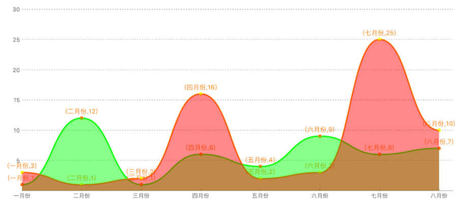
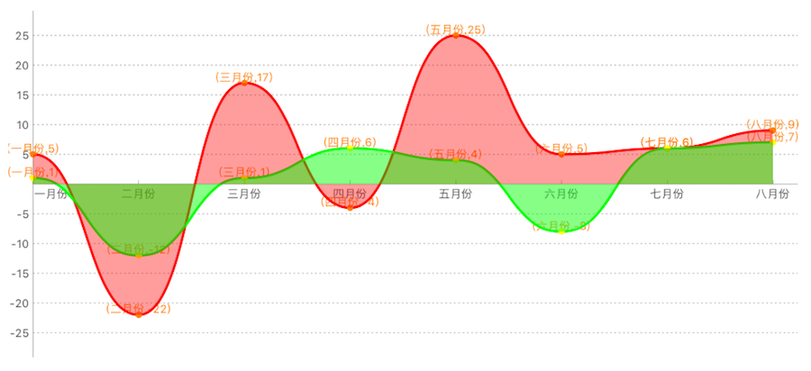
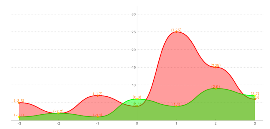
描述: JHLineChart可以创建数据源多样的线性图表,包括折线和曲线图,可以根据数据源判断是否为多条线性表。并且,可以根据需求设置是否有区间填充颜色。同时该表支持不同象限的不同需求,这里只是设置了第一象限的示例,其他象限使用方法一致。
/*     Create object        */
JHLineChart *lineChart = [[JHLineChart alloc] initWithFrame:CGRectMake(10, 100, k_MainBoundsWidth-20, 300) andLineChartType:JHChartLineValueNotForEveryX];/* The scale value of the X axis can be passed into the NSString or NSNumber type and the data structure changes with the change of the line chart type. The details look at the document or other quadrant X axis data source sample.*/lineChart.xLineDataArr = @[@"0",@"1",@"2",@3,@4,@5,@6,@7];/* The different types of the broken line chart, according to the quadrant division, different quadrant correspond to different X axis scale data source and different value data source. */lineChart.lineChartQuadrantType = JHLineChartQuadrantTypeFirstQuardrant;lineChart.valueArr = @[@[@"1",@"12",@"1",@6,@4,@9,@6,@7],@[@"3",@"1",@"2",@16,@2,@3,@5,@10]];/* Line Chart colors */
lineChart.valueLineColorArr =@[ [UIColor purpleColor], [UIColor brownColor]];
/* Colors for every line chart*/
lineChart.pointColorArr = @[[UIColor orangeColor],[UIColor yellowColor]];
/* color for XY axis */
lineChart.xAndYLineColor = [UIColor blackColor];
/* XY axis scale color */
lineChart.xAndYNumberColor = [UIColor blueColor];
/* Dotted line color of the coordinate point */
lineChart.positionLineColorArr = @[[UIColor blueColor],[UIColor greenColor]];
/*        Set whether to fill the content, the default is False         */
lineChart.contentFill = YES;
/*        Set whether the curve path         */
lineChart.pathCurve = YES;
/*        Set fill color array         */
lineChart.contentFillColorArr = @[[UIColor colorWithRed:0.500 green:0.000 blue:0.500 alpha:0.468],[UIColor colorWithRed:0.500 green:0.214 blue:0.098 alpha:0.468]];
[self.view addSubview:lineChart];
/*       Start animation        */
[lineChart showAnimation];
效果图如下:
第一象限折线图/曲线图.
第一四象限折线图/曲线图.
第一二象限折线图/曲线图.
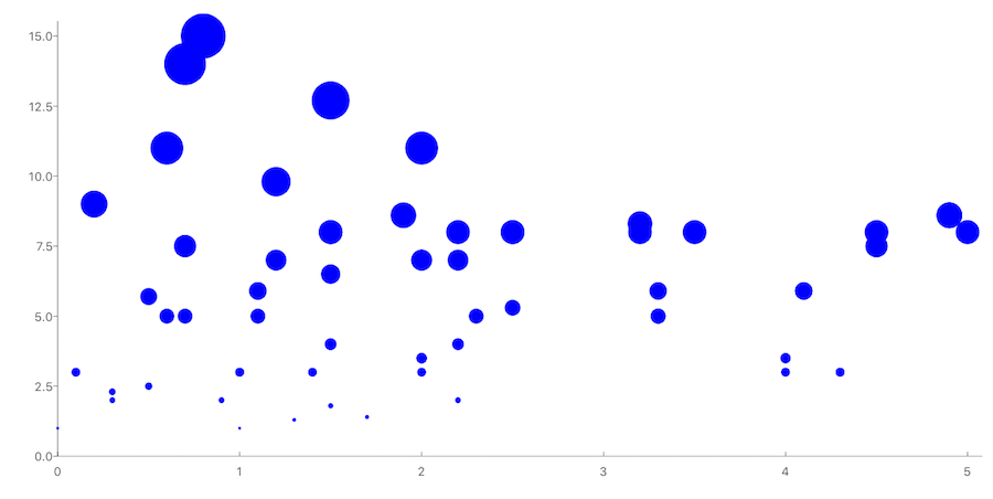
散点图
描述:散点图使用较为简单,在此不做赘述,详情可看demo
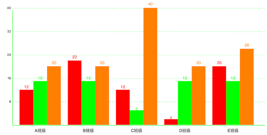
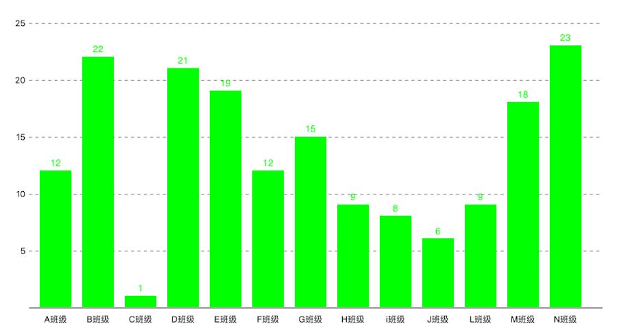
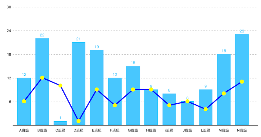
柱状图 –JHColumnChart
描述:JHColumnChart是一个可滚动的柱状图,您可以设置灵活的数据源数组来绘制您需要的样式,它不仅支持设置不同的柱状体颜色,还给您提供了多个描述属性,用来标记不同的样式。
JHColumnChart *column = [[JHColumnChart alloc] initWithFrame:CGRectMake(0, 100, k_MainBoundsWidth, k_MainBoundsWidth)];
/*        Create an array of data sources, each array is a module data. For example, the first array can represent the average score of a class of different subjects, the next array represents the average score of different subjects in another class        */
column.valueArr = @[
@[@12,@15,@20],
@[@22,@15,@20],
@[@12,@5,@40],
@[@2,@15,@20],
@[@20,@15,@26]
];
/*       This point represents the distance from the lower left corner of the origin.         */
column.originSize = CGPointMake(30, 30);
/*    The first column of the distance from the starting point     */
column.drawFromOriginX = 10;
/*        Column width         */
column.columnWidth = 40;
/*        X, Y axis font color         */
column.drawTextColorForX_Y = [UIColor whiteColor];
/*        X, Y axis line color         */
column.colorForXYLine = [UIColor blackColor];
/*    Each module of the color array, such as the A class of the language performance of the color is red, the color of the math achievement is green     */
column.columnBGcolorsArr = @[[UIColor redColor],[UIColor greenColor],[UIColor orangeColor]];
/*        Module prompt         */
column.xShowInfoText = @[@"A班级",@"B班级",@"C班级",@"D班级",@"E班级"];
/*       Start animation        */
[column showAnimation];
[self.view addSubview:column];
效果图如下:
- 分组的柱状图:
- 不分组的柱状图:
- 柱状图和折线图混合:
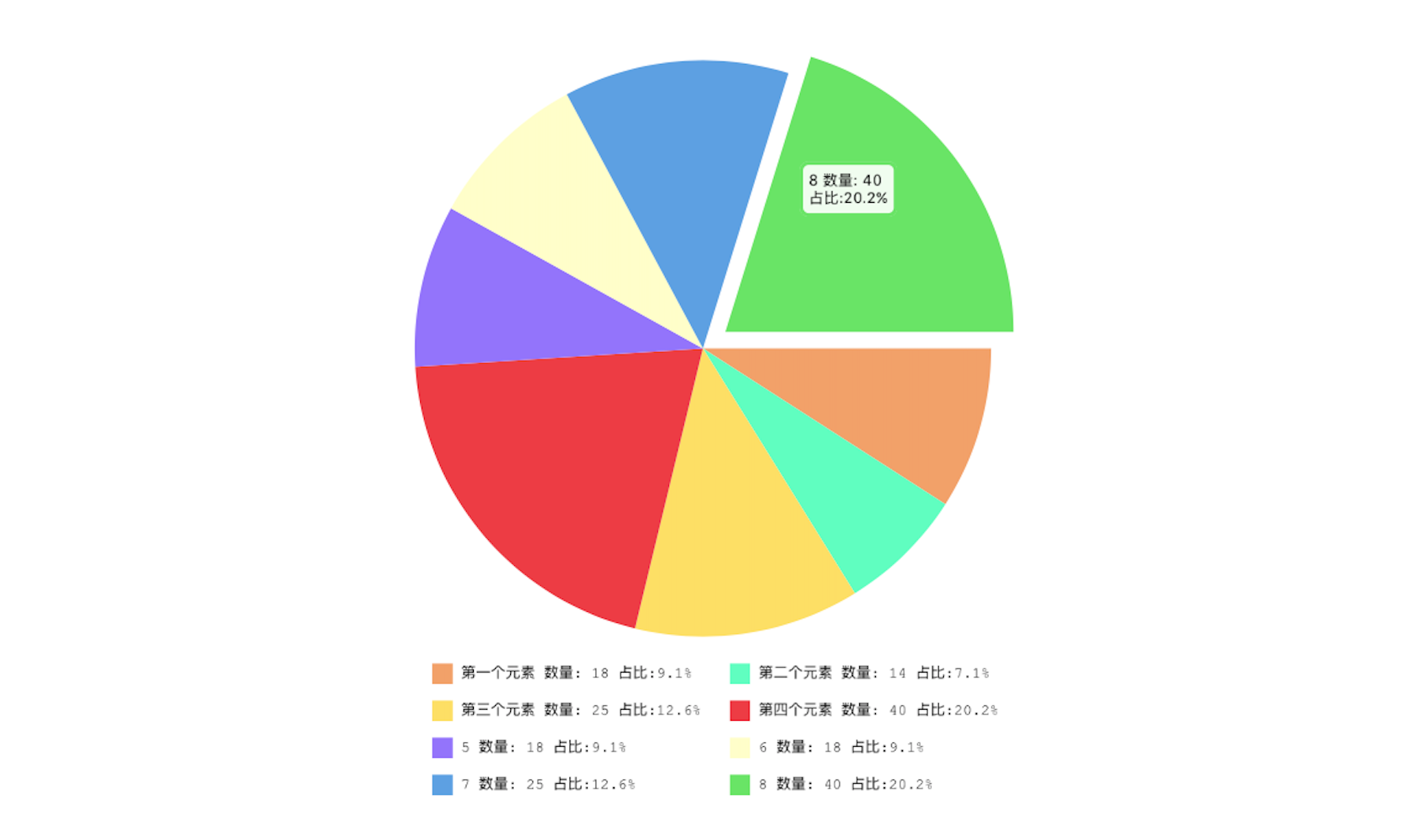
饼状图 –JHPieChart
描述:JHPieChart可根据您的数据源和视图大小设置,自动生成大小合适,并且有提示动画的饼状图。当您点击某块饼状图时,会动画显示当前的饼块信息。
JHPieChart *pie = [[JHPieChart alloc] initWithFrame:CGRectMake(100, 100, 321, 421)];
pie.center = CGPointMake(CGRectGetMaxX(self.view.frame)/2, CGRectGetMaxY(self.view.frame)/2);
/* Pie chart value, will automatically according to the percentage of numerical calculation */
pie.valueArr = @[@18,@10,@25,@40,@18,@10,@25,@40,@18,@10,@15,@12,@30,@18];
/* The description of each sector must be filled, and the number must be the same as the pie chart. */
pie.descArr = @[@"第一个元素",@"第二个元素",@"第三个元素",@"第四个元素",@"5",@"6",@"7",@"8",@"9",@"10",@"23",@"12",@"21",@"30"];
pie.backgroundColor = [UIColor whiteColor];
[self.view addSubview:pie];
/*    When touching a pie chart, the animation offset value     */
pie.positionChangeLengthWhenClick = 15;
/*        Start animation         */
[pie showAnimation];
Actual effect chart:
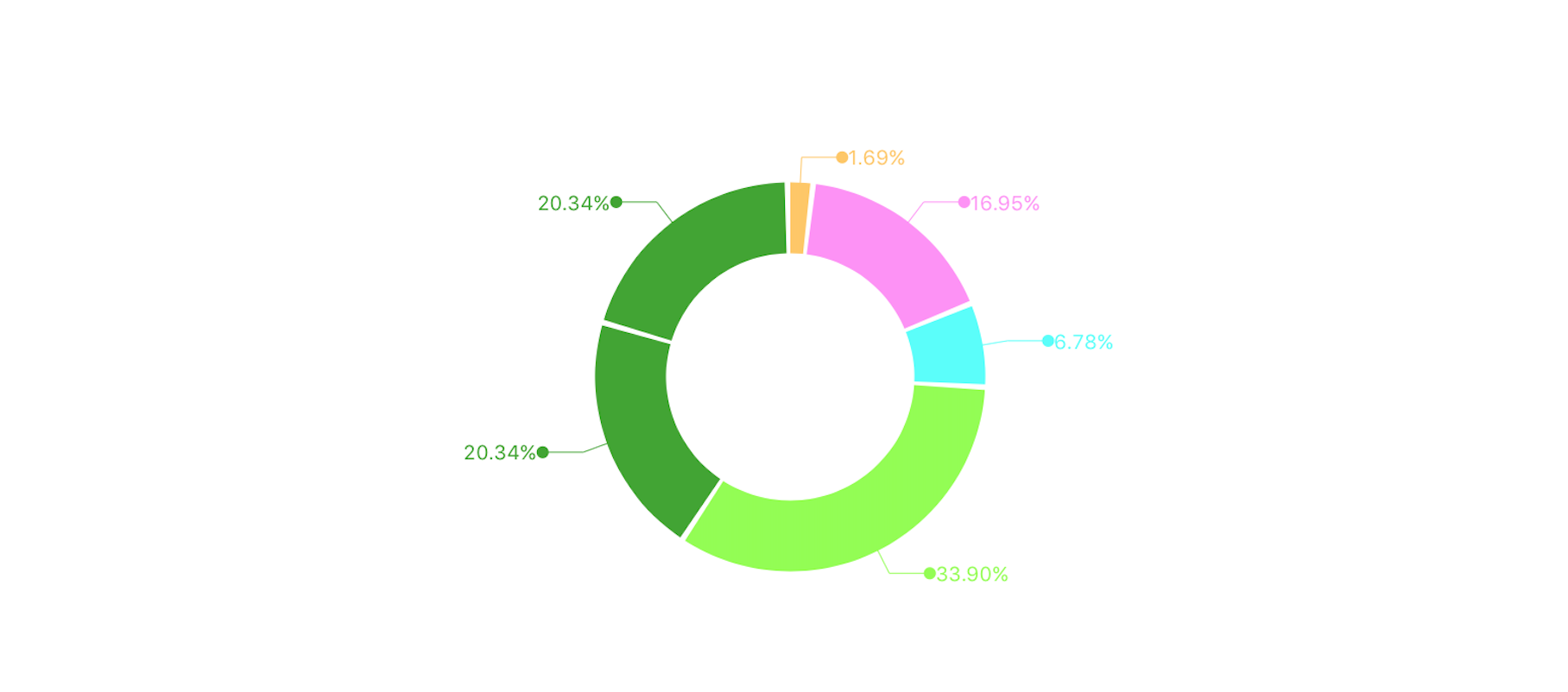
环形图 –JHRingChart
描述:JHRingChart 根据您的数据源,自动计算相关数据比例,动画展示环状图,并且从每个环段引出相关信息提示
JHRingChart *ring = [[JHRingChart alloc] initWithFrame:CGRectMake(0, 100, k_MainBoundsWidth, k_MainBoundsWidth)];
/*        background color         */
ring.backgroundColor = [UIColor whiteColor];
/*        Data source array, only the incoming value, the corresponding ratio will be automatically calculated         */
ring.valueDataArr = @[@"0.5",@"5",@"2",@"10",@"6"];
/*         Width of ring graph        */
ring.ringWidth = 35.0;
/*        Fill color for each section of the ring diagram         */
ring.fillColorArray = @[[UIColor colorWithRed:1.000 green:0.783 blue:0.371 alpha:1.000], [UIColor colorWithRed:1.000 green:0.562 blue:0.968 alpha:1.000],[UIColor colorWithRed:0.313 green:1.000 blue:0.983 alpha:1.000],[UIColor colorWithRed:0.560 green:1.000 blue:0.276 alpha:1.000],[UIColor colorWithRed:0.239 green:0.651 blue:0.170 alpha:1.000]];
/*        Start animation             */
[ring showAnimation];
[self.view addSubview:ring];
效果图如下:
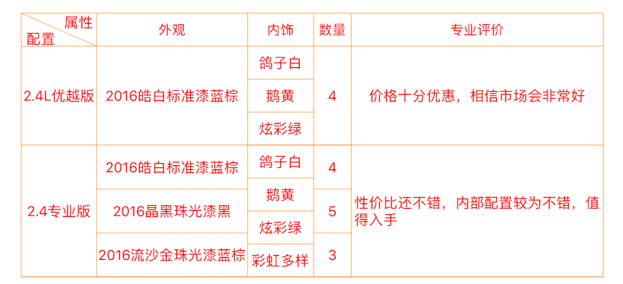
表格 –JHTableChart
描述:JHTableChart用于静态绘制样式多变的表格视图,所有的单元格展示样式取决于数据源,不需要特殊的处理某一个单元格,十分灵活易用
JHTableChart *table = [[JHTableChart alloc] initWithFrame:CGRectMake(10, 64, k_MainBoundsWidth-20, k_MainBoundsHeight)];
/*       Table name         */
table.tableTitleString = @"全选jeep自由光";
/*        Each column of the statement, one of the first to show if the rows and columns that can use the vertical segmentation of rows and columns         */
table.colTitleArr = @[@"属性|配置",@"外观",@"内饰",@"数量"];
/*        The width of the column array, starting with the first column         */
table.colWidthArr = @[@100.0,@120.0,@70,@100];
/*        Text color of the table body         */
table.bodyTextColor = [UIColor redColor];
/*        Minimum grid height         */
table.minHeightItems = 35;
/*        Table line color         */
table.lineColor = [UIColor orangeColor];table.backgroundColor = [UIColor whiteColor];
/*       Data source array, in accordance with the data from top to bottom that each line of data, if one of the rows of a column in a number of cells, can be stored in an array of         */
table.dataArr = @[
@[@"2.4L优越版",@"2016皓白标准漆蓝棕",@[@"鸽子白",@"鹅黄",@"炫彩绿"],@[@"4"]],
@[@"2.4专业版",@[@"2016皓白标准漆蓝棕",@"2016晶黑珠光漆黑",@"2016流沙金珠光漆蓝棕"],@[@"鸽子白",@"鹅黄",@"炫彩绿",@"彩虹多样色"],@[@"4",@"5",@"3"]]
];
/*        show                            */
[table showAnimation];
[self.view addSubview:table];
/*        Automatic calculation table height        */
table.frame = CGRectMake(10, 64, k_MainBoundsWidth-20, [table heightFromThisDataSource]);
效果图如下:
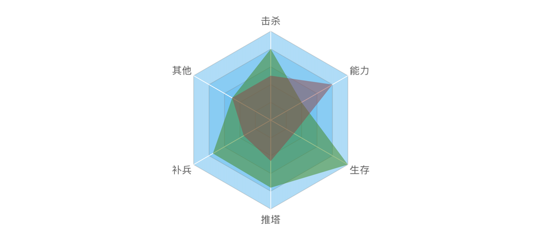
雷达图 –JHRadarChart
描述:雷达图可以根据您的数据源,自动生成合适边角数量的雷达图。
JHRadarChart *radarChart = [[JHRadarChart alloc] initWithFrame:CGRectMake(10, 74, k_MainBoundsWidth - 20, k_MainBoundsWidth - 20)];
radarChart.backgroundColor = [UIColor whiteColor];
/*       Each point of the description text, according to the number of the array to determine the number of basic modules         */
radarChart.valueDescArray = @[@"击杀",@"能力",@"生存",@"推塔",@"补兵",@"其他"];/*         Number of basic module layers        */
radarChart.layerCount = 5;/*        Array of data sources, the need to add an array of arrays         */
radarChart.valueDataArray = @[@[@"80",@"40",@"100",@"76",@"75",@"50"],@[@"50",@"80",@"30",@"46",@"35",@"50"]];/*        Color of each basic module layer         */
radarChart.layerFillColor = [UIColor colorWithRed:94/ 256.0 green:187/256.0 blue:242 / 256.0 alpha:0.5];/*        The fill color of the value module is required to specify the color for each value module         */
radarChart.valueDrawFillColorArray = @[[UIColor colorWithRed:57/ 256.0 green:137/256.0 blue:21 / 256.0 alpha:0.5],[UIColor colorWithRed:149/ 256.0 green:68/256.0 blue:68 / 256.0 alpha:0.5]];/*       show        */
[radarChart showAnimation];[self.view addSubview:radarChart];
效果图如下:
项目文件截图
结语
好了,中文ReadMe就到此为止了,如果想看英文版ReadMe,点击这里 哦! 未完待续……JHChart 1.1.0 iOS图表工具库中文ReadMe
代码地址如下:
http://www.demodashi.com/demo/11701.html注:本文著作权归作者,由demo大师发表,拒绝转载,转载需要作者授权
JHChart 1.1.0 iOS图表工具库中文ReadMe相关推荐
- iOS 图表工具charts之LineChartView
关于charts的系列视图介绍传送门: iOS 图表工具charts介绍 iOS 图表工具charts之LineChartView iOS 图表工具charts之BarChartView iOS 图表 ...
- iOS 图表工具charts之BarChartView
关于charts的系列视图介绍传送门: iOS 图表工具charts介绍 iOS 图表工具charts之LineChartView iOS 图表工具charts之BarChartView iOS 图表 ...
- python画画用哪库好_数据可视化哪款工具更好用?对比7款Python 数据图表工具的性能...
更多腾讯海量技术文章,请关注云加社区:https://cloud.tencent.com/developer/column 作者:CDA数据分析师 摘要:Python 的科学栈相当成熟,各种应用场景都 ...
- iOS架构-静态库.a 和.framework的区别(0)
原文网址:https://my.oschina.net/kaqijiang/blog/649632 一.什么是库? 库是共享程序代码的方式. 库从本质上来说是一种可执行代码的二进制格式,可以被载入内存 ...
- 33 个 2017 年必须了解的 iOS/swift 开源库第三方库
本文翻译自Medium,原作者为 Paweł Białecki <img src="https://pic3.zhimg.com/v2-c786777447261347b0d9 ...
- iOS 常用第三方库及插件
//菜单切换 https://github.com/pujiaxin33/JXCategoryView //各种导航栏样式 https://github.com/rickytan/RTRootNavi ...
- 覆盖所有领域的 Python 工具库汇总!建议收藏!!!
文章首发于个人站点 覆盖所有领域的 Python 工具库汇总 公众号:[DreamHub] 环境管理 管理 Python 版本和环境的工具 p – 非常简单的交互式 python 版本管理工具. py ...
- 可爱的python测试开发库(python测试开发工具库汇总)
2019独角兽企业重金招聘Python工程师标准>>> 欢迎转载,转载请注明来源: github地址 谢谢点赞 本文地址 Python测试开发库 参考资料 https://githu ...
- iOS常用第三方库大全,史上最全第三方库收集
下拉刷新 EGOTableViewPullRefresh – 最早的下拉刷新控件. SVPullToRefresh – 下拉刷新控件. MJRefresh – 仅需一行代码就可以为UITableVie ...
最新文章
- Redis 缓存穿透、雪崩、缓存数据库不一致、持久化方式、分布式锁、过期策略
- XML – E4X概述
- 自定义类似于listView中Item背景
- notepad++的NppFTP插件远程连接linux操作系统
- python怎么调用列表_Python中列表的使用
- android 复制u盘文件到手机本地_如何导出Android中的文件(把Android当做U盘)
- 前端—每天5道面试题(十三)
- ArcGIS中文注记图层发布服务后变乱码(方框乱码)/如何有效修改注记要素类文字样式
- 编程入门先学什么python-编程入门先学什么比较好
- Codeforces 436D Pudding Monsters
- 天秀!花费 200W 设计的新版 “小米”图标,看看用Python怎么绘制?
- 中国行政区域边界坐标(google)
- linux下opendir的使用
- 简述JAVAoop思想
- python dfs
- 为网站鼠标点击添加富强民主等内容Js代码
- 第四届传智杯(初赛B组) | python题解思路
- 基于MNIST手写体数字识别--含可直接使用代码【Python+Tensorflow+CNN+Keras】
- halo java_Halo - 轻快,简洁,功能强大,使用Spring Boot开发的博客系统
- JAVA设计模式什么鬼(装饰)——作者:凸凹里歐