数据科学导论实验:基于Twitter的网络结构和社会群体演化
分析及预处理
查看json结构
随便选一个json文件拖入浏览器,借助chrome的开发者工具查看json结构
其中,name其实不需要取,nick是唯一的且只允许英文数字下划线 (\w),作为用户的唯一标识
迭代取数据
先取完再处理耗费内存,故通过yield建立迭代器
import json
import osdef extract_info(batch):plist = batch["response"]["list"]for post in plist:nick = post['trackback_author_nick']name = post['trackback_author_name']date = post['trackback_date']content = post['content']yield nick, date, name, contentdef get_infos(fplist):f_i = 0for fp in fplist:fs = os.listdir(fp)for filename in fs:with open(fp+filename,encoding="utf-8") as f:try:batch = json.load(f)except:print("{} is error json file".format(f))for info in extract_info(batch):yield list(info)f_i+= 1print("read all {} files".format(f_i))
提取关系
根据用户转发、评论关系构建网络。当用户 A 在其 content 字段中@用户 B,我们
认为用户 A 与用户 B 之间存在联系。
因此需要通过正则表达式提取用户的nick
import repattern = re.compile('@(\w+)')
def get_at_list(content):return pattern.findall(content)
时间分割
地震时间(2011年3月11日13:46)需要统一时间格式,这里统一为时间戳
import datetime
equake_time = datetime.datetime(2011,3,11,13,46).timestamp()
输出csv,同时保存关系文件以便之后读取
注意数据清洗,通过nick+date的唯一性去重
还需除去@自己的,避免后面的图中出现自环
另外,如果@自己,info中的nick是@中的nick的小写,需要判断一下
import csvfor c in ['EN', 'JP']:key_dic = {}at_dic = {'Pre': {}, 'Post': {}}with open('data/' + c + 'All' + '.csv', 'w', newline='', encoding='utf-8') as f0:writer = csv.writer(f0)writer.writerow(['nick', 'date'])for info in get_infos(['data/' + c + 'alljson/']):ater = info[0]date = info[1]key = (ater, date)if key not in key_dic:key_dic[key] = 1writer.writerow([ater, date])for atee in get_at_list(info[3]):atee = atee.lower()if atee == ater:continuei = 'Pre' if date <= equake_time else 'Post'if (ater, atee) not in at_dic[i]:at_dic[i][(ater, atee)] = 0at_dic[i][(ater, atee)] += 1for type in ['Pre', 'Post']:with open('data/' + c + type + '.csv', 'w', newline='', encoding='utf-8') as f1:writer = csv.writer(f1)writer.writerow(['ater', 'atee', 'count'])for item in at_dic[type].items():writer.writerow(list(item[0]) + [item[1]])del key_dic
del at_dic
构建网络
构建图
import pandas as pd
import networkx as nx
from tqdm import tqdm_notebook as tqdmdef build_graph(df: pd.DataFrame):g = nx.Graph()g.add_weighted_edges_from(df.values.tolist())# for row in tqdm(df.iterrows(), total=len(df)):#     ater = row[1]['nick']#     for at in row[1]['atlist']:#         data = g.get_edge_data(ater, at)#         if data is None:#             g.add_edge(ater, at, weight=1)#         else:#             g[data[0]][data[1]].update({'weight': data[]})return g
删除非共有节点
def drop_diff_point(G1: nx.Graph, G2: nx.Graph):nodes = list(G1.nodes())for node in nodes:if not(node in G2):G1.remove_node(node)nodes = list(G2.nodes())for node in nodes:if not(node in G1):G2.remove_node(node)
装载入内存
dfs = {'EN': {}, 'JP': {}}
nets = {'EN': {}, 'JP': {}}
for c in ['EN', 'JP']:for type in ['All', 'Pre', 'Post']:dfs[c][type] = pd.read_csv('data/' + c + type + '.csv')if type != 'All':nets[c][type] = build_graph(dfs[c][type])drop_diff_point(nets[c]['Pre'], nets[c]['Post'])
保存网络模型
for c in ['EN', 'JP']:for type in ['Pre', 'Post']:nx.write_gml(nets[c][type], 'data/' + c + type + '.gml')
相关系数计算
网络平均度
import numpy as npdef average_deg(G):return np.array([i[1] for i in nx.degree(G)]).mean()
最大连通片(最大连通分支)
def largest_com(G):largest_components = max(nx.connected_components(nx.Graph(G)), key=len)return len(largest_components)
平均群居系数(平均聚集系数)
def average_clu(G):return nx.average_clustering(G)
图直径
最长最短路径的长度 nx.diameter(G)
所有节点间平均最短路径长度 nx.average_shortest_path_length(G)
def diameter(G):return nx.diameterdef avg_shortest_path_len(G):return nx.average_clustering(G)
但是因为图并不完全联通,所以计算会报错
个人层面度分析
import matplotlib.pyplot as pltdef add_identity(axes, *line_args, **line_kwargs):identity, = axes.plot([], [], *line_args, **line_kwargs)def callback(axes):low_x, high_x = axes.get_xlim()low_y, high_y = axes.get_ylim()low = max(low_x, low_y)high = min(high_x, high_y)identity.set_data([low, high], [low, high])callback(axes)axes.callbacks.connect('xlim_changed', callback)axes.callbacks.connect('ylim_changed', callback)return axesdef individualdegree(G1, G2, name, ax):nodes1 = G1.nodes()nodes2 = G2.nodes()degree1 = []degree2 = []for node in nodes1:if node in nodes2:degree1.append(G1.degree(node))degree2.append(G2.degree(node))# plt.scatter(degree1,degree2)#在双对坐标轴上绘制度分布曲线# plt.subplot(121)plt.title(name)plt.xlabel('before')plt.ylabel('after')plt.loglog(degree1,degree2,'o', label=name)#在双对坐标轴上绘制度分布曲线add_identity(ax, ls='--')累积度分析
def cumlutive_degree_distribution(G):degree = []k = G.degree()for each_node in k:degree.append(each_node[1])xs = degreedistKeys = range(min(xs), max(xs) + 1)pdf = dict([(k, 0) for k in distKeys])for x in xs:pdf[x] += 1pdf_temp=pdfscope = range(min(pdf),max(pdf)+1)for degree in scope:k=degree+1while k<=max(pdf):pdf[degree]+=pdf_temp[k]k+=1return pdf
#根据(图,名称,度列表,返回一个度分布图)
def draw_degree_chart(G, name, distribution, ax=None):# degree=nx.degree_histogram(G)#返回图中所有节点的度分布序列degree = distribution# print(degree)y = np.array(list(degree.values()))# print(y)# y=[z/float(sum(degree))for z in degree]#将频次转化为频率,利用列表内y = y/y[0]#将频次转化为频率,利用列表内涵x=range(len(degree))#生成 X 轴序列,从 1 到最大度if ax is None:ax = plt# y = degreeif 'e' in name:color = 'lightsteelblue'marker = 'o'else:color = 'lightsalmon'marker = '^'line = ax.loglog(x, y, color=color, marker=marker, linestyle='', label=name) # 在双对坐标轴上绘制度分布曲线
分析结果
网络基本特性信息统计对比
from prettytable import PrettyTable
table = PrettyTable([' ', '  ', '#users', '#tweets', '#links', '#nodes', 'avg_deg', 'largest_com', 'avg_clustering'])
for c in ['JP', 'EN']:for type in ['Pre', 'Post']:dff = dfs[c]['All']if type == 'Pre':df = dff[dff['date'] <= equake_time]else:df = dff[dff['date'] > equake_time]n_usrs = len(df['nick'].unique())n_tws = len(df)n_links = dfs[c][type]['count'].sum()n_nodes = nets[c][type].number_of_nodes()d = average_deg(nets[c][type])s = largest_com(nets[c][type])clu = average_clu(nets[c][type])table.add_row([c, type, n_usrs, n_tws, n_links, n_nodes, round(d/2, 3), s, round(clu/2, 3)])
print(table)
因为是有向图,个人认为度和聚集系数不能直接按原来的无向图算,需要除以2;
另外,有点奇怪的是论文和老师给的模板中,user都没有去重,这里我做了一下去重
+----+------+--------+---------+--------+--------+---------+-------------+--------------+
|    |      | #users | #tweets | #links | #nodes | avg_deg | largest_com | avg_cluster  |
+----+------+--------+---------+--------+--------+---------+-------------+--------------+
| JP | Pre  |  4000  |  39347  | 25738  |  5467  |  1.602  |     4392    |     0.035    |
| JP | Post |  5383  |  102669 | 90825  |  5467  |  3.390  |     4949    |     0.045    |
| EN | Pre  |  3887  |  44124  | 29215  |  4922  |  1.338  |     4024    |     0.044    |
| EN | Post |  4436  |  57462  | 38099  |  4922  |  1.500  |     4204    |     0.048    |
+----+------+--------+---------+--------+--------+---------+-------------+--------------+
个人层面 度分析
for c in ['JP', 'EN']:f, ax = plt.subplots(figsize=(6,6))individualdegree(nets[c]['Pre'], nets[c]['Post'], c, ax)
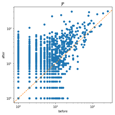
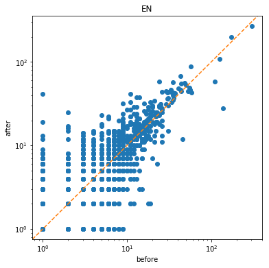
为了更直观地显示前后的变化,我加上了对角线。
个人层面上,日本地震前后 y > x的更多,说明个人的度增高了,即有了更多的联系;EN则较平稳,整体的变化不大。
累积度分析
for c in ['JP', 'EN']:for type in ['Pre', 'Post']:draw_degree_chart(nets[c][type], type, cumlutive_degree_distribution(nets[c][type]))plt.legend()plt.title(c)plt.show()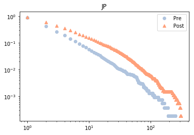
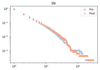
可以看到地震对美国影响不大,对日本则使累计度普遍增高。
Dephi分析
网络信息统计
![]()
社区划分与渲染
![]()
社区分析
from prettytable import PrettyTable
from networkx.algorithms.community import k_clique_communitiestable = PrettyTable(['Region', 'Period', 'community_num', 'max_com_size'])
cliques = {'JP': {'Pre': None, 'Post': None}, 'EN': {'Pre': None, 'Post': None}}
for c in ['JP', 'EN']:for type in ['Pre', 'Post']:clique = k_clique_communities(nets[c][type],4)clique = list(clique)clique_size = [len(cl) for cl in clique]cliques[c][type] = cliquetable.add_row([c, type, len(clique), max(clique_size)])
print(table)
+--------+--------+---------------+--------------+
| Region | Period | community_num | max_com_size |
+--------+--------+---------------+--------------+
|   JP   |  Pre   |       20      |     218      |
|   JP   |  Post  |       35      |     711      |
|   EN   |  Pre   |       27      |      97      |
|   EN   |  Post  |       34      |      73      |
+--------+--------+---------------+--------------+
可以看到,美国的社区数增长,是正常的发展趋势;而日本的社区数减少,侧面反映了日本社交聚合关系加强;渲染图更直观地说明了这一点。
桑基图
又叫冲击图 Alluvial diagram,查了一下库,几乎都是R语言写的,除了一个floweaver比较不错,就用了它
https://github.com/ricklupton/floweaver
from floweaver import *from ipysankeywidget import SankeyWidgetc = 'JP'
# c = 'EN'
clique_dic = {'Pre':{}, 'Post': {}}
for type in ['Pre', 'Post']:cliques[c][type].sort(reverse=True, key=len)for i in range(20):for name in cliques[c][type][i]:clique_dic[type][name] = i + 1
df1 = pd.DataFrame.from_dict(clique_dic['Pre'], orient='index', columns=['source'])
df2 = pd.DataFrame.from_dict(clique_dic['Post'], orient='index', columns=['target'])
df3 = df1.join(df2, how='inner').astype('Int64')
df3 = df3.reset_index()
df3.columns = ['source', 'pre', 'post']
df3['type'] = 1
df3['value'] = 1
df3['target'] = df3['source']
from floweaver import *size = dict(width=888, height=666)
nodes = {'PreTop10': ProcessGroup(df3['source'].tolist()),'PostTop10': ProcessGroup(df3['source'].tolist()),
}
ordering = [['PreTop10'], ['PostTop10']]
bundles = [Bundle('PreTop10', 'PostTop10'),]
sdd = SankeyDefinition(nodes, bundles, ordering)pre_partition = Partition.Simple('process',[(i, df3[df3.pre==i].source.tolist()) for i in list(range(100))[1:]])
post_partition = Partition.Simple('process', [(i, df3[df3.post==i].source.tolist()) for i in list(range(100))[1:]])
nodes['PreTop10'].partition = pre_partition
nodes['PostTop10'].partition = post_partitionweave(sdd, df3[['source', 'target', 'type', 'value']]).to_widget(**size)
![]()
日本的桑基图中,几乎所有社区的用户都汇集在一起,也很少有社区分散,同样可以看到社区紧密程度的提升
![]()
EN的桑基图中,社区用户的汇聚变化不如日本,从第一大社区的增幅和来源成分就可以看出;另外,EN地震后的没有出现在图中的社区大多由离散的用户(因为不构成社区所以不在左侧的来源中)组成,社区变化也较简单。
数据科学导论实验:基于Twitter的网络结构和社会群体演化相关推荐
- 数据科学导论 考试有感 2019 山东大学
数据科学导论 考试有感 2019 山东大学 数据科学导论 数据科学导论 平时分50分 有4个实验 两个人一组 爬虫.实体融合.twitter.MapReduce 3道题 简答:各种距离 设计:MapR ...
- python数据科学导论_数据科学导论:Python语言(原书第3版)
数据科学导论:Python语言(原书第3版) 作者:(意)阿尔贝托·博斯凯蒂;(意)卢卡·马萨罗 著 出版日期:2020年02月 文件大小:48.52M 支持设备: ¥50.00 适用客户端: 言商书 ...
- 数据科学导论学习小结——其一
数据科学导论学习小结--其一 这是笔者大学二年级必修科目<数据科学基础>个人向笔记整理的第一部分,包含前三个章节.本笔记内容基于清华大学出版社<数据科学导论-探索数据的奥秘>的 ...
- 山东大学软件学院2022-2023数据科学导论知识点整理【软工大数据课组】
每年考点变化较大,仅供参考 CSDN的排版能力有限,因此留pdf版本,祝大伙全部95+,呼呼 山东大学软件学院2022-2023数据科学导论知识点整理[软工大数据课组]-统计分析文档类资源-CSDN文 ...
- 数据科学导论python语言实现_数据科学导论:Python语言实现(原书第2版)
数据科学导论:Python语言实现(原书第2版) 作者:(意)阿尔贝托·博斯凯蒂(Alberto Boschetti);(意)卢卡·马萨罗(Luca Massaron) 著 出版日期:2018年01月 ...
- 数据科学导论学习小结——其三
数据科学导论学习小结--其三 这是笔者大学二年级必修科目<数据科学基础>个人向笔记整理的第三部分,包含第六.第七两个章节.本笔记内容基于清华大学出版社<数据科学导论-探索数据的奥秘& ...
- 作者:朱扬勇(1963-),男,博士,复旦大学计算机科学技术学院教授、学术委员会主任,上海市数据科学重点实验室主任。...
朱扬勇(1963-),男,博士,复旦大学计算机科学技术学院教授.学术委员会主任,上海市数据科学重点实验室主任.1989年起从事数据领域研究,2008年提出数据资源保护和利用,2009年发表了数据科学论 ...
- 作者:朱扬勇,复旦大学计算机科学技术学院教授、学术委员会主任,上海市数据科学重点实验室主任。...
朱扬勇,男,博士,复旦大学计算机科学技术学院教授.学术委员会主任,上海市数据科学重点实验室主任.1989年起从事数据领域研究,2008年提出数据资源保护和利用,2009年发表了数据科学论文" ...
- 客座编辑:朱扬勇,男,复旦大学计算机科学技术学院教授,上海市数据科学重点实验室主任。...
朱扬勇(1963-),男,博士,复旦大学计算机科学技术学院教授.学术委员会主任,上海市数据科学重点实验室主任.1989年起从事数据领域研究,2008年提出数据资源保护和利用,2009年发表了数据科学论 ...
最新文章
- 【C 语言】二级指针作为输入 ( 二维数组 | 二维数组内存大小计算 | 指针跳转步长问题 )
- Python基础教程:字符串的常用操作
- 方法入门_方法的定义
- unity 地图编辑器_基于Unity的场景基础测试
- Python中的zip函数
- Gamma 函数与exponential power distribution (指数幂分布)
- 在WPF中调用Winform控件
- 从架构设计到系统实施-基于.NET 3.0的全新企业应用之基于WCF的系统服务
- 部署Screego浏览器实现多人共享屏幕
- 小米8 青春版root时无法检测到手机
- 我不建议大家随便跳槽
- c语言打造dnf游戏角色视频,主播DK:展示成果!打造20个武炼18个卢克C角色! - 地下城与勇士掌游宝...
- ANDROID_APP C++框架
- Android有道词典开发
- RAID卡及其管理工具
- AJ-Report小白配置大屏手册
- 博弈论——2.4古诺模型练习题
- 服务器虚拟机租用价格,云服务器虚拟机租用
- 中科大校友一次意外事故,造就了让3000万人摘掉眼镜的手术
- 【计组】设计大型DMP系统--《深入浅出计算机组成原理》(十四)