knowladge_网站开发_jQuery插件_Clock Demo
今天要用jQuery做一个Clock Demo. 查了查相关的资料
找到了一个很好的插件设计 http://css-tricks.com/css3-clock
转发一下这个文章
Old School Clock with CSS3 and jQuery
PUBLISHED NOVEMBER 17, 2008 BY GUEST AUTHOR
Hi everyone, my name is Toby Pitman and Chris has asked me to write a post about a recent experiment that I posted up on the forum a little while ago. It all started when I was looking at the WebKit blog and saw an article on the new CSS3 animations and the one that caught my eye was 'rotate'. I started thinking what the hell can you rotate on a webpage (it's animated GIF's times ten!). Then it hit me - a clocks hands rotate! Bingo!

CSS3 transform: rotate
transform: rotate; is a new feature of CSS 3 which lets you... well, rotate stuff. Transform will also allow you to scale, skew and translate (move) objects in your web page. All these can be animated by the Transition property (complete with easing and duration).
Sound familiar? Well it should, it's the same thing we are currently using frameworks like jQuery to animate elements on our web pages. As with jQuery you can animate pretty much any CSS property worth animating with Transition. Think of a :hover effect and you should get some ideas. It's nowhere near as powerful as jQuery or Mootools etc but can still do some cool stuff. I doubt John Resig will lose any sleep!
And no, this won't work in IE6... ever! OK let's go!
View Demo Download Files
The Graphics
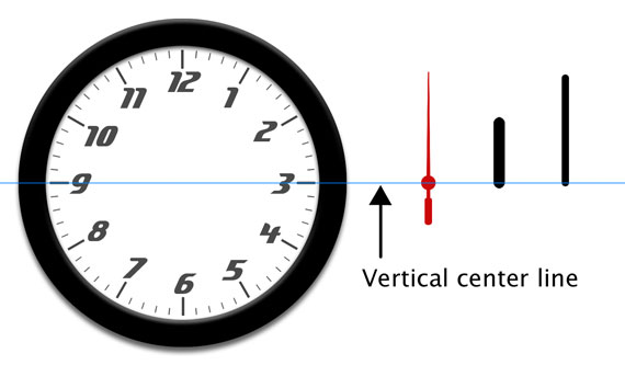
First we'll need some graphics for our clock interface. We have a face and three hands. All the moving parts are sliced in Photoshop at 600px high and 30px wide and are positioned vertically dead center as by default the rotate property 'rotates' from the center of the element. You can use 'transform-origin' to set a rotate point if you want.
I've gone with a generic clock thing here but there's nothing to stop you going for a Micky Mouse clock if you like. The moving parts are all PNG images making this effect possible.
The HTML Markup
The mark-up for the clock is a simple un-ordered list. Each list item will hold a moving part and is given a relevant id. Here it is.
<ul id="clock">   <li id="sec"></li><li id="hour"></li><li id="min"></li>
</ul>
NOTE: The forum post had a bit more of a clunky mark-up as it has realistic drop shadows on the hands. I've refined some of the code a bit for this demo and the forum one has been left as is.
The CSS
#clock {position: relative;width: 600px;height: 600px;margin: 20px auto 0 auto;background: url(clockface.jpg);list-style: none;
}#sec, #min, #hour {position: absolute;width: 30px;height: 600px;top: 0px;left: 285px;
}#sec {background: url(sechand.png);z-index: 3;
}#min {background: url(minhand.png);z-index: 2;
}#hour {background: url(hourhand.png);z-index: 1;
}
The CSS is really simple too. As the moving parts share the same dimensions and start positions we can declare these together to avoid repeating ourselves making the CSS a bit leaner. The <ul> is given a position of relative allowing us to absolutely position the clock hands inside it.
NOTE: Rotate doesn't effect layout and the object behaves like an absolutely positioned element outside the normal flow when rotated.
So where is is the CSS3 stuff? Well we’re going to apply that using some simple jQuery.
The jQuery JavaScript
- Get the timing information for the clock.
- Calculate and inject the CSS style (rotation angle) for each element.
- Update the CSS style info at regular intervals.
It should be noted that jQuery has no problem at all using these new CSS3 properties. Also as the styles are allocated dynamically and not from the stylesheet this clock still validates as CSS2.1!
Getting the time
Some of you might (well I did!) equate date and time info with PHP, and when I started this PHP was my first thought, but then I discovered javascript has it's own built in functionality for getting date and time data too. Note with JavaScript the time is local to the machine not the server.
We're going to get this info using the Date() syntax and assigning that to a variable. We can get each hands specific data by attaching GetSeconds(), GetMinutes() orGetHours() to the Date() syntax like this example.
var seconds = new Date().getSeconds();The above code will return a number between 0 and 59 and store it inside the variable 'seconds'.
Getting the angle
Next we have calculate the angle for each hand. In the case of the seconds and minutes which have 60 increments per rotation we just divide 360 by 60 which gives us 6. This means that for each second or minute we have to rotate the hand by 6 degrees. We're going to to store this equation inside another variable. For the seconds it will look like this.
var sdegree = seconds * 6;The hour hand throws up a different scenario. Because there are 12 increments per rotation the angle for each hour is 30 degrees. That's 360/12=30. Now that would be simple if a clocks hour hand moved in hour increments but it does't. It moves in smaller amounts based on the minute value. Say at 4:30 the hour hand will be half way between 3 and 4. So how do we do this. Here's the code.
var hdegree = hours * 30 + (mins / 2);Basically we're going to add the current number of minutes divided by two which should give us a number between 0.5 and 29.5 ('rotate' can handle all floating point numbers) this puts the hand somewhere between any given 30 degree (hour) increment.
Example:
| 2.40 would be: | 2 * 30 | = | 60 degrees | |
| + | 40 / 2 | = | 20 degrees | |
| --------- | --- | ---------- | ||
| hdegree | = | 80 degrees |
I did think that the clock might explode when it got past 12 as it would be a number higher then 360 but it worked fine.
So now we've figured the math lets inject the new CSS.
Set the style
Here is the CSS3 rotate as if it were in a style sheet.
#sec {-webkit-transform: rotate(45deg);-moz-transform: rotate(45deg);-ms-transform: rotate(45deg);-o-transform: rotate(45deg);transform: rotate(45deg);
}
Here it is injected by jQuery (NOTE: As of jQuery 1.8, the proper vendor prefixes will be applied when using the .css() function. Older versions of jQuery will need to apply them manually).
$("#sec").css({"transform": "rotate(45deg)"
});
The problem we have here is getting the variable 'sdegree' (which holds our angle) into this syntax to replace the (45deg). At first I just tried putting the variable between the brackets but it wouldn't have it. To make this work we need to build a 'string' inside another variable called 'srotate' and completely replace the second argument. Here's how we make it.
var srotate = "rotate(" + sdegree + "deg)";The jQuery will now be written as this.
$("#sec").css({ "transform": srotate });Putting it all together (in time!)
The whole jQuery code looks like this.
$(function() {setInterval( function() {var seconds = new Date().getSeconds();var sdegree = seconds * 6;var srotate = "rotate(" + sdegree + "deg)";$("#sec").css({ "transform": srotate });}, 1000 );setInterval( function() {var hours = new Date().getHours();var mins = new Date().getMinutes();var hdegree = hours * 30 + (mins / 2);var hrotate = "rotate(" + hdegree + "deg)";$("#hour").css({ "transform": hrotate});}, 1000 );setInterval( function() {var mins = new Date().getMinutes();var mdegree = mins * 6;var mrotate = "rotate(" + mdegree + "deg)";$("#min").css({ "transform" : mrotate });}, 1000 );});Notice how we've used a JavaScript setInterval so the function is run every second. The variables that get the time data have to be inside the function so they update too. If not they would only gather that data on page load once, making a pretty rubbish clock.
Our clock should now work (in Safari and other modern browsers).
Alternatives
Flash is the obvious one but unless you've got ActionScript chops I'd give it a swerve. This may even be possible with PHP using the GD image library to rotate the hands but that's way above my level.
Incidentally, Soh Tanaka posted this a few days after by pure coincidence: CSS clock. His clock uses JavaScript to add classes and sprite images for the hands.
UPDATE Nov 2012: Daniel Bakan has a very similar article "How To Write a Full Screen Web App Optimized For iOS Devices" in which he builds an old timey clock as well. If you're super interested in this, that's worth checking out as well.
Conclusion
So there you have it folks, a real and (probably the only) practical use for the new CSS3 property transform:rotate. I for one can't wait for upside down and sideways websites (Yes, you can even rotate the HTML tag! Although look what that does to Safari) and my personal favorite the spinning/zooming cartoon newspaper blog posts.
So go on, give some of those new CSS3 features a try!
小结一下: 做了一下 非常好用 关于计算那的代码还没有细看 如果要将钟的size变小 只需要改一下背景图片 然后用PS将背景中的白色空白p掉即可。
转载于:https://www.cnblogs.com/kidshaoran/archive/2013/05/23/3095664.html
knowladge_网站开发_jQuery插件_Clock Demo相关推荐
- Knowladge_网站学习_jQuery插件
几个参考的jquery插件网站 1. 240 多个jQuery 插件 http://www.cnblogs.com/Terrylee/archive/2007/12/09/the-ultimate-j ...
- 网站开发中很实用的 HTML5 jQuery 插件
这篇文章挑选了15款在网站开发中很实用的 HTML5 & jQuery 插件,如果你正在寻找能优化网站,使其更具创造力和视觉冲击,那么本文正是你需要的.这些优秀的 jQuery 插件能为你的网 ...
- 安卓逆向——AS开发Xposed插件demo案例
AS开发Xposed插件demo案例 环境和工具 : 模拟器:雷电 4.0.43版本 安卓版本:7.1.2 x86 Xposed :xposed-installer-3-1-5 安装好 androi ...
- html页面打印插件,分享8款网站开发中最好用的打印页面插件
原标题:分享8款网站开发中最好用的打印页面插件 通常浏览器是通过打印命令来确定需要打印的内容,但它可以在 jQuery 插件打印页面插件的帮助下打印一个特定区域的内容..因此,您可以使用这些 jQue ...
- 尝鲜Jumony for MVC,体验插件化网站开发
Jumony for MVC是这一年来Jumony项目的重头戏,Jumony for MVC是Jumony技术与ASP.NET MVC的结合,尽管现在Jumony for MVC还未发布稳定版本,但确 ...
- 一文教会你如何用Vue开发Chrome插件
前言 作为一个常年的B端前端开发者来说,千篇一律的业务开发有着些许的枯燥无味.在联调过程中,会经常发现后端在部署服务,然后又不知什么时候部署好,由于公司的部署系统查看系统部署状态入口较深,所以闲暇之余 ...
- QIIME 2教程. 26为QIIME 2开发新插件DevelopingPlugin(2021.2)
为QIIME 2开发新插件 Developing a QIIME 2 plugin https://docs.qiime2.org/2021.2/plugins/developing/ 注意:本文档还 ...
- QIIME 2教程. 26为QIIME 2开发新插件DevelopingPlugin(2020.11)
文章目录 为QIIME 2开发新插件 概述Overview 插件组件Plugin components 定义功能Define functionality 创建一个函数并注册为方法 Create a f ...
- 手机网站开发必修课[1]:手机浏览器 本文来自:http://www.fool2fish.cn/?p=290
前言: 头大的是,除了自己公司已有的一些经验,网上恐怕没有过多的(公开的)文档可以参考. 09年上半年的工作重心全在手机网页开发上面,这使得自己某种程度上也成了拓荒者.现将这段时间的开发心得同大家分 ...
最新文章
- 僵尸网络病毒之BotNet扫盲、预防及清除
- html 字号自适应,自适应网页中字体大小自适应屏幕 - YangJunwei
- JVM锁和分布式锁是什么关系
- bzoj2424 订货
- 课时 29:安全容器技术(王旭)
- pop3服务器协议初始化失败,Exchange2003系统管理器中的默认POP3 虚拟服务器无法自动启动...
- 机器学习06神经网络--学习
- Linux下如何搭建Java环境
- 闲鱼:1月13日至1月19日冻结涉欺诈用户1.1万个
- Ecology 建模表单 数据库字段与页面字段对应关系显示
- Spring框架配置文件 application.xml 示例
- asp 入门实例(页面+代码)
- RxJava学习 - 11. Switching, Throttling, Windowing, and Buffering
- ipad无法充电怎么办_Ipad显示不在充电怎么办
- 数字 阅读与创造——读戴德金之三
- Scrapy抓取新浪微博
- S7-200SMART案例分析——伺服选型(二)
- qt -- 字符串加密
- 15. 生死执行力—电商经营之道
- java 下载zip文件_Java以压缩包方式下载文件