imessage_重新设计iMessage以获得更好的用户体验— UX案例研究
imessage
体验设计 (EXPERIENCE DESIGN)
Communication is a vital part of our everyday lives. We almost don’t even have to think about it. With social media and our devices as prime tools, we’re constantly finding new ways to stay connected. Instant messaging — a quality example. Today; despite the rise of social distancing, we get to share our thoughts, ideas, and information all across the world. Within split seconds.
沟通是我们日常生活的重要组成部分。 我们几乎甚至不必考虑它。 以社交媒体和我们的设备为主要工具,我们一直在寻找保持联系的新方法。 即时消息传递-一个很好的例子。 今天; 尽管社会距离越来越大,但我们还是可以在全世界分享我们的思想,想法和信息。 在几秒钟内。
On this project I improve the user experience of Apple’s official messaging app — iMessage, with the central focus on restoring usability. My design offers potential solutions in the form of minor adjustments to the look, feel, and functionality of the app. With these improvements, I achieved a communication tool that is usable, accessible, and efficient; meeting users needs for rich interaction.
在这个项目中,我改善了苹果官方消息应用程序iMessage的用户体验,并着重于恢复可用性。 我的设计以细微调整应用程序的外观,感觉和功能的形式提供了潜在的解决方案。 通过这些改进,我实现了一种可用,可访问且高效的通信工具。 满足用户丰富互动的需求。
了解问题 (Understanding the Problem)
挑战 (The Challenge)
iMessage launched in 2011 and has received several major upgrades since then — most recent being the updates that came along with iOS 13. The application comes pre-installed as the default messaging app on every iOS device. Yet, we find that a lot of users do not adopt it as their primary messaging tool. Why? I found this an interesting challenge to solve.
iMessage于2011年启动,此后已进行了几次重大升级-最新的更新是iOS 13随附的更新。该应用程序已预先安装为每台iOS设备上的默认消息传递应用程序。 但是,我们发现许多用户并未将其用作主要的消息传递工具。 为什么? 我发现这是一个有趣的挑战。
As an occasional iMessage user, I had a few ideas about why this was. Interactions with the app often revealed clear usability issues and pain points. However, I needed to confirm my observations.
作为偶然的iMessage用户,我对为什么会这样有一些想法。 与该应用程序的交互通常显示出明确的可用性问题和痛点。 但是,我需要确认我的观察。

My major goal for the project was to revise usability in iMessage. I wanted to give people a more engaging and seamless experience while communicating and staying connected.
我对该项目的主要目标是修改iMessage的可用性。 我想给别人 一个 在交流和保持联系的同时,获得更多的参与和无缝体验。
检查痛点 (Examining pain points)
认识用户 (Meeting the Users)

To get some data to work with, I carried out qualitative interviews with frequent iMessage users. Some of the questions asked were focused on:
为了获得一些有用的数据,我对iMessage的频繁用户进行了定性采访。 提出的一些问题集中在:
- their nature of use,使用的性质
- possible frustrations experienced during use, and使用过程中可能遇到的挫折感,以及
- functionalities they liked in other messaging apps.他们喜欢其他消息传递应用程序中的功能。
At the end of each interview, I asked them to use the application. I wanted to observe their personal interactions with the app and the context in which they used it.
在每次面试结束时,我要求他们使用该应用程序。 我想观察他们与该应用的个人互动以及他们使用该应用的环境。
Likewise, I got feedback from a Typeform survey carried out with a group of 88 iMessage users across social media. I was able to gather the following insights:
同样,我从Typeform调查中获得了反馈,该调查是通过88个iMessage用户在社交媒体上进行的。 我能够收集以下见解:
FREQUENT MISCOMMUNICATION OFTEN OCCURRED
经常发生误通信
- Users get annoyed when they had to carefully specify which response was to what question; so the reader did not misinterpret the meaning.当用户不得不仔细指定对哪个问题的回答时,他们会感到恼火。 因此读者不会误解其含义。
- This slowed down the chatting process and allowed for big misunderstandings. Users expected iMessage to be more intuitive这减慢了聊天过程的速度,并引起了严重的误解。 用户期望iMessage更加直观

SIMPLE TASKS REQUIRED LONGER PROCESSES
简单的任务需要更长的过程
- Users were put off by the fact that they could get tasks done a lot faster on other messaging apps.用户因为可以在其他消息传递应用程序上更快地完成任务而被推迟。
- People respond to a lot of their messages while multitasking. As such, they want to be able to process and divulge information as fast as possible. Users expected iMessage to be more efficient.人们在执行多任务处理时会回复很多信息。 因此,他们希望能够尽快处理和泄漏信息。 用户期望iMessage更加高效。

MINIMAL CONSIDERATION FOR RECURRING ERRORS
纠正错误的最小考虑
- Mistakes often occurred while communicating. And users did not trust iMessage to help them recover from errors with little effort.交流时经常发生错误。 用户不信任iMessage可以帮助他们轻松地从错误中恢复。
- Users got irritated whenever a mistake occurred and there was no simple action to correct it.每当发生错误并且没有简单的纠正措施时,都会激怒用户。
UNRELIABLE NAVIGATION
无关的 导航
- Users needed to reference other information when communicating and did not feel like iMessage met that need.用户在交流时需要参考其他信息,并且感觉iMessage不能满足需求。
- Actions such as sending media and conducting searches to find information were not optimised on the app’s interface. Users expected iMessage to be more coordinated.未在应用程序界面上优化发送媒体和进行搜索以查找信息之类的操作。 用户期望iMessage能够更加协调。
POOR ALTERNATIVES TO TEXT MESSAGING
文本消息的替代方案很差
- Users respond to a lot of their messages on the go; and as such also communicate using the voice feature. Ever lost several minutes worth of a voice recording? iMessage users often did.用户可以随时随地回复许多邮件; 并且还可以使用语音功能进行交流。 曾经损失了几分钟的语音记录吗? iMessage用户经常这样做。
- Users wanted a seamless playback experience.用户想要无缝播放体验。
Digging into the rest of the data revealed a major insight into the online messaging app experience.
对其余数据的挖掘揭示了对在线消息传递应用程序体验的重大见解。
发现 (The Discovery)
用户期望随时间变化 (Users Expectations Changed Over Time)
The instant messaging scene had changed. Users had gotten used to innovation from other messaging apps and Apple’s iMessage was not exempted. It became clearer that users expected the experience to just work with minimal effort. As usability became more integral to their lives, their expectations evolved.
即时消息传递场景已经改变。 用户已经习惯了其他消息传递应用程序的创新,苹果的iMessage也不例外。 越来越清楚的是,用户期望这种体验可以轻松完成。 随着可用性成为他们生活中不可或缺的一部分,他们的期望也在不断发展。
更深入的见解 (Deeper Insights)
制定设计原则 (Formulating Design Principles)
Before I could go into designing, it was important to define the metrics of success and understand the required scope of the redesign. I reversed the nature of the imperfections discovered during the research to kickstart creativity. I wanted to maintain a direct relationship between the survey results and my visual hierarchy and UI design. Hence, I created five key principles to adopt while designing:
在进行设计之前,定义成功的指标并了解重新设计的要求范围很重要。 我颠倒了研究过程中发现的缺陷的本质,以激发创造力。 我想在调查结果与我的视觉层次和UI设计之间保持直接的关系。 因此,我创建了在设计时要采用的五项关键原则:

“…How might we help iMessage improve usability?”
“……我们将如何帮助iMessage改善可用性?”
While ideating, I came up with a bunch of ideas that could solve the issues raised. There were multiple variations, so I concurrently got feedback from peers to narrow down the best solutions.
在进行构想时,我提出了许多可以解决所提出问题的构想。 有多种变体,因此我同时获得了同行的反馈,以缩小最佳解决方案的范围。
用户任务 (User tasks)
平台背后的逻辑。 (The logic behind the platform.)

I defined the important tasks users would have to perform daily. I aimed to create a mix of user and task flows. This kind of approach also helped me refine and think about each pages’ inventory, and how the system would react to required actions.
我定义了 用户每天必须执行的重要任务。 我的目标是创建用户流和任务流的混合体。 这种方法也帮助了我 完善思考 有关每页库存的信息,以及系统对所需操作的React。


To further validate my solutions, I carried out usability checks and consulted apple design guidelines. I wanted to retain the look & feel of the iMessage interface users were familiar with.
为了进一步验证我的解决方案,我进行了可用性检查并参考了Apple设计指南 。 我想保留用户熟悉的iMessage界面的外观。
Some of the primary questions that aided the usability checks:
有助于可用性检查的一些主要问题:
- What is the most minimum action the user takes to accomplish a task?用户完成任务所采取的最少动作是什么?
- How can I minimize the effort required to take the intended action?如何减少采取预期措施所需的精力?
- How can I design this feature to be discoverable within the app?如何设计此功能使其在应用程序中可发现?
- Will this solution pass for Heuristic Evaluation?该解决方案将通过启发式评估吗?

I tested early prototypes of the designs with real users. Every test was focused on the user achieving a single task.
我与实际用户一起测试了设计的早期原型。 每个测试都针对于完成一项任务的用户。
To my surprise, not a single participant had an issue with the flow. The accelerators I designed resonated well with users, confirming my intuition around designing for usability.
令我惊讶的是,没有一个参与者的流程有问题。 我设计的加速器在用户中引起了很好的共鸣,证实了我对可用性设计的直觉。
Enter, my proposal:
输入我的建议:
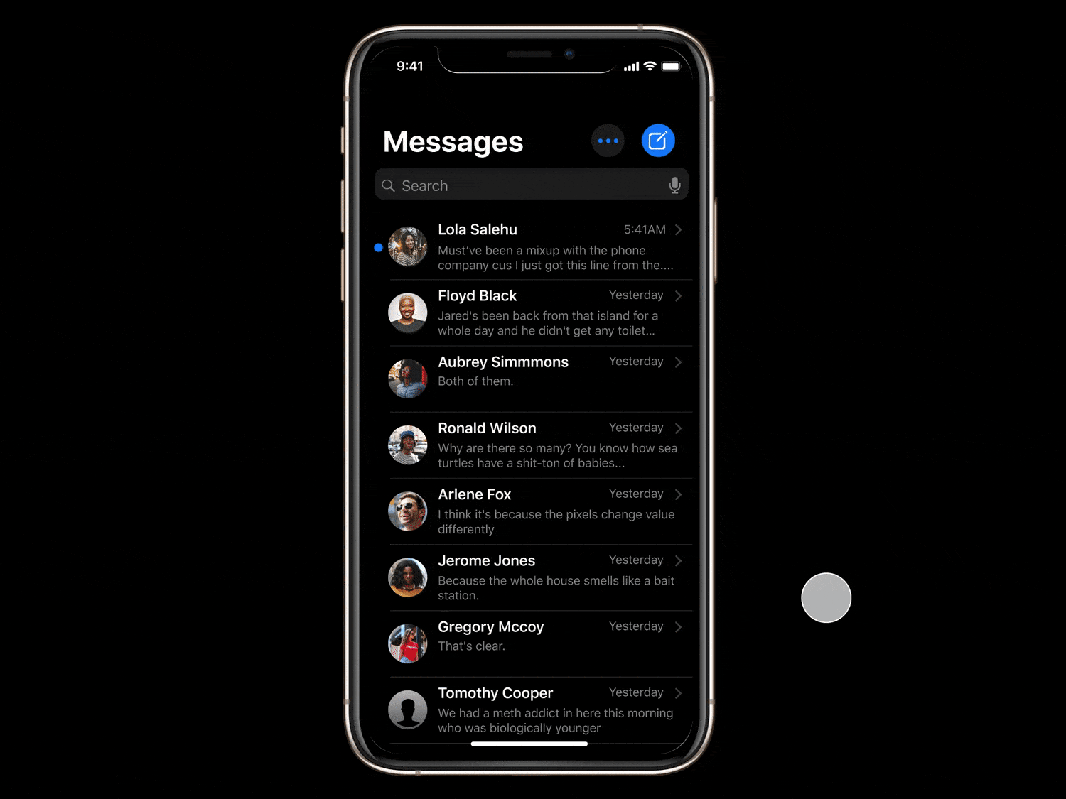
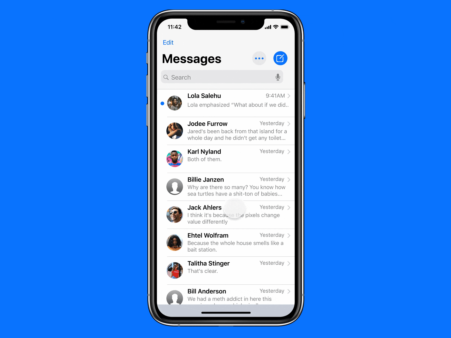
重新设计 (The Redesign)
重新引入iMessage (Reintroducing iMessage)
In an age where messaging is a sure way to reach your loved ones, iMessage gives you the best experience by making communication fast, effortless and simple; meeting your needs for rich interaction.
在这样的时代,通过消息传递是您与亲人联系的必经之路,iMessage通过使通信变得快速,轻松,简单而给您带来最佳体验。 满足您丰富互动的需求。
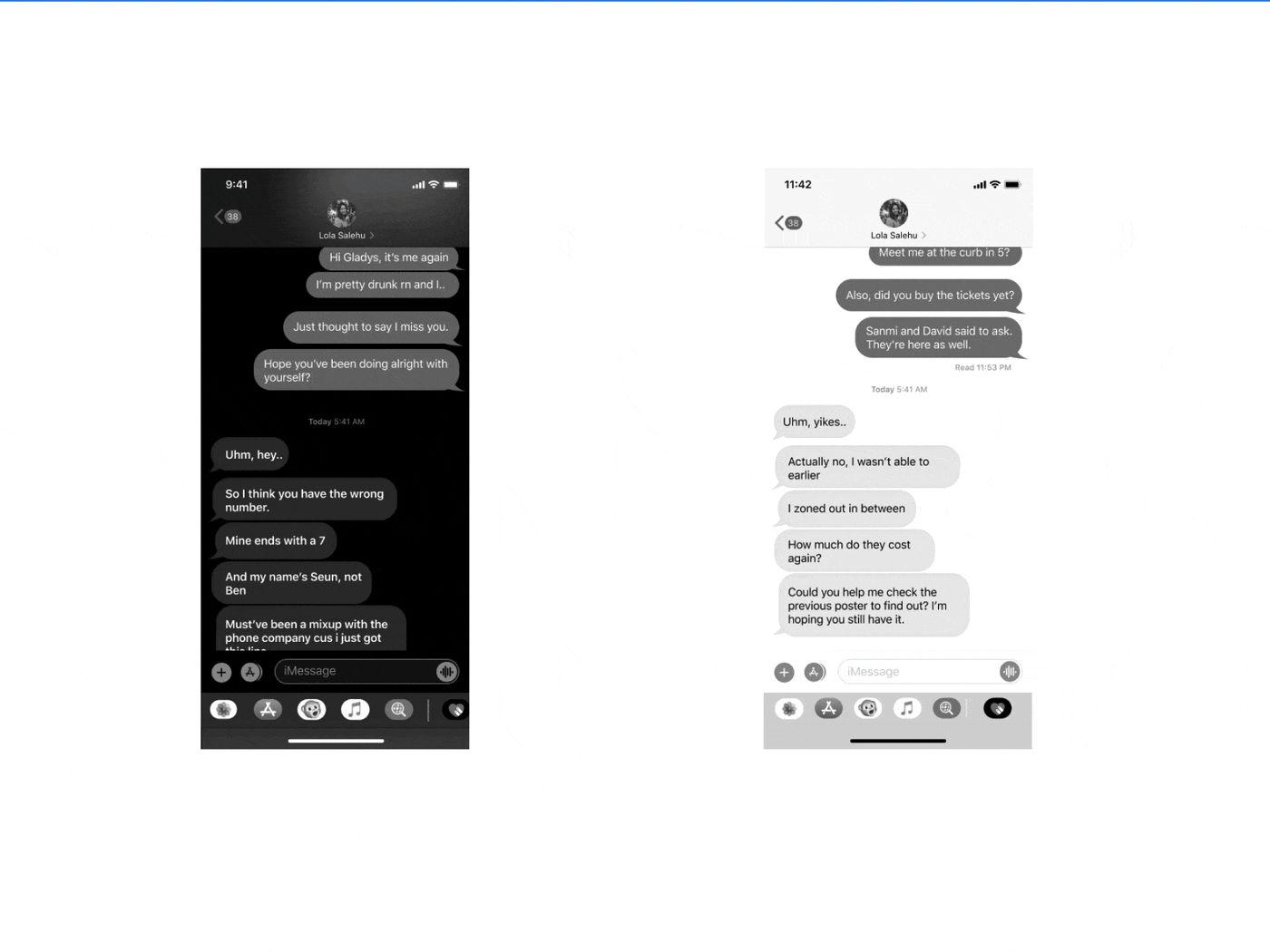
从不可靠到直观 (From Unreliable to Intuitive)
满足您需求的工具 (A Tool That Anticipates Your Needs)
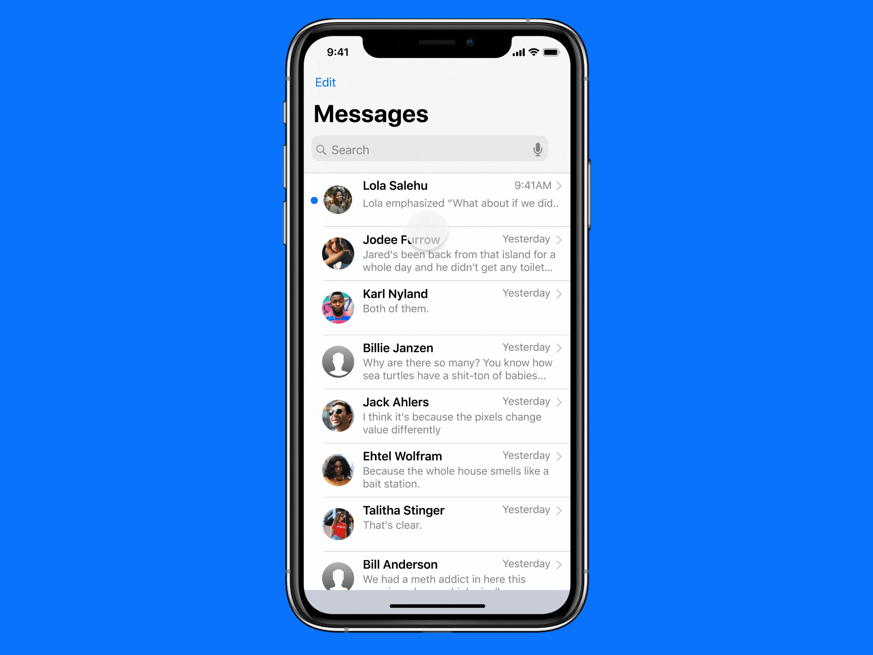
The new message screen, showing new and existing users key information they need upon opening the message.
新消息屏幕,显示新用户和现有用户在打开消息时所需的关键信息。
从复杂到简单 (From Complex to Simple)
分享所有你想要的 (Share All You Want)
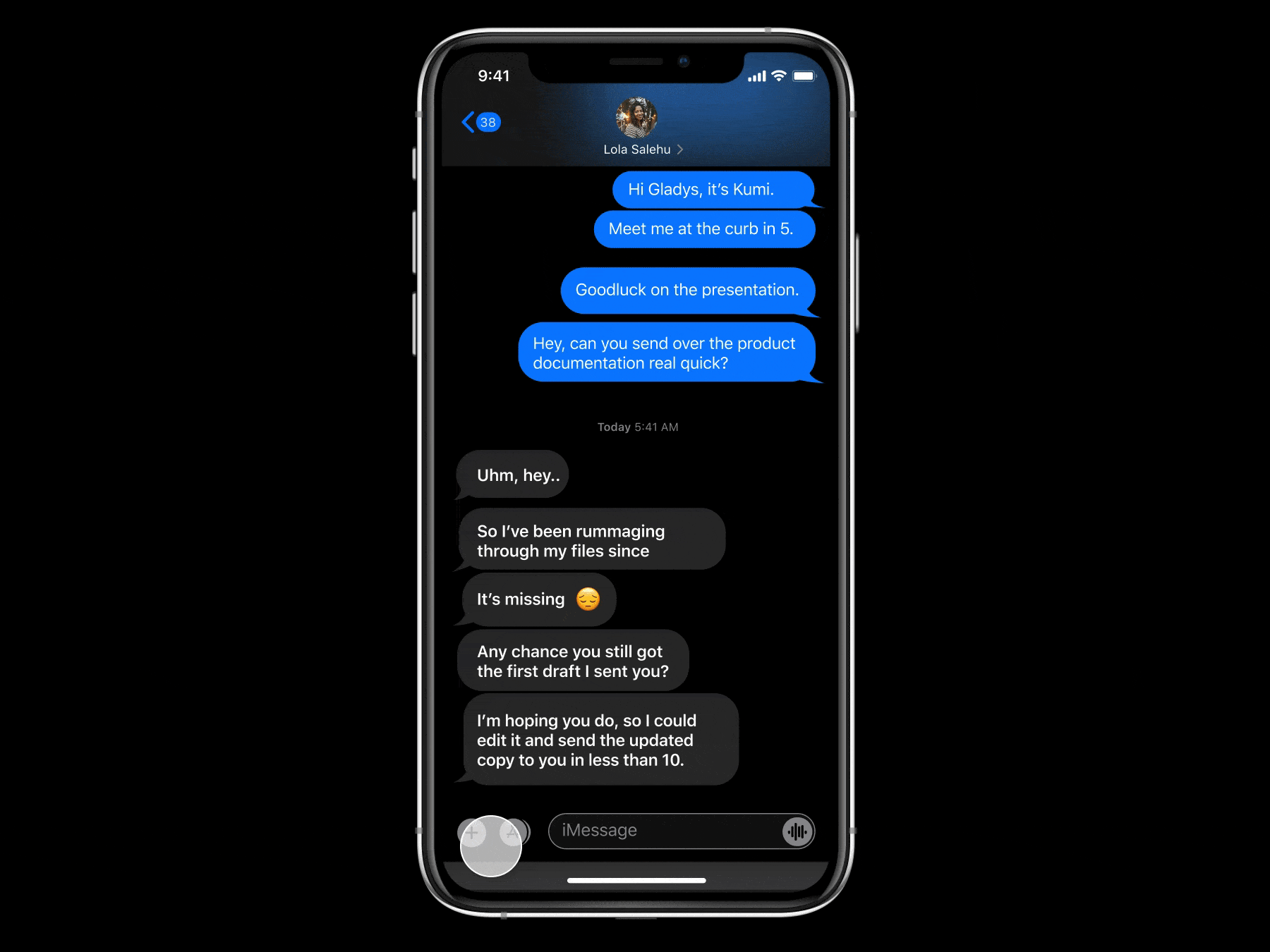
I understand that a critical part of real-time communication is exchanging media. Now, users can share their pictures, videos, files, location, and contacts; all at the tap of a button.
我了解实时通信的关键部分是交换媒体。 现在,用户可以共享他们的图片,视频,文件,位置和联系人; 只需按一下按钮。
Add uses familiar and consistent interactions, making complex tasks straightforward to perform.
Add使用熟悉且一致的交互方式,使复杂的任务易于执行。
从乏味到即时 (From Tedious to Instant)
搜寻 (A Search Away)
Users can instantly reference previously shared information from their personal chat history. Now easy as pie.
用户可以立即从他们的个人聊天历史中引用以前共享的信息。 现在很容易。
Search features the voice input option, making lives easier through accessibility.
搜索功能具有语音输入选项,可访问性使生活更加轻松。
从低效到优化 (From Inefficient to Optimized)
智能重定向 (Smart Redirect)
A key insight discovered during research was that the reaction feature — Tapback — was underutilized. It often left them confused whenever they got a notification from the sender but couldn’t pinpoint exactly what was being reacted to.
研究期间发现的一个重要见解是,React功能Tapback没有得到充分利用。 每当他们收到发件人的通知时,这常常使他们感到困惑,但却无法准确指出正在响应的内容。
Smart Redirect was born so the user no longer gets lost in the conversation. Central to this feature were these key ideas:
Smart Redirect诞生了,因此用户不再在对话中迷路。 这些功能的核心是这些关键思想:
- Provide direct access to the highlighted message.提供对突出显示的消息的直接访问。
- Micro-interactions to immediately draw the reader’s attention.微交互立即引起了读者的注意。
- An optional shortcut to return the reader to the initial point on the message thread.使阅读器返回到消息线程上的初始点的可选快捷方式。
从受约束到体贴 (From Constrained to Considerate)
全部删除 (Delete for All)

We all make mistakes, especially while communicating. Users can now simply erase miscommunications and get right back to it. Delete for All explores 3D Touch interactions, giving the user more control over their communication process.
我们都会犯错,尤其是在交流时。 用户现在可以简单地消除误解并立即解决。 删除所有人探索3D Touch交互,使用户可以更好地控制其通信过程。
播放滑块 (Playback Slider)
Users no longer have to worry about missing out on that bit of the voice message. A simple rewind, or fast forward can do the trick. Playback Slider uses direct manipulation to engage the user, reminding them that the control lies with them.
用户不再需要担心错过语音消息的那部分。 简单的倒带或快进都可以解决问题。 播放滑块的使用 直接操作以吸引用户,提醒他们控制权在于他们。
从受限到可访问 (From Limited to Accessible)
快速回复 (Quick Reply)
Whether it’s a long chat or replying on the go, users can easily respond to messages with just a slide. Quick Reply optimizes the user’s accessibility by exploring simplified gestures for interaction.
无论是长时间的聊天还是在旅途中回复,用户都可以仅用一张幻灯片轻松地回复消息。 快速回复通过探索简化的手势进行交互来优化用户的可访问性。
反射 (Reflection)
Redesigning this app and doing this case study reminded me that users are very integral to every design decision. It was amazing how little changes such as adding a search bar could create such a big usability impact.
重新设计该应用程序并进行此案例研究使我想起,用户对于每个设计决策都是不可或缺的。 令人惊讶的是,几乎没有什么变化(例如添加搜索栏)会产生如此大的可用性影响。
Thanks for reading! Follow my medium profile to keep up-to-date on my incoming articles featuring UX nuggets, and links to provoking reads I’ve found helpful for my career. If you’d like to reach out, follow me on Twitter to continue the conversation. You can also check out more of my work on my portfolio.
谢谢阅读! 遵循我的中等资料,以了解有关UX掘金的最新文章,以及指向我发现对我的职业有用的激怒读物的链接。 如果您想联系我们,请在Twitter上关注我 ,继续对话。 您也可以在我的投资组合中查看更多我的工作。
Let me know if you have any questions or comments on my redesign for iMessage AND / OR If you’d like to have a chat about anything design related I’d love to hear from you!
如果您对我对iMessage重新设计的重新设计有任何疑问或意见,请与我联系,或者/如果您想就任何与设计相关的问题进行交谈,我希望能收到您的来信!
Tools credit: Figma, Cloudinary, Overflow, Typeform and Miro (Awesome wingmen)
用户体验改善案例 by Peace Ojemeh (Perrie) 由Peace Ojemeh(Perrie) 用户体验案例研究:建立更好的体验(重新设计"和平航空"网站) (A ... 实现线程哪种方法更好 Gone are the days when design used to rely mainly on the color palettes and the creativit ... 苹果风格ui设计 重点 (Top highlight) TLDR? UI重新设计 (TLDR? UI Redesign) I didn't realise how much I'd written f ... 9月19日,项目组组织参加了在深圳腾讯举行的专家论坛:"没有最好,只有更适合--打造更有价值的用户体验团队".来自华为.腾讯.金蝶.中兴的六位嘉宾,大约八十余UCD相关团队成员参加 ... 如何获得更好的交互体验 According to a study by Missouri University of Science and Technology, over 94 percent o ... 对于产品设计而言,"了解你的用户"是非常重要的设计原则.虽然我无法通过这一篇文章来清楚地总结与用户有关的所有信息,但仍然可以提炼出一些最重要的设计原则及注意事项.而对用户体验设计师 ... 随着做互联网的人们越来越多,网站优化也越来越多,同样,网站优化的竞争压力也越来越大,想要让更多的人们了解你的网站,就要保证自己的网站要更突出有亮点,那么这就涉及到网站布局方面来了,接下来,就带大家一起 ... 对于互联网公司来说,用户体验起到至关重要的作用,能否给用户留下深刻的印象:开发出的产品是否实用.易用?等等这些都是开发者必将思考的话题.当有用性一样的时候,大家的竞争重点就是易用性了,这就是互联网产品 ... 让用户在不同设备和尺寸的屏幕下看的页面显示效果更佳,屏幕空间利用更高,操作体验更统一,交互方式更符合习惯.本文主要围绕什么是响应式,如何搭建响应系统,响应式网站解析 三个部分进行阐述,在项目中提前定义 ...imessage_重新设计iMessage以获得更好的用户体验— UX案例研究相关推荐
最新文章
热门文章