如何在div中垂直对齐图像
如何在包含div内部对齐图像?
例
在我的示例中,我需要使用class ="frame ”将<img>在<div>垂直居中:
<div class="frame" style="height: 25px;"><img src="http://jsfiddle.net/img/logo.png" />
</div>
.frame的高度是固定的,图像的高度是未知的。 如果这是唯一的解决方案,则可以在.frame添加新元素。 我正在尝试在Internet Explorer 7和更高版本的WebKit,Gecko上执行此操作。
在这里查看jsfiddle。
.frame { height: 25px; /* Equals maximum image height */ line-height: 25px; width: 160px; border: 1px solid red; text-align: center; margin: 1em 0; } img { background: #3A6F9A; vertical-align: middle; max-height: 25px; max-width: 160px; } <div class=frame> <img src="http://jsfiddle.net/img/logo.png" height=250 /> </div> <div class=frame> <img src="http://jsfiddle.net/img/logo.png" height=25 /> </div> <div class=frame> <img src="http://jsfiddle.net/img/logo.png" height=23 /> </div> <div class=frame> <img src="http://jsfiddle.net/img/logo.png" height=21 /> </div> <div class=frame> <img src="http://jsfiddle.net/img/logo.png" height=19 /> </div> <div class=frame> <img src="http://jsfiddle.net/img/logo.png" height=17 /> </div> <div class=frame> <img src="http://jsfiddle.net/img/logo.png" height=15 /> </div> <div class=frame> <img src="http://jsfiddle.net/img/logo.png" height=13 /> </div> <div class=frame> <img src="http://jsfiddle.net/img/logo.png" height=11 /> </div> <div class=frame> <img src="http://jsfiddle.net/img/logo.png" height=9 /> </div> <div class=frame> <img src="http://jsfiddle.net/img/logo.png" height=7 /> </div> <div class=frame> <img src="http://jsfiddle.net/img/logo.png" height=5 /> </div> <div class=frame> <img src="http://jsfiddle.net/img/logo.png" height=3 /> </div> #1楼
这可能有用:
div {position: relative;width: 200px;height: 200px;
}
img {position: absolute;top: 0;bottom: 0;margin: auto;
}
.image {min-height: 50px
}
参考: http : //www.student.oulu.fi/~laurirai/www/css/middle/
#2楼
我有同样的问题。 这对我有用:
<style type="text/css">div.parent {position: relative;}img.child {bottom: 0;left: 0;margin: auto;position: absolute;right: 0;top: 0;}
</style><div class="parent"><img class="child">
</div>
#3楼
我的解决方案: http : //jsfiddle.net/XNAj6/2/
<div class="container"><div class="frame"><img src="http://jsfiddle.net/img/logo.png" class="img" alt="" /></div>
</div>.container {display: table;float: left;border: solid black 1px;margin: 2px;padding: 0;background-color: black;width: 150px;height: 150px;
}
.frame {display: table-cell;text-align: center;vertical-align: middle;border-width: 0;
}
.img {max-width: 150px;max-height: 150px;vertical-align: middle;
}
#4楼
matejkramny的解决方案是一个不错的开始,但是过大的图像比例错误。
这是我的叉子:
演示: https : //jsbin.com/lidebapomi/edit?html,css,输出
HTML:
<div class="frame"><img src="foo"/>
</div>
CSS:
.frame {height: 160px; /* Can be anything */width: 160px; /* Can be anything */position: relative;
}
img {max-height: 100%;max-width: 100%;width: auto;height: auto;position: absolute;top: 0;bottom: 0;left: 0;right: 0;margin: auto;
}
#5楼
这样,您可以将图像垂直居中( demo ):
div{height: 150px; // Internet Explorer 7 fixline-height: 150px;
}
img{vertical-align: middle;margin-bottom: 0.25em;
}
#6楼
我不确定Internet Explorer,但是在Firefox和Chrome下,如果div容器中有img ,则以下CSS内容应该可以使用。 至少对我来说效果很好:
div.img-container {display: table-cell;vertical-align: middle;height: 450px;width: 490px;
}div.img-container img {max-height: 450px;max-width: 490px;
}
#7楼
最好的解决方案是
.block{/* Decor */padding:0 20px;background: #666;border: 2px solid #fff;text-align: center;/* Important */min-height: 220px;width: 260px;white-space: nowrap;
}
.block:after{content: '';display: inline-block;height: 220px; /* The same as min-height */width: 1px;overflow: hidden;margin: 0 0 0 -5px;vertical-align: middle;
}
.block span{vertical-align: middle;display: inline-block;white-space: normal;
}
#8楼
三行解决方案:
position: relative;
top: 50%;
transform: translateY(-50%);
这适用于任何东西。
从这里 。
#9楼
一个对我有用的简单方法:
img {vertical-align: middle;display: inline-block;position: relative;
}
它非常适合Google Chrome浏览器。 在其他浏览器中尝试一下。
#10楼
我一直在使用填充进行中心对齐。 您将需要定义顶层外部容器的大小,但是内部容器应调整大小,并且可以将填充设置为不同的百分比值。
jsfiddle
<div class='container'><img src='image.jpg' />
</div>.container {padding: 20%;background-color: blue;
}img {width: 100%;
}
#11楼
对于更现代的解决方案,如果不需要支持旧版浏览器,则可以执行以下操作:
.frame { display: flex; /** Uncomment 'justify-content' below to center horizontally. ✪ Read below for a better way to center vertically and horizontally. **/ /* justify-content: center; */ align-items: center; } img { height: auto; /** ✪ To center this image both vertically and horizontally, in the .frame rule above comment the 'justify-content' and 'align-items' declarations, then uncomment 'margin: auto;' below. **/ /* margin: auto; */ } /* Styling stuff not needed for demo */ .frame { max-width: 900px; height: 200px; margin: auto; background: #222; } p { max-width: 900px; margin: 20px auto 0; } img { width: 150px; } <div class="frame"> <img src="https://s3-us-west-2.amazonaws.com/s.cdpn.io/9988/hand-pointing.png"> </div> 这是一支钢笔: http : //codepen.io/ricardozea/pen/aa0ee8e6021087b6e2460664a0fa3f3e
#12楼
flexbox有一个超级简单的解决方案!
.frame {display: flex;align-items: center;
}
#13楼
您可以尝试以下代码:
.frame{ display: flex; justify-content: center; align-items: center; width: 100%; } <div class="frame" style="height: 25px;"> <img src="http://jsfiddle.net/img/logo.png" /> </div> #14楼
使用表格和表格单元的解决方案
有时应通过显示为table / table-cell来解决。 例如,快速标题屏幕。 这也是W3推荐的方式。 我建议您检查此链接,该链接称为W3C.org中的“ 将块或图像居中” 。
这里使用的技巧是:
- 绝对定位容器显示为表格
- 垂直对齐到显示为表格单元的中心内容
.container { position: absolute; display: table; width: 100%; height: 100%; } .content { display: table-cell; vertical-align: middle; } <div class="container"> <div class="content"> <h1 style="text-align:center">Peace in the world</h1> </div> </div> 就我个人而言,我实际上不同意为此目的使用辅助工具。
#15楼
使用这个:
position: absolute;
top: calc(50% - 0.5em);
left: calc(50% - 0.5em);
line-height: 1em;
您可以更改font-size 。
#16楼
是否要对齐文本/标题之后且都在div内的图像?
参见JSfiddle或运行代码片段。
只要确保在所有元素(div,img,标题等)上都有一个ID或一个类即可。
对我来说,此解决方案可在所有浏览器上使用(对于移动设备,您必须使用@media修改代码)。
h2.h2red { color: red; font-size: 14px; } .mydivclass { margin-top: 30px; display: block; } img.mydesiredclass { margin-right: 10px; display: block; float: left; /* If you want to allign the text with an image on the same row */ width: 100px; heght: 100px; margin-top: -40px /* Change this value to adapt to your page */; } <div class="mydivclass"> <br /> <img class="mydesiredclass" src="https://upload.wikimedia.org/wikipedia/commons/thumb/b/b3/Wikipedia-logo-v2-en.svg/2000px-Wikipedia-logo-v2-en.svg.png"> <h2 class="h2red">Text aligned after image inside a div by negative manipulate the img position</h2> </div> #17楼
使用table和table-cell方法可以完成这项工作,特别是因为您也以一些旧的浏览器为目标,所以我为您创建了一个片段,您可以运行它并检查结果:
.wrapper { position: relative; display: table; width: 300px; height: 200px; } .inside { vertical-align: middle; display: table-cell; } <div class="wrapper"> <div class="inside"> <p>Centre me please!!!</p> </div> <div class="inside"> <img src="https://cdn2.iconfinder.com/data/icons/social-icons-circular-black/512/stackoverflow-128.png" /> </div> </div> #18楼
为了使图像居中放置在容器(可能是徽标)中,除了像这样的一些文字:
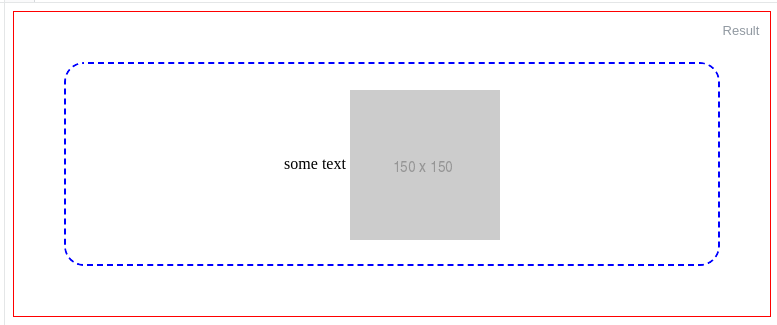
基本上,您包装图像
.outer-frame { border: 1px solid red; min-height: 200px; text-align: center; /* Only to align horizontally */ } .wrapper{ line-height: 200px; border: 2px dashed blue; border-radius: 20px; margin: 50px } img { /* height: auto; */ vertical-align: middle; /* Only to align vertically */ } <div class="outer-frame"> <div class="wrapper"> some text <img src="http://via.placeholder.com/150x150"> </div> </div> #19楼
这段代码对我很有用。
<style>.listing_container{width:300px; height:300px;font: 0/0 a;}.listing_container:before { content: ' ';display: inline-block;vertical-align: bottom;height: 100%;}.listing_container img{ display: inline-block; vertical-align: middle;font: 16px/1 Arial sans-serif; max-height:100%; max-width:100%;}
<style><div class="listing_container"><img src="http://www.advancewebsites.com/img/theme1/logo.png">
</div>
#20楼
另外,您可以使用Flexbox获得正确的结果:
.parent { align-items: center; /* For vertical align */ background: red; display: flex; height: 250px; /* justify-content: center; <- for horizontal align */ width: 250px; } <div class="parent"> <img class="child" src="https://cdn2.iconfinder.com/data/icons/social-icons-circular-black/512/stackoverflow-128.png" /> </div> #21楼
您可以使用此:
.loaderimage {position: absolute;top: 50%;left: 50%;width: 60px;height: 60px;margin-top: -30px; /* 50% of the height */margin-left: -30px;}
#22楼
想像你有
<div class="wrap"><img src="#">
</div>
和CSS:
.wrap {display: flex;
}
.wrap img {object-fit: contain;
}
#23楼
这适用于现代浏览器(编辑时为2016年),如本演示中的Codepen所示
.frame {height: 25px;line-height: 25px;width: 160px;border: 1px solid #83A7D3;
}
.frame img {background: #3A6F9A;display:inline-block;vertical-align: middle;
}
给图像一个类或使用继承来定位需要居中的图像非常重要。 在此示例中,我们使用.frame img {}以便仅将由div包装的带有.frame类的图像作为目标。
#24楼
背景图片解决方案
我完全删除了图像元素,并使用.frame类将其设置为div的背景
http://jsfiddle.net/URVKa/2/
至少在Internet Explorer 8,Firefox 6和Chrome 13上可以正常工作。
我检查了一下,该解决方案无法缩小大于25像素高度的图像。 有一个称为background-size的属性可以设置元素的大小,但是CSS 3会与Internet Explorer 7的要求相冲突。
我建议您要么重新设置浏览器优先级并设计最佳的浏览器,要么获得一些服务器端代码来调整图像的大小(如果您想使用此解决方案)。
#25楼
您可以这样做:
演示版
http://jsfiddle.net/DZ8vW/1
的CSS
.frame {height: 25px;      /* Equals maximum image height */line-height: 25px;width: 160px;border: 1px solid red;text-align: center; margin: 1em 0;position: relative; /* Changes here... */
}
img {background: #3A6F9A;max-height: 25px;max-width: 160px;top: 50%;           /* Here.. */left: 50%;          /* Here... */position: absolute; /* And here */
}
的JavaScript
$("img").each(function(){this.style.marginTop = $(this).height() / -2 + "px";
})
#26楼
http://jsfiddle.net/MBs64/
.frame {height: 35px;      /* Equals maximum image height */width: 160px;border: 1px solid red;text-align: center;margin: 1em 0;display: table-cell;vertical-align: middle;
}
img {background: #3A6F9A;display: block;max-height: 35px;max-width: 160px;
}
关键属性为display: table-cell; 对于.frame 。 Div.frame与此内联显示,因此您需要将其包装在block元素中。
这适用于Firefox,Opera,Chrome,Safari和Internet Explorer 8(及更高版本)。
更新
对于Internet Explorer 7,我们需要添加一个CSS表达式:
*:first-child+html img {position: relative;top: expression((this.parentNode.clientHeight-this.clientHeight)/2+"px");
}
#27楼
纯 CSS解决方案:
.frame { margin: 1em 0; height: 35px; width: 160px; border: 1px solid red; position: relative; } img { max-height: 25px; max-width: 160px; position: absolute; top: 0; bottom: 0; left: 0; right: 0; margin: auto; background: #3A6F9A; } <div class=frame> <img src="http://jsfiddle.net/img/logo.png" height=250 /> </div> <div class=frame> <img src="http://jsfiddle.net/img/logo.png" height=25 /> </div> <div class=frame> <img src="http://jsfiddle.net/img/logo.png" height=23 /> </div> <div class=frame> <img src="http://jsfiddle.net/img/logo.png" height=21 /> </div> <div class=frame> <img src="http://jsfiddle.net/img/logo.png" height=19 /> </div> <div class=frame> <img src="http://jsfiddle.net/img/logo.png" height=17 /> </div> <div class=frame> <img src="http://jsfiddle.net/img/logo.png" height=15 /> </div> <div class=frame> <img src="http://jsfiddle.net/img/logo.png" height=13 /> </div> <div class=frame> <img src="http://jsfiddle.net/img/logo.png" height=11 /> </div> <div class=frame> <img src="http://jsfiddle.net/img/logo.png" height=9 /> </div> <div class=frame> <img src="http://jsfiddle.net/img/logo.png" height=7 /> </div> <div class=frame> <img src="http://jsfiddle.net/img/logo.png" height=5 /> </div> <div class=frame> <img src="http://jsfiddle.net/img/logo.png" height=3 /> </div> 关键的东西
// position: relative; - in .frame holds the absolute element within the frame
// top: 0; bottom: 0; left: 0; right: 0; - this is key for centering a component
// margin: auto; - centers the image horizontally & vertically
#28楼
使用纯CSS http://jsfiddle.net/sandeep/4RPFa/72/尝试此解决方案
也许这是HTML的主要问题。 当你定义c您没有使用引号lass和image height在你的HTML。
CSS:
.frame {height: 25px;      /* Equals maximum image height */width: 160px;border: 1px solid red;position: relative;margin: 1em 0;top: 50%;text-align: center;line-height: 24px;margin-bottom: 20px;
}img {background: #3A6F9A;vertical-align: middle;line-height: 0;margin: 0 auto;max-height: 25px;
}
当我处理img标签时,它与top距离为3像素到2像素。 现在,我降低line-height ,它正在工作。
CSS:
    .frame {height: 25px;      /* Equals maximum image height */width: 160px;border: 1px solid red;margin: 1em 0;text-align: center;line-height: 22px;*:first-child+html line-height:24px; /* For Internet Explorer 7 */}img {background: #3A6F9A;vertical-align: middle;line-height: 0;    max-height: 25px;max-width: 160px;}
@media screen and (-webkit-min-device-pixel-ratio:0) {.frame {line-height:20px; /* WebKit browsers */}
在不同的浏览器中, line-height属性的呈现方式有所不同。 因此,我们必须定义不同的line-height属性浏览器。
检查此示例: http : //jsfiddle.net/sandeep/4be8t/11/
查看此示例,了解不同浏览器中的line-height不同: 在Firefox和Chrome中输入高度差
#29楼
据我所知,唯一(也是最好的跨浏览器)方法是在两个元素上使用height: 100%和vertical-align: middle的inline-block帮助器。
因此,有一个解决方案: http : //jsfiddle.net/kizu/4RPFa/4570/
.frame { height: 25px; /* Equals maximum image height */ width: 160px; border: 1px solid red; white-space: nowrap; /* This is required unless you put the helper span closely near the img */ text-align: center; margin: 1em 0; } .helper { display: inline-block; height: 100%; vertical-align: middle; } img { background: #3A6F9A; vertical-align: middle; max-height: 25px; max-width: 160px; } <div class="frame"> <span class="helper"></span><img src="http://jsfiddle.net/img/logo.png" height=250px /> </div> <div class="frame"> <span class="helper"></span><img src="http://jsfiddle.net/img/logo.png" height=25px /> </div> <div class="frame"> <span class="helper"></span><img src="http://jsfiddle.net/img/logo.png" height=23px /> </div> <div class="frame"> <span class="helper"></span><img src="http://jsfiddle.net/img/logo.png" height=21px /> </div> <div class="frame"> <span class="helper"></span><img src="http://jsfiddle.net/img/logo.png" height=19px /> </div> <div class="frame"> <span class="helper"></span> <img src="http://jsfiddle.net/img/logo.png" height=17px /> </div> <div class="frame"> <span class="helper"></span> <img src="http://jsfiddle.net/img/logo.png" height=15px /> </div> <div class="frame"> <span class="helper"></span> <img src="http://jsfiddle.net/img/logo.png" height=13px /> </div> <div class="frame"> <span class="helper"></span> <img src="http://jsfiddle.net/img/logo.png" height=11px /> </div> <div class="frame"> <span class="helper"></span> <img src="http://jsfiddle.net/img/logo.png" height=9px /> </div> <div class="frame"> <span class="helper"></span> <img src="http://jsfiddle.net/img/logo.png" height=7px /> </div> <div class="frame"> <span class="helper"></span> <img src="http://jsfiddle.net/img/logo.png" height=5px /> </div> <div class="frame"> <span class="helper"></span> <img src="http://jsfiddle.net/img/logo.png" height=3px /> </div> 或者,如果您不想在现代浏览器中添加多余的元素并且不介意使用Internet Explorer表达式,则可以使用伪元素,然后使用方便的表达式将其添加到Internet Explorer,该表达式每个元素仅运行一次,因此不会有任何性能问题:
Internet Explorer的: :before和expression()解决方案: http : //jsfiddle.net/kizu/4RPFa/4571/
.frame { height: 25px; /* Equals maximum image height */ width: 160px; border: 1px solid red; white-space: nowrap; text-align: center; margin: 1em 0; } .frame:before, .frame_before { content: ""; display: inline-block; height: 100%; vertical-align: middle; } img { background: #3A6F9A; vertical-align: middle; max-height: 25px; max-width: 160px; } /* Move this to conditional comments */ .frame { list-style:none; behavior: expression( function(t){ t.insertAdjacentHTML('afterBegin','<span class="frame_before"></span>'); t.runtimeStyle.behavior = 'none'; }(this) ); } <div class="frame"><img src="http://jsfiddle.net/img/logo.png" height=250px /></div> <div class="frame"><img src="http://jsfiddle.net/img/logo.png" height=25px /></div> <div class="frame"><img src="http://jsfiddle.net/img/logo.png" height=23px /></div> <div class="frame"><img src="http://jsfiddle.net/img/logo.png" height=21px /></div> <div class="frame"><img src="http://jsfiddle.net/img/logo.png" height=19px /></div> <div class="frame"><img src="http://jsfiddle.net/img/logo.png" height=17px /></div> <div class="frame"><img src="http://jsfiddle.net/img/logo.png" height=15px /></div> <div class="frame"><img src="http://jsfiddle.net/img/logo.png" height=13px /></div> <div class="frame"><img src="http://jsfiddle.net/img/logo.png" height=11px /></div> <div class="frame"><img src="http://jsfiddle.net/img/logo.png" height=9px /></div> <div class="frame"><img src="http://jsfiddle.net/img/logo.png" height=7px /></div> <div class="frame"><img src="http://jsfiddle.net/img/logo.png" height=5px /></div> <div class="frame"><img src="http://jsfiddle.net/img/logo.png" height=3px /></div> 怎么运行的:
当您有两个彼此相邻的
inline-block元素时,您可以使它们彼此对齐,因此,使用vertical-align: middle您将得到如下所示的内容:
当您使用固定高度的块(以
px,em或其他绝对单位表示)时,可以将内部块的高度设置为%。- 因此,添加一个
height: 100%inline-blockheight: 100%在高度固定的块中height: 100%将使其中的另一个inline-block元素(在您的情况下为<img/>)垂直对齐。
#30楼
您可以尝试将PI的CSS设置为display: table-cell; vertical-align: middle; display: table-cell; vertical-align: middle;
#31楼
如果您可以使用像素大小的边距,只需添加font-size: 1px; 到.frame 。 但是请记住,现在在.frame 1em = 1px上,这意味着您也需要以像素为单位设置边距。
http://jsfiddle.net/feeela/4RPFa/96/
现在它不再在Opera中居中...
如何在div中垂直对齐图像相关推荐
- 如何在Flexbox中垂直对齐文本?
本文翻译自:How to vertically align text inside a flexbox? I would like to use flexbox to vertically align ...
- php h1怎么居中,html-如何在div中垂直居中放置H1?
html-如何在div中垂直居中放置H1? 首先,我道歉. 我知道这里针对此问题发布了各种解决方案,但是对于我一生来说,我无法让它们发挥任何作用. 对于响应式网站,我正在尝试将H1放在div中. 水平 ...
- 如何在CAD中进行对齐连续标注?
如何在CAD中进行对齐连续标注?想要让图纸标注看起来更清晰,想让标注工作变得更轻松,我们一般会用到对齐连续标注.那么具体该如何操作呢?下面小编来为你详细讲解. 1.电脑下载迅捷CAD编辑器专业版,鼠标 ...
- html中如何给图片设置浮动,css – 如何在div中浮动图像
我有这个 HTML: Keith Anderson VP, Digital Advisory RetailNet Group Store of the Future 它是由Drupal视图动态生成的, ...
- html左浮动不管用图片往下放,html - 如何在HTML / CSS中水平对齐图像(浮动和显示内联块不起作用) - 堆栈内存溢出...
我有一个水平排列的图像库,但是后来我做到了,以便当您将鼠标悬停在图像上时,图像上会覆盖文字,现在我以前没有什么东西可以用来使它们水平排列. 我尝试在所有选择器上使用左浮点数(同样使用display i ...
- css 最后一行文字对齐,如何在CSS中居中对齐最后一行文本?
9 个答案: 答案 0 :(得分:124) .center-justified { text-align: justify; text-align-last: center; } 适用于除Safari ...
- html 绝对位置居中,如何在div中对绝对定位元素进行居中?
响应解 这里有一个很好的解决方案用于响应性设计或未知尺寸总体而言如果你不需要支持IE8和更低的..centered-axis-x { position: absolute; left: 50%; tr ...
- html怎么显示base64,如何在HTML中显示Base64图像?
首先将图像转换为Base64(编码为Base64) . 您可以在线或使用PHP脚本进行操作 . 转换后,您将获得结果 iVBORw0KGgoAAAANSUhEUgAAABkAAAAZCAYAAADE6 ...
- canvas中添加html,如何在DIV中添加html5 CANVAS
GOK.. 9 试试这段代码,肯定会对你有用: Game Stage function loadCanvas(id) { var canvas = document.createElement('ca ...
最新文章
- linux主机释放cache和buffer
- SAP HUM事务代码HUMO里显示内层和外层HU信息
- python的concat函数_python concat函数
- sublime text 3设置快捷键让html文件在浏览器打开
- 湖南师范大学c语言作业答案,2017年湖南师范大学物理与信息科学学院845C语言程序设计考研题库...
- 当你的技术债务到期时,LinkedIn的故事 | IDCF
- 动态头像 Android 实现,Android仿京东金融首页头像效果
- MyBatis3源码解析(6)TypeHandler使用
- CHD4B1(hadoop-0.23)实现NameNode HA安装配置
- linux回到上次目录与历史命令查找快捷方式
- 为什么我离开了管理岗位
- 在mac上开启httpServer服务
- butter滤波器是iir吗_IIR Butterworth型模拟低通滤波器设计原理
- 南京大学计算机学院飞跃手册,2014南京大学物理学院飞跃手册.pdf
- R:基于每股权益的量化分析 —— PEG估值法
- Nginx实现会话保持
- 【C语言随笔2】GCC编译环境下Socket编程简单实践
- 计算机房在单位的作用,你们单位计算机房工作人员临时不在,单位人事部小陈,路过计算机房闻...
- 顺丰菜鸟之争落幕:今日12时起恢复数据传输
- ASP.NET Web Pages #8211; WebGrid 帮助器