用于Power BI Desktop中的库存数据分析的烛台图
Candlestick chart for stock data analysis in Power BI Desktop
用于Power BI Desktop中的库存数据分析的烛台图
Power BI Desktop contains a wide range of custom visualizations which helps to represent and analysis of the data with extensive formatting options. You can effectively showcase your data and save time as well by creating complex data chart with simple configuration options.
Power BI Desktop包含各种自定义可视化内容,这些可视化内容有助于使用丰富的格式选项来表示和分析数据。 通过使用简单的配置选项创建复杂的数据图表,您可以有效地展示数据并节省时间。
In the series of charts in PowerBI, we have explored below so far.
在PowerBI中的一系列图表中,到目前为止,我们已经进行了以下探索。
- Mekko Charts Mekko图表
- Hexbin Scatterplot 六边形散点图
- Word Cloud 词云
- Pulse Charts 脉搏图
- Interactive chord diagrams 互动和弦图
In this article, we will explore a Candlestick chart. Let us take an overview of this first.
在本文中,我们将探讨烛台图。 让我们首先对此进行概述。
烛台图概述 (Overview of Candlestick chart)
Candlestick charts are used to show price movement for the securities in the stock market. These financial charts are commonly used by the technical analyst to analyze the trends of a particular security and do the trend analysis.
烛台图用于显示股市中证券的价格走势。 这些财务图表通常由技术分析师用来分析特定证券的趋势并进行趋势分析。
In this chart, we represent each day data for a stock with the candlestick. It contains information about open, high, low and closing price about a stock.
在此图表中,我们用烛台代表股票的每日数据。 它包含有关股票的开盘价,最高价,最低价和收盘价的信息。
There are two kinds of candlestick available:
烛台有两种:
- Bearish Candlestick: If the closing price is less than the opening price for the period then it shows Bearish Candlestick 空头烛台 :如果收盘价低于该时期的开盘价,则显示空头烛台
- Bullish Candlestick: If the closing price is higher than the opening price for the period then it shows Bullish Candlestick 看涨烛台 :如果该期间的收盘价高于开盘价,则显示看涨烛台
In Candlestick chart, both the bearish and bullish candlesticks are represented by the different color so that easily identify the stock pattern for the period. The candlestick body shows the price range in between the open and close price for the period.
在烛台图表中,看跌烛台和看涨烛台都用不同的颜色表示,以便轻松识别该期间的库存模式。 烛台主体显示该期间开盘价与收盘价之间的价格范围。
Let us import sample data into Power BI Desktop to create the Candlestick charts.
让我们将样本数据导入Power BI Desktop以创建Candlestick图表。
在Power BI Desktop中导入数据 (Import data in Power BI Desktop )
In the previous articles, we imported data into Power BI Desktop using the flat file (.CSV or .txt) or from the excel sheet (.xls or .xlsx).
在先前的文章中,我们使用平面文件(.CSV或.txt)或从excel工作表(.xls或.xlsx)将数据导入Power BI Desktop。
In this article, we will import the data from the ‘Web’ data source. In web data source, we will import data directly from the web page.
在本文中,我们将从“ Web”导入数据 数据源。 在网络数据源中,我们将直接从网页中导入数据。
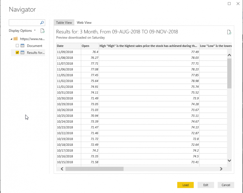
Click on the ‘Web’ from the Get data as shown here.
单击获取数据中的“ Web”,如下所示。
In this example, we will import the data from the NASDAQ website. Paste the URL from which you want to import the data into Power BI dataset.
在此示例中,我们将从纳斯达克网站导入数据。 将要从中导入数据的URL粘贴到Power BI数据集中。
Click OK and it launches Navigator where we can see the table view of the data.
单击确定,它将启动导航器,在该导航器中我们可以看到数据的表视图。
We can get the web view of the URL as well from the ‘web view’ link.
我们也可以从“网络视图”链接中获取URL的网络视图。
Click on ‘Edit’ and modify the column names. To modify column name, double-click on the particular column name and edit it.
单击“编辑”并修改列名称。 要修改列名,请双击特定的列名并进行编辑。
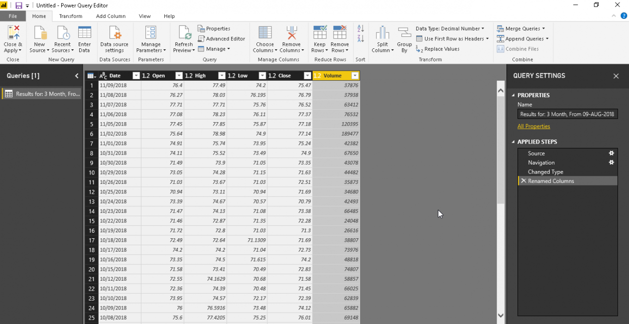
‘Close & Apply’ to save the formatted data.
单击“关闭并应用”以保存格式化的数据。
It applies the query changes and shows below pop up message.
它应用查询更改并在弹出消息下方显示。
Now, in this step, the data set is now shown in the ‘Fields’ section. Our dataset contains close, data, high, low, close and volume the stock for that particular day.
现在,在此步骤中,数据集现在显示在“字段”部分中。 我们的数据集包含该特定日期的收盘价,数据,高,低,收盘和成交量。
Candlestick chart is a custom visual so we need to download it from the Marketplace. In the menu bar, click on the ‘From Marketplace’ and search for the keyword ‘Candlestick’.
烛台图是自定义外观,因此我们需要从市场下载。 在菜单栏中,单击“来自市场”,然后搜索关键字“烛台”。
Add the visual by clicking on the ‘Add’ and below icon is added into visualization along with the success message.
通过单击“添加”来添加视觉效果,下面的图标将与成功消息一起添加到可视化中。
Double click on the Candlestick chart icon and adjust the size of the visual give it a proper visual.
双击烛台图表图标并调整视觉效果的大小,以提供适当的视觉效果。
In the detail section, add the respective value as below.
在详细信息部分中,如下添加相应的值。
- Axis: – Date 轴:–日期
- Open: Open field from the dataset 打开:从数据集中打开字段
- Close: Close field from the dataset 关闭:关闭数据集中的字段
- High: High field from the dataset 高:数据集中的高字段
- Low: Low field from the dataset 低:数据集中的低字段
This generates the candlestick chart as below.
这将生成如下的烛台图。
To understand the candlestick chart better, let us reduce the data size. To do so, click on ‘Edit Queries’ from the menu bar.
为了更好地了解烛台图,让我们减小数据大小。 为此,请从菜单栏中单击“编辑查询”。
This opens the power query editor where we can make changes in the data set.
这将打开电源查询编辑器,我们可以在其中更改数据集。
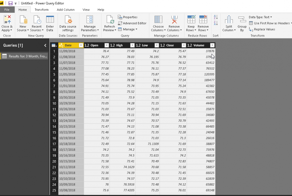
Now, we want to narrow the data set so click on the ‘Remove Rows’ and ‘Remove Bottom Rows’.
现在,我们要缩小数据集,因此请单击“删除行”和“删除底部行”。
Enter the number of rows we want to remove from the bottom of the dataset. In this example, we want to remove 30 rows from the bottom. Click on OK to apply the changes.
输入我们要从数据集底部删除的行数。 在此示例中,我们要从底部删除30行。 单击确定以应用更改。
Click on ‘Close & Apply’ to save the changes in the data set.
单击“关闭并应用”以将更改保存在数据集中。
Now, Candlestick chart is generated with the updated data set. This chart is visible now to understand it properly.
现在,使用更新的数据集生成烛台图。 现在可以看到此图表,以正确理解它。
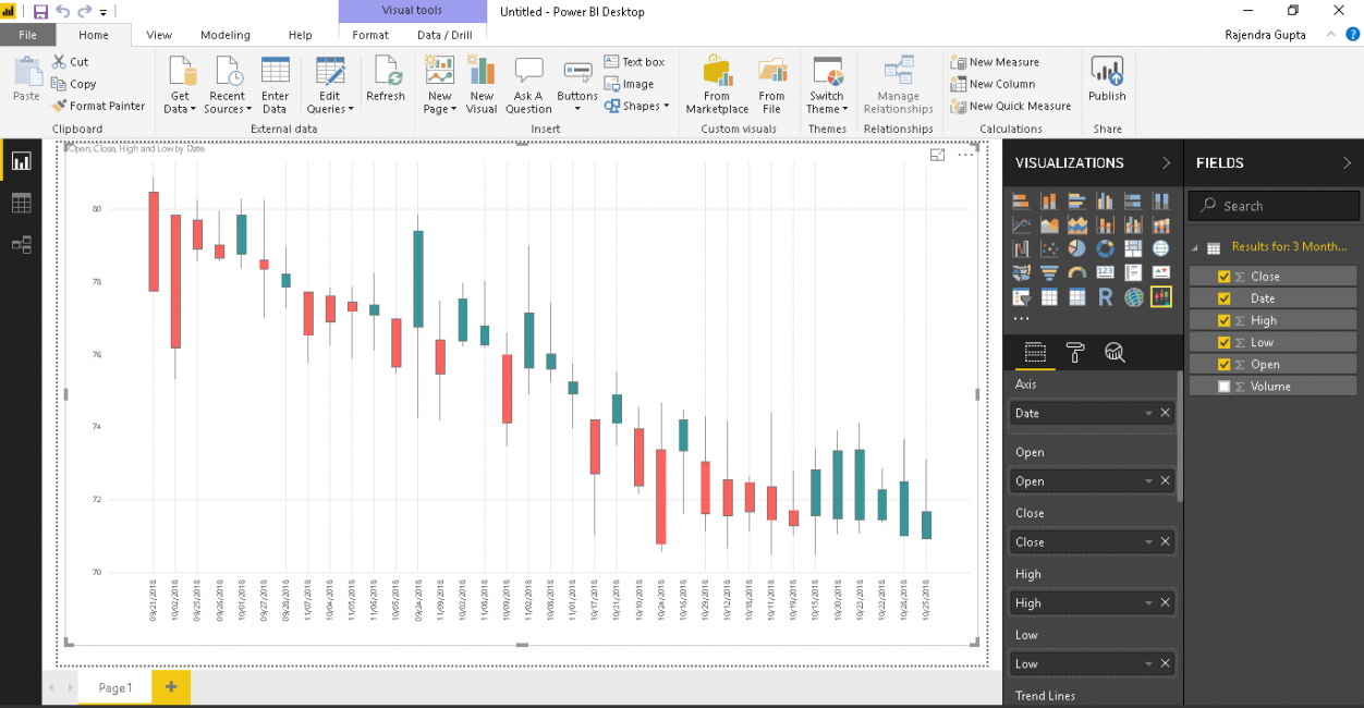
In the chart, candlesticks are in two colors. This is because of the bearish and bullish pattern for the timeframe. We can control the colors of these candlesticks, which we will see in a later section of the article.
在图表中,烛台有两种颜色。 这是因为时间框架的看跌和看涨模式。 我们可以控制这些烛台的颜色,我们将在本文的下一部分中看到。
If we hover the mouse over a candlestick, it shows the complete detail of the stock open, close, high and low values.
如果将鼠标悬停在烛台上,它将显示股票开盘价,收盘价,最高价和最低价的完整细节。
Now let us do some formatting to customize the chart and get details in the much better way.
现在,让我们进行一些格式化以自定义图表并以更好的方式获取详细信息。
Trend lines: we can add trend lines to under the stock trend for a particular value. For example, in below we specified trend lines for the ‘High’ value in the dataset.
趋势线:我们可以将趋势线添加到特定价格的股票趋势下。 例如,在下面,我们为数据集中的“高”值指定了趋势线。
We can add multiple trend lines in a candlestick chart. In below screenshot, you can see trend lines for both the high and low values.
我们可以在烛台图中添加多个趋势线。 在下面的屏幕截图中,您可以看到高值和低值的趋势线。
Candles colors: By default, it shows the below colors for the bullish and bearish candlestick chart pattern.
蜡烛颜色:默认情况下,它为蜡烛图图表的看涨和看跌显示以下颜色。
Let us change the color for both the bearish and bullish candles. You can view the changes quickly in the chart.
让我们更改看跌蜡烛和看涨蜡烛的颜色。 您可以在图表中快速查看更改。
High/Low Caps: we can place the high and low-value caps. To do so, turn on the ‘High/Low caps’ and you can find the caps as pointed in the chart.
高/低上限 :我们可以设置高和低上限。 为此,打开“上限/下限”,您可以找到图表中指出的上限。
Borders color: we can change the borders colors for the candlesticks with the option ‘Borders color’. Choose an appropriate color and it is applied to the candlestick chart.
边框颜色 :我们可以使用“边框颜色”选项更改烛台的边框颜色。 选择一种合适的颜色,并将其应用于烛台图表。
Trend lines: By default, trend lines appearance is straight and we have common colors for both the high and low-value trend lines.
趋势线:默认情况下,趋势线的外观是笔直的,高值和低值趋势线都有相同的颜色。
If we change the appearance to ‘Monotone’, you can notice the difference in the trend lines shape.
如果将外观更改为“单调”,您会注意到趋势线形状的差异。
Similarly, for ‘Smooth’ appearance the trend line appears as below.
同样,对于“平滑”外观,趋势线如下所示。
As mentioned earlier, by default trend line color is common for both high and low values. Let us change different color for both the trend lines as shown here.
如前所述,默认情况下,趋势线颜色对于高值和低值都是通用的。 让我们为两条趋势线更改不同的颜色,如下所示。
Legend: By default, the legend is set to off. If we set it ‘On’, we can see a legend as highlighted below.
图例:默认情况下,图例设置为关闭。 如果将其设置为“开”,则可以看到以下突出显示的图例。
We can give a name to legend as well. In below example, I gave legend name as ‘Stock Price’ and you can see legend name highlighted here.
我们也可以给传说命名。 在下面的示例中,我将图例名称命名为“股票价格”,您可以在此处看到突出显示的图例名称。
The x-axis and Y-Axis Formatting: We can do the formatting for the x-axis and y-axis such as color, text size, text font etc.
x轴和Y轴格式设置:我们可以对x轴和y轴进行格式设置,例如颜色,文本大小,文本字体等。
In below example, I change the formatting for x-axis and you can notice the change.
在下面的示例中,我更改了x轴的格式,您会注意到这一变化。
Similarly, for y-axis formatting, the chart looks as below.
同样,对于y轴格式,图表如下所示。
Color Blindness: we have different option to set color formatting by vision. By default, vision is set to Normal in candlestick chart.
色盲:我们有不同的选项可以根据视觉设置颜色格式。 默认情况下,烛台图中的视觉设置为正常。
Below are the options to choose for the vision:
以下是为愿景选择的选项:
- Normal 正常
- Protanopia 千变万化
- Deuteranopia 十眼
- Deuteranomaly 申命记
- Tritanopia Tritanopia
- Tritanomaly 三角虫
- Achromatopsia 色盲
- Achromatomaly 消色差
- Low Contrast 低对比度
Let us change the vision to ‘Deuteranomaly’ in Candelstick chart and we can notice the change the color combination of candlestick chart.
让我们在Candelstick图表中将视野更改为'Deuteranomaly',然后可以注意到烛台图表的颜色组合发生了变化。
Similarly for ‘Achomatomaly’ chart looks as below
同样,'Achomatomaly'图表如下所示
结论 (Conclusion)
Candlesticks chart in Power BI Desktop helps to analyze the security (stock) data for the data analyst or the traders so that they can read the stock price movement and technical charts effectively. You can explore this chart with your data set. We will cover more useful charts in upcoming articles.
Power BI Desktop中的烛台图有助于分析数据分析师或交易者的安全(股票)数据,以便他们可以有效地读取股价走势和技术图表。 您可以使用数据集浏览此图表。 我们将在以后的文章中介绍更有用的图表。
目录 (Table of contents)
| Power BI Desktop Interactive chord diagrams |
| Power BI Desktop Pulse Charts |
| How to create a Word Cloud generator in Power BI Desktop |
| Power BI desktop Mekko Charts |
| Hexbin Scatterplot in Power BI Desktop |
| Candlestick chart for stock data analysis in Power BI Desktop |
| Enlighten World Flag Slicer in Power BI Desktop |
| Flow Map Chart in Power BI Desktop |
| Ask a Question feature in Power BI Desktop |
| Power BI Desktop Q&A data interaction examples |
| Power BI Desktop and Python; like Peanut Butter and Chocolate |
| Power BI Desktop Pie Chart Tree |
| Importing data from a PDF file in Power BI Desktop |
| Power BI Desktop交互式和弦图 |
| Power BI桌面脉冲图 |
| 如何在Power BI Desktop中创建词云生成器 |
| Power BI桌面Mekko图表 |
| Power BI Desktop中的Hexbin散点图 |
| 用于Power BI Desktop中的库存数据分析的烛台图 |
| 在Power BI桌面中启发世界国旗切片器 |
| Power BI Desktop中的流程图 |
| Power BI Desktop中的“提问”功能 |
| Power BI桌面问答数据交互示例 |
| Power BI Desktop和Python; 像花生酱和巧克力 |
| Power BI桌面饼图树 |
| 从Power BI Desktop中的PDF文件导入数据 |
翻译自: https://www.sqlshack.com/candlestick-chart-for-stock-data-analysis-in-power-bi-desktop/
用于Power BI Desktop中的库存数据分析的烛台图相关推荐
- power bi可视化表_滚动器可视化功能,用于Power BI Desktop中的股价变动
power bi可视化表 In the article, Candlestick chart for stock data analysis in Power BI Desktop, we explo ...
- Power BI Desktop中的“提问”功能
In this article, we are going to learn how to use Power BI Desktop Q&A functionality to enable u ...
- 如何在Power BI Desktop中创建词云生成器
In this article, we'll look at how to create a Word cloud generator in Power BI Desktop, including i ...
- power bi导入文件夹_从Power BI Desktop中的PDF文件导入数据
power bi导入文件夹 Power BI Desktop is a useful reporting and analytical tool to represent data in variou ...
- power python_在 Power BI Desktop 中运行 Python 脚本
在 Power BI Desktop 中运行 Python 脚本Run Python scripts in Power BI Desktop 06/02/2020 本文内容 你可以直接在 Power ...
- Power BI Desktop中的分解树
介绍 (Introduction) Power BI is enriched with many useful visualizations and helps to represent data i ...
- Power Bi Desktop 中如何做出像 Excel 一样的透视表,PowerBi的分组依据用法
Power Bi Desktop 中如何做出像 Excel 一样的透视表 或许 Power Bi Desktop 在国内普及度仍然不高,或许大家觉得这个太过简单,反正我没有找到正解,接近正解的不过是 ...
- 在Power BI Desktop中实施星型架构
In this article, you will see how to implement a star schema in Power BI. Microsoft Power BI is a bu ...
- hexbin_Power BI Desktop中的Hexbin散点图
hexbin We have explored useful visualizations in Power BI Desktop with my previous articles that cov ...
最新文章
- Clion 远程开发 配置
- 分数化小数(模拟除法操作)
- 随记一个C的毫秒级群PING
- java掩码校验_Java 检查Ip掩码
- VC按最小化、关闭按钮、Esc都隐藏主窗口
- 笨办法学 Python · 续 练习 40:SQL 读取
- 图书室用计算机,电子阅览室使用
- 修改监视器驱动为大显示器来提高屏幕分辨率
- 什么软件可以测试电脑显示器坏点,怎么检测液晶显示器亮点、暗点、坏点
- 「又报错了TAT」 编译器报错是什么原因error: lvalue required as left operand of assignment|
- 大学python挂科补考_大学挂科后补考不过怎么样一种体验?
- 不同空间任务要求下认知地图的神经表征
- java中怎么输入中文_MultiMC下载-MultiMC中文实用版 v1.0
- brctl 使用说明
- rsync使用ssh指定端口
- 【MidJourney】初体验——账号注册与基本操作
- R语言之系统聚类(层次)分析之图谱形式完整版
- 微信小程序实现充值,自定义金额充值
- qq 4 android,Android QQ HD v5.5.4 正式版发布
- Terraformer-wkt-parser wkt和geoJson转换