供独立游戏开发者参考的2D美工教程
作者:Chris Hildenbrand
引言
对大多数独立游戏开发者来说,自己亲自解决美术设计的工作是必然的——可能是因为财政预算上的限制,或根本就没有财政预算,许多年轻的独立游戏从业者雇不起专门的美工或外包美术设计。(请点击此处阅读教程第二部分、第三部分、第四部分、第五部分、第六部分)
幸亏我们还有大量的免费软件,如 gimp、 inkscape、 truespace、daz studio 和 vue pioneer 等(在此只列举几款),再加上基本能理解美术创意,几乎人人都能制作出惊艳又专业的作品。
首先,我将带领大家做几个基础的练习,以巩固对美术设计的理解。所有练习用到的都是免费软件。操作流程与 Adobe Illustrator、 Adobe PhotoShop和 CorelDraw等软件相似。我会告诉你们如何运用这些软件。因为美术创作软件和技术太多了,所以我没有办法面面俱道,不过我尽量保证以下练习用的都是你所选择的软件吧。
在开始我们的教程以前,我先澄清几个观点:
1、“我需要昂贵的软件工具才能制作出真正专业的游戏美术设计。”
错,不需要!现有大把免费软件供你选择。如果说Blender是3D领域的王道,那么Gimp就是2D世界的霸主。对于全职美工来说,把工具升级至“行业标准”还是有道理的,特别是与其他使用标准文件格式的人合作时,因为那样可以使交接美术设计工作更容易。
2、“有了昂贵的工具,美术制作自然就会更好。”
错,不会。只有美工才能让作品更好。即使手头上只有一支笔一张纸,优秀的美工也会能做出了不起的设计;最高级的工具也需要优秀的美工来操作才能产生佳作。
3、“我不懂美术,我连简笔画者不会。”
错,你行。这就是现代计算机的意义所在,让没有美术设计资格证书的人也能制作出强悍的游戏美术效果。
4、“我的游戏本身就很好了,不需要美术设计了。”
好吧,你可以这么说。现在的独立游戏市场还在速度扩张着,人们对它的关注也比过去多了。要让你的游戏在众多竞争者中脱颖而出,你的游戏应该“全面发展”——玩法要有趣,画面和音效也不能落后。
共同的阻碍
期望过高:
独立游戏开发者面临的共同问题之一是,对自己期望过高。对于势单力薄的个人开发者或小工作室,不要妄想制作出大工作室才有能做出来的AAA游戏。你确实应该朝大师级的方向努力,这正是独立游戏制作的奥义。尽力而为,坚持不懈,超越自我……但你得现实一点,根据自己的能力和预算调整自己的期望,这是走向成功的重要一步。
确定重点:
许多时候,游戏创意来源于一个灵感的火花。我们只是想到游戏的可能运作方式,就着手制作。一开始,游戏制作过程很顺利,但随着开发深入,问题会渐渐暴露出来。所以,从美术设计入手游戏开发并不适合,应该先确定游戏引擎/核心玩法。一旦确定了游戏玩法,要想出适合整个游戏的视觉效果就非常容易了。
一致性:
为了产生良好的游戏体验,画面的在视觉和感觉上的一致性是非常重要的。从图标、启动画面到游戏屏幕,都必须保持一致。
最常见的错误是:
字体太多——游戏UI的字体控制在2到3种足矣(除非字体是以图片的形式用于表示商店/包装等)。
反差强烈——保持画面处于接近的水平,你可以采用色彩过渡——从开头到BOSS战/史诗场景,色彩越来越丰富。
特效——好是好,但许多“美工”认为特效使用得越多,画面会……我的建议是节制地使用个把特效,尽量重复利用或调整变量。
光照——看你的屏幕,想象一下产生高光所需的光源、游戏内物品/UI元素的阴影……吓着了吧,相同屏幕上的物品总是被打上随机的光影。
焦点缺失:
看到你的美术设计与游戏玩法和代码一样精彩,你非常容易陷入得意忘形之中。我们总是把关注重点放在自己喜欢的元素上,而忽略了那些我们不感兴趣的部分。例如,菜单系统和UI通常是被我们冷落的对象。这些元素往往是游戏开发的最后阶段才补上的,而那时候,制作人员的积极性都不太高。然而,这些却是最先映入玩家眼帘的东西,会极大地影响玩家对游戏的看法和感觉。
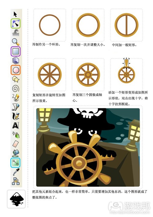
教程
第一个教程是在inkscape上完成的,主要用到圆形工具(在工具条中用橙色框标出)和锚点工具(绿色框标出)。
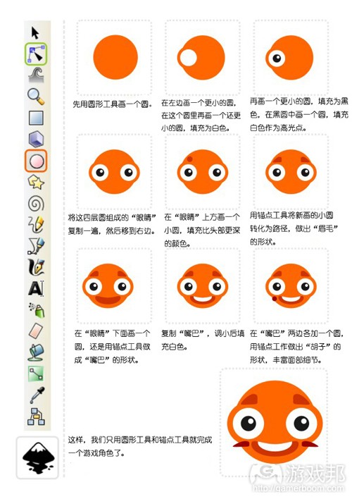
教程图1(from gamasutra)
教程图2(from gamasutra)
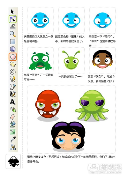
使用位图工具(游戏邦注:如gimp中的圆形)可以制作出相似的图案。操作流程稍有不同,不过只要你保存不同图层上的元素,移动、改变和调整都很简单。
教程图3(from gamaustra)
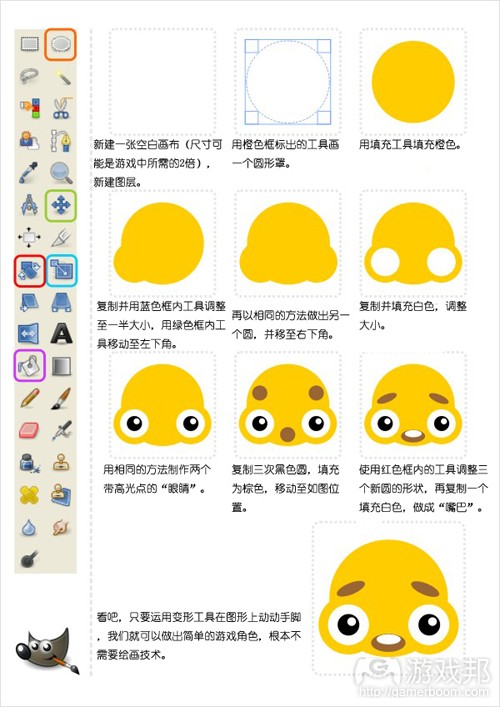
接下来的教程和上面的差不多,这回使用的是矩形工具:

教程图4(from gamasutra)
教程图5(from gamaustra)

教程图6(from gamasutra)
这幅图的概略图看起来有些乱,但从中我们可以发现,这整幅图都是由矩形和变形的矩形组成的。
渐变填充是一个非常有用的工具。我们来看看下面这个教程:

教程图7(from gamasutra)

教程图8(from gamasutra)
下次我们将综合运用Union、Intersection、Exclusion、Difference和Division来制作更复杂的图形。

教程图9(from gamasutra)
教程图10(from gamasutra)
但愿读者们能自己尝试着制作与教程类似的图案,从中发现inkscape、gimp等软件的乐趣。(本文为游戏邦/gamerboom.com编译,拒绝任何不保留版权的转载,如需转载请联系:游戏邦)
2D Game Art For Programmers – Part 1 [updated]
by Chris Hildenbrand
Introduction:
Creating your own art work is a necessity for most independent developers. Due to the budget restraints or in a lot of cases the complete lack of a budget a lot of young indie game developer can’t afford to hire an artist or buy art assets.
With the help of free software like gimp, inkscape, truespace, daz studio and vue pioneer (just to mention a few) combined with a basic understanding of art creation pretty much anyone can create impressive and professional looking results.
I will try to start with some basic ideas and exercises to improve this kind of understanding. All of the examples will be based on free software. The workflow will be similar if you work with different software like Adobe Illustrator, Adobe PhotoShop, CorelDraw or others. I will try to mention the different approaches for those software packages. With the vast variety of software available at the moment and the sheer endless amount of our art creation tools and techniques it is impossible to cover everything but I will try to keep my examples basic enough to work with the software of your choice.
Let me start by clarifying some common believes when it comes to creating game at.
“I need expensive software tools to create truly professional game art.”
No, you don’t! There is a huge amount of free tools available that offer a true alternative. Gimp is one of the most well-known examples in the 2D realm as well as Blender in 3D field.
For the full time game artist upgrading your tools to ‘ industry standards’ makes sense. Especially when collaborating with others using standard file format makes sharing and exchanging art a lot easier.
“Buying an expensive tool will automatically create better art.”
No, it won’t. It’s always the artist creating the art that makes it great. Given the simplest tools like pen and paper a good artist can still create stunning pieces, while the most sophisticated tools still need a good artist to create something special.
“I can’t do art. I can’t even draw a stick figure.”
Yes, you can. This is where modern computers to come in and allow you to create good game art without having a graphic arts degree.
“My game is good as it is. I don’t need art.”
Yes, you do. The independent game market is getting larger and larger and is attracting a lot more attention than it used to a few years back. In order to stand out your game should be the whole deal – have a great game play as well as rewarding and consistent visuals and matching sound and music.
Common hurdles
High Expectations:
One of the main problems facing independent developers are the expectations they have themselves. For single developers or small studios it is close to impossible to create AAA games match the quality of big studios. You should try and aim for the stars. Making games is all about that. Do the best you can and constantly push your limits and improve your skills…
but thinking realistically and adjusting your expectations to your abilities and your budget is a big step towards creating the best game you can create.
Defining a theme:
A lot of the time game creation happens with a spark. We have an idea of how the game playing might work and start creating. Creating very concrete in game art in the early stages of development can often lead to problems as the game evolves during development.
It usually helps to create a working game engine/ core gameplay before starting on the actual art work. Once you know how the game plays it’s a lot easier to find a visual theme that encompasses the whole game.
Consistency:
Creating a consistent look and feel is a key element in creating a good gaming experience. It starts with the icon, the splash screen and goes all the way through to the game over screen. The most common mistakes are:
- the overuse of fonts – stick to 2 or 3 for the whole game UI [unless the font is used in images as lettering for shops/ packaging/ etc.]
- drastic changes in light and contrast – keep screens on a similar level – you can progress through the colour realm – usually starting out less colourful and getting more colourful for boss/ epic scenes
- photoshop effects – they are fun but a lot of ‘artist’ think the more you use the better the image will be… My suggestion is limit your use of fx to a few and keep reusing and variating them
- lighting – look at your screens and imagine the light sources needed to create the highlights, shadows of your ingame/ ui elements… It’s scary how often you find lights being randomly used for objects that appear on the same screen
Losing focus:
It is only easy to get carried away with your art work as well as game play or coding. We all tend to focus on those elements we like to do while neglecting those we don’t. A good example is generally the menu system/ UI. These usually are implemented at a late stage in the development with motivation at a low point. Yet they are one of the first things the player gets to see and they can greatly define the look and feel of the game.
Let’s get started
The first tutorial is based on inkscape using mainly the circle tool [marked in orange in the tool bar on the left] and the nodes tool [marked in green].
A very similar result can be created in a bitmap tool [e.g. using circle shapes in gimp]. The work flow is a little different but as long as you keep elements on different layers it’s easy to move, alter and modify.
The second tutorial works the same way – this time using squares:
The outline version still looks somewhat messy but it shows that the whole scene is made up of nothing but squares and deformed rectangles.
One very useful tool is the gradient fill. Let’s have a look at it in the next tutorial:
Next we are moving on to more complex shapes with the help of combined shapes using union, intersection, difference, exclusion and division.
Let’s take the gradient fill to the next level and work with colour and alpha to create a simple underwater background.
Hint:
Use the ‘Page Up’ and ‘Page Down’ key to adjust the order of objects [e.g. place the sea anemones in the mid ground behind the light rays.]
I would like to add more life to the underwater scene and create some fish. The basic principle when adding ‘real’ elements to a vector scene is to look at the shapes and ‘deconstruct’ them into basic elements like the circle, square, rectangle or ellipse.
I usually do a quick google image search for a reference image to get a better idea what I am going to create. In this case the ‘yellow reef fish’ search came up with a nice yellow longnose butterfly fish.
It works great as the main body is kind of squarish and the front has a triangular shape.
The same approach works the same with far more complex elements. It’s a matter of seeing the ‘building blocks’.
This concludes the first post. I hope you have fun trying to recreate some of the tutorials yourself or just play around with inkscape, gimp & co.
…and please let me know what you think about the tutorials, tell me what you would like to see featured or would like me to change.(source:gamasutra)
经过第一部分教程的练习,我们已经掌握了圆形和方形工具,还了解了填充和组合对象的方法。现在我们可以进一步学习制作基本的场景了。(请点击此处阅读本教程第三部分、第四部分、第五部分、第六部分内容)
渐变
我们再进一步运用渐变填充工具,制作一个简单的水下背景。

教程图11(from gamasutra)

教程图12(from gamasutra)
小贴士:
用“Page Up”和“Page Down”键来调整对象的顺序(如把中间的海葵层移到光线层后面)。
我想给这个海底世界增加一点生机,所以我要制作一些鱼。在矢量场景中增加“真实的”元素,其基本原理是观察形状,然后把图形“分解”成圆形、矩形、方形或椭圆形等基本元素。
我通常是从谷歌搜索一些参考图片,以进一步完善我的想法。我搜到了一些黄色的“长头蝶鱼”的图片。
我的“分解”法很有效:鱼的主体接近方形,前部略呈三角形。

教程图13(from gamasutra)
这个“分解”图形的方法也适用于其他更复杂的图形,基本原理就是找出“组成的积木”。
clip工具
逛完了海底世界,我们还要到岸边的沙滩上看看日落。接下来我们再学习一些更实用的工具和技术。

教程图14(from gamasutra)
这就是我们的“摇滚式”日落,我们要做的就是把圆形变成水中的石头,再进行渐变透明填充处理。

教程图15(from gamasutra)
用矢量制作图形的另一个优势在于它的可延展性——对象可以无损质量地收缩或放大,便利了图片的编辑和调整。
如图,棕榈树的大小决定了观察者的观看距离。较小的棕榈树使小岛看起来更小,更加遥远,而大的棕榈树则让小岛看起来更大。更加接近。

教程图16(from gamasutra)
顺便一提,云的形状是一样的,因为小岛只是压缩了,并配合天空的渐变调整了颜色。请尝试一下重复利用图形,甚至只需要微调整、重上色、压缩、旋转或增加变量,你的场景就会更加生动有趣。
注:
我在教程中用到的图形(棕榈树等)是来自预先定义好的图形(游戏邦注:如圆形、方形、星形等),这只是一种选择。徒手或直线工具也可以达到相同的效果,但需要一定的美术技巧。
为了丰富棕榈树的细节,我们需要运用到inkscape的两个“更高级”的功能:插值(Interpolation)和路径效果(Path Effects)。

教程图17(from gamasutra)
改变叶片,增加插值以及参考一些图片可以进一步改善棕榈的外观。
我希望这些稍微高级一点的功能不会给大家带来太多麻烦。

教程图18(from gamasutra)
如果你想制作如上图所示的邮票齿状边缘效果,可以按照下面的步骤进行操作:

教程图19(from gamasutra)
注:先进行取消组合并集合圆的原因在于,Inkscape仅限两个对象之间进行Union、Difference、Intersection、Exclusion或Division的操作。
而CoreIDraw之类的工具却可以进行成组或者几个选中对象之间的同时操作,不妨挖掘下你的矢量应用程序还有哪些更顺手的操作指令吧。(本文为游戏邦/gamerboom.com编译,拒绝任何不保留版权的转载,如需转载请联系:游戏邦)
2D Game Art For Programmers – Part 2
by Chris Hildenbrand
After the initial playing around with circles and squares, learning a little bit about the fills and combining objects [part 1] , I would like to move on to a basic scene.
Having more fun with gradients:
Let’s take the gradient fill to the next level and work with colour and alpha to create a simple underwater background.
Hint:
Use the ‘Page Up’ and ‘Page Down’ key to adjust the order of objects [e.g. place the sea anemones in the mid ground behind the light rays.]
I would like to add more life to the underwater scene and create some fish. The basic principle when adding ‘real’ elements to a vector scene is to look at the shapes and ‘deconstruct’ them into basic elements like the circle, square, rectangle or ellipse.
I usually do a quick google image search for a reference image to get a better idea what I am going to create. In this case the ‘yellow reef fish’ search came up with a nice yellow longnose butterfly fish.
It works great as the main body is kind of squarish and the front has a triangular shape.
The same approach works the same with far more complex elements. It’s a matter of seeing the ‘building blocks’.
Staying in shape… the Clip Tool…
In line with the water theme let’s go ashore and look at a sunset on the beach to introduce some more helpful tools and techniques.
This is our basic ‘pop style’ sunset with some modified circles and gradient alpha fills added to represent some rocks in the water.
One of the ‘wonderful’ things about working with vectors ist the scalability. Objects can be scaled up and down without loss, allowing for easy editing and adjusting of the illustration.
In this case the scale of the palm trees will define the viewer’s perception of distance. Smaller palm trees will put the island further in to the distance while large trees will ‘bring’ it up close.
Btw. the clouds are the same shape as the island just squashed and coloured in a colour matching the sky gradient. Try reusing shapes even just slightly modified, recoloured, squashed, rotated or flipped to speed things up, add variation and make your scene more interesting.
Note:
A lot of the objects I am covering in my tutorials (like the palm trees above) working from predefined shapes (circle, square, star, etc.) is only one option. The freehand or straight line tool will create identical shapes but require a little more artistic skill.
For our detailed palm we need two ‘more advanced’ features of inkscape: Interpolation and Path Effects.
Varying the fronds, adding to the interpolation and checking some reference images can improve the look of the palms even further.
I hope even these slightly more advanced features don’t pose too much of a problem. Enjoy and stay tuned for more!(source:gamasutra)
供独立游戏开发者参考的2D美工教程相关推荐
- 供独立游戏开发者参考的2D美工教程(一)
对大多数独立游戏开发者来说,自己亲自解决美术设计的工作是必然的--可能是因为财政预算上的限制,或根本就没有财政预算,许多年轻的独立游戏从业者雇不起专门的美工或外包美术设计.(请点击此处阅读教程第二部分 ...
- 供独立游戏开发者参考的2D美工教程(五)
经过前面四个部分的学习,我们已经掌握了基本的角色制作技术,接下来我们将学习如何给角色添加动画效果.(请点击此处阅读本教程第一.第二.第三.第四.第六部分内容) 在前面的四部分教程中,角色的上下肢的两部 ...
- 供独立游戏开发者参考的2D美工教程(三)
在本教程的前两个部分,我们已经分别学习了圆形工具.矩形工具.填充.组合对象和渐变场景等.现在我们开始学习一些更有趣的东西吧.(请点击此处阅读本教程第一.第二.第四.第五.第六部分内容) 制作游戏角色 ...
- 供独立游戏开发者参考的2D美工教程(二)
经过第一部分教程的练习,我们已经掌握了圆形和方形工具,还了解了填充和组合对象的方法.现在我们可以进一步学习制作基本的场景了.(请点击此处阅读本教程第三部分.第四部分.第五部分.第六部分内容) 渐变 我 ...
- 供独立游戏开发者参考的2D美工教程(九)
在本教程中,我将教大家如何用圆形工具和排列工具制作可爱的卡通动物.( 请点击此处阅读本教程第一 . 第二. 第三. 第四 . 第五. 第六 . 第七. 第八篇 ...
- 供独立游戏开发者参考的2D美工教程(七)
早在2003年和2005年为<HeliAttack 2>.<HeliAttack 3>制作美术内容的时候,我就深为直升机所着迷.它们是很棒的游戏资产.(请点击此处阅读本教程第一 ...
- 供独立游戏开发者参考的2D美工教程(四)
第1个教程我们学习了圆形工具.矩形工具.一点点填充以及组合对象,第2个教程我们学习了利用渐变制作场景,第3个教程则是游戏角色的创意制作.这次我们将学习基本的动画制作.(请点击此处阅读本教程第一.第二. ...
- 供独立游戏开发者参考的2D美工教程(八)
我在上一篇教程中提到,只要你的核心形状到位了,据此调整并创造变体也就相当容易了.(请点击此处阅读本教程第一.第二.第三.第四.第五.第六.第七部分内容) 本篇教程将分享如何制作出更像上篇教程首张< ...
- 独立游戏开发者谈《World Of Goo》诞生记
此刻,在旧金山的一间咖啡吧有许多人坐着看自己的笔记本电脑.他们可能是在查看邮件,也可能是在听音乐,还可能是正在办公的自由职业者--他们每天溜出荒凉的公寓来咖啡吧,因为在这里不仅可以蹭免费的WiFi.喝 ...
最新文章
- 1行代码搞定Latex公式编写,这个4.6M的Python小插件,堪称论文必备神器
- GNSS系列--GNSS坐标系转换
- Python遍历列表时删除元素
- springCloud(22):Eureka总结提升
- php spss,spss数据分析的一般步骤
- Node.js 极简笔记
- ☆☆在Eclipse中编译NDK的so文件(普通安卓项目转换为NDK项目的设定)
- mfc实现播放器功能,双击全屏,再双击还原
- IDEA 访问Maven私服与上传组件
- mongo 的逻辑存储和物理存储
- extjs4.0视频教程
- stata 空间杜宾模型_利用STATA创建空间权重矩阵及空间杜宾模型计算----命令
- airpak模拟案例_《CFD模拟基本概念》Airpak模拟高级班48讲
- BOM Routing (2009-08-31 23:46:00)
- Gungho重点工作事项督办督查跟踪管理方案
- DDR4原理及硬件设计
- 关于网络隔离技术与网闸的理解
- 支持html5特性的浏览器,五大主流浏览器对CSS3和HTML5特性支持情况的详细清单
- 重新整理秋招准备的思路-9.20
- hiredis的各种windows版本