贝尔曼福特_福特自行车之旅
贝尔曼福特
FordGoBikes数据旅行的数据探索 (Data Exploration on FordGoBikes Data Trip)
初步争吵 (Preliminary Wrangling)
This dataset has been taken from the FordGoBikes website, which tells us about how much a bike has been used in terms of duration and distance and what type of user has used it.
该数据集取自FordGoBikes网站,该网站告诉我们有关自行车的使用时间和行驶距离以及使用哪种类型的用户的信息。
# import all packages and set plots to be embedded inlineimport numpy as npimport pandas as pdimport matplotlib.pyplot as pltimport seaborn as sb%matplotlib inlinedf.info()<class 'pandas.core.frame.DataFrame'>RangeIndex: 192082 entries, 0 to 192081Data columns (total 14 columns): # Column Non-Null Count Dtype --- ------ -------------- ----- 0 duration_sec 192082 non-null int64 1 start_time 192082 non-null object 2 end_time 192082 non-null object 3 start_station_id 191834 non-null float64 4 start_station_name 191834 non-null object 5 start_station_latitude 192082 non-null float64 6 start_station_longitude 192082 non-null float64 7 end_station_id 191834 non-null float64 8 end_station_name 191834 non-null object 9 end_station_latitude 192082 non-null float64 10 end_station_longitude 192082 non-null float64 11 bike_id 192082 non-null int64 12 user_type 192082 non-null object 13 bike_share_for_all_trip 192082 non-null object dtypes: float64(6), int64(2), object(6)memory usage: 20.5+ MB# Converting logitudes and Latitudes into distances using haversine formuladef haversine_np(lon1, lat1, lon2, lat2):"""Calculate the great circle distance between two pointson the earth (specified in decimal degrees)All args must be of equal length."""lon1, lat1, lon2, lat2 = map(np.radians, [lon1, lat1, lon2, lat2])dlon = lon2 - lon1dlat = lat2 - lat1a = np.sin(dlat/2.0)**2 + np.cos(lat1) * np.cos(lat2) * np.sin(dlon/2.0)**2c = 2 * np.arcsin(np.sqrt(a))km = 6367 * creturn km# Applying haversinedf['distance'] = haversine_np(df['start_station_longitude'],df['start_station_latitude'],df['end_station_longitude'],df['end_station_latitude'])您的数据集的结构是什么? (What is the structure of your dataset?)
There are 192082 times the bikes have been issued by the Ford Go Bikes company in January, 2019. There are 14 columns out of which the numerical variable is the duration column containing the number of seconds the bike was issued for.
2019年1月,Ford Go Bikes公司发布了192082次自行车。其中有14列,其中数字变量是Duration列,其中包含发布自行车的秒数。
Timestamps are given as start_time and end_time.
时间戳记为start_time和end_time 。
- Starting station’s latitude and longitude is given along with the station id. Same for the ending station.
起始站的纬度和经度与站ID一起给出。 结束站也一样。 - A bike id is given.
给出了自行车ID。 - User type: whether the user is a subscriber of the company’s service or just a customer for the day.
用户类型:用户是公司服务的订户还是当天的客户。 - If the bike has been shared for all trip: Yes or No.
如果已为所有行程共享自行车:是或否。 - I have also used haversine formula to calculate, with the given latitudes and longitudes, the distance travelled by each bike in km.
我还使用Haversine公式,根据给定的纬度和经度,计算出每辆自行车的行驶距离(以公里为单位)。
数据集中感兴趣的主要特征是什么? (What is/are the main feature(s) of interest in your dataset?)
I’m most interest in figuring out how is a bike ride on an average, in the provided dataset. Also, the distance traveled by the bike.
我最感兴趣的是在提供的数据集中弄清楚自行车的平均骑行情况。 另外,自行车的行驶距离。
您认为数据集中的哪些特征将有助于支持您对感兴趣的特征进行调查? (What features in the dataset do you think will help support your investigation into your feature(s) of interest?)
I think duration will be the most important feature that will support my investigation, however I might have to convert it into minutes for better understanding. I can then see whether the bikes are more used by customers or subscribers, and who uses it for more time. Also, the distance covered by a bike.
我认为持续时间将是支持我调查的最重要功能,但是我可能需要将其转换为分钟以便更好地理解。 然后,我可以查看这些自行车是否被客户或订户更多使用,以及谁使用它的时间更长。 此外,自行车所覆盖的距离。
单变量探索 (Univariate Exploration)
In this section, investigate distributions of individual variables. If you see unusual points or outliers, take a deeper look to clean things up and prepare yourself to look at relationships between variables.
在本节中,研究单个变量的分布。 如果发现异常点或异常值,请进行更深入的研究以清理问题,并准备好研究变量之间的关系。
#starting with durationbin_edges = np.arange(0, df['duration_sec'].max()+1, 50)plt.figure(figsize = (8, 6))plt.hist(data=df, x='duration_sec', bins = bin_edges)plt.xlabel('Duration (s)');plt.xlim(0, 10000);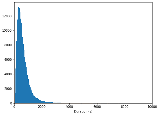
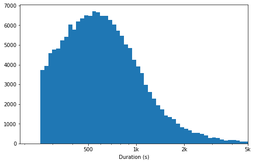
# there's a long tail in the distribution, so let's put it on a log scale insteadlog_binsize = 0.025bins = 10 ** np.arange(2.4, np.log10(df['duration_sec'].max())+log_binsize, log_binsize)plt.figure(figsize=[8, 5])plt.hist(data = df, x = 'duration_sec', bins = bins)plt.xscale('log')plt.xticks([500, 1e3, 2e3, 5e3, 1e4, 2e4], [500, '1k', '2k', '5k', '10k', '20k'])plt.xlabel('Duration (s)')plt.xlim(0, 5e3)plt.show();The duration of the bike being ridden is unimodal, but still skewed to the right even after performing log values. This means that the bikes are ridden for smaller durations more than longer durations.
骑自行车的持续时间是单峰的,但即使执行对数值后仍会偏向右侧。 这意味着自行车的骑行时间较短,而骑行时间较长。
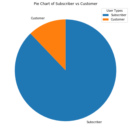
#Having a look at subscribers vs Customerssorted_counts = df['user_type'].value_counts()plt.figure(figsize=(8,8))plt.pie(sorted_counts, labels = sorted_counts.index, startangle=90, counterclock = False);plt.legend(['Subscriber', 'Customer'], title='User Types')plt.title('Pie Chart of Subscriber vs Customer');Clearly there are more subscribers to the company service than ordinary customers.
显然,公司服务的订户比普通客户更多。
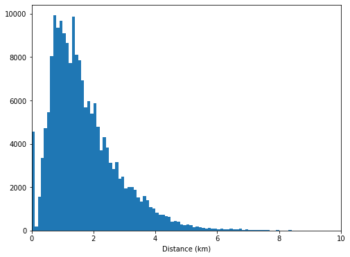
bin_edges = np.arange(0, df['distance'].max()+0.1, 0.1)plt.figure(figsize = (8, 6))plt.hist(data=df, x='distance', bins = bin_edges)plt.xlabel('Distance (km)');plt.xlim(0, 10);This graph shows us that the distance is quite bimodal with some people traveling for less than quarter of a kilometer while the majority of the users are riding for 1–1.5 kilometers. Then it decreases as the distance increases.
该图向我们显示,该距离是双峰的,有些人的行驶距离不到四分之一公里,而大多数用户的骑行距离为1-1.5公里。 然后,它随着距离的增加而减小。
讨论您感兴趣的变量的分布。 有什么异常之处吗? 您需要执行任何转换吗? (Discuss the distribution(s) of your variable(s) of interest. Were there any unusual points? Did you need to perform any transformations?)
The duration_sec variable had a large range of value, so I used log transformation. Under the transformation, the data looked unimodel with the peak at 550 seconds.
duration_sec变量的值范围很大,因此我使用了对数转换。 在转换下,数据看起来是单一模型,峰值为550秒。
在您调查的功能中,是否存在任何异常分布? 您是否对数据执行了任何操作以整理,调整或更改数据的形式? 如果是这样,您为什么这样做? (Of the features you investigated, were there any unusual distributions? Did you perform any operations on the data to tidy, adjust, or change the form of the data? If so, why did you do this?)
There were no unusual distributions, therefore no operations were required to change the data.
没有异常分布,因此不需要任何操作即可更改数据。
双变量探索 (Bivariate Exploration)
In this section, investigate relationships between pairs of variables in your data. Make sure the variables that you cover here have been introduced in some fashion in the previous section (univariate exploration).
在本节中,研究数据中变量对之间的关系。 确保在上一节中以某种方式介绍了您在此处介绍的变量(单变量探索)。
To start off with, I want to look at the variables in pairwise data.
首先,我想看看成对数据中的变量。
numeric_vars = ['duration_sec', 'distance']categoric_vars = ['user_type']# correlation plotplt.figure(figsize = [8, 5])sb.heatmap(df[numeric_vars].corr(), annot = True, fmt = '.3f',cmap = 'vlag_r', center = 0)plt.show();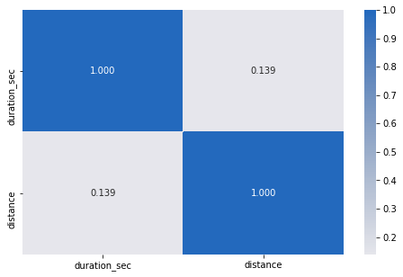
# plot matrix: sample 500 bike rides so that plots are clearer and they render fastersamples = np.random.choice(df.shape[0], 500, replace = False)df_samp = df.loc[samples,:]g = sb.PairGrid(data = df_samp, vars = numeric_vars)g = g.map_diag(plt.hist, bins = 20);g.map_offdiag(plt.scatter)g.fig.suptitle('Scatter Matrix for Duration vs Distance');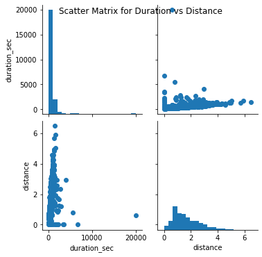
There is a correlation of 0.139 between distance and duration. That means there is a weak relationship between the two numeric variables present in this data.
距离和持续时间之间的相关性为0.139。 这意味着此数据中存在的两个数字变量之间存在弱关系。
However, with the help of the scatterplot we are able to identify a positive(weak) relationship between the two.
但是,借助散点图,我们能够确定两者之间的正(弱)关系。
Moving on, I’ll look at the relationship between the numerical variables with the categorical variables.
继续,我将研究数字变量与分类变量之间的关系。
# plot matrix of numeric features against categorical features using a sample of 2000samples = np.random.choice(df.shape[0], 2000, replace = False)df_samp = df.loc[samples,:]def boxgrid(x, y, **kwargs):""" Quick hack for creating box plots with seaborn's PairGrid. """default_color = sb.color_palette()[0]sb.violinplot(x, y, color = default_color)plt.figure(figsize = [10, 10])g = sb.PairGrid(data = df_samp , y_vars = ['duration_sec', 'distance'], x_vars = categoric_vars, size = 2, aspect =5)g.map(boxgrid)plt.show();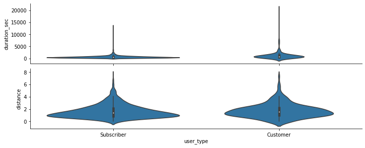
Interestingly enough, there has been useful visual representation of the data here. As we can see, the subscribers tend to use the bikes for more duration than the customers.
有趣的是,这里有有用的数据可视表示。 正如我们所看到的,订户比顾客更倾向于使用自行车。
The subscribers and customers however cover similar distances.
然而,订户和客户覆盖相似的距离。
def freq_poly(x, bins=10, **kwargs):if type(bins)==int:bins=np.linspace(x.min(), x.max(), bins+1)bin_centers = (bin_edges[1:] + bin_edges[:1])/2data_bins=pd.cut(x, bins, right=False, include_lowest = True)counts = x.groupby(data_bins).count()plt.errorbar(x=bin_centers, y=counts, **kwargs)bin_edges = np.arange(-3, df['distance'].max()+1/3, 1/3)g = sb.FacetGrid(data=df, hue = 'user_type', size=5)g.map(freq_poly, "distance", bins = bin_edges)g.add_legend()plt.xlabel('Distance (km)')plt.title('Distance of km travelled on bikes by users');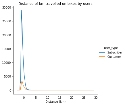
bin_edges = np.arange(-3, df['duration_sec'].max()+1/3, 1/3)g = sb.FacetGrid(data=df, hue = 'user_type', size=5)g.map(freq_poly, "duration_sec", bins = bin_edges)g.add_legend()plt.xlabel('Duration (s)')plt.title('Duration of time spent on bikes by users');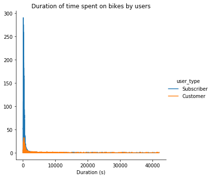
In these two graphs above we can see the distance travelled by the users and the duration of time, they spent on the bikes they used.
在上面的两个图表中,我们可以看到用户行驶的距离以及他们在所用自行车上花费的时间。
谈论您在调查的这一部分中观察到的一些关系。 感兴趣的特征与数据集中的其他特征如何变化? (Talk about some of the relationships you observed in this part of the investigation. How did the feature(s) of interest vary with other features in the dataset?)
The correlation between both the numerical variables namely duration_sec and distance is 0.139, implying that there is a very weak relation between the two variables. However when I plotted a scatter matrix, we could see that there is a positive relationship between the two. In the diagnol of the scatter matrix we can see that most bikes take less duration of time and for the distance variable we can see that mostly users travel for 1.5 km, however there are users who go for more too.
两个数值变量(即duration_sec和distance)之间的相关性为0.139,这意味着两个变量之间的关系非常弱。 但是,当我绘制散点矩阵时,我们可以看到两者之间存在正相关关系。 在散射矩阵的诊断中,我们可以看到大多数自行车花费的时间更少,而对于距离变量,我们可以看到大多数用户行驶1.5公里,但也有一些用户需要行驶更长的时间。
您是否观察到其他特征(不是感兴趣的主要特征)之间有任何有趣的关系? (Did you observe any interesting relationships between the other features (not the main feature(s) of interest)?)
Expected results were found when I plotted the violin plots grid. We could see that the subscribers are the users between both the type of users who use the bikes more. Even though, as we can interpret, that there are many outliers in the subscriber duration graph, in the customer duration graph, there are more users that use the bike for more time than the subscribers. But with immense number of outliers we can conclude that the subscribers use the bikes more.
当我绘制小提琴图网格时,发现了预期的结果。 我们可以看到,订户是使用自行车更多的两种用户之间的用户。 尽管,正如我们可以解释的那样,订户持续时间图中有许多离群值,但在客户持续时间图中,使用自行车的时间却比订户更多。 但是,由于存在大量异常值,我们可以得出结论,订户使用自行车的次数更多。
The distance is more or less the same between the two groups, most of the users travel approximately 1.5 kilometers.
两组之间的距离大致相同,大多数用户行驶约1.5公里。
多元探索 (Multivariate Exploration)
Create plots of three or more variables to investigate your data even further. Make sure that your investigations are justified, and follow from your work in the previous sections.
创建三个或更多变量的图,以进一步调查数据。 确保您的调查是合理的,并遵循上一部分中的工作。
fig = plt.figure(figsize = [8,6])ax = sb.pointplot(data = df, x = 'user_type', y = 'duration_sec', palette = 'Blues')plt.title('KM covered in duration across user types')plt.ylabel('Duration (s)')ax.set_yticklabels([],minor = True)plt.legend(['Subscriber', 'Customer'], title='User Types')plt.show();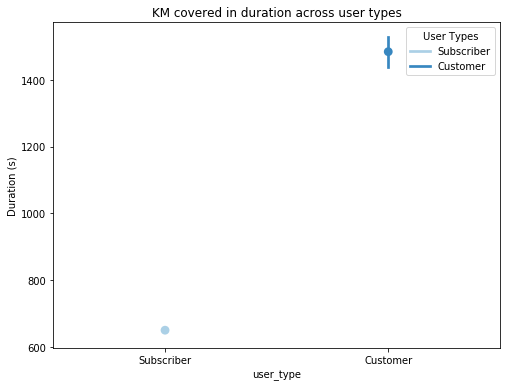
谈论您在调查的这一部分中观察到的一些关系。 在查看您感兴趣的功能方面,功能是否互为补充? (Talk about some of the relationships you observed in this part of the investigation. Were there features that strengthened each other in terms of looking at your feature(s) of interest?)
Due to less amount of data, having only one categoric variable, I was not able to plot many graphs.
由于数据量少,只有一个分类变量,因此我无法绘制许多图。
功能之间是否存在任何有趣或令人惊讶的交互作用? (Were there any interesting or surprising interactions between features?)
However, I managed to plot an interesting pointplot where we can see that the customers seem to use the bikes for a longer duration. This contradicts the fact which we earlier tried to adhere, being: Subscribers spend more time on bikes than customers
但是,我设法绘制了一个有趣的点状图,我们可以看到客户似乎在使用自行车更长的时间。 这与我们之前尝试坚持的事实相矛盾:订户在自行车上花费的时间比顾客更多
翻译自: https://medium.com/@rana96prateek/fordgobikes-data-trip-44b3fbf714cf
贝尔曼福特
相关文章:
- 福特汽车是美股电动汽车行业值得投资的股票吗?
- 检测图中的负循环 | (贝尔曼福特)
- 美国陪审团裁定福特向车祸遇难者家属赔偿17亿美元
- 从图森未来到通用、谷歌,自动驾驶怎么样了?
- 2013.9.23 福特
- 福特FORD EDI需求分析
- 福特FORD EDI流程指南
- 全球最佳15个免费云存储服务推荐
- fl studio mobile安卓,ios下载
- 如何将免费的WordPress音乐播放器添加到您的网站
- 最佳免费Android应用程序以及如何自行创建
- 程序员福利---免费接口
- MAC地址是怎么保证全球唯一的
- ip地址mac地址
- 以太网 以太网地址(MAC地址)
- 网络之mac地址和ip地址
- 解决:win10下修改mac地址的方法
- MAC地址IP地址 端口
- win10 系统修改无线网卡MAC地址
- MAC地址和IP地址说明
- win10如何修改mac地址(亲测通过)
- 北京现代APP每日问答合集(持续更新)
- 盛世昊通解析新能源汽车行业排行,电动汽车也能撑起半边天
- python 爬取懂车帝详情页“全部车型模块信息”
- 汽车之家精选论坛图片下载
- 生活不止眼前的苟且
- 纯电动汽车杂谈
- 中国造车要把百年车企按在地上打?你别说,我看有戏。
- 年终盘点,蔚来终于失去互联网造车老大地位,被小鹏取而代之
- 新能源汽车造车搅局
贝尔曼福特_福特自行车之旅相关推荐
- JavaScript实现bellmanFord贝尔曼-福特算法(附完整源码)
JavaScript实现bellmanFord贝尔曼-福特算法 bellmanFord.js完整源代码 bellmanFord.js完整源代码 export default function bell ...
- C++实现bellman ford贝尔曼-福特算法(最短路径)(附完整源码)
C++实现bellman ford贝尔曼-福特算法 实现bellman ford贝尔曼-福特算法的完整源码(定义,实现,main函数测试) 实现bellman ford贝尔曼-福特算法的完整源码(定义 ...
- 算法系列——贝尔曼福特算法(Bellman-Ford)
本系列旨在用简单的人话讲解算法,尽可能避免晦涩的定义,读者可以短时间内理解算法原理及应用细节.我在努力! 本篇文章编程语言为Python,供参考. 贝尔曼福特算法(Bellman-Ford) 典型最短 ...
- 漫话最短路径(二)--bellman-Ford(贝尔曼-福特)算法
上次讲到,没有负权边的有向图或无向图,可以使用迪杰斯特拉算法求出单源最短路径.如果没吃透迪杰斯特拉算法,请移步迪杰斯特拉算法 然而,有负权边时,则有可能正确,也有可能不正确.我们可以用下图来解释: 比 ...
- 算法/最短路径/Bellman-Ford贝尔曼福特算法
##问题描述 Dijkstra算法是处理单源最短路径的有效算法,但它局限于边的权值非负的情况,若图中出现权值为负的边,Dijkstra算法就会失效,求出的最短路径就可能是错的.这时候,就需要使用其他的 ...
- 贝尔曼-福特算法(Bellman-Ford)最短路径问题
贝尔曼-福特算法(Bellman-Ford) 一.贝尔曼-福特算法(Bellman-Ford) 二.代码实现 一.贝尔曼-福特算法(Bellman-Ford) 贝尔曼-福特算法与迪科斯彻算法类似,都以 ...
- 了解贝尔曼·福特算法
文章目录 为什么在现实生活中会有负权重的边? 为什么我们要留意负权重? 贝尔曼·福特算法如何工作 贝尔曼·福特伪码 Bellman Ford vs Dijkstra C示例 贝尔曼·福特算法的复杂度 ...
- 算法-贝尔曼-福特算法
算法-贝尔曼-福特算法 注:该文是本博主记录学习之用,没有太多详细的讲解,敬请谅解! 一.简介 贝尔曼-福特算法(Bellman–Ford algorithm )用于计算出起点到各个节点的最短距离,支 ...
- Python实现迪杰斯特拉算法和贝尔曼福特算法求解最短路径
文章目录 (一).题目 (二).导库 (三).绘制带权无向图 (四).获得最短路径 (四).实现最短路径高亮 (五).完整代码 (六).结果展示 关于Python数据分析在数学建模中的更多相关应用:P ...
最新文章
- 提升职场价值,把握成长方向
- libevent-signal(2)
- Java知多少(23)类的基本运行顺序
- C#读取Excel显示到repeater中
- 会计证考试《财经法规与职业道德》第三章精选题
- hdu 2196(经典树形dp)
- c语言memset函数用法,深入学习C语言中memset()函数的用法
- DCMTK:测试ConcatenationCreator类
- HTML第八章ppt,第八章 web基础教程之HTML篇v1.0.ppt
- 树莓派安装python3.5_树莓派 | 04 安装基于python3.5的tensorflow,解决python版本不匹配问题...
- 从零开始学Pytorch(三)之多层感知机的实现
- 华为机试HJ54:表达式求值
- jquery中常见的标题内容之间的切换
- 无法卸载mysql server 2008 r2,卸载安装失败的sqlserver2008R2
- 0206.BFPRT在一大堆数中求其前k大或前k小的问题,简称TOP-K问题(左神算法基础班源码)
- 2020年下半年教师资格幼儿园《综合素质》真题与参考答案
- 4.16Day21垃圾回收机制、re模块正则
- python编程基础与数据分析_Python编程基础与数据分析
- RPC框架系列——Avro
- Android界面布局练习
热门文章
- 送什么礼物给小学生比较有纪念意义?适合送小学生的小礼物
- 低端N卡完美硬解1080p的WMV3
- 基于Java毕业设计爱心公益网站设计与制作源码+系统+mysql+lw文档+部署软件
- 网易严选应用的云原生演进实践
- Linux 的常用系统及网络命令
- 2020年中国维生素行业发展现状及竞争格局分析,市场空间广阔「图」
- 动物大全和动物识别系统毕业设计,动物大全和动物AI识别系统设计与实现,动物识别系统论文毕设作品参考
- Nginx服务器支持.htaccess的方法
- 黄灯闪烁c语言程序,模拟交通灯C程序,用定时器0,如何实现黄灯闪烁功能
- 阿里大手子评:入门到大成!GitHub新上线并发编程深度解析实战PDF