CSS3 Media Queries在iPhone4和iPad上的运用
CSS3 Media Queries的介绍在W3CPlus上的介绍已有好几篇文章了,但自己碰到的问题与解决的文章还是相对的较少。前几天在《修复iPhone上submit按钮bug》上介绍了修复form中sumit按钮的bug。同一个项目,为了实现iPhone和iPad横板与竖板的风格,让我还是头疼了一翻。
一开始按照CSS3 Media Queries模板中的介绍来运用,虽然帮我解决了iPad的横板与竖板的风格渲染问题,但在iPhone4上还是存在问题的。后来结过网上的查找,总算是问题解决了,下面就来看看问题是如何解决的。
在具体开始之前,先来看看他的源码:
    <!DOCTYPE HTML>
<html lang="en-US">
<head><meta charset="UTF-8"><meta name="viewport" content="width=device-width, initial-scale=1, maximum-scale=1"> <title>login form</title><style type="text/css" media="screen">button,input{margin: 0;font-size: 100%;vertical-align: middle;*overflow: visible;line-height: normal;}button::-moz-focus-inner,input::-moz-focus-inner {padding: 0;border: 0;}button,input[type="button"],input[type="reset"],input[type="submit"] {cursor: pointer;-webkit-appearance: button;}body {margin: 0;padding: 58px 2% 2%;background: -webkit-gradient(linear, left top, left bottom, color-stop(0%,rgba(61,157,179,1)), color-stop(15%,rgba(61,157,179,0.3)), color-stop(40%,rgba(61,157,179,.5)),color-stop(70%,rgba(239,239,239,.4)),color-stop(100%,rgba(239,239,239,0.3)));background: -webkit-linear-gradient(top, rgba(61,157,179,1) 0%,rgba(61,157,179,0.8) 15%,rgba(61,157,179,.5) 40%,rgba(239,239,239,.4) 70%,rgba(239,239,239,0.3) 100%);background-repeat: no-repeat;background-attachment: fixed;}form {margin: 0;padding: 0;}form fieldset {border: none;border-radius: 10px;box-shadow: inset 0 0 2px rgba(0,0,0,0.3),0 0 5px rgba(0,0,0,0.13);background-color: rgba(255,255,255,0.8);background-image: -webkit-gradient(linear, 0 0, 0 100%, from(rgba(255,255,255,0.8)), to(rgba(216,216,216,0.8)));background-image: -webkit-linear-gradient(top,rgba(255,255,255,0.8), rgba(216,216,216,0.8));background-repeat: repeat-x;padding:20px 5%;margin: 0;position: relative;border: 1px solid rgba(216,216,216,0.8);}.control-group {margin-bottom: 15px;         }.control-label {color: #405c60;display:block;line-height: 18px;font-weight: normal;font-size: 16px;display:inline-block;min-width: 80px;max-width: 80px;text-align: right;margin-top: 12px;vertical-align: top;}.controls {display: inline-block;vertical-align: top;width: 65%;}input {outline: medium none;}input:not([type="checkbox"]){width: 90%;margin-top: 4px;padding: 10px;    border: 1px solid rgb(178, 178, 178);-webkit-appearance: textfield;-webkit-box-sizing: content-box;box-sizing : content-box;border-radius: 3px;box-shadow: 0px 1px 4px 0px rgba(168, 168, 168, 0.6) inset;-webkit-transition: all 0.2s linear;transition: all 0.2s linear;}input:not([type="checkbox"]):active,input:not([type="checkbox"]):focus{border: 1px solid rgba(91, 90, 90, 0.7);background: rgba(238, 236, 240, 0.2);   box-shadow: 0px 1px 4px 0px rgba(168, 168, 168, 0.9) inset;}.form-actions {text-align: center;          } .form-actions input{width: 30%;cursor: pointer;   background: rgb(61, 157, 179);padding: 8px 5px;font-family: 'BebasNeueRegular','Arial Narrow',Arial,sans-serif;color: #fff;font-size: 24px; margin: 5px;border: 1px solid rgb(28, 108, 122);    margin-bottom: 10px;    text-shadow: 0 1px 1px rgba(0, 0, 0, 0.5);border-radius: 3px;   box-shadow:0px 1px 6px 4px rgba(0, 0, 0, 0.07) inset,0px 0px 0px 3px rgb(254, 254, 254),0px 5px 3px 3px rgb(210, 210, 210);-webkit-transition: all 0.2s linear;transition: all 0.2s linear;-webkit-appearance: none;     }.form-actions input:hover{background: rgb(74, 179, 198);}.form-actions input:active,.form-actions input:focus{background: rgb(40, 137, 154);position: relative;top: 1px;border: 1px solid rgb(12, 76, 87);    box-shadow: 0px 1px 6px 4px rgba(0, 0, 0, 0.2) inset;}</style>    </head><body><form name="form1" method="post" action="2.html" οnsubmit="return check()" class="form-horizontal"><fieldset><div class="control-group"><label for="text1" class="control-label">用户名:</label><div class="controls"><input id="username_reg" type="text" name="text1" οnblur="check()" required="required" /><div class="help-inline" id="div1"></div></div></div><div class="control-group"><label for="text2" class="control-label">密码:</label><div class="controls"><input id="password_reg" type="password" name="text2" οnblur="check()" required="required"><div class="help-inline" id="div2"></div></div></div><div class="control-group"><label for="text3" class="control-label">确认密码:</label><div class="controls"><input id="confirm_reg" type="password" name="text3" οnblur="check()" required="required" /><div class="help-inline" id="div3"></div></div></div><div class="form-actions"><input type="button" value="提交" name="tect6" class="btn btn-primary" οnclick="reg()" /><input type="reset" value="重置" name="text7" class="btn" /></div></fieldset>           </form></body>
</html>
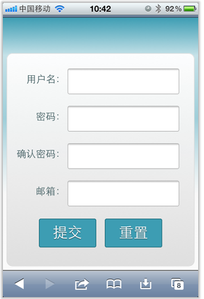
现在在iPhone4竖板是OK的,如下图所示
但现在需求是,在iPhone4的横板以及iPad的横板与竖板下,也需要让表单居中显示:
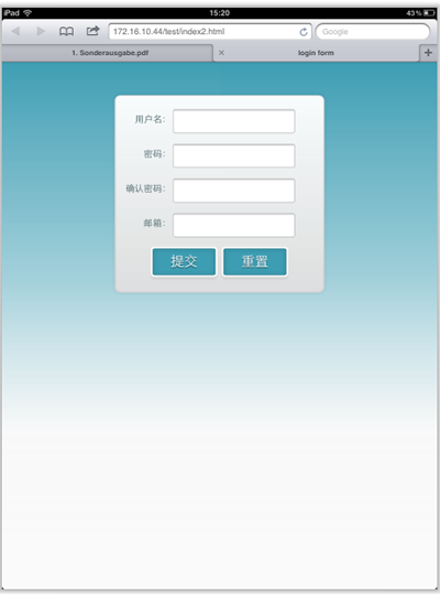
上图显示的是iPad竖板下的需求,横板下也需要类似的效果。
需求明确,做法也是有思路的,首先我按照:CSS3 Media Queries模板中的模板在样式中增加了代码:
/*iPad竖板*/@media screen and (max-device-width: 768px) and (orientation: portrait) {form {margin: 0 25%;}}/*iPad横板*/@media screen and (max-device-width: 1024px) and (orientation: landscape) {form {margin: 0 25%;}}/*iPhone4*/@media only screen and (max-device-width: 480px),only screen and (-webkit-min-device-pixel-ratio: 2) {form {margin: 0 ;}.controls {width: 68%;}}
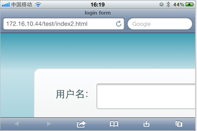
加上上面代码后在iPad下是正常了,而且不会有什么问题存在。但在iPhone4上依然存在一个怪异的现象:当你iPhone4加载页面是用横板加载,再旋转到竖板,不会存在任何问题,而且显示也是蛮正常的。但是初始加载页面是竖板,然后在旋转到横板,就有问题了,表单给放大了
初步给我感觉就是放大了,但具体是不是因为这个原因,我也不太清楚,查找了一些资料,也尝试了无解决办法。最后也从横板竖板的思路出发查找资料,经过一试,给解决了,下面来看看这段代码:
  /* iPhone 4 竖板 */
@media
only screen and (-webkit-min-device-pixel-ratio : 1.5) and (orientation:portrait),
only screen and (min-device-pixel-ratio : 1.5)  and (orientation:portrait){form {margin:0;}.controls {width: 68%;}
}/* iPhone 4 横板 */
@media
only screen and (-webkit-min-device-pixel-ratio : 1.5) and (orientation:landscape),
only screen and (min-device-pixel-ratio : 1.5)  and (orientation:landscape){form {margin:0 10%;}.controls {width: 68%;}
}
这样一来就OK了。在iPhone4和iPad的横竖板下都能正常让表单居中显示。

那么以后大家在iPhone4和iPad设备上,就可以按照横竖板来定样式了:
1、iPhone4竖板
@mediaonly screen and (-webkit-min-device-pixel-ratio : 1.5) and (orientation:portrait),only screen and (min-device-pixel-ratio : 1.5) and (orientation:portrait){/*你的样式写在这里*/ }
2、iPhone横板
@mediaonly screen and (-webkit-min-device-pixel-ratio : 1.5) and (orientation:landscape),only screen and (min-device-pixel-ratio : 1.5) and (orientation:landscape){/*你的样式写在这里*/}
3、iPad竖板
@media screen and (max-device-width: 768px) and (orientation: portrait) {/*你的样式写在这里*/}
4、iPad横板
@media screen and (max-device-width: 1024px) and (orientation: landscape) {/*你样式写在这里*/}
上面四种CSS3 Media Queries就是用来对付iPhone4和iPad的,至于其他的运用,大家参考下面我重新整理的CSS3 Media Queries模板:
CSS3 Media Queries 模板:
1、Smartphones (竖板和横板)
@media only screen and (min-device-width : 320px) and (max-device-width : 480px) {/* 你的样式写在这里 */}//===或者====//< link rel="stylesheet" href="smartphones.css" media="only screen and (min-device-width : 320px) and (max-device-width : 480px)" />
2、Smartphones (横板)
@media only screen and (min-width : 321px) {/* 你的样式写在这里 */}//===或者====//< link rel="stylesheet" href="smartphones-landscape.css" media="only screen and (min-width : 321px)" />
3、Smartphones (竖板)
@media only screen and (max-width : 320px) {/* 你的样式写在这里 */}//===或者====//< link rel="stylesheet" href="smartphones-portrait.css" media="only screen and (max-width : 320px)" />
4、iPad(竖板和横板)
@media only screen and (min-device-width : 768px) and (max-device-width : 1024px) {/* 你的样式写在这里 */}//===或者====//< link rel="stylesheet" href="ipad.css" media="only screen and (min-device-width : 768px) and (max-device-width : 1024px)" />
5、iPad横板
@media only screen and (min-device-width : 768px) and (max-device-width : 1024px) and (orientation : landscape) {/* 你的样式写在这里 */} //===或者====//< link rel="stylesheet" href="ipad-landscape.css" media="only screen and (min-device-width : 768px) and (max-device-width : 1024px) and (orientation : landscape)" />
6、iPad的竖板
@media only screen and (min-device-width : 768px) and (max-device-width : 1024px) and (orientation : portrait) {/* 你的样式写在这里 */}//===或者====//< link rel="stylesheet" href="ipad-portrait.css" media="only screen and (min-device-width : 768px) and (max-device-width : 1024px) and (orientation : portrait)" />
7、Desktops and laptops
@media only screen and (min-width : 1224px) {/* 你的样式写在这里 */}//===或者====//< link rel="stylesheet" href="desktops-and-laptops.css" media="only screen and (min-width : 1224px)" />
8、Large screens
@media only screen and (min-width : 1824px) {/* 你的样式写在这里 */}//===或者====//< link rel="stylesheet" href="large-screens.css" media="only screen and (min-width : 1824px)" />
9、iPone4
@media only screen and (-webkit-min-device-pixel-ratio : 1.5),only screen and (min-device-pixel-ratio : 1.5) {/* 你的样式写在这里 */}//===或者====//< link rel="stylesheet" href="iphone4.css" media="only screen and (-webkit-min-device-pixel-ratio : 1.5),only screen and (min-device-pixel-ratio : 1.5)" />
10、iPhone4竖板
@media only screen and (-webkit-min-device-pixel-ratio : 1.5) and (orientation:portrait), only screen and (min-device-pixel-ratio : 1.5) and (orientation:portrait){/*你的样式写在这里*/ }//===或者====//< link rel="stylesheet" href="iphone4-portrait.css" media="only screen and (-webkit-min-device-pixel-ratio : 1.5) and (orientation:portrait), only screen and (min-device-pixel-ratio : 1.5) and (orientation:portrait)" />
11、iPhone4横板
@media only screen and (-webkit-min-device-pixel-ratio : 1.5) and (orientation:landscape),only screen and (min-device-pixel-ratio : 1.5) and (orientation:landscape){/*你的样式写在这里*/}//===或者====//< link rel="stylesheet" href="iphone4-landscape.css" media="only screen and (-webkit-min-device-pixel-ratio : 1.5) and (orientation:landscape),only screen and (min-device-pixel-ratio : 1.5) and (orientation:landscape)" />
上面罗列了常用的CSS3 Media Queries模板,特别是在移动设备上的几种,希望对大家在今后的移动开发端上的运用有所帮助。当然CSS3 Media Queries的运用条件往往不只这些,大家完全可以根据自己的需求去定义不同的条件,但个人建议,使用CSS3 Media Queries采用主流就Ok了。随着潮流走嘛。那么今天就扯到这了。如果大家有更好的经验,可以通过下面的评论与我们一起分享。
转载于:https://www.cnblogs.com/aimyfly/p/3727904.html
CSS3 Media Queries在iPhone4和iPad上的运用相关推荐
- CSS:媒体查询 CSS3 Media Queries
定义和使用 使用 @media 查询,你可以针对不同的媒体类型定义不同的样式. @media 可以针对不同的屏幕尺寸设置不同的样式,特别是如果你需要设置设计响应式的页面,@media 是非常有用的. ...
- CSS3 Media Queries:移动 Web 的完美开端
移动时代,是任何 Web 设计与开发者都不能忽视的一个时代,总有一天,你设计的东西将被显示在两种屏幕上,桌面大屏幕和移动小屏幕,如何让同一个网站同时适应完全不同的两种尺寸的屏幕,这是一个很久以来都没有 ...
- css3 media queries
CSS3 Media Queries模板 作者:大漠 日期:2012-04-04 点击:3183 最早在<CSS3 Media Queries>一文中初探了CSS3的媒体类型和媒体特性 ...
- CSS3 Media Queries 实现网页自适应
文章转载自:爱思资源网http://www.aseoe.com/show-10-261-1.html 导语 接下来会展示如何运用 HTML5 和 CSS3 来设计一个自适应网页.当今银屏分辨率从 32 ...
- CSS3 Media Queries 详细介绍与使用方法,Responsive Web Design 必备技术, 响应式设计
上一篇我们介绍了Responsive Web Design之后,这次要来详细介绍CSS3 Media Queries了. 在上一篇中,我们提到Responsive Web Desig n的实作方式有大 ...
- 响应式web设计之CSS3 Media Queries
开始研究响应式web设计,CSS3 Media Queries是入门. Media Queries,其作用就是允许添加表达式用以确定媒体的环境情况,以此来应用不同的样式表.换句话说,其允许我们在不改变 ...
- CSS3 Media Queries详细介绍和使用实例
Media Queries直译过来就是"媒体查询",在我们平时的Web页面中head部分常看到这样的一段代码: 复制代码 代码如下: <link href="css ...
- CSS之Responsive设计和CSS3 Media Queries的结合
随着高科技的发展,现在我们浏览网页不在局限于PC机上了,用户可使用上网的设备是越来越多的品种:手机.小笔记本.iPad.Playbook,以及PC机,而且PC机的显展大小各不一致.这样一来不同的屏幕分 ...
- 实践 HTML5 的 CSS3 Media Queries
先来介绍下 media,确切的说应该是 CSS media queries(CSS 媒体查询),媒体查询包含了一个媒体类型和至少一个使用如宽度.高度和颜色等媒体属性来限制样式表范围的表达式.CSS3 ...
最新文章
- 本地打包Docker镜像上传至阿里云远程仓库(一站式脚本)
- EasyUI权限系统
- SD-WAN如何安装在企业WAN中?—Vecloud
- 【控制】多智体系统一致性基础知识
- grep 显示前后几行
- 2019年最新银行存款利息,有的银行最高给到5.45%
- html实现拖拽排序,简单的jquery拖拽排序效果实现代码
- jersey2.22.2异常java.lang.NoSuchMethodError: org.glassfish.jersey.CommonProperties.getValue
- Python+tkinter打造类似于IDLE的代码编辑器(83行源码)
- saltstack的探索-salt指定目标和分组
- java/php/net/pythont物流配送中心管理系统设计
- 中科院计算所培训中心新一期javascript培训结束
- Linux下载Java包,Linux环境Java包的安装和环境配置
- 测试显卡矿卡用什么软件,3分钟看懂:AMD二手矿卡简明鉴别、检测教程,从此脱坑不求人...
- 阿里云服务大规模故障:运维操作失误
- 1.21 同级比较 倒装句 否定Neither
- 【转载】冗余与热备的概念区别
- mysql中ddl是什么_MySQL中DDL是什么意思
- C++:endl的作用
- 学习正则表达式 - 18位身份证号
热门文章
- 关于python类的继承正确的说法是_2017美团点评的运维岗校招笔试题,测测你会几题?...
- linux主机解析虚拟机超时_Linux 内核超时导致虚拟机无法正常启动
- python批量写入数据库engine_python 快速写入postgresql数据库方法
- excel删除重复数据保留一条_VBA利用字典删除重复行,保留唯一值
- delphi7存储过程传入数组_数据结构线性表之顺序存储 类的封装
- conda常用命令汇总
- filepath直接指定到文件名吗_PyTest运行指定的测试集
- php mysql查询结果_php对mysql查询结果进行分页 - ceil
- yarn的基本组成和工作流程
- java没有释放内存_java – G1年轻的GC没有释放内存 – 空间耗尽