power bi可视化表_在Power BI报表视图中创建可视化
power bi可视化表
The Report View in Power BI can be used to create beautiful visualizations in Power BI.
Power BI中的报表视图可用于在Power BI中创建漂亮的可视化效果。
Power BI has several interconnected modules such as Query Editor, Data View, Relationship View, Report View, etc. Each module has its own functionality.
Power BI具有几个互连的模块,例如查询编辑器,数据视图,关系视图,报表视图等。每个模块都有其自己的功能。
In this post, we will look at how to create a simple visualization in Power BI Report View with the help of different plots.
在本文中,我们将研究如何借助不同的图在Power BI Report View中创建简单的可视化。
将Power BI连接到您的数据 (Connecting Power BI to your Data )
Before you start creating visualizations using Report View, you need to import data to your model. To do this, from the top menu, click on “Get Data” as shown in the following screenshot.
在开始使用“报表视图”创建可视化文件之前,需要将数据导入模型。 为此,请从顶部菜单中单击“获取数据”,如以下屏幕截图所示。
A new window will pop up, showing all the sources of data sources available to Power BI.
将弹出一个新窗口,显示可用于Power BI的所有数据源。
Type “Web” into the search area.
在搜索区域中键入“ Web”。
Very quickly, “Web” will appear as a data source in your All Data list of sources.
很快,“ Web”将作为数据源出现在“所有数据”源列表中。
You need to click on “Web” and select the ‘Connect’ button. You will be able to see this in the screenshot below.
您需要单击“ Web”并选择“连接”按钮。 您将可以在下面的屏幕截图中看到它。
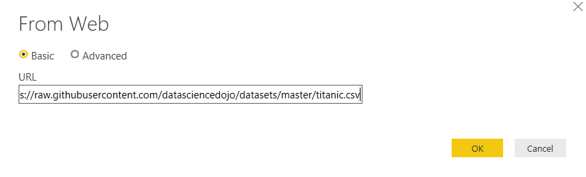
The box showing below will pop up, where it says ‘URL’ you need to insert the below URL:
将弹出下面显示的框,其中显示“ URL”,您需要插入以下URL:
https://raw.githubusercontent.com/datasciencedojo/datasets/master/titanic.csv
https://raw.githubusercontent.com/datasciencedojo/datasets/master/titanic.csv
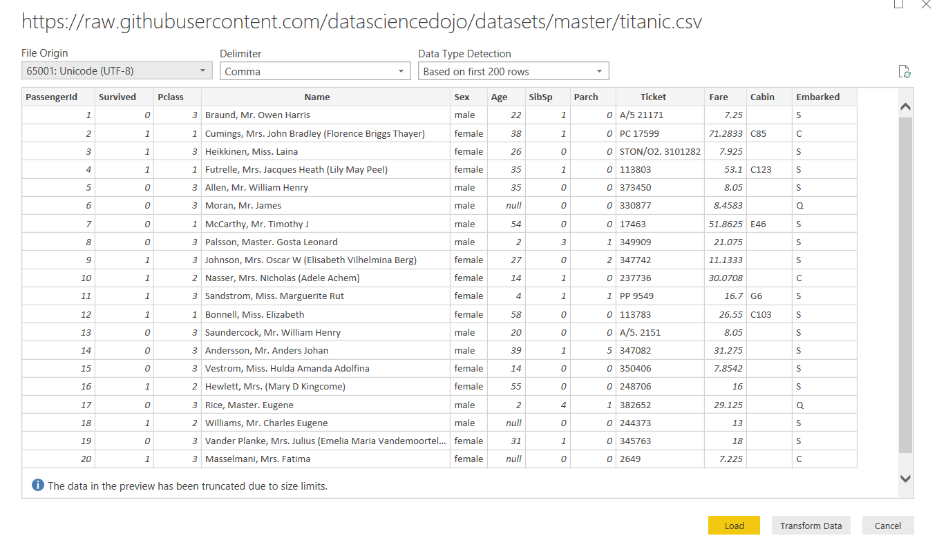
This URL will take you to a file of data held on Github. It is a CSV file.
该网址会将您带到Github上保存的数据文件。 这是一个CSV文件。
This CSV contains data on the Titanic, including the passengers that traveled on this unlucky cruise as the Titanic was hit by an iceberg on its maiden voyage in 1912. The dataset consists of 12 columns and 887 records.
该CSV包含有关泰坦尼克号的数据,其中包括1912年泰坦尼克号在首次航行中遭到冰山撞击时乘坐的不幸运程中的乘客。该数据集包括12列和887条记录。
Sometimes Power BI can be slow to find and create a connection with files that are held online so you may need to be a little patient.
有时Power BI可能很难找到并与在线保存的文件建立连接,因此您可能需要耐心一点。
However, as soon as it has created the connection, your Power BI window will be as shown below.
但是,一旦创建了连接,您的Power BI窗口将如下所示。
Now, if you select the ‘Load’ button, the data will be imported into Power BI. Once the data is loaded, we can create our visualization in the Report View.
现在,如果您选择“加载”按钮,则数据将被导入Power BI。 加载数据后,我们可以在报告视图中创建可视化文件。
在Power BI报表视图中创建可视化 (Creating a visualization in Power BI Report View)
In this section, you will see how to create a very simple visualization in Power BI Report View. As an example, we will create a clustered column chart and a pie chart.
在本节中,您将看到如何在Power BI报表视图中创建非常简单的可视化。 作为示例,我们将创建一个聚集的柱状图和一个饼图。
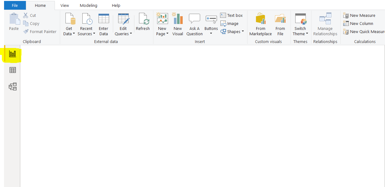
Once you click the “Load Button” after importing the data, as explained in the last section, you should see the following screen. The screen is empty at the moment. On the left side of the screen, you should see three options stacked vertically. The topmost option, highlighted in yellow in the screenshot, is the Report View. Click this icon to open the Report View if you have not done so already.
如上一节所述,在导入数据后单击“加载按钮”后,您将看到以下屏幕。 屏幕目前是空的。 在屏幕的左侧,您应该看到三个选项垂直堆叠。 屏幕截图中以黄色突出显示的最上面的选项是“报告视图”。 如果尚未打开报告视图,请单击此图标。
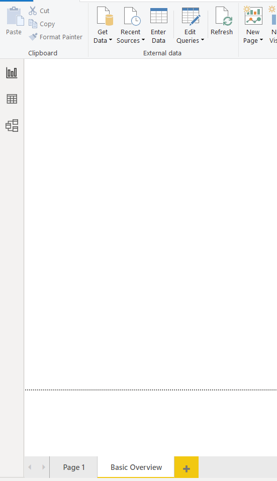
At the bottom left of the report view, you should see the default page name, i.e., “Page 1”, as shown in the following screenshot. A visualization in Power BI can span multiple pages. Having multiple pages is a way to logically categorize your visualizations.
在报告视图的左下方,您应该看到默认的页面名称,即“页面1”,如以下屏幕截图所示。 Power BI中的可视化可以跨越多个页面。 拥有多个页面是对可视化文件进行逻辑分类的一种方法。
You can create a new page by simply clicking the plus button next to the names of the already existing pages. We will create a new page named “Basic Overview”, as shown in the following screenshot. To create a new page, all you have to do is double click the page name and overwrite the existing page names.
您只需单击现有页面名称旁边的加号按钮即可创建新页面。 我们将创建一个名为“基本概述”的新页面,如以下屏幕截图所示。 要创建新页面,您需要做的就是双击页面名称并覆盖现有页面名称。
在Power BI中创建群集的柱形图可视化 (Creating a Clustered Column Chart visualization in Power BI)
Let’s create a simple clustered column chart. To create a new graph, you have to select the chart type that you want to plot from the “Visualization” panel, as shown in the following screenshot, where we select the “Clustered Column Chart” option, as shown highlighted in the following screenshot.
让我们创建一个简单的群集柱形图。 要创建新图形,您必须从“ Visualization”面板中选择要绘制的图表类型,如以下屏幕截图所示,我们在其中选择“ Clustered Column Chart”选项,如以下屏幕截图中突出显示的那样。
Once you click the chart type, you should see an empty clustered column chart, as shown below. You can drag and drop the chart as well as resize it according to your preference.
单击图表类型后,应该会看到一个空的聚集柱形图,如下所示。 您可以拖放图表,也可以根据自己的喜好调整图表大小。
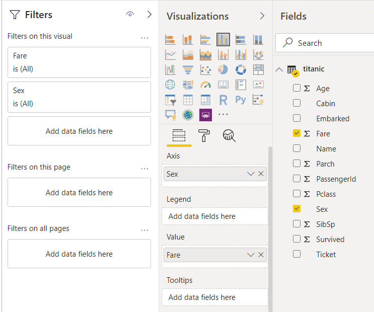
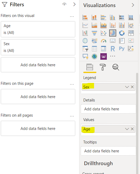
We want to create a clustered column chart that displays the fare paid by the passengers of both the genders who traveled in the Titanic ship. Click the “Fields” button under the “Visualization” panel. Drag the “Fare” column from the Titanic dataset and drop it in the “Value” field. In the “Axis” field, drag the “Sex” column, as shown in the following screenshot.
我们想要创建一个聚集的柱形图,以显示乘坐泰坦尼克号船的男女乘客支付的票价。 单击“可视化”面板下的“字段”按钮。 从“泰坦尼克号”数据集中拖动“票价”列,并将其放在“值”字段中。 在“轴”字段中,拖动“性别”列,如以下屏幕截图所示。
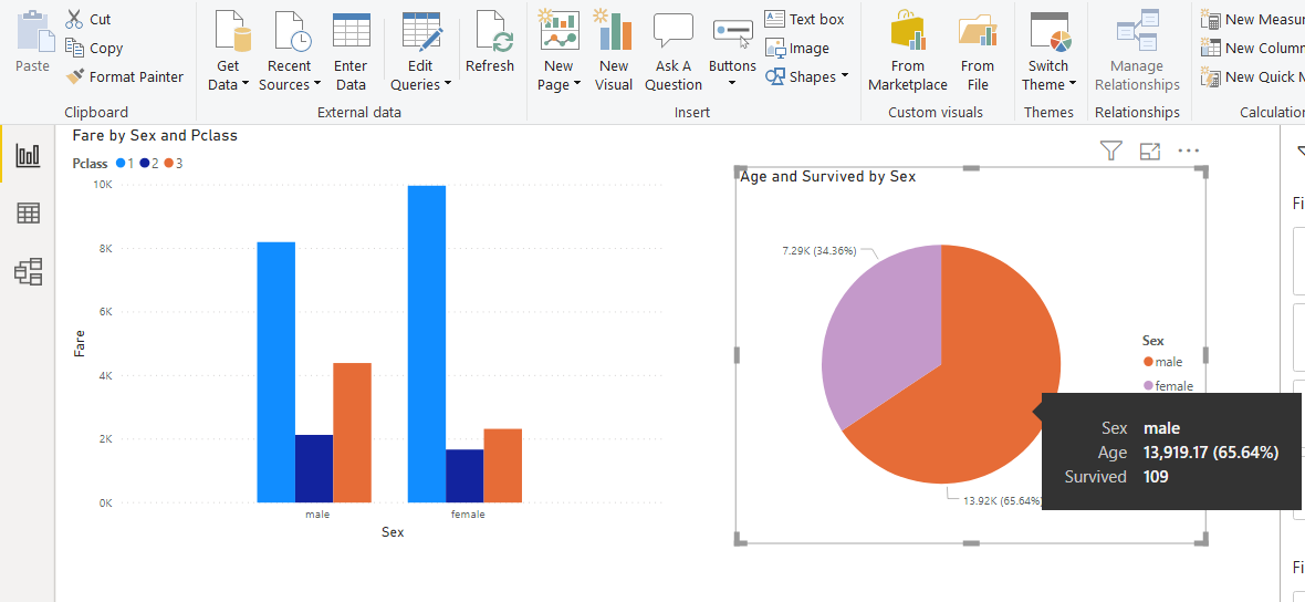
You should see the following clustered column chart in the output. You can see that overall, that the total fare paid by the males is slightly more than females.
您应该在输出中看到以下群集柱状图。 您可以看到,总体而言,男性支付的总票价略高于女性。
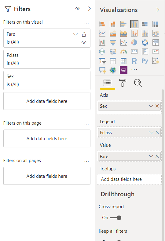
Let’s further categorize the column chart by dividing the columns into the passenger class. To do so, drag the “Pclass” column from the dataset to the “Legend” field, as shown below.
让我们通过将列划分为乘客类别来进一步对柱状图进行分类。 为此,将“ Pclass”列从数据集中拖到“ Legend”字段,如下所示。
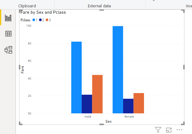
In the output, you should see clustered column chart with fare further divided into passenger class, in addition to the gender of the passengers. It can be clearly seen that the first-class passengers paid the highest fares.
在输出中,您应该看到聚集的柱形图,其中除乘客的性别之外,票价进一步分为乘客类。 可以清楚地看到,头等舱乘客支付的票价最高。
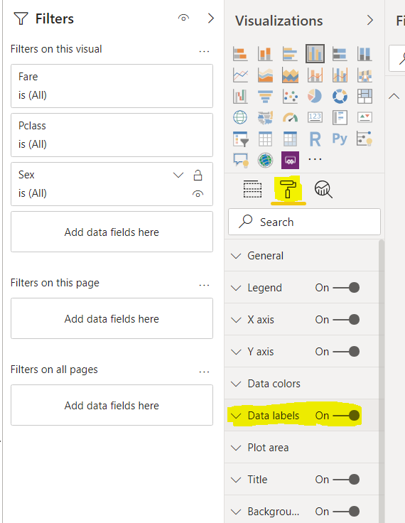
Our clustered column chart is not labeled at the moment. You cannot see the total amount of fare paid by passengers from different genders belonging to different passenger classes. To label the data, click on the “Format” button under visualizations, as highlighted in the following screenshot. Next, drag the radio button to the right of “Data Labels” so that it displays “On”.
我们的群集柱形图目前尚未标记。 您看不到属于不同乘客类别的不同性别的乘客支付的总票价。 要标记数据,请单击可视化下的“格式”按钮,如以下屏幕快照中突出显示的那样。 接下来,将单选按钮拖到“数据标签”右侧,使其显示为“开”。
Now if you look at your clustered column chart, you can see that the bars are labeled as shown in the screenshot below:
现在,如果您查看群集的柱状图,您可以看到条形图的标签如下图所示:
在Power BI中创建饼图可视化 (Creating a Pie Chart visualization in Power BI)
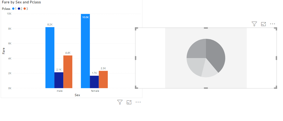
Let’s create one more chart type for our visualization. We will add a pie chart to our existing visualization. To do so, you need to click on the “Pie Chart” visualization from the “Visualization” pane as shown below:
让我们为可视化创建另一种图表类型。 我们将饼图添加到我们现有的可视化中。 为此,您需要从“可视化”窗格中单击“饼图”可视化,如下所示:
You should see an empty pie chart on your page. You can drag it across the page and resize it if you want.
您应该在页面上看到一个空的饼图。 您可以在页面上拖动它,并根据需要调整其大小。
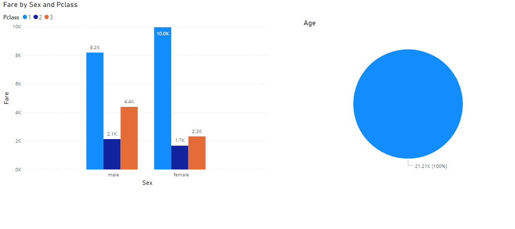
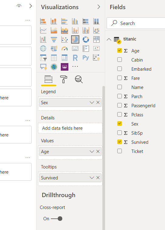
Like clustered column chart, the next step is to add data to your pie chart. We will create a pie chart that displays the ratio of the total ages of males and females. Let’s first drag and drop the “Age” column from the Titanic dataset to the “Values” field, as shown below:
与聚簇柱状图一样,下一步是将数据添加到饼图中。 我们将创建一个饼状图,以显示男性和女性总年龄的比例。 首先,将“年龄”列从“泰坦尼克号”数据集中拖放到“值”字段,如下所示:
In the output, you see that the pie chart contains only one color and displays the overall age of the passengers.
在输出中,您看到饼图仅包含一种颜色,并显示了乘客的总体年龄。
To split the pie chart by gender, drag the “Sex” column from the dataset and drop it to the “legends” field as shown below:
要按性别划分饼图,请从数据集中拖动“性别”列,并将其拖放到“传奇”字段中,如下所示:
Now in the output, you can see the pie chart showing the distribution of age for male and female passengers.
现在,在输出中,您可以看到饼图,该图显示了男性和女性乘客的年龄分布。
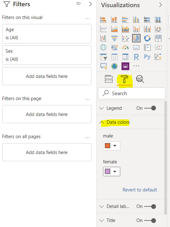
You can change the color of any plot by clicking the “Format” field under the visualizations pane, as shown in the following image. In the following image, the color for male passengers in the pie chart is set to orange, while for female passengers, the data color is set to pink.
您可以通过单击可视化窗格下的“格式”字段来更改任何图的颜色,如下图所示。 在下图中,饼图中男性乘客的颜色设置为橙色,而女性乘客的数据颜色设置为粉红色。
In the output, you should see the updated pie chart with the colors that you supplied.
在输出中,您应该看到带有提供的颜色的更新的饼图。
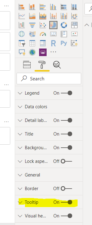
When you hover over the charts, by default, you do not see any tooltip. To enable the tooltips again, go to “Format” and then drag the “Tooltip” radio button to switch it on, as shown in the following screenshot.
当您将鼠标悬停在图表上时,默认情况下,您不会看到任何工具提示。 要再次启用工具提示,请转到“格式”,然后拖动“工具提示”单选按钮将其打开,如以下屏幕截图所示。
Once you enable the tooltip, you can hover over the plot to see additional information about the plot as shown below:
启用工具提示后,您可以将鼠标悬停在图上以查看有关图的其他信息,如下所示:
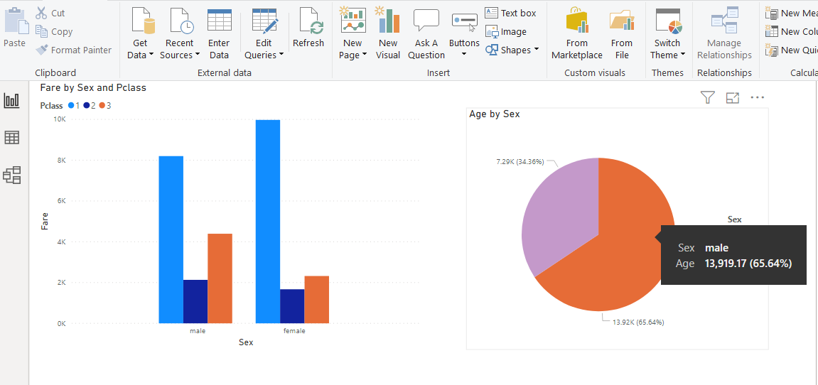
You can see the total male age along with the percentage of the total age on the tooltip. For instance, if you want to display the number of survived passengers on the tooltip, drag the “Survived” column from the Titanic dataset to the “Tooltips” field as shown below:
您可以在工具提示上查看男性总年龄以及总年龄的百分比。 例如,如果要在工具提示上显示幸存乘客的数量,请从“泰坦尼克号”数据集中将“幸存”列拖动到“工具提示”字段,如下所示:
Now, if you again hover your mouse over the male portion of the pie chart, you can see the number of male passengers who survived.
现在,如果您再次将鼠标悬停在饼图的男性部分上,则可以看到幸存的男性乘客数量。
结论 (Conclusion)
In this article, you saw how to create a very simple visualization in Power BI using Report View. You saw how to create a clustered column chart and how to create a Pie chart using Power BI. You also saw how to change color and add tooltips to the charts in the report view.
在本文中,您了解了如何使用报表视图在Power BI中创建非常简单的可视化。 您已经了解了如何创建聚簇柱形图以及如何使用Power BI创建饼图。 您还看到了如何更改颜色以及如何在报表视图的图表中添加工具提示。
翻译自: https://www.sqlshack.com/creating-a-visualization-in-power-bi-report-view/
power bi可视化表
power bi可视化表_在Power BI报表视图中创建可视化相关推荐
- power bi可视化表_如何使用Power BI可视化数据?
power bi可视化表 什么是数据可视化? (What is Data Visualization?) With the technological revolution, data went fr ...
- power bi可视化表_滚动器可视化功能,用于Power BI Desktop中的股价变动
power bi可视化表 In the article, Candlestick chart for stock data analysis in Power BI Desktop, we explo ...
- power bi 创建空表_使用Power BI创建足球热图
power bi 创建空表 When I watched the 2018 FIFA World Cup Russia match, at the end of the match I saw a v ...
- power bi指标呈现_在Power BI中使用关键绩效指标
power bi指标呈现 In this article, we will learn Key Performance Indicators usage in Power BI and solve a ...
- python做大数据可视化软件_一般用哪些工具做大数据可视化分析?
大家都回答的是工具产品,似乎都没有人讲讲R语言和Python,怒答. -------------------------------------------多图预警! R-ggplot2 ggplot ...
- flask创建mysql表_请教一下,flask-sqlalchemy 怎么动态创建数据表?
首先你需要动态地创建一个表结构: tb_name = 'tb_test' pk_col = db.Column('tid', db.Integer, primary_key=True, autoinc ...
- python数据分析与可视化清华大学_【官方正版】 Python数据分析与可视化 微课视频版 清华大学出版社 魏伟一 李晓红 软件工具 程序设计...
第1章数据分析与可视化概述 1.1数据分析 1.2数据可视化 1.3数据分析与可视化常用工具 1.4为何选用Python进行数据分析与可视化 1.5Python数据分析与可视化常用类库 1.6Jupy ...
- c++可视化界面_新基建的福音:智慧楼宇可视化监控系统引领智能化新时代
前言 智慧楼宇和人们的生活息息相关,楼宇智能化程度的提高,会极大程度的改善人们的生活品质,在当前 工业互联网 大背景下受到很大关注.目前 智慧楼宇可视化监控 的主要优点包括: 智慧化 -- 智慧楼宇是 ...
- axure rp 创建弹框_如何在Axure RP 9中创建交换机
axure rp 创建弹框 Axure is a well-known prototyping tool with a lot of history, it has been around for y ...
最新文章
- 如何用Python做三阶拼图?
- 操作系统实验之作业调度算法
- 红旗Linux可以兼容,红旗 Linux 桌面操作系统11来了:支持国产自主CPU,全新UI风格设计,兼容面广...
- [BUUCTF-pwn]——ciscn_2019_ne_5
- excel怎么把单元格内某个字标红,其他字不变
- C++ : 内联函数和引用变量
- skywalking前端_skywalking实现分布式系统链路追踪
- 联想java笔试题20190618
- 硬件知识:网线的分类知识笔记,看完你就懂了!
- 如何查看本机的内网IP
- 计算机实现两个数相加的过程,嵌入式FORTH虚拟计算机的实现
- 文曲星猜数游戏c语言带结果,文曲星猜数游戏 C实现
- python的print输出格式举例_python中print输出格式是什么
- 百度千言-中文文本相似度实战
- 天下文章一大抄 之 修改excel 创建时间
- 计划任务(啊啊啊啊啊)
- java JLabel改变大小后如何刷新_java实习面经整理
- 3.13 小红书笔记怎样带话题,才能增加曝光?【玩赚小红书】
- 罗克韦尔自动化收购网络安全公司
- 树莓派3B+控制LCD1602显示英文或数字