QQPlot/Quantile-Quantile Plot
QQPlot用于直观验证一组数据是否来自某个分布,或者验证某两组数据是否来自同一(族)分布。在教学和软件中常用的是检验数据是否来自于正态分布。
详细信息参考:
http://onlinestatbook.com/2/advanced_graphs/q-q_plots.html
-----------------------------------------------------------------
(原文如下)
Quantile-Quantile (q-q) Plots
Author(s)
David Scott
Prerequisites
Histograms , Distributions , Percentiles , Describing Bivariate Data , Normal Distributions
Learning Objectives
- State what q-q plots are used for.
- Describe the shape of a q-q plot when the distributional assumption is met.
- Be able to create a normal q-q plot.
Introduction
The quantile-quantile or q-q plot is an exploratory graphical device used to check the validity of a distributional assumption for a data set. In general, the basic idea is to compute the theoretically expected value for each data point based on the distribution in question. If the data indeed follow the assumed distribution, then the points on the q-q plot will fall approximately on a straight line.
Before delving into the details of q-q plots, we first describe two related graphical methods for assessing distributional assumptions: the histogram and the cumulative distribution function (CDF). As will be seen, q-q plots are more general than these alternatives.
Assessing Distributional Assumptions
As an example, consider data measured from a physical device such as the spinner depicted in Figure 1. The red arrow is spun around the center, and when the arrow stops spinning, the number between 0 and 1 is recorded. Can we determine if the spinner is fair?
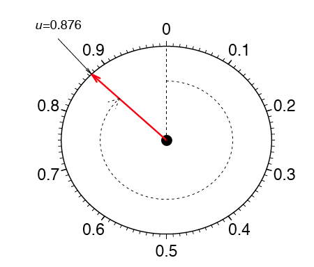
Figure 1. A physical device that gives samples from a uniform distribution.
If the spinner is fair, then these numbers should follow a uniform distribution. To investigate whether the spinner is fair, spin the arrow n times, and record the measurements by {μ1, μ2, ..., μn}. In this example, we collect n = 100 samples. The histogram provides a useful visualization of these data. In Figure 2, we display three different histograms on a probability scale. The histogram should be flat for a uniform sample, but the visual perception varies depending on whether the histogram has 10, 5, or 3 bins. The last histogram looks flat, but the other two histograms are not obviously flat. It is not clear which histogram we should base our conclusion on.
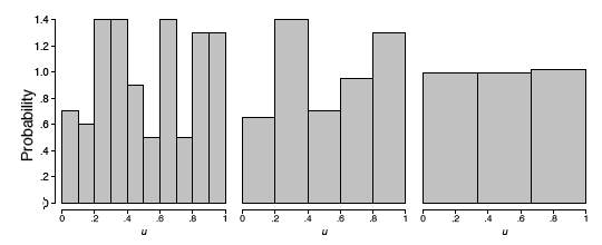
Figure 2. Three histograms of a sample of 100 uniform points.
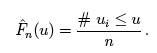
Alternatively, we might use the cumulative distribution function (CDF), which is denoted by F(μ). The CDF gives the probability that the spinner gives a value less than or equal to μ, that is, the probability that the red arrow lands in the interval [0, μ]. By simple arithmetic, F(μ) = μ, which is the diagonal straight line y = x. The CDF based upon the sample data is called the empirical CDF (ECDF), is denoted by  , and is defined to be the fraction of the data less than or equal to μ; that is,
In general, the ECDF takes on a ragged staircase appearance.
For the spinner sample analyzed in Figure 2, we computed the ECDF and CDF, which are displayed in Figure 3. In the left frame, the ECDF appears close to the line y = x, shown in the middle frame. In the right frame, we overlay these two curves and verify that they are indeed quite close to each other. Observe that we do not need to specify the number of bins as with the histogram.
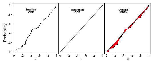
Figure 3. The empirical and theoretical cumulative distribution functions of a sample of 100 uniform points.
q-q plot for uniform data
The q-q plot for uniform data is very similar to the empirical CDF graphic, except with the axes reversed. The q-q plot provides a visual comparison of the sample quantiles to the corresponding theoretical quantiles. In general, if the points in a q-q plot depart from a straight line, then the assumed distribution is called into question.
Here we define the qth quantile of a batch of n numbers as a number ξqsuch that a fraction q x n of the sample is less than ξq, while a fraction (1 - q) x n of the sample is greater than ξq. The best known quantile is the median, ξ0.5, which is located in the middle of the sample.
Consider a small sample of 5 numbers from the spinner:
μ1 = 0.41, μ2 =0.24, μ3 =0.59, μ4 =0.03,and μ5 =0.67.
Based upon our description of the spinner, we expect a uniform distribution to model these data. If the sample data were “perfect,” then on average there would be an observation in the middle of each of the 5 intervals: 0 to .2, .2 to .4, .4 to .6, and so on. Table 1 shows the 5 data points (sorted in ascending order) and the theoretically expected value of each based on the assumption that the distribution is uniform (the middle of the interval).
Table 1. Computing the Expected Quantile Values.
| Data (μ) | Rank (i) |
Middle of the ith Interval |
|---|---|---|
|
.03 .24 .41 .59 .67 |
1 2 3 4 5 |
.1 .3 .5 .7 .9 |
The theoretical and empirical CDFs are shown in Figure 4 and the q-q plot is shown in the left frame of Figure 5.
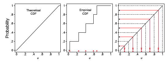
Figure 4. The theoretical and empirical CDFs of a small sample of 5 uniform points, together with the expected values of the 5 points (red dots in the right frame).
In general, we consider the full set of sample quantiles to be the sorted data values
μ(1) < μ(2) < μ(3) < ··· < μ(n-1) < μ(n) ,
where the parentheses in the subscript indicate the data have been ordered. Roughly speaking, we expect the first ordered value to be in the middle of the interval (0, 1/n), the second to be in the middle of the interval (1/n, 2/n), and the last to be in the middle of the interval ((n - 1)/n, 1). Thus, we take as the theoretical quantile the value
where q corresponds to the ith ordered sample value. We subtract the quantity 0.5 so that we are exactly in the middle of the interval ((i - 1)/n, i/n). These ideas are depicted in the right frame of Figure 4 for our small sample of size n = 5.
We are now prepared to define the q-q plot precisely. First, we compute the n expected values of the data, which we pair with the n data points sorted in ascending order. For the uniform density, the q-q plot is composed of the n ordered pairs
This definition is slightly different from the ECDF, which includes the points (u(i), i/n). In the left frame of Figure 5, we display the q-q plot of the 5 points in Table 1. In the right two frames of Figure 5, we display the q-q plot of the same batch of numbers used in Figure 2. In the final frame, we add the diagonal line y = x as a point of reference.
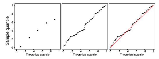
Figure 5. (Left) q-q plot of the 5 uniform points. (Right) q-q plot of a sample of 100 uniform points.
The sample size should be taken into account when judging how close the q-q plot is to the straight line. We show two other uniform samples of size n = 10 and n = 1000 in Figure 6. Observe that the q-q plot when n = 1000 is almost identical to the line y = x, while such is not the case when the sample size is only n = 10.
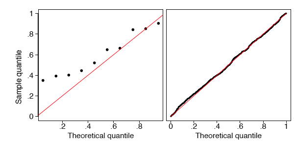
Figure 6. q-q plots of a sample of 10 and 1000 uniform points.
In Figure 7, we show the q-q plots of two random samples that are not uniform. In both examples, the sample quantiles match the theoretical quantiles only at the median and at the extremes. Both samples seem to be symmetric around the median. But the data in the left frame are closer to the median than would be expected if the data were uniform. The data in the right frame are further from the median than would be expected if the data were uniform.
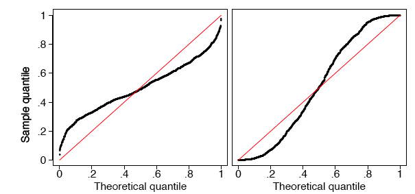
Figure 7. q-q plots of two samples of size 1000 that are not uniform.
In fact, the data were generated in the R language from beta distributions with parameters a = b = 3 on the left and a = b =0.4 on the right. In Figure 8 we display histograms of these two data sets, which serve to clarify the true shapes of the densities. These are clearly non-uniform.
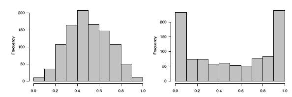
Figure 8. Histograms of the two non-uniform data sets.
q-q plot for normal data
The definition of the q-q plot may be extended to any continuous density. The q-q plot will be close to a straight line if the assumed density is correct. Because the cumulative distribution function of the uniform density was a straight line, the q-q plot was very easy to construct. For data that are not uniform, the theoretical quantiles must be computed in a different manner.
Let {z1, z2, ..., zn} denote a random sample from a normal distribution
with mean μ = 0 and standard deviation σ = 1. Let the ordered values be
denoted by
z{1) < z(2) < z(3) < ... < z(n-1) <z(n).
These n ordered values will play the role of the sample quantiles.
Let us consider a sample of 5 values from a distribution to see how they compare with what would be expected for a normal distribution. The 5 values in ascending order are shown in the first column of Table 2.
Table 2. Computing the expected quantile values for normal data.
| Data (z) | Rank (i) |
Middle of the ith Interval |
Normal(z) |
|---|---|---|---|
|
-1.96 -.78 .31 1.15 1.62 |
1 2 3 4 5 |
.1 .3 .5 .7 .9 |
-1.28 -0.52 0.00 0.52 1.28 |
Just as in the case of the uniform distribution, we have 5 intervals. However, with a normal distribution the theoretical quantile is not the middle of the interval but rather the inverse of the normal distribution for the middle of the interval. Taking the first interval as an example, we want to know the z value such that 0.1 of the area in the normal distribution is below z. This can be computed using the Inverse Normal Calculator as shown in Figure 9. Simply set the “Shaded Area” field to the middle of the interval (0.1) and click on the “Below” button. The result is -1.28. Therefore, 10% of the distribution is below a z value of -1.28.
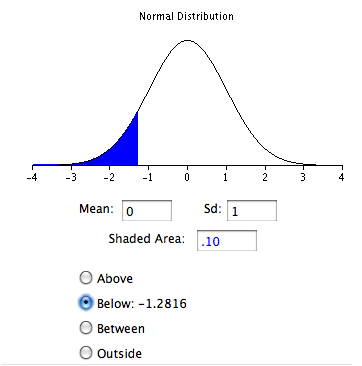
Figure 9. Example of the Inverse Normal Calculator for finding a value of the expected quantile from a normal distribution.
The q-q plot for the data in Table 2 is shown in the left frame of Figure 11.
In general, what should we take as the corresponding theoretical quantiles? Let the cumulative distribution function of the normal density be denoted by Φ(z). In the previous example, Φ(-1.28) = 0.10 and Φ(0.00) = 0.50. Using the quantile notation, if ξq is the qth quantile of a normal distribution, then
Φ(ξq)= q.
That is, the probability a normal sample is less than ξq is in fact just q.
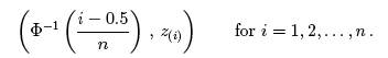
Consider the first ordered value, z(1). What might we expect the value of Φ(z(1)) to be? Intuitively, we expect this probability to take on a value in the interval (0, 1/n). Likewise, we expect Φ(z(2)) to take on a value in the interval (1/n, 2/n). Continuing, we expect Φ(z(n)) to fall in the interval ((n - 1)/n, 1). Thus, the theoretical quantile we desire is defined by the inverse (not reciprocal) of the normal CDF. In particular, the theoretical quantile corresponding to the empirical quantile z(i) should be
for i = 1, 2, ..., n.
The empirical CDF and theoretical quantile construction for the small sample given in Table 2 are displayed in Figure 10. For the larger sample of size 100, the first few expected quantiles are -2.576, -2.170, and -1.960.
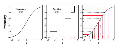
Figure 10. The empirical CDF of a small sample of 5 normal points, together with the expected values of the 5 points (red dots in the right frame).
In the left frame of Figure 11, we display the q-q plot of the small normal sample given in Table 2. The remaining frames in Figure 11 display the q-q plots of normal random samples of size n = 100 and n = 1000. As the sample size increases, the points in the q-q plots lie closer to the line y = x.
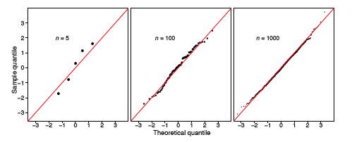
Figure 11. q-q plots of normal data.
As before, a normal q-q plot can indicate departures from normality. The two most common examples are skewed data and data with heavy tails (large kurtosis). In Figure 12, we show normal q-q plots for a chi-squared (skewed) data set and a Student’s-t (kurtotic) data set, both of size n = 1000. The data were first standardized. The red line is again y = x. Notice, in particular, that the data from the t distribution follow the normal curve fairly closely until the last dozen or so points on each extreme.
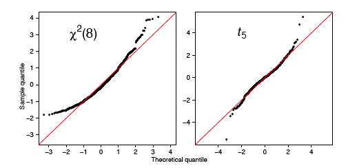
Figure 12. q-q plots for standardized non-normal data (n = 1000).
q-q plots for normal data with general mean and scale
Our previous discussion of q-q plots for normal data all assumed that our data were standardized. One approach to constructing q-q plots is to first standardize the data and then proceed as described previously. An alternative is to construct the plot directly from raw data.
In this section, we present a general approach for data that are not standardized. Why did we standardize the data in Figure 12? The q-q plot is comprised of the n points
If the original data {zi} are normal, but have an arbitrary mean μ and standard deviation σ, then the line y = x will not match the expected theoretical quantiles. Clearly, the linear transformation
μ + σ ξq
would provide the qth theoretical quantile on the transformed scale. In practice, with a new data set
{x1,x2,...,xn} ,
the normal q-q plot would consist of the n points
Instead of plotting the line y = x as a reference line, the line
y = M + s · x
should be composed, where M and s are the sample moments (mean and standard deviation) corresponding to the theoretical moments μ and σ. Alternatively, if the data are standardized, then the line y = x would be appropriate, since now the sample mean would be 0 and the sample standard deviation would be 1.
Example: SAT Case Study
The SAT case study followed the academic achievements of 105 college students majoring in computer science. The first variable is their verbal SAT score and the second is their grade point average (GPA) at the university level. Before we compute inferential statistics using these variables, we should check if their distributions are normal. In Figure 13, we display the q-q plots of the verbal SAT and university GPA variables.
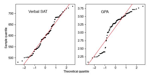
Figure 13. q-q plots for the student data (n = 105).
The verbal SAT seems to follow a normal distribution reasonably well, except in the extreme tails. However, the university GPA variable is highly non-normal. Compare the GPA q-q plot to the simulation in the right frame of Figure 7. These figures are very similar, except for the region where x ≈ -1. To follow these ideas, we computed histograms of the variables and their scatter diagram in Figure 14. These figures tell quite a different story. The university GPA is bimodal, with about 20% of the students falling into a separate cluster with a grade of C. The scatter diagram is quite unusual. While the students in this cluster all have below average verbal SAT scores, there are as many students with low SAT scores whose GPAs were quite respectable. We might speculate as to the cause(s): different distractions, different study habits, but it would only be speculation. But observe that the raw correlation between verbal SAT and GPA is a rather high 0.65, but when we exclude the cluster, the correlation for the remaining 86 students falls a little to 0.59.
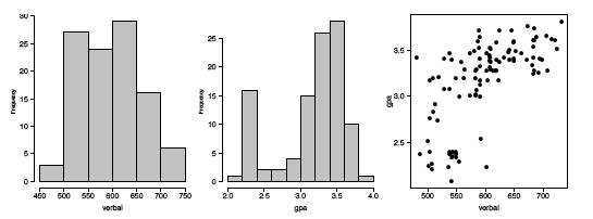
Figure 14. Histograms and scatter diagram of the verbal SAT and GPA variables for the 105 students.
Discussion
Parametric modeling usually involves making assumptions about the shape of data, or the shape of residuals from a regression fit. Verifying such assumptions can take many forms, but an exploration of the shape using histograms and q-q plots is very effective. The q-q plot does not have any design parameters such as the number of bins for a histogram.
In an advanced treatment, the q-q plot can be used to formally test the null hypothesis that the data are normal. This is done by computing the correlation coefficient of the n points in the q-q plot. Depending upon n, the null hypothesis is rejected if the correlation coefficient is less than a threshold. The threshold is already quite close to 0.95 for modest sample sizes.
We have seen that the q-q plot for uniform data is very closely related to the empirical cumulative distribution function. For general density functions, the so-called probability integral transform takes a random variable X and maps it to the interval (0, 1) through the CDF of X itself, that is,
Y = FX(X)
which has been shown to be a uniform density. This explains why the q-q plot on standardized data is always close to the line y = x when the model is correct.
Finally, scientists have used special graph paper for years to make relationships linear (straight lines). The most common example used to be semi-log paper, on which points following the formula y = aebx appear linear. This follows of course since log(y) = log(a) + bx, which is the equation for a straight line. The q-q plots may be thought of as being “probability graph paper” that makes a plot of the ordered data values into a straight line. Every density has its own special probability graph paper.
QQPlot/Quantile-Quantile Plot相关推荐
- Quantile Quantile Plot----QQ图
QQ图是统计学一种常用的图,但是今天上网查了一下竟然一下子没找到讲解的非常好的资料,一番搜索后发现了下面这篇文章,直观易懂,点赞点赞,特此转载. 原文地址 添加链接描述
- 分位数回归(Quantile regression)笔记
分位数回归(Quantile regression)是在给定 X \mathbf{X} X的条件下估计 y \mathbf{y} y的中位数或其他分位数, 这是与最小二乘法估计条件均值最大的不同. 分 ...
- pandas中quantile函数浅解
1 分位数(Quantile) 分位数(Quantile),亦称分位点,是连续分布函数中的一个点,该点将一个随机变量的概率分布范围分为几个等份的数值点,这个点对应概率p.若概率0<p<1, ...
- 【Python】NumPy 的分位数实现 quantile() 是否出错
文章目录 四分位数. numpy.quantile() 实例与代码. 四分位数. 给定长度为 nnn 的升序序列,四分位数有 333 个,其位置由下式给出:Qi=i4(n+1),i=1,2,3(1)Q ...
- Kaggle比赛(二)House Prices: Advanced Regression Techniques
房价预测是我入门Kaggle的第二个比赛,参考学习了他人的一篇优秀教程:https://www.kaggle.com/serigne/stacked-regressions-top-4-on-lead ...
- 数理统计(matlab实现)
目录 一.区间估计 二.QQ图 三.秩和检验 四.方差分析 4.1单因素方差分析 4.2双因素方差分析 4.2多因素方差分析 五.回归分析 5.1多元线性回归 5.2后退法 一.区间估计 1.有一大批 ...
- 【转】第5章 数据的描述性分析
文章来源于:炼数成金:摘自<数据分析:R语言实战> 第5章 数据的描述性分析 通过前面两章的学习,我们知道,数据收集是取得统计数据的过程,数据预处理是将数据中的问题清理干净,那么接下来的步 ...
- 10个实用的数据可视化的图表总结
用于深入了解数据的一些独特的数据可视化技术 可视化是一种方便的观察数据的方式,可以一目了然地了解数据块.我们经常使用柱状图.直方图.饼图.箱图.热图.散点图.线状图等.这些典型的图对于数据可视化是必不 ...
- matlab中normfit函数进行正太分布拟合
一.简介 正态分布(Normal distribution)又名高斯分布(Gaussian distribution),是一个在数学.物理及工程等领域都非常重要的概率分布,在统计学的许多方面有着重大的 ...
- PP图和QQ图以及它们意义
先说结论1: P-P图和Q-Q图的用途完全相同,只是检验方法存在差异. 如果两个分布相似,则该Q-Q图趋近于落在y=x线上.如果两分布线性相关,则点在Q-Q图上趋近于落在一条直线上,但不一定在y=x线 ...
最新文章
- UIButton的属性设置
- 深入理解 sudo 与 su 之间的区别
- linux help命令编写,Linux shell命令帮助格式详解
- Atitit 知识管理的重要方法 数据来源,聚合,分类,备份,发布 搜索
- linux qt显示gif图片,QT显示GIF图片
- 《Applying Deep Learning to Answer Selection: A Study And an Open Task》文章理解小结
- vscode 不能运行h5c3代码_Golang安装与环境搭建并在VSCode里面输出HelloWord
- pam_limits(sshd:session): unknown limit item 'noproc'
- STM32——库函数版——独立按键程序
- Google Code Review代码审查标准
- GetLastError错误码大全
- VSS2005下载地址 VS6.0d下载地址(软件+我的教程)
- Three 之 three.js (webgl)涉及的各种材质简单说明(常用材质配有效果图)
- VMWare 导出vmdk并转为qcow2格式
- python中as是什么意思_python中with python中with as 是什么意思刚入门求解释!!!
- 车牌识别相机4G、WiFi联网功能
- NLP中的全局注意力机制(Global Attention)
- Oracle导入英文日期格式数据出现问题的解决
- 实例学习Ansible系列:配置文件ansible.cfg的设定与使用
- 自编码器(Autoencoder)基本原理与模型实现