r语言ggplot合并图形_R中带有ggplot2的图形
r语言ggplot合并图形
介绍 (Introduction)
R is known to be a really powerful programming language when it comes to graphics and visualizations (in addition to statistics and data science of course!).
当涉及图形和可视化时(当然,除了统计和数据科学!), R是一种非常强大的编程语言。
To keep it short, graphics in R can be done in two ways, via the:
为了简短起见,R中的图形可以通过以下两种方式完成:
{graphics}package (the base graphics in R, loaded by default){graphics}软件包(R中的基本图形,默认情况下加载){ggplot2}package (which needs to be installed and loaded beforehand){ggplot2}软件包(需要预先安装和加载 )
The {graphics} package comes with a large choice of plots (such as plot, hist, barplot, boxplot, pie, mosaicplot, etc.) and additional related features (e.g., abline, lines, legend, mtext, rect, etc.). It is often the preferred way to draw plots for most R users, and in particular for beginners to intermediate users.
的{graphics}包带有一个大的选择重复(如plot , hist , barplot , boxplot , pie , mosaicplot等)和其他相关特征(例如, abline , lines , legend , mtext , rect等) 。 对于大多数R用户,尤其是初学者到中级用户,这通常是绘制图的首选方法。
Since its creation in 2005 by Hadley Wickham, {ggplot2} has grown in use to become one of the most popular R packages and the most popular package for graphics and data visualizations. The {ggplot2} package is a much more modern approach to creating professional-quality graphics. More information about the package can be found at ggplot2.tidyverse.org.
自从Hadley Wickham于2005年创建以来, {ggplot2}使用量逐渐增长,已成为最受欢迎的R软件包之一以及用于图形和数据可视化的最受欢迎的软件包之一 。 {ggplot2}软件包是创建专业品质图形的一种更为现代的方法。 有关该软件包的更多信息,请参见ggplot2.tidyverse.org 。
In this article, we will see how to create common plots such as scatter plots, line plots, histograms, boxplots, barplots, density plots in R with this package. If you are unfamiliar with any of these types of graph, you will find more information about each one (when to use it, its purpose, what does it show, etc.) in my article about descriptive statistics in R.
在本文中,我们将看到如何使用此程序包在R中创建常见图,例如散点图,线图,直方图,箱线图,条形图,密度图。 如果您不熟悉这些类型的图形,则可以在我有关R中描述性统计的文章中找到有关每个图形的更多信息(何时使用它,其目的,显示什么等)。
数据 (Data)
To illustrate plots with the {ggplot2} package we will use the mpg dataset available in the package. The dataset contains observations collected by the US Environmental Protection Agency on fuel economy from 1999 to 2008 for 38 popular models of cars (run ?mpg for more information about the data):
为了说明{ggplot2}软件包的绘图,我们将使用软件包中提供的mpg数据集。 该数据集包含美国环境保护署从1999年到2008年收集的关于38种流行车型的燃油经济性的观察结果(运行?mpg以获取有关数据的更多信息):
library(ggplot2)dat <- ggplot2::mpgBefore going further, let’s transform the cyl, drv, fl, year and class variables in factor with the transform() function:
在继续之前,让我们使用transform()函数对cyl , drv , fl , year和class变量进行因子 transform() :
dat <- transform(dat, cyl = factor(cyl), drv = factor(drv), fl = factor(fl), year = factor(year), class = factor(class)){ggplot2}基本原理 (Basic principles of {ggplot2})
The {ggplot2} package is based on the principles of “The Grammar of Graphics” (hence “gg” in the name of {ggplot2}), that is, a coherent system for describing and building graphs. The main idea is to design a graphic as a succession of layers.
{ggplot2}软件包基于“图形语法”的原理(因此以{ggplot2}的名称命名为“ gg”),即描述和构建图形的连贯系统。 主要思想是将图形设计为一系列图层 。
The main layers are:
主要层是:
The dataset that contains the variables that we want to represent. This is done with the
ggplot()function and comes first.包含我们要表示的变量的数据集 。 这是通过
ggplot()函数完成的,并且是第一个。The variable(s) to represent on the x and/or y-axis, and the aesthetic elements (such as color, size, fill, shape and transparency) of the objects to be represented. This is done with the
aes()function (abbreviation of aesthetic).要在x和/或y轴上表示的变量 ,以及要表示的对象的美学元素(例如颜色,大小,填充,形状和透明度)。 这是通过
aes()函数(美学的缩写)完成的。The type of graphical representation (scatter plot, line plot, barplot, histogram, boxplot, etc.). This is done with the functions
geom_point(),geom_line(),geom_bar(),geom_histogram(),geom_boxplot(), etc.图形表示的类型 (散点图,折线图,条形图,直方图,箱形图等)。 这是通过函数
geom_point(),geom_line(),geom_bar(),geom_histogram(),geom_boxplot()等完成的。- If needed, additional layers (such as labels, annotations, scales, axis ticks, legends, themes, facets, etc.) can be added to personalize the plot.如果需要,可以添加其他图层(例如标签,注释,比例,轴刻度,图例,主题,构面等)来个性化绘图。
To create a plot, we thus first need to specify the data in the ggplot() function and then add the required layers such as the variables, the aesthetic elements and the type of plot:
因此,要创建绘图,我们首先需要在ggplot()函数中指定数据,然后添加所需的图层,例如变量,美观元素和绘图类型:
ggplot(data) + aes(x = var_x, y = var_y) + geom_x()datainggplot()is the name of the data frame which contains the variablesvar_xandvar_y.data在ggplot()是其中包含变量的数据帧的名称var_x和var_y。The
+symbol is used to indicate the different layers that will be added to the plot. Make sure to write the+symbol at the end of the line of code and not at the beginning of the line, otherwise R throws an error.+符号用于指示将添加到绘图中的不同图层。 确保在代码行的末尾而不是在行的开头写+,否则R会引发错误。The layer
aes()indicates what variables will be used in the plot and more generally, the aesthetic elements of the plot.图层
aes()指示将在情节中使用哪些变量,更普遍地指示情节的美学元素。Finally,
xingeom_x()represents the type of plot.最后,
geom_x()x表示图的类型。- Other layers are usually not required unless we want to personalize the plot further.除非我们想进一步个性化绘图,否则通常不需要其他图层。
Note that it is a good practice to write one line of code per layer to improve code readability.
请注意,优良作法是每层编写一行代码以提高代码的可读性。
使用{ggplot2}创建图 (Create plots with {ggplot2})
In the following sections we will show how to draw the following plots:
在以下各节中,我们将显示如何绘制以下图:
- scatter plot散点图
- line plot线图
- histogram直方图
- density plot密度图
- boxplot箱形图
- barplot条形图
In order to focus on the construction of the different plots and the use of {ggplot2}, we will restrict ourselves to drawing basic (yet beautiful) plots without unnecessary layers. For the sake of completeness, we will briefly discuss and illustrate different layers to further personalize a plot at the end of the article (see this section).
为了专注于不同图的构建和{ggplot2}的使用,我们将限制自己绘制基本(至今很漂亮)的图而没有不必要的图层。 为了完整起见,我们将在文章末尾简要讨论和说明不同的层次,以进一步个性化情节(请参阅本节 )。
Note that if you still struggle to create plots with {ggplot2} after reading this tutorial, you may find the {esquisse} addin useful. This addin allows you to interactively (that is, by dragging and dropping variables) create plots with the {ggplot2} package. Give it a try!
请注意,如果在阅读完本教程后仍然{ggplot2}创建图,则可能会发现{esquisse}插件很有用。 这个插件允许您使用{ggplot2}软件包以交互方式 (即,通过拖放变量)创建图。 试试看!
散点图 (Scatter plot)
We start by creating a scatter plot using geom_point. Remember that a scatter plot is used to visualize the relation between two quantitative variables.
我们首先使用geom_point创建散点图 。 请记住,散点图用于可视化两个定量变量之间的关系。
- We start by specifying the data:我们首先指定数据:
ggplot(dat) # data
2. Then we add the variables to be represented with the aes() function:
2.然后,添加要使用aes()函数表示的变量:
ggplot(dat) + # data aes(x = displ, y = hwy) # variables
3. Finally, we indicate the type of plot:
3.最后,我们指出情节的类型:
ggplot(dat) + # data aes(x = displ, y = hwy) + # variables geom_point() # type of plot
You will also sometimes see the aesthetic elements (aes() with the variables) inside the ggplot() function in addition to the dataset:
除了数据集,有时您还会在ggplot()函数中看到美学元素(带有变量的aes() ):
ggplot(mpg, aes(x = displ, y = hwy)) + geom_point()
This second method gives the exact same plot than the first method. I tend to prefer the first method over the second for better readability, but this is more a matter of taste so the choice is up to you.
第二种方法给出的绘图与第一种方法完全相同。 为了更好的可读性,我倾向于选择第一种方法而不是第二种方法,但这更多地取决于口味,因此选择取决于您。
线图 (Line plot)
Line plots, particularly useful in time series or finance, can be created similarly but by using geom_line():
可以通过创建geom_line()类似地创建在时间序列或财务方面特别有用的折线图 :
ggplot(dat) + aes(x = displ, y = hwy) + geom_line()
线和点的组合 (Combination of line and points)
An advantage of {ggplot2} is the ability to combine several types of plots and its flexibility in designing it. For instance, we can add a line to a scatter plot by simply adding a layer to the initial scatter plot:
{ggplot2}一个优点是能够组合几种类型的图及其在设计时的灵活性。 例如,我们可以通过简单地在初始散点图上添加一层来向散点图添加一条线:
ggplot(dat) + aes(x = displ, y = hwy) + geom_point() + geom_line() # add line
直方图 (Histogram)
A histogram (useful to visualize distributions and detect potential outliers) can be plotted using geom_histogram():
可以使用geom_histogram()绘制直方图 (用于可视化分布并检测潜在的离群值 geom_histogram() :
ggplot(dat) + aes(x = hwy) + geom_histogram()
By default, the number of bins is equal to 30. You can change this value using the bins argument inside the geom_histogram() function:
默认情况下,箱数等于30。您可以使用geom_histogram()函数内的bins参数更改此值:
ggplot(dat) + aes(x = hwy) + geom_histogram(bins = sqrt(nrow(dat)))
Here I specify the number of bins to be equal to the square root of the number of observations (following Sturge’s rule) but you can specify any numeric value.
在这里,我指定箱数等于观察数的平方根(遵循Sturge规则),但是您可以指定任何数值。
密度图 (Density plot)
Density plots can be created using geom_density():
可以使用geom_density()创建密度图 :
ggplot(dat) + aes(x = hwy) + geom_density()
直方图和密度的组合 (Combination of histogram and densities)
We can also superimpose a histogram and a density curve on the same plot:
我们还可以在同一图上叠加直方图和密度曲线:
ggplot(dat) + aes(x = hwy, y = ..density..) + geom_histogram() + geom_density()
Or superimpose several densities:
或叠加几种密度:
ggplot(dat) + aes(x = hwy, color = drv, fill = drv) + geom_density(alpha = 0.25) # add transparency
The argument alpha = 0.25 has been added for some transparency. More information about this argument can be found in this section.
添加了alpha = 0.25参数以提高透明度。 有关此参数的更多信息,请参见本节 。
箱形图 (Boxplot)
A boxplot (also very useful to visualize distributions and detect potential outliers) can be plotted using geom_boxplot():
可以使用geom_boxplot()绘制箱形图 (对可视化分布和检测潜在异常值也非常有用geom_boxplot() :
# Boxplot for one variableggplot(dat) + aes(x = "", y = hwy) + geom_boxplot()
# Boxplot by factorggplot(dat) + aes(x = drv, y = hwy) + geom_boxplot()
It is also possible to plot the points on the boxplot with geom_jitter(), and to vary the width of the boxes according to the size (i.e., the number of observations) of each level with varwidth = TRUE:
还可以使用geom_jitter()在geom_jitter()上绘制点,并使用varwidth = TRUE根据每个级别的大小(即观察数)来改变盒子的宽度:
ggplot(dat) + aes(x = drv, y = hwy) + geom_boxplot(varwidth = TRUE) + # vary boxes width according to n obs. geom_jitter(alpha = 0.25, width = 0.2) # adds random noise and limit its width
The geom_jitter() layer adds some random variation to each point in order to prevent them from overlapping (an issue known as overplotting).1 Moreover, the alpha argument adds some transparency to the points (see more in this section) to keep the focus on the boxes and not on the points.
geom_jitter()层向每个点添加一些随机变化,以防止它们重叠(称为geom_jitter() )。 1此外, alpha参数为点增加了一些透明度(请参阅本节中的更多内容 ),以使焦点集中在框上而不是点上。
Finally, it is also possible to divide boxplots into several panels according to the levels of a qualitative variable:
最后,还可以根据定性变量的级别将箱形图分成几个面板:
ggplot(dat) + aes(x = drv, y = hwy) + geom_boxplot(varwidth = TRUE) + # vary boxes width according to n obs. geom_jitter(alpha = 0.25, width = 0.2) + # adds random noise and limit its width facet_wrap(~year) # divide into 2 panels
For a visually more appealing plot, it is also possible to use some colors for the boxes depending on the x variable:
对于视觉上更具吸引力的图,还可以根据x变量为框使用一些颜色:
ggplot(dat) + aes(x = drv, y = hwy, fill = drv) + # add color to boxes with fill geom_boxplot(varwidth = TRUE) + # vary boxes width according to n obs. geom_jitter(alpha = 0.25, width = 0.2) + # adds random noise and limit its width facet_wrap(~year) + # divide into 2 panels theme(legend.position = "none") # remove legend
In that case, it best to remove the legend as it becomes redundant. See more information about the legend in this section.
在这种情况下,最好删除图例,因为它变得多余。 在本节中查看有关图例的更多信息。
条形图 (Barplot)
A barplot (useful to visualize qualitative variables) can be plotted using geom_bar():
可以使用geom_bar()绘制条形图 (用于可视化定性变量geom_bar() :
ggplot(dat) + aes(x = drv) + geom_bar()
By default, the heights of the bars correspond to the observed frequencies for each level of the variable of interest (drv in our case).
默认情况下,条形的高度对应于所关注变量的每个级别(在本例中为drv )的观测频率。
Again, for a more appealing plot, we can add some colors to the bars with the fill argument:
再次,对于更具吸引力的绘图,我们可以使用fill参数为条形添加一些颜色:
ggplot(dat) + aes(x = drv, fill = drv) + # add colors to bars geom_bar() + theme(legend.position = "none") # remove legend
We can also create a barplot with two qualitative variables:
我们还可以创建带有两个定性变量的条形图:
ggplot(dat) + aes(x = drv, fill = year) + # fill by years geom_bar()
In order to compare proportions across groups, it is best to make each bar the same height using position = "fill":
为了比较各组之间的比例,最好使用position = "fill"将每个条形设置为相同的高度:
ggplot(dat) + geom_bar(aes(x = drv, fill = year), position = "fill")
To draw the bars next to each other for each group, use position = "dodge":
要为每个组彼此相邻绘制条,请使用position = "dodge" :
ggplot(dat) + geom_bar(aes(x = drv, fill = year), position = "dodge")
进一步个性化 (Further personalization)
标签 (Labels)
The first things to personalize in a plot is the labels to make the plot more informative to the audience. We can easily add a title, subtitle, caption and edit axis titles with the labs() function:
在情节中进行个性化设置的第一件事是使情节对观众更具参考价值的标签。 我们可以使用labs()函数轻松添加标题,字幕,标题和编辑轴标题:
p <- ggplot(dat) + aes(x = displ, y = hwy) + geom_point()p + labs( title = "Fuel efficiency for 38 popular models of car", subtitle = "Period 1999-2008", caption = "Data: ggplot2::mpg. See more at www.statsandr.com", x = "Engine displacement (litres)", y = "Highway miles per gallon (mpg)")
As you can see in the above code, you can save one or more layers of the plot in an object for later use. This way, you can save your “main” plot, and add more layers of personalization until you get the desired output. Here we saved the main scatter plot in an object called p and we will refer to it for the subsequent personalizations.
如您在上面的代码中看到的,您可以将图形的一层或多层保存在一个对象中以备后用。 这样,您可以保存“主”图,并添加更多的个性化层,直到获得所需的输出。 在这里,我们将主散点图保存在名为p的对象中,并在以后的个性化设置中参考它。
轴刻度 (Axis ticks)
Axis ticks can be adjusted using scale_x_continuous() and scale_y_continuous() for the x and y-axis, respectively:
可以使用scale_x_continuous()和scale_y_continuous()为x和y轴调整轴刻度:
# Adjust ticksp + scale_x_continuous(breaks = seq(from = 1, to = 7, by = 0.5)) + # x-axis scale_y_continuous(breaks = seq(from = 10, to = 45, by = 5)) # y-axis
日志转换 (Log transformations)
In some cases, it is useful to plot the log transformation of the variables. This can be done with the scale_x_log10() and scale_y_log10() functions:
在某些情况下,绘制变量的对数转换很有用。 这可以通过scale_x_log10()和scale_y_log10()函数来完成:
p + scale_x_log10() + scale_y_log10()
限度 (Limits)
The most convenient way to control the limits of the plot is to use again the scale_x_continuous() and scale_y_continuous() functions in addition to the limits argument:
控制图的极限的最方便的方法是,除了limits参数之外,再次使用scale_x_continuous()和scale_y_continuous()函数:
p + scale_x_continuous(limits = c(3, 6)) + scale_y_continuous(limits = c(20, 30))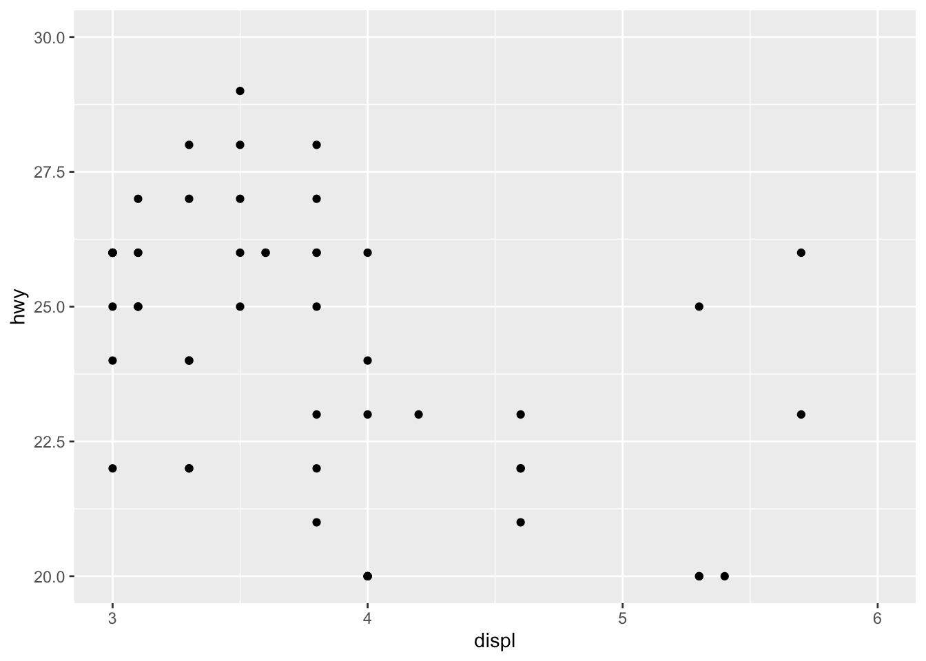
It is also possible to simply take a subset of the dataset with the subset() or filter() function. See how to subset a dataset if you need a reminder.
也可以使用subset()或filter()函数简单地获取数据集的一个子集。 如果需要提醒,请参阅如何对数据集进行子集设置 。
传说 (Legend)
By default, the legend is located to the right side of the plot (when there is a legend to be displayed of course). To control the position of the legend, we need to use the theme() function in addition to the legend.position argument:
默认情况下,图例位于图的右侧(当然要显示图例时)。 要控制图例的位置,除了legend.position参数,我们还需要使用theme()函数:
p + aes(color = class) + theme(legend.position = "top")
Replace "top" by "left" or "bottom" to change its position and by "none" to remove it.
将"top"替换为"left"或"bottom"以更改其位置,并替换为"none"以将其删除。
The title of the legend can be removed with legend.title = element_blank():
可以使用legend.title = element_blank()删除图例的标题:
p + aes(color = class) + theme( legend.title = element_blank(), legend.position = "bottom" )
The legend now appears at the bottom of the plot, without the legend title.
现在,图例出现在图的底部,没有图例标题。
形状,颜色,大小和透明度 (Shape, color, size and transparency)
There are a very large number of options to improve the quality of the plot or to add additional information. These include:
有很多选项可以改善绘图质量或添加其他信息。 这些包括:
- shape,形状,
- size,尺寸,
- color, and颜色,以及
- alpha (transparency).alpha(透明度)。
We can for instance change the shape of all points in a scatter plot by adding shape to geom_point(), or vary the shape according to the values taken by another variable (in that case, the shape argument must be inside aes()):2
例如,我们可以通过将shape添加到geom_point()来geom_point()散点图中所有点的shape ,或者根据另一个变量获取的值来改变形状(在这种情况下, shape参数必须位于aes() ): 2
# Change shape of all pointsggplot(dat) + aes(x = displ, y = hwy) + geom_point(shape = 4)
# Change shape of points based on a categorical variableggplot(dat) + aes(x = displ, y = hwy, shape = drv) + geom_point()
Following the same principle, we can modify the color, size and transparency of the points based on a qualitative or quantitative variable. Here are some examples:
遵循相同的原理,我们可以基于定性或定量变量来修改点的颜色,大小和透明度。 这里有些例子:
p <- ggplot(dat) + aes(x = displ, y = hwy) + geom_point()# Change color for all pointsp + geom_point(color = "steelblue")
# Change color based on a qualitative variablep + aes(color = drv)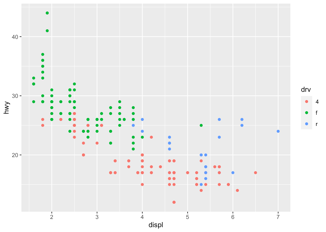
# Change color based on a quantitative variablep + aes(color = cty)
# Change color based on a criterion (median of cty variable)p + aes(color = cty > median(cty))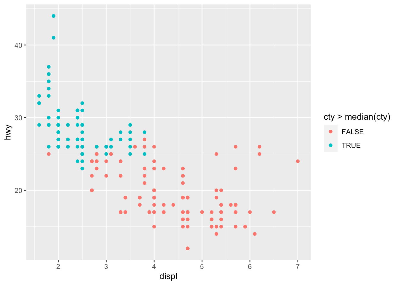
# Change size of all pointsp + geom_point(size = 4)
# Change size of points based on a quantitative variablep + aes(size = cty)
# Change transparency based on a quantitative variablep + aes(alpha = cty)
We can of course mix several options (shape, color, size, alpha) to build more complex graphics:
我们当然可以混合使用多个选项(形状,颜色,大小,alpha)来构建更复杂的图形:
p + geom_point(size = 0.5) + aes(color = drv, shape = year, alpha = cty)
平滑线和回归线 (Smooth and regression lines)
In a scatter plot, it is possible to add a smooth line fitted to the data:
在散点图中,可以添加拟合数据的平滑线:
p + geom_smooth()
In the context of simple linear regression, it is often the case that the regression line is displayed on the plot. This can be done by adding method = lm (lm stands for linear model) in the geom_smooth() layer:
在简单线性回归的情况下,通常在绘图上显示回归线。 这可以通过在geom_smooth()层中添加method = lm ( lm代表线性模型)来geom_smooth() :
p + geom_smooth(method = lm)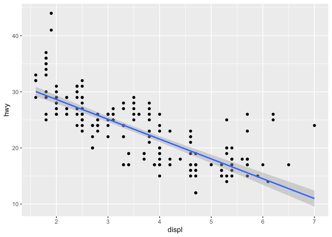
It is also possible to draw a regression line for each level of a categorical variable:
还可以为分类变量的每个级别绘制一条回归线:
p + aes(color = drv, shape = drv) + geom_smooth(method = lm, se = FALSE)
The se = FALSE argument removes the confidence interval around the regression lines.
se = FALSE参数删除回归线周围的置信区间。
刻面 (Facets)
facet_grid allows you to divide the same graphic into several panels according to the values of one or two qualitative variables:
facet_grid允许您根据一个或两个定性变量的值将同一图形分为几个面板:
# According to one variablep + facet_grid(. ~ drv)
# According to 2 variablesp + facet_grid(drv ~ year)
It is then possible to add a regression line to each facet:
然后可以向每个构面添加回归线:
p + facet_grid(. ~ drv) + geom_smooth(method = lm)
facet_wrap() can also be used, as illustrated in this section.
如本节所示,也可以使用facet_wrap() 。
主题 (Themes)
Several functions are available in the {ggplot2} package to change the theme of the plot. The most common themes after the default theme (i.e., theme_gray()) are the black and white (theme_bw()), minimal (theme_minimal()) and classic (theme_classic()) themes:
{ggplot2}软件包中提供了几个功能,可以更改绘图的主题。 默认主题(例如, theme_gray() )之后最常见的主题是黑白( theme_bw() ),最小( theme_minimal() )和经典( theme_classic() )主题:
# Black and white themep + theme_bw()
# Minimal themep + theme_minimal()
# Classic themep + theme_classic()
I tend to use the minimal theme for most of my R Markdown reports as it brings out the patterns and points and not the layout of the plot, but again this is a matter of personal taste. See more themes at ggplot2.tidyverse.org/reference/ggtheme.html and in the {ggthemes} package.
我倾向于在我的大多数R Markdown报告中使用最小主题,因为它显示出图案和点而不是情节的布局,但这再次是个人喜好问题。 在ggplot2.tidyverse.org/reference/ggtheme.html和{ggthemes}包中查看更多主题。
In order to avoid having to change the theme for each plot you create, you can change the theme for the current R session using the theme_set() function as follows:
为了避免必须为创建的每个绘图更改主题,可以使用theme_set()函数更改当前R会话的主题,如下所示:
theme_set(theme_minimal()){plotly}互动情节 (Interactive plot with {plotly})
You can easily make your plots created with {ggplot2} interactive with the {plotly} package:
您可以轻松地使由{ggplot2}创建的绘图与{plotly}软件包进行交互:
library(plotly)ggplotly(p + aes(color = year))Go to the original article to see the interactive plot.
转到原始文章以查看交互式图解。
You can now hover over a point to display more information about that point. There is also the possibility to zoom in and out, to download the plot, to select some observations, etc. More information about {plotly} for R can be found here.
现在,您可以将鼠标悬停在一个点上以显示有关该点的更多信息。 也可以放大和缩小,下载图,选择一些观测值等。有关{plotly} for R的更多信息,请参见此处 。
将地块与{patchwork} (Combine plots with {patchwork})
There are several ways to combine plots made in {ggplot2}. In my opinion, the most convenient way is with the {patchwork} package using symbols such as +, / and parentheses.
有几种方法可以组合在{ggplot2}制作的图。 我认为,最方便的方法是使用{patchwork}包,并使用+ , /和括号之类的符号。
We first need to create some plots and save them:
我们首先需要创建一些图并保存它们:
p_a <- ggplot(dat) + aes(x = displ, y = hwy) + geom_point()p_b <- ggplot(dat) + aes(x = hwy) + geom_histogram()p_c <- ggplot(dat) + aes(x = drv, y = hwy) + geom_boxplot()Now that we have 3 plots saved in our environment, we can combine them. To have plots next to each other simply use the + symbol:
现在我们已经在环境中保存了3个图,我们可以将它们合并。 要使绘图彼此相邻,只需使用+符号:
library(patchwork)p_a + p_b + p_c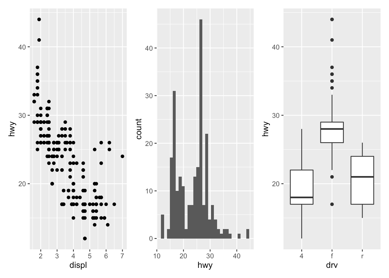
To display them above each other simply use the / symbol:
要将它们彼此上方显示,只需使用/符号:
p_a / p_b / p_c
And finally, to combine them above and next to each other, mix +, / and parentheses:
最后,要将它们彼此上下组合,请混合+ , /和括号:
p_a + p_b / p_c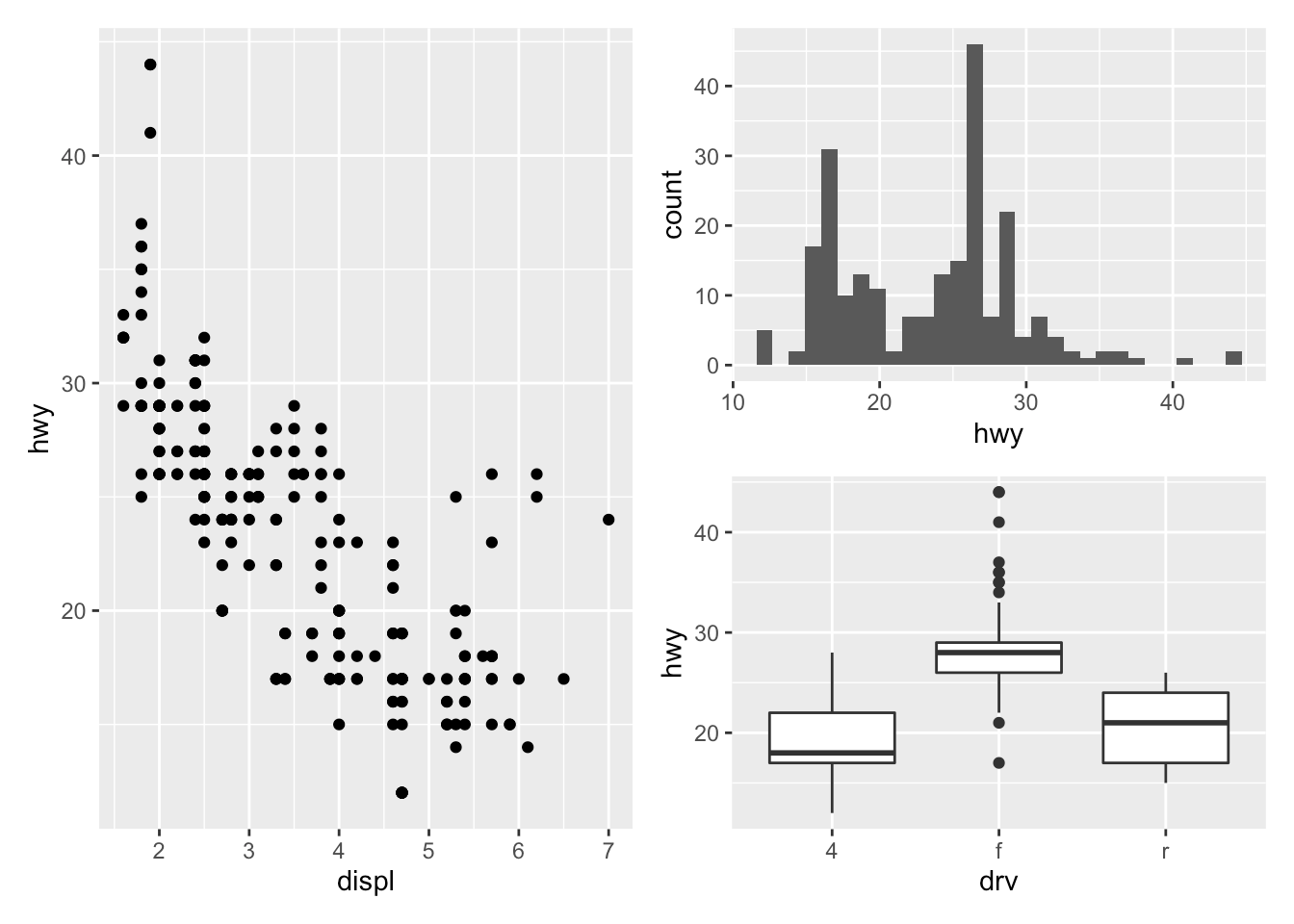
(p_a + p_b) / p_c
翻转坐标 (Flip coordinates)
Flipping coordinates of your plot is useful to create horizontal boxplots, or when labels of a variable are so long that they overlap each other on the x-axis. See with and without flipping coordinates below:
绘图的翻转坐标对于创建水平箱形图很有用,或者当变量的标签太长以致于它们在x轴上相互重叠时,很有用。 请参见下面有无翻转坐标的情况:
# without flipping coordinatesp1 <- ggplot(dat) + aes(x = class, y = hwy) + geom_boxplot()# with flipping coordinatesp2 <- ggplot(dat) + aes(x = class, y = hwy) + geom_boxplot() + coord_flip()library(patchwork)p1 + p2 # left: without flipping, right: with flipping
This can be done with many types of plot, not only with boxplots. For instance, if a categorical variable has many levels or the labels are long, it is usually best to flip the coordinates for a better visual:
这不仅可以通过箱线图进行,而且可以通过多种类型的绘图来完成。 例如,如果类别变量具有多个级别或标签很长,通常最好翻转坐标以获得更好的视觉效果:
ggplot(dat) + aes(x = class) + geom_bar() + coord_flip()
保存情节 (Save plot)
The ggsave() function will save the most recent plot in your current working directory unless you specify a path to another folder:
ggsave()函数会将最新的图保存在当前工作目录中,除非您指定另一个文件夹的路径:
ggplot(dat) + aes(x = displ, y = hwy) + geom_point()ggsave("plot1.pdf")更进一步 (To go further)
By now you have seen that {ggplot2} is a very powerful and complete package to create plots in R. This article illustrated only the tip of the iceberg, and you will find many tutorials on how to create more advanced plots and visualizations with {ggplot2} online. If you want to learn more than what is described in the present article, I highly recommend starting with:
到目前为止,您已经看到{ggplot2}是一个非常强大且完整的软件包,可用于在R中创建绘图。本文仅说明了冰山一角,并且您将找到许多有关如何使用{ggplot2}创建更高级的绘图和可视化效果的{ggplot2}在线。 如果您想学习的内容不限于本文所述,我强烈建议您从以下内容开始:
the chapters Data visualisation and Graphics for communication from the book R for Data Science from Garrett Grolemund and Hadley Wickham
Garrett Grolemund和Hadley Wickham的《 R for Data Science 》一书中的“ 数据可视化和图形通信 ”一章
the book ggplot2: Elegant Graphics for Data Analysis from Hadley Wickham
ggplot2: Hadley Wickham 撰写的用于数据分析的精美图形
the ggplot2 extensions guide which lists many of the packages that extend
{ggplot2}ggplot2扩展指南 ,其中列出了许多扩展
{ggplot2}的软件包the
{ggplot2}cheat sheet{ggplot2}备忘单
Thanks for reading. I hope this article helped you to create your first plots with the {ggplot2} package. As a reminder, for simple graphs, it is sometimes easier to draw them via the {esquisse} addin. After some time, you will quickly learn how to create them by yourselves and in no time you will be able to build complex and sophisticated data visualizations.
谢谢阅读。 希望本文能帮助您使用{ggplot2}包创建第一个绘图。 提醒一下,对于简单的图形,有时可以通过{esquisse}插件来绘制它们。 一段时间后,您将很快学会如何自行创建它们,并且您将很快能够构建复杂而复杂的数据可视化。
As always, if you have a question or a suggestion related to the topic covered in this article, please add it as a comment so other readers can benefit from the discussion.
与往常一样,如果您对本文涉及的主题有疑问或建议,请将其添加为评论,以便其他读者可以从讨论中受益。
Use the
geom_jitter()layer with caution because, although it makes a plot more revealing at large scales, it also makes it slightly less accurate at small scales since some randomness is added to the points.↩︎请谨慎使用
geom_jitter()层,因为尽管它使绘图在大比例尺上更显眼,但由于在点上添加了一些随机性,因此在小比例尺上也使精度降低了一些。 ↩︎There are (at the time of writing) 26 shapes accepted in the
shapeargument. See this documentation for all available shapes.↩︎(在撰写本文时)
shape参数接受了26个形状。 有关所有可用形状,请参阅此文档 。 ↩︎
相关文章 (Related articles)
Correlation coefficient and correlation test in R
R中的相关系数和相关检验
COVID-19 in Belgium: is it over yet?
比利时的COVID-19:结束了吗?
A package to download free Springer books during Covid-19 quarantine
在Covid-19隔离期间下载免费的Springer图书的软件包
How to create a simple Coronavirus dashboard specific to your country in R
如何在R中创建特定于您所在国家/地区的简单冠状病毒仪表板
Top 100 R resources on Novel COVID-19 Coronavirus
新型COVID-19冠状病毒的前100个R资源
Originally published at https://www.statsandr.com on August 21, 2020.
最初于 2020年8月21日 发布在 https://www.statsandr.com 。
翻译自: https://towardsdatascience.com/graphics-in-r-with-ggplot2-9380cbfe116a
r语言ggplot合并图形
http://www.taodudu.cc/news/show-5970653.html
相关文章:
- SAS Programming for R Users, Part 2 R语言的SAS编程教程,第2部分 Lynda课程中文字幕
- 第16章 绘图与动画程序设计
- Haskell的数据分析教程 | Lynda教程 中文字幕
- After Effects动态图形和数据可视化
- Matplotlib剑客行——布局指南与多图实现(更新)
- opencv学习笔记七:绘图和注释
- python matplotlib 画滚动图_Python下matplotlib常见图形绘制
- 2014年哪些网页设计流行趋势最值得关注的?
- 代码手写UI,xib和StoryBoard间的博弈
- UI界面:手写UI代码或者使用xib和StoryBoard制作UI界面的区别和分析
- iPhone App Store提交流程
- 使用PHP辅助快速制作一套自己的手写字体实践
- css3初识
- 杨老师课堂_Java教程第五篇之函数运用
- 杨老师课堂_Java教程第四篇之数组运用
- 你是王者荣耀里的哪类程序员?
- 在王者荣耀角度下分析面向对象程序设计B中23种设计模式之模板方法模式
- 设计模式-中介者模式(Mediator Pattern)
- 在 IDEA 中使用 Debug,简直太爽了
- 1个新氧=3个更美=10个悦美?
- 面试怎么回答MySQL索引问题,看这里
- [Unity-3d] 联网五子棋~~
- CleanMyMacParagon NTFS黑五秒杀继续 薅毛继续
- Unity3d制作一个简单粗暴的五子棋项目工程源码
- 在 IDEA 中使用 Debug,简直太爽了。详细图文,博主制作了小视频教你如何使用 Debug
- 复盘:我的三个月远程办公实践,有自由,也有代价
- 软件工程第一次结对作业unity项目展示
- 喜迎国庆,居家五黑,自己写个组队匹配叭
- SAP S4HANA 大概变化
- 微搭低代码入门教程-问卷调查实例
r语言ggplot合并图形_R中带有ggplot2的图形相关推荐
- 求问R语言 分层抽样 合并两个数据框为什么出现了空集
求问R语言 分层抽样 合并两个数据框为什么出现了空集 rbind计算不了 #分层抽样 mydata <- read.csv("dat.csv") #simsample 简单随 ...
- R语言ggplot绘制地图-报错汇总(一)
R语言ggplot绘制地图-报错汇总 报错两例 报错1: 报错2: 报错两例 在用ggplot绘制地图时出现了两个报错,网上搜索了没有相关说明,虽然解决方式很蠢,但是可能对于出现同样报错的人会有帮助, ...
- R语言学习笔记——入门篇:第三章-图形初阶
R语言 R语言学习笔记--入门篇:第三章-图形初阶 文章目录 R语言 一.使用图形 1.1.基础绘图函数:plot( ) 1.2.图形控制函数:dev( ) 补充--直方图函数:hist( ) 补充- ...
- R语言计算资本资产定价模型(CAPM)中的Beta值和可视化
原文链接:http://tecdat.cn/?p=22588 今天我们将计算投资组合收益的CAPM贝塔.这需要拟合一个线性模型,得到可视化,从资产收益的角度考虑我们的结果的意义. 简单的背景介绍,资本 ...
- R语言在气象、水文中数据处理及结果分析、绘图
R语言是一门由统计学家开发的用于统计计算和作图的语言(a Statistic Language developed for Statistic by Statistician),由S语言发展而来,以统 ...
- R语言str_trim函数去除字符串中头部和尾部的空格
R语言str_trim函数去除字符串中头部和尾部的空格 目录 R语言str_trim函数去除字符串中头部和尾部的空格 #导入包和库 #仿
- R语言str_extract函数从字符串中抽取匹配模式的字符串
R语言str_extract函数从字符串中抽取匹配模式的字符串 目录 R语言str_extract函数从字符串中抽取匹配模式的字符串 #导入包和库
- R语言str_sub函数从字符串中提取或替换子字符串(substring):str_sub函数指定起始位置和终止位置抽取子字符、str_sub函数指定起始位置和终止位置替换子字符串
R语言str_sub函数从字符串中提取或替换子字符串(substring):str_sub函数指定起始位置和终止位置抽取子字符.str_sub函数指定起始位置和终止位置替换子字符串 目录
- R语言dplyr包将dataframe中的NA值替换(replace)为0实战:所有NA值替换(replace)为0、具体列的NA值替换(replace)为0、若干列的NA值替换(replace)为0
R语言dplyr包将dataframe中的NA值替换(replace)为0实战:所有NA值替换(replace)为0.具体列的NA值替换(replace)为0.若干列的NA值替换(replace)为0 ...
最新文章
- No module named MySQLdb (django)
- 乡村振兴国际经验-农民丰收节贸易会: 谋定城镇化进程
- 遇到attemp to invoke virtual method
- Win 7英文系统显示中文乱码的解决
- 荣威i5能升级鸿蒙系统吗,荣威i5更新系统方法
- 生活不可缺的46个搜索引擎
- 二维矩阵边界包围JAVA_Quart 2D 绘制图形简单总结
- python - 机器学习lightgbm相关实践
- 如何在mac中使用downie下载视频?
- 阿里平头哥首次交货——玄铁910是个啥?是芯片吗?
- Qt学习——聊天的QQ列表QToolBox类
- 简易的安卓天气app(四)——搜索城市、完善页面
- 企企通持续助力全球管道预制先行者「迈科管道」,二期项目逐步启动
- mysql navicate查询_Mysql Navicate 基础操作与SQL语句 版本5.7.29
- american主板网卡灯关机后还亮_七彩虹主板设置概述.pdf
- java支付宝当面付接口_支付宝当面付秘钥生成教程(加对接案例)
- 数学知识——矩阵乘法
- ROS中launch文件的编写
- mars xlog源码分析
- 第8组 团队展示(组长)