tableau使用_使用Tableau升级Kaplan-Meier曲线
tableau使用
In a previous article, I showed how we can create the Kaplan-Meier curves using Python. As much as I love Python and writing code, there might be some alternative approaches with their unique set of benefits. Enter Tableau!
在上一篇文章中 ,我展示了如何使用Python创建Kaplan-Meier曲线。 尽管我非常喜欢Python和编写代码,但可能会有一些其他方法具有其独特的优势。 进入Tableau!

Tableau is a business intelligence tool used for creating elegant and interactive visualizations on top of data coming from a vast number of sources (you would be surprised how many distinct ones are there!). To make the definition even shorter, Tableau is used for building dashboards.
Tableau是一种商务智能工具,用于在来自大量来源的数据之上创建优雅的交互式可视化效果(您会惊讶地发现那里有许多不同的数据!)。 为了使定义更短,Tableau用于构建仪表板。
So why would a data scientist be interested in using Tableau instead of Python? When creating a Notebook/report with the results of a survival analysis exercise in Python, the reader will always be limited to:
那么,为什么数据科学家会对使用Tableau而不是Python感兴趣? 当使用Python的生存分析练习的结果创建Notebook /报告时,读者将始终限于:
- what the creator of the visualization had in mind,可视化创建者的想法是什么,
- what data was available at the moment of creating the report.创建报告时可以使用哪些数据。
In other words, there is little freedom for the reader to explore some alternative angles. What is more, if someone in the company will accidentally find the report a few years later, the only way to make the analysis up-to-date would be to find the data scientist and make them rerun the Notebook and generate another report. Definitely not the best situation.
换句话说,读者几乎没有自由来探索某些替代角度。 更重要的是,如果公司中有人会在几年后无意间找到报告,那么使分析保持最新状态的唯一方法是找到数据科学家,然后让他们重新运行笔记本并生成另一份报告。 绝对不是最好的情况。
This is where a solution based on Tableau (or other business intelligence tools such as PowerBI, Looker, etc.) shines. As the visualizations are built directly on top of a data source, the visualization will be updated together with the data. Less work for the data scientist!
这是基于Tableau(或其他商业智能工具,如PowerBI,Looker等)的解决方案的发源地。 由于可视化直接建立在数据源之上,因此可视化将与数据一起更新。 减少数据科学家的工作!
Another extra benefit is the possibility to include some filters, so the readers can play around and try to explore different subsets of the data. From experience, this is a feature often used by product owners, who want to dive deep into the details and at the same time do not want to constantly come to the data person with another request for a new filter or feature. Another win :)
另一个额外的好处是可以包含一些过滤器,以便读者可以玩转并尝试探索数据的不同子集。 根据经验,这是产品所有者经常使用的功能,他们想深入了解细节,同时又不想不断向数据人员提出新过滤器或功能的另一要求。 另一个胜利:)
Lastly, by using such tools, the analysts democratize the access to the data and analyses, as basically anyone in the company can access the dashboard and try to answer their own questions or verify their hypotheses.
最后,通过使用此类工具,分析师可以使对数据和分析的访问民主化,因为基本上公司中的任何人都可以访问仪表板并尝试回答自己的问题或验证其假设。
After this introduction, let’s jump right into re-creating the very same Kaplan-Meier curves we created in the previous article. Once again, we use the Telco Churn dataset, which requires close to no extra preparation before the analysis. Please refer to that article if you need a refresher on the Kaplan-Meier estimator, as we will not cover theory this time. Also, we assume some basic knowledge of Tableau.
在介绍完之后,让我们直接重新创建与上一篇文章中创建的相同的Kaplan-Meier曲线。 再一次,我们使用Telco Churn数据集,该数据集在分析之前几乎不需要任何额外准备。 如果您需要对Kaplan-Meier估计器进行复习,请参阅该文章,因为我们这次将不讨论理论。 此外,我们假设您具有Tableau的一些基本知识。
Note: Tableau is a commercial software and requires a license. You can get access to a 14-day trial by following the instructions here.
注意 :Tableau是商业软件,需要许可证。 您可以按照此处的说明访问14天试用版。

方法1:简易模式 (Approach #1: Easy mode)
The first approach is dubbed easy, as it will favor speed and simplicity, while at the same time introducing some shortcomings. First, we load the data from a text file (available here).
第一种方法被称为简单方法,因为它将有利于速度和简便性,同时又带来了一些缺点。 首先,我们从文本文件(可在此处下载 )中加载数据。
To carry out the survival analysis in Tableau, we will need the following variables:
为了在Tableau中进行生存分析,我们将需要以下变量:
- time-to-event — expressed as time periods (for example, days or months) elapsed since joining the sample until the event of interest or censoring.事件发生时间-表示从加入样本到感兴趣或检查事件为止的时间段(例如,天或数月)。
- event-of-interest — expressed as a binary variable, where 1 indicates that the event happened, 0 otherwise.感兴趣的事件—用二进制变量表示,其中1表示事件已发生,否则为0。
- additional categorical variables — used for filtering and/or grouping.其他类别变量-用于过滤和/或分组。
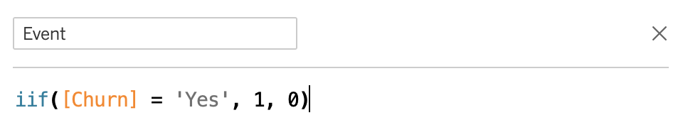
The tenure variable does not require any preparation, as it already expresses the number of months since signing up for the services of the Telco company. But the Churn variable is expressed as a yes/no string, so we need to encode it to binary using a calculated field:
tenure变量不需要任何准备,因为它已经表示自注册电信公司的服务以来的月数。 但是Churn变量表示为是/否字符串,因此我们需要使用计算字段将其编码为二进制:
To create this field, right-click on the Churn variable in the variable selector on the left (Data tab), select Create -> Calculated Field.
要创建此字段,请在左侧(数据选项卡)的变量选择器中右键单击Churn变量,然后选择创建->计算字段。
As the next step, we create a new calculated field, d_i, which represents the number of events that occur over time:
下一步,我们创建一个新的计算字段d_i ,该字段代表随时间发生的事件数:

The names we used for the variables correspond to the elements you can find in the formula for the Kaplan-Meier estimator.
我们用于变量的名称与您可以在Kaplan-Meier估计器的公式中找到的元素相对应。
The next variable we create will be the denominator used for calculating the hazard function at a given time. It represents the total number of observations since the last time period:
我们创建的下一个变量将是在给定时间用于计算危险函数的分母。 它表示自上一个时间段以来的观察总数:
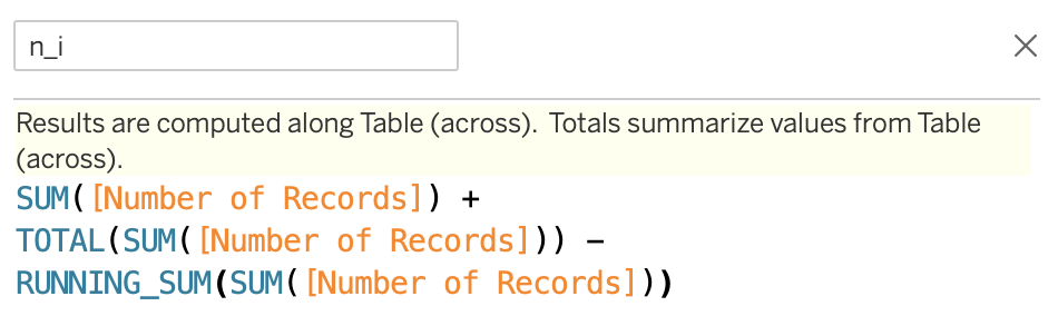
The Number of Records variable is a helper variable used for, as you might have guessed, counting the observations. For that purpose, newer versions of Tableau create a variable based on the name of the data source. However, you can easily create this variable manually by creating a calculated field and placing 1 in the field’s definition. Lastly, we define the Kaplan-Meier curve as:
“ Number of Records变量是一个辅助变量,您可能已经猜到了该变量用于对观察值进行计数。 为此,Tableau的较新版本根据数据源的名称创建一个变量。 但是,您可以通过创建一个计算字段并在该字段的定义中放置1来轻松手动创建此变量。 最后,我们将Kaplan-Meier曲线定义为:
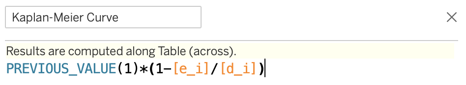
Here, the probability of survival is defined as 1 - hazard function.
在此,将生存概率定义为1 - hazard function 。
All the building blocks are ready. Now, we place the tenure on the x-axis, the Kaplan-Meier Curve on the y-axis, format the curve as a percentage, add the tile and place the PaymentMethod variable as a color. This way, we create the following visualization:
所有构建块均已准备就绪。 现在,我们将使用tenure放置在x轴上,将Kaplan-Meier Curve放置在y轴上,将曲线设置为百分比格式,添加平铺,并将PaymentMethod变量放置为颜色。 这样,我们创建以下可视化文件:

Which is very similar to what we obtained last time using lifelines:
这与我们上次使用lifelines获得的结果非常相似:
Some quick observations:
一些快速观察:
- the survival curves obtained in Tableau are more or less straight, without the characteristic step structure,在Tableau中获得的生存曲线或多或少是笔直的,没有典型的阶梯结构,
- there are no confidence intervals, as their calculation is not that simple in Tableau.没有置信区间,因为在Tableau中它们的计算不是那么简单。
Using Tableau, we can easily add some additional filters to the visualization, such as the cohort date, age, or any of the available categorical variables.
使用Tableau,我们可以轻松地向可视化添加一些其他过滤器,例如队列日期,年龄或任何可用的分类变量。
方法2:正常模式 (Approach #2: Normal Mode)
In this approach, we will focus on recreating the characteristic step-like shape of the Kaplan-Meier curves. This approach is dubbed the normal mode, as it requires a bit more preparation.
在这种方法中,我们将专注于重新创建Kaplan-Meier曲线的特征阶梯状形状。 这种方法被称为普通模式,因为它需要更多的准备。
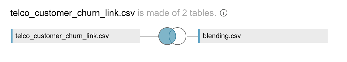
For the additional data preprocessing, we need to complete two steps. First, add a column called link to the CSV file with the Telco Customer Churn data. The column should be populated with a ‘link’ string. As a matter of fact, this string can be arbitrary, just as the column name. What matters is consistency, but all will become clear in a second. The second step is to create a new CSV file (we called it blending.csv), which contains the following:
对于其他数据预处理,我们需要完成两个步骤。 首先,在带有Telco客户流失数据的CSV文件中添加一个名为link的列。 该列应使用'link'字符串填充。 实际上,该字符串可以是任意的,就像列名一样。 重要的是一致性,但是所有这些都将在一秒钟之内变得清晰。 第二步是创建一个新的CSV文件(我们将其称为blending.csv ),其中包含以下内容:
link, setlink, 1link, 2Yep, that’s pretty much it. For your convenience, I stored both files on my GitHub.
是的,仅此而已。 为了方便起见,我将这两个文件都存储在GitHub上 。
Armed with the two files, we load them to Tableau and left join the tables using the link variable. You can see that in the following image.
有了这两个文件,我们将它们加载到Tableau,并使用link变量左连接表。 您可以在下图中看到它。
As this is the “normal mode”, we will combine a few steps at the same time and create a calculated field called Kaplan-Meier Dots:
由于这是“正常模式”,因此我们将同时结合几个步骤,并创建一个称为Kaplan-Meier Dots的计算字段:
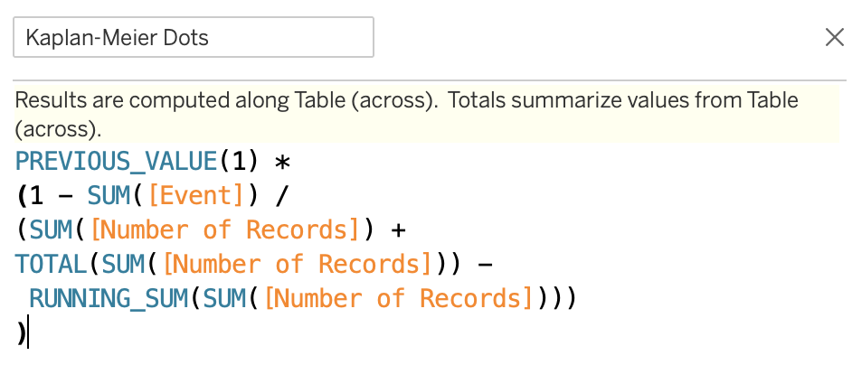
You can easily recognize the contents of this field from the “easy mode”, this time, we have put everything into one field. After doing so, comes the new part. We define the Kaplan-Meier Curve as:
您可以从“简单模式”轻松识别该字段的内容,这一次,我们将所有内容都放在一个字段中。 这样做之后,出现了新的部分。 我们将Kaplan-Meier Curve定义为:
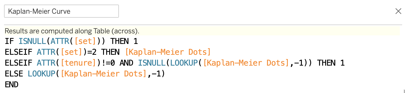
This convoluted formula will enable us to obtain the step-like shape of the curves. Lastly, we need one more helper variable:
这个复杂的公式将使我们能够获得曲线的阶梯状形状。 最后,我们需要一个辅助变量:
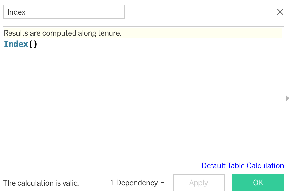
When doing so, please click on the Default Table Calculation and specify to compute the results along tenure.
这样做时,请单击“ 默认表计算”,并指定沿tenure计算结果。
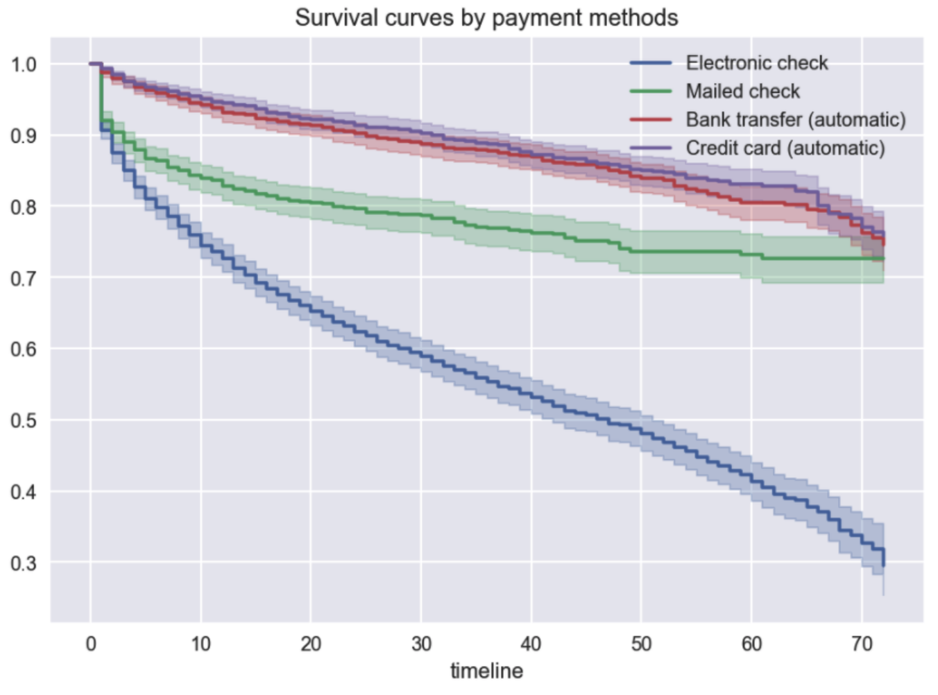
Finally, we have all the building blocks to create the curves. We approach the setup similarly to the “easy mode”, with the difference of placing the Index as the Path and set as the Detail. To recreate the curves from Python, we once again use the PaymentMethod as the Color.
最后,我们具有创建曲线的所有构造块。 我们采用类似于“简易模式”的方法进行设置,不同之处在于将“ Index ”放置为“路径”并set为“细节”。 要从Python重新创建曲线,我们再次使用PaymentMethod作为颜色。
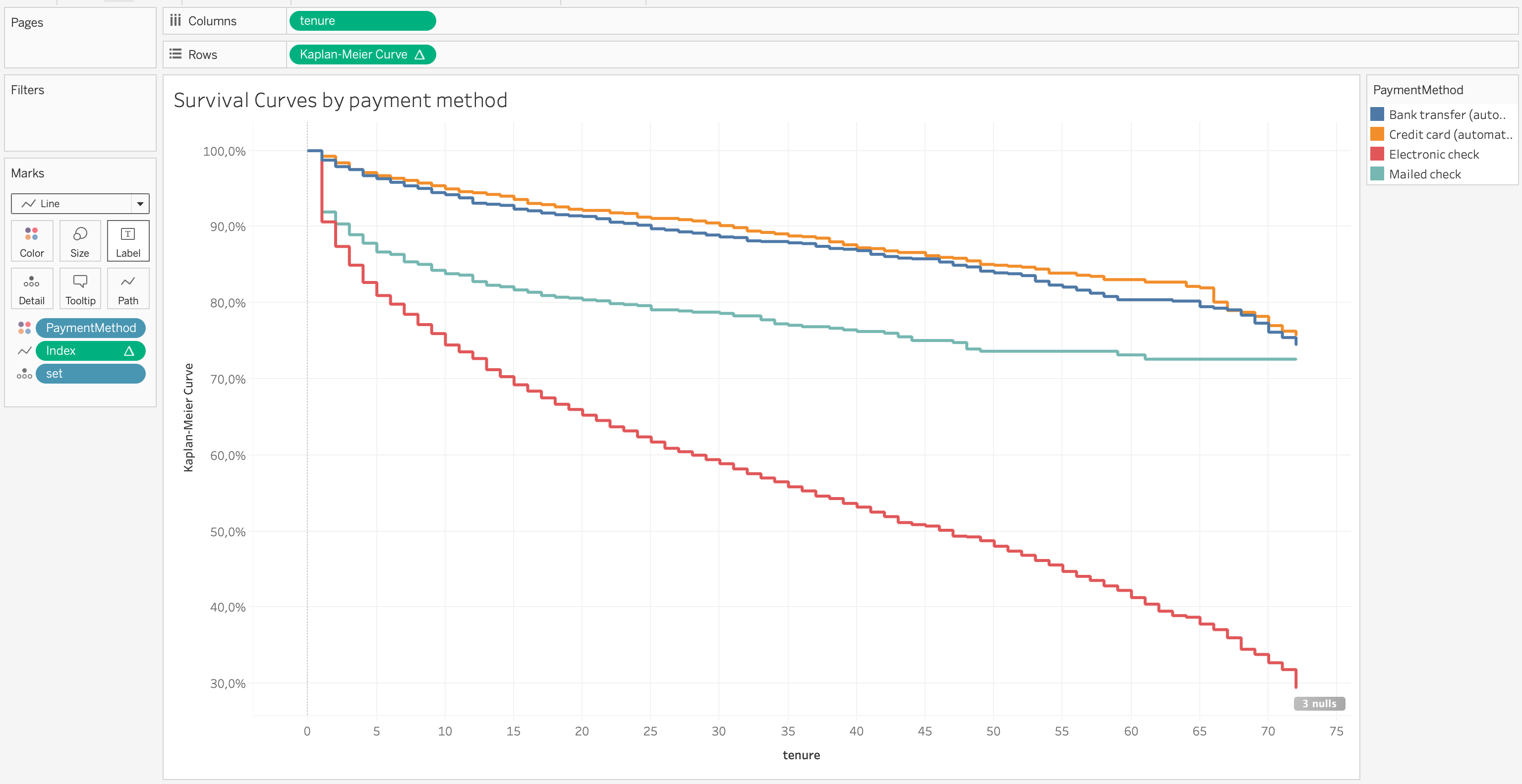
In the picture above, we accurately recreated the curves we previously obtained using the lifelines library in Python. This definitely required a bit more work but can pay off in the end.
在上图中,我们准确地重新创建了先前使用Python的lifelines库获得的曲线。 这肯定需要更多的工作,但最终可以得到回报。
We can additionally use the Kaplan-Meier Dots to visualize the events as they happen along the curve. In this case, I believe this would simply clutter the visualization. It would be more suitable for a smaller dataset.
我们还可以使用Kaplan-Meier Dots来可视化沿曲线发生的事件。 在这种情况下,我相信这只会使可视化变得混乱。 它更适合于较小的数据集。
We can further improve the dashboard by adding some filters/splits and then share it with our colleagues via the company’s reporting portal (in this case, an instance of Tableau Server).
我们可以通过添加一些过滤器/拆分来进一步改进仪表板,然后通过公司的报告门户(在本例中为Tableau Server实例)与同事共享。
结论 (Conclusion)
In this article, I explained the potential benefits of using business intelligence tools such as Tableau for survival analysis and showed how to create dashboards with the Kaplan-Meier curves.
在本文中,我解释了使用Tableau等商业智能工具进行生存分析的潜在好处,并展示了如何使用Kaplan-Meier曲线创建仪表板。
As is often the case, nothing comes for free and there are also some disadvantages to this approach:
通常,没有什么是免费的,这种方法也有一些缺点:
- Calculating the confidence intervals is definitely harder and needs quite some effort.计算置信区间肯定比较困难,并且需要付出很多努力。
- In Tableau, there is no simple way to carry out the log-rank test to compare different survival curves (unless we use R from Tableau, but this might be an idea for a future article).在Tableau中,没有简单的方法来执行对数秩检验以比较不同的生存曲线(除非我们使用Tableau中的R,但这可能是以后的文章的想法)。
- If new features are added to the data, for example, new customer segmentation or another category for each observation, this will still require some work from an analyst to add to an already existing dashboard. However, most of the time this does not happen often or requires little extra work.如果将新功能(例如,新客户细分或每个观察的另一个类别)添加到数据中,则仍需要分析师进行一些工作才能添加到现有仪表板中。 但是,在大多数情况下,这种情况并不经常发生或需要很少的额外工作。
I hope you enjoyed this alternative approach to visualizing the Kaplan-Meier curves. As always, any constructive feedback is welcome. You can reach out to me on Twitter or in the comments.
我希望您喜欢这种替代方法来可视化Kaplan-Meier曲线。 一如既往,欢迎任何建设性的反馈。 您可以在Twitter或评论中与我联系。
If you liked this article, you might also like the other ones in the series:
如果您喜欢这篇文章,您可能还喜欢该系列中的其他文章:
翻译自: https://towardsdatascience.com/level-up-your-kaplan-meier-curves-with-tableau-bc4a10ec6a15
tableau使用
http://www.taodudu.cc/news/show-997518.html
相关文章:
- numpy 线性代数_数据科学家的线性代数—用NumPy解释
- 数据eda_银行数据EDA:逐步
- Bigmart数据集销售预测
- dt决策树_决策树:构建DT的分步方法
- 已知两点坐标拾取怎么操作_已知的操作员学习-第3部分
- 特征工程之特征选择_特征工程与特征选择
- 熊猫tv新功能介绍_熊猫简单介绍
- matlab界area_Matlab的数据科学界
- hdf5文件和csv的区别_使用HDF5文件并创建CSV文件
- 机器学习常用模型:决策树_fairmodels:让我们与有偏见的机器学习模型作斗争
- 100米队伍,从队伍后到前_我们的队伍
- mongodb数据可视化_使用MongoDB实时可视化开放数据
- Python:在Pandas数据框中查找缺失值
- Tableau Desktop认证:为什么要关心以及如何通过
- js值的拷贝和值的引用_到达P值的底部:直观的解释
- struts实现分页_在TensorFlow中实现点Struts
- 钉钉设置jira机器人_这是当您机器学习JIRA票证时发生的事情
- 小程序点击地图气泡获取气泡_气泡上的气泡
- PopTheBubble —测量媒体偏差的产品创意
- 面向Tableau开发人员的Python简要介绍(第3部分)
- pymc3使用_使用PyMC3了解飞机事故趋势
- 吴恩达神经网络1-2-2_图神经网络进行药物发现-第2部分
- 数据图表可视化_数据可视化十大最有用的图表
- 接facebook广告_Facebook广告分析
- eda可视化_5用于探索性数据分析(EDA)的高级可视化
- css跑道_如何不超出跑道:计划种子的简单方法
- 熊猫数据集_为数据科学拆箱熊猫
- matplotlib可视化_使用Matplotlib改善可视化设计的5个魔术技巧
- 感知器 机器学习_机器学习感知器实现
- 快速排序简便记_建立和测试股票交易策略的快速简便方法
tableau使用_使用Tableau升级Kaplan-Meier曲线相关推荐
- tableau使用_使用Tableau探索墨尔本房地产市场
tableau使用 介绍 (Introduction) Melbourne, being one of the most liveable cities in the world, has attra ...
- Tableau实战系列浏览 Tableau 环境(二) -工作区域
前言 接上篇Tableau实战系列浏览 Tableau 环境(一) 以下是我为大家准备的几个精品专栏,喜欢的小伙伴可自行订阅,你的支持就是我不断更新的动力哟! MATLAB-30天带你从入门到精通 M ...
- tableau 自定义省份_在Tableau中使用自定义图像映射
tableau 自定义省份 We have been reading about all the ways to make our vizzes in Tableau with more creati ...
- tableau无法建立连接_的Tableau错误连接到本地MySQL数据库
Windows Server 2008的 的Tableau桌面7.0 本地MySQL使用XAMPP的Tableau错误连接到本地MySQL数据库 当试图使用的Tableau Desktop中的原生My ...
- python tableau工作流_提取数据
数据提取是保存的数据子集,您可以使用这些数据子集来改善性能,或利用原始数据中没有或不支持的 Tableau 功能.在创建数据的数据提取时,您可以通过使用筛选器和配置其他限制来减少数据总数.创建数据提取 ...
- 判断用户是否存在再进行新增_基于tableau从商业分析模型角度对业务数据进行多维度分析--【商业分析类】...
基于tableau从商业分析模型角度对业务数据进行多维度分析 常规商业数据分析方法: 财务多维指标 客户生命周期 客户价值RFM 客户留存分析 购物篮关联分析 漏斗转化ABtest 以下内容主要从商业 ...
- tableau三轴合并_《Tableau数据可视化实战》——1.12节合并不同数据源-阿里云开发者社区...
本节书摘来自华章社区<Tableau数据可视化实战>一书中的第1章,第1.12节合并不同数据源,作者(美)Ashutosh Nandeshwar,更多章节内容可以访问云栖社区"华 ...
- tableau可视化_如何在Tableau中构建自定义地图可视化
tableau可视化 Sometime last year, I got fascinated with bubble charts when I saw a data visualization v ...
- tableau获取筛选器值_认识Tableau中的筛选器
Tableau中的筛选器: (1)提取筛选器(2)数据源筛选器(3)上下文筛选器(4)维度筛选器(5)度量筛选器(6)参数筛选器(7)表计算筛选器(8)页面筛选器 对筛选器进行简单的分类: 数据层(提 ...
最新文章
- 魔改宜家灯泡当主机,玩转《毁灭战士》无压力!网友:远超我家第一台电脑...
- 印象笔记电脑版使用技巧_我的印象笔记使用手册(2020)
- 【C++】 外传篇 2_函数的异常规格说明
- 【OpenCV3】OpenCV3.0 在WIN8+VS2012环境下的配置
- mysql数据类型查询命令_Linux命令:MySQL系列之三--mysql数据类型及SQL结构化查询语句使用...
- 在 java 的 bin 目录下,jdk 提供了很多使用的工具,下面学习一些监控和故障处理的工具。...
- python3 生成器_python3基础之生成器
- Mac升级macOS Big Sur之前如何优化并增加内存空间?
- 程序员吐槽:互联网就是高薪富士康,还不如在事业单位混日子
- 中国公有云 Top10
- pythonrequests发送数据_使用Python爬虫库requests发送表单数据和JSON数据
- 【计算机网络】实验一 Protocol Layer
- 积分营销系统的优势知多少
- python_判断是否回文
- 自然可视图是什么意思?
- 杨天宇20180912-3 词频统计
- idea项目启动不了,报错war exploded: Artifact is being deployed, please wait...
- 美国公派访问学者申请全过程
- Multisim建立工程及常用逻辑门的位置
- 学会开发者工具,小程序测试再也不用愁啦
热门文章
- atlas怎么看日志_亿级的日志治理!微服务最佳方案,ELK stack从零搭建
- 下拉插件 (带搜索) Bootstrap-select 从后台获取数据填充到select的 option中 用法详解...
- UVA 125 Numbering Paths
- IPHONE 开发 7 -- Object C 02 字符串NSString 与 char* ,字符串的遍历,字符串的比较,截取与大小写改变,搜索字符串与替换字符串...
- go 成长路上的坑(1)
- 大学刚毕业,零基础大数据如何入门?
- 思维导图分析http之http协议版本
- 人工智能时代号角已吹响 COMPUTEX如何凝聚AI这股力量?
- [家里蹲大学数学杂志]第041期中山大学数计学院 2008 级数学与应用数学专业《泛函分析》期末考试试题 A...
- Statspack安装心得