移动平均线ma分析_使用动态移动平均线构建交互式库存量和价格分析图
移动平均线ma分析
I decided to code out my own stock tracking chart despite a wide array of freely available tools that serve the same purpose. Why? Knowledge gain, it’s fun, and because I recognize that a simple project can generate many new ideas. Even the basic googling I did to learn more about moving averages and interactive Jupyter python charts opened the door to many amazing resources. My current 2 favorites:
尽管有许多用于相同目的的免费工具,但我还是决定编写自己的库存跟踪图。 为什么? 获得知识,这很有趣,而且因为我认识到一个简单的项目可以产生许多新想法。 即使是基本的谷歌搜索,我也要学习更多有关移动平均值的信息,而交互式Jupyter python图表也打开了许多神奇资源的大门。 我目前的2个最爱:
Financial Signal Processing and Machine Learning by Ali Akansu
Ali Akansu撰写的金融信号处理和机器学习
This article on signal processing and trend following: https://alphaarchitect.com/2020/08/13/an-introduction-to-digital-signal-processing-for-trend-following/
有关信号处理和趋势的文章如下: https : //alphaarchitect.com/2020/08/13/an-introduction-to-digital-signal-processing-for-trend-following/
Regardless of the reason and research rabbit holes I found myself in, I conceded to accomplishing one small task before tackling all the new large projects inflating my notes board. The end result of my work? A simple and easily recreated chart that has some unique interactive features. By simply passing 3 parameters, you can choose whatever stock you would like to look at and then set the window size of the simple moving averages. I’ve provided the full code later in the article, but all you have to do is copy, paste, and play with these parameters.
不管我发现自己的原因和研究的麻烦,我都答应先完成一项小任务,然后再处理所有使笔记板膨胀的新的大型项目。 我工作的最终结果? 一个简单且易于重新创建的图表,具有一些独特的交互功能。 通过简单地传递3个参数,您可以选择想要查看的任何股票,然后设置简单移动平均线的窗口大小。 我将在本文后面提供完整的代码,但是您要做的就是复制,粘贴和使用这些参数。
查询财务数据 (Querying Financial Data)
A constant fact of life for those of us working in the data science/analytics field is that we rarely get a data set that is clean. Missing data, mismatched date-time formats, and my personal favorite… misspelled categorical values (nothing like realizing you forgot to consider all of the ‘Canceld’ data points when counting ‘Canceled’).
对于我们从事数据科学/分析领域工作的人们来说,一个永恒的事实是,我们很少获得干净的数据集。 数据丢失,日期时间格式不匹配,以及我个人最喜欢的……分类值拼写错误(没想到您忘了在计算“取消”时忘记考虑所有“取消”数据点)。
Like a breath of fresh air, the yfinance library for python quickly downloads financial data in a clean ready-to-work-with format: https://pypi.org/project/yfinance/
就像呼吸一口新鲜空气一样,用于python的yfinance库快速以干净的即用型格式下载财务数据: https : //pypi.org/project/yfinance/
import yfinance as yf
# data = yf.download(ticker, start_date, end_date)
data = yf.download('AAPL', '2019-08-21','2020-08-21')
data.head()
The above code downloads stock data for Apple into a pandas data-frame with Date as the index. In terms of granularity, the data returned is daily, including each day’s open, high, low, close, adjusted close, and volume for the given ticker, and looks like this:
上面的代码将Apple的股票数据下载到以Date为索引的熊猫数据框中。 就粒度而言,每天返回的数据包括给定股票的每日开盘价,最高价,最低价,收盘价,调整后的收盘价和交易量,如下所示:

简单移动平均线 (Simple Moving Average)
The simple moving average is calculated by adding the daily price of an asset over a specified window of time and then dividing by the number of time periods. When talking securities, we sum the adjusted closing price of ‘Stock A’ over the last ’n’ days and divide by ‘n.’ Simply put (ha ha):
通过将指定时间段内资产的每日价格相加,然后除以时间段数,可以计算出简单移动平均线。 在谈论证券时,我们将最近“ n”天的“ A股”调整后的收盘价相加,然后除以“ n”。 简单地说(哈哈):

In python, this equation can be performed in many ways, I feel this function is straightforward:
在python中,可以通过多种方式执行此方程式,我觉得这个函数很简单:
import pandas as pd
import yfinance as yfdata = yf.download('AAPL', '2019-08-21', '2020-08-21')def SMA(values, window):"""SMA - returns a list of moving avg. values based on input list of values and window size  inputs:values - takes a list or pandas frame column containing ints/floatswindow - takes int as input, size of period to calc. moving avg.returns null if larger than length of param values."""x = 0moving_avg = []while x < len(values) - window + 1:current_window = values[x:x+window]window_avg = sum(current_window)/windowmoving_avg.append(window_avg)x += 1return(moving_avg)SMA(data['Adj Close'], 20)
Luckily, though, the pandas library has a built in function to accomplish this same goal, so we can easily pass a pandas data frame column and return a custom simple moving average:
不过,幸运的是,pandas库具有一个内置函数来实现相同的目标,因此我们可以轻松地传递pandas数据框列并返回自定义的简单移动平均值:
import yfinance as yf
import pandas as pddata = yf.download('AAPL', '2019-08-21', '2020-08-21')
moving_avg = data['Adj Close'].rolling(window=100).mean()
moving_avg
Here, we extend the query range to 2-years to visualize a 100-day moving average on top of the adjusted closing price:
在这里,我们将查询范围扩展到2年,以便在调整后的收盘价之上可视化100天移动平均线:

The 100-day moving average completely eliminates any noise in the data, especially compared to the daily adjusted close price. A caveat of using moving averages to analyze trends is the smoothing effect that results from large window sizes. A 25, 50, and even 75 window size will show more noise from the variance in the data than the 100-day window. At what point does the moving average window size cause the trend to be too smooth, and no longer representative of the data? The answer varies based on the data itself and what signals we are looking to find.
100天移动平均线完全消除了数据中的任何噪音,尤其是与每日调整后的收盘价相比。 使用移动平均值分析趋势的一个警告是,较大的窗口尺寸会导致平滑效果。 25天,50天甚至75天的窗口大小将比100天的窗口显示更多来自数据差异的噪声。 在什么时候移动平均窗口大小会导致趋势变得过于平滑,从而不再代表数据? 答案因数据本身以及我们要查找的信号而异。
data = yf.download('AAPL', '2018-08-21', '2020-08-21')data.reset_index(level=0, inplace=True)fig, ax = plt.subplots(figsize=(15, 7))ax.set_ylabel('Adj. Closing Price ($)')
ax.set_xlabel('Date')ax.plot(data['Date'], data['Adj Close'], label='Adj. Close',color = 'red')moving100 = data['Adj Close'].rolling(window=100).mean()
ax.plot(data['Date'], moving100, label='100-Day Moving Avg.',color='orange', linestyle="--")legend = ax.legend(loc=2)
plt.show()
动态绘图以比较移动平均趋势并识别信号 (Dynamic Plotting to Compare Moving Average Trends and Identify Signals)
Making 3, 4, 5 charts each with their own simple moving average and underlying data is, frankly, inefficient. That’s why I wanted to build a plot that allows me to chart out as many moving averages as I desire to c.
坦率地说,制作3、4、5个图表时,每个图表都有自己的简单移动平均值和基础数据,效率很低。 这就是为什么我想构建一个图,使我能够绘制出我想要的任意数量的移动平均线。
The first step to making an interactive matplotlib chart is making sure the package is updated and then the simple command:
制作交互式matplotlib图表的第一步是确保已更新软件包,然后执行简单命令:
%matplotlib nbagg
%matplotlib nbagg
Switching back to static plots is just as simple:
切换回静态图非常简单:
%matplotlib inline
%matplotlib内联
Another fun tool to add is the mplcursors package. This package allows us to hover over data points and receive some information, like the ‘tooltip’ in Tableau if you’re familiar with that. It’ll end up looking like this:
另一个有趣的工具是mplcursors软件包。 此软件包使我们可以将鼠标悬停在数据点上并接收一些信息,例如如果您熟悉Tableau中的“工具提示”。 最终看起来像这样:

Below, I’ve provided the code that will yield the full chart. For reference, I’ve commented out the mplcursor argument and set my matplotlib back to static — they’re the only two lines commented out so just know that removing the # and commenting out the ‘%matplotlib inline’ will allow the output of the following function to be interactive.
在下面,我提供了将生成完整图表的代码。 作为参考,我已经注释掉了mplcursor参数并将我的matplotlib设置为静态-它们是仅有的两行被注释掉了,所以只要知道删除#并注释掉'%matplotlib inline'将允许输出以下功能是交互式的。
#%matplotlib nbagg
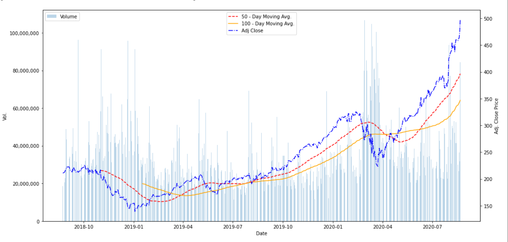
%matplotlib inlinedef Volume_Line_Chart(ticker, SMA_Window1, SMA_Window2):x = datetime.date.today()y = x - dateutil.relativedelta.relativedelta(months = 24)data = yf.download(ticker, y,x)data.reset_index(level=0, inplace=True)fig, ax1 = plt.subplots(figsize=(15, 7))ax1.set_ylabel('Vol.')ax1.set_xlabel('Date')ax1.bar(data['Date'], data['Volume'], label='Volume', alpha=0.3)ax2 = ax1.twinx()ax2.set_ylabel('Adj. Close Price')roll1 = data['Adj Close'].rolling(window=SMA_Window1).mean()ax2.plot(data['Date'], roll1, color='red', label=str(SMA_Window1)+' - Day Moving Avg.', linestyle='--')roll2 = data['Adj Close'].rolling(window=SMA_Window2).mean()ax2.plot(data['Date'], roll2, color='orange', label=str(SMA_Window2)+' - Day Moving Avg.', linestyle='-')ax2.plot(data['Date'], data['Adj Close'], color='blue', label='Adj Close', linestyle='-.')ax1.get_yaxis().set_major_formatter(matplotlib.ticker.FuncFormatter(lambda x, p: format(int(x), ',')))legend = ax1.legend(loc=2), ax2.legend(loc=9)fig.tight_layout()#mplcursors.cursor(hover=True)plt.show()Volume_Line_Chart('AAPL', 50, 100)I’ve made it as simple as plug and play — just change the ticker symbol from AAPL to whatever publicly listed security you want, contained in ‘ ’ of course, and then run it. Changing the moving average window sizes will also dynamically change their label that will appear on the chart, so no need to go into the function and change the name of the moving average lines manually. The end result will look like this:
我已经做到了即插即用的简单操作-只需将代码从AAPL更改为所需的任何公开列出的安全性(当然包含在“”中),然后运行它即可。 更改移动平均线窗口大小还将动态更改其标签,该标签将出现在图表上,因此无需进入功能并手动更改移动平均线的名称。 最终结果将如下所示:
By enabling the two commented out lines you will be able to hover and get a tooltip pop-up like the previous image.
通过启用两条注释掉的行,您将能够像以前的图像一样悬停并弹出工具提示弹出窗口。
It’s basic, simple, but a great chart to have the ability to build. To add more SMA lines, simply copy and paste these lines, but replace the number after roll:
它是基本的,简单的但具有构建能力的强大图表。 要添加更多SMA线,只需复制并粘贴这些线,但在滚动后替换数字:

And then don’t forget to include a new parameter for the function.
然后不要忘记为该函数包括一个新参数。
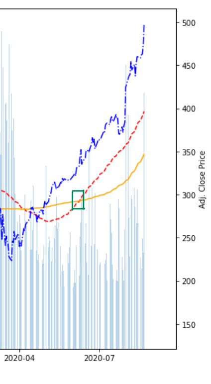
In terms of signal recognition, I don’t have anything automated. My next project will ideally result in a function that can identify the crossover points of the moving average lines. A basic signal would be to buy shares of the given stock when the shorter window moving average crosses above the longer moving average, indicating upward momentum. I drew that green box in Microsoft Paint — which is my preferred method of disappointing every art teacher I’ve ever had.
在信号识别方面,我没有自动化的东西。 理想情况下,我的下一个项目将产生一个可以识别移动平均线交叉点的函数。 一个基本的信号是,当较短的窗口移动平均线超过较长的移动平均线时,买入给定股票的股票,表明上升势头。 我在Microsoft Paint中画了一个绿色框,这是让我曾经有过的每位美术老师失望的首选方法。
Further, another simple signal is to sell when the shorter window average line dips below the longer window average line. Many rudimentary algorithm trading bots are built on this simple buy/sell rule set for simple moving averages.
此外,当较短的窗口平均线跌落至较长的窗口平均线以下时,另一个简单的信号就是卖出。 许多基本的算法交易机器人都基于此简单的买卖规则集,用于简单的移动平均线。
I hope this article helps someone build a better chart, learn something new, or inspire a small project. Regardless, thanks for reading it.
我希望本文能帮助某人建立更好的图表,学习新知识或激发一个小型项目。 无论如何,感谢您的阅读。
翻译自: https://medium.com/@desant_c1/building-an-interactive-stock-volume-and-price-analysis-chart-with-dynamic-moving-averages-7c0798abe373
移动平均线ma分析
http://www.taodudu.cc/news/show-997542.html
相关文章:
- 静态变数和非静态变数_统计资料:了解变数
- 不知道输入何时停止_知道何时停止
- 掌握大数据数据分析师吗?_要掌握您的数据吗? 这就是为什么您应该关心元数据的原因...
- 微信支付商业版 结算周期_了解商业周期
- mfcc中的fft操作_简化音频数据:FFT,STFT和MFCC
- r语言怎么以第二列绘制线图_用卫星图像绘制世界海岸线图-第二部分
- rcp rapido_Rapido使用数据改善乘车调度
- 飞机上的氧气面罩有什么用_第2部分—另一个面罩检测器……(
- 数字经济的核心是对大数据_大数据崛起为数字世界的核心润滑剂
- azure第一个月_MLOps:两个Azure管道的故事
- 编译原理 数据流方程_数据科学中最可悲的方程式
- 解决朋友圈压缩_朋友中最有趣的朋友[已解决]
- pymc3 贝叶斯线性回归_使用PyMC3进行贝叶斯媒体混合建模,带来乐趣和收益
- ols线性回归_普通最小二乘[OLS]方法使用于机器学习的简单线性回归变得容易
- Amazon Personalize:帮助释放精益数字业务的高级推荐解决方案的功能
- 西雅图治安_数据科学家对西雅图住宿业务的分析
- 创意产品 分析_使用联合分析来发展创意
- 多层感知机 深度神经网络_使用深度神经网络和合同感知损失的能源产量预测...
- 使用Matplotlib Numpy Pandas构想泰坦尼克号高潮
- pca数学推导_PCA背后的统计和数学概念
- 鼠标移动到ul图片会摆动_我们可以从摆动时序分析中学到的三件事
- 神经网络 卷积神经网络_如何愚弄神经网络?
- 如何在Pandas中使用Excel文件
- tableau使用_使用Tableau升级Kaplan-Meier曲线
- numpy 线性代数_数据科学家的线性代数—用NumPy解释
- 数据eda_银行数据EDA:逐步
- Bigmart数据集销售预测
- dt决策树_决策树:构建DT的分步方法
- 已知两点坐标拾取怎么操作_已知的操作员学习-第3部分
- 特征工程之特征选择_特征工程与特征选择
移动平均线ma分析_使用动态移动平均线构建交互式库存量和价格分析图相关推荐
- 九、股票收盘价与滑动平均线MA
股票K线图里面的MACD,和DIF,DEA,MSI,MA MACD称为指数平滑异同移动平均线是从双移动平均线发展而来的,由快的移动平均线减去慢的移动平均线, MACD的意义和双移动平均线基本相同 DI ...
- 数字货币量化交易策略—基于移动平均线MA
本文介绍金融市场中的量化交易策略之移动平均线MA策略. 一.概念 移动平均线,Moving Average,简称MA,MA是用统计分析的方法,将一定时期内的证券价格(指数)加以平均,并把不同时间的平均 ...
- 消费者行为分析_消费者行为分析-是否点击广告?
消费者行为分析 什么是消费者行为? (What is Consumer Behavior?) consumer behavior is the study of individuals, groups ...
- python计算移动平均线_(转)简单移动平均线(Simple Moving Average,SMA) 定义及使用...
REF 什么是简单移动平均线 简单移动平均线(SMA)又称"算术移动平均线",是指对特定期间的收盘价进行简单平均化的意思.一般所提及之移动平均线即指简单移动平均线(SMA). 简单 ...
- 【量化投资实训】基于MATLAB实验一.简单移动平均线MA
量化投资区别于价值投资,价值投资对债券进行估值,价值投资理念支持了大多数的投资产品.量化投资以数量化的投资交易为主,不依赖"人脑",更多的借助数量的逻辑来进行买入卖出(交易),比如 ...
- 股票——简单移动平均线
简介: 简单移动平均线(Simple Moving Average,SMA),又称"算术移动平均线",是指对特定期间的收盘价进行简单平均化的意思.一般所提及之移动平均线即指简单移动 ...
- 股票——指数移动平均线
指数移动平均线一般指指数平滑移动平均线 译指数平滑移动平均线,乃为因应移动平均线被视为落后指标的缺失而发展出来的,为解决一旦价格已脱离均线差值扩大,而平均线未能立即反应,EXPMA可以减少类似缺点. ...
- 股票技术指标详解--移动平均线(MA)
移动平均线(MA) 移动平均线是应用非常广泛的一种技术指标.它构造简单,客观公正,不易人为操作骗线,受到很多股票投资者的青睐. 一.指数平均数的计算 所谓"移动平均线" ...
- 趋势分析之移动平均线
趋势分析之移动平均线 趋势分析原理是外汇交易技术分析的重要内容.外汇市场的价格走势总是呈现趋势运动,因此,了解和把握外汇交易的趋势分析原理,对于准确地分析和预测外汇价格的走势具有重要意义. 一.趋势分 ...
最新文章
- sigprocmask理解
- Visual Studio跨平台开发Xamarin
- 1242 Rescue BFS
- 阿里修冶:微服务拆分之道
- ORACLE 正值表达式
- python模块datetime_Python模块-datetime
- Multisim14.0软件安装+破解
- iwconfig命令
- 网络打不其他计算机的共享文件,快速解决“电脑无法访问共享文件夹”的4种方法!...
- Windows系统安装失败日志分析
- 多个路由器无线桥接,共享网络
- 翻译 | Placing Search in Context The Concept Revisited
- 去水印软件哪个好_去水印工具
- 微信小程序之js 字符串转换成数字的三种方法, 取float型小数点后两位数的方法
- 索引的使用以及常见索引类型,组合索引的具体使用方法。
- 软件项目测试流程的规划
- 几行代码就能实现复杂的 Excel 导入导出,这个工具类真心强大!
- python3豆瓣电影排行榜爬取
- shell脚本遍历目录下的所有文件并进行操作
- 常用putty命令汇总