Keras Tutorial: Deep Learning in Python

Deep Learning
By now, you might already know machine learning, a branch in computer science that studies the design of algorithms that can learn. Today, you’re going to focus on deep learning, a subfield of machine learning that is a set of algorithms that is inspired by the structure and function of the brain. These algorithms are usually called Artificial Neural Networks (ANN). Deep learning is one of the hottest fields in data science with many case studies with marvelous results in robotics, image recognition and Artificial Intelligence (AI).
One of the most powerful and easy-to-use Python libraries for developing and evaluating deep learning models is Keras; It wraps the efficient numerical computation libraries Theano and TensorFlow. The advantage of this is mainly that you can get started with neural networks in an easy and fun way.
Today’s Keras tutorial for beginners will introduce you to the basics of Python deep learning:
- You’ll first learn what Artificial Neural Networks are
- Then, the tutorial will show you step-by-step how to use Python and its libraries to understand, explore and visualize your data,
- How to preprocess your data: you’ll learn how to split up your data in train and test sets and how you can standardize your data,
- How to build up multi-layer perceptrons for classification tasks,
- How to compile and fit the data to these models,
- How to use your model to predict target values, and
- How to validate the models that you have built.
- Lastly, you’ll also see how you can build up a model for regression tasksand you’ll learn how you can fine-tune the model that you’ve built.
Would you like to take a course on Keras and deep learning in Python? Consider taking DataCamp’s Deep Learning in Python course!
Also, don’t miss our Keras cheat sheet, which shows you the six steps that you need to go through to build neural networks in Python with code examples!
Introducing Artificial Neural Networks
Before going deeper into Keras and how you can use it to get started with deep learning in Python, you should probably know a thing or two about neural networks. As you briefly read in the previous section, neural networks found their inspiration and biology, where the term “neural network” can also be used for neurons. The human brain is then an example of such a neural network, which is composed of a number of neurons.
And, as you all know, the brain is capable of performing quite complex computations and this is where the inspiration for Artificial Neural Networks comes from. The network a whole is a powerful modeling tool.
Perceptrons
The most simple neural network is the “perceptron”, which, in its simplest form, consists of a single neuron. Much like biological neurons, which have dendrites and axons, the single artificial neuron is a simple tree structure which has input nodes and a single output node, which is connected to each input node. Here’s a visual comparison of the two:
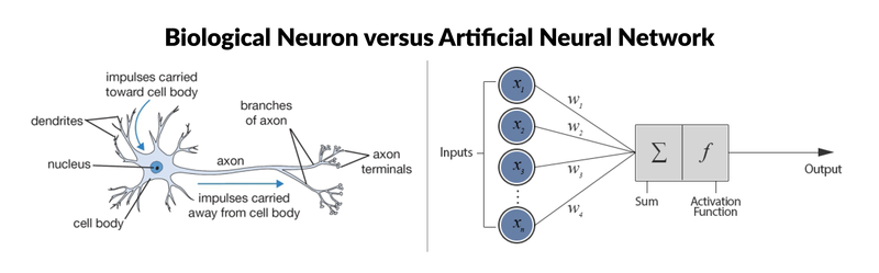
As you can see from the picture, there are six components to artificial neurons. From left to right, these are:
- Input nodes. As it so happens, each input node is associated with a numerical value, which can be any real number. Remember that real numbers make up the full spectrum of numbers: they can be positive or negative, whole or decimal numbers.
- Connections. Similarly, each connection that departs from the input node has a weight associated with it and this can also be any real number.
- Next, all the values of the input nodes and weights of the connections are brought together: they are used as inputs for a weighted sum: y=f(∑Di=1wi∗xi)y=f(∑i=1Dwi∗xi), or, stated differently, y=f(w1∗x1+w2∗x2+...wD∗xD)y=f(w1∗x1+w2∗x2+...wD∗xD).
- This result will be the input for a transfer or activation function. In the simplest but trivial case, this transfer function would be an identity function, f(x)=xf(x)=x or y=xy=x. In this case, xx is the weighted sum of the input nodes and the connections. However, just like a biological neuron only fires when a certain treshold is exceeded, the artificial neuron will also only fire when the sum of the inputs exceeds a treshold, let’s say for example 0. This is something that you can’t find back in an identity function! The most intuitive way that one can think of is by devising a system like the following:
f(x)=0f(x)=0 if x<0x<0
f(x)=0.5f(x)=0.5 if x=0x=0
f(x)=1f(x)=1 if x>0x>0 - Of course, you can already imagine that the output is not going to be a smooth line: it will be a discontinuous function. Because this can cause problems in the mathematical processing, a continuous variant, the sigmoid function, is often used. An example of a sigmoid function that you might already know is the logistic function. Using this function results in a much smoother result!
- As a result, you have the output node, which is associated with the function (such as the sigmoid function) of the weighted sum of the input nodes. Note that the sigmoid function is a mathematical function that results in an “S” shaped curve; You’ll read more about this later.
- Lastly, the perceptron may be an additional parameter, called a bias, which you can actually consider as the weight associated with an additional input node that is permanently set to 1. The bias value is important because it allows you to shift the activation function to the left or right, which can make a determine the success of your learning.
Note that the logical consequence of this model is that perceptrons only work with numerical data. This implies that you should convert any nominal data into a numerical format.
Now that you know that perceptrons work with tresholds, the step to using them for classification purproses isn’t that far off: the perceptron can agree that any output above a certain treshold indicates that an instance belongs to one class, while an output below the treshold might result in the input being a member of the other class. The straight line where the output equals the treshold is then the boundary between the two classes.

Multi-Layer Perceptrons
Networks of perceptrons are multi-layer perceptrons, and this is what this tutorial will implement in Python with the help of Keras! Multi-layer perceptrons are also known as “feed-forward neural networks”. As you sort of guessed it by now, these are more complex networks than the perceptron, as they consist of multiple neurons that are organized in layers. The number of layers is usually limited to two or three, but theoretically, there is no limit!
The layers act very much like the biological neurons that you have read about above: the outputs of one layer serve as the inputs for the next layer.
Among the layers, you can distinguish an input layer, hidden layers and an output layer. Multi-layer perceptrons are often fully connected. This means that there’s a connection from each perceptron in a certain layer to each perceptron in the next layer. Even though the connectedness is no requirement, this is typically the case.
Note that while the perceptron could only represent linear separations between classes, the multi-layer perceptron overcomes that limitation and can also represent more complex decision boundaries.
Predicting Wine Types: Red or White?
For this tutorial, you’ll use the wine quality data set that you can find in the wine quality data set from the UCI Machine Learning Repository. Ideally, you perform deep learning on bigger data sets but for the purpose of this tutorial, you will make use of a smaller one. This is mainly because the goal is to get you started with the library and to familiarize yourself with how neural networks work.
You might already know this data set, as it’s one of the most popular data sets to get started on learning how to work out machine learning problems. In this case, it will serve for you to get started with deep learning in Python with Keras.
Let’s get started now!
Understanding The Data
However, before you start loading in the data, it might be a good idea to check how much you really know about wine (in relation with the dataset, of course). Most of you will know that there are, in general, two very popular types of wine: red and white.
(I’m sure that there are many others, but for simplicity and because of my limited knowledge of wines, I’ll keep it at this. I’m sorry if I’m disappointing the true connoisseurs among you :)).
Knowing this is already one thing but if you want to analyze this data, you will need to know just a little bit more.
First, check out the data description folder to see which variables have been included. This is usually the first step to understanding your data. Go to this page to check out the description or keep on reading to get to know your data a little bit better.
The data consists of two datasets that are related to red and white variants of the Portuguese “Vinho Verde” wine. As stated in the description, you’ll only find physicochecmical and sensory variables included in this data set. The data description file just list the 12 variables that are included in the data, but for those who, like me, aren’t really chemistry experts either, here’s a short description of each variable:
- Fixed acidity: acids are major wine properties and contribute greatly to the wine’s taste. Usually, the total acidity is divided into two groups: the volatile acids and the nonvolatile or fixed acids. Among the fixed acids that you can find in wines are the following: tartaric, malic, citric, and succinic. This variable is expressed in g(tartaricacidtartaricacid)/dm3dm3 in the data sets.
- Volatile acidity: the volatile acidity is basically the process of wine turning into vinegar. In the U.S, the legal limits of Volatile Acidity are 1.2 g/L for red table wine and 1.1 g/L for white table wine. In these data sets, the volatile acidity is expressed in g(aceticacidaceticacid)/dm3dm3.
- Citric acid is one of the fixed acids that you’ll find in wines. It’s expressed in g/dm3dm3 in the two data sets.
- Residual sugar typically refers to the sugar remaining after fermentation stops, or is stopped. It’s expressed in g/dm3dm3 in the
redandwhitedata. - Chlorides can be a major contributor to saltiness in wine. Here, you’ll see that it’s expressed in g(sodiumchloridesodiumchloride)/dm3dm3.
- Free sulfur dioxide: the part of the sulphur dioxide that is added to a wine and that is lost into it is said to be bound, while the active part is said to be free. Winemaker will always try to get the highest proportion of free sulphur to bind. This variables is expressed in mg/dm3dm3 in the data.
- Total sulfur dioxide is the sum of the bound and the free sulfur dioxide (SO2). Here, it’s expressed in mg/dm3dm3. There are legal limits for sulfur levels in wines: in the EU, red wines can only have 160mg/L, while white and rose wines can have about 210mg/L. Sweet wines are allowed to have 400mg/L. For the US, the legal limits are set at 350mg/L and for Australia, this is 250mg/L.
- Density is generally used as a measure of the conversion of sugar to alcohol. Here, it’s expressed in g/cm3cm3.
- pH or the potential of hydrogen is a numeric scale to specify the acidity or basicity the wine. As you might know, solutions with a pH less than 7 are acidic, while solutions with a pH greater than 7 are basic. With a pH of 7, pure water is neutral. Most wines have a pH between 2.9 and 3.9 and are therefore acidic.
- Sulphates are to wine as gluten is to food. You might already know sulphites from the headaches that they can cause. They are a regular part of the winemaking around the world and are considered necessary. In this case, they are expressed in g(potassiumsulphatepotassiumsulphate)/dm3dm3.
- Alcohol: wine is an alcoholic beverage and as you know, the percentage of alcohol can vary from wine to wine. It shouldn’t surprised that this variable is inclued in the data sets, where it’s expressed in % vol.
- Quality: wine experts graded the wine quality between 0 (very bad) and 10 (very excellent). The eventual number is the median of at least three evaluations made by those same wine experts.
This all, of course, is some very basic information that you might need to know to get started. If you’re a true wine connoisseur, you probably know all of this and more!
Now, it’s time to get your data!
Loading In The Data
This can be easily done with the Python data manipulation library Pandas. You follow the import convention and import the package under it’s alias, pd.
Next, you make use of the read_csv() function to read in the CSV files in which the data is stored. Additionally, use the sep argument to specify that the separator in this case is a semicolon and not a regular comma.
Try it out in the DataCamp Light chunk below:
- script.py
- IPython Shell
Awesome! That wasn’t a piece of cake, wasn’t it?
You have probably done this a million times by now, but it’s always an essential step to get started. Now you’re completely set to start exploring, manipulating and modeling your data!
Data Exploration
With the data at hand, it’s easy for you to learn more about these wines! One of the first things that you’ll probably want to do is to start off with getting a quick view on both of your DataFrames:
- script.py
- IPython Shell
Now is the time to check whether your import was successful: double check whether the data contains all the variables that the data description file of the UCI Machine Learning Repository promised you. Besides the number of variables, also check the quality of the import: are the data types correct? Did all the rows come through? Are there any null values that you should take into account when you’re cleaning up the data?
You might also want to check out your data with more than just info():
- script.py
- IPython Shell
A brief recap of all these pandas functions: you see that head(), tail() and sample() are awesome because they provide you with a quick way of inspecting your data without any hassle.
Next, describe() offers some summary statistics about your data that can help you to assess your data quality. You see that some of the variables really have a lot of difference in their min and max values. This is something that you’ll deal with later, but at this point, it’s just very important to be aware of this.
Lastly, you have double checked the presence of null values in red with the help of isnull(). This is a function that always can come in handy when you’re still in doubt after having read the results of info().
Tip: also check out whether the wine data contains null values. You can do this by using the IPython shell of the DataCamp Light chunk which you see right above.
Now that you have already inspected your data to see if the import was successful and correct, it’s time to dig a little bit deeper.
Visualizing The Data
One way to do this is by looking at the distribution of some of the dataset’s variables and make scatter plots to see possible correlations. Of course, you can take this all to a much higher level if you would use this data for your own project.
Alcohol
One variable that you could find interesting at first sight is alcohol. It’s probably one of the first things that catches your attention when you’re inspecting a wine data set. You can visualize the distributions with any data visualization library, but in this case, the tutorial makes use of matplotlib to quickly plot the distributions:
- script.py
- IPython Shell
As you can see in the image below, you see that the alcohol levels between the red and white wine are mostly the same: they have around 9% of alcohol. Of course, there are also a considerable amount of observations that have 10% or 11% of alcohol percentage.
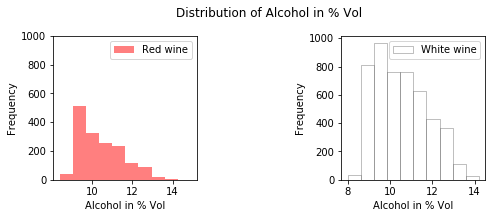
Note that you can double check this if you use the histogram() function from the numpy package to compute the histogram of the white and red data, just like this
- script.py
- IPython Shell
If you’re interested in matplotlib tutorials, make sure to check out DataCamp’s Matplotlib tutorial for beginners and Viewing 3D Volumetric Data tutorial, which shows you how to make use of Matplotlib’s event handler API.
Sulphates
Next, one thing that interests me is the relation between the sulphates and the quality of the wine. As you have read above, sulphates can cause people to have headaches and I’m wondering if this infuences the quality of the wine. What’s more, I often hear that women especially don’t want to drink wine exactly because it causes headaches. Maybe this affects the ratings for the red wine?
Let’s take a look.
- script.py
- IPython Shell
As you can see in the image below, the red wine seems to contain more sulphates than the white wine, which has less sulphates above 1 g/dm3dm3. For the white wine, there only seem to be a couple of exceptions that fall just above 1 g/dm3dm3, while this is definitely more for the red wines. This could maybe explain the general saying that red wine causes headaches, but what about the quality?
You can clearly see that there is white wine with a relatively low amount of sulphates that gets a score of 9, but for the rest it’s difficult to interpret the data correctly at this point.
Of course, you need to take into account that the difference in observations could also affect the graphs and how you might interpret them.

Acidity
Apart from the sulphates, the acidity is one of the major and important wine characteristics that is necessary to achieve quality wines. Great wines often balance out acidity, tannin, alcohol and sweetness. Some more research taught me that in quantities of 0.2 to 0.4 g/L, volatile acidity doesn’t affect a wine’s quality. At higher levels, however, volatile acidity can give wine a sharp, vinegary tactile sensation. Extreme volatile acidity signifies a seriously flawed wine.
Let’s put the data to the test and make a scatter plot that plots the alcohol versus the volatile acidity. The data points should be colored according to their rating or quality label:
- script.py
- IPython Shell
Note that the colors in this image are randomly chosen with the help of the NumPy random module. You can always change this by passing a list to the redcolors or whitecolors variables. Make sure that they are the same (except for 1 because the white wine data has one unique quality value more than the red wine data), though, otherwise your legends are not going to match!
Check out the full graph here:

In the image above, you see that the levels that you have read about above especially hold for the white wine: most wines with label 8 have volatile acidity levels of 0.5 or below, but whether or not it has an effect on the quality is too difficult to say, since all the data points are very densely packed towards one side of the graph.
This is just a quick data exploration. If you would be interested in elaborating this step in your own projects, consider DataCamp’s data exploration posts, such as Python Exploratory Data Analysis and Python Data Profiling tutorials, which will guide you through the basics of EDA.
Wrapping Up The Exploratory Data Analysis
This maybe was a lot to digest, so it’s never too late for a small recap of what you have seen during your EDA that could be important for the further course of this tutorial:
- Some of the variables of your data sets have values that are considerably far apart. You can and will deal with this in the next section of the tutorial.
- You have an ideal scenario: there are no null values in the data sets.
- Most wines that were included in the data set have around 9% of alcohol.
- Red wine seems to contain more sulphates than the white wine, which has less sulphates above 1 g/dm3dm3.
- You saw that most wines had a volatile acidity of 0.5 and below. At the moment, there is no direct relation to the quality of the wine.
Up until now, you have looked at the white wine and red wine data separately. The two seem to differ somewhat when you look at some of the variables from close up, and in other cases, the two seem to be very similar. Do you think that there could there be a way to classify entries based on their variables into white or red wine?
There is only one way to find out: preprocess the data and model it in such a way so that you can see what happens!
Preprocess Data
Now that you have explored your data, it’s time to act upon the insights that you have gained! Let’s preprocess the data so that you can start building your own neural network!
- script.py
- IPython Shell
You set ignore_index to True in this case because you don’t want to keep the index labels of white when you’re appending the data to red: you want the labels to continue from where they left off in red, not duplicate index labels from joining both data sets together.
Intermezzo: Correlation Matrix
Now that you have the full data set, it’s a good idea to also do a quick data exploration; You already know some stuff from looking at the two data sets separately, and now it’s time to gather some more solid insights, perhaps.
Since it can be somewhat difficult to interpret graphs, it’s also a good idea to plot a correlation matrix. This will give insights more quickly about which variables correlate:
- script.py
- IPython Shell
As you would expect, there are some variables that correlate, such as densityand residual sugar. Also volatile acidity and type are more closely connected than you originally could have guessed by looking at the two data sets separately, and it was kind of to be expected that free sulfur dioxide and total sulfur dioxide were going to correlate.

Very interesting!
Train and Test Sets
Imbalanced data typically refers to a problem with classification problems where the classes are not represented equally.Most classification data sets do not have exactly equal number of instances in each class, but a small difference often does not matter. You thus need to make sure that all two classes of wine are present in the training model. What’s more, the amount of instances of all two wine types needs to be more or less equal so that you do not favour one or the other class in your predictions.
In this case, there seems to be an imbalance, but you will go with this for the moment. Afterwards, you can evaluate the model and if it underperforms, you can resort to undersampling or oversampling to cover up the difference in observations.
For now, import the train_test_split from sklearn.model_selection and assign the data and the target labels to the variables X and y. You’ll see that you need to flatten the array of target labels in order to be totally ready to use the X and y variables as input for the train_test_split() function. Off to work, get started in the DataCamp Light chunk below!
- script.py
- IPython Shell
You’re already well on your way to build your first neural network, but there is still one thing that you need to take care of! Do you still know what you discovered when you were looking at the summaries of the white and reddata sets?
Indeed, some of the values were kind of far apart. It might make sense to do some standardization here.
Standardize The Data
Standardization is a way to deal with these values that lie so far apart. The scikit-learn package offers you a great and quick way of getting your data standardized: import the StandardScaler module from sklearn.preprocessingand you’re ready to scale your train and test data!
# Import `StandardScaler` from `sklearn.preprocessing`
from sklearn.preprocessing import StandardScaler# Define the scaler
scaler = StandardScaler().fit(X_train)# Scale the train set
X_train = scaler.transform(X_train)# Scale the test set
X_test = scaler.transform(X_test)
Now that you’re data is preprocessed, you can move on to the real work: building your own neural network to classify wines.
Model Data
Before you start modelling, go back to your original question: can you predict whether a wine is red or white by looking at its chemical properties, such as volatile acidity or sulphates?
Since you only have two classes, namely white and red, you’re going to do a binary classification. As you can imagine, “binary” means 0 or 1, yes or no. Since neural networks can only work with numerical data, you have already encoded red as 1 and white as 0.
A type of network that performs well on such a problem is a multi-layer perceptron. As you have read in the beginning of this tutorial, this type of neural network is often fully connected. That means that you’re looking to build a fairly simple stack of fully-connected layers to solve this problem. As for the activation function that you will use, it’s best to use one of the most common ones here for the purpose of getting familiar with Keras and neural networks, which is the relu activation function.
Now how do you start building your multi-layer perceptron? A quick way to get started is to use the Keras Sequential model: it’s a linear stack of layers. You can easily create the model by passing a list of layer instances to the constructor, which you set up by running model = Sequential().
Next, it’s best to think back about the structure of the multi-layer perceptron as you might have read about it in the beginning of this tutorial: you have an input layer, some hidden layers and an output layer. When you’re making your model, it’s therefore important to take into account that your first layer needs to make the input shape clear. The model needs to know what input shape to expect and that’s why you’ll always find the input_shape, input_dim, input_length, or batch_size arguments in the documentation of the layers and in practical examples of those layers.
In this case, you will have to use a Dense layer, which is a fully connected layer. Dense layers implement the following operation: output = activation(dot(input, kernel) + bias). Note that without the activation function, your Dense layer would consist only of two linear operations: a dot product and an addition.
In the first layer, the activation argument takes the value relu. Next, you also see that the input_shape has been defined. This is the input of the operation that you have just seen: the model takes as input arrays of shape (12,), or (*, 12). Lastly, you see that the first layer has 12 as a first value for the units argument of Dense(), which is the dimensionality of the output space and which are actually 12 hidden units. This means that the model will output arrays of shape (*, 12): this is is the dimensionality of the output space. Don’t worry if you don’t get this entirely just now, you’ll read more about it later on!
The units actually represents the kernel of the above formula or the weights matrix, composed of all weights given to all input nodes, created by the layer. Note that you don’t include any bias in the example below, as you haven’t included the use_bias argument and set it to TRUE, which is also a possibility.
The intermediate layer also uses the relu activation function. The output of this layer will be arrays of shape (*,8).
You are ending the network with a Dense layer of size 1. The final layer will also use a sigmoid activation function so that your output is actually a probability; This means that this will result in a score between 0 and 1, indicating how likely the sample is to have the target “1”, or how likely the wine is to be red.
- script.py
- IPython Shell
All in all, you see that there are two key architecture decisions that you need to make to make your model: how many layers you’re going to use and how many “hidden units” you will chose for each layer.
In this case, you picked 12 hidden units for the first layer of your model: as you read above, this is is the dimensionality of the output space. In other words, you’re setting the amount of freedom that you’re allowing the network to have when it’s learning representations. If you would allow more hidden units, your network will be able to learn more complex representations but it will also be a more expensive operations that can be prone to overfitting.
Remember that overfitting occurs when the model is too complex: it will describe random error or noise and not the underlying relationship that it needs to describe. In other words, the training data is modelled too well!
Note that when you don’t have that much training data available, you should prefer to use a a small network with very few hidden layers (typically only one, like in the example above).
If you want to get some information on the model that you have just created, you can use the attributed output_shape or the summary() function, among others. Some of the most basic ones are listed below.
Try running them to see what results you exactly get back and what they tell you about the model that you have just created:
- script.py
- IPython Shell
Compile and Fit
Next, it’s time to compile your model and fit the model to the data: once again, make use of compile() and fit() to get this done.
model.compile(loss='binary_crossentropy',optimizer='adam',metrics=['accuracy'])model.fit(X_train, y_train,epochs=20, batch_size=1, verbose=1)In compiling, you configure the model with the adam optimizer and the binary_crossentropy loss function. Additionally, you can also monitor the accuracy during the training by passing ['accuracy'] to the metricsargument.
The optimizer and the loss are two arguments that are required if you want to compile the model. Some of the most popular optimization algorithms used are the Stochastic Gradient Descent (SGD), ADAM and RMSprop. Depending on whichever algorithm you choose, you’ll need to tune certain parameters, such as learning rate or momentum. The choice for a loss function depends on the task that you have at hand: for example, for a regression problem, you’ll usually use the Mean Squared Error (MSE). As you see in this example, you used binary_crossentropy for the binary classification problem of determining whether a wine is red or white. Lastly, with multi-class classification, you’ll make use of categorical_crossentropy.
After, you can train the model for 20 epochs or iterations over all the samples in X_train and y_train, in batches of 1 sample. You can also specify the verbose argument. By setting it to 1, you indicate that you want to see progress bar logging.
In other words, you have to train the model for a specified number of epochs or exposures to the training dataset. An epoch is a single pass through the entire training set, followed by testing of the verification set. The batch size that you specify in the code above defines the number of samples that going to be propagated through the network. Also, by doing this, you optimize the efficiency because you make sure that you don’t load too many input patterns into memory at the same time.
Predict Values
Let’s put your model to use! You can make predictions for the labels of the test set with it. Just use predict() and pass the test set to it to predict the labels for the data. In this case, the result is stored in y_pred:
y_pred = model.predict(X_test)Before you go and evaluate your model, you can already get a quick idea of the accuracy by checking how y_pred and y_test compare:
y_pred[:5]array([[0],[1],[0],[0],[0]], dtype=int32)y_test[:5]array([0, 1, 0, 0, 0])You see that these values seem to add up, but what is all of this without some hard numbers?
Evaluate Model
Now that you have built your model and used it to make predictions on data that your model hadn’t seen yet, it’s time to evaluate it’s performance. You can visually compare the predictions with the actual test labels (y_test), or you can use all types of metrics to determine the actual performance. In this case, you’ll use evaluate() to do this. Pass in the test data and test labels and if you want, put the verbose argument to 1. You’ll see more logs appearing when you do this.
score = model.evaluate(X_test, y_test,verbose=1)print(score)[0.025217213829228164, 0.99487179487179489]The score is a list that holds the combination of the loss and the accuracy. In this case, you see that both seem very great, but in this case it’s good to remember that your data was somewhat imbalanced: you had more white wine than red wine observations. The accuracy might just be reflecting the class distribution of your data because it’ll just predict white because those observations are abundantly present!
Before you start re-arranging the data and putting it together in a different way, it’s always a good idea to try out different evaluation metrics. For this, you can rely on scikit-learn (which you import as sklearn, just like before when you were making the train and test sets) for this.
In this case, you will test out some basic classification evaluation techniques, such as:
- The confusion matrix, which is a breakdown of predictions into a table showing correct predictions and the types of incorrect predictions made. Ideally, you will only see numbers in the diagonal, which means that all your predictions were correct!
- Precision is a measure of a classifier’s exactness. The higher the precision, the more accurate the classifier.
- Recall is a measure of a classifier’s completeness. The higher the recall, the more cases the classifier covers.
- The F1 Score or F-score is a weighted average of precision and recall.
- The Kappa or Cohen’s kappa is the classification accuracy normalized by the imbalance of the classes in the data.
# Import the modules from `sklearn.metrics`
from sklearn.metrics import confusion_matrix, precision_score, recall_score, f1_score, cohen_kappa_score# Confusion matrix
confusion_matrix(y_test, y_pred)
array([[1585, 3],[ 8, 549]])# Precision
precision_score(y_test, y_pred)0.994565217391# Recall
recall_score(y_test, y_pred)0.98563734290843807# F1 score
f1_score(y_test,y_pred)0.99008115419296661# Cohen's kappa
cohen_kappa_score(y_test, y_pred)0.98662321692498967All these scores are very good! You have made a pretty accurate model despite the fact that you have considerably more rows that are of the white wine type.
Good job!
Some More Experiments
You’ve successfully built your first model, but you can go even further with this one. Why not try out the following things and see what their effect is? Like you read above, the two key architectural decisions that you need to make involve the layers and the hidden nodes. These are great starting points:
- You used 1 hidden layers. Try to use 2 or 3 hidden layers;
- Use layers with more hidden units or less hidden units;
- Take the
qualitycolumn as the target labels and the rest of the data (including the encodedtypecolumn!) as your data. You now have a multi-class classification problem!
But why also not try out changing the activation function? Instead of relu, try using the tanh activation function and see what the result is!
Predicting Wine Quality
Your classification model performed perfectly for a first run!
But there is so much more that you can do besides going a level higher and trying out more complex structures than the multi-layer perceptron. Why not try to make a neural network to predict the wine quality?
In this case, the tutorial assumes that quality is a continuous variable: the task is then not a binary classification task but an ordinal regression task. It’s a type of regression that is used for predicting an ordinal variable: the quality value exists on an arbitrary scale where the relative ordering between the different quality values is significant. In this scale, the quality scale 0-10 for “very bad” to “very good” is such an example.
Note that you could also view this type of problem as a classification problem and consider the quality labels as fixed class labels.
In any case, this situation setup would mean that your target labels are going to be the quality column in your red and white DataFrames for the second part of this tutorial. This will require some additional preprocessing.
Preprocess Data
Since the quality variable becomes your target class, you will now need to isolate the quality labels from the rest of the data set. You will put wines.quality in a different variable y and you’ll put the wines data, with exception of the quality column in a variable x.
Next, you’re ready to split the data in train and test sets, but you won’t follow this approach in this case (even though you could!). In this second part of the tutorial, you will make use of k-fold validation, which requires you to split up the data into K partitions. Usually, K is set at 4 or 5. Next, you instantiate identical models and train each one on a partition, while also evaluating on the remaining partitions. The validation score for the model is then an average of the K validation scores obtained.
You’ll see how to do this later. For now, use StandardScaler to make sure that your data is in a good place before you fit the data to the model, just like before.
- script.py
- IPython Shell
Remember that you also need to perform the scaling again because you had a lot of differences in some of the values for your red, white (and consequently also wines) data.
Try this out in the DataCamp Light chunk below. All the necessary libraries have been loaded in for you!
- script.py
- IPython Shell
Now you’re again at the point where you were a bit ago. You can again start modelling the neural network!
Model Neural Network Architecture
Now that you have preprocessed the data again, it’s once more time to construct a neural network model, a multi-layer perceptron. Even though you’ll use it for a regression task, the architecture could look very much the same, with two Dense layers.
Don’t forget that the first layer is your input layer. You will need to pass the shape of your input data to it. In this case, you see that you’re going to make use of input_dim to pass the dimensions of the input data to the Dense layer.
- script.py
- IPython Shell
Note again that the first layer that you define is the input layer. This layer needs to know the input dimensions of your data. You pass in the input dimensions, which are 12 in this case (don’t forget that you’re also counting the Type column which you have generated in the first part of the tutorial!). You again use the relu activation function, but once again there is no bias involved. The number of hidden units is 64.
Your network ends with a single unit Dense(1), and doesn’t include an activation. This is a typical setup for scalar regression, where you are trying to predict a single continuous value).
Compile The Model, Fit The Data
With your model at hand, you can again compile it and fit the data to it. But wait. Don’t you need the K fold validation partitions that you read about before? That’s right.
import numpy as np
from sklearn.model_selection import StratifiedKFoldseed = 7
np.random.seed(seed)kfold = StratifiedKFold(n_splits=5, shuffle=True, random_state=seed)
for train, test in kfold.split(X, Y):model = Sequential()model.add(Dense(64, input_dim=12, activation='relu'))model.add(Dense(1))model.compile(optimizer='rmsprop', loss='mse', metrics=['mae'])model.fit(X[train], Y[train], epochs=10, verbose=1)
Use the compile() function to compile the model and then use fit() to fit the model to the data. To compile the model, you again make sure that you define at least the optimizer and loss arguments. In this case, you can use rsmprop, one of the most popular optimization algorithms, and mse as the loss function, which is very typical for regression problems such as yours.
The additional metrics argument that you define is actually a function that is used to judge the performance of your model. For regression problems, it’s very common to take the Mean Absolute Error (MAE) as a metric. You’ll read more about this in the next section.
Pass in the train data and labels to fit(), determine how many epochs you want to run the fitting, the batch size and if you want, you can put the verbose argument to 1 to get more logs because this can take up some time.
Evaluate Model
Just like before, you should also evaluate your model. Besides adding y_pred = model.predict(X[test]) to the rest of the code above, it might also be a good idea to use some of the evaluation metrics from sklearn, like you also have done in the first part of the tutorial.
To do this, you can make use of the Mean Squared Error (MSE) and the Mean Absolute Error (MAE). The former, which is also called the “mean squared deviation” (MSD) measures the average of the squares of the errors or deviations. In other words, it quantifies the difference between the estimator and what is estimated. This way, you get to know some more about the quality of your estimator: it is always non-negative, and values closer to zero are better.
The latter evaluation measure, MAE, stands for Mean Absolute Error: it quantifies how close predictions are to the eventual outcomes.
Add these lines to the previous code chunk, and be careful with the indentations:
mse_value, mae_value = model.evaluate(X[test], Y[test], verbose=0)print(mse_value)0.522478731072print(mae_value)0.561965950103Note that besides the MSE and MAE scores, you could also use the R2 score or the regression score function. Here, you should go for a score of 1.0, which is the best. However, the score can also be negative!
from sklearn.metrics import r2_scorer2_score(Y[test], y_pred)0.3125092543At first sight, these are quite horrible numbers, right? The good thing about this, though, is that you can now experiment with optimizing the code so that the results become a little bit better.
That’s what the next and last section is all about!
Model Fine-Tuning
Fine-tuning your model is probably something that you’ll be doing a lot, because not all problems are as straightforward as the one that you saw in the first part of this tutorial. As you read above, there are already two key decisions that you’ll probably want to adjust: how many layers you’re going to use and how many “hidden units” you will chose for each layer.
In the beginning, this will really be quite a journey.
Adding Layers
What would happen if you add another layer to your model? What if it would look like this?
model = Sequential()
model.add(Dense(64, input_dim=12, activation='relu'))
model.add(Dense(64, activation='relu'))
model.add(Dense(1))
Hidden Units
Also try out the effect of adding more hidden units to your model’s architecture and study the effect on the evaluation, just like this:
model = Sequential()
model.add(Dense(128, input_dim=12, activation='relu'))
model.add(Dense(1))
Note again that, in general, because you don’t have a ton of data, the worse overfitting can and will be. That’s why you should use a small network.
Some More Experiments: Optimization Parameters
Besides adding layers and playing around with the hidden units, you can also try to adjust (some of) the parameters of the optimization algorithm that you give to the compile() function. Up until now, you have always passed a string, such as rmsprop, to the optimizer argument.
But that doesn’t always need to be like this!
Try, for example, importing RMSprop from keras.models and adjust the learning rate lr. You can also adjust the default values that have been set for the other parameters for RMSprop() but this is not recommended. You can get more information here.
from keras.optimizers import RMSprop
rmsprop = RMSprop(lr=0.0001)
model.compile(optimizer=rmsprop, loss='mse', metrics=['mae'])
Also, try out experimenting with other optimization algorithms, like the Stochastic Gradient Descent (SGD). Do you notice an effect?
from keras.optimizers import SGD, RMSprop
sgd=SGD(lr=0.1)
model.compile(optimizer=sgd, loss='mse', metrics=['mae'])
Go Further!
This tutorial was just a start in your deep learning journey with Python and Keras. There is still a lot to cover, so why not take DataCamp’s Deep Learning in Python course? In the meantime, also make sure to check out the Keras documentation, if you haven’t done so already. You’ll find more examples and information on all functions, arguments, more layers, etc… It’ll undoubtedly be an indispensable resource when you’re learning how to work with neural networks in Python! If you rather feel like reading a book that explains the fundamentals of deep learning (with Keras) together with how it's used in practice, you should definitely read François Chollet's Deep Learning in Python book.
原文地址: https://www.datacamp.com/community/tutorials/deep-learning-python
Keras Tutorial: Deep Learning in Python相关推荐
- Keras【Deep Learning With Python】RNN Classifier 循环神经网络
文章目录 1 前言 2 RNN-循环神经网络 2.1 序列数据 2.2 处理序列数据的神经网络 2.3 应用 3 代码实现 4 代码讲解 5 输出 1 前言 本文分为RNN简单讲解,与Keras快速搭 ...
- Keras【Deep Learning With Python】MNIST数据集识别优化
文章目录 前言 1 线性回归预测 2 手写数字识别 3 模型优化 前言 本文分为三部分: a.线性回归 b.手写数字识别 c.手写数字识别模型优化. 1 线性回归预测 import keras Usi ...
- Keras【Deep Learning With Python】更优模型探索Keras实现LSTM
文章目录 1.LSTM 网络 2.之前也提到过RNNs取得了不错的成绩,这些成绩很多是基于LSTMs来做的,说明LSTMs适用于大部分的序列场景应用. 3.代码实现 1.LSTM 网络 可以理解为RN ...
- Keras【Deep Learning With Python】—Keras基础
文章目录 1.关于Keras 2.Keras的模块结构 3.使用Keras搭建一个神经网络 4. 主要概念 5.第一个示例 下载网站数据注意 1.关于Keras 1)简介 Keras是由纯python ...
- Keras【Deep Learning With Python】手写数字识别
文章目录 1 Keras实现 2 优化 1 Keras实现 import keras.datasets.mnist as mnist import matplotlib.pyplot as plt i ...
- Keras【Deep Learning With Python】逻辑回归·softmax多分类与交叉熵
文章目录 1 逻辑回归 1.2 Sigmod函数 1.2 逻辑回归损失函数 2 交叉熵 3 softmax分类 1 逻辑回归 回答0或1 1.2 Sigmod函数 0.9是好人 0.1是坏人 二分类 ...
- Keras【Deep Learning With Python】实现多元线性回归
文章目录 1 example 2 keras实现 1 example Y=w1* x1+w2* x2+b 2 keras实现 import pandas as pd import keras from ...
- Keras【Deep Learning With Python】实现线性回归模型
文章目录 1 keras-Dense层 2 batch epoch step 3 keras实现线性回归 1 keras-Dense层 Dense层就是所谓的全连接神经网络层 以下给出Dense方法的 ...
- Keras【Deep Learning With Python】Save reload 保存提取模型
文章目录 1 代码实现 2 输出: 3 过程讲解 3.1 训练模型 3.2 保存模型 3.3 导入模型并应用 1 代码实现 import numpy as np np.random.seed(1337 ...
最新文章
- DialogFragment 的使用
- Oracle优化器:星型转换
- Unity Shader基本例子
- Spring事务异常回滚,try catch 捕获异常不回滚
- 互联网元年:如何提升自己?
- 《Fabric 云存储的电子健康病历系统》(3)病历结构体API
- 初步认识Volatile-JMM
- MongoDB数据库备份恢复与导入导出
- matlab rand函数
- Java程序设计基础笔记 • 【第1章 初识Java】
- APP开发用什么框架最好?这5大框架,开发者必备神器
- Mac版本git下载和使用
- Spring中的用到的设计模式
- perl统计日志文件ip及数量
- Centos7.2+Coturn+SignalMaster 搭建WebRTC进行H5直播
- ■ 直接调用阿里云视频点播API实现视频播放
- 力扣中国(LeetCode) 算法题 有效独数(python)
- 非对称加密之公钥密码体系 【五】
- 晶体三极管放大电路的基础
- 决定了,把以前做过的CF,TC总结都补上来