CSS3: 动画循环执行(带延迟)的实现
出处:http://www.cnblogs.com/starof/p/5443445.html
一、最终效果

需求:gift图片的小动画每隔2s执行一次。
需求就一句话,我们看一下实现过程。
二、实现过程
1、网页结构
<!DOCTYPE html>
<html lang="en"><head><meta charset="UTF-8"><title>Document</title><style>a {display: inline-block;background-color: #cc2222;text-decoration: none;color: #fff;font-size: 14px;padding: 10px 12px;width: 100px;position: relative;}.ico {position: absolute;width: 14px;height: 16px;background: url(images/ico.png) no-repeat center;background-size: 100%;position: absolute;top: 4px;right: 27px;}</style>
</head><body><nav><a href="javascript:;" class="box">一元夺宝 <div class="ico"></div></a></nav>
</body></html>
2、原始动画
原始动画效果为:鼠标hover上去出现动画。
动画样式如下:
/*动画*/.ico:hover{-webkit-animation: Tada 1s both;-moz-animation: Tada 1s both;-ms-animation: Tada 1s both;animation: Tada 1s both
}
/*浏览器兼容性部分略过*/
@keyframes Tada {0% {transform: scale(1);transform: scale(1)}10%,20% {transform: scale(0.9) rotate(-3deg);transform: scale(0.9) rotate(-3deg)}30%,50%,70%,90% {transform: scale(1.1) rotate(3deg);transform: scale(1.1) rotate(3deg)}40%,60%,80% {transform: scale(1.1) rotate(-3deg);transform: scale(1.1) rotate(-3deg)}100% {transform: scale(1) rotate(0);transform: scale(1) rotate(0)}
}
效果:鼠标hover上去gift图片会动一动。

3、实现变化后的需求
需求变动,要求不再是hover上去展示动画,而是每隔2s展示一次动画。
思路:不需要hover上去出现动画,就把hover去掉,每隔2s显示一次动画,很容易想到延迟2s,然后动画一直执行。
此时相关样式变成:
.ico{
-webkit-animation: Tada 1s  2s both infinite;
-moz-animation: Tada 1s 2s both infinite;
-ms-animation: Tada 1s 2s both infinite;
animation: Tada 1s 2s both infinite;
}
但是显示的效果是:页面加载第一次出现动画会延迟2s,后面的动画将不再有延迟。如下,这是不符合需求的。
为了看出效果,下图为延迟6s的效果。

此时换种思路,不要延迟执行动画,而是动画的效果本身就是前2s元素不动,后1s是元素动,然后一直循环执行。 这样在视觉上就会看起来是延迟2s执行1s动画。
计算一下,原来的百分比节点变成了多少。
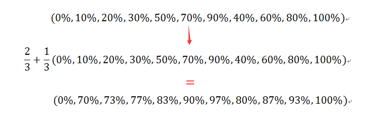
将动画总时长变成3s,用计算出的百分比替换原来的百分比,代码如下:
.ico{-webkit-animation: Tada 3s both infinite;-moz-animation: Tada 3s both infinite;-ms-animation: Tada 3s both infinite;animation: Tada 3s both infinite;
}
@keyframes Tada {0% {transform: scale(1);transform: scale(1)}70%,73%{transform: scale(0.9) rotate(-3deg);transform: scale(0.9) rotate(-3deg)}77%,83%,90%,97%  {transform: scale(1.1) rotate(3deg);transform: scale(1.1) rotate(3deg)}80%,87%,93%{transform: scale(1.1) rotate(-3deg);transform: scale(1.1) rotate(-3deg)}100% {transform: scale(1) rotate(0);transform: scale(1) rotate(0)}
}
效果就是我们期望的了。

完整代码如下:
<!DOCTYPE html>
<html lang="en"><head><meta charset="UTF-8"><title>demo of starof</title><style>a {display: inline-block;background-color: #cc2222;text-decoration: none;color: #fff;font-size: 14px;padding: 10px 12px;width: 100px;position: relative;}.ico {position: absolute;width: 14px;height: 16px;background: url(images/ico.png) no-repeat center;background-size: 100%;position: absolute;top: 4px;right: 27px;}/*动画*/.ico{-webkit-animation: Tada 3s both infinite;-moz-animation: Tada 3s both infinite;-ms-animation: Tada 3s both infinite;animation: Tada 3s both infinite;
}
@-webkit-keyframes Tada {0% {-webkit-transform: scale(1);transform: scale(1)}70%,73% {-webkit-transform: scale(0.9) rotate(-3deg);transform: scale(0.9) rotate(-3deg)}77%,83%,90%,97% {-webkit-transform: scale(1.1) rotate(3deg);transform: scale(1.1) rotate(3deg)}80%,87%,93% {-webkit-transform: scale(1.1) rotate(-3deg);transform: scale(1.1) rotate(-3deg)}100% {-webkit-transform: scale(1) rotate(0);transform: scale(1) rotate(0)}
}@-moz-keyframes Tada {0% {-moz-transform: scale(1);transform: scale(1)}70%,73% {-moz-transform: scale(0.9) rotate(-3deg);transform: scale(0.9) rotate(-3deg)}77%,83%,90%,97% {-moz-transform: scale(1.1) rotate(3deg);transform: scale(1.1) rotate(3deg)}80%,87%,93%{-moz-transform: scale(1.1) rotate(-3deg);transform: scale(1.1) rotate(-3deg)}100% {-moz-transform: scale(1) rotate(0);transform: scale(1) rotate(0)}
}@-ms-keyframes Tada {0% {-ms-transform: scale(1);transform: scale(1)}70%,73% {-ms-transform: scale(0.9) rotate(-3deg);transform: scale(0.9) rotate(-3deg)}77%,83%,90%,97% {-ms-transform: scale(1.1) rotate(3deg);transform: scale(1.1) rotate(3deg)}80%,87%,93% {-ms-transform: scale(1.1) rotate(-3deg);transform: scale(1.1) rotate(-3deg)}100% {-ms-transform: scale(1) rotate(0);transform: scale(1) rotate(0)}
}@keyframes Tada {0% {transform: scale(1);transform: scale(1)}70%,73%{transform: scale(0.9) rotate(-3deg);transform: scale(0.9) rotate(-3deg)}77%,83%,90%,97%  {transform: scale(1.1) rotate(3deg);transform: scale(1.1) rotate(3deg)}80%,87%,93%{transform: scale(1.1) rotate(-3deg);transform: scale(1.1) rotate(-3deg)}100% {transform: scale(1) rotate(0);transform: scale(1) rotate(0)}
}</style>
</head><body><nav><a href="javascript:;" class="box">一元夺宝 <div class="ico"></div></a></nav>
</body></html>
本文只是介绍一种思路,关于动画各个参数详情可参考:
css3中变形与动画(一)
css3中变形与动画(二)
css3中变形与动画(三)
更多参考:
CSS3: 常用动画特效及4个最流行的动画库
详解CSS的盒模型(box model) 及 CSS3新增盒模型计算方式box-sizing
CSS3 媒体查询移动设备尺寸 Media Queries for Standard Devices (包括 苹果手表 apple watch)
CSS:媒体查询 CSS3 Media Queries
CSS3: Media Query实现响应式Web设计
CSS3 Flex 弹性布局用法
本文转自:CSS3: 动画循环执行(带延迟)的实现
CSS3: 动画循环执行(带延迟)的实现相关推荐
- 微信小程序动画循环执行
微信小程序提供了动画API,但是属性有限,并没有css3中动画循环播放等属性. 所以要在微信小程序里实现动画的循环执行,就需要借助定时器来完成. moreToDetailAnim(){const an ...
- html animation怎么多次触发,css3动画连续执行两个怎么做
如果可以用js来控制的话,定义好两个css动画class,当一个动画结束了删除该class,再加上下一个动画的class,就好了.如果要用纯css,则可以通过在动画里设置百分比来设置动画. html& ...
- bat循环执行带参数_wxappUnpacker的bingo.bat脚本逐行解读
点击上方"蓝字"关注我们 之前发过一篇文章小程序反编译工具在windows系统下的调用脚本提到了Windows平台下的脚本,但是对脚本没有做详细说明.本文就是针对脚本做的讲解.对批 ...
- html怎样使动画循环,html – 如何在css动画循环之间添加延迟
参见英文答案 > CSS animation delay in repeating 7个 我正在旋转圆形< div&g ...
- bat循环执行带参数_dos命令exit图文教程,结束退出CMD.EXE程序或当前bat批处理脚本...
大家好,我是老盖,首先感谢观看本文,本篇文章做的有视频,视频讲述的比较详细,也可以看我发布的视频. 今天我们学习dos命令中的exit这个命令,退出 CMD.EXE 程序(命令解释器)或当前批处理脚本 ...
- bat循环执行带参数_C++:main处理命令行选项/main函数的参数
main函数参数 通常,定义main函数形参列表都是空的,遇到有参数的main函数到不知道怎么理解了. 给main函数传递实参,常见的情况是传递命令参数. int main(int argc, cha ...
- js 监听css3动画的执行,animation动画暂停
CSS 动画播放时,会发生以下三个事件: animationstart -CSS 动画开始后触发 animationiteration - CSS 动画重复播放时触发 animationend - C ...
- css3动画图片旋转绕轴,css3图片旋转如何实现?css3实现图片旋转动画效果的方法...
在网页中,我们经常可以看到一张图片在旋转,这样的图片旋转是怎么来实现的呢?本篇文章就来为你介绍一下关于css3实现图片旋转动画效果的方法. 实现css3中图片的旋转可以使用可以使用 -webkit-a ...
- html5 特效框架,带37种3D动画特效的跨浏览器CSS3动画框架
AllAnimation.css是一款带37种3D动画特效的跨浏览器CSS3动画框架.它可以轻松的制作出各种CSS3 3D动画效果,可以在移动手机上使用.并且使用极其简单,使用时只需要添加相应的cla ...
最新文章
- 自己启动spark集群的实验记录
- 微服务注册发现集群搭建——Registrator + Consul + Consul-template + nginx
- 请珍惜应届生的身份,这是你这辈子最大的一次优势,也是最后一次!
- [微信开发] 微信网页授权Java实现(https://www.cnblogs.com/lovebread/p/5513241.html)
- 递归 与 动态规划 区别
- SqlHelper编写
- rabbitmq多个消费者_为什么要选择RabbitMQ,RabbitMQ简介,各种MQ选型对比
- 使用 web storage 制作简单留言本
- [luoguP2285] [HNOI2004]打鼹鼠(DP)
- python locust mqtt_Boomer 实战压测 mqtt,2w 并发轻松实现
- net configuration assistant 没反应_@尾款人:错过这条推送,7000多块就没了……
- 如何将Win7、Win10笔记本,台式机系统C盘软件搬家? 只需3个步骤!!!
- webpack中对CSS压缩
- 基于SSM的美容院管理系统
- threejs坑记录-笔记
- 书呆子rico_书呆子父母指南:何时以及如何向您的孩子介绍《星球大战》
- 由一份诊断报告引发的思考
- k8s对node添加Label
- 经典:全国老婆一览表
- 动态规划(准备工作)