html设计动画小黄人,【二次元的CSS】—— 用 DIV + LESS 做一个小黄人构造器
仅仅使用div作为身体的布局,用css3的各种transform和圆角属性来绘制各个细节的形状,当然也不会使用任何图片哦。那就没意思了。
有的同学说,用canvas不是能画得更逼真而且更简单吗?这点我也非常赞同,但我的理由还是,那就没意思了。
这次用到了一些LESS的特性,通过设置一些指定的参数来生成不同种类、不同身材的小黄人。
效果是这个样子的
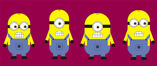
首先 先做个标准版的(ps:也就是图中的第一个小黄人)
HTML结构如下:(ps:每个小黄人的html结构都是一样的)
LESS代码如下:(ps:先定义一个小黄人的类,然后通过设置参数来实例化每个小黄人)
定义小黄人类
.Minion(@width:1;@height:1;@eye:2){
width: 380px * @width;
height:700px * @height;
position:absolute;
margin-top: -100px;
margin-left:-20px;
transform : scale(0.5,0.5);
.hairs{
position:absolute;
top: -40px;
z-index: 3;
width: 100%;
.hair{
background:#000;
width:2px;
height:70px;
position:absolute
}
.hair1{
.hair;
left:45%;
transform:rotate(-20deg);
}
.hair2{
.hair;
left:50%;
}
.hair3{
.hair;
left:55%;
transform:rotate(20deg);
}
}
.body{
overflow: hidden;
background: #fff500;
width: 380px * @width;
position:absolute;
z-index: 1;
height:700px * @height;
border-radius: 180px * @width;
}
.glasses-type{ //眼镜
height:52px;
background:#1f1a17;
width:100%;
position: absolute;
top: 200px;
z-index: 1;
}
.glasses{
z-index: 2;
position:absolute;
background:#dededd;
border:2px solid #1f1a17;
width:150px;
height:150px;
border-radius: 50%;
top: 140px;
&.left-glasses when (@eye = 2){
left:8%;
.ball{
//left : 45%;
animation: eye 1.5s infinite ease;
}
}
&.right-glasses when (@eye = 2){
right:8%;
.ball{
//right:45%;
animation: eye 1.5s infinite ease;
}
}
&.left-glasses when (@eye = 1){
left:50%;
margin-left: -90px;
width: 180px;
height: 180px;
.eye{
width: 150px;
height: 150px;
.ball{
animation: eye 1.5s infinite ease;
}
}
}
&.right-glasses when (@eye = 1){
display: none;
}
.eye{
background:#fff;
width:120px;
height:120px;
border-radius: 50%;
border:2px solid #1f1a17;
margin:15px auto;
position:relative;
.ball{
background:#8f5444;
width:40px;
height:40px;
border-radius: 50%;
border:2px solid #1f1a17;
position:absolute;
top: 40%;
transition: all .15s linear;
strong{
display: block;
width:20px;
height:20px;
background:#1f1a17;
border-radius: 50%;
position:absolute;
top: 10px;
left:10px;
}
}
}
}
.mouth{
width:40%;
height:80px;
background:#fff;
position:absolute;
bottom:42%;
left:30%;
z-index: 1;
border-radius: 120px 120px 40px 40px;
border:2px solid #1f1a17;
overflow:hidden;
animation: up-down 0.5s infinite ease;
.tooths{
.tooth{
border-right:2px solid #1f1a17;
height:100%;
width:0;
position:absolute;
}
.tooth1{
.tooth;
left:25%;
}
.tooth2{
.tooth;
left:50%;
}
.tooth3{
.tooth;
left:75%;
}
.line{
width:100%;
top: 48%;
border-top:3px solid #1f1a17;
position:absolute;
}
}
}
.arm{
position:absolute;
width:50px;
height:400px;
background:#fff500;
border-radius: 50px;
top: 190px;
z-index: 0;
&.left-arm{
left:-20px;
transform:rotate(20deg);
}
&.right-arm{
right:-20px;
transform:rotate(-20deg);
}
.hand{
position:absolute;
bottom:0;
width:60px;
height:60px;
border-radius: 50%;
background:#1f1a17;
left:-5px;
}
}
.cloth{
background:#667ab3;
border-radius: 20px;
bottom:20px;
width:80%;
height:250px;
position:absolute;
z-index: 1;
left:10%;
}
.pocket{
border:2px solid #1f1a17;
border-radius: 5px 5px 30px 30px;
width:100px;
left:50%;
margin-left: -50px;
height:100px;
position:absolute;
z-index: 2;
bottom: 80px;
>div{
background:#1f1a17;
width:50px;
height:50px;
border-radius: 50%;
top: 20px;
left:25px;
position:absolute;
>div{
width:20px;
height:20px;
border:5px solid #667ab3;
transform:rotate(45deg);
position:absolute;
top: 10px;
left:10px
}
}
}
.trousers{
background:#667ab3;
border-radius: 10px 10px 130px 130px;
bottom:0;
width:100%;
height:160px;
position:absolute;
z-index: 1;
}
.straps{
width:40px;
height:150px;
position:absolute;
z-index: 1;
background:#667ab3;
bottom:230px;
&.left-straps{
left:10px;
transform:rotate(-40deg);
}
&.right-straps{
right:10px;
transform:rotate(40deg);
}
.fastener{
background:#1f1a17;
width:20px;
height:20px;
border-radius: 50%;
bottom:10px;
position:absolute;
left:10px;
}
}
.leg{
background:#667ab3;
width:70px;
height:120px;
position:absolute;
bottom:-80px;
&.left-leg{
left:20%;
.footer{
right:-2px;
border-radius: 100px 0 0 20px;
}
}
&.right-leg{
right:20%;
.footer{
left:-2px;
border-radius: 0 100px 20px 0;
}
}
.footer{
background:#1f1a17;
width:100px;
height:50px;
position:absolute;
bottom:0;
}
}
}
实例化
.minion-1{
z-index: 1;
top: 50px;
left: 0;
.Minion(1,1,2);
}
.minion-2{
z-index: 2;
top: 0;
left: 24%;
.Minion(0.88,1.1,1);
}
.minion-3{
z-index: 2;
top: 44px;
left: 42%;
.Minion(1.15,1.02,1);
}
.minion-4{
z-index: 1;
top: 5px;
left: 67%;
.Minion(1,1.1,2);
}
最后加点料
附加了2个小动画效果,眼睛转动和牙齿抖动。
@keyframes eye {
0% {
transform:rotate(0,0);
}
50% {
transform:translate(70px,0px)
}
100% {
transform:translate(0px,0px)
}
}
@keyframes up-down {
0% {
transform:rotate(0,0);
}
50% {
transform:translate(0,2px)
}
100% {
transform:translate(0,0)
}
}
后续
没有特别详细的描述每个细节部分,大家看一下源码或者fork一下就能知道具体每个元素是怎么实现的了。
当然这个肯定是有bug的,比如参数设置的过大或者过小,都会导致生成出来的小黄人乱七八糟,也欢迎大家吐槽。
html设计动画小黄人,【二次元的CSS】—— 用 DIV + LESS 做一个小黄人构造器相关推荐
- python手机版做小游戏代码大全-Python大牛手把手教你做一个小游戏,萌新福利!...
原标题:Python大牛手把手教你做一个小游戏,萌新福利! 引言 最近python语言大火,除了在科学计算领域python有用武之地之外,在游戏.后台等方面,python也大放异彩,本篇博文将按照正规 ...
- 吃豆人html代码原理,如何用HTML做一个吃豆人?
首先做一个项目的先想如何去实现它.比如做一个吃豆人,如图: 167b84dcbf0d3ed647b6b8c4abd75f92.jpg 首先,需要分析这个吃豆人的组成部分. 上半部分嘴,下半部分嘴,豆基 ...
- Esp8266 进阶之路20 【高级篇】深入学习esp8266的esp now模式组网,仿机智云做一个小网关,实现无需网络下轻松彼此连接通讯交互数据。(附带Demo)
本系列博客学习由非官方人员 半颗心脏 潜心所力所写,不做开发板.仅仅做个人技术交流分享,不做任何商业用途.如有不对之处,请留言,本人及时更改. 序号 SDK版本 内容 链接 1 nonos2.0 搭建 ...
- 做一个小程序的完整流程
一. 引言 最近在帮朋友开发一个小程序,都说今年是小程序快速发展的一年,不懂技术的人,大部分零售店面都开始想做一个小程序帮助推广销售.虽然小程序技术门槛没那么高,但自己独立做一个小程序还是需要了解的内 ...
- 关于做一个有价值的人的思考(1,财富扮演什么角色)
最近读了一些书,大致是关于人生观.世界观.价值观.爱情观之类的,其中有关于价值的东西,我了解了之后有一些自己感想,就顺手写下来,其实昨天晚上我就对于这个问题思考了许久不能入眠,这里就整理一下. 首先想 ...
- 如何做一个小程序商城,需要多少钱
如何做一个小程序商城,需要多少钱? 操作像玩消消乐那么简单! 费用是一年1998元至3498元.免300元认证费.买两年用四年. 日均花费不到2元就能搭建一个小程序商城. 下面分享的是自建小程序商城的 ...
- 做一个小程序大概需要多少钱?一般小程序要多少钱?
做一个小程序大概需要多少钱?一般小程序要多少钱?小程序本身就是微信生态环保的一个月活动客户,创建一个小程序,当然,在整个小程序制作过程中,很可能我们关心这样一个,那么做一个小程序大概需要多少钱? 事实 ...
- 永远做一个有计划的人
http://www.cnblogs.com/hnrainll/archive/2010/12/28/1918848.html#3129909 大部分的人都高估了1年内所能完成的事,而低估了10年之中 ...
- 最近用周立功的IOT3960板子做一个小控制器,现在到了界面美化阶段,各位大侠有没有高招?
最近用周立功的IOT3960板子做一个小控制器,现在到了界面美化阶段,各位大侠有没有高招? 环境是虚拟机ubuntu 16.04LTS 开发软件是QT creator 5.6.1 最初想用AI画一个漂 ...
最新文章
- NLP顶级专家Dan Roth :自然语言处理领域近期的任务和主要应用
- php memcached 扩展安装目录,php安装memcached扩展
- 带你认识清华标杆课教师 | 卓晴:自带BGM的硬核“技术流”教师
- 有了“手掌”,机械手也能盘“核桃”,耶鲁出品 | Science子刊
- 无偏估计【统计学-通俗解释】
- 组策略 之 恢复默认组策略对象命令
- 4.WCF事务【Transaction】
- 【转载】MongoDB基本操作
- 计算机的组成 —— 磁盘阵列(RAID)
- mysql 行显示 g_MySQL行(记录)详细操作
- 关于备考软考过程中历年真题的说明
- 【智能制造】海阔凭鱼跃:记一场工业场景下的AI技术实践
- 数字孪生典型应用案例
- 深蓝学院-多传感器融合定位课程学习分享-专栏汇总
- Twitter 用户推文时间线爬虫
- 关于Telegram广告的那些事: 推广原因及推广途径
- SSH Tunneling (SSH隧道)远程连接服务器
- WKWebView白屏问题
- 如何安装Python的PIL库
- 自我管理的经典书籍推荐:《自我管理必读12篇》