免费开源字体_7种华丽的免费开源字体以及何时使用它们
免费开源字体
by Noemi Stauffer
诺米·斯塔福 ( Noemi Stauffer)
If you’re looking for a useful free font with a bit of an edge, look no further than this collection of modern typefaces. These sleek and versatile fonts are perfect for all sorts of designs, from websites to printed material, and they are all completely free for both personal and commercial use.
如果您正在寻找一种有用的带有一点边缘的免费字体,那此现代字体集合便是最好的选择。 这些流畅,通用的字体非常适合从网站到印刷材料的各种设计,并且完全免费供个人和商业使用。
To facilitate your font picking and pairing process, I’ve included examples of how these typefaces have been put to use recently, and a few pairing ideas. Enjoy and don’t forget to ping me on Twitter (@noemistauffer) to show me how you’ve used them, I’d love to see it!
为了方便您进行字体选择和配对过程,我提供了一些示例,介绍了最近如何使用这些字体以及一些配对想法。 尽情享受,别忘了在Twitter( @noemistauffer )上ping我,向我展示您如何使用它们,我很乐意看到它!

黑帮格罗特斯克 (Gangster Grotesk)
Designed by Adrien Midzic, Gangster Grotesk is a contemporary grotesk with angled terminal strokes that slightly curve inward. Because of these quirky individual touches, the typeface brings a unique flavour to headlines and posters when used at large sizes. Its low contrast and slightly condensed width make it a good choice for body copy and other texts of small type sizes as well.
Gangster Grotesk由Adrien Midzic设计,是当代的grotesk,其末端弯曲的笔触向内弯曲。 由于这些古怪的个人风格,因此在大尺寸使用时,字体为标题和海报带来独特的风味。 它的低对比度和稍微凝缩的宽度使其成为正文和其他较小字体的不错的选择。
The family comes in three weights, from Light to Bold, with stylistic alternates, including a loopy expressive ampersand. Gangster Grotesk is offered for free when signing up for the Fresh Fonts newsletter.
该系列有3种配重,从轻到粗,有风格上的替代,包括有圈的表达与号。 订阅Fresh Fonts时事通讯可免费获得Gangster Grotesk。
Download Gangster Grotesk →
下载黑帮Grotesk→
建议的字体配对 (Suggested Font Pairings)
When applying Gangster Grotesk to titles, the quirky grotesk pairs well with low x-height serifs for text settings, such as FF Atma. Used at small sizes instead, pairing Gangster Grotesk with Le Murmure (see below) offers the right mix of character and neutrality.
当将Gangster Grotesk应用于标题时,古怪的grotesk与低x高度衬线(例如FF Atma)的文本设置很好地配对。 相反,将Gangster Grotesk与Le Murmure(请参阅下文)配对使用时,尺寸较小,可以将性格和中性完美融合。

用例 (Use Case)
Gangster Grotesk excels in punchy designs with strong colors when it’s asked to render strings of text, for example on this flyer designed by Tokyo-based Juri Okita for Pells Coffee.
Gangster Grotesk在被要求渲染文本字符串时,例如在东京Juri Okita为Pells Coffee设计的传单上,擅长于具有强烈色彩的强力设计。

Le Murmure (Le Murmure)
Recently awarded a Certificate of Typographic Excellence by the Type Directors Club, Le Murmure was commissioned by French design agency Murmure to renew their brand image. Drawing inspiration from magazine titling fonts, Le Murmure is a condensed sans serif with an interesting mismatch between its characters, making it especially distinctive for use at large sizes. Its height and the singularity of its shapes provide elegance, while conveying notions of experimentation and creativity. Le Murmure comes with many, even more original alternate letters, and there is even a stylistic set that ‘randomizes’ all alternates for you (SS08).
Le Murmure最近获得了Type Directors Club的版式优秀证书,它是由法国设计机构Murmure委托进行的,以更新其品牌形象。 Le Murmure是从杂志标题字体中汲取灵感的,是一种浓缩的无衬线字体,其字符之间有趣的不匹配,使其特别适合大尺寸使用。 它的高度和形状的奇异之处提供了优雅,同时传达了实验和创造力的概念。 Le Murmure附带了许多甚至更多的原始替换字母,甚至还有一套样式集,可为您“随机化”所有替换字母(SS08)。
Download Le Murmure →
下载Le Murmure→
建议的字体配对 (Suggested Font Pairings)
Used as a titling font, Le Murmure can pair well with a sans serif with warm curves, like Standard CT, or with a sans that has more pronounced irregularities, like Dinamo’s Prophet.
Le Murmure用作标题字体,可以与带有温暖曲线的无衬线衬线(如Standard CT )或具有更明显不规则性的无衬线(如Dinamo's Prophet)搭配使用。
用例 (Use Case)
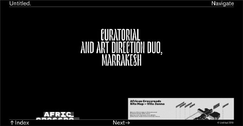
Marrakesh’s Untitled Duo picked Le Murmure for the headlines of their studio’s website, complemented with Classic Sans for the navigation, which they also used at smaller size for the body text.
马拉喀什(Marrakesh)的《 无题二重奏》 ( Untitled Duo)选择了Le Murmure作为其工作室网站的头条新闻,并为Classic Sans导航做了补充,他们还以较小的字体用于正文。

改革 (Reforma)
Reforma is a bespoke typeface designed by PampaType for the Universidad Nacional de Córdoba in Argentina, an educational institution more than 400 years old. The typeface is composed of three subfamilies: Reforma 1918, a classic Serif, Reforma 2018, a modern Sans, and Reforma 1969, an intermediate hybrid that combines the qualities of the other two (subtle modulation and flare serifs). I find all three subfamilies to adapt well to a wide range of bodies, from display to immersive text, and each one of them comes in three weights, with matching italics.
Reforma是由PampaType为阿根廷国立科尔多瓦大学(Universidad Nacional deCórdoba)设计的定制字体,该大学已有400多年的历史了。 字体由三个子家族组成:Reforma 1918,经典的衬线字体,Reforma 2018,现代的Sans字体,以及Reforma 1969,融合了其他两个特质的中间混合字体(细调和衬线衬线)。 我发现这三个子家族都可以很好地适应各种物体,从显示到沉浸式文本,它们每个都有三个权重,并带有斜体。
Download Reforma →
下载Reforma→
建议的字体配对 (Suggested Font Pairings)
This typeface allows for interesting combinations among its different styles. The most obvious would be to use Reforma Sans for display use, and to pair it with its serif counterpart for body text. However, I would encourage you to do something more original and try it the other way around, using the serif for titling.
此字体允许在其不同样式之间进行有趣的组合。 最明显的是将Reforma Sans用于显示,并将其与衬线字体配对以用于正文。 但是,我鼓励您做一些更原始的事情,然后使用衬线进行标题处理,尝试其他方法。

用例 (Use Case)
Graphic designer Étienne Pouvreau chose Reforma for the creation of the annual programs of the two Caf family centers of the Loir-et-Cher department in France. The booklets feature Reforma 1918 (the serif) for the headings, in italic, and Reforma 2018 (the sans) for the titles, subtitles and body text.
平面设计师ÉtiennePouvreau选择Reforma来创建法国卢瓦尔-谢尔省(Loir-et-Cher)的两个Caf家庭中心的年度计划。 手册的标题为斜体的“ Reforma 1918”(衬线),斜体字为标题的“ Reforma 2018”(sans),标题,副标题和正文。

太空怪兽 (Space Grotesk)
The new foundry of Florian Karsten is behind this versatile, geometric sans serif. Derived from Space Mono, a monospaced typeface designed by Colophon Foundry for Google Fonts in 2016, Space Grotesk kept the nerdy charm of its predecessor, and its particular retro-future voice. Available in five weights, Space Grotesk is well-suited for a wide range of uses, from body text to bold headlines. In addition, it comes with five sets of alternate letters, the third one (SS03) removing the connections between the diagonal strokes of uppercase A, M, N, V, W and lowercase v, w, y — which can be particularly effective to create distinctive headlines.
Florian Karsten的新铸造厂是这种多功能几何无衬线的背后。 起源于Colophon Foundry在2016年为Google字体设计的等宽字体Space Mono ,Space Grotesk保留了其前任的书呆子魅力以及独特的复古风格。 Space Grotesk有五种砝码,非常适合从正文到醒目的标题的广泛使用。 此外,它附带五组备用字母,第三组(SS03)删除了大写A,M,N,V,W和小写字母v,w,y的对角笔画之间的连接-这对创造独特的头条新闻。
Download Space Grotesk →
下载Space Grotesk→
建议的字体配对 (Suggested Font Pairings)
As one would guess, Space Grotesk pairs well with Colophon Foundry’s Space Mono, the typeface it was derived from, which is also open source and free to use. Alternatively, if you’d like to pair it with a serif typeface, I would recommend one with pointy serifs and sharp details, such as Fortescue, or Wremena, which is also free to use (see below).
就像人们可能会猜到的那样,Space Grotesk与Colophon Foundry的Space Mono (它的字体源自此字体)非常匹配,它也是开源的,可以免费使用。 另外,如果您想将其与衬线字体配合使用,我建议您使用尖的衬线和清晰的细节,例如Fortescue或Wremena,它们也可以免费使用(请参见下文)。
用例 (Use Case)
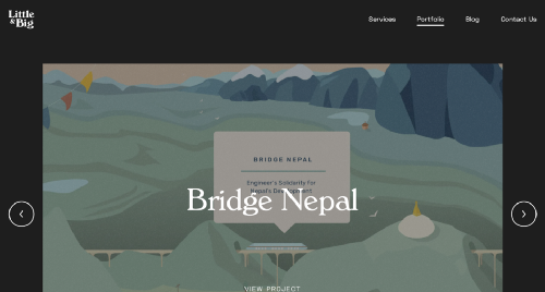
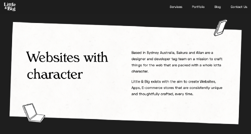
Little & Big, a web design and development studio based in Sydney, Australia, chose Space Grotesk as the body text font for their website, including on blog entries, header and footer. They decided to pair it with Verona Serial, giving the website a professional, yet playful look and feel.
位于澳大利亚悉尼的Web设计和开发工作室Little&Big选择了Space Grotesk作为其网站的正文字体,包括博客条目,页眉和页脚。 他们决定将其与Verona Serial搭配使用,以使网站具有专业而有趣的外观。
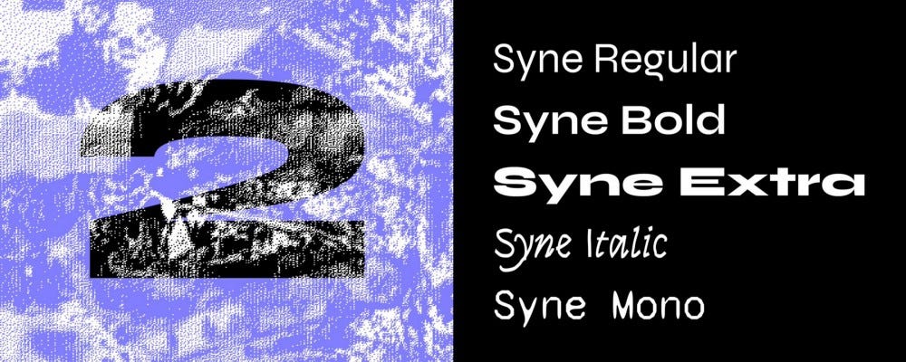
辛尼 (Syne)
Syne is a type family designed by Bonjour Monde for the visual identity of Synesthésie, an art center close to Paris. It consists of five distinct styles, amplifying the notion of structural differentiation within a font family: Syne Extra is a wide, heavy weight intended for use at large sizes, Syne Regular is a geometric sans with short ascenders and descenders (visible in the lowercase ‘g’ among others), complemented with a wider bold style, an italic in a handwritten style and a monospaced with a distorted look.
Syne是由Bonjour Monde设计的一种类型系列,其外观是Synesthésie (靠近巴黎的艺术中心)的视觉标识。 它由五种不同的样式组成,放大了字体家族中结构差异的概念:Syne Extra是一种宽而重的字体,旨在用于大尺寸; Syne Regular是一种几何形状的sans,具有短的上升和下降(在小写字母“ g'等),并辅以宽大胆的字体,手写体的斜体和扭曲的等宽字体。
Updated just days ago, Syne now comes with more alternates, a set of brand new accents, and a variable font version.
Syne仅在几天前进行了更新,现在带有更多替代项,一组全新的重音符号以及可变字体版本。
Download Syne →
下载Syne→
建议的字体配对 (Suggested Font Pairings)
The particularity of this typeface is that you can play with its different styles, and create fresh and atypical associations among them. For instance, Syne Extra does wonder for titles and headlines, and works well with Syne Regular for body copy.
这种字体的特殊性在于您可以使用其不同的样式,并在它们之间创建新鲜且非典型的关联。 例如,Syne Extra确实对标题和标题感到奇怪,并且与Syne Regular的正文复制效果很好。
用例 (Use Case)
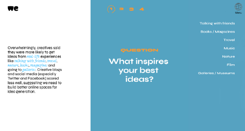
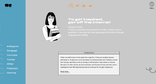
Syne was recently used by WeTransfer to present the results of their Ideas Report 2018, making extensive use of the typeface’s five different cuts on the website of the report and on its beautiful PDF companion.
Syne最近被WeTransfer用来展示其Ideas Report 2018的结果,并在该报告的网站及其漂亮的PDF伴侣中广泛使用了字体的五种不同形式。
VG5000 (VG5000)
Named after the VG 5000, a computer created by Phillips in 1984, this typeface playfully combines pixelated and curved strokes, blurring the lines between old and new digital shapes. It also includes many early emojis and pictograms from the VG 5000’s original set, allowing you to create unexpected combinations. Moreover, the typeface comes with contemporary gender inclusive characters for the French language, replacing pronouns “il” and “elle” (“he” and “she”) with the neutral “iel”, and providing an alternative to gendered words by combining their masculine and feminine versions.
以Phillips于1984年发明的计算机VG 5000命名,该字体巧妙地结合了像素化和弯曲的笔触,模糊了新旧数字形状之间的界限。 它还包括来自VG 5000原始设置的许多早期表情符号和象形图,使您可以创建意想不到的组合。 此外,字体带有法语的当代性别包容性字符,用中性的“ iel”代替代词“ il”和“ elle”(“ he”和“ she”),并通过组合它们来提供性别单词的替代形式男性和女性版本。
Download VG5000 →
下载VG5000→
建议的字体配对 (Suggested Font Pairings)
Because of its pixelated details, and to remain truthful to its origins, I would suggest pairing VG5000 with a monospaced font, for example League Mono, which is also open source. Alternatively, you could decide to pair it with the sans or serif version of Input, or with a semi-proportional typeface like ETC Trispace, which is also free.
由于其像素化的细节,并且要忠于其起源,我建议将VG5000与等宽字体配对,例如League Mono ,它也是开源的。 另外,您可以决定将其与Input的sans或serif版本或与ETC Trispace之类的半比例字体(也免费) 配对 。
用例 (Use Case)
French design studio Brand Brothers put VG5000 to use for the visual identity of Les Halles de la Cartoucherie, a new, versatile space dedicated to cultural, artistic and gastronomic activities in Toulouse. Paired with a custom, grid-based logo that represents the structure of the space, VG5000 was used both at large and small sizes on print materials, on the website of the space and even on its walls, using VG5000’s pixelated arrows for its wayfinding system.
法国设计工作室Brand Brothers将VG5000用作Les Halles de la Cartoucherie的视觉标识,这是一个新的多功能空间,致力于图卢兹的文化,艺术和美食活动。 VG5000与代表该空间结构的基于网格的自定义徽标配对使用,使用VG5000的像素化箭头作为寻路系统,在印刷材料上,该空间的网站上甚至在墙壁上都使用了大小尺寸的VG5000 。

Wremena (Wremena)
Wremena is a serif typeface designed by Roman Gornitsky and published by Moscow-based foundry Typefaces of The Temporary State. Its design was based on Vremena, a free typeface by the same designer, but it features more pronounced triangular serifs and sharper angles, which become even more visible in heavier weights. Wremena is available in three styles (Light, Regular and Bold) without italics but with support for the Latin and Cyrillic scripts. Because of its similarities with Times New Roman, Wremena can be used as a free, more contemporary alternative to the ever-popular typeface.
Wremena是Serif字体,由Roman Gornitsky设计,由位于莫斯科的铸造厂出版,字体为The Temporary State。 其设计基于同一设计师的免费字体Vremena ,但它具有更明显的三角形衬线和更锐利的角度,在较重的重量中变得更加明显。 Wremena提供三种样式(浅色,常规和粗体),不带斜体,但支持拉丁和西里尔字母。 由于其与Times New Roman的相似之处,Wremena可以用作流行字体的免费,更现代的替代品。
Download Wremena →
下载Wremena→
建议的字体配对 (Suggested Font Pairings)
A good tip to find pairings for a specific font is to browse the library of typefaces created by the same designer, as they often pair well together. This is especially true in this case, as Roman Gornitsky designed two sans serifs that are great matches for Wremena: Nowie Vremena, with its distinctive lowercase ‘g’, and more recently, Steinbeck, a lively font with intentional irregularities.
找到特定字体的配对的一个好技巧是浏览由同一位设计师创建的字体库,因为它们通常会很好地配对在一起。 在这种情况下尤其如此,因为Roman Gornitsky设计了两个无衬线字体,非常适合Wremena: Novie Vremena (带有独特的小写字母“ g”),以及最近的Steinbeck (一种有意的不规则字体)。
用例 (Use Case)
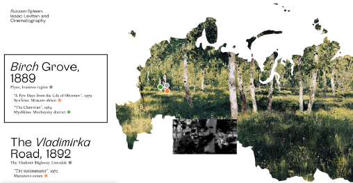
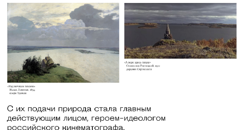
The Jewish Museum and Tolerance Center and Readymag have come together to bring the Russian Spleen project to life, which is a picturesque interactive web project that explores how Russian landscape painter Isaac Levitan impacted the 20th-century cinematography. Designer Pavel Kedich decided to typeset the website in Steinbeck (used at large sizes) and Wremena (here used for captions). Both fonts being multi-script, they allow the website to be available in English and Russian languages.
犹太博物馆和宽容中心以及Readymag携手合作,使俄罗斯脾脏项目栩栩如生,这是一个风景如画的互动网络项目,旨在探讨俄罗斯风景画家艾萨克·列维坦(Isaac Levitan)对20世纪摄影艺术的影响。 设计师Pavel Kedich决定使用Steinbeck(大尺寸使用)和Wremena(此处用于标题)对网站进行排版。 两种字体都是多脚本的,它们使网站可以使用英语和俄语。
现在就这样! (That’s It For Now!)
While I’ve included great examples of how these free fonts have been used, you’ll find many more on Typewolf and Fonts in Use. And if you’d like to discover new, high-quality free and open source fonts, make sure to subscribe to my newsletter Fresh Fonts.
尽管我提供了有关如何使用这些免费字体的出色示例,但您会在Typewolf和使用中的字体中找到更多信息。 而且,如果您想发现新的,高质量的免费和开源字体,请确保订阅我的时事通讯Fresh Fonts 。
Originally published on Smashing Magazine on July 17, 2019.
最初于 2019年7月17日 发布在《 粉碎杂志》 上。
All works and screenshots are property of their respective owners.
所有作品和屏幕截图均为其各自所有者的财产。
翻译自: https://medium.com/@smashingmag/7-gorgeous-free-and-open-source-typefaces-and-when-to-use-them-2c0fd23eb4f8
免费开源字体
http://www.taodudu.cc/news/show-1968398.html
相关文章:
- 开源字体_开源字体的前5大资源
- html 字体思源_思源字体打包下载
- 网站开源字体使用
- leaflet地图之 获取经纬度
- 奥维地图(OMAP)中坐标为什么有偏移?如何基于WGS84或GCJ02的经纬度坐标生成kml?怎么导出图上一个标签点的WGS84经纬度坐标?
- ArcMap怎么导出shape文件到奥维互动地图
- 将经纬度坐标用线段形式在地图上链接起来
- echars 绘制多点连线地图 vue
- 奥维互动地图自定义地图
- 国外卫星地图mapbox的基本操作
- 地图上导出坐标html文件,如何将标签的坐标、海拔等属性导出到TXT文本中
- 奥维kml文件制作工具_如何将平面控制点导入Google Earth、奥维互动地图及手机奥维互动地图APP里面?...
- 大地坐标系是不是经纬度_批量导入经纬度点到奥维地图中
- 百度地图和openlayers融合封装(想法)
- android 高德地图设置不能旋转_如何将平面控制点导入Google Earth、奥维互动地图及手机奥维互动地图APP里面?...
- 奥维怎么记录沿线轨迹_奥维地图怎么将已有线路画为轨迹
- ECharts地图,echarts自定义map地图,echarts添加标注,自定义坐标、图标、icon
- C#+AE 地图制图(二)
- shp地图如何导入奥维地图手机_如何将CAD图导入到手机版奥维互动地图
- 地图 显示 动态轨迹_野外探路必备神器——奥维互动地图浏览器
- 网站中引入百度地图的方法分享(含源码)
- shp地图如何导入奥维地图手机_如何将平面控制点导入Google Earth、奥维互动地图及手机奥维互动地图APP里面?...
- 奥维互动地图恢复旧版及导入谷歌卫星图
- shp地图如何导入奥维地图手机_奥维地图如何导入文件 奥维地图导出文件在哪...
- uni-app 使用高德地图
- cad图形如何导入到奥维地图_如何将CAD图导入奥维地图
- 奥维怎么记录沿线轨迹_奥维互动地图怎么绘制路线
- shp地图如何导入奥维地图手机_奥维地图如何导入路线数据?
- 批量导入经纬度点到奥维地图中
- 奥维怎么记录沿线轨迹_奥维地图如何绘制轨迹
免费开源字体_7种华丽的免费开源字体以及何时使用它们相关推荐
- 开源是一种精神,但开源也是一剂慢性毒药
对于从商而言,造不如买,买不如租.从成本上看,这是不争的事实.何况开源呢?有开源的东西拿来用,不用钱,多好的事情.但真如此美好么?要知道天下没有免费的午餐,实际上,开源往往是一种慢性毒药,特别是对于一 ...
- web 常用的几种字体_3种免费Web字体服务比较
这些年来,网站只能使用Arial,Georgia,Times等典型字体. 这是由于浏览器的局限性,浏览器一次只能只能从用户的计算机传递字体. 幸运的是,当今网络发展Swift,当今的浏览器支持webf ...
- JetBrains 发布新款编程字体,提高编程效率、开源免费可商用!
上一篇:这300G的Java资料是我师傅当年给我的,免费分享给大家(已修复) 下一篇:昨天分享资料不小心把百度网盘深处的秘密泄露了(已修复) 来源:公众号SegmentFault 作为一名「代码操纵者 ...
- web设计字体规范_适用于Web设计人员的30种高质量免费字体
高质量字体是设计师的重要资产. 我们始终努力在每个设计项目中保持独特,但是有时候为正确的设计获取正确的字体可能很困难. 通过搜索引擎和字体网站搜索字体既费时又乏味. 在今天的帖子中,我们尝试将尽可能多 ...
- SaaSpace:8种最好的免费图形设计软件
不言而喻,精心制作的图像或图形能够吸引潜在客户的眼球. 正确的视觉效果会将博客或网站从混乱的单词提升到令人惊叹的视觉信息,但需要许多不同的工具才能实现. 图形设计软件包含多种软件工具,可以帮助你完成工 ...
- 开源激荡 30 年:从免费社区到价值数十亿美元公司
开源起始于边缘活动,活跃于社区,30 年来一路进化,无数的企业在开源项目的基础上拔地而起,今天,开源商业已经迎来了最好的发展机会. 演讲 | Peter Levine,A16Z Partner Edi ...
- 微软自证开源决心:GitHub 私有库免费无限开放!
号外号外!兹有 GitHub 私仓免费开放,众皆欢腾,喜不自禁-- 2018 年 6 月,微软斥资 75 亿美元,十里红妆豪"娶"GitHub,当即引发巨大争议,众多程序员纷纷表示 ...
- linux开源同步软件,开源备份也安全 六大国外免费Linux工具
六大国外免费Linux备份工具a 如今,很多中小企业用户常常会因为某种原因而丢失重要的数据,特别是在开源架构平台下,这会导致用户时间甚至业务运营上的损失.针对这种情况,市场中先后出现了很多的Linux ...
- 免费时代的4种销售方式
原文地址:免费时代的4种销售方式作者:正见品牌顾问 1.向上销售 推出免费的基本款产品,以获得广泛使用,然后对高级版本收费. 前提条件: ·免费产品要能吸引庞大的用户群,这样即使转换为付费用户 ...
- 开源企业内部沟通协作平台, 免费企业IM, ENTBOOST, Windows环境:免安装模式部署
关于ENTBOOST 恩布互联: ENTBOOST公司致力于提供,开源企业内部沟通协作平台,开源团队协作平台,免费企业IM,私有云部署产品:所有ENTBOOST产品可以免费部署到企业内部服务器上,帮助 ...
最新文章
- poj2029(二维树状数组)
- 微软为什么要公开AI系统测试数据集和度量指标?
- [转载] New Concept English 1——Lesson 14 What colour's your…?
- 如何折叠Visual Studio Code for Windows中的代码部分?
- MPC class get last modified - how to implement
- PetShop 4.0知识点:base 关键字用于从派生类中访问基类的成员
- Linux下setsockopt函数返回-1,errno=22
- 社交类APP原型模板分享——Tinder
- C++战斗游戏-----------圣光战神の起源之战 V8.13.0
- Win32基础学习笔记
- 公众号里面套页面_怎么套用别人的公众号模板?公众号模板在哪找? | 微信公众号指南...
- 阿里云账号注销踩坑实践记录
- Safari浏览器模拟iPhone手机浏览器的方法
- 影视寒冬,但却可能是广告主营销的机遇
- js页面加载实现loading提示效果
- 卡塔尔世界杯:带“芯片”的智能足球亮相!背后藏着哪些技术原理?
- springboot配置内置tomcat的日志
- Kahan求和公式原理
- SQL Server 查看列,添加列,修改列,删除列
- 高并发编程之生产者—消费者设计模式