COVID-19和世界幸福报告数据告诉我们什么?
For many people, the idea of staying home actually sounded good at first. This process was really efficient for Netflix and Amazon. But then sad truths awaited us. What was boring was the number of dead and intubated patients one after the other. We all know the aftermath well.
对于很多人来说,居家的想法一开始听起来确实不错。 对于Netflix和Amazon,此过程确实非常有效。 但是可悲的事实等待着我们。 无聊的是死者和插管者的数量接连不断增加。 我们都知道后果。
In this article, we will try to examine the covid-19 virus, which can affect all countries in the world, and the relationship between it and the countries explained in the happiness report.
在本文中,我们将尝试检查可能影响世界所有国家的covid-19病毒,以及它与幸福报告中解释的国家之间的关系。
Before we start, let’s get to know our datasets:
在开始之前,让我们了解我们的数据集:
- ‘covid19_Confirmed_dataset.csv’ (Data include 96 days from the first case)'covid19_Confirmed_dataset.csv'(数据包括自第一种情况起的96天)
- ‘worldwide_happiness_report.csv’'worldwide_happiness_report.csv'
And of course the libraries we will use:
当然,我们将使用的库:
import pandas as pd import numpy as np import seaborn as snsimport matplotlib.pyplot as pltFirst of all, we will need a small clearing of our data. We will follow the following procedures to obtain our data frame, where ‘Lat’ and ‘Long’ are removed from the columns:
首先,我们将需要少量清除数据。 我们将按照以下过程获取数据框,其中从列中删除了“ Lat”和“ Long”:
corona_dataset_csv.drop(["Lat", "Long"],axis=1,inplace=True)And only the country names and the number of cases are shown day by day:
每天仅显示国家名称和案件数:
corona_dataset_aggregated = corona_dataset_csv.groupby("Country/Region").sum()
For 3 countries to be shown in the same graphic:
在同一图形中显示3个国家/地区:
corona_dataset_aggregated.loc["China"].plot()corona_dataset_aggregated.loc["Italy"].plot()corona_dataset_aggregated.loc["Spain"].plot()plt.legend()
We will use the derivative function in order to better observe which periods stand out and the prominent trend points in infected numbers. Of course for this: diff ()
我们将使用导数函数,以便更好地观察哪些时期脱颖而出以及感染人数中的显着趋势点。 当然要这样做:diff()
corona_dataset_aggregated.loc["China"].diff().plot()
We add ‘max_infection_rate’ as a new column and refresh our data frame.
我们将“ max_infection_rate”添加为新列,并刷新我们的数据框。
countries = list(corona_dataset_aggregated.index)max_infection_rates = [] for c in countries : max_infection_rates.append(corona_dataset_aggregated.loc[c].diff().max())max_infection_ratesMeanwhile, we are starting to process our data from the happiness report.To import:
同时,我们开始处理幸福报告中的数据。要导入:
happiness_report_csv = pd.read_csv("worldwide_happiness_report.csv")
We extract “Overall rank”, “Score”, “Generosity”, “Perceptions of corruption” from among the columns.
我们从各列中提取“总体排名”,“得分”,“慷慨”,“腐败感”。
useless_cols = ["Overall rank","Score","Generosity","Perceptions of corruption"]Now we are including “max_infection_rate” in this framework and we are making countries fits for themselves.
现在,我们将“ max_infection_rate”包含在此框架中,并且正在使国家适合自己。
data = corona_data.join(happiness_report_csv,how="inner")data.head()
We will use the corr () function for the correlation matrix:
我们将对相关矩阵使用corr()函数:
data.corr()
As you can see this matrix consists of correlation coefficcients off every two columns in our data set.
如您所见,此矩阵由数据集中每两列的相关系数组成。
We have ‘max infection rate’ and ‘GDP per capita’ and this data frame is the correlation coefficient between these two variables. As this value gets higher, it means the correlation between these two variables is also higher.
我们有“最大感染率”和“人均GDP”,并且此数据框是这两个变量之间的相关系数。 随着该值变高,这意味着这两个变量之间的相关性也变高。
If you look at other of life factors, for example social support has the life expectancy and freedom to make life choices is also we can see that we have positive correlations betwen all off other life factors.
如果您查看其他生活因素,例如社会支持具有预期寿命和自由选择生活的机会,那么我们也可以看到我们与其他生活因素之间存在正相关关系。
But our work is not done yet. We know that our Analysis is not finished unless we visualize the results in terms figures and graphs so that everyone can understand what you get out of our analysis.
但是我们的工作还没有完成。 我们知道,除非我们用术语图和图形将结果可视化,以便每个人都可以理解您从分析中得到的结果,否则分析尚未完成。
We found out that there are positive correlation between the max inf rate and all off the life factors that we have in our data set.
我们发现,最大INF比率与数据集中所有寿命因素之间存在正相关。
In this task, i am going to use seaborn module, which is a very handed tool for regionalisation. What we want to do is to plot every each of these columns.
在此任务中,我将使用seaborn模块,这是用于区域化的非常有用的工具。 我们要做的是绘制每个这些列。
x = data["GDP per capita"]y = data["max_infection_rate"]sns.scatterplot(x,y)
However, it is not possible to examine the graph in detail. So this difference between in X axis and Y access has caused the problem that we cannot enough details in our data. So for so to solve this problem, what we can do is to use log scaling:
但是,无法详细检查图表。 因此,X轴访问和Y轴访问之间的差异导致了问题,即我们的数据中没有足够的细节。 因此,要解决此问题,我们可以做的是使用日志缩放:
x = data["GDP per capita"]y = data["max_infection_rate"]sns.scatterplot(x, np.log(y))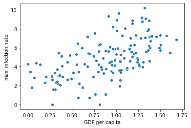
This is completely shows us as it goes. So this slope, as you can see there is increase. There is a correlation positive.
这完全向我们展示了一切。 如您所见,这个斜率在增加。 存在正相关。
sns.regplot(x, np.log(y))
Very clearly there is a positive slope between these two variables (“max inf rate” & “GDP per capita”)
很明显,这两个变量之间存在正斜率(“最大通胀率”和“人均GDP”)
所以 (Consequently)
We have found very interestingresult in this analysis. This result shows that people who are living in developed countries are more prone to getting the infection off Covid-19 with compare off with compared to less developed countries.Can be said that this result is because off lack of corona test kits in less developed countries, in order to prove that this is not the case.
我们在这项分析中发现了非常有趣的结果。 该结果表明,与欠发达国家相比,生活在发达国家的人更容易感染Covid-19,这可以说是因为欠发达国家缺少电晕测试仪,以证明事实并非如此。
Even so i recommend to do the similar analysis on the data said related to cumulative number of the deaths.
即便如此,我还是建议对与死亡总数相关的数据进行类似分析。
See here for more: https://github.com/fk-pixel/Coursera-Project-Network/blob/master/Covid19_DataAnalysis%20.ipynb
有关更多信息,请参见此处: https : //github.com/fk-pixel/Coursera-Project-Network/blob/master/Covid19_DataAnalysis%20.ipynb
翻译自: https://medium.com/think-make/what-does-covid-19-and-world-happiness-report-data-tell-us-c76bdd44b7ac
http://www.taodudu.cc/news/show-997454.html
相关文章:
- lisp语言是最好的语言_Lisp可能不是数据科学的最佳语言,但是我们仍然可以从中学到什么呢?...
- python pca主成分_超越“经典” PCA:功能主成分分析(FPCA)应用于使用Python的时间序列...
- 大数据平台构建_如何像产品一样构建数据平台
- 时间序列预测 时间因果建模_时间序列建模以预测投资基金的回报
- 贝塞尔修正_贝塞尔修正背后的推理:n-1
- php amazon-s3_推荐亚马逊电影-一种协作方法
- 简述yolo1-yolo3_使用YOLO框架进行对象检测的综合指南-第一部分
- 数据库:存储过程_数据科学过程:摘要
- cnn对网络数据预处理_CNN中的数据预处理和网络构建
- 消解原理推理_什么是推理统计中的Z检验及其工作原理?
- 大学生信息安全_给大学生的信息
- 特斯拉最安全的车_特斯拉现在是最受欢迎的租车选择
- ml dl el学习_DeepChem —在生命科学和化学信息学中使用ML和DL的框架
- 用户参与度与活跃度的区别_用户参与度突然下降
- 数据草拟:使您的团队热爱数据的研讨会
- c++ 时间序列工具包_我的时间序列工具包
- adobe 书签怎么设置_让我们设置一些规则…没有Adobe Analytics处理规则
- 分类预测回归预测_我们应该如何汇总分类预测?
- 神经网络推理_分析神经网络推理性能的新工具
- 27个机器学习图表翻译_使用机器学习的信息图表信息组织
- 面向Tableau开发人员的Python简要介绍(第4部分)
- 探索感染了COVID-19的动物的数据
- 已知两点坐标拾取怎么操作_已知的操作员学习-第4部分
- lime 模型_使用LIME的糖尿病预测模型解释— OneZeroBlog
- 永无止境_永无止境地死:
- 吴恩达神经网络1-2-2_图神经网络进行药物发现-第1部分
- python 数据框缺失值_Python:处理数据框中的缺失值
- 外星人图像和外星人太空船_卫星图像:来自太空的见解
- 棒棒糖 宏_棒棒糖图表
- nlp自然语言处理_不要被NLP Research淹没
COVID-19和世界幸福报告数据告诉我们什么?相关推荐
- World Happiness Report(世界幸福报告)
原文: World Happiness Report Happiness scored according to economic production, social support, etc. T ...
- 幸福指数报告 -- 数据可视化+聚类分析
幸福指数报告 – 数据可视化+聚类分析 背景描述 <世界幸福报告>是对全球幸福状况的具有里程碑意义的调查,根据其公民对自己的幸福程度对156个国家进行了排名. < 2020年报告&g ...
- matlab箱形图_使用javascript可视化世界幸福来构建箱形图
matlab箱形图 Data visualization is an important and sometimes undervalued tool in a data scientist's to ...
- 使用R语言分析世界幸福指数
使用R语言分析世界幸福指数 本文中的数据为2019年的世界幸福指数报告,数据来源于kaggle. 数据详情 数据包含9个字段: Rank: 排名 Country or Region: 国家或地区 Sc ...
- 数据可视化--世界幸福指数报告
世界幸福指数报告可视化 数据集描述 Kaggle提供的数据集包括2015.2016.2017的报告.每年的报告的形式为CSV文件:2015.csv, 2016.csv.由于2017报告的格式与之前两年 ...
- 2018世界幸福指数中国排第86,这种报告是怎样做出来的?
导读:每天跟数据打交道,一定会接触到各类报告和榜单.比如数据叔最近就被安利了一份2018世界快乐报告,相信你跟数据叔一样,除了在排行榜上看看热闹之外,还会很好奇,诸如"快乐"&qu ...
- GDP越高就越幸福吗?用Python分析《世界幸福指数报告》后我们发现…
公众号后台回复"图书",了解更多号主新书内容 作者:CDA数据分析师 来源:CDA数据分析师 CDA数据分析师 出品 作者:真达.Mika 数据:真达 [导读] 今天教大 ...
- 数据可视化分析2015-2017年世界幸福指数
1.查看2015-2017年每年幸福指数Happiness Rank排名前5和后5的国家 所用的数据集2015.2016.2017.csv文件可以去百度,3个文件存放在4个代码所在目录code的同级目 ...
- covid 19如何重塑美国科技公司的工作文化
未来 , 技术 , 观点 (Future, Technology, Opinion) Who would have thought that a single virus would take dow ...
最新文章
- mysql数据库常见进阶使用
- 1022.在线视频—IT售前营销讲座(三)售前情报、策划和资源协调
- JavaScript前端框架的思考
- python开发应用程序错误怎么办_编程中遇到的Python错误和解决方法汇总整理
- python mac 安装pillow,关于python:安装了Pillow,但仍然得到“ImportError:没有名为PIL的模块”...
- 一键去除网页BOM属性【解决乱码,头部空白,#65279问题】
- Visual Basic编程常见问题及解答(3)
- php-5.6配置,PHP5.6+apache2.4环境配置
- fedora yum无法正常运行问题的解决
- JQuery datepicker
- JavaWeb——Servlet开发1
- Eclipse 设置保护色
- VS2008 安装顺序
- 计算机c语言好学吗?要是想自学应该怎么办?
- Android Hybrid开发实战之图片的交互
- 在cmd运行java_用cmd运行java时的问题
- ZCMU1860: zbj的电梯间
- 微信朋友圈评论/回复/cell/键盘谈起
- 我的世界HMCL启动器以及加入服务器步骤
- java ocr 条型码_Tesseract.js (JavaScript OCR) 识别1D条形码下面的数字