季节性时间序列数据分析_如何指导时间序列数据的探索性数据分析
季节性时间序列数据分析
为什么要进行探索性数据分析? (Why Exploratory Data Analysis?)
You might have heard that before proceeding with a machine learning problem it is good to do en end-to-end analysis of the data by carrying a proper exploratory data analysis. A common question that pops in people’s head after listening to this as to why EDA?
您可能已经听说,在进行机器学习问题之前,最好通过进行适当的探索性数据分析来对数据进行端到端分析。 听了为什么要使用EDA的一个普遍问题在人们的脑海中浮现。
· What is it, that makes EDA so important?
·这是什么使EDA如此重要?
· How to do proper EDA and get insights from the data?
·如何进行适当的EDA并从数据中获取见解?
· What is the right way to begin with exploratory data analysis?
·探索性数据分析的正确方法是什么?
So, let us how we can perform exploratory data analysis and get useful insights from our data. For performing EDA I will take dataset from Kaggle’s M5 Forecasting Accuracy Competition.
因此,让我们了解如何进行探索性数据分析并从数据中获得有用的见解。 为了执行EDA,我将从Kaggle的M5预测准确性竞赛中获取数据集。
了解问题陈述: (Understanding the Problem Statement:)
Before you begin EDA, it is important to understand the problem statement. EDA depends on what you are trying to solve or find. If you don’t sync your EDA with respect to solving the problem it will just be plain plotting of meaningless graphs.
开始EDA之前,了解问题陈述很重要。 EDA取决于您要解决或找到的内容。 如果您不同步您的EDA以解决问题,那将只是无意义的图形的简单绘图。
Hence, before you begin understand the problem statement. So, let us understand the problem statement for this data.
因此,在您开始理解问题陈述之前。 因此,让我们了解此数据的问题陈述。
问题陈述: (Problem Statement:)
We here have a hierarchical data for products for Walmart store for different categories from three states namely, California, Wisconsin and Texas. Looking at this data we need to predict the sales for the products for 28 days. The training data that we have consist of individual sales for each product for 1914 days. Using this train data we need to make a prediction on the next days.
我们在这里拥有来自三个州(加利福尼亚州,威斯康星州和德克萨斯州)不同类别的沃尔玛商店产品的分层数据。 查看这些数据,我们需要预测产品28天的销售量。 我们拥有的培训数据包括1914天每种产品的个人销售。 使用此火车数据,我们需要在未来几天进行预测。
We have the following files provided from as the part of the competition:
作为比赛的一部分,我们提供了以下文件:
- calendar.csv — Contains information about the dates on which the products are sold.
calendar.csv-包含有关产品销售日期的信息。 - sales_train_validation.csv — Contains the historical daily unit sales data per product and store [d_1 — d_1913]
sales_train_validation.csv-包含每个产品和商店的历史每日单位销售数据[d_1-d_1913] - sample_submission.csv — The correct format for submissions. Reference the Evaluation tab for more info.
sample_submission.csv —提交的正确格式。 请参考评估选项卡以获取更多信息。 - sell_prices.csv — Contains information about the price of the products sold per store and date.
sell_prices.csv-包含有关每个商店和日期出售产品的价格的信息。 - sales_train_evaluation.csv — Includes sales [d_1 — d_1941] (labels used for the Public leaderboard)
sales_train_evaluation.csv-包括销售[d_1-d_1941](用于公共排行榜的标签)
Using this dataset we need to make the sales prediction for the next 28 days.
使用此数据集,我们需要对未来28天进行销售预测。
分析数据框: (Analyzing Dataframes:)
Now, after you have understood the problem statement well, the first thing to do, to begin with, EDA, is analyze the dataframes and understand the features that are present in our dataset.
现在,在您很好地理解了问题陈述之后,首先要做的是EDA,首先要分析数据框并了解数据集中存在的特征。
As mentioned earlier, for this data we have 5 different CSV files. Hence, to begin with, EDA we will first print the head of each of the dataframe to get the intuition of features and the dataset.
如前所述,对于此数据,我们有5个不同的CSV文件。 因此,首先,EDA我们将首先打印每个数据框的头部,以获取要素和数据集的直觉。
Here, I am using Python’s pandas library for reading the data and printing the first few rows. View the first few rows and write your observations.:
在这里,我正在使用Python的pandas库读取数据并打印前几行。 查看前几行并写下您的观察结果:
日历数据: (Calendar Data:)
First Few Rows:
前几行:
Value Counts Plot:
值计数图:
To get a visual idea about our data we will plot the value counts in each of the category of calendar dataframe. For this we will use the Seaborn library.
为了对我们的数据有一个直观的了解,我们将在日历数据框的每个类别中绘制值计数。 为此,我们将使用Seaborn库。

日历数据框的观察结果: (Observations from Calendar Dataframe:)
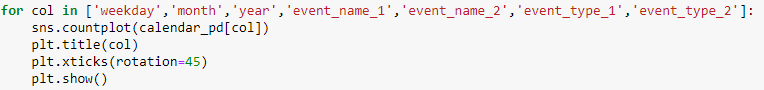
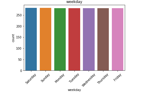
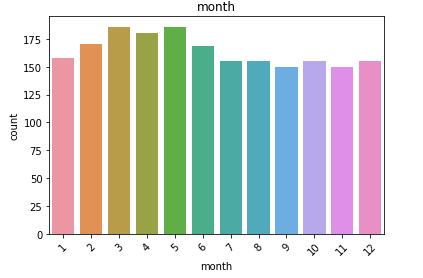
We have the date, weekday, month, year and event for each of day for which we have the forecast information.
我们拥有每天的日期 , 工作日 , 月份 , 年份和事件 ,并为其提供了预测信息。
- Also, we see many NaN vales in our data especially in the event fields, which means that for the day there is no event, we have a missing value placeholder.
同样,我们在数据中看到许多NaN值,尤其是在事件字段中,这意味着在没有事件的那天,我们缺少一个占位符。 - We have data for all the weekdays with equal counts. Hence, it is safe to say we do not have any kind of missing entries here.
我们拥有所有平日的数据,并且计数相同。 因此,可以肯定地说我们在这里没有任何缺失的条目。 - We have a higher count of values for the month of March, April and May. For the last quarter, the count is low.
我们在3月,4月和5月的值计数更高。 对于最后一个季度,这一数字很低。 - We have data from 2011 to 2016. Although we don’t have the data for all the days of 2016. This explains the higher count of values for the first few months.
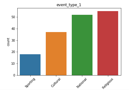
我们拥有2011年至2016年的数据。尽管我们没有2016年所有时间的数据。这解释了前几个月的价值较高。 - We also have a list of events, that might be useful in analyzing trends and patterns in our data.
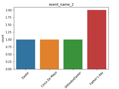
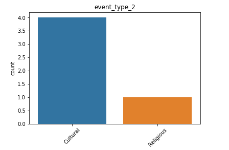
我们还提供了事件列表,这可能有助于分析数据中的趋势和模式。 - We have more data for cultural events rather than religious events.
我们有更多的文化活动而非宗教活动数据。
Hence, by just plotting a few basic graphs we are able to grab some useful information about our dataset that we didn’t know earlier. That is amazing indeed. So, let us try the same for other CSV files we have.
因此,只需绘制一些基本图形,我们就可以获取一些我们之前不知道的有关数据集的有用信息。 确实是太神奇了。 因此,让我们对已有的其他CSV文件尝试相同的操作。
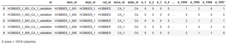
销售验证数据集: (Sales Validation Dataset:)
First few rows:
前几行:
Next, we will explore the validation dataset provided to us:
接下来,我们将探索提供给我们的验证数据集:
Value counts plot:
值计数图:
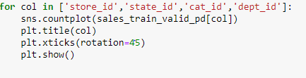
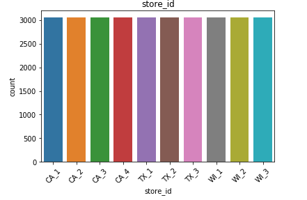
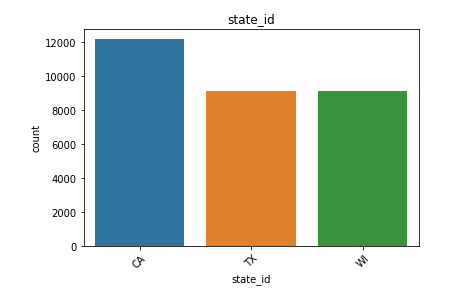
来自销售数据的观察: (Observations from Sales Data:)
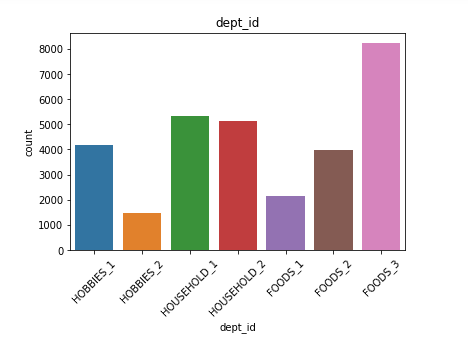
- We have data for three different categories which are Household, Food and Hobbies
我们有三个不同类别的数据,分别是家庭,食品和嗜好 - We have data for three different states California, Wisconsin and Texas. Of these three states, maximum sales are from the state of California.
我们有加利福尼亚,威斯康星州和德克萨斯州三个不同州的数据。 在这三个州中,最大的销售量来自加利福尼亚州。 - Sales for the category of Foods is maximum.
食品类别的销售额最高。
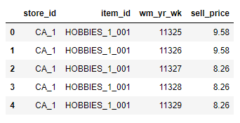
卖价数据: (Sell Price Data:)
First few rows:
前几行:
Observations:
观察结果:
- Here we have the sell_price of each item.
这里我们有每个项目的sell_price。 - We have already seen the item_id and store_id plots earlier.
我们之前已经看过item_id和store_id的图。
向您的数据提问: (Asking Questions to your Data:)
Till now we have seen the basic EDA plots. The above plots gave us a brief overview about the data that we have. Now, for the next phase we need to find answers of the questions that we have from put data. This depends on the problem statement that we have.
到目前为止,我们已经看到了基本的EDA图。 上面的图对我们提供的数据进行了简要概述。 现在,对于下一阶段,我们需要从放置数据中找到问题的答案。 这取决于我们的问题陈述。
For Example:
例如:
In our data we need to forecast the sales for each product on the next 28 days. Hence, for this we need to know if there are any kind of patterns in the sales earlier before that 28 days? Because, if that is so then the sales is likely to follow the same pattern for next 28 days too.
在我们的数据中,我们需要预测未来28天每种产品的销售额。 因此,为此,我们需要知道在那28天之前的销售情况中是否存在任何类型的模式? 因为,如果是这样,那么接下来的28天销售量也可能会遵循相同的模式。
So, here goes our first question?
那么,这是我们的第一个问题?
过去的销售分布是什么? (What is the Sales distribution in the past?)
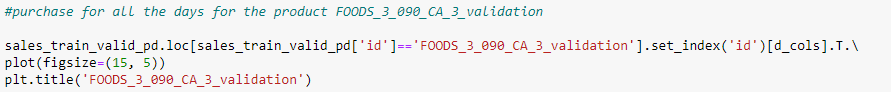
So, to find out the same, let us randomly select few products and see their sales distribution for 1914 days given in our validation data:
因此,要找出相同的结果,让我们随机选择一些产品,并在我们的验证数据中查看其1914天的销售分布:
Observations:
观察结果:
- The plots are very random and it is difficult to find out a pattern.
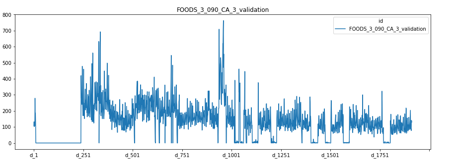
这些图是非常随机的,很难找到一个模式。 For FOODS_3_0900_CA_3_validation we see that on day1 the sales were high after which it was Nil for sometime. After that once again it reached high and is fluctuating up and down since then. The sudden fall after day1 might be because the product got out of stock.
对于FOODS_3_0900_CA_3_validation,我们 看到第一天的销售量很高,此后一段时间内为零。 此后,它再次达到高点,此后一直在上下波动。 第一天过后的突然下跌可能是因为产品缺货。
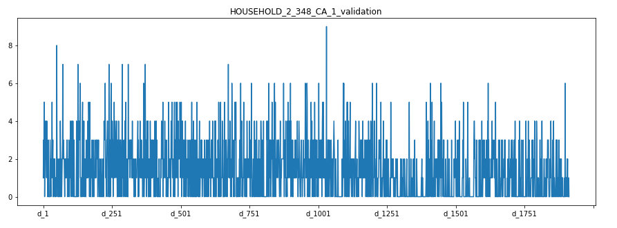
For HOUSEHOLD_2_348_CA_1_validation we see that the sales plot is extremely random. It has a lot of noise. On some day the sales are high and on some it got lowered considerably.
对于HOUSEHOLD_2_348_CA_1_validation,我们看到销售情况非常随机。 它有很多噪音。 有一天,销售很高,有的时候却大大降低了。
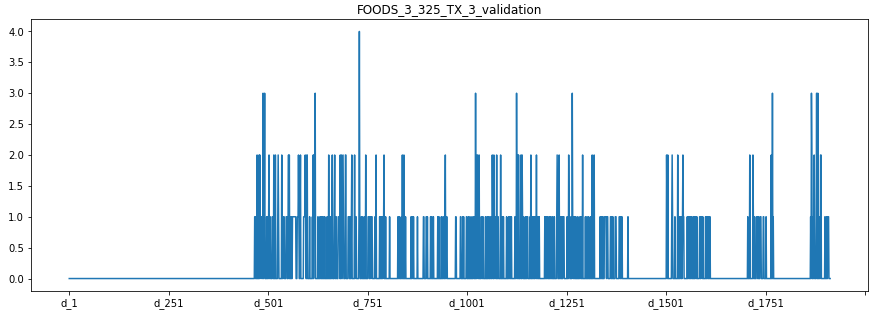
For FOODS_3_325_TX_3_validation we see absolutely no sales for first 500 days. This means that for the first 500 days the product was not in stock. After that the sales reached a peak in every 200 days. Hence, for this food product we see a seasonal dependency.
对于FOODS_3_325_TX_3_validation,我们发现前500天绝对没有销售。 这意味着前500天该产品没有库存。 此后,销量每200天达到峰值。 因此,对于这种食品,我们看到了季节依赖性。
Hence, by just randomly plotting few sales graph we are able to take our some important insights from our dataset. These insights will also help us in choosing the right model for training process.
因此,仅通过随机绘制少量销售图,我们就可以从数据集中获取一些重要见解。 这些见解还将帮助我们为培训过程选择正确的模型。
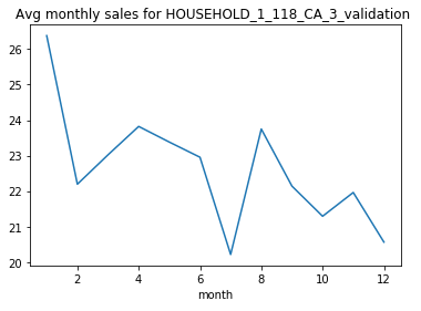
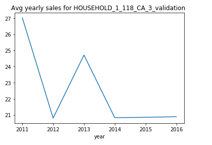
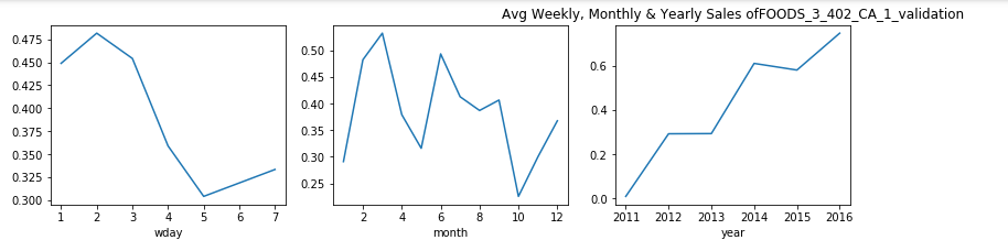
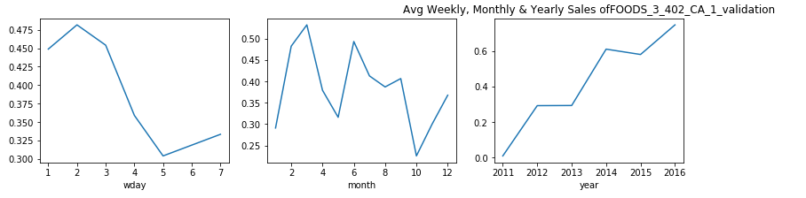
每周,每月和每年的销售方式是什么? (What is the Sales Pattern on Weekly, Monthly and Yearly Basis?)
We saw earlier that there are seasonal trends in our data. So, next let us break down the time variables and see the weekly, monthly and yearly sales pattern:
之前我们看到数据中存在季节性趋势。 因此,接下来让我们分解时间变量,并查看每周,每月和每年的销售模式:
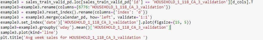
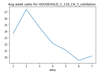
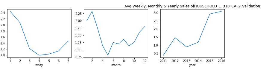
For this particular HOUSEHOLD_1_118_CA_3_validation we can see that the sales see a drop after Tuesday and hits minimum on Saturday.
对于此特定的HOUSEHOLD_1_118_CA_3_validation,我们可以看到销售在周二之后有所下降,在周六达到最低。
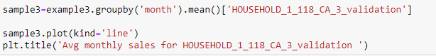
The monthly sales drop in the middle of the year. After which we can say that it reaches a minimum in 7th month that is July.
每月的销售额在年中下降。 之后,我们可以说它在7月份的第7个月达到了最小值。
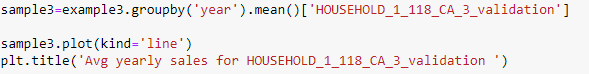
From the above graph we can see that the sales just dropped to zero from 2013 to 2014. This means that the product might be have been updated with a new product version or just removed from this store. From this plot it will be safe to say that for days to predict the sales should still be zero.
从上图可以看出,从2013年到2014年,销售刚刚下降到零。这意味着该产品可能已经使用新产品版本进行了更新,或者刚刚从该商店中删除。 从该图可以肯定地说,几天来可以预测销售额仍为零。
每个类别的销售分布是什么? (What is the Sales Distribution in Each Category?)
We have sales data belonging to three different categories. Hence, it might be good to see if the sales of product depend on the category it belongs to. The same we will do now:
我们拥有属于三个不同类别的销售数据。 因此,最好查看产品的销售是否取决于其所属的类别。 我们现在将做的相同:

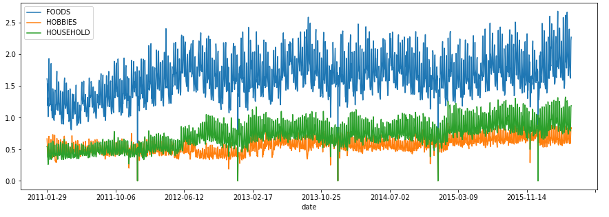
We see that the sales is maximum for Foods. Also, the sales curve for FOOD do not overlap at all with the other two categories. This shows that on any day the sales of Food is more than Household and Hobbies.
我们看到食品的销售量最大。 另外,食品的销售曲线与其他两个类别完全不重叠。 这表明,在任何一天,食品的销量都超过了家庭和嗜好 。
每个州的销售分布是什么? (What is the Sales Distribution for Each State?)
Besides category we also have state to which the sales belong. So, let us analyze if there is a state for which the sales follow a different pattern:
除了类别,我们还具有销售所属的州。 因此,让我们分析一下是否存在销售遵循不同模式的状态:


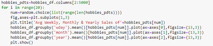
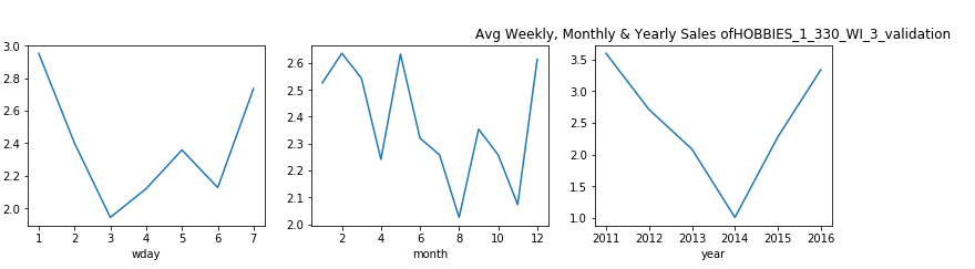
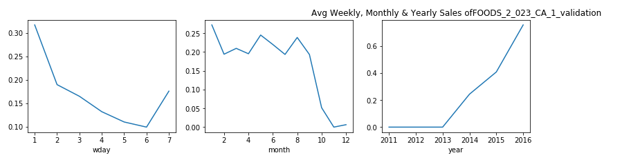
在每周,每月和每年的基础上,属于“兴趣”类别的产品的销售分布是什么? (What is the Sales Distribution for Products that belong to category of Hobbies on weekly, monthly and yearly basis?)
Now, let us see the sales of randomly selected products from the categories Hobbies and see if their weekly, monthly or yearly average follows a pattern:
现在,让我们查看“兴趣爱好”类别中随机选择的产品的销售情况,并查看其每周,每月或每年的平均值是否遵循以下模式:


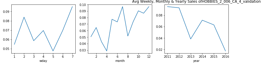
观察结果 (Observations)
From the above plot we see that in meed week usually for 4th and 5th day (Tuesday and Wednesday), the sales drop especially in the case when states are ‘WI’ and ‘TX’.
从上图可以看出,通常在第4天和第5天(星期二和星期三)的一周中,销量下降,尤其是在州为“ WI”和“ TX”的情况下。
Let us analyze the results on individual states to see this more clearly, as we see different sales pattern for different states. And, this brings us to our next question:
让我们分析各个州的结果,以便更清楚地看到这一点,因为我们看到了不同州的不同销售模式。 并且,这将我们带入下一个问题:
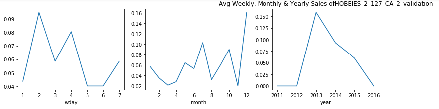
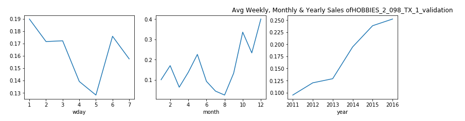
特定州在每周,每月和每年的基础上属于“兴趣”类别的产品的销售分布是什么? (What is the Sales Distribution for Products that belong to the category of Hobbies on weekly, monthly and yearly basis for a particular state?)


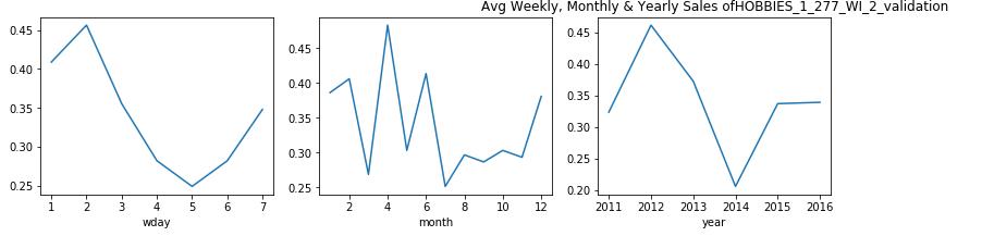
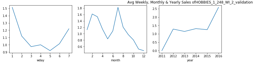
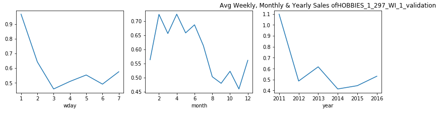
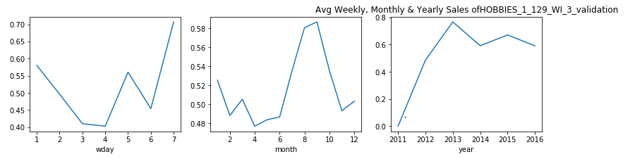
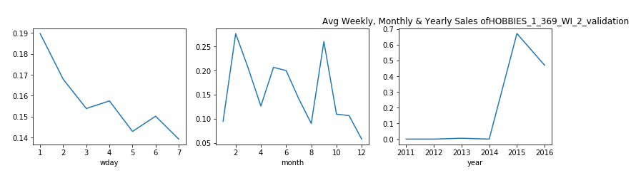

观察结果: (Observations:)
- From the above plots, we can see that in the state of Wisconsin, for most of the products the sales decrease considerably in mid-week.
从上面的图可以看出,在威斯康星州,大多数产品的销售在星期三中大幅下降。 - This also gives us a little sense of life-style of people in Wisconsin, that people here do not shop much during day 3–4 which is Monday and Tuesday. This probably might be because are these are the busiest days of the week.
这也使我们对威斯康星州人们的生活方式有所了解,即这里的人们在周一至周二的第3至4天购物不多。 这可能是因为这些是一周中最忙的日子。 - From the monthly average we can see that, in first quarter the sales often experienced a dip.
从每月平均数可以看出,第一季度的销售额经常出现下降。 - For the product HOBBIES_1_369_WI_2_validation, we see that the sales data is nill till year 2014. This shows that this product was introduced after this year and the weekly and monthly pattern that we see for this product is after the year 2014.
对于产品HOBBIES_1_369_WI_2_validation,我们看到直到2014年为止的销售数据都是零。这表明该产品是在今年之后推出的,而我们看到的该产品的每周和每月模式是在2014年之后。
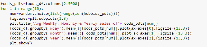
每周,每月和每年,属于食品类别的产品的销售分布是什么? (What is the Sales Distribution for Products that belong to category of Foods on weekly, monthly and yearly basis?)
Now, doing analysis for Hobbies individually gave us some useful insights. Let, us try the same for the category of Foods:
现在,分别对爱好进行分析可以为我们提供一些有用的见解。 让我们对食品类别尝试相同的方法:


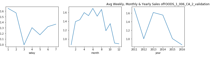
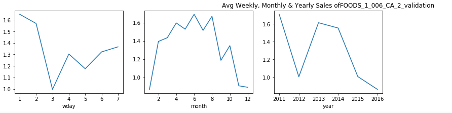
观察: (Observation:)
- From the plots above we can say that, for food items categories the purchase is more in the early week as compared to the last two days.
从上面的图可以看出,对于食品类别,与前两天相比,在前一周的购买量更多。 - This is might be because people are habituated of buying food supplies during the start of the week and then keep it for the entire week. This curves shows us the similar behavior.
这可能是因为人们习惯于在一周开始时购买食品,然后整个星期都保持食用。 该曲线向我们展示了类似的行为。
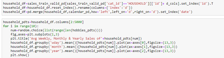
每周,每月和每年,属于家庭类别的产品的销售分布是什么? (What is the Sales Distribution for Products that belong to category of Household on weekly, monthly and yearly basis?)

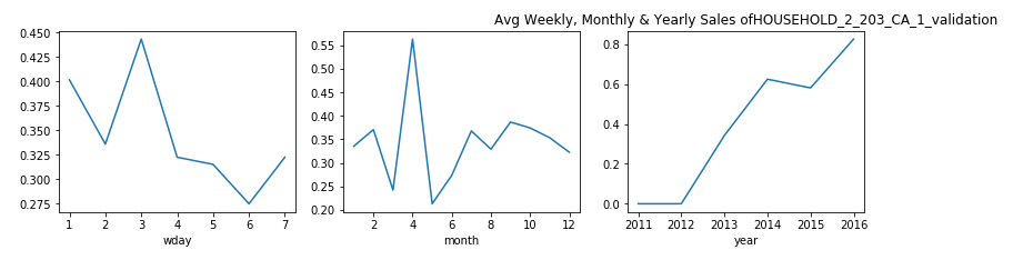
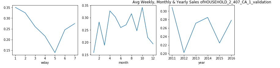
观察: (Observation:)
From the plots above we can say that, for Household items categories the purchase shows a dip for Monday and Tuesday.
从上面的图可以看出,对于家庭用品类别,购买显示星期一和星期二有所下降。
- In the start of week people are busy with office work and hardly go for shopping. This is the pattern that we see here.
在一周的开始,人们忙于办公室工作,几乎不去购物。 这就是我们在这里看到的模式。
有没有办法在不丢失信息的情况下更清楚地看到产品的销售情况? (Is there a way to see the sales of products more clearly without losing information?)
We saw plots for sales distribution earlier for each products. These were quite cluttered and we couldn’t see the pattern clearly. Hence, you might be wondering if there is a way to do so. And, the good news is yes there is.
我们早先看到了每种产品的销售分布图。 这些非常混乱,我们看不清模式。 因此,您可能想知道是否有办法做到这一点。 而且,好消息是,是的。
Here comes denoising in picture. We will denoise our dataset and see the distribution.
图片降噪 。 我们将对数据集进行去噪并查看分布。
Here we will see two common denoising techniques. Wavelet denoising and Moving average.
在这里,我们将看到两种常见的降噪技术。 小波去噪与移动平均 。
Wavelet Denoising:
小波去噪:
From the sales plots of invidual products we saw that the sales changes rapidly. This is because the sales of a product on a day depend on multiple factors. So, let us try denoising our data and see if we are able to find anything intresesting.
从单个产品的销售图上,我们看到销售变化Swift。 这是因为一天的产品销售取决于多个因素。 因此,让我们尝试对数据进行去噪处理,看看是否能够找到令人感兴趣的东西。
The basic idea behind wavelet denoising, or wavelet thresholding, is that the wavelet transform leads to a sparse representation for many real-world signals and images. What this means is that the wavelet transform concentrates signal and image features in a few large-magnitude wavelet coefficients. Wavelet coefficients which are small in value are typically noise and you can “shrink” those coefficients or remove them without affecting the signal or image quality. After you threshold the coefficients, you reconstruct the data using the inverse wavelet transform.
小波去噪或小波阈值处理的基本思想是,小波变换导致许多现实信号和图像的稀疏表示。 这意味着小波变换将信号和图像特征集中在几个大幅度的小波系数中。 小值的小波系数通常是噪声,您可以“缩小”这些系数或将其删除而不影响信号或图像质量。 对系数设定阈值后,您可以使用小波逆变换来重建数据。
For wavelet denoising, we require the the library pywt.
对于小波去噪,我们需要库pywt。
Here we will use wavelet denoising. For deciding the threshold of denoising we will use Mean Absolute Deviation.
在这里,我们将使用小波去噪。 为了确定降噪的阈值,我们将使用平均绝对偏差 。
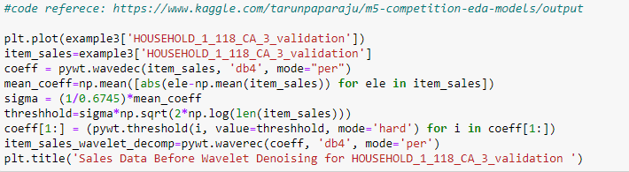

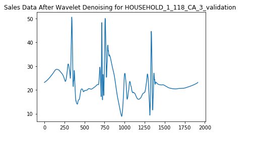
Observations:
观察结果:
We are able to see a pattern more clear after denoising the data. It shows the same pattern every 500 days which we were not able to see before denoising.
去噪数据后,我们可以看到更清晰的图案。 它每500天显示一次相同的模式,这是我们在去噪之前无法看到的。
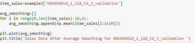
Moving Average Denoising:
移动平均降噪:
Let us now try a simple smoothing technique.In this technique, we take a fixed window sie and move it along out time-series data calculating the average. We also take a stride value so as to leave the intervals accordingly. For example, let's say we take a window size of 20 and stride as 5. Then our first point will be the mean of points from day1 to day 20, the next will be the mean of points from day5 to day25, then day10 to day30 and so on.
现在让我们尝试一种简单的平滑技术,在此技术中,我们采用固定的窗口sie并将其沿时间序列数据移出以计算平均值。 我们还采用跨度值,以便相应地保留间隔。 例如,假设我们的窗口大小为20,跨度为5,那么我们的第一个点将是从第1天到第20天的点的平均值,下一个是从第5天到第25天的点的平均值,然后是从第10天到第30的点的平均值。等等。
So, let us try this average smoothing on our dataset and see if we find any kind of patterns here.
因此,让我们对数据集尝试这种平均平滑处理,看看是否在这里找到任何类型的模式。
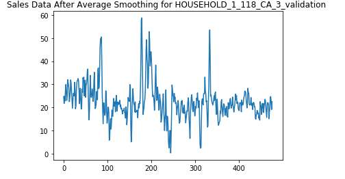
Observations:
观察结果:
We see that the average smoothing does remove some noise but not as effective as the wavelet decomposition.
我们看到,平均平滑确实消除了一些噪声,但效果不如小波分解。
每个州的总销售额是否有所不同? (Do the sales vary overall for each state?)
Now, from a broader perspective let us see if the sales vary for each state:
现在,从更广泛的角度来看,让我们看看每个州的销售额是否有所不同:

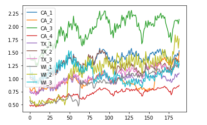
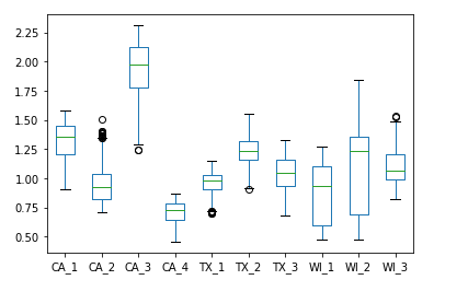
观察结果: (Observations:)
- From the above plot we can see that the sales for store CA_3 lie above the sales for all other states. The same applies for CA_4 where the sales are lowest. For other sales the patterns are distinguishable to some extent.
从上图可以看出,商店CA_3的销售额高于所有其他州的销售额。 CA_4的销售额最低也是如此。 对于其他销售,这些模式在一定程度上是可以区分的。 - One thing that we observe that all these patterns follow a similar trend that repeats itself after some time. Also, the sales reaches a higher value in the graph.
我们观察到的一件事是,所有这些模式都遵循类似的趋势,并在一段时间后重复出现。 同样,销售额在图中达到更高的值。 - As we saw from the line-plot, the box plot also shows non-overlapping sales patternf for CA_3 nd CA_4.
从线图中可以看到,箱形图还显示了CA_3和CA_4的非重叠销售模式f。 - No overlapping between the stores of California and totally independent of the fact that all of these belong to the same state. This shows high variance for the state of California.
加利福尼亚的商店之间没有重叠,并且完全独立于所有这些商店都属于同一州。 这表明加利福尼亚州的差异很大。 - For Texas the states TX_1 and TX_3 have quite smiliar patterns and intersect a couple of times. But TX_2 lies above them with maximum sales and more disparity as compared to the other two. In the later parts, we see that TX_3 is growing rapidly and is approaching towards TX_2. Hence, from this, we can conclude that sales for TX_3 increase at the fastest pace.
对于得克萨斯州,州TX_1和TX_3具有相当明显的模式,并且相交几次。 但是TX_2位于它们之上,与其他两个相比,其销售量最大且差异更大。 在后面的部分中,我们看到TX_3正在快速增长,并且正在接近TX_2。 因此,由此可以得出结论,TX_3的销售额增长最快。
结论: (Conclusion:)
Hence, by just plotting few simple graphs we are able to know our dataset quite well. Its just a matter of questions that you want to ask to the data. The plotting will give you all the answers.
因此,仅绘制几个简单的图,我们就能很好地了解我们的数据集。 这只是您要向数据询问的问题。 绘图将为您提供所有答案。
I hope this would have given you an idea of doing simple EDA. You can find the complete code in my github repository.
我希望这会给您带来进行简单EDA的想法。 您可以在我的github存储库中找到完整的代码。
https://www.appliedaicourse.com/course/11/Applied-Machine-learning-course
https://www.appliedaicourse.com/course/11/Applied-Machine-learning-course
https://www.kaggle.com/tarunpaparaju/m5-competition-eda-models/output
https://www.kaggle.com/tarunpaparaju/m5-competition-eda-models/output
https://mobidev.biz/blog/machine-learning-methods-demand-forecasting-retail
https://mobidev.biz/blog/machine-learning-methods-demand-forecasting-retail
https://www.mygreatlearning.com/blog/how-machine-learning-is-used-in-sales-forecasting/
https://www.mygreatlearning.com/blog/how-machine-learning-is-used-in-sales-forecasting/
https://medium.com/@chunduri11/deep-learning-part-1-fast-ai-rossman-notebook-7787bfbc309f
https://medium.com/@chunduri11/deep-learning-part-1-fast-ai-rossman-notebook-7787bfbc309f
https://www.kaggle.com/anshuls235/time-series-forecasting-eda-fe-modelling
https://www.kaggle.com/anshuls235/time-series-forecasting-eda-fe-modelling
https://eng.uber.com/neural-networks/
https://eng.uber.com/neural-networks/
https://www.kaggle.com/mayer79/m5-forecast-keras-with-categorical-embeddings-v2
https://www.kaggle.com/mayer79/m5-forecast-keras-with-categorical-embeddings-v2
翻译自: https://medium.com/analytics-vidhya/how-to-guide-on-exploratory-data-analysis-for-time-series-data-34250ff1d04f
季节性时间序列数据分析
相关文章:
- 美团骑手检测出虚假定位_在虚假信息活动中检测协调
- 回归分析假设_回归分析假设的最简单指南
- 为什么随机性是信息
- 大数据相关从业_如何在组织中以数据从业者的身份闪耀
- 汉诺塔递归算法进阶_进阶python 1递归
- 普里姆从不同顶点出发_来自三个不同聚类分析的三个不同教训数据科学的顶点...
- 荷兰牛栏 荷兰售价_荷兰的公路货运是如何发展的
- 如何成为数据科学家_成为数据科学家需要了解什么
- 个人项目api接口_5个免费有趣的API,可用于学习个人项目等
- 如何评价强gis与弱gis_什么是gis的简化解释
- 自我接纳_接纳预测因子
- python中knn_如何在python中从头开始构建knn
- tb计算机存储单位_如何节省数TB的云存储
- 数据可视化机器学习工具在线_为什么您不能跳过学习数据可视化
- python中nlp的库_用于nlp的python中的网站数据清理
- 怎么看另一个电脑端口是否通_谁一个人睡觉另一个看看夫妻的睡眠习惯
- tableau 自定义省份_在Tableau中使用自定义图像映射
- 熊猫烧香分析报告_熊猫分析进行最佳探索性数据分析
- 白裤子变粉裤子怎么办_使用裤子构建构建数据科学的monorepo
- 青年报告_了解青年的情绪
- map(平均平均精度_客户的平均平均精度
- 鲜活数据数据可视化指南_数据可视化实用指南
- 图像特征 可视化_使用卫星图像可视化建筑区域
- 海量数据寻找最频繁的数据_在数据中寻找什么
- 可视化 nlp_使用nlp可视化尤利西斯
- python的power bi转换基础
- 自定义按钮动态变化_新闻价值的变化定义
- 算法 从 数中选出_算法可以选出胜出的nba幻想选秀吗
- 插入脚注把脚注标注删掉_地狱司机不应该只是英国电影历史数据中的脚注,这说明了为什么...
- 贝叶斯统计 传统统计_统计贝叶斯如何补充常客
季节性时间序列数据分析_如何指导时间序列数据的探索性数据分析相关推荐
- 拉勾网招聘数据的探索性数据分析③
Github 文件地址:https://github.com/why19970628/Python_Crawler/tree/master/LaGou 探索性数据分析(Explore data ana ...
- 时间序列模式识别_空气质量传感器数据的时间序列模式识别
时间序列模式识别 · 1. Introduction· 2. Exploratory Data Analysis ∘ 2.1 Pattern Changes ∘ 2.2 Correlation Bet ...
- 共享单车 芝加哥 数据分析_为什么311无法使用数据科学识别并解决芝加哥311明显的服务问题...
共享单车 芝加哥 数据分析 Did you know that if you call 311, the City of Chicago can help you trim your trees an ...
- 带你和Python与R一起玩转数据科学: 探索性数据分析(附代码)
作者:Jose A Dianes 翻译:季洋 校对:丁楠雅 本文约5822字,建议阅读20+分钟. 本系列将介绍如何在现在工作中用两种最流行的开源平台玩转数据科学.先来看一看数据分析过程中的关键步骤 ...
- orange 数据分析_使用Orange GUI的放置结果数据分析
orange 数据分析 Objective : Analysing of several factors influencing the recruitment of students and ext ...
- 带你和Python与R一起玩转数据科学: 探索性数据分析
内容简介 本系列将介绍如何在现在工作中用两种最流行的开源平台玩转数据科学.本文先来看一看数据分析过程中的关键步骤 – 探索性数据分析(Exploratory Data Analysis,EDA). 探 ...
- 使用python数据分析_如何使用Python提升您的数据分析技能
使用python数据分析 If you're learning Python, you've likely heard about sci-kit-learn, NumPy and Pandas. A ...
- azw3 python数据分析 活用pandas库_Python数据分析 活用Pandas库 数据科学教程数据分析入门图书 Python编程入门数据处理...
内容介绍 本书是Python数据分析入门书,每个概念都通过简单实例来阐述,便于读者理解与上手.具体内容包括:Python及Pandas基础知识,加载和查看数据集,Pandas的DataFrame对象和 ...
- 分享思路:Python+Spark招聘爬虫可视化系统 招聘数据分析 Hadoop职位可视化 大数据毕业设计 51job数据分析(可选加推荐算法)
开发技术 Hadoop.HDFS.Spark.SpringBoot.echarts.PySpark.Python.MySQL 创新点 大数据架构.爬虫.数据可视化 啰里啰嗦 适合大数据毕业设计.数据分 ...
最新文章
- 同一个类 cannot be cast to_留学热门assignment之 税收筹划类essay
- html获取get信息,在HTML页面用JS获取Get参数方法(示例代码)
- 转 linux进程内存到底怎么看 剖析top命令显示的VIRT RES SHR值
- p1164 小A点菜 题解——背包初步
- 计算机科学与技术在线阅读,TL2011计算机科学与技术.pdf
- 后缀树和后缀数组的一些资料收集
- iptables防火墙详解
- 自动刷新_AutoRefresh插件:开启页面自动刷新!
- Atmel megaAVR控制器 串行引导Bootloader
- 微信公众号开发之文本消息自动回复,以及系统关注自动回复,php代码
- 深度学习之tensorflow环境搭建
- 【转】Java垃圾收集器
- AWK 之 RS、ORS与FS、OFS
- 大家的第一次创业钱是通过什么方式得到的呢?
- SPFA+Dinic HDOJ 3416 Marriage Match IV
- File指定过滤器得到需要的文件
- SQL Server查询优化
- 熵简技术谈 | 金融情绪分析真的有用吗?一起来看金融情绪分析的研究进展及应用实践
- java如何把汉字转换成机内码_如何用java随机生成一个汉字?
- php解析失败,php – 解析错误:语法错误,意外(T_VARIABLE)