15款最佳的响应式 Web 设计测试工具
响应式网页设计是根据设备的屏幕尺寸,平台和方向来开发的网页,是一种对最终用户的行为和环境作出反应的方法。响应式设计使用灵活的网格和布局,图像和智能使用 CSS 媒体查询的组合。当从它们在不同设备使用的时候,网站能够自动切换到容纳该特定分辨率,图像尺寸和脚本的能力。
1. ProtoFluid 4
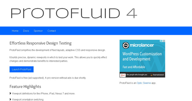
ProtoFluid simplifies the development of fluid layouts, adaptive CSS and responsive design. It builds precise, dynamic viewports in which to test your work. This allows you to quickly effect changes and demonstrate benefits to interested parties. It is free and lets you use other extensions like FireBug.
2. Viewport Resizer
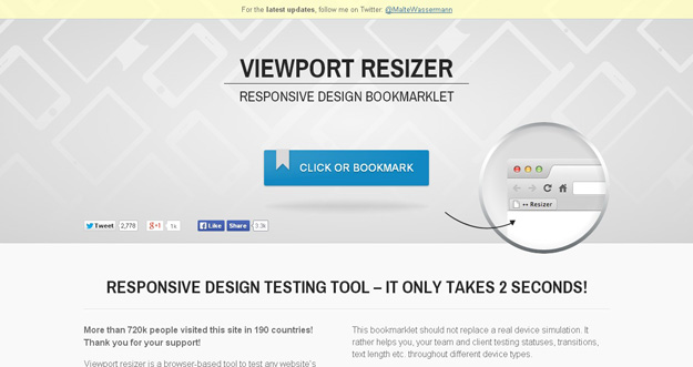
Viewport resizer is a browser-based tool to test any website’s responsiveness. Just save the bookmarklet, go to the page you want to test, click on your created bookmarklet and check all kinds of screen resolutions of the page. The smartest way to share your defined environment of devices and breakpoints directly with your team and client. However, this bookmarklet should not replace a real device simulation. It rather helps you, your team and client testing statuses, transitions, text length etc. throughout different device types.
3. Responsive.IS
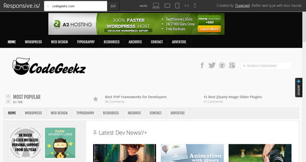
Responsive.Is is developed by TypeCast another impressive responsive design testing tool, which you can use to test your responsive design. Just type in a URL, and it will automatically change its size depending on the device you choose.
4. Respondr
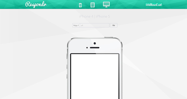
Respondr is a lightweight, pretty useful and handy tool that lets you test your websites on different devices. You need to enter the URL of the site/page that you want to test, and then select the device of your choice. You can select an iPhone, iPad, or desktop.
5. Froont
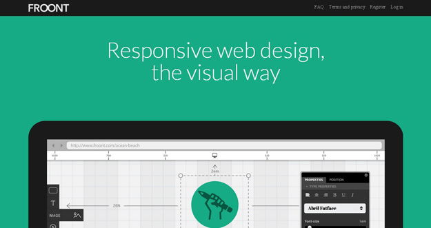
FROONT is a web-based design tool that runs in the browser and makes responsive web design accessible to all kinds of visual designers, even those without any coding skills.
FROONT makes responsive web design visual. Design can be done in-browser with intuitive drag-and-drop tools. After all, humans judge design with their eyes therefore it seems just normal to see right away how designs will look across all different screen sizes. Each project has its own URL,that makes it easy to test the designs on real devices right away.
6. Responsivepx
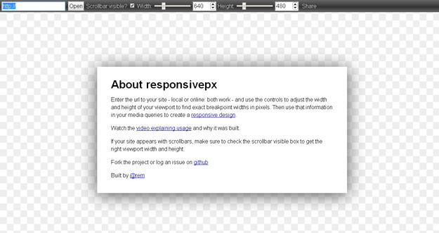
With responsivepx you need to Enter the url to your site – local or online: both work – and use the controls to adjust the width and height of your viewport to find exact breakpoint widths in pixels. Then use that information in your media queries to create a responsive design.
7. Responsive Web Design Testing Tool
Responsive Web Design Testing tool has been built to help with testing your responsive websites while you design and build them.
8. Screenfly
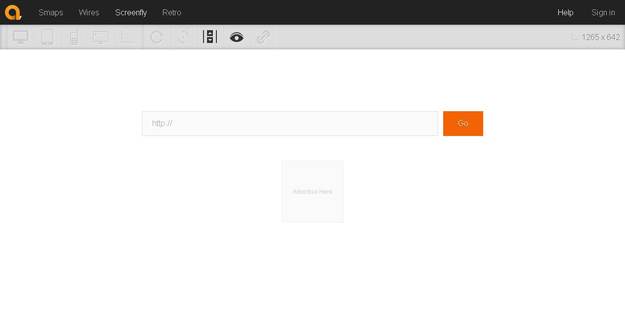
Screenfly lets you enter a URL to test, and then you choose phone, tablet, desktop, or TV. You can also enter a custom screensize, rotate the screen, and generate a URL to share with others for testing.
9. Review.js
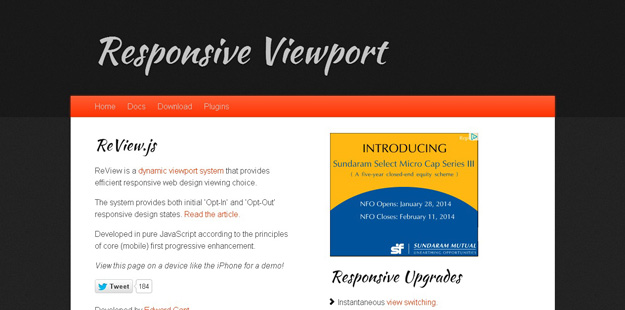
ReView is a dynamic viewport system that provides efficient responsive web design viewing choice. Developed in pure JavaScript according to the principles of core (mobile) first progressive enhancement. The system provides both initial ‘Opt-In’ and ‘Opt-Out’ responsive design states.
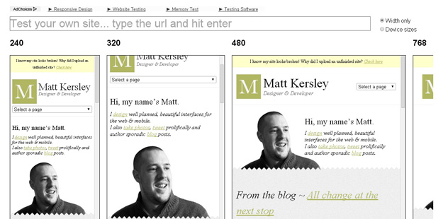
10. Responsinator
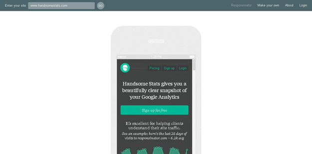
Responsinator helps website makers quickly get an indication of how their responsive site will look on the most popular devices Responsivator lets you test your web applications iphone and ipad, kindle and Android platform. It also shows your site both in portrait and landscape mode.
11. Resizemybrowser
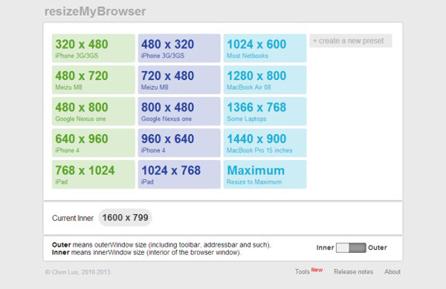
resizeMyBrowser allows you to choose the dimensions of your browser for testing. You can choose between 15 different presets, or you can enter your own custom screen sizes.
12. Responsive Design Bookmarklet
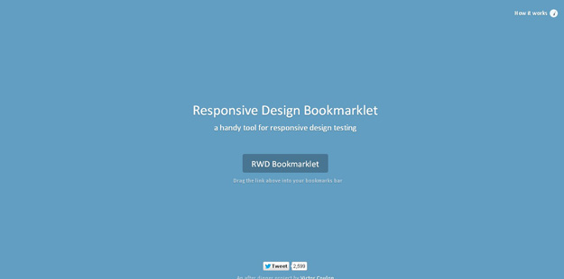
It’s a simple responsive design testing tool, you need to drag the bookmarklet above your bookmarks bar and it will be applied in your browser. You can then choose to preview the current page on screen widths the size of tablets and smartphones.
13. Adobe Edge Inspect CC
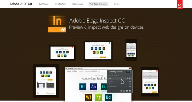
Adobe Edge lets you preview and inspect web designs on devices.
14. I am mobile
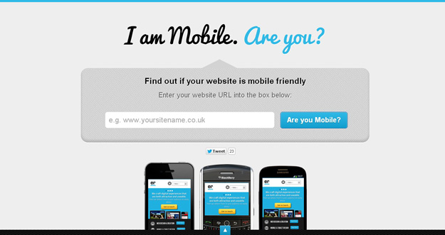
I am mobile is another good responsive design testing tool that test your web sites on various viewports and also gives you some tips to make your websites more mobile friendly.
15. Retina Images
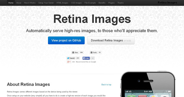
Retina Images serves different images based on the device being used by the viewer.
Once setup on your website (very simple!) all you have to do is create a high-res version of each image you would like optimized for retina screens and all the work is done for you. You don’t even need to change any img tags (providing they have a height or width).
本文链接:Best Responsive Web Design Testing Tools
15款最佳的响应式 Web 设计测试工具相关推荐
- 十大响应式Web设计框架
2019独角兽企业重金招聘Python工程师标准>>> 本文将分享十款最佳的响应式Web设计,助你大大简化工作流程. Gumby Framework Gumby 2是建立在Sass基 ...
- 响应式Web设计——最佳指南
2012年被称为智能手机年.根据最近一份调查显示,美国的智能手机覆盖率已达50%.现在确实是提升移动终端用户体验的大好时机.如果你正运营一个网站,那就必须有一个响应式的Web设计,以便可以从移动终端上 ...
- 【转发】响应式Web设计?怎样进行?
什么是响应式Web设计?怎样进行? 眼下,几乎每个新客户都希望他们的网站可以有专门的移动设备版本.最完美的情况呐,就是为iPhone.iPad.黑莓.Kindle-各自打造一款--页面分辨率还必须兼容 ...
- 响应式Web设计:HTML5和CSS3实战 读书笔记
响应式Web设计:HTML5和CSS3实战 Responsive Web Design with HTML5 and CSS3 By : Pandao pandao####vip.qq.com ...
- 分享29个超赞的响应式Web设计
原文自:http://www.csdn.net/article/2013-01-16/2813678-responsive-design-websites 最近几年,响应式Web设计不断印入人们眼帘, ...
- 什么是响应式Web设计?
开始第一篇.老规矩,先无聊的谈论天气一类的话题.十一长假,天气也终于开始有些秋天的味道,坐在屋里甚至觉得需要热咖啡.话说两年前也是在国庆假期里开始做Joomla文档翻译的:长假好时光,总会可以抽出一两 ...
- 什么是响应式Web设计?怎样进行?
开 始第一篇.老规矩,先无聊的谈论天气一类的话题.十一长假,天气也终于开始有些秋天的味道,坐在屋里甚至觉得需要热咖啡.话说两年前也是在国庆假期里开始 做Joomla文档翻译的:长假好时光,总会可以抽出 ...
- 《响应式Web设计实践》一2.1 布局选项
本节书摘来异步社区<响应式Web设计实践>一书中的第2章,第2.1节,作者: [美]Tim Kadlec 译者: 侯鸿儒 责编: 赵轩,更多章节内容可以访问云栖社区"异步社区&q ...
- 50种响应式web设计的奇妙工具
在您开始着手响应式站点的搭建之前,如果能拥有强有力的开发工具会让您的世界另有一番风采.本文中Denise Javobs和Peter Gasston推荐了50种强大的工具来支持您建造响应式站点的过程. ...
最新文章
- OpenResty 最佳实践
- 数据结构 - 平衡二叉树
- 浅谈最近发布的金融行业多方安全计算的技术标准
- 卷积网络和卷积神经网络_卷积神经网络的眼病识别
- [Java开发]打印当前路径到控制台
- 【转】分布式websocket服务器
- IE10兼容性故障的解决办法
- 加密芯片在游戏行业内的应用
- 推荐一下:微软的Ramp Up学习计划
- 3.程序员的自我修养---目标文件
- 人人开源快速搭建脚手架工程
- 【解决方案】校园明厨亮灶监控系统实施方案
- 声艺fx16调音台怎么样_声艺调音台FX16II使用说明书.doc
- c语言所有逻辑符号大全,C语言中的逻辑取反是“~”符号吗逻辑或是“|”符号吗?...
- dell t640 添加硬盘_Dell PowerEdge T640服务器安装教程
- 【IoT】蓝牙 GAP 和 GATT 协议简析
- 软件测试工程师应该具备哪些能力?
- 如何给学生选择好的台灯?分享国AA级照度的护眼台灯
- 【密码学】Schnorr认证,Schnorr签名,安全性证明
- 校验码 汉明码 CRC码