跨浏览器实现等高栏 Equal Height Columns with Cross-Browser CSS
实例:
2 Column 2栏 | 3 Column 3栏 | 4 Column 4栏 | 5 Column 5栏
Creating equal height columns with CSS is not as easy as it may first seem. This tutorial highlights the display problems that occur with multiple column layouts, and then shows a simple solution that works in all common web browsers. The method shown here is 100% CSS hack-free, image-free and JavaScript-free so it can even be used on the most strictly coded websites.For those who want some action immediately check out my demo pages: 2 column, 3 column, 4 column and 5 column. Also see my Perfect multi-column CSS liquid layouts - these use the same equal height column CSS principles as discussed below.
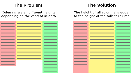
The problem with equal height columns
-
- 跨浏览器实现等高栏 Equal Height Columns with Cross-Browser CSS
In the example above we have three columns each with a different amount of content. You will notice that the problem is the column background colours stretch only as far down as the height of the content they contain. This is the problem we are trying to solve. How can we make all columns the same height? Or more specifically, how can we make all columns the same height as the tallest column? This is a tricky thing to do because we will never know exactly how high each column will be or which one will be the longest. We can't simply give all columns an arbitrary height either as this will cause big spaces at the end of the page if there is only minimal content, and if there is too much content then the columns will end before the text does. Neither of these situations are desirable. The fact is, content length is dynamic so the heights of each column must also be dynamic. We must remember that nothing is 'fixed' on the web, people have different screen resolutions and the text in their browsers can be set to any size, all of these things can affect the height of content.
Separating the column content from it's background colour
The first step to solving the equal height problem is to break it into smaller pieces that can be solved separately. The way we do this is to use two divs for each column instead of one. The first div will be used to hold the content and the other will be used as the background colour. This separation gives us individual control over these elements plus we can put them together in a more useful way. This will all become clear shortly.
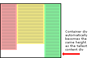
A floated container div will always be the height of it's floated contents
This is the central principle behind this equal column height method. The only way to make the height of a div equal to the tallest column is if that div contains all the columns. So to explain this another way, by placing the columns inside a container we cause the container to be the height of the tallest column. This is a very useful structure.
-
- 跨浏览器实现等高栏 Equal Height Columns with Cross-Browser CSS
Three column HTML div structure
In the example above the three content columns are inside a container div.
<div id="container1"><div id="col1">Column 1</div><div id="col2">Column 2</div><div id="col3">Column 3</div>
</div>
Three column CSS
And here is the CSS that forces the container div to the height of the longest column.
#container1 {float:left;width:100%;
}
#col1 {float:left;width:30%;background:red;
}
#col2 {float:left;width:40%;background:yellow;
}
#col3 {float:left;width:30%;background:green;
}
For this structure to work correctly in all browsers the container div must be floated (left or right) plus each of the column content divs must also be floated, it does not matter which way. The process of floating the content divs makes them line up horizontally across the page. Floating the container makes it stretch down to the height of the tallest column inside. If we don't float the container then the content divs will stick out of the container at the bottom and the container won't have the correct height. Actually in this example the container will end up with a height of zero if it is not floated.
Adding extra nested containers
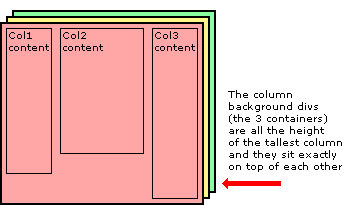
The next step to equal height columns is to add extra containers so they are nested inside each other. We need the same number of containers as we do columns - three. These three containers are going to be the backgrounds of each column. Notice that we have removed the background colours from the original columns and added them to the containers.
-
- 跨浏览器实现等高栏 Equal Height Columns with Cross-Browser CSS
Three column HTML div structure
The two extra containers have been added to the HTML below.
<div id="container3"><div id="container2"><div id="container1"><div id="col1">Column 1</div><div id="col2">Column 2</div><div id="col3">Column 3</div></div></div>
</div>
Three column CSS
All the elements are floated to the left and the containers have a width set to 100% so they stay the full width of the page. The background colours have been removed from the content divs and added to the containers.
#container3 {float:left;width:100%;background:green;
}
#container2 {float:left;width:100%;background:yellow;
}
#container1 {float:left;width:100%;background:red;
}
#col1 {float:left;width:30%;
}
#col2 {float:left;width:40%;
}
#col3 {float:left;width:30%;
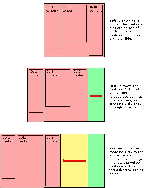
}Moving the containers into place with relative positioning
Using relative positioning we now move the containers to their new locations. When each container is moved the divs become visible below. It is the layering and position of the coloured containers that create the background of the equal height columns. The container2 div is moved to the left by 30% to reveal the green right-hand column and the container1 div is moved to the left 40% to reveal the yellow center column and at the same time the red section that is still visible becomes the left-hand column.
-
- 跨浏览器实现等高栏 Equal Height Columns with Cross-Browser CSS
The CSS relative positioning rules
Here is the CSS showing the the addition of relative positioning.
#container3 {float:left;width:100%;background:green;
}
#container2 {float:left;width:100%;background:yellow;position:relative;right:30%;
}
#container1 {float:left;width:100%;background:red;position:relative;right:40%;
}
#col1 {float:left;width:30%;
}
#col2 {float:left;width:40%;
}
#col3 {float:left;width:30%;
}
Moving the content back into each column
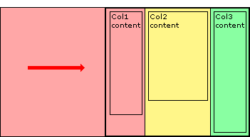
The next thing to do is to move the content of each column back onto the page so that it aligns with the column background colour underneath. Again this is done with simple relative positioning.
-
- 跨浏览器实现等高栏 Equal Height Columns with Cross-Browser CSS
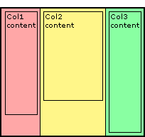
And then finally we chop off the overhanging containers by adding an overflow:hidden; rule on the outermost container - container3.
-
- 跨浏览器实现等高栏 Equal Height Columns with Cross-Browser CSS
The CSS relative positioning rules
Here is the CSS showing the the addition of relative positioning and the overflow rule. Notice the extra position:relative; on container3, this is to solve an Internet Explorer bug that stops the overflow:hidden; from working.
#container3 {float:left;width:100%;background:green;overflow:hidden;position:relative;
}
#container2 {float:left;width:100%;background:yellow;position:relative;right:30%;
}
#container1 {float:left;width:100%;background:red;position:relative;right:40%;
}
#col1 {float:left;width:30%;position:relative;left:70%;
}
#col2 {float:left;width:40%;position:relative;left:70%;
}
#col3 {float:left;width:30%;position:relative;left:70%;
}
Adding padding to the columns
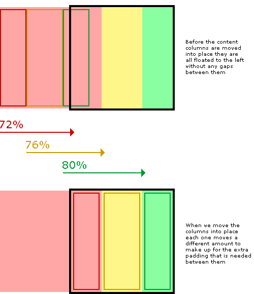
The last thing to do is add padding to the columns so the text is not squashed right up against the edge of each column. If we were to add a CSS padding rule to the columns this might work in some browsers but unfortunately not all. Internet Explorer get's the box model wrong and so it calculates the width of elements with padding differently. A box 200 pixels wide with 20 pixels padding will be a total of 200 pixels wide in Internet Explorer but in all other browsers it will be a correct 240 pixels wide. Padding, you see, should be 'added' to the width of an element, not taken away. CURSE MICROSOFT!
But don't worry... we can solve this problem in a completely different way that does not rely on a padding rule. Instead we just make our columns narrower (the column width minus padding on both sides) and then just move them into the correct position with relative positioning. In our example we will use 2% padding so a column that is 30% wide will be reduced to 26% and a 40% wide column is reduced to 36%. When we move the columns back into place with relative positioning we need to remember that the columns are now narrower so when they are initially all floated together to the left, each one has progressively further to move into place than the one before.
-
- 跨浏览器实现等高栏 Equal Height Columns with Cross-Browser CSS
The completed CSS
To keep the layout together at small widths I have also added an overflow:hidden; rule to each content column. This will chop off any content that is too wide for the column and stop it interfering with the rest of the layout. Again, this is only really a problem with Internet explorer, all other browsers will maintain the correct layout no matter what is in the columns. If you really want to, try exposing this rule only to IE with IE conditional comments.
#container3 {float:left;width:100%;background:green;overflow:hidden;position:relative;
}
#container2 {float:left;width:100%;background:yellow;position:relative;right:30%;
}
#container1 {float:left;width:100%;background:red;position:relative;right:40%;
}
#col1 {float:left;width:26%;position:relative;left:72%;overflow:hidden;
}
#col2 {float:left;width:36%;position:relative;left:76%;overflow:hidden;
}
#col3 {float:left;width:26%;position:relative;left:80%;overflow:hidden;
}
Well, that's it. I hope you found this article useful. Have a play with the CSS and see how it works for yourself. You can have as many columns as you want as long as there are the same amount of containers as content columns.
Don't forget to check out my demo pages: 2 column, 3 column, 4 column and 5 column.
原文:http://matthewjamestaylor.com/blog/equal-height-columns-cross-browser-css-no-hacks
实例:
2 Column 2栏 | 3 Column 3栏 | 4 Column 4栏 | 5 Column 5栏
本文:跨浏览器实现等高栏 Equal Height Columns with Cross-Browser CSS
跨浏览器实现等高栏 Equal Height Columns with Cross-Browser CSS相关推荐
- jQuery一步一步实现跨浏览器的可编辑表格,支持IE、Firefox、Safari、
脚 本 之 家 www.jb51.net 脚本云 专题 素材下载 电子书 软件下载 源码下载 服务器常用软件 a5交易 首页 网页制作 脚本专栏 脚本下载 网络编程 数据库 CMS教程 电子书籍 平面 ...
- 使用ZeroClipboard解决跨浏览器复制到剪贴板的问题
Zero Clipboard的实现原理 Zero Clipboard 利用透明的Flash让其漂浮在复制按钮之上,这样其实点击的不是按钮而是 Flash ,这样将需要的内容传入Flash,再通过Fla ...
- marbin mysql_跨浏览器图像灰度(grayscale)解决方案
首先,你需要在一个svg里声明滤镜,该svg可以内嵌到html文件里,也可以单独保存. [html] view plaincopy 如果该文件保存成了单独的文件gray.svg,我们可以在html文件 ...
- 跨浏览器开发:CSS代码的金科玉律
作为Web设计师,你的网站在各种浏览器中有完全一样的表现是很多人的目标,然而这是一个永远无法真正实现的目标,很多人认为,完美的跨浏览器兼容并不必要,这样说虽然没错,但在很多情形,一种近似的兼容还是很容 ...
- html div float center,跨浏览器实现float:center
跨浏览器实现float:center 互联网 发布时间:2008-10-17 19:26:11 作者:佚名 我要评论 原文: http://www.macji.com/blog/artic ...
- [css] 如何使用css实现跨浏览器的最小高度?
[css] 如何使用css实现跨浏览器的最小高度? div{height:auto!important; height:200px; min-height:200px; } 这个第一个已经 impor ...
- 跨浏览器开发工作小结
本篇小结是在2011年时候总结的,当时做一个产品的跨浏览器兼容工作,由于产品开发的时间比较早,最开始只能在IE下面(IE 8.IE 9还有点点问题)使用,做跨浏览器兼容工作的时候,主要是适配IE 6- ...
- 跨浏览器用javascript获取窗口的位置和大小
跨浏览器获取位置 var leftX = typeof window.screenLeft == 'number' ? window.screenLeft : window.screenX; var ...
- 如何调试CSS的跨浏览器样式bug
首先要做的是挑选一个好的浏览器.我的选择是Chrome,因为它拥有强大的调试工具.当我在Chrome上完成调试后,我会接着在Safari或者Firefox上调试. 如果在这些"好的" ...
最新文章
- 一篇极好的 CSS 教程
- Nginx学习_狂神
- 巧用记忆化搜索代替暴力递归(洛谷P1464题题解,Java语言描述)
- 观点 | 2017,区块链与加密货币“追逐者”玩命的一年
- SAP Basis常用事务代码
- Parallels Desktop 17 “操作失败 执行该操作失败”的解决方法
- 自己动手写操作系统(一)
- 国内第三个双机场城市新机场试飞,6月正式投用
- Kotlin - 函数
- jdom生成与解析xml详解
- 计算机开机主机无法启动,手把手教你电脑无法启动怎么办
- OpenWrt增加Led
- 计算机概论综述,计算机组成原理唐朔飞PPT 第1章 计算机系统概论综述.ppt
- Python进阶读书笔记之(四) set集合
- 使用Python进行IP地址查询
- [软件安装] 动态图像录制工具LICEcap
- 小程序入门(1)-项目环境搭建
- Failing because I am unlikely to write too排查方案
- Mac运行Android模拟器报The emulator process for AVD XXX has terminated错误
- 一篇文让你秒懂CDN
热门文章
- 61 MM配置-后勤发票校验-发票冻结-设置容差限制
- 日语学习-多邻国-平假名4
- C语言 strcat函数实现
- 2007年noip普及组初赛试题
- odbc驱动程序管理器连接未打开_Windows 10 怎么修复 Windows 中的 Wi-Fi 连接问题,我教你...
- c++99乘法表_nine-nine table 不是“99张桌子”,理解错了数学老师会打你!
- css 透明度_如何在网页控制透明度
- OpenVINO Inference Engine之LoadNetwork
- 2021.08.23学习内容Pytorch与Torch的关系以及Torchvision作用
- flask带有传入参数既有URL还有其他参数类型:建议使用方式二(flask 使用查询字符串的方式)