数据可视化 信息可视化_可视化数据以帮助清理数据
数据可视化 信息可视化
The role of a data scientists involves retrieving hidden relationships between massive amounts of structured or unstructured data in the aim to reach or adjust certain business criteria. In recent times this role’s importance has been greatly magnified as businesses look to expand insight about the market and their customers with easily obtainable data.
数据科学家的作用涉及检索大量结构化或非结构化数据之间的隐藏关系,以达到或调整某些业务标准。 近年来,随着企业希望通过易于获得的数据来扩大对市场及其客户的洞察力,这一作用的重要性已大大提高。
It is the data scientists job to take that data and return a deeper understanding of the business problem or opportunity. This often involves the use of scientific methods of which include machine learning (ML) or neural networks (NN). While these types of structures may find meaning in thousands of data points much faster than a human can, they can be unreliable if the data that is fed into them is messy data.
数据科学家的工作是获取这些数据并返回对业务问题或机会的更深刻理解。 这通常涉及使用科学方法,包括机器学习(ML)或神经网络(NN)。 尽管这些类型的结构可以在数千个数据点中找到比人类更快得多的含义,但是如果馈入其中的数据是凌乱的数据,则它们可能不可靠。
Messy data could cause have very negative consequences on your models they are of many forms of which include:
杂乱的数据可能会对您的模型造成非常不利的影响,它们的形式很多,包括:
缺少数据 : (Missing data:)
Represented as ‘NaN’ (an acronym of Not a Number) or as a ‘None’ a Python singleton object.
表示为“ NaN”(不是数字的缩写)或Python单例对象的“无”。
Sometimes the best way to deal with problems is the simplest.
有时,解决问题的最佳方法是最简单的。
import numpy as npimport pandas as pdimport matplotlib.pyplot as pltimport seaborn as snsdf = pd.read_csv('train.csv')df.info()A quick inspection of the returned values shows the column count of 891 is inconsistent across the different columns a clear sign of missing information. We also notice some fields are of type “object” we’ll look at that next.
快速检查返回的值会发现在不同的列中891的列数不一致,明显缺少信息。 我们还注意到,接下来将要介绍一些字段属于“对象”类型。
<class 'pandas.core.frame.DataFrame'>RangeIndex: 891 entries, 0 to 890Data columns (total 11 columns):survived 891 non-null int64pclass 891 non-null int64name 891 non-null objectsex 891 non-null objectage 714 non-null float64sibsp 891 non-null int64parch 891 non-null int64ticket 891 non-null objectfare 891 non-null float64cabin 204 non-null objectembarked 889 non-null objectdtypes: float64(2), int64(4), object(5)memory usage: 76.7+ KBAlternatively you can plot the missing values on a heatmap using seaborn but this could be very time consuming if handling big dataframes.
或者,您可以使用seaborn在热图上绘制缺失值,但是如果处理大数据帧,这可能会非常耗时。
sns.heatmap(df.isnull(), cbar=False)数据不一致 : (Inconsistent data:)
- Inconsistent columns types: Columns in dataframes can differ as we saw above. Columns could be of a different types such as objects, integers or floats and while this is usually the case mismatch between column type and the type of value it holds might be problematic. Most important of format types include datetime used for time and date values.列类型不一致:数据框中的列可能会有所不同,如上所述。 列可以具有不同的类型,例如对象,整数或浮点数,虽然通常这是列类型与其所拥有的值类型不匹配的情况,但可能会出现问题。 最重要的格式类型包括用于时间和日期值的日期时间。
- Inconsistent value formatting: While this type of problem might mainly arise during categorical values if misspelled or typos are present it can be checked with the following:值格式不一致:虽然这种类型的问题可能主要在分类值期间出现(如果存在拼写错误或错字),但可以使用以下方法进行检查:
df[‘age’].value_counts()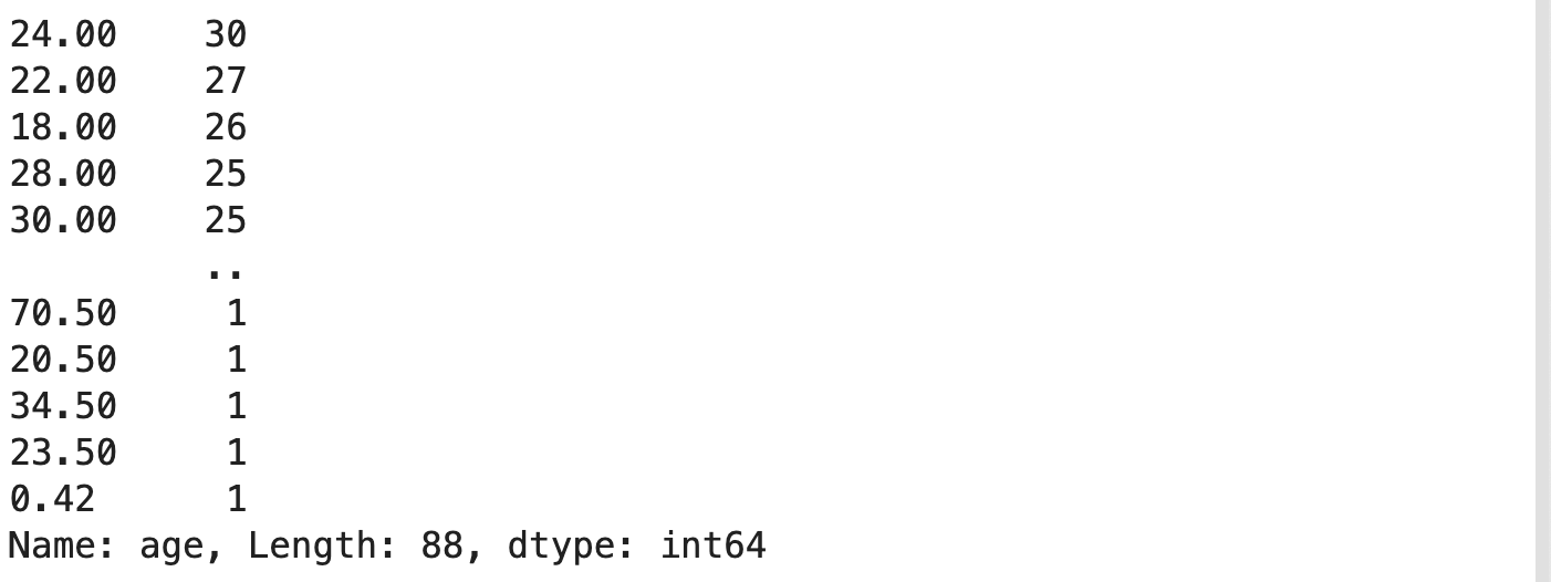
This will return the number of iterations each value is repeated throughout the dataset.
这将返回在整个数据集中重复每个值的迭代次数。
离群数据 : (Outlier data:)
A dataframe column holds information about a specific feature within the data. Hence we can have a basic idea of the range of those values. For example age, we know there is going to be a range between 0 or 100. This does not mean that outliers would not be present between that range.
数据框列保存有关数据中特定功能的信息。 因此,我们可以对这些值的范围有一个基本的了解。 例如,年龄,我们知道将有一个介于0或100之间的范围。这并不意味着在该范围之间不会出现异常值。
A simple illustration of the following can be seen graphing a boxplot:
可以通过绘制箱形图来简单了解以下内容:
sns.boxplot(x=df['age'])plt.show()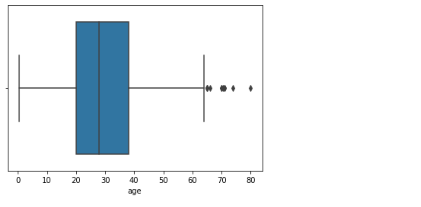
The values seen as dots on the righthand side could be considered as outliers in this dataframe as they fall outside the the range of commonly witnessed values.
在此数据框中,右侧的点表示的值可以视为离群值,因为它们不在通常见证的值范围之内。
多重共线性: (Multicollinearity:)
While multicollinearity is not considered to be messy data it just means that the columns or features in the dataframe are correlated. For example if you were to have a a column for “price” a column for “weight” and a third for “price per weight” we expect a high multicollinearity between these fields. This could be solved by dropping some of these highly correlated columns.
虽然多重共线性不被认为是凌乱的数据,但这仅意味着数据框中的列或要素是相关的。 例如,如果您有一个“价格”列,一个“重量”列和一个“每重量价格”列,那么我们期望这些字段之间具有较高的多重共线性。 这可以通过删除一些高度相关的列来解决。
f, ax = plt.subplots(figsize=(10, 8))corr = df.corr()sns.heatmap(corr, mask=np.zeros_like(corr, dtype=np.bool), cmap=sns.diverging_palette(220, 10, as_cmap=True), square=True, ax=ax)In this case we can see that the values do not exceed 0.7 either positively nor negatively and hence it can be considered safe to continue.
在这种情况下,我们可以看到值的正或负均不超过0.7,因此可以认为继续操作是安全的。
使此过程更容易: (Making this process easier:)
While data scientists often go through these initial tasks repetitively, it could be made easier by creating structured functions that allows the easy visualisation of this information. Lets try:
尽管数据科学家经常重复地完成这些初始任务,但通过创建结构化的函数可以使此信息的可视化变得更加容易。 我们试试吧:
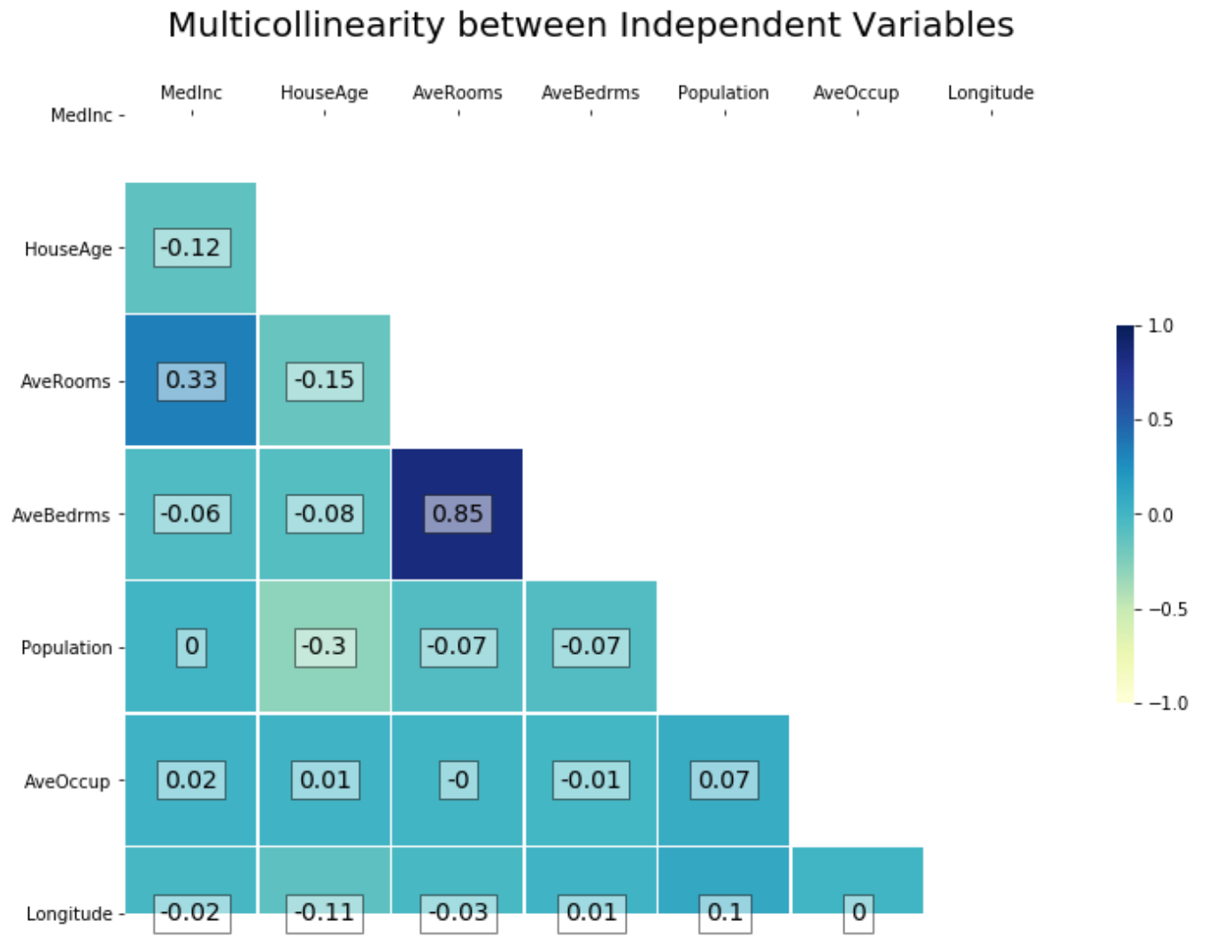
----------------------------------------------------------------from quickdata import data_viz # File found in repository----------------------------------------------------------------from sklearn.datasets import fetch_california_housingdata = fetch_california_housing()print(data[‘DESCR’][:830])X = pd.DataFrame(data[‘data’],columns=data[‘feature_names’])y = data[‘target’]1-Checking Multicollinearity
1-检查多重共线性
The function below returns a heatmap of collinearity between independent variables as well as with the target variable.
下面的函数返回自变量之间以及目标变量之间共线性的热图。
data = independent variable df X
数据 =自变量df X
target = dependent variable list y
目标 =因变量列表y
remove = list of variables not to be included (default as empty list)
remove =不包括的变量列表(默认为空列表)
add_target = boolean of whether to view heatmap with target included (default as False)
add_target =是否查看包含目标的热图的布尔值(默认为False)
inplace = manipulate your df to save the changes you made with remove/add_target (default as False)
inplace =操纵df保存使用remove / add_target所做的更改(默认为False)
*In the case remove was passed a column name, a regplot of that column and the target is also presented to help view changes before proceeding*
*如果为remove传递了一个列名,该列的重新绘制图和目标,则在继续操作之前还会显示目标以帮助查看更改*
data_viz.multicollinearity_check(data=X, target=y, remove=[‘Latitude’], add_target=False, inplace=False)
data_viz.multicollinearity_check(data = X,target = y,remove = ['Latitude'],add_target = False,inplace = False)
2- Viewing Outliers:This function returns a side-by-side view of outliers through a regplot and a boxplot visualisation of a the input data and target values over a specified split size.
2-查看离群值:此函数通过regplot和箱形图可视化返回离群值的并排视图,该图显示输入数据和目标值在指定分割范围内的情况。
data = independent variable df X
数据 =自变量df X
target = dependent variable list y
目标 =因变量列表y
split = adjust the number of plotted rows as decimals between 0 and 1 or as integers
split =将绘制的行数调整为0到1之间的小数或整数
data_viz.view_outliers(data=X, target=y, split_size= 0.3 )
data_viz.view_outliers(data = X,target = y,split_size = 0.3)
It is important that these charts are read by the data scientist and not automated away to the machine. Since not all datasets follow the same rules it is important that a human interprets the visualisations and acts accordingly.
这些图表必须由数据科学家读取,而不是自动传送到计算机,这一点很重要。 由于并非所有数据集都遵循相同的规则,因此重要的是,人类必须解释视觉效果并据此采取行动。
I hope this short run-through of data visualisation helps provide more clear visualisations of your data to better fuel your decisions when data cleaning.
我希望这段简短的数据可视化过程有助于为您的数据提供更清晰的可视化,以便在清理数据时更好地推动您的决策。
The functions used in the example above is available here :
上面示例中使用的功能在此处可用:
Feel free to customise these as you see fit!
随意自定义这些内容!
翻译自: https://medium.com/@rani_64949/visualisations-of-data-for-help-in-data-cleaning-dce15a94b383
数据可视化 信息可视化
http://www.taodudu.cc/news/show-995230.html
相关文章:
- 使用python pandas dataframe学习数据分析
- 前端绘制绘制图表_绘制我的文学风景
- 回归分析检验_回归分析
- 数据科学与大数据技术的案例_主数据科学案例研究,招聘经理的观点
- cad2016珊瑚_预测有马的硬珊瑚覆盖率
- 用python进行营销分析_用python进行covid 19分析
- 请不要更多的基本情节
- 机器学习解决什么问题_机器学习帮助解决水危机
- 网络浏览器如何工作
- 案例与案例之间的非常规排版
- 隐私策略_隐私图标
- figma 安装插件_彩色滤光片Figma插件,用于色盲
- 设计师的10种范式转变
- 实验心得_大肠杆菌原核表达实验心得(上篇)
- googleearthpro打开没有地球_嫦娥五号成功着陆地球!为何嫦娥五号返回时会燃烧,升空却不会?...
- python实训英文_GitHub - MiracleYoung/You-are-Pythonista: 汇聚【Python应用】【Python实训】【Python技术分享】等等...
- 工作失职的处理决定_工作失职的处理决定
- vue图片压缩不失真_图片压缩会失真?快试试这几个无损压缩神器。
- 更换mysql_Docker搭建MySQL主从复制
- advanced installer更换程序id_好程序员web前端培训分享kbone高级-事件系统
- 3d制作中需要注意的问题_浅谈线路板制作时需要注意的问题
- cnn图像二分类 python_人工智能Keras图像分类器(CNN卷积神经网络的图片识别篇)...
- crc16的c语言函数 计算ccitt_C语言为何如此重要
- python 商城api编写_Python实现简单的API接口
- excel表格行列显示十字定位_WPS表格:Excel表格打印时,如何每页都显示标题行?...
- oem是代工还是贴牌_代加工和贴牌加工的区别是什么
- redis将散裂中某个值自增_这些Redis命令你都掌握了没?
- opa847方波放大电路_电子管放大电路当中阴极电阻的作用和选择
- 深度学习数据扩张_适用于少量数据的深度学习结构
- 城市轨道交通运营票务管理论文_城市轨道交通运营管理专业就业前景怎么样?中职优选告诉你...
数据可视化 信息可视化_可视化数据以帮助清理数据相关推荐
- python足球数据可视化_NBA数据分析_python可视化数据分析_可视化数据分析工具_可视化分析工具-帆软...
夺冠没含金量!python和BI可视化分析,湖人赢在这点上. 在经历了很多很多之后,湖人队终于获得了总冠军,众望所归. 如果科比还在的话,一定也很自豪吧,毕竟上一次夺冠还是10年前. 那问题来了,为什 ...
- 大数据好还是不好_学python好还是大数据好?想学IT,但有点搞不清方向的人可以看看...
这是我在某平台上看到的一个问题,学IT的话,是学python好还是学大数据好? 首先这个问题不太对,因为大数据和python,从根源上来说是两码事,就像你问我,是学做湘菜好,还是学做打铁好. 所以,学 ...
- 数据透视表 筛选_筛选器选择中的数据透视图标题
数据透视表 筛选 Instead of adding a static title to your Pivot Chart, use a worksheet formula to create a d ...
- 光滑噪声数据常用的方法_整理一份详细的数据预处理方法
重磅干货,第一时间送达 作者:lswbjtuhttps://zhuanlan.zhihu.com/p/51131210 为什么数据处理很重要? 熟悉数据挖掘和机器学习的小伙伴们都知道,数据处理相关的工 ...
- python大数据运维工程师_运维工程师转型大数据怎么样
运维工作没意思,运维没有前途,运维会被取代--让很多的运维工程师感受到前途无"亮",随着资本寒冬的来临,以及各种新技术的不断出现,很多运维工程师开始走向了转型的道路.那么在如今的数 ...
- 5可视化数据大屏模板_可视化大屏模板分享
3个月前的一天,老板找到我:"小王,数据怎么才能产生让人惊艳的感觉呢?" 我说:"肯定是用代码让程序员操作一下,再让设计师做一下配色,最好还能是数据实时变化的那种,简直就 ...
- 数据库数据过长避免_为什么要避免使用商业数据科学平台
数据库数据过长避免 让我们从一个类比开始 (Let's start with an analogy) Stick with me, I promise it's relevant. 坚持下去,我保证这 ...
- oracle数据泵导入导出_【软件】R语言数据导入与导出
"R语言导入文本和xlsx文件数据的方法,以及数据与图片的输出" 许多数据往往保存在TXT文件或Excel文件中,该如何将这些文件导入R语言进行分析呢?另外,使用R语言处理完数据之 ...
- 小程序数据框有重影_关于拖动滚动条编辑框数据重影的问题
你的位置: 问答吧 -> C/C++ -> 问题详情 关于拖动滚动条编辑框数据重影的问题 我用VC++做了一个编辑框,并设置有垂直滚动条.当编辑框中的数据太多时,此时滚动条可用.我在拖动滚 ...
- 两部手机怎样才能把数据都传过来_两台苹果手机怎么传数据最快(两台 iPhone 互传应用的 3 个小技巧)...
如何与好友分享应用,或将应用同步到另一部 iPhone 上?下面有三个小技巧,一起来看看: 一.通过隔空投送分享 该方法适用于与好友分享自己已经下载的应用:长按桌面上的应用图标,选择分享 App,如果 ...
最新文章
- Linux Mount Windows域用户限制的共享文件夹
- 年中盘点:2021年最炙手可热的10家AI初创公司
- Pyrex也许是一个好东西
- 业务逻辑数据层SqlDataSourcesql的输入参数
- AndroidStudio更改默认编码(不用每次新建项目再更改编码了)
- 父子域+主辅域控的搭建
- 市场营销渠道含义是什么?
- Unity 崩溃问题解决方法——之一
- vue element table expand 扩展行点击行展示且保证只展示一行
- JDBC练习1 从控制台向数据库的表customers中插入一条数据
- Android 高仿微信实时聊天 基于百度云推送
- 2021-“新“的开源项目之handpose_x(手势识别交互)
- Failed resolution of: Landroid/webkit/TracingController;
- 打破传统的控制理论之(控制理论+深度学习)
- 原创:用python把链接指向的网页直接生成图片的http服务及网站(含源码及思想)...
- 利用蜜罐捕捉攻击实验(31)
- 查看当前设备是否启用SR-IOV
- [渝粤教育] 东北财经大学 财务管理 参考 资料
- gorm Preload主子表查询 学习笔记
- 魔兽世界服务器存档位置,选择服务器也有大学问?新手入坑《魔兽世界》该在哪里“扎根”...