css界面内容可滚动_带有CSS滚动捕捉点的直观滚动界面
css界面内容可滚动
Scroll Snap Points are a native CSS-only technique that you can use to create layouts where your content is easily scrolled or panned. With this new feature you can easily control how your content will scroll and how it will ‘snap’ to the correct locations (letting you create features such as pagination with ease).
滚动捕捉点是仅CSS的一种原生技术,可用于创建布局,在此布局中可以轻松滚动或平移内容。 使用此新功能,您可以轻松控制内容的滚动方式以及如何“捕捉”到正确的位置(让您轻松创建分页等功能)。
Historically developers have used JavaScript (often jQuery) to create perfect smooth-scrolling, snapping interfaces. While these work just fine, having a native CSS approach that does essentially the same thing is always better.
历史上,开发人员曾使用JavaScript(通常是jQuery)来创建完美的平滑滚动,捕捉界面。 尽管这些方法很好用,但使用本质上可以完成相同操作的本机CSS方法总是更好。
The specification for Snap Points is still relatively new (and under development); however it’s supported by a few browsers and is stable enough for us to start playing around with.
快照点的规范仍然相对较新(正在开发中); 但是它受到一些浏览器的支持,并且足够稳定,可供我们开始使用。
捕捉点概述 (An Overview of Snap Points)
Snap point scrolling works by defining a Scroll Container element and then setting each of its inner elements to be Snap Points. Once these elements have been set, normal scrolling will be modified so that as users scroll/pan they will be snapped from one snap point to the next.
捕捉点滚动的工作方式是定义“ 滚动容器”元素,然后将其每个内部元素设置为“ 捕捉点”。 设置完这些元素后,将修改常规滚动,以便在用户滚动/平移时将其从一个捕捉点捕捉到下一个捕捉点。
The main element that holds all of your other elements you wish to scroll between is called the Scroll Container. This is our main element and the majority of the snap-related properties will be set here. We can define:
包含要在其间滚动的所有其他元素的主要元素称为Scroll Container 。 这是我们的主要元素,大多数与快照相关的属性都将在此处设置。 我们可以定义:
- How tall/wide the container will be 容器的高度/宽度
- On which axis/axes the container will scroll (i.e. X, Y, or both) 容器将在哪个轴/轴上滚动(即X,Y或两者都滚动)
- The strength of the snap elements and how they will react to scrolling捕捉元素的强度及其对滚动的React
- The positions/offsets from the container to the snap elements as you scroll 滚动时从容器到对齐元素的位置/偏移
The elements inside the scroll container will become our “Snap Points”. It’s this content that will be scrolled/panned to when we interact with the container. For an individual snap point you will define:
滚动容器内的元素将成为我们的“捕捉点”。 当我们与容器交互时,将滚动/平移到此内容。 对于单个捕捉点,您将定义:
- The offset of the current snap element against the scroll container. 当前对齐元素相对于滚动容器的偏移量。
滚动捕捉点属性 (The Scroll Snap Points Properties)
Getting Snap Points to work in your projects involves only a few CSS properties. Let’s outline these below and then later when can look at a few examples that showcase how they work.
使捕捉点在您的项目中工作仅涉及一些CSS属性。 让我们在下面概述这些内容,然后稍后再看一些展示它们如何工作的示例。
scroll-snap-destination (scroll-snap-destination)
This property is set on the scroll container and it defines the X position and Y position values (relative to itself) that the elements inside will snap to. You use this property to tell the container exactly where its elements will be snapped to.
此属性在滚动容器上设置,它定义内部元素将捕捉到的X位置和Y位置值(相对于其自身)。 您可以使用此属性来告诉容器确切地将其元素捕捉到的位置。
Here are the possible values:
以下是可能的值:
unset– Used to declare that this container is not a scroll container (by default no containers are unless you set it)unset–用于声明此容器不是滚动容器(默认情况下,除非您进行设置,否则没有容器)position– You must set both the X and Y position or the browser will ignore your propertyposition–您必须同时设置X和Y位置,否则浏览器将忽略您的属性Value can be in pixels such as
scroll-snap-destination: 50px 100px;which tells the browser that it will snap elements from 50px to the left and 100px from the top.值可以以像素为单位,例如
scroll-snap-destination: 50px 100px;告诉浏览器它将向左对齐50px,从顶部对齐100px的元素。Value can be a set of percentages such as
scroll-snap-destination: 0% 100%;which tells the browser that it will snap elements from 0% to the left and 100% from the top.值可以是一组百分比,例如
scroll-snap-destination: 0% 100%;告诉浏览器它将捕捉从0%到左侧和100%从顶部到顶部的元素。Value can also be other allowed units such as
scroll-snap-destination: 0vw 50vwwhich tells the browser that it will snap elements from 0% of the current viewport height to the left and 50% of the current viewport height to the top.值也可以是其他允许的单位,例如
scroll-snap-destination: 0vw 50vw,它告诉浏览器它将把元素从当前视口高度的0%向左对齐,并将当前视口高度的50%捕捉到顶部。
position– You must set both the X and Y position or the browser will ignore your propertyposition–您必须同时设置X和Y位置,否则浏览器将忽略您的属性
Let’s look at a few visual aids so you can see how this property works (as it’s one of those properties you will need to adjust until you get the correct effect).
让我们看一些视觉辅助工具,以便您可以看到此属性的工作原理(因为它是其中之一,需要调整直到获得正确的效果)。
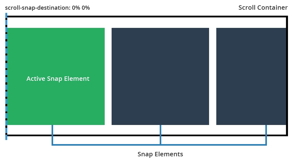
scroll-snap-destination: 0% 0% Setting the scroll destination to 0% will ensure that all inner elements snap to the leading left edge of the container.
scroll-snap-destination:0%0%将滚动目标设置为0%将确保所有内部元素都对齐到容器的左前边缘。
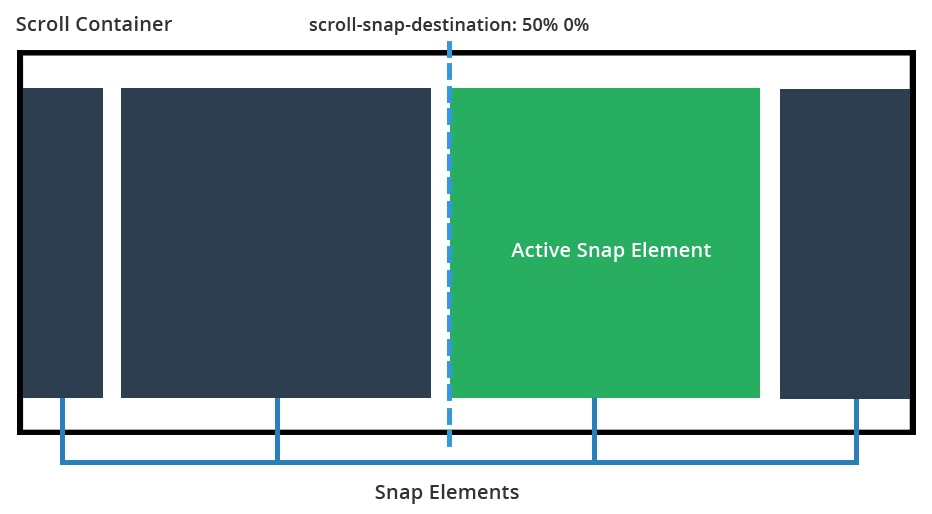
scroll-snap-destination: 50% 0% Here we set the scroll container to snap content at 50% of its width. This means that as we scroll, the active element will snap to the left hand side of the 50% position.
scroll-snap-destination:50%0%这里,我们将滚动容器设置为以其宽度的50%捕捉内容。 这意味着当我们滚动时,活动元素将捕捉到50%位置的左侧。
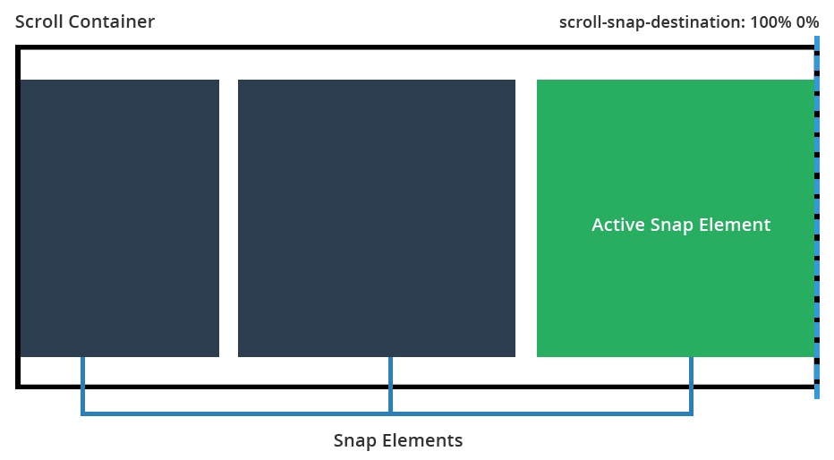
scroll-snap-destination: 100% 0% This time our snap destination is 100%. This means each of the inner elements will snap to the right side of the container as we scroll.
scroll-snap-destination:100%0%这次,我们的捕捉目标是100%。 这意味着当我们滚动时,每个内部元素都将捕捉到容器的右侧。
scroll-snap-coordinate (scroll-snap-coordinate)
This property is defined on each snap element and determines the X position and Y position values where this element will snap to. This property works together with the scroll-snap-destination declared on the container and determines the element’s offset from the snap point.
在每个捕捉元素上定义此属性,并确定该元素将捕捉到的X位置和Y位置值。 此属性与在容器上声明的scroll-snap-destination一起使用,并确定元素与捕捉点的偏移量。
none– There will be no offset for this element. It will snap directly where the scroll container has defined.none–该元素没有偏移量。 它会直接对齐滚动容器定义的位置。position– You must set both the X and Y position for this to work.position–必须同时设置X和Y位置才能起作用。Value can be in pixels such as
scroll-snap-coordinate: 100px 0px, which tells the browser the snap element will be offset by 100px from the left edge of the snap point and 0px from the top.值可以以像素为单位,例如
scroll-snap-coordinate: 100px 0px,它告诉浏览器snap元素将从对齐点的左边缘偏移100px,从顶部偏移0px。Value can use percentages such as
scroll-snap-coordinate: 25% 0%, which tells the browser that the element will be offset by 25% of its width from the left edge of the snap point (and also offset by 0% from the top).值可以使用百分比,例如
scroll-snap-coordinate: 25% 0%,它告诉浏览器该元素将与对齐点的左边缘偏移其宽度的25%(并且与该对齐点的偏移量也为0%。最佳)。Value can also be other allowed measurements such as
scroll-snap-coordinate: 15vw 15vwwhich will mean the snap element is offset by both 15% of the viewport width from the top and left of the snap container.值也可以是其他允许的测量值,例如:
scroll-snap-coordinate: 15vw 15vw,这意味着快照元素从快照容器的顶部和左侧偏移视口宽度的15%。position (multiple)– You can also set multiple coordinates for the snap element by passing set pairs such asscroll-snap-coordinate: 50% 0%, 100% 0%which tells the browser this element will snap to 50% of its width from the leading left edge of the snap point (and 0% from the top) and it will also snap to 100% of its width from the snap point edge (and 0% from the top). This is useful because sometimes at the start or end of a scrolling list an item should snap in multiple places, not just one.position (multiple)–您还可以通过传递设置对来为snap元素设置多个坐标,例如scroll-snap-coordinate: 50% 0%, 100% 0%,告诉浏览器此元素将捕捉到其宽度的50%从捕捉点的左前边缘开始(从顶部开始为0%),并且还将从捕捉点的边缘(从顶部开始为0%)捕捉到其宽度的100%。 这很有用,因为有时在滚动列表的开头或结尾,一个项目应该在多个位置而不只是一个位置。
position– You must set both the X and Y position for this to work.position–必须同时设置X和Y位置才能起作用。
If this property is not set, the element will simply snap as defined by the scroll container. If you do set the scroll-snap-coordinate property, the element itself will offset itself depending on what you enter. This is mainly used so you can position your elements just right (or to allow other content to peek through the viewport).
如果未设置此属性,则元素将简单地按滚动容器的定义对齐。 如果您确实设置了scroll-snap-coordinate属性,则元素本身将根据您输入的内容而偏移。 这主要是为了使您可以将元素定位在正确的位置(或允许其他内容通过视口窥视)。
Let’s look at some examples for scroll-snap-coordinate with a description of what each one does:
让我们看一下scroll-snap-coordinate一些示例,并描述每个示例的功能:
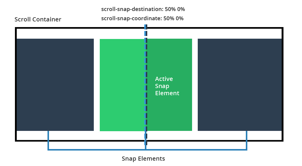
scroll-snap-coordinate: 50% 0% This tells the browser that the element should snap towards the set edge of the scroll container, but that its snap should offset itself by 50% of its width to the left. This basically means that it will center align itself to the snap point.
scroll-snap-coordinate:50%0%这告诉浏览器,元素应朝滚动容器的设置边缘对齐,但元素的对齐应使其自身向左偏移其宽度的50%。 这基本上意味着它将与对齐点居中对齐。
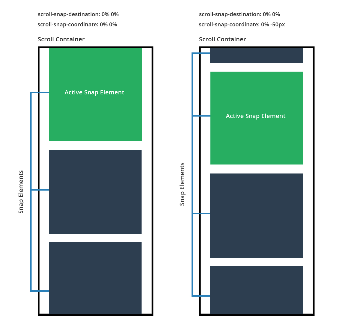
scroll-snap-coordinate: 0% 0% and scroll-snap-coordinate: 0% -50px Here we see a side by side comparison so we can look at what happens when you specify that your elements will have a negative offset.
scroll-snap-coordinate:0%0%和scroll-snap-coordinate:0%-50px在这里,我们看到了并排比较,因此我们可以看看当您指定元素具有负偏移量时会发生什么。
For the example on the left, we don’t set the coordinate property (it will just snap to its parent’s container). The example on the right, we explicitly tell the browser to offset the vertical snap position by -50px (which lets another element before it sneak in).
对于左侧的示例,我们未设置坐标属性(它将仅捕捉到其父级的容器)。 在右边的示例中,我们明确告诉浏览器将垂直捕捉位置偏移-50px(让另一个元素潜入之前)。
You can adjust the coordinate properties until your snaps work for your interface.
您可以调整坐标属性,直到捕捉对您的界面起作用为止。
scroll-snap-type (scroll-snap-type)
This property determines how strongly the scroll container will snap to its inner elements. Here are the possible values:
此属性确定滚动容器将如何牢固地捕捉到其内部元素。 以下是可能的值:
none– The scroll container ignores all snap points (scrolls normally)none–滚动容器忽略所有捕捉点(正常滚动)mandatory– The scroll container will move to the next snap element during even a small scroll or single click on the scroll bar. The scroll container will immediately move and align itself with the snap point. This is best used you want to be 100% sure that as your user scrolls they will always snap to the next element.mandatory–即使在进行小滚动或单击滚动条时,滚动容器也将移至下一个对齐元素。 滚动容器将立即移动并与对齐点对齐。 最好使用此方法,以确保您的用户在滚动时始终能捕捉到下一个元素,这是100%保证的。proximity– The scroll container will move to the next snap element only if it is somewhat close to a snap point. As the user scrolls or clicks on the scroll bar, the scrolling motion will seem to be normal, however if the user gets close to the edge of a snap element it will then snap into place. This is best used when you want your users to be able to scroll freely, but would like the scroll container to snap to content if it gets close enough (somewhat like a magnet).proximity-滚动容器只有在稍微接近捕捉点的情况下才会移动到下一个捕捉元素。 当用户滚动或单击滚动条时,滚动运动似乎是正常的,但是,如果用户靠近捕捉元素的边缘,它将随后捕捉到位。 当您希望用户能够自由滚动,但又希望滚动容器足够靠近内容(有点像磁铁)时,希望滚动容器捕捉到内容。
I find using mandatory works the best as it’s a hard forced snap, however proximity also works well with its softer snap between zones (the downside is there is no way to customize how sensitivity of when it will snap)
我发现使用mandatory工作是最好的,因为它是一个硬性强制捕捉,但是proximity也可以在区域之间较柔和的捕捉中很好地工作(缺点是无法自定义捕捉时间的敏感性)
scroll-snap-points-x和scroll-snap-points-y (scroll-snap-points-x and scroll-snap-points-y)
If you view the current version of the spec you’ll notice it includes descriptions for the scroll-snap-points-x and scroll-snap-points-y properties. As pointed out in a notice on MDN, these two properties have been deprecated and so they’re not included in the editor’s draft of the spec. So I won’t go into details on those here.
如果查看规范的当前版本,您会注意到它包含对scroll-snap-points-x和scroll-snap-points-y属性的描述。 正如有关MDN的通知中所指出的,这两个属性已被弃用,因此它们未包含在规范的编辑草案中 。 因此,我将不在此处详细介绍。
滚动捕捉点的实际示例 (Practical Examples with Scroll Snap Points)
Now that we’ve covered the basics, lets jump into some examples so you can see how this all works in practice.
既然我们已经介绍了基础知识,那么让我们跳入一些示例,以便您可以实际了解这一切。
Each of the examples below has its own CodePen with even more notes that discuss exactly how the scrolling works (plus a few little design bugs you might run into). Feel free to fork your own copies and create something fun with them.
下面的每个示例都有自己的CodePen,甚至还有更多注释,这些注释准确地讨论了滚动的工作方式(以及您可能会遇到的一些小设计错误)。 随意散发自己的副本,并为它们创造乐趣。
全角互动部分滚动条 (A full-width interactive section scroller)
The great thing about CSS Snap Points is how easy they are to implement. All you do is define your container, its elements, and how it will snap. Look at the additional full-width container slider I have built below. Here’s what it contains:
CSS捕捉点的优点在于实现起来非常容易。 您要做的只是定义容器,其元素以及如何捕捉。 看看我在下面构建的其他全角容器滑块。 它包含的内容是:
- Full-width outer container (using vw and vh units)全宽外部容器(使用大众和大众单位)
- Each section has its own dynamic height, not a set height with px每个部分都有自己的动态高度,而不是设置为px的高度
- On scroll, each section is snapped to the top of the scroll container 在滚动时,每个部分都捕捉到滚动容器的顶部
See Full Page Demo
查看整页演示
具有不同尺寸图像的动态图库滑块 (Dynamic gallery slider with differently-sized images)
This gallery contains images of all different shapes, sizes and aspect ratios. Here’s a description:
该画廊包含所有不同形状,大小和纵横比的图像。 描述如下:
- Handles different image sizes and aspect ratios (so a real life example)处理不同的图像尺寸和宽高比(以真实生活为例)
- Snaps content to the center of the container将内容捕捉到容器的中心
- It’s responsive. Works based on either an auto width / height with additional maximums set by max-width / max-height. Images are adjusted to fit within (and their scroll positions updated).React灵敏。 基于自动宽度/高度以及通过max-width / max-height设置的其他最大值来工作。 调整图像以适合其中(并更新其滚动位置)。
Uses a combination of
scroll-snap-destinationandscroll-snap-coordinateto handle the snapping结合使用
scroll-snap-destination和scroll-snap-coordinate来处理捕捉
See the Pen Snap Points Demo: Scroller with different sized images by SitePoint (@SitePoint) on CodePen.
请参阅CodePen上的Site Snap( @SitePoint )提供的Pen Snap Points演示:带有不同大小图像的滚动条 。
And here is the vertical scrolling example:
这是垂直滚动示例:
See the Pen Snap Points example: Vertical scroller with different sized images by SitePoint (@SitePoint) on CodePen.
请参见“笔捕捉点”示例:带有 CodePen上SitePoint ( @SitePoint )的不同大小图像的垂直滚动 条 。
响应式画廊滑块具有相等大小的图像 (Responsive gallery slider with equal-size images)
For this example, all of our images are the same size. In addition, the images themselves will be responsive, using bottom padding to make them perfectly square. As the viewport resizes, they will resize accordingly (up to a set maximum width).
对于此示例,我们所有图像的大小均相同。 此外,图像本身将具有响应性,使用底部填充使它们完美方形。 当视口调整大小时,它们将相应地调整大小(最大设置为最大宽度)。
- Fully responsive, width 100% with padding 0% to create a perfectly responsive square gallery完全响应,宽度100%,填充0%,创建完美响应的方形画廊
Shows one image at a time by using either
snap-scroll-points-xorsnap-scroll-points-yto move horizontally or vertically through the gallery.通过使用
snap-scroll-points-x或snap-scroll-points-y或一次在图库中水平或垂直移动一次显示一张图像。
See the Pen Snap Points example: Responsive Horizontal Scroller with same sized images by SitePoint (@SitePoint) on CodePen.
请参见“笔捕捉点”示例: CodePen上具有 SitePoint( @SitePoint ) 相同大小图像的响应式水平滚动 条 。
And here is a vertical example:
这是一个垂直的示例:
See the Pen Snap Points example: Responsive Vertical Scroll Gallery with Same Sized Images by SitePoint (@SitePoint) on CodePen.
请参见“笔捕捉点”示例: CodePen上具有 SitePoint( @SitePoint ) 相同大小图像的响应式垂直滚动库 。
浏览器对捕捉点的支持 (Browser Support for Snap Points)
Details on browser support for Snap Points can be found on Can I Use, but here’s a quick summary, as of this writing:
关于浏览器对快照点的支持的详细信息可以在“我可以使用”中找到 ,但是在撰写本文时,这里是一个简短的摘要:
- Firefox 39+ – Fully supported for current specification.Firefox 39+ –当前规范完全受支持。
IE10 – Requires a touch device for this to work and requires the
-msprefix.IE10 –需要触摸设备才能工作,并且需要
-ms前缀。IE11 – Can use snap points on either a touch screen, mouse, keyboard, or trackpad and requires the
-msprefix.IE11 –可以在触摸屏,鼠标,键盘或触控板上使用捕捉点,并且需要
-ms前缀。Edge – Much like IE10 and IE11, supports snap points with the
-msprefixEdge –类似于IE10和IE11,支持带有
-ms前缀的捕捉点Safari 9 – Supports snap points but doesn’t support the
nonekeyword for thescroll-snap-coordinateproperty. Also, doesn’t support length keywords oftop,right,left, orbottomfor thescroll-snap-destinationandscroll-snap-coordinateproperties.Safari 9 –支持捕捉点,但不支持
scroll-snap-coordinate属性的none关键字。 另外,对于scroll-snap-destination和scroll-snap-coordinate属性,不支持top,right,left或bottomlength关键字。iOS Safari 9 – Requires
-webkitprefix (this is the only mobile browser that supports Snap Points)iOS Safari 9 –需要
-webkit前缀(这是唯一支持快照点的移动浏览器)
Basically we have great support if you’re on Firefox, average support on Internet Explorer / Edge and basic support on Safari. Chrome Canary (Google’s bleeding edge version of Chrome) has support for Snap Points so it should find itself in stable Chrome soon.
基本上, 如果您使用的是Firefox ,我们将提供大力支持 , Internet Explorer / Edge上的平均支持,以及Safari上的基本支持 。 Chrome Canary(Google的最新版Chrome)支持Snap Points,因此很快就会在稳定的Chrome中找到自己的位置。
Sadly If you’re hoping to use this on mobile apps, it might take a while before most of the major browsers support it.
可悲的是,如果您希望在移动应用程序上使用此功能,则大多数主流浏览器可能需要一段时间才能支持它。
If you’re interested in using Snap Points today, you can try a polyfill by Clemens Krack.
如果您有兴趣使用捕捉点的今天,你可以尝试一个填充工具由克莱门斯Krack。
结论 (Conclusion)
I hope you now you have a fairly solid understanding of CSS Snap Points and how they can be leveraged to create interesting and easy to manage user interfaces. Going forward, support will spread fully to Chrome and IE and then we can start pushing for its inclusion in upcoming projects.
希望您现在对CSS捕捉点以及如何利用它们创建有趣且易于管理的用户界面有相当深刻的了解。 展望未来,支持将完全扩展到Chrome和IE,然后我们可以开始推动将其包含在即将到来的项目中。
I’d love to hear from you if you end up implementing snap points in one of your projects!
如果您最终在其中一个项目中实现了快照点,我很想听听您的意见!
翻译自: https://www.sitepoint.com/intuitive-scrolling-interfaces-with-css-scroll-snap-points/
css界面内容可滚动
css界面内容可滚动_带有CSS滚动捕捉点的直观滚动界面相关推荐
- css实现图片虚化_什么? CSS 阴影竟然还有这种骚操作 ?
点击上方"IT平头哥联盟",选择"置顶或者星标" 与你一起成长- 原作者:cocoqiao 关于 CSS 阴影,之前已经有写过一篇,box-shadow 与 f ...
- css设置按钮样式_使用CSS设置按钮样式的快速指南
css设置按钮样式 by Ashwini Sheshagiri 通过Ashwini Sheshagiri Buttons have become an inevitable part of front ...
- 使用HTML语言和CSS开发商业站点_初识CSS
第4章 初识CSS 一.CSS概述 1.什么事CSS CSS全称为层叠样式表(Cascading Style Sheet),通常又称为风格样式表(Style Sheet),它是 ...
- 纯css导航下拉_纯CSS标签导航
纯css导航下拉 The appearence of "tab" navigation is relatively easy to create, but making a tab ...
- css不换行属性_前端 | css display:flex 的六个属性你知道吗
前言:display:flex 是一种布局方式.它即可以应用于容器中,也可以应用于行内元素.是W3C提出的一种新的方案,可以简便.完整.响应式地实现各种页面布局.目前,它已经得到了所有浏览器的支持. ...
- css禁用选中文本_使用CSS禁用文本选择突出显示
css禁用选中文本 Introduction: 介绍: Texts are the most fundamental elements of any websites or web pages, th ...
- css 中文文字字体_使用CSS的网络字体
css 中文文字字体 CSS | 网络字体 (CSS | Web fonts) Web fonts allow people to use fonts that are not pre-install ...
- css椭圆圆形边框_使用CSS在弧形,圆形和椭圆形中制作动画元素
css椭圆圆形边框 Web animation is most often created between two points: from and to a state, or between po ...
- css画横线箭头_用CSS绘制三角形箭头
用CSS绘制三角形箭头.使用纯CSS,你只需要很少的代码就可以创作出各种浏览器都兼容的三角形箭头! CSS代码:/* create an arrow that points up */ div.arr ...
最新文章
- stm32对c语言要求高吗?c语言什么水平可以学stm32?
- eclipse中编辑properties文件无法看到中文
- 儿童python编程入门-天津少儿编程Python入门
- 【十大经典排序算法】java实现--选择排序(2)
- SpringBoot+zxing+Vue实现前端请求后台二维码图片
- faster rcnn在自己的数据集上训练
- Number 和 Math 类
- pure CSS3 triangle icon
- 软件工程第二次作业——个人项目
- STM32 使用串口下载程序( ISP 一键下载)
- 迅雷7.22 和迅雷5.9 去广告优化增强绿色版
- swift subscript scraps
- 使用GeoServer发布WMS动态地图服务,使用openlayers访问wms服务浏览地图数据
- 配置apache和nginx的tomcat负载均衡
- Rust之Sea-orm快速入门指南
- 简繁转换API接口,免费好用
- jaeger 是很么软件_jaeger 使用初探
- Java集成第三方支付宝(会员卡)——文档篇
- 自定义Dialog不显示视图
- linux source code download