r语言r-shiny_如何使用R Shiny进行EDA和预测
r语言r-shiny
The objective of the present article is to provide a simple guide on how to develop an R Shiny application to analyze, explore, and predict variables within a dataset.
本文的目的是提供有关如何开发R Shiny应用程序以分析,探索和预测数据集中变量的简单指南。
The first segment of the article covers R Shiny basics, such as the explanation fo its functionality. Further, I will develop an exploratory data analysis of bike-sharing data in the form of interactive graphs. Then, I will create a prediction model to help the user of the application predict the number of total bike registration the system by taking into consideration weather conditions and a specific day of the year.
本文的第一部分介绍R Shiny基础知识,例如其功能的解释。 此外,我将以交互图的形式开发自行车共享数据的探索性数据分析。 然后,我将创建一个预测模型,以帮助应用程序的用户通过考虑天气状况和一年中的特定日期来预测系统中自行车总注册的数量。
Furthermore, I will describe the data to get in the context of the information that the dataset contains. To put a purpose to the web application, in the data understanding section, I will create several business questions that I will walk through to build the R Shiny.
此外,我将在数据集包含的信息的上下文中描述要获取的数据。 为了达到Web应用程序的目的,在“数据理解”部分,我将创建几个业务问题,并将逐步构建R Shiny。
Then, by using R, I will arrange the data in the correct format to build the machine learning model and the Shiny application. Finally, I will display the code and explain the steps on how to create an R Shiny application.
然后,通过使用R,我将以正确的格式排列数据以构建机器学习模型和Shiny应用程序。 最后,我将显示代码并解释如何创建R Shiny应用程序的步骤。
内容 (Content)
- What is R Shiny?什么是R Shiny?
- Data understanding数据理解
- Data preparation资料准备
- Modeling造型
- EDA in R ShinyR Shiny中的EDA
- Prediction in R ShinyR Shiny中的预测
什么是R Shiny? (What is R Shiny?)
R Shiny is an R package that is capable of building an interactive web page application straight from R without using any web application languages such as HTML, CSS, or JavaScript knowledge.
R Shiny是一个R软件包,它能够直接从R构建交互式的Web页面应用程序,而无需使用任何Web应用程序语言(例如HTML,CSS或JavaScript知识)。
One essential feature of Shiny is that these applications are in a way “live” since the output of the web page changes as the user modifies the inputs, without reloading the browser.
Shiny的一个基本特征是这些应用程序处于“实时”状态,因为网页的输出随用户修改输入而改变,而无需重新加载浏览器。
Shiny contains two fundamental parameters, the UI and the Server. The user interface (UI) holds all the text code that describes the layout of the page, any additional text, images, and other HTML elements we want to include so the user can interact and understand how to use the web page. On the other hand, the Server is the back end of the Shiny application. This parameter creates a web server specifically designed to host Shiny apps in a controlled environment.
Shiny包含两个基本参数,即UI和Server。 用户界面(UI)包含所有描述页面布局的文本代码,任何其他文本,图像以及我们要包括的其他HTML元素,以便用户可以交互并了解如何使用网页。 另一方面,服务器是Shiny应用程序的后端。 此参数创建专门设计用于在受控环境中托管Shiny应用程序的Web服务器。
数据理解 (Data understanding)
The dataset used to develop the R Shiny application is called Bike Sharing Dataset (specifically the “hour.csv” file), taken from UCI Machine Learning Repository.
用于开发R Shiny应用程序的数据集称为“ 自行车共享数据集” (特别是“ hour.csv”文件),取自UCI机器学习存储库 。
The data I collected was from the bike share system called “Capital Bikeshare”. The system consists of a group of bikes located throughout six different jurisdictions in Washington, DC. The bikes are locked throughout a network of the docking station for the users to perform their daily transportation. The users can unlock the bikes with an app and, after they finished their rides, return them to any other available docking station.
我收集的数据来自名为“ Capital Bikeshare ”的自行车共享系统。 该系统由位于华盛顿特区六个不同辖区的一组自行车组成。 自行车被锁定在扩展坞的整个网络中,以供用户执行日常运输。 用户可以使用应用程序解锁自行车,并在骑行完成后将其返回到任何其他可用的扩展坞。
The dataset contains the hourly count of bike registrations, between the years 2011 and 2012, taking into consideration the weather conditions and the seasonal information. It holds 16 attributes and 17,379 observations in which each row of the data represents a specific hour of the day from January 1, 2011; till December 31, 2012.
该数据集包含2011年至2012年之间每小时的自行车注册计数,并考虑了天气情况和季节性信息。 它包含16个属性和17,379个观察值,其中数据的每一行代表从2011年1月1日起的一天中的特定时间; 直到2012年12月31日。
There are 9 categorical variables, which are the following:
有9个类别变量,它们是:
- dteday: datedteday:日期
- season: season (1 = winter, 2 = spring, 3 = summer, 4 = fall)季节:季节(1 =冬季,2 =Spring,3 =夏季,4 =秋季)
- yr: year (0 = 2011, 1 = 2012)yr:年(0 = 2011,1 = 2012)
- mnth: month (1 to 12)mnth:月(1到12)
- hr: hour (0 to 23)hr:小时(0到23)
- holiday: weather day is holiday or not (0 = no, 1 = yes)假日:天气是否为假日(0 =否,1 =是)
- weekday: day of the week工作日:星期几
- workingday: weather day is a working day or not (if the day is neither weekend nor holiday is 1, otherwise is 0)工作日:天气日是否为工作日(如果该日既不是周末也不是假日,则为1,否则为0)
- weathersit: weather condition (1 = clear, few clouds, partly cloudy, partly cloudy; 2 = mist + cloudy, mist + broken clouds, mist + few clouds, mist; 3 = light snow, light rain + thunderstorm + scattered clouds, light rain + scattered clouds; 4 = heavy rain + ice pallets + thunderstorm + mist, snow + fog)weathersit:天气情况(1 =晴,少云,部分多云,部分多云; 2 =薄雾+多云,薄雾+碎云,薄雾+少云,薄雾; 3 =小雪,小雨+雷暴+零星云+轻云雨+零散的云; 4 =大雨+冰架+雷暴+薄雾,雪+雾)
Also, the data has 7 numerical variables:
此外,数据具有7个数字变量:
- temp: normalized temperature in Celsius ( the values are derived via (t-t_min)/(t_max-t_min), t_min=-8, t_max=+39)temp:标准化温度,以摄氏度为单位(这些值是通过(t-t_min)/(t_max-t_min),t_min = -8,t_max = + 39得出的)
- atemp: normalized feeling temperature in Celsius (the values are derived via (t-t_min)/(t_max-t_min), t_min=-16, t_max=+50)atemp:标准化的摄氏温度,以摄氏度为单位(这些值是通过(t-t_min)/(t_max-t_min),t_min = -16,t_max = + 50得出的)
- hum: normalized humidity (the values are divided to 100 (max))嗡嗡声:标准化湿度(值除以100(最大值))
- windspeed: normalized wind speed (the values are divided to 67 (max)风速:标准化风速(值除以67(最大值)
- casual: count of casual users that used the bike share system in a specific hourCasual:在特定时间使用自行车共享系统的休闲用户数
- registered: count of new users registered to use the bike share system in a specific hour已注册:在特定小时内注册使用自行车共享系统的新用户数
- cnt: count of total rental bikes in a specific hour (included both, casual and registered)cnt:特定小时内的总租赁自行车数(包括休闲和注册自行车)
业务问题 (Business questions)
Once I understood the data, I developed some business questions which I will be answering throughout this article, to show how to use the R Shiny application in a real-world scenario.
一旦理解了数据,我便提出了一些业务问题,这些问题将在本文全文中予以回答,以展示如何在实际场景中使用R Shiny应用程序。
- Is there a notable difference between the number of new and casual registrations in the dataset?数据集中新注册和临时注册的数量之间有显着差异吗?
- Throughout both years, what was the weather condition that predominated the most when bike rides occurred?在过去的两年中,当自行车骑行发生时,最主要的天气条件是什么?
- Throughout the year 2012, which month had the highest number of new user registrations into the bike-share system?在2012年全年,哪个月份的共享单车系统新用户注册数量最多?
- Which season had the highest number of casual and new user registrations in a type “Good” weather condition during 2012?在2012年的“良好”天气类型中,哪个季节的休闲和新用户注册数量最多?
- The company wants to predict the number of bike registrations for tomorrow Thursday, May 14, 2020 (which is a working day), at 3 pm; with the following weather information:该公司希望预测2020年5月14日(星期四)(工作日)明天下午3点的自行车注册数量; 具有以下天气信息:
- There is going to be 35% of humidity.将会有35%的湿度。
- With a temperature of 17 Celsius and a feeling temperature of 15 Celsius.温度为17摄氏度,感觉温度为15摄氏度。
- A wind speed of 10 mph.10英里/小时的风速。
- And “Fair” weather type.和“一般”天气类型。
资料准备 (Data preparation)
To enter the data in the correct format into R Shiny application, first, I prepared the data. For this reason, I proceed to load the dataset into RStudio and check for the data type of each attribute.
要将正确格式的数据输入到R Shiny应用程序中,首先,我准备了数据。 因此,我继续将数据集加载到RStudio中并检查每个属性的数据类型。
## Bike-sharing initial analysis#Import the datasetdata <- read.csv('hour.csv')[,-1]str(data)It is necessary to notice that the first column of the dataset was the row index, which does not hold any predictive value. For that reason, I decided to load the data, excluding the first column of the original dataset.
需要注意的是,数据集的第一列是行索引,它不包含任何预测值。 因此,我决定加载数据,但不包括原始数据集的第一列。
Now, once loaded the variables, it is of absolute importance to check that they possess the correct data type. Visualizing the results, we can see that eight of the nine categorical variables had the incorrect data type. For this reason, I proceed to change the data type from int (integer) to factor. Additionally, I change the numbered values to their respective category name to make their manipulation more understandable.
现在,一旦加载了变量,检查它们是否具有正确的数据类型就至关重要。 可视化结果,我们可以看到九个分类变量中的八个具有错误的数据类型。 因此,我将数据类型从int (integer)更改为factor 。 另外,我将编号的值更改为其各自的类别名称,以使其操作更易于理解。
It is essential to mention that I followed a different criterion to label the weather conditions. By analyzing each of the output of the weather, I have decided to label them on a scale from “good” to “very bad”, where 1 represents good weather and 4 indicates very bad weather.
必须提及的是,我遵循了不同的标准来标记天气状况。 通过分析天气的每个输出,我决定将其标记为从“好”到“非常差”的等级,其中1表示好天气,4表示非常差的天气。
#Data preparation #Arranging values and changing the data typedata$yr <- as.factor(ifelse(data$yr == 0, '2011', '2012'))data$mnth <- as.factor(months(as.Date(data$dteday), abbreviate = TRUE))data$hr <- factor(data$hr)data$weekday <- as.factor(weekdays(as.Date(data$dteday)))data$season <- as.factor(ifelse(data$season == 1, 'Spring', ifelse(data$season == 2, 'Summer', ifelse(data$season == 3, 'Fall', 'Winter'))))data$weathersit <- as.factor(ifelse(data$weathersit == 1, 'Good', ifelse(data$weathersit == 2, 'Fair', ifelse(data$weathersit == 3, 'Bad', 'Very Bad'))))data$holiday<-as.factor(ifelse(data$holiday == 0, 'No', 'Yes'))data$workingday<-as.factor(ifelse(data$workingday == 0, 'No', 'Yes'))Further, I continued to change the name columns “registered” and “cnt” with “new” and “total”, respectively.
此外,我继续将名称栏“ registered”和“ cnt”分别更改为“ new”和“ total”。
This change is not required, but it will allow me to differentiate between the new and the total number of registrations.
不需要进行此更改,但是它将使我能够区分新注册数量和总注册数量。
#Changing columns namesnames(data)[names(data) == "registered"] <- "new"names(data)[names(data) == "cnt"] <- "total"Finally, for the last step of the data preparation, I denormalized the values of the variables “temp”, “atemp”, “hum”, and “windspeed”; so that later I can analyze the real observations on the exploratory data analysis and in the prediction model.
最后,在数据准备的最后一步,我将变量“ temp”,“ atemp”,“ hum”和“ windspeed”的值归一化; 这样,以后我就可以在探索性数据分析和预测模型中分析实际的观察结果。
#Denormalizing the values #Temperaturefor (i in 1:nrow(data)){ tn = data[i, 10] t = (tn * (39 - (-8))) + (-8) data[i, 10] <- t} #Feeling temperaturefor (i in 1:nrow(data)){ tn = data[i, 11] t = (tn * (50 - (-16))) + (-16) data[i, 11] <- t} #Humiditydata$hum <- data$hum * 100 #Wind speeddata$windspeed <- data$windspeed * 67For the final arrangement, I dropped the first column of the dataset since it is not essential for the study. Once I have all the variables in the correct type and all the values in the desired format, I proceed to write a new file with the current arranged data.
对于最终安排,我删除了数据集的第一列,因为它对于研究不是必需的。 一旦所有变量的类型正确并且所有值的格式都正确,就可以使用当前排列的数据编写新文件。
Furthermore, I will use the new file to build the graphs of the R Shiny application.
此外,我将使用新文件来构建R Shiny应用程序的图形。
#Write the new filedata <- data[-1]write.csv(data, "bike_sharing.csv", row.names = FALSE)造型 (Modeling)
For the model, I want to predict the total number of registrations that can occur in a single day considering a time frame (month, hour, and day of the week) and weather conditions. For this matter, the first step is to drop the columns that will not be part of the model.
对于该模型,我想考虑时间范围(月,小时和星期几)和天气情况,预测一天中可能发生的注册总数。 为此,第一步是删除不属于模型的列。
The columns “season” and “workingday” are dropped because the variables “mnth” and “weekday” can provide the same information. By indicating the month, we know which season of the year corresponds. Also, by providing information about the day of the week, we identify if it is a working day or not.
由于变量“ mnth”和“工作日”可以提供相同的信息,因此删除了“季节”和“工作日”列。 通过指示月份,我们知道一年中的哪个季节。 此外,通过提供有关星期几的信息,我们可以确定是否是工作日。
Since the prediction model acknowledges weather conditions and specific information of a day, the variable year does not provide any essential information needed for the model. For this matter, I eliminated the variable “yr” from the data frame. Likewise, the columns “casual” and “new” are excluded from the model because the purpose of the model is to predict the total number of registrations.
由于预测模型可以确认天气状况和一天的特定信息,因此可变年份不提供该模型所需的任何基本信息。 为此,我从数据帧中删除了变量“ yr”。 同样,模型中不包括“休闲”和“新”列,因为该模型的目的是预测注册总数。
#Modeling #Dropping columnsdata <- data[c(-1,-2,-7,-13,-14)]分割数据 (Splitting the data)
Now that the data is ready for modeling, I proceed to split the data into train and test set. Additionally, to use the data for the R Shiny application, I saved these datasets into a new file. I used a split ratio of 0.8, meaning that the train data will contain 80% of the total observations and the test the remaining 20%.
既然数据已经准备好进行建模,那么我将把数据分成训练和测试集。 另外,为了将数据用于R Shiny应用程序,我将这些数据集保存到了一个新文件中。 我使用0.8的分割比率,这意味着火车数据将包含总观测值的80%,而测试将剩余20%。
#Splitting datalibrary(caTools)set.seed(123)split = sample.split(data$total, SplitRatio = 0.8)train_set = subset(data, split == TRUE)test_set = subset(data, split == FALSE) #Write new files for the train and test setswrite.csv(train_set, "bike_train.csv", row.names = FALSE)write.csv(test_set, "bike_test.csv", row.names = FALSE)楷模 (Models)
Moreover, I continued to select the model for the prediction. Since the dependent variable is numeric (total registrations), it means that we are in the presence of a regression task. For this reason, I pre-selected multilinear regression, decision tree, and random forest models to predict the outcome of the dependent variable.
此外,我继续选择用于预测的模型。 由于因变量是数字(总注册量),因此这意味着我们正在执行回归任务。 因此,我预选了多线性回归,决策树和随机森林模型来预测因变量的结果。
For the next step, I created the regression model with the training data. Then, I evaluated its performance by calculating the mean absolute error (MAE) and root mean square error (RMSE).
下一步,我使用训练数据创建了回归模型。 然后,我通过计算平均绝对误差(MAE)和均方根误差(RMSE)来评估其性能。
#Multilinear regressionmulti = lm(formula = total ~ ., data = train_set) #Predicting the test valuesy_pred_m = predict(multi, newdata = test_set) #Performance metricslibrary(Metrics)mae_m = mae(test_set[[10]], y_pred_m)rmse_m = rmse(test_set[[10]], y_pred_m)mae_mrmse_m
#Decision treelibrary(rpart)dt = rpart(formula = total ~ ., data = train_set, control = rpart.control(minsplit = 3)) #Predicting the test valuesy_pred_dt = predict(dt, newdata = test_set) #Performance metricsmae_dt = mae(test_set[[10]], y_pred_dt)rmse_dt = rmse(test_set[[10]], y_pred_dt)mae_dtrmse_dt
#Random forestlibrary(randomForest)set.seed(123)rf = randomForest(formula = total ~ ., data = train_set, ntree = 100) #Predicting the test valuesy_pred_rf = predict(rf, newdata = test_set) #Performance metricsmae_rf = mae(test_set[[10]], y_pred_rf)rmse_rf = rmse(test_set[[10]], y_pred_rf)mae_rfrmse_rf
Once I have the performance metrics of all the models, I continued to analyze them to finally chose the best model. As we know, the mean absolute error (MAE) and the root mean square error (RMSE) are two fo the most common metrics to measure the accuracy of a regression model.
获得所有模型的性能指标后,我将继续对其进行分析,以最终选择最佳模型。 众所周知,平均绝对误差(MAE)和均方根误差(RMSE)是衡量回归模型准确性的最常用指标中的两个。
Since the MAE delivers an average value of the errors of the prediction, it is best to select a model where the MAE value is small. In other words, with a low MAE, the magnitude of the error in the forecast is tiny, making the prediction closer to the real value. Following these criteria, I chose the random forest model, which has an MAE equal to 47.11.
由于MAE会提供预测误差的平均值,因此最好选择MAE值小的模型。 换句话说,MAE较低时,预测中的误差幅度很小,从而使预测更接近真实值。 按照这些标准,我选择了随机森林模型,其MAE等于47.11。
Additionally, I proceed to analyze the RMSE. This metric also measures the average magnitude of the errors by taking the square root of the average of squared differences between the predicted value and actual observation, meaning it will give high weight to large errors. In other words, with a smaller RMSE, we can capture fewer errors in the model. With that said, the random forest was the correct option. Additionally, the difference between the MAE and RMSE of the random forest is small, meaning that the variance in the individual error is lower.
此外,我继续分析RMSE。 此度量标准还通过获取预测值和实际观测值之间平方差的平均值的平方根来测量误差的平均大小,这意味着它将为较大的误差赋予较高的权重。 换句话说,采用较小的RMSE,我们可以捕获较少的模型错误。 话虽如此,随机森林是正确的选择。 另外,随机森林的MAE和RMSE之间的差异很小,这意味着个体误差的方差较小。
Now that I know that the random forest model is the best one, it is required to save the model in a file to use it in the Shiny application.
现在,我知道随机森林模型是最好的模型,现在需要将模型保存到文件中,以便在Shiny应用程序中使用它。
#Saving the modelsaveRDS(rf, file = "./rf.rda")R Shiny中的EDA (EDA in R Shiny)
In this step of the project, I built an R Shiny application where I can perform a univariate analysis of the numeric and categorical independent variables. Also, I developed an interactive dashboard to answer the business questions presented at the beginning of the article.
在项目的此步骤中,我构建了一个R Shiny应用程序,可以在其中对数字和分类自变量进行单变量分析。 另外,我开发了一个交互式仪表板来回答本文开头提出的业务问题。
In a new R document, I proceed to create the R Shiny applications. First, I loaded the necessary libraries used throughout the Shiny application and the datasets.
在一个新的R文档中,我继续创建R Shiny应用程序。 首先,我加载了整个Shiny应用程序和数据集中使用的必要库。
#Load librarieslibrary(shiny)library(shinydashboard)library(ggplot2)library(dplyr)#Importing datasetsbike <- read.csv('bike_sharing.csv')bike$yr <- as.factor(bike$yr)bike$mnth <- factor(bike$mnth, levels = c('Jan', 'Feb', 'Mar', 'Apr', 'May', 'Jun', 'Jul', 'Aug', 'Sep', 'Oct', 'Nov', 'Dec'))bike$weekday <- factor(bike$weekday, levels = c('Sunday', 'Monday', 'Tuesday', 'Wednesday', 'Thursday', 'Friday', 'Saturday'))bike$season <- factor(bike$season, levels = c('Spring', 'Summer', 'Fall', 'Winter'))R Shiny UI (R Shiny UI)
First, I created the web page (UI), which is going to display all the information and visualization for the exploratory data analysis.
首先,我创建了网页(UI),该网页将显示所有信息和可视化信息,以进行探索性数据分析。
The UI will be a variable containing information about elements such as header, sidebar, and body of the dashboard. To build a new dashboard page with all the necessary components, follow the code below.
UI将是一个变量,其中包含有关元素的信息,例如标题,侧边栏和仪表板的主体。 要构建具有所有必要组件的新仪表板页面,请遵循以下代码。
ui <- dashboardPage(dashboardHeader(), dashboardSidebar(), dashboardBody())Further, I proceed to design the title, create sidebars tabs, and indicate the body information.
此外,我将继续设计标题,创建侧栏选项卡并指示正文信息。
For a better understanding of the code, I will cut it into separate segments. However, it is necessary to know that for the application to work correctly, we have to run all the pieces together.
为了更好地理解该代码,我将其分为几个部分。 但是,有必要知道,为了使应用程序正确运行,我们必须将所有部分一起运行。
For the dashboard header, I specified the title name of the Shiny application and arranged the width of the space where the title will be displayed.
对于仪表板标题,我指定了Shiny应用程序的标题名称,并安排了显示标题的空间宽度。
#R Shiny uiui <- dashboardPage(

  #Dashboard title  dashboardHeader(title = 'BIKE SHARING EXPLORER',                   titleWidth = 290),
Then, I defined the sidebar layout, where I set the width of the sidebar. Then, with the sidebarMenu() function, I assigned the number of tabs the sidebar menu will have and tab names. To set the tabs, I used the menuItem() function, where I provided the actual name of the tab (the name revealed in the application), the reference tab name (the alias used to call the tab throughout the code), and define the icon or figure I want to append to the actual name.
然后,我定义了侧边栏布局,在其中设置了侧边栏的宽度。 然后,使用sidebarMenu()函数,分配了侧边栏菜单将具有的选项卡数量和选项卡名称。 要设置选项卡,我使用了menuItem()函数,在其中提供了选项卡的实际名称(应用程序中显示的名称),参考选项卡名称(在整个代码中用于调用选项卡的别名)并定义我要附加到实际名称的图标或图形。
For the EDA, I created two tabs called Plots and Dashboard. In the first tab, I displayed the univariate analysis of all the variables. The other tab presents a bivariate analysis of specific variables to answer the business questions.
对于EDA,我创建了两个选项卡,分别称为Plots和Dashboard。 在第一个标签中,我显示了所有变量的单变量分析。 另一个选项卡显示对特定变量的双变量分析,以回答业务问题。
#Sidebar layout dashboardSidebar(width = 290, sidebarMenu(menuItem("Plots", tabName = "plots", icon = icon('poll')), menuItem("Dashboard", tabName = "dash", icon = icon('tachometer-alt')))),Further, in the dashboard body, I described the content and layout of each of the tabs created.
此外,在仪表板主体中,我描述了所创建的每个选项卡的内容和布局。
First, I used a CSS component, which is a style language that can be used in HTML documents, to change the title into bold font. Further, in the tabItems(), I set the content of each of the tabs created above. Using the tabItem() function, I defined the reference tab name and then described the different elements it is going to hold.
首先,我使用CSS组件(一种可以在HTML文档中使用的样式语言)将标题更改为粗体。 此外,在tabItems()中,我设置了上面创建的每个选项卡的内容。 使用tabItem()函数,我定义了引用选项卡的名称,然后描述了它将包含的不同元素。
Once I determined the reference tab name (‘plots’), I proceed to find four different spaces to reveal the information by using the box() function. With this function, I defined the style of the box (status), the title, add an optional footer, a control widget, and the output of a plot.
确定引用选项卡的名称(“绘图”)后,我便开始使用box()函数找到四个不同的空格来显示信息。 使用此功能,我定义了框的样式(状态),标题,添加了可选的页脚,控件小部件以及图的输出。
In this code, first, I defined four boxes. Two of them containing a widget, and the other two boxes are to display the plots created latter in the server. The control widget used is the selectInput(), which is a dropdown menu with different choices to select. In the same function, I described the reference name of the widget, the actual name, and a list of options that will appear on the menu. On the other hand, I used the last two boxes to reveal the output of the plot. For that matter, I defined the function plotOutput() and indicated its reference name.
在这段代码中,首先,我定义了四个框。 其中两个包含小部件,另外两个框用于显示服务器中后者创建的图。 使用的控件是selectInput(),这是一个具有不同选择选项的下拉菜单。 在同一功能中,我描述了小部件的参考名称,实际名称以及将出现在菜单上的选项列表。 另一方面,我使用了最后两个框来显示绘图的输出。 为此,我定义了函数plotOutput()并指出了它的引用名称。
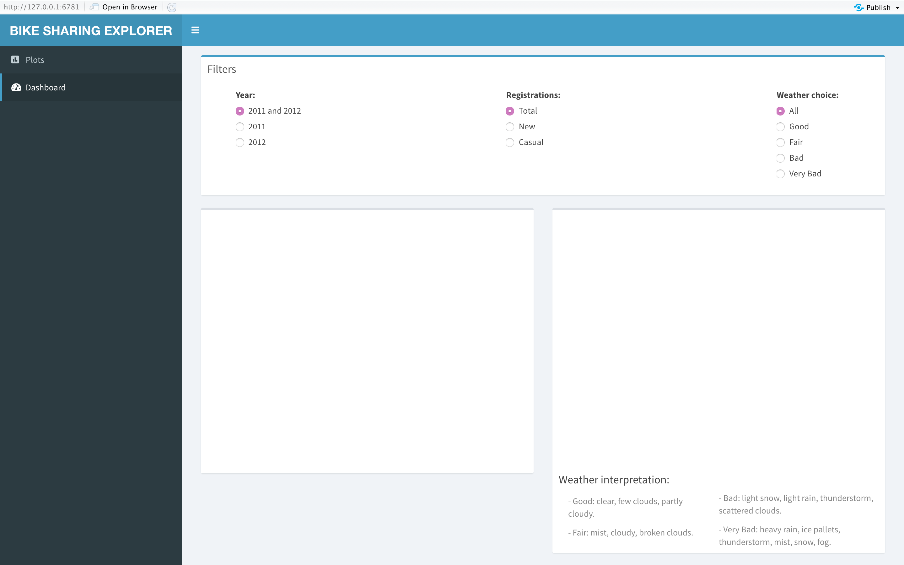
#Tabs layout dashboardBody(tags$head(tags$style(HTML('.main-header .logo {font-weight: bold;}'))), tabItems( #Plots tab content tabItem('plots', #Histogram filter box(status = 'primary', title = 'Filter for the histogram plot', selectInput('num', "Numerical variables:", c('Temperature', 'Feeling temperature', 'Humidity', 'Wind speed', 'Casual', 'New', 'Total')), footer = 'Histogram plot for numerical variables'), #Frecuency plot filter box(status = 'primary', title = 'Filter for the frequency plot', selectInput('cat', 'Categorical variables:', c('Season', 'Year', 'Month', 'Hour', 'Holiday', 'Weekday', 'Working day', 'Weather')), footer = 'Frequency plot for categorical variables'), #Boxes to display the plots box(plotOutput('histPlot')), box(plotOutput('freqPlot'))),For the next tab item (‘dash’), I used a similar design as the code above. The layout of the tab contains three boxes. The first box possesses the filters, and the remaining boxes hold the space for the plots.
对于下一个选项卡项目(“破折号”),我使用了与上面的代码类似的设计。 该选项卡的布局包含三个框。 第一个框包含过滤器,其余框保留用于绘制的空间。
In the filter box, I used the splitLayout() function to split the layout of the box into three different columns. For these filters, I used a control widget called radioButtons(), where I indicated the reference name, the actual name, and the list of the choices we will have in the application.
在过滤器框中,我使用splitLayout()函数将框的布局分为三个不同的列。 对于这些过滤器,我使用了一个名为radioButtons()的控件小部件,其中指示了参考名称,实际名称以及我们将在应用程序中选择的列表。
Then, in the other boxes of the dashboard, I indicated it’s content, such as graphs, and declare the reference names. Also, for the last box, I inputted the function column(), where I indicated its width. Additionally, I created two different columns where I wrote a description of the meaning of each weather condition filters by using the helpText() function.
然后,在仪表板的其他框中,指示其内容(例如图形),并声明参考名称。 另外,对于最后一个框,我输入了函数column() ,在其中指示其宽度。 此外,我创建了两个不同的列,在其中使用helpText()函数对每个天气条件过滤器的含义进行了描述。
#Dashboard tab content tabItem('dash', #Dashboard filters box(title = 'Filters', status = 'primary', width = 12, splitLayout(cellWidths = c('4%', '42%', '40%'), div(), radioButtons( 'year', 'Year:', c('2011 and 2012', '2011', '2012')), radioButtons( 'regis', 'Registrations:', c('Total', 'New', 'Casual')), radioButtons( 'weather', 'Weather choice:', c('All', 'Good', 'Fair', 'Bad', 'Very Bad')))), #Boxes to display the plots box(plotOutput('linePlot')), box(plotOutput('barPlot'), height = 550, h4('Weather interpretation:'), column(6, helpText('- Good: clear, few clouds, partly cloudy.'), helpText('- Fair: mist, cloudy, broken clouds.')), helpText('- Bad: light snow, light rain, thunderstorm, scattered clouds.'), helpText('- Very Bad: heavy rain, ice pallets, thunderstorm, mist, snow, fog.'))))))Finally, I created an empty server to run the code and visualized the progress of the Shiny application.
最后,我创建了一个空服务器来运行代码并可视化Shiny应用程序的进度。
# R Shiny serverserver <- shinyServer(function(input, output) {})shinyApp(ui, server)
Since I do not have outputs on the server, the application will display blank spaces where I will place the plots later on.
由于我在服务器上没有输出,因此该应用程序将显示空白,稍后我将在这些空白处放置绘图。
R闪亮服务器 (R Shiny Server)
Furthermore, in the server variable, I proceed to create the plots built for the analysis to answer the business questions.
此外,在服务器变量中,我继续创建用于分析的图表,以回答业务问题。
The first plot I created was the histogram plot. By using the output$histPlot vector, I accessed the histogram plot box indicated in the UI, which I proceed to assign the renderPlot({}) reactive function. This function will get data from the UI and implemented it into the Server.
我创建的第一个图是直方图。 通过使用output $ histPlot向量,我访问了UI中指示的直方图图框,然后继续分配了renderPlot({})React函数。 此功能将从UI获取数据并将其实现到服务器中。
Moreover, I created a new variable called “num_val”. This variable will store the name of the column in the dataset that refers to the numerical variables filter. Now, with this new variable, I proceed to build the histogram plot.
此外,我创建了一个名为“ num_val”的新变量。 此变量将在数据集中存储引用数字变量过滤器的列的名称。 现在,使用这个新变量,我将继续构建直方图。
# R Shiny serverserver <- shinyServer(function(input, output) {

  #Univariate analysis  output$histPlot <- renderPlot({    #Column name variable    num_val = ifelse(input$num == 'Temperature', 'temp',                     ifelse(input$num == 'Feeling temperature', 'atemp',                            ifelse(input$num == 'Humidity', 'hum',                                   ifelse(input$num == 'Wind speed', 'windspeed',                                          ifelse(input$num == 'Casual', 'casual',                                                 ifelse(input$num == 'New', 'new', 'total'))))))

    #Histogram plot    ggplot(data = bike, aes(x = bike[[num_val]]))+       geom_histogram(stat = "bin", fill = 'steelblue3',                      color = 'lightgrey')+      theme(axis.text = element_text(size = 12),            axis.title = element_text(size = 14),            plot.title = element_text(size = 16, face = 'bold'))+      labs(title = sprintf('Histogram plot of the variable %s', num_val),           x = sprintf('%s', input$num),y = 'Frequency')+      stat_bin(geom = 'text',                aes(label = ifelse(..count.. == max(..count..), as.character(max(..count..)), '')),      vjust = -0.6)  })
Next, I developed the frequency plot for the categorical variable. Performing the same steps as before, I called the output$freqPlot vector to plot the graph using the renderPlot({}) reactive function. Likewise, I generated a new variable to store the column names of the dataset set related to the values selected on the filter. Then, using the new variable, I built the frequency plot.
接下来,我为分类变量开发了频率图。 执行与之前相同的步骤,我调用了output $ freqPlot向量以使用renderPlot({})React函数来绘制图形。 同样,我生成了一个新变量来存储与在过滤器上选择的值相关的数据集的列名。 然后,使用新变量构建频率图。
output$freqPlot <- renderPlot({#Column name variable    cat_val = ifelse(input$cat == 'Season', 'season',                     ifelse(input$cat == 'Year', 'yr',                            ifelse(input$cat == 'Month', 'mnth',                                   ifelse(input$cat == 'Hour', 'hr',                                          ifelse(input$cat == 'Holiday', 'holiday',                                                 ifelse(input$cat == 'Weekday', 'weekday',                                                    ifelse(input$cat == 'Working day', 'workingday', 'weathersit')))))))

    #Frecuency plot    ggplot(data = bike, aes(x = bike[[cat_val]]))+      geom_bar(stat = 'count', fill = 'mediumseagreen',                width = 0.5)+      stat_count(geom = 'text', size = 4,                 aes(label = ..count..),                 position = position_stack(vjust = 1.03))+      theme(axis.text.y = element_blank(),            axis.ticks.y = element_blank(),            axis.text = element_text(size = 12),            axis.title = element_text(size = 14),            plot.title = element_text(size = 16, face="bold"))+      labs(title = sprintf('Frecuency plot of the variable %s', cat_val),           x = sprintf('%s', input$cat), y = 'Count')

  })
Now, I proceeded to build the graphs for the dashboard tab. To answer the 3rd business questions, I created a line plot visualizing the number of registrations per month. Additionally, I will be able to filter the graph by year and type of registration.
现在,我继续为“仪表板”选项卡构建图形。 为了回答第三个业务问题,我创建了一个折线图,可视化了每月的注册数量。 此外,我将能够按年份和注册类型过滤图表。
First, I indicated the output vector and the reactive function. Then, I developed a table that will contain the necessary column used on the plot by following a specific condition.
首先,我指出了输出向量和React函数。 然后,通过遵循特定条件,我开发了一个表,其中包含在绘图上使用的必要列。
Later, I generated a new variable (“regis_val”) to store the column name of the dataset, considering the type of registration the user selected on the filter. Finally, I built the line plot.
后来,考虑到用户在过滤器上选择的注册类型,我生成了一个新变量(“ regis_val”)来存储数据集的列名。 最后,我建立了线图。
#Dashboard analysis  output$linePlot <- renderPlot({

    if(input$year != '2011 and 2012'){

      #Creating a table filter by year for the line plot      counts <- bike %>% group_by(mnth) %>% filter(yr == input$year) %>% summarise(new = sum(new), casual = sum(casual), total = sum(total))} else{

      #Creating a table for the line plot      counts <- bike %>% group_by(mnth) %>% summarise(new = sum(new), casual = sum(casual), total = sum(total))}#Column name variable    regis_val = ifelse(input$regis == 'Total', 'total',                       ifelse(input$regis == 'New', 'new','casual'))

    #Line plot    ggplot(counts, aes(x = mnth, y = counts[[regis_val]],                       group = 1))+      geom_line(size = 1.25)+      geom_point(size = 2.25,                 color = ifelse(counts[[regis_val]] == max(counts[[regis_val]]), 'red','black'))+      labs(title = sprintf('%s bike sharing registrations by month', input$regis),           subtitle = sprintf('Throughout the year %s \nMaximum value for %s registrations: %s \nTotal amount of %s registrations: %s', input$year, regis_val, max(counts[[regis_val]]), regis_val, sum(counts[[regis_val]])),           x = 'Month',            y = sprintf('Count of %s registrations', regis_val))+      theme(axis.text = element_text(size = 12),            axis.title = element_text(size = 14),            plot.title = element_text(size = 16, face = 'bold'),            plot.subtitle = element_text(size = 14))+      ylim(NA, max(counts[[regis_val]])+7000)+      geom_text(aes(label = ifelse(counts[[regis_val]] == max(counts[[regis_val]]), as.character(counts[[regis_val]]),'')),                col ='red',hjust = 0.5, vjust = -0.7)  })
Furthermore, I continued to develop the bar plot to answer the business question number 4. I followed similar steps as the code above. First, I created some restrictions to create the table used for the different filters, which will consider the year and the weather conditions. Then, I created the variable that stores the column name of the type of registrations it is selected on the filter. And finally, built the bar frequency plot to display the counts of registrations by year, type of registration, weather conditions.
此外,我继续开发条形图以回答第4个业务问题。我遵循与上述代码类似的步骤。 首先,我创建了一些限制来创建用于不同过滤器的表,该表将考虑年份和天气情况。 然后,我创建了一个变量,用于存储在过滤器上选择的注册类型的列名。 最后,建立条形频率图,以按年份,注册类型和天气状况显示注册次数。
  output$barPlot <- renderPlot({

    if(input$year != '2011 and 2012'){

      if(input$weather != 'All'){

        #Creating a table filter by year and weathersit for the bar plot        weather <- bike %>% group_by(season, weathersit) %>% filter(yr == input$year) %>%  summarise(new = sum(new), casual = sum(casual), total = sum(total))

        weather <- weather %>% filter(weathersit == input$weather)} else{

        #Creating a table filter by year for the bar plot        weather <- bike %>% group_by(season, weathersit) %>% filter(yr == input$year) %>%  summarise(new = sum(new), casual = sum(casual), total = sum(total))

      }

    } else{

      if(input$weather != 'All'){

        #Creating a table filter by weathersit for the bar plot        weather <- bike %>% group_by(season, weathersit) %>% filter(weathersit == input$weather) %>%  summarise(new = sum(new), casual = sum(casual), total = sum(total))

      } else{

        #Creating a table for the bar plot        weather <- bike %>% group_by(season, weathersit) %>%  summarise(new = sum(new), casual = sum(casual), total = sum(total))

      }    }

    #Column name variable    regis_val = ifelse(input$regis == 'Total', 'total',                        ifelse(input$regis == 'New', 'new','casual'))

    #Bar plot    ggplot(weather, aes(x = season, y = weather[[regis_val]],                         fill = weathersit))+      geom_bar(stat = 'identity', position=position_dodge())+      geom_text(aes(label = weather[[regis_val]]),                vjust = -0.3, position = position_dodge(0.9),                 size = 4)+      theme(axis.text.y = element_blank(),            axis.ticks.y = element_blank(),            axis.text = element_text(size = 12),            axis.title = element_text(size = 14),            plot.title = element_text(size = 16, face = 'bold'),            plot.subtitle = element_text(size = 14),            legend.text = element_text(size = 12))+      labs(title = sprintf('%s bike sharing registrations by season and weather', input$regis),           subtitle = sprintf('Throughout the year %s', input$year),           x = 'Season',            y = sprintf(Count of %s registrations', regis_val))+      scale_fill_manual(values = c('Bad' = 'salmon2', 'Fair' = 'steelblue3', 'Good' = 'mediumseagreen', 'Very Bad' = 'tomato4'),                        name = 'Weather')

  })
Now that I have created the plots in the server, I proceed to run the code to visualize the Shiny application.
现在,我已经在服务器中创建了绘图,接下来我将运行代码以可视化Shiny应用程序。


结论 (Conclusions)
Finally, I proceed to display the answer to the business questions with an analysis.
最后,我将通过分析显示业务问题的答案。
Is there a notable difference between the number of new and casual registrations in the dataset?
数据集中新注册和临时注册的数量之间有显着差异吗?
I continued to present the graphs to answer the first question.
我继续展示图表来回答第一个问题。


Analyzing the “new” variable, I stated that, throughout the dataset, there was a minimum of 0 new registrations and an approximate maximum of 875. On the other hand, there is a minimum casual registration of 0 and a rough maximum of 350.
在分析“新”变量时,我说过,在整个数据集中,最少有0个新注册,大约是最多875个。另一方面,最少临时注册是0个,大约是最大350个。
As we can visualize, both graphs are skewed to the right, meaning that most of the registrations recorded for each day where lower than 250 and 100 for the new and casual type of registration, respectively.
正如我们可以看到的那样,两个图形都向右倾斜,这意味着每天记录的大多数注册都分别低于新注册类型和临时注册类型的250和100。
Finally, to answer the first business questions, I concluded that there is a notable difference between the number of new and casual registrations. The dataset shows, in more than 1,500 observations, that the users performed less than 125 new registrations per day. However, on more than 1,000 occasions, the system captured less than 50 casual registrations per day.
最后,为了回答第一个业务问题,我得出结论,新注册和临时注册的数量之间存在显着差异。 该数据集显示,在1,500多个观察结果中,用户每天执行的新注册少于125次。 但是,每天有1000多次该系统捕获不到50个临时注册。
In other words, the system throughout the years 2011 and 2012, had more new users registered into the Capital Bikeshare than casual users using the system. One of the reasons that can be causing this phenomenon is the launch of the system. Since the operation launched in 2010, new users were still registering during the following years.
换句话说,该系统在2011年和2012年期间的注册新用户数量比使用该系统的临时用户多。 可能导致此现象的原因之一是系统启动。 自2010年开始运营以来,新用户在接下来的几年中仍在注册。
Throughout both years, what was the weather condition that predominated the most when bike rides occurred?
在过去的两年中,当自行车骑行发生时,最主要的天气条件是什么?
To answer the question, I showed the required plot.
为了回答这个问题,我显示了所需的图。

Visualizing the graph, I concluded that the most common weather conditions throughout 2011 and 2012 were the type “Good”. The plot shows that 11,413 observations in the dataset capture “Good” weather, which means that for both years, the weather was mostly clear, with few clouds, or partly cloudy.
可视化该图,我得出结论,2011年和2012年最常见的天气状况是“好”类型。 该图显示,数据集中的11,413个观测值捕获了“好”天气,这意味着在过去的两年中,天气大多是晴的,几乎没有云,或部分多云。
Throughout the year 2012, which month had the highest number of new user registrations into the bike-share system?
在2012年全年,哪个月份的共享单车系统新用户注册数量最多?
To answer this question, I proceed to click on the dashboard tab and display the following plot.
为了回答这个问题,我继续单击“仪表板”选项卡并显示以下图表。

Once I filtered the plot by year and type of registration, I obtained the result displayed above. As we can visualize, the month with the highest amount of registrations of new users was in September. One of the reasons that were approximately 170,000 new users is because in September is the beginning of the Fall season, where temperatures are dropping. In other words, there is less heat, and the weather is nicer for people to commute in bikes.
一旦按年份和注册类型过滤了图,就得到了上面显示的结果。 正如我们可以看到的那样,新用户注册数量最多的月份是9月。 大约有170,000个新用户的原因之一是因为9月是秋季的开始,秋季气温下降。 换句话说,热量更少,人们骑自行车上下班的天气也更好。
Which season had the highest number of casual and new registrations in a type “Good” weather condition during 2012?
在2012年的“良好”天气类型中,哪个季节的休闲和新登记人数最多?
For the following questions, I proceed to display two different plots from the dashboard tab.
对于以下问题,我将从“仪表板”选项卡继续显示两个不同的图。


As we know from previous analysis, the amount of new registration in the bike-sharing system is considerably higher than the casual registrations. For this matter, the new registration plot will show a higher number of registered users regardless of the season.
从先前的分析中我们知道,自行车共享系统中的新注册数量大大高于临时注册。 因此,无论季节如何,新的注册图将显示更多的注册用户。
Furthermore, I stated that in both types of registrations, the highest amount of registrations were captured in the Fall season, followed by the Summer. As I mentioned before, the Fall season has an ideal weather condition for people to commute in bikes. Moreover, Summer also presents a considerable high number of registrations because it is the season where people are on vacation and uses the bike system sharing for sightseeing and tourism.
此外,我说过,在两种类型的注册中,秋季都捕获了最多的注册,其次是夏季。 正如我之前提到的,秋季是人们骑自行车上下班的理想天气条件。 此外,夏季也是很多人注册的地方,因为在这个季节人们休假,并且使用共享的自行车系统进行观光和旅游。
R Shiny中的预测 (Prediction in R Shiny)
To answer the final question, I proceed to deploy the model. In this step, I created a new tab in the R Shiny application. In this tab, the user will be able to input the single values for each variable and obtain the total number of registration and a range of value for the prediction result.
为了回答最后一个问题,我继续部署模型。 在此步骤中,我在R Shiny应用程序中创建了一个新选项卡。 在此选项卡中,用户将能够为每个变量输入单个值,并获得注册总数和预测结果的值范围。
For a better understanding of the code, I set the type character on “bold” to indicate the new text added into the R Shiny.
为了更好地理解代码,我将字体字符设置为“粗体”,以指示添加到R Shiny中的新文本。
In the Shiny application document, I continued to add a new library and to import the datasets required for the prediction. Both train and test data are introduced into the application to arrange the categorical levels. Additionally, I loaded the random forest model to collect the mean absolute error value.
在Shiny应用程序文档中,我继续添加新的库并导入预测所需的数据集。 训练数据和测试数据都被引入应用程序以安排分类级别。 另外,我加载了随机森林模型以收集平均绝对误差值。
#Load librarieslibrary(shiny)library(shinydashboard)library(ggplot2)library(dplyr)library(randomForest)library(Metrics)#Importing datasetsbike <- read.csv('bike_sharing.csv')bike$yr <- as.factor(bike$yr)bike$mnth <- factor(bike$mnth, levels = c('Jan', 'Feb', 'Mar', 'Apr', 'May', 'Jun', 'Jul', 'Aug', 'Sep', 'Oct', 'Nov', 'Dec'))bike$weekday <- factor(bike$weekday, levels = c('Sunday', 'Monday', 'Tuesday', 'Wednesday', 'Thursday', 'Friday', 'Saturday'))bike$season <- factor(bike$season, levels = c('Spring', 'Summer', 'Fall', 'Winter'))train_set <- read.csv('bike_train.csv')train_set$hr <- as.factor(train_set$hr)test_set <- read.csv('bike_test.csv')test_set$hr <- as.factor(test_set$hr)levels(test_set$mnth) <- levels(train_set$mnth)levels(test_set$hr) <- levels(train_set$hr)levels(test_set$holiday) <- levels(train_set$holiday)levels(test_set$weekday) <- levels(train_set$weekday)levels(test_set$weathersit) <- levels(train_set$weathersit)#Importing modelmodel_rf <- readRDS(file = './rf.rda')y_pred = predict(model_rf, newdata = test_set)mae_rf = mae(test_set[[10]], y_pred)rmse_rf = rmse(test_set[[10]], y_pred)R Shiny UI (R Shiny UI)
Now, I progressed to include the new text code in the UI. I added new lines of code at the end of the dashboardSidebar() and dashboardBody() functions.
现在,我逐步将新的文本代码包含在UI中。 我在dashboardSidebar()和dashboardBody()函数的末尾添加了新的代码行。
For the sidebar, I included a new menu item called “pred” indicating the new tab in the Shiny application.
对于侧边栏,我包括了一个名为“ pred”的新菜单项,该菜单项指示Shiny应用程序中的新选项卡。
#R Shiny uiui <- dashboardPage(

  #Dashboard title  dashboardHeader(title = 'BIKE SHARING EXPLORER', titleWidth = 290),

  #Sidebar layout  dashboardSidebar(width = 290,                   sidebarMenu(menuItem("Plots", tabName = "plots", icon = icon('poll')),                               menuItem("Dashboard", tabName = "dash", icon = icon('tachometer-alt')),                               menuItem("Prediction", tabName = "pred", icon = icon('search')))),
Then, in the dashboard body, I proceed to describe the content of the new tab created above. This tab will have four boxes. The first two boxes will contain control widgets where the user can input the value for each of the variables in the model. In the first box will have all the categorical variables where I implemented four selectInput() and one radioButtons() widget.
然后,在仪表板主体中,我继续描述上面创建的新选项卡的内容。 此选项卡将有四个框。 前两个框将包含控件,用户可以在其中输入模型中每个变量的值。 在第一个框中,将具有所有类别变量,在其中我实现了四个selectInput()和一个radioButtons()小部件。
The second box contains the numerical variables. To input the humidity value, I used the sliderInput() widget to select the percentage of humid from a range between 0% and 100%. This widget accepts the reference name, actual name, minimum value, maximum value, and default value as parameters. Further, for the remaining variable, I used the numericInput(), where the user can type in the value of the variable. This widget’s parameters are the reference name, the actual name, and the default value.
第二个框包含数字变量。 要输入湿度值,我使用了sliderInput()小部件从0%到100%的范围内选择湿度的百分比。 此小部件接受参考名称,实际名称,最小值,最大值和默认值作为参数。 此外,对于其余变量,我使用了numericInput() ,用户可以在其中键入变量的值。 该小部件的参数是参考名称,实际名称和默认值。
Further, I built the following box to display the results of the single prediction. To reveal the results of the forecast and the range of values of the prediction, I used a control widget called verbatimTextOutput(), where I define the reference name and label it as a place holder for a value. Also, I added a button with the actionButton() widget to calculate the results once the user has inputted all the values. For this control widget, I identified the reference name, the actual name, and the icon as parameters.
此外,我建立了以下框来显示单个预测的结果。 为了显示预测结果和预测值的范围,我使用了一个名为verbatimTextOutput()的控件,在其中定义了引用名称并将其标记为值的占位符。 另外,一旦用户输入了所有值,我就在actionButton()小部件中添加了一个按钮来计算结果。 对于此控件,我将参考名称,实际名称和图标标识为参数。
Finally, the functionality of the last box is to deliver information and explain the model I selected.
最后,最后一个框的功能是传递信息并解释我选择的模型。
#Tabs layout dashboardBody(tags$head(tags$style(HTML('.main-header .logo {font-weight: bold;}'))), #Plots tab content tabItems(tabItem('plots', #Histogram filter box(status = 'primary', title = 'Filter for the histogram plot', selectInput('num', "Numerical variables:", c('Temperature', 'Feeling temperature', 'Humidity', 'Wind speed', 'Casual', 'New', 'Total')), footer = 'Histogram plot for numerical variables'), #Frecuency plot filter box(status = 'primary', title = 'Filter for the frequency plot', selectInput('cat', 'Categorical variables:', c('Season', 'Year', 'Month', 'Hour', 'Holiday', 'Weekday', 'Working day', 'Weather')), footer = 'Frequency plot for categorical variables'), #Boxes to display the plots box(plotOutput('histPlot')), box(plotOutput('freqPlot'))), #Dashboard tab content tabItem('dash', #Dashboard filters box(title = 'Filters', status = 'primary', width = 12, splitLayout(cellWidths = c('4%', '42%', '40%'), div(), radioButtons( 'year', 'Year:', c('2011 and 2012', '2011', '2012')), radioButtons( 'regis', 'Registrations:', c('Total', 'New', 'Casual')), radioButtons( 'weather', 'Weather choice:', c('All', 'Good', 'Fair', 'Bad', 'Very Bad')))), #Boxes to display the plots box(plotOutput('linePlot')), box(plotOutput('barPlot'), height = 550, h4('Weather interpretation:'), column(6, helpText('- Good: clear, few clouds, partly cloudy.'), helpText('- Fair: mist, cloudy, broken clouds.')), helpText('- Bad: light snow, light rain, thunderstorm, scattered clouds.'), helpText('- Very Bad: heavy rain, ice pallets, thunderstorm, mist, snow, fog.'))),#Prediction tab content tabItem('pred', #Filters for categorical variables box(title = 'Categorical variables', status = 'primary', width = 12, splitLayout( tags$head(tags$style(HTML(".shiny-split-layout > div {overflow: visible;}"))), cellWidths = c('0%', '19%', '4%', '19%', '4%', '19%', '4%', '19%', '4%', '8%'), selectInput( 'p_mnth', 'Month', c("Jan", "Feb", "Mar", "Apr", "May", "Jun", "Jul","Aug", "Sep", "Oct", "Nov", "Dec")), div(), selectInput('p_hr', 'Hour', c('0', '1', '2', '3', '4', '5', '6', '7', '8','9', '10', '11', '12', '13', '14', '15', '16', '17', '18', '19', '20', '21', '22', '23')), div(), selectInput( 'p_weekd', 'Weekday', c('Sunday', 'Monday', 'Tuesday', 'Wednesday', 'Thursday', 'Friday', 'Saturday')), div(), selectInput( 'p_weather', 'Weather', c('Good', 'Fair', 'Bad', 'Very Bad')), div(), radioButtons( 'p_holid', 'Holiday', c('Yes', 'No')))), #Filters for numeric variables box(title = 'Numerical variables', status = 'primary', width = 12, splitLayout(cellWidths = c('22%', '4%','21%', '4%', '21%', '4%', '21%'), sliderInput( 'p_hum', 'Humidity (%)', min = 0, max = 100, value = 0), div(), numericInput( 'p_temp', 'Temperature (Celsius)', 0), div(), numericInput( 'p_ftemp', 'Feeling temperature (Celsius)', 0), div(), numericInput( 'p_wind', 'Wind speed (mph)', 0))), #Box to display the prediction results box(title = 'Prediction result', status = 'success', solidHeader = TRUE, width = 4, height = 260, div(h5('Total number of registrations:')), verbatimTextOutput("value", placeholder = TRUE), div(h5('Range of number of registrations:')), verbatimTextOutput("range", placeholder = TRUE), actionButton('cal','Calculate', icon = icon('calculator'))), #Box to display information about the model box(title = 'Model explanation', status = 'success', width = 8, height = 260, helpText('The following model will predict the total number of bikes rented on a specific day of the week, hour, and weather conditions.'), helpText('The name of the dataset used to train the model is "Bike Sharing Dataset Data Set", taken from the UCI Machine Learning Repository website. The data contains 17,379 observations and 16 attributes related to time and weather conditions.'), helpText(sprintf('The prediction is based on a random forest supervised machine learning model. Furthermore, the models deliver a mean absolute error (MAE) of %s total number of registrations, and a root mean squared error (RMSE) of %s total number of registrations.', round(mae_rf, digits = 0), round(rmse_rf, digits = 0))))) ) ) )Once I added the UI code, I run the application to visualize the layout.
添加UI代码后,我将运行该应用程序以可视化布局。

R闪亮服务器 (R Shiny Server)
Next, I continued to add the server text code, which is going to calculate the single prediction with the model.
接下来,我继续添加服务器文本代码,它将使用模型计算单个预测。
First, for the single prediction outcome, I define a reactiveValues() function, where I set a default the value of NULL. This value will react when the user pushes the “calculate” button.
首先,对于单个预测结果,我定义了reactValues()函数,在其中将默认值设置为NULL。 当用户按下“计算”按钮时,该值将做出React。
Next, I used the observeEvent() function to perform the calculation of the prediction. This function will perform calculations behind the Shiny application and show the result when the user calls the button referred at the beginning of the function (input$cal). Since there is a link between the result and the reactive value created above, the outcome will not be displayed unless the user clicks on the “calculated” button. Now, I proceed to call the output$value, which is the place holder for the single prediction result, to display the outcome in the application by using the function renderText({}). It is necessary to mention that this function only delivers results as a string type.
接下来,我使用了watchEvent()函数来执行预测的计算。 该函数将在Shiny应用程序后面执行计算,并在用户调用函数开头引用的按钮时显示结果( input $ cal )。 由于结果与上面创建的React值之间存在链接,因此除非用户单击“计算”按钮,否则不会显示结果。 现在,我继续调用output $ value (它是单个预测结果的占位符),以使用函数renderText({})在应用程序中显示结果。 值得一提的是,此函数仅以字符串类型传递结果。
Finally, by calling the place holder to reveal the range result (output$range) using the function renderText({}), and calling the active button in the function (input$cal); the Shiny application will reveal the range result in the indicated place.
最后,通过使用函数renderText({})调用占位符以显示范围结果( output $ range ),并调用函数中的活动按钮( input $ cal ); Shiny应用程序将在指定位置显示范围结果。
Additionally, since the code for the “univariate analysis” and the “dashboard analysis” section has many lines of text, I decided to replace it by the symbol “…” for a better understanding.
此外,由于“单变量分析”和“仪表板分析”部分的代码包含很多文本行,因此我决定将其替换为符号“…”,以便更好地理解。
# R Shiny serverserver <- shinyServer(function(input, output) {

  #Univariate analysis  output$histPlot <- renderPlot({...})  output$freqPlot <- renderPlot({...})  #Dashboard analysis  output$linePlot <- renderPlot({...})  output$barPlot <- renderPlot({...})#Prediction model    #React value when using the action button  a <- reactiveValues(result = NULL)

  observeEvent(input$cal, {    #Copy of the test data without the dependent variable    test_pred <- test_set[-10]

    #Dataframe for the single prediction    values = data.frame(mnth = input$p_mnth,                         hr = input$p_hr,                        weekday = input$p_weekd,                        weathersit = input$p_weather,                        holiday = input$p_holid,                        hum = as.integer(input$p_hum),                        temp = input$p_temp,                         atemp = input$p_ftemp,                         windspeed = input$p_wind)

    #Include the values into the new data    test_pred <- rbind(test_pred,values)

    #Single preiction using the randomforest model    a$result <-  round(predict(model_rf,                                newdata = test_pred[nrow(test_pred),]),                        digits = 0)  })

  output$value <- renderText({    #Display the prediction value    paste(a$result)  })

  output$range <- renderText({    #Display the range of prediction value using the MAE value    input$cal    isolate(sprintf('(%s) - (%s)',                     round(a$result - mae_rf, digits = 0),                    round(a$result + mae_rf, digits = 0)))  })

})

shinyApp(ui, server)
结论 (Conclusions)
Moreover, I proceed to use the application to answer the last business question.
此外,我继续使用该应用程序来回答最后一个业务问题。
The company wants to predict the number of bike registrations for a specific day and weather condition.
该公司希望预测特定日期和天气条件下的自行车注册数量。
Parameters:
参数:
- Date: Thursday, May 14, 2020 (which is a working day), at 3 pm.日期:2020年5月14日,星期四(这是一个工作日),下午3时。
- Weather conditions: 35% of humidity, a temperature of 17 Celsius, a feeling temperature of 15 Celsius, a wind speed of 10 mph, and a “Fair” weather type.天气条件:35%的湿度,17摄氏度的温度,15摄氏度的感觉温度,10 mph的风速和“正常”天气类型。
Finally, to answer the last business problem, I continued to input the date and weather values showed in the question and click the “Calculate” button to obtain the results.
最后,为回答最后一个业务问题,我继续输入问题中显示的日期和天气值,然后单击“计算”按钮以获取结果。

The result obtained from the prediction was a value of 228 total number of registrations for that specific date and weather condition. Additionally, the forecast also reveals the range in which the prediction value can vary. As the results show, the company can expect a total number of registrations between 181 and 275.
从该预测获得的结果是该特定日期和天气状况的总注册数量为228。 此外,预测还揭示了预测值可以变化的范围。 结果表明,该公司可以期望的注册总数为181至275。
边注 (Sidenote)
To find all the R codes and datasets, visit my GitHub repository.
要查找所有R代码和数据集,请访问我的GitHub存储库 。
翻译自: https://towardsdatascience.com/how-to-use-r-shiny-for-eda-and-prediction-72e6ef842240
r语言r-shiny
http://www.taodudu.cc/news/show-2682421.html
相关文章:
- ShinyApp中的表格:第三天笔记
- shiny 服务器未响应,在centos上重启shiny-server
- html网页嵌入shiny,用Shiny生态快速搭建交互网页应用
- ch2第一个shiny应用_v1
- java调用shiny_使用Shiny fileInput仅获取路径
- [译]R语言——Shiny框架之入门(一):Shiny应用的基本构成
- shiny小记
- Shiny-Server的安装和使用教程
- shiny导出html,将R Shiny页面导出为PDF
- Shiny App
- shiny-server部署
- shiny改写服务器文件,Shiny生产环境部署与共享
- 工作内容Rshiny框架使用
- Shiny
- 「R shiny基础」使用shinyapp分享你的Shiny应用
- Shiny应用基础(5):数据获取与响应
- shiny教程一 -- shiny入门
- 关于手机的各种mac地址
- JAVA 获取mac地址
- 查看手机的mac地址
- iPhone手机Mac地址查看
- 获取手机设备的mac地址
- 关于获取安卓手机MAC地址的问题
- android mac地址不可用,Android手机里的mac地址显示不可用是为什么。我的手机是海信E920....
- 获取手机mac地址和串号IMEI
- android10返回mac地址,android 获取mac地址
- 获取手机mac地址工具类
- android伪装mac地址,安卓手机如何伪装ip或者mac地址
- android mac 探针,wifi探针获取手机mac地址
- 获取手机MAC地址问题
r语言r-shiny_如何使用R Shiny进行EDA和预测相关推荐
- 使用R语言的正确姿势,R包干货奉献
生物信息学习的正确姿势 NGS系列文章包括NGS基础.在线绘图.转录组分析 (Nature重磅综述|关于RNA-seq你想知道的全在这).ChIP-seq分析 (ChIP-seq基本分析流程).单细胞 ...
- R语言编写自定义函数计算R方、使用自助法Bootstrapping估计多元回归模型的R方的置信区间、可视化获得的boot对象、估计单个统计量的置信区间、分别使用分位数法和BCa法
R语言编写自定义函数计算R方.使用自助法Bootstrapping估计多元回归模型的R方的置信区间.可视化获得的boot对象.估计单个统计量的置信区间.分别使用分位数法和BCa法(Bootstrapp ...
- R语言使用lm函数拟合多元线性回归模型、假定预测变量没有交互作用(Multiple linear regression)
R语言使用lm函数拟合多元线性回归模型.假定预测变量没有交互作用(Multiple linear regression) 目录
- R语言ggplot2可视化:使用R原生plot函数为指定曲线下面的区域着色、ggplot2可视化在曲线的特定下方添加分割线、ggplot2为指定曲线下面的区域着色
R语言ggplot2可视化:使用R原生plot函数为指定曲线下面的区域着色.ggplot2可视化在曲线的特定下方添加分割线.ggplot2为指定曲线下面的区域着色 目录
- R语言使用tryCatch函数调试R代码实战:tryCatch函数运行正常R代码、tryCatch函数运行有错误(error)的R代码示例/tryCatch函数运行有警告(warning)的R代码示例
R语言使用tryCatch函数调试R代码实战:tryCatch函数运行正常R代码.tryCatch函数运行有错误(error)的R代码示例/tryCatch函数运行有警告(warning)的R代码示例 ...
- R语言构建logistic回归模型并评估模型:模型预测结果抽样、可视化模型分类预测的概率分布情况、使用WVPlots包绘制ROC曲线并计算AUC值
R语言构建logistic回归模型并评估模型:模型预测结果抽样.可视化模型分类预测的概率分布情况.使用WVPlots包绘制ROC曲线并计算AUC值 目录
- R语言explore包进行探索性数据分析实战(EDA、exploratory data analysis):基于iris数据集
R语言explore包进行探索性数据分析实战(EDA.exploratory data analysis):基于iris数据集 目录
- r语言和python-Python和R语言的区别_Python与R的区别和联系
Python和R语言的区别_Python与R的区别和联系 可能问这个问题会很无脑,但是我还没有深入接触过Python,只是用过R语言.谁能帮我解答一下,这两者的主要区别呢?是否存在代替关系呢? 精彩解 ...
- R语言的版本更新以及迁移R包
R语言的版本更新以及迁移R包 R版本的更新可以直接利用代码实习,这一操作并不困难,只不过在更新完之后需要将R包进行迁移 首先介绍一下如何更新R的版本 版本更新 install.packages(&qu ...
- R语言之使用C++开发R包
R语言之使用C++开发R包 引言 使用Rcpp开发R包 引言 作为一名R的忠实用户,我深深的体会到了R作为利剑般的简捷实用性,但是随着统计模型越来越复杂,数据量越来越大,我也深切的感受到效率变成了这门 ...
最新文章
- 判断是不是素数python_Python 判断是否为质数或素数的实例
- Spring Tool Suite记录
- java 开源 网络流量统计_jpcap java流量监控
- 在雅加达EE TCK中使用Arquillian的可能方法
- File类的用法总结,及文件过滤器的介绍。
- PL/SQL Developer 登录 Oracle 12c和Win10下安装Oracle 11g
- sqoop-1.4.7安装
- 计算机网络及分布式系统
- 如何下载海淀区卫星地图高清版大图
- 心理学当中一些很有用的定律
- 人工智能的十大应用方向是哪些?
- ThinkPHP报错The requested URL /index/index/xxx.html was not found on this server.
- 2018.7.18 上半年课程总结 4- 高级英语
- vue中watch的详细用法,带deep,immediate
- Python爬取的微信好友信息里我看到了自律 | CSDN博文精选
- 微信iOS卡顿监控系统
- 我们遭遇攻击——2004全球信息安全调研
- 为什么要格式化namenode以及注意点
- 202112-3 登机牌条码(50分)不知道错哪了
- 恒隆地产华中首个大型商业综合体项目--武汉恒隆广场正式开幕
热门文章
- 《AJAX实战》ajax in action电子版
- 《R3Det:Refined Single-Stage Detector with Feature Refinement for Rotating Object》论文笔记
- 固态硬盘是什么接口_小白指南:固态硬盘接口傻傻分不清,新手用户应该如何选?...
- STM32F407二维码识别(使用内部RAM+无FIFO摄像头OV7670
- 软件测试工程师人才需求量,软件测试工程师:人才缺口超20万 月薪达七八千
- Python物流运输管理系统源代码,基于Django实现,实现了运单录入、发车出库、到货签收、客户签收等基本功能,含测试账号
- Ubuntu找不到wifi适配器问题及解决办法
- Exception in thread “main“ org.apache.spark.sql.catalyst.parser.ParseException: extraneous input ‘$
- django安装mysqlclient报错mand errored out with exit status 1: python setup.py egg_info Check the logs f
- MTK DDR进行ETT之后的压力测试--进行压力测试