python plot画柱状图_matplotlib使用:画柱状图
matplotlib画柱状图十分简单,首先需要导入matplotlib中的pyplot,这个就是能够画图的类啦
import matplotlib.pyplot as plt
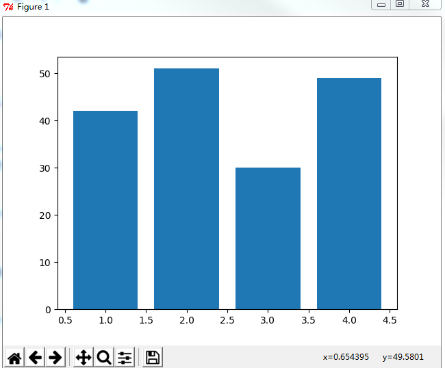
画柱状图十分简单,使用bar方法,比如画一个各个班级的人数吧,先准备一些数据,有两组数据,students为人数,这里放到y坐标系中,变量x就放在x坐标系中
students = [42,51,30,49]
x = [1,2,3,4]
好了,现在我们可以直接画出来,调用bar方法,最后再调用show就能画图啦,代码如下
plt.bar(x=x, height=students)
plt.show()
完整代码如下
#coding:utf-8
import matplotlib.pyplot as plt
students = [42,51,30,49]
x = [1,2,3,4]
plt.bar(x=x, height=students)
plt.show()
效果是这样的
自定义X轴文字
然后我们可以对上面的图进行一些扩充,bar方法里面有很多的参数,比如x轴的数据我们要显示班级,那么我们可以这样
plt.xticks(x, [u"一班", u"二班", u"三班", u"四班"])
如果遇到中文显示方块的问题,原因是字体不支持中文,可以在代码中指定字体
plt.rcParams['font.sans-serif'] = ['simHei']
plt.rcParams['axes.unicode_minus'] = False
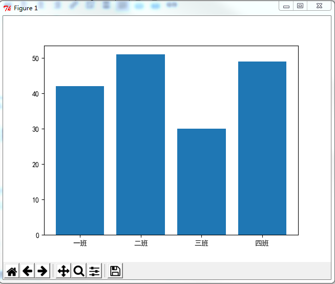
这样就能显示中文了
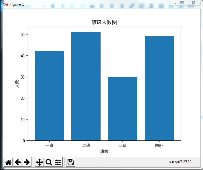
给X轴和Y轴命名以及加上标题
x轴和y轴分别代表什么呢,只看这个图可能会不太清楚,那么我们就给x轴和y轴命名吧,贴上一个label
plt.xlabel(u"班级")
plt.ylabel(u"人数")
plt.title(u"班级人数图")
完整代码如下
#coding:utf-8
import matplotlib.pyplot as plt
#解决中文乱码问题
plt.rcParams['font.sans-serif'] = ['simHei']
plt.rcParams['axes.unicode_minus'] = False
students = [42,51,30,49]
x = [1,2,3,4]
plt.xlabel(u"班级")
plt.ylabel(u"人数")
plt.xticks(x, [u"一班", u"二班", u"三班", u"四班"])
plt.bar(x=x, height=students)
plt.show()
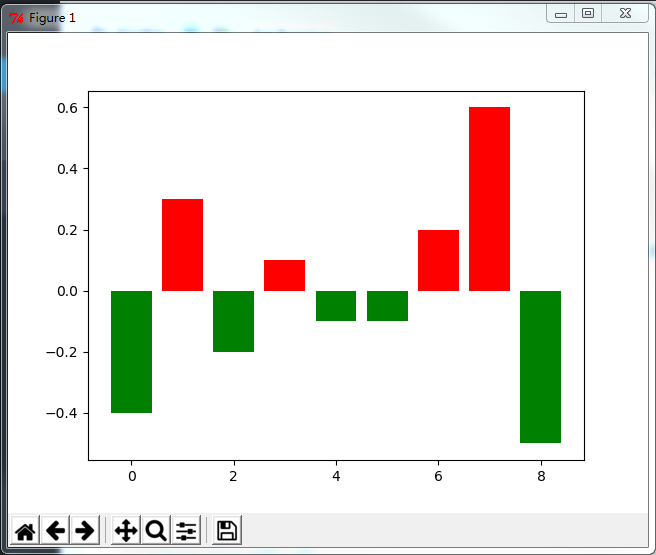
根据以上信息,能够画出绝大部分的柱状图了,下面有一些有意思并且实用的东西,比如说根据柱状图显示股票的资金进出,下面就用自定义颜色来说明吧。
自定义柱状图颜色
现在要准备全新的数据了,首先是Y轴,现在有正负之分了,在x轴上面的颜色上色为红色,x轴下方的上色为绿色
#coding:utf-8
import matplotlib.pyplot as plt
height = [-0.4, 0.3, -0.2, 0.1, -0.1, -0.1, 0.2, 0.6, -0.5]
x = range(0,len(height))
#颜色参数,设定在X轴上方为红色,X轴下方为绿色
colors = []
for i in height:
if i > 0:
colors.append("red")
else:
colors.append("green")
plt.bar(x = x, height=height, color = colors)
plt.show()
结果如下图所示
另外可以给X轴设定自定义文字之类的,上面已经有说明,这里就不演示了。另外附带一下bar的参数表
x : sequence of scalars
the x coordinates of the bars.
align controls if x is the bar center (default) or left edge.
height : scalar or sequence of scalars
the height(s) of the bars
width : scalar or array-like, optional
the width(s) of the bars default: 0.8
bottom : scalar or array-like, optional
the y coordinate(s) of the bars default: None
align : {‘center’, ‘edge’}, optional, default: ‘center’
If ‘center’, interpret the x argument as the coordinates of the centers of the bars. If ‘edge’, aligns bars by their left edges
To align the bars on the right edge pass a negative width and align='edge'
color : scalar or array-like, optional
the colors of the bar faces
edgecolor : scalar or array-like, optional
the colors of the bar edges
linewidth : scalar or array-like, optional
width of bar edge(s). If None, use default linewidth; If 0, don’t draw edges. default: None
tick_label : string or array-like, optional
the tick labels of the bars default: None
xerr : scalar or array-like, optional
if not None, will be used to generate errorbar(s) on the bar chart default: None
yerr : scalar or array-like, optional
if not None, will be used to generate errorbar(s) on the bar chart default: None
ecolor : scalar or array-like, optional
specifies the color of errorbar(s) default: None
capsize : scalar, optional
determines the length in points of the error bar caps default: None, which will take the value from theerrorbar.capsize rcParam.
error_kw : dict, optional
dictionary of kwargs to be passed to errorbar method. ecolor and capsize may be specified here rather than as independent kwargs.
log : boolean, optional
If true, sets the axis to be log scale. default: False
orientation : {‘vertical’, ‘horizontal’}, optional
This is for internal use, please do not directly use this, call barh instead.
The orientation of the bars.
赞赏
 微信赞赏
微信赞赏 支付宝赞赏
支付宝赞赏
python plot画柱状图_matplotlib使用:画柱状图相关推荐
- python画风向杆_matplotlib quiver 画风速风向
一个箭头的组成 quiver几个参数的理解 quiver([X, Y], U, V, [C], **kw),其中kw可供选择的参数有: units:默认值是width, width/heigth:箭头 ...
- python plot如何保存图片_Matplotlib 保存图片、图画接口和显示中文的使用方法
一.保存图片 可以通过savefig()方法,将绘制的图形保存为文件: importnumpy as npimportmatplotlib.pyplot as plt x= np.linspace(0 ...
- python plot画柱状图_python plotly画柱状图
原博文 2019-12-12 18:49 − 代码 import pandas as pd import numpy as np import plotly.plotly as py import p ...
- python 折线图_Python 编程一次画三种图:柱状图、散点图、折线图
Python 编程一次画三种图:柱状图.散点图.折线图 柱状图.散点图.折线图是三种常用数据图,用 Python 能轻易的画出来. #导入必须的库 import matplotlib.pyplot a ...
- 使用python的matplotlib(pyplot)画折线图和柱状图
使用python的matplotlib(pyplot)画折线图和柱状图 今天帮师兄赶在deadline之前画论文的图,现学现卖很是刺激,现把使用matplotlib的子库pyplot画折线图和柱状图的 ...
- python画柱状图和折线图-Python读取Excel表格,并同时画折线图和柱状图的方法
今日给大家分享一个Python读取Excel表格,同时采用表格中的数值画图柱状图和折线图,这里只需要几行代码便可以实. 首先我们需要安装一个Excel操作的库xlrd,这个很简单,在安装Python后 ...
- python用表格中的数据画柱状图_Python数据可视化:5种绘制柱状图表的方法(附源码)...
本文的文字及图片来源于网络,仅供学习.交流使用,不具有任何商业用途,版权归原作者所有,如有问题请及时联系我们以作处理 以下文章来源于数据Magic,作者我不是小样 前言 python里面有很多优秀的可 ...
- python中用matplotlib画多个并列的柱状图(展示3种图)
首先如果柱状图中有中文,比如X轴和Y轴标签需要写中文,解决中文无法识别和乱码的情况,加下面这行代码就可以解决了: plt.rcParams['font.sans-serif'] = ['SimHei' ...
- python用表格中的数据画柱状图_[python]统计excel表格某列中每项出现的次数并画柱状图...
一.需求: 需要统计该列中每个院系的总数并画成柱状图 有三个这样的表格,需要统计这三个表格所有的每个院系的数量 二.步骤: 1.读xls文件 xls_file17 = xl.open_workbook ...
- python使用matplotlib可视化包含倒影的柱状图(bar plot with shadow)、配置rcParams坐标轴正确显示负号(-)
python使用matplotlib可视化包含倒影的柱状图(bar plot with shadow).配置rcParams坐标轴正确显示负号(-) 目录
最新文章
- 10.24,华为鲲鹏要为程序员发福利!
- 网页的手机版本是否值得去做?,互联网营销
- vue按钮字体大小设置_vue-elementui之按钮
- MySql数据库连接池
- linux 抓包文件 导出,tcpdump抓包和scp导出以及Wireshark查看
- java第二章_JAVA第二章知识点
- 了解NearPy,进行快速最近邻搜索
- 雷锋网2012应用下载排行榜
- Java集合框架使用总结
- python :super 的作用
- 行业点评:大疆反腐事件,员工的反驳
- 简单介绍三级分销系统开发源码
- Alienware-17-R2 Ubuntu killer无线网卡
- 网络靶场攻防综合实验
- 360浏览器打不开html5文件,360浏览器打不开oa_打不开360浏览器
- Spring Data JPA/Hibernate 运行期动态模型、动态实体建表、动态字段查询的方式
- Python numpy.testing.assert_warns函数方法的使用
- AtCoder Beginner Contest 266(C- G)「判凸包」「dp」「期望」「基环树」「组合数」
- python用户输入错误重新输入_Python输错4次用户名密码需要输入验证码
- 不狠狠逼一下自己,永远不知道自己有多么强大