CSS3 Box-sizing属性以及解决兼容性的一些做法
CSS3 Box-sizing属性以及解决兼容性的一些做法。
| box-sizing是CSS3的box属性之一。一说到CSS的盒模型(Box model)我想很多人都会比较烦,特别是对于新手,然而这个Box model又是我们CSS运用中比较重要的一个属性。那么CSS3的Box-sizing跟盒模型有什么关系呢?第一句话就说了,Box-sizing是CSS3的Box属性之一,那他当然也遵循CSS的Box model原理,为了能更好的学习和理解这个Box-sizing属性,我们有必要先了解一下CSS中Box model的原理。 |
CSS中Box model是分为两种,第一种是W3C的标准模型,另一种是IE的传统模型,他们相同之处都是对元素计算尺寸的模型,具体说就是对元素的width,height,padding,border以及元素实际尺寸的计算关系;他们不同之处呢?两者的计算方法不一至:
1、W3C的标准Box Model:
/*外盒尺寸计算(元素空间尺寸)*/Element空间高度 = content height + padding + border + marginElement 空间宽度 = content width + padding + border + margin/*内盒尺寸计算(元素大小)*/Element Height = content height + padding + border (Height为内容高度)Element Width = content width + padding + border (Width为内容宽度)
2、IE)传统下Box Model(IE6以下,不含IE6版本或“QuirksMode下IE5.5+”):
/*外盒尺寸计算(元素空间尺寸)*/Element空间高度 = content Height + margin (Height包含了元素内容宽度,边框宽度,内距宽度)Element空间宽度 = content Width + margin (Width包含了元素内容宽度、边框宽度、内距宽度)/*内盒尺寸计算(元素大小)*/Element Height = content Height(Height包含了元素内容宽度,边框宽度,内距宽度)Element Width = content Width(Width包含了元素内容宽度、边框宽度、内距宽度)
其实原则上来说Box Model是分得很细的,我们这里主要分了两个比较明显的地方,就是外盒模型和内合模型,如上面计算公式所示(后面我将会详细介绍一下CSS中的Box Model)。这样说大家可能还不太好理解,下面我们一起来看一个实际的例子,比如说现在有一个叫boxtest的Div,其具有下面一个属性
.boxtest {border: 20px solid;padding: 30px;margin: 30px;background: #ffc;width: 300px;}
我们先来看一下W3C标准浏览器(Firefox,Safari,Chrome,Opera,IE6+)和传统浏览器(IE6以下版本浏览器)的Layout截图
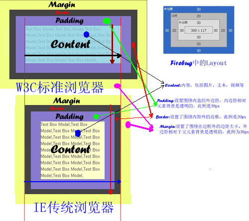
上图中明显可以看出IE6以下版本浏览器的宽度包含了元素的padding,border值,换句话来说在IE6以下版本其内容真正的宽度是(width-padding-boder)。用内外盒来说的话,W3C标准浏览器的内盒宽度等于IE6以下版本浏览器的外盒宽度。这样下来我们就需要在IE6下的版本写Hack统一其内外盒的宽度,关于如何处理这样的兼容问题,我在这里不多说,感兴趣的朋友可以点击这里。那么浏览器发展到今天,世面上用IE6以下的浏览器应该所占比例相当的少,但不排除没有人不在用。所以目前浏览器大部分元素都是基于W3C标准的Box Model上,但对于form中的有部分元素还是基于传统的Box Model上,比如说input中的submit,reset,button和select等元素,这样如果我们给其设置border和padding他也只会往内延伸。关于如何处理form中的这些元素,今日将会借此机会和大定一起探讨一下,那么现在我们还是先回到今天的正题上。
上面简单让大家对CSS的Box Model有了一个初步的概念(如果想了解更多的Box Model相关知识,可以点击W3C Box Model,另外在这里有中文版)。下面开始我们今天的主题——CSS3的Box-sizing。
语法:
box-sizing : content-box || border-box || inherit
取值说明
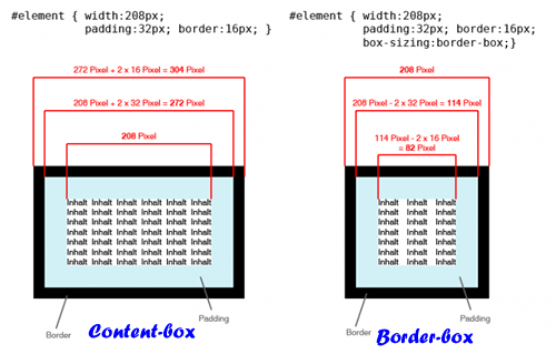
1、content-box:此值为其默认值,其让元素维持W3C的标准Box Model,也就是说元素的宽度/高度(width/height)等于元素边框宽度(border)加上元素内边距(padding)加上元素内容宽度/高度(content width/height)即:Element Width/Height = border+padding+content width/height。
2、border-box:此值让元素维持IE传统的Box Model(IE6以下版本),也就是说元素的宽度/高度等于元素内容的宽度/高度。(从上面Box Model介绍可知,我们这里的content width/height包含了元素的border,padding,内容的width/height【此处的内容宽度/高度=width/height-border-padding】)。
为了更能形像看出box-sizing中content-box和border-box两者的区别,我们先简单来看一人示例图,如下所示:
兼容浏览器
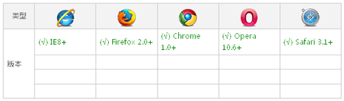
box-sizing现代浏览器都支持,但IE家族只有IE8版本以上才支持,虽然现代浏览器支持box-sizing,但有些浏览器还是需要加上自己的前缀,Mozilla需要加上-moz-,Webkit内核需要加上-webkit-,Presto内核-o-,IE8-ms-,所以box-sizing兼容浏览器时需要加上各自的前缀:
Element {-moz-box-sizing: content-box; -webkit-box-sizing: content-box; -o-box-sizing: content-box; -ms-box-sizing: content-box; box-sizing: content-box; }Element {-moz-box-sizing: border-box; -webkit-box-sizing: border-box; -o-box-sizing: border-box; -ms-box-sizing: border-box; box-sizing: border-box; }
上面主要介绍了box-sizing的理论知识,我们还是理论和实践结合吧,下面就一起先来看一个简单点的例子:
HTML Code:
<<span class="title" style="margin-left: 60px; color: rgb(38, 139, 210);">div class="imgBox" id="contentBox"><<span class="title" style="margin-left: 60px; color: rgb(38, 139, 210);">img src="/images/header.jpeg" alt="" /></<span class="title" style="margin-left: 60px; color: rgb(38, 139, 210);">div><<span class="title" style="margin-left: 60px; color: rgb(38, 139, 210);">div class="imgBox" id="borderBox"><<span class="title" style="margin-left: 60px; color: rgb(38, 139, 210);">img src="/images/header.jpeg" alt="" /></<span class="title" style="margin-left: 60px; color: rgb(38, 139, 210);">div>
CSS Code:
.imgBox img{width: 140px;height: 140px;padding: 20px;border: 20px solid orange;margin: 10px;}#contentBox img{-moz-box-sizing: content-box;-webkit-box-sizing: content-box;-o-box-sizing: content-box;-ms-box-sizing: content-box;box-sizing: content-box; }#borderBox img{-moz-box-sizing: border-box;-webkit-box-sizing: border-box;-o-box-sizing: border-box;-ms-box-sizing: border-box;box-sizing: border-box;}
效果:

上面效果图让大家很明显的区分开了content-box和border-box的区别了,为了更好的理解,我截了一份他们在Firebug下的一layout分析图:
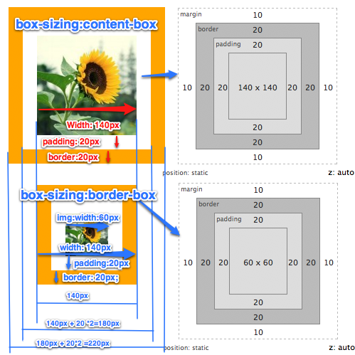
Layout分析图再次证明了box-sizing:content-box是维持了W3C的标准Box Model,而box-sizing:border-box是维持了IE传统(IE怪异模式)下的Box Model。其两者区别我在这就不多说了,因为前面说的很清楚了,如果还有不清楚的同学,只要仔细看一下上面那张Layout分析图,我想你会恍惚大悟的。那么box-sizing主要运用在哪些方面呢?我总结了一下,第一点就是我们布局上,第二点就是表单元素上。为什么呢?我想大家在平时布局中都有碰到当两个块元素的宽度刚好是其父元素总宽度时我们布局不会有任何问题,但当你在其中一个块加上padding或border时(哪怕是1px)整个布局就会完全打乱,因为其总宽度超过了父元素的宽度。第二点表单元素,前面我提到过,form有很多元素还是使用的IE传统Box Model,针对这两点,box-sizing将在其身上发挥强大的作用,下面我们分别来看看box-sizing在这两方面的运用:
一、box-sizing拯救我们的布局
为了能更好的说明问题,我们先来模仿一个两栏布局,先来看其HTML Code:
<<span class="title" style="margin-left: 60px; color: rgb(38, 139, 210);">div class="layoutDemo"><<span class="title" style="margin-left: 60px; color: rgb(38, 139, 210);">div id="header" class="innerPadding border">Header Content</<span class="title" style="margin-left: 60px; color: rgb(38, 139, 210);">div><<span class="title" style="margin-left: 60px; color: rgb(38, 139, 210);">div id="content" class="clearfix"><<span class="title" style="margin-left: 60px; color: rgb(38, 139, 210);">div id="left" class="aside innerPadding border">Left Sidebar</<span class="title" style="margin-left: 60px; color: rgb(38, 139, 210);">div>;<<span class="title" style="margin-left: 60px; color: rgb(38, 139, 210);">div id="main-content" class="article innerPadding border">Main Content</<span class="title" style="margin-left: 60px; color: rgb(38, 139, 210);">div></<span class="title" style="margin-left: 60px; color: rgb(38, 139, 210);">div><<span class="title" style="margin-left: 60px; color: rgb(38, 139, 210);">div id="footer" class="innerPadding border"> Footer Content</<span class="title" style="margin-left: 60px; color: rgb(38, 139, 210);">div></<span class="title" style="margin-left: 60px; color: rgb(38, 139, 210);">div>
简单的分析一下,这里把LayoutDemo的div当作我们页中的body,而div#header是页面头部,div#left是页面左边栏,div#main-content是页面主内容,div#footer是页面的页脚,下面我们来模仿一个960的布局(比例缩小一半),我们加上平时布局的样式上去:
.layoutDemo {width: 960px;background: #000; }#header {width: 100%;background: orange;}#left {width: 220px;float: left;margin-right: 20pxbackground: green;}#main-content {width: 720px;float: left;background: gray;}#footer {width: 100%;background: red;}
效果:
到目前布局来说一点问题都没有,那是因为我们子元素宽度加起来刚好与元素的是相等,那么我们现在来变动一下,如果根据设计需要,每个块中内容都离边缘有10px的距离,那么我们先来看看基header,left,main-content,footer这几个块加一个padding:10px,看看有什么变化:
.innerPadding {padding: 10px;}
效果:

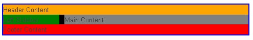
上图清晰告诉我们,加了一个padding,恶梦就开始来了,header,footer撑破容器伸出去了,main-content也被掉到left的下面了。跟刚才当初的效果可是完全不一样的呀,有人可能会问,如果我不使用padding我只使用border什么怎么样呢?大家猜猜会怎么样?不用猜了,马上换个代码给大家看看,我们只要把刚才的padding注掉换成border,如下所示:
.border {border: 10px solid yellow;}
效果:

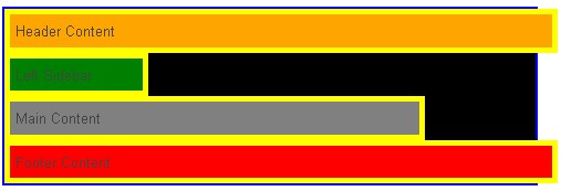
上图是去掉了padding只加了10px的边框,同样把布局给打乱了。接着把padding和border同时加进去,反正都撑破了布局,就破罐子破摔。加上的效果如下:
不上我说,大家都知道上图是因为加上了padding和border把布局给打乱了,下面主要看如何用box-sizing来修复这个撑破的布局,前面介绍了,上图中box-sizing是取了其默认值content-box,其Box Model完全符合W3C的标准,为了修复这样的布局,我们需要把Box Model改用IE传统下的解析,这样一加,我们给他加上下面box-sizing属性:
.box-sizing {-moz-box-sizing: border-box;-webkit-box-sizing: border-box;-o-box-sizing: border-box;-ms-box-sizing: border-box;box-sizing: border-box;}
效果:
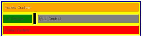
通过box-sizing:border-box改变了Box Model后,布局神奇般的好了,记得以前为了处理这样的问题,我们需要改变box的宽度或者在box里面在嵌套一个div,在里面的div中增加padding和border来达到这样的效果。从今天开始,我们不需要那样做了,我们只要通过box-sizing:border-box来改变Box Model回到IE的传统模式下,就可以实现了,只是有一点遗憾的是,我们IE6和IE7不支持,如果为了达到一致的效果,在加上你知道CSS Hack如何写,这样也并不难,你只要让IE6和IE7的宽度改变一下,也能达到效果:
#left {*width:180px; }#right {*width: 680px;}
通过上面的hack,我们在IE6和IE7下也能正常显示我们的布局需求。但是大家说讨厌CSS Hack,不想写,那么大家在项目中运用时不得不要考虑一下,但对于我们学习CSS3的box-sizing来说是没有大碍的。
二、Box-sizing统一form元素风格
前面简单提到form有些input还是支持IE传统下的Box Model标准,比如说【type="submit"】、【type="reset"】、button、select等,然在搜索box-sizing属性使用时偶尔发现Roger Johansson早在2004年就发表了一篇关于表单元素样式测试的文章《Styling form controls》。他告诉我们如果用样式来控制表单元素在各浏览器下的显示效果是很难,如果还要兼容各系统下的效果更是难上加难。除非使用UI去制作。那么今天我们就要来看看用box-sizing如何来让他们达到一致效果:今天我们只要来测试一下submit,reset,button,section,input[type="text"]几个元素,下面我们先来看其默认状态下的效果(模式是在):
Html Code:
<<span class="title" style="margin-left: 60px; color: rgb(38, 139, 210);">form action="#" method="post"><<span class="title" style="margin-left: 60px; color: rgb(38, 139, 210);">div class="form-field"><<span class="title" style="margin-left: 60px; color: rgb(38, 139, 210);">input type="submit" value="submit" class="submit" /></<span class="title" style="margin-left: 60px; color: rgb(38, 139, 210);">div><<span class="title" style="margin-left: 60px; color: rgb(38, 139, 210);">div class="form-field"><<span class="title" style="margin-left: 60px; color: rgb(38, 139, 210);">input type="reset" value="reset" class="reset" /></<span class="title" style="margin-left: 60px; color: rgb(38, 139, 210);">div><<span class="title" style="margin-left: 60px; color: rgb(38, 139, 210);">div class="form-field"><<span class="title" style="margin-left: 60px; color: rgb(38, 139, 210);">button class="button">button</<span class="title" style="margin-left: 60px; color: rgb(38, 139, 210);">button></<span class="title" style="margin-left: 60px; color: rgb(38, 139, 210);">div><<span class="title" style="margin-left: 60px; color: rgb(38, 139, 210);">div class="form-field"><<span class="title" style="margin-left: 60px; color: rgb(38, 139, 210);">input type="text" value="text" class="text" /></<span class="title" style="margin-left: 60px; color: rgb(38, 139, 210);">div><<span class="title" style="margin-left: 60px; color: rgb(38, 139, 210);">div class="form-field"><<span class="title" style="margin-left: 60px; color: rgb(38, 139, 210);">select name="select" id="select" class="select"><<span class="title" style="margin-left: 60px; color: rgb(38, 139, 210);">option value="1">1980</<span class="title" style="margin-left: 60px; color: rgb(38, 139, 210);">option></<span class="title" style="margin-left: 60px; color: rgb(38, 139, 210);">select></<span class="title" style="margin-left: 60px; color: rgb(38, 139, 210);">div><<span class="title" style="margin-left: 60px; color: rgb(38, 139, 210);">div class="form-field"><<span class="title" style="margin-left: 60px; color: rgb(38, 139, 210);">input type="checkbox" class="checkbox" />checkbox</<span class="title" style="margin-left: 60px; color: rgb(38, 139, 210);">div><<span class="title" style="margin-left: 60px; color: rgb(38, 139, 210);">div class="form-field"><<span class="title" style="margin-left: 60px; color: rgb(38, 139, 210);">input type="radio" class="radio" />radio</<span class="title" style="margin-left: 60px; color: rgb(38, 139, 210);">div><<span class="title" style="margin-left: 60px; color: rgb(38, 139, 210);">div class="form-field"><<span class="title" style="margin-left: 60px; color: rgb(38, 139, 210);">textarea name="textarea" id="" cols="30" rows="3" class="textarea"></<span class="title" style="margin-left: 60px; color: rgb(38, 139, 210);">textarea></<span class="title" style="margin-left: 60px; color: rgb(38, 139, 210);">div></<span class="title" style="margin-left: 60px; color: rgb(38, 139, 210);">form>
CSS Code
<<span class="title" style="margin-left: 60px; color: rgb(38, 139, 210);">style type="text/css">body {font-size: 12px;}form {width: 200px;margin: 20px auto;padding: 10px;border: 1px solid #ccc;}.form-field {margin-bottom: 5px;background: #cdcdcd;padding: 2px;}.submit,.reset,.button,.text,.select,.textarea {width: 80px;border-color: red;}.textarea {resize: none;}</<span class="title" style="margin-left: 60px; color: rgb(38, 139, 210);">style>
我们来看其效果,我在效果截图中附上各个部分在firebug下的layout图:
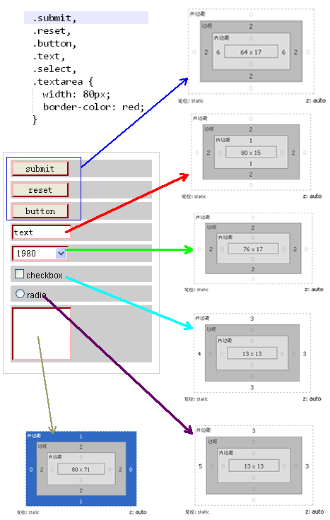
DOM元素的Layout图明显告诉我们:
1、【type="submit"】、【type="reset"】、button、【type="text"】、select、textarea默认情况下都带有2px的border;
2、【type="submit"】、【type="reset"】、button默认情况下会有6px的左右padding;height在mac系统下会比在winxp win7系统下少1px,只有16px,(12px的字体时高度为17px);
3、【type="text"】默认情况下会有1px的上下padding;WinXP和Win7下高度为15px,Mac系统下为14px
4、【type="checkbox"】默认情况下会有margin:3px 3px 3px 4px,并且宽/高度默认为13px(IE6,IE7默认大约是15px,Mac系统下只有9px)
5、【type="radio"】默认情况下会有margin: 3px 3px 0 5px的外边,并且宽/高度默认为13px(IE6,IE7默认大约是15px,Mac系统下只有9px)
6、textarea默认情况带有1px的上下margin;
最后要说的一点是,上面那些常用的form元素只有【type="text"】和textarea两者是遵循W3C的标准Box Model,而其他几个都是还是遵循IE传统下的Box Model。下面我们在把CSS修改一下,我们把margin、padding和border都统一一下。
.submit,.reset,.button,.text,.select,.textarea,.checkbox,.radio {margin: 0;padding: 0;border-width: 1px;}
同样我们来看看其各元素在firebug下的Layout分析图:
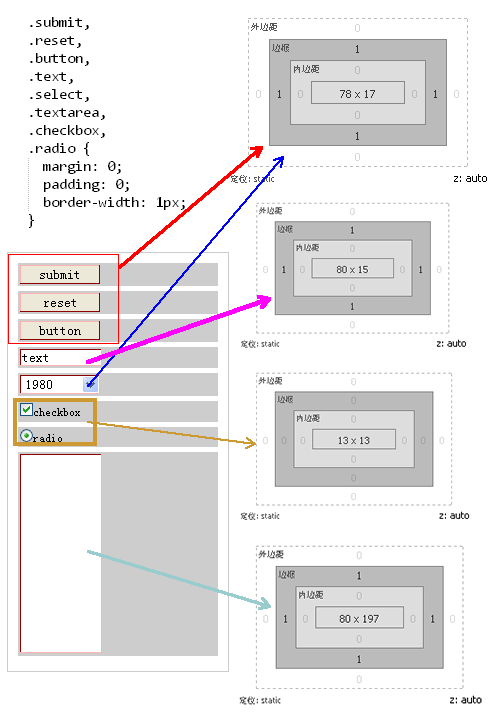
Layout图告诉我们,其margin,border,padding现在都统一了,宽度只有【type="checkbox"】和【type="radio"】在不同的系统和浏览器会解析不一样,最明显的上面也说过了,这两个表单元素在IE6和IE7下的宽、高度都是15px,而在Mac系统下是9px,但在WinXP/Win7的Firefox下又是13px,这样给我们在线上的显示效果完全带来了不一样的风格,这也是大家头痛的一个地方;另外还有一点需要说明的一点是,别然在上面的Layout中分析【type="submit"】、【type="reset"】、button的宽度一样,但是在IE6-7之中会随着内容显示不同而宽度不同,关于这个问题大家可以参考前面我写的另一篇文章《input 按钮在IE下兼容问题》。然而最让我们头痛的是表单元素的高度问题,前面也提到过了,在Mac系统下各种表单元素的高度都会比Win系列下少1px,这样给我们也带来很大的烦恼。我在网站搜索,看到nwind写了一篇《如何更好地控制input输入框的高度》,作者拿了【type="text"】做了很仔细的分析,另外Roger Johansson的《Controlling width with CSS3 box-sizing》一文也做过详细的分析。从这两篇文章得知解决这样的兼容问题我们可以使用CSS3的box-sizing的border-box属性。下面我截取【type="text"】的解决高度不一到致的方法,运用到表单元素上来
.submit,.reset,.button,.text,.select,.textarea,.checkbox,.radio {margin: 0;padding: 0;border-width: 1px;height: 17px;-moz-box-sizing: border-box;-webkit-box-sizing: border-box;-o-box-sizing: border-box;-ms-box-sizing: border-box;box-sizing: border-box;}.checkbox,.radio {width: 13px;height: 13px;-moz-box-sizing: border-box;-webkit-box-sizing: border-box;-o-box-sizing: border-box;-ms-box-sizing: border-box;box-sizing: border-box;}
我们来看看加上了box-sizing:border-box的layout分析图:
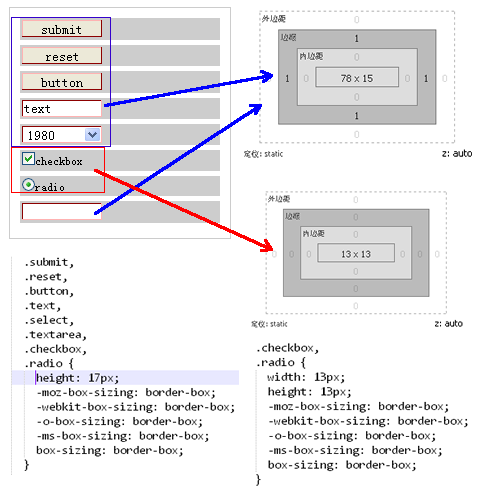
从Layout图明显的可以看出,现在元素的参数都统一了,但是IE6和IE7是不支持box-sizing的属性,所以为了兼容我们还需要为他们写一个hack:
.submit,.reset,.button,.text,.select,.textarea,.checkbox,.radio {margin: 0;padding: 0;border-width: 1px;height: 17px;-moz-box-sizing: border-box;-webkit-box-sizing: border-box;-o-box-sizing: border-box;-ms-box-sizing: border-box;box-sizing: border-box;*height:15px; *width: 15px;}
上面详细介绍了form元素如何使用box-sizing来解决浏览器兼容问题。需要提醒大家一点的是,如果你在样式中没有对border进行设置的话,那么表单中除了checkbox和radio外默认都是2px的border,这样一来你的宽度和高度在都要相应的减去4px。
CSS3 Box-sizing属性以及解决兼容性的一些做法相关推荐
- html5调盒子边框大小,CSS3 - 盒子大小(CSS3 - Box Sizing)
CSS3 - 盒子大小(CSS3 - Box Sizing) Box大小调整属性用于更改元素的高度和宽度. 从css2开始,box属性的工作方式如下所示 -width + padding + bord ...
- 在less中不能正常使用css3的calc属性的解决方法
在less中不能正常使用css3的calc属性的解决方法 参考文章: (1)在less中不能正常使用css3的calc属性的解决方法 (2)https://www.cnblogs.com/zhaozh ...
- css3 calc()自适应布局属性 ---浏览器版本兼容性的问题
"无意中发现了一个巨牛的人工智能教程,忍不住分享一下给大家.教程不仅是零基础,通俗易懂,而且非常风趣幽默,像看小说一样!觉得太牛了,所以分享给大家.点这里可以跳转到教程." 我们想 ...
- CSS盒子模型之CSS3可伸缩框属性(Flexible Box)
CSS盒子模型(下) 一.CSS3可伸缩框(Flexible Box) 可伸缩框属性(Flexible Box)是css3新添加的盒子模型属性,有人称之为弹性盒模型,它的出现打破了我们经常使用的浮动布 ...
- Shadow属性和【CSS3 Box Shadow(阴影)效果在线调试工具】
Shadow属性示例 向内/向外 | x偏移量 | y偏移量 | 阴影模糊半径 | 阴影扩散半径 | 阴影颜色 inset 阴影向内 (默认向外) /* x偏移量 | y偏移量 | 阴影颜色 */ b ...
- 半深入理解CSS3 object-position/object-fit属性
半深入理解CSS3 object-position/object-fit属性 转载:https://www.zhangxinxu.com/wordpress/2015/03/css3-object-p ...
- html表格如何两段对齐,用css3多列属性实现css两端对齐
要实现css两端对齐,我在网上找了很多方法,都不怎么实用,都是兼容性闹得,column是css3的属性,是多列布局,使用column来实现两端对齐简单实用,就要设置下模块的个数跟column的列数一致 ...
- 浅谈CSS3中display属性的Flex布局,关于登陆页面属性框的设置
声明:本文转发自三里屯柯南的浅谈CSS3中display属性的Flex布局http://www.cnblogs.com/xuyuntao/articles/6391728.html 基本概念 采用Fl ...
- win10环境下安装VB(解决兼容性问题)
关于很多人遇到win10无法安装VB的问题,主要是由于兼容性的问题,在这里就简单的说一下解决方法: 打开vb所在文件夹,找到vb6.exe程序,右键"属性",找到兼容性,勾选其中以 ...
- 瀑布流布局:CSS3多列属性column实现
使用CSS3多列属性所踩得坑 多列属性会将容器平分成对应设置列数 如图:column-count: 2, 会将容器分成两列.需要注意:每列之间会有个默认间距,大概是16px,间隔如图红线所处的空白空间 ...
最新文章
- bzoj 2435: [Noi2011]道路修建 树上 dp
- Python 字典初始化dict()和{}
- JAVA-2NIO之Channel
- Tracing mysqld Using DTrace
- Java Object 类 深入分析
- Nginx+Tomcat负载均衡群集
- 为什么AI需要的是角色扮演,而不是象棋和围棋?
- unity3d多个版本共存
- 人工神经网络分为哪两类,人工神经网络包括哪些
- 得了骨关节炎不能吃什么?
- Linux运维——Vim编辑器
- Github 上 lux 下载神器的安装及使用教程
- 工作室转型做什么好项目?
- matlab神经网络函数(feedforwardnet,fitnet,patternet)
- 如何在CSDN写笔记_写笔记前的插件安装
- 三菱服务器显示003C,三菱电机空调出现故障代码大全及原因
- 安卓逆向从入门到嗝屁之另一道CTF题目
- js点击缩略图,整屏居中放大图片
- JQuery的一个插件boxy
- pytorch深度学习框架——实现病虫害图像分类