React Native布局
一款好的APP离不了一个漂亮的布局,本文章将向大家分享React Native中的布局方式FlexBox。
在React Native中布局采用的是FleBox(弹性框)进行布局。
FlexBox提供了在不同尺寸设备上都能保持一致的布局方式。FlexBox是CSS3弹性框布局规范,目前还处于最终征求意见稿 (Last Call Working Draft)阶段,并不是所有的浏览器都支持Flexbox。但大家在做React Native开发时大可不必担心FlexBox的兼容性问题,因为既然React Native选择用FlexBox布局,那么React Native对FlexBox的支持自然会做的很好。
宽和高
在学习FlexBox之前首先要清楚一个概念“宽和高”。一个组件的高度和宽度决定了它在屏幕上的尺寸,也就是大小。
像素无关
在React Native中尺寸是没有单位的,它代表了设备独立像素。
<View style={ {width:100,height:100,margin:40,backgroundColor:'gray'}}> <Text style={ {fontSize:16,margin:20}}>尺寸</Text> </View> 上述代码,运行在Android上时,View的长和宽被解释成:100dp 100dp单位是dp,字体被解释成16sp 单位是sp,运行在iOS上时尺寸单位被解释称了pt,这些单位确保了布局在任何不同dpi的手机屏幕上显示不会发生改变;
和而不同
值得一提的是,React Native中的FlexBox 和Web CSSS上FlexBox工作方式是一样的。但有些地方还是有些出入的,如:
React Native中的FlexBox 和Web CSSS上FlexBox的不同之处
- flexDirection: React Native中默认为
flexDirection:'column',在Web CSS中默认为flex-direction:'row' - alignItems: React Native中默认为
alignItems:'stretch',在Web CSS中默认align-items:'flex-start' - flex: 相比Web CSS的flex接受多参数,如:
flex: 2 2 10%;,但在 React Native中flex只接受一个参数 - 不支持属性:align-content,flex-basis,order,flex-basis,flex-flow,flex-grow,flex-shrink
以上是React Native中的FlexBox 和Web CSSS上FlexBox的不同之处,记住这几点,你可以像在Web CSSS上使用FlexBox一样,在React Native中使用FlexBox。
Layout Props
Flex in React Native
以下属性是React Native所支持的Flex属性。
父视图属性(容器属性):
- flexDirection enum(‘row’, ‘column’,’row-reverse’,’column-reverse’)
- flexWrap enum(‘wrap’, ‘nowrap’)
- justifyContent enum(‘flex-start’, ‘flex-end’, ‘center’, ‘space-between’, ‘space-around’)
- alignItems enum(‘flex-start’, ‘flex-end’, ‘center’, ‘stretch’)
主轴和侧轴(横轴和竖轴)
在学习上述属性之前,让我们先了解一个概念:主轴和侧轴

主轴即水平方向的轴线,可以理解成横轴,侧轴垂直于主轴,可以理解为竖轴。
flexDirection
flexDirection enum('row', 'column','row-reverse','column-reverse')
flexDirection属性定义了父视图中的子元素沿横轴或侧轴方片的排列方式。
- row: 从左向右依次排列
- row-reverse: 从右向左依次排列
- column(default): 默认的排列方式,从上向下排列
- column-reverse: 从下向上排列
Usage:
<View style={ {flexDirection:'row-reverse',backgroundColor:"darkgray",marginTop:20}}> <View style={ {width:40,height:40,backgroundColor:"darkcyan",margin:5}}> <Text style={ {fontSize:16}}>1</Text> </View> <View style={ {width:40,height:40,backgroundColor:"darkcyan",margin:5}}> <Text style={ {fontSize:16}}>2</Text> </View> <View style={ {width:40,height:40,backgroundColor:"darkcyan",margin:5}}> <Text style={ {fontSize:16}}>3</Text> </View> <View style={ {width:40,height:40,backgroundColor:"darkcyan",margin:5}}> <Text style={ {fontSize:16}}>4</Text> </View> </View> 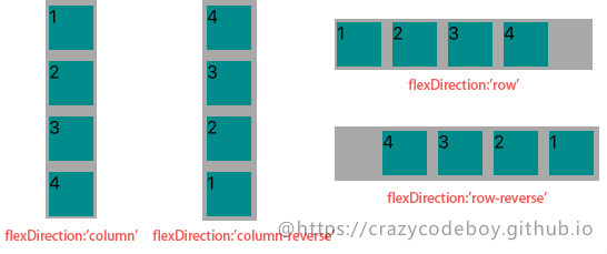
flexWrap
flexWrap enum('wrap', 'nowrap')
flexWrap属性定义了子元素在父视图内是否允许多行排列,默认为nowrap。
- nowrap flex的元素只排列在一行上,可能导致溢出。
- wrap flex的元素在一行排列不下时,就进行多行排列。
Usage:
<View style={ {flexWrap:'wrap',flexDirection:'row',backgroundColor:"darkgray",marginTop:20}}> ··· </View> 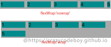
justifyContent
justifyContent enum('flex-start', 'flex-end', 'center', 'space-between', 'space-around')
justifyContent属性定义了浏览器如何分配顺着父容器主轴的弹性(flex)元素之间及其周围的空间,默认为flex-start。
- flex-start(default) 从行首开始排列。每行第一个弹性元素与行首对齐,同时所有后续的弹性元素与前一个对齐。
- flex-end 从行尾开始排列。每行最后一个弹性元素与行尾对齐,其他元素将与后一个对齐。
- center 伸缩元素向每行中点排列。每行第一个元素到行首的距离将与每行最后一个元素到行尾的距离相同。
- space-between 在每行上均匀分配弹性元素。相邻元素间距离相同。每行第一个元素与行首对齐,每行最后一个元素与行尾对齐。
- space-around 在每行上均匀分配弹性元素。相邻元素间距离相同。每行第一个元素到行首的距离和每行最后一个元素到行尾的距离将会是相邻元素之间距离的一半。
Usage:
<View style={ {justifyContent:'center',flexDirection:'row',backgroundColor:"darkgray",marginTop:20}}> ··· </View> 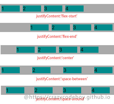
alignItems
alignItems enum('flex-start', 'flex-end', 'center', 'stretch')
alignItems属性以与justify-content相同的方式在侧轴方向上将当前行上的弹性元素对齐,默认为stretch。
- flex-start 元素向侧轴起点对齐。
- flex-end 元素向侧轴终点对齐。
- center 元素在侧轴居中。如果元素在侧轴上的高度高于其容器,那么在两个方向上溢出距离相同。
- stretch 弹性元素被在侧轴方向被拉伸到与容器相同的高度或宽度。
Usage:
<View style={ {justifyContent:'center',flexDirection:'row',backgroundColor:"darkgray",marginTop:20}}> ··· </View> 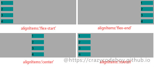
子视图属性
- alignSelf enum(‘auto’, ‘flex-start’, ‘flex-end’, ‘center’, ‘stretch’)
- flex number
alignSelf
alignSelf enum('auto', 'flex-start', 'flex-end', 'center', 'stretch')
alignSelf属性以属性定义了flex容器内被选中项目的对齐方式。注意:alignSelf 属性可重写灵活容器的 alignItems 属性。
- auto(default) 元素继承了它的父容器的 align-items 属性。如果没有父容器则为 “stretch”。
- stretch 元素被拉伸以适应容器。
- center 元素位于容器的中心。
- flex-start 元素位于容器的开头。
- flex-end 元素位于容器的结尾。
Usage:
<View style={ {alignSelf:'baseline',width:60,height: 20,backgroundColor:"darkcyan",margin:5}}> <Text style={ {fontSize:16}}>1</Text> </View> ... 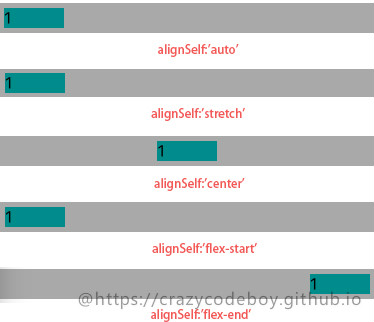
flex
flex number
flex 属性定义了一个可伸缩元素的能力,默认为0。 >
Usage:
<View style={ {flexDirection:'row',height:40, backgroundColor:"darkgray",marginTop:20}}> <View style={ {flex:1,backgroundColor:"darkcyan",margin:5}}> <Text style={ {fontSize:16}}>flex:1</Text> </View> <View style={ {flex:2,backgroundColor:"darkcyan",margin:5}}> <Text style={ {fontSize:16}}>flex:2</Text> </View> <View style={ {flex:3,backgroundColor:"darkcyan",margin:5}}> <Text style={ {fontSize:16}}>flex:3</Text> </View> </View> 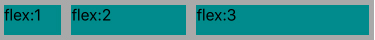
其他布局 in React Native
以下属性是React Native所支持的除Flex以外的其它布局属性。
视图边框
- borderBottomWidth number 底部边框宽度
- borderLeftWidth number 左边框宽度
- borderRightWidth number 右边框宽度
- borderTopWidth number 顶部边框宽度
- borderWidth number 边框宽度
border<Bottom Left Right Top>Color 个方向边框的颜色 - borderColor 边框颜色
尺寸
- width number
- height number
外边距
- margin number 外边距
- marginBottom number 下外边距
- marginHorizontal number 左右外边距
- marginLeft number 左外边距
- marginRight number 右外边距
- marginTop number 上外边距
- marginVertical number 上下外边距
内边距
- padding number 内边距
- paddingBottom number 下内边距
- paddingHorizontal number 左右内边距
- paddingLeft number 做内边距
- paddingRight number 右内边距
- paddingTop number 上内边距
- paddingVertical number 上下内边距
边缘
- left number 属性规定元素的左边缘。该属性定义了定位元素左外边距边界与其包含块左边界之间的偏移。
- right number 属性规定元素的右边缘。该属性定义了定位元素右外边距边界与其包含块右边界之间的偏移
- top number 属性规定元素的顶部边缘。该属性定义了一个定位元素的上外边距边界与其包含块上边界之间的偏移。
- bottom number 属性规定元素的底部边缘。该属性定义了一个定位元素的下外边距边界与其包含块下边界之间的偏移。
定位(position)
position enum(‘absolute’, ‘relative’)属性设置元素的定位方式,为将要定位的元素定义定位规则。
- absolute:生成绝对定位的元素,元素的位置通过 “left”, “top”, “right” 以及 “bottom” 属性进行规定。
- relative:生成相对定位的元素,相对于其正常位置进行定位。因此,”left:20” 会向元素的 LEFT 位置添加 20 像素。
水平垂直居中
水平居中用alignItems, 垂直居中用justifyContent
<Text style={[styles.text, styles.header]}>水平居中</Text><View style={{height: 100, backgroundColor: '#333333', alignItems: 'center'}}><View style={{backgroundColor: '#fefefe', width: 30, height: 30, borderRadius: 15}}/></View><Text style={[styles.text, styles.header]}>垂直居中</Text><View style={{height: 100, backgroundColor: '#333333', justifyContent: 'center'}}><View style={{backgroundColor: '#fefefe', width: 30, height: 30, borderRadius: 15}}/></View><Text style={[styles.text, styles.header]}>水平垂直居中</Text><View style={{height: 100, backgroundColor: '#333333', alignItems: 'center', justifyContent: 'center'}}><View style={{backgroundColor: '#fefefe', width: 30, height: 30, borderRadius: 15}}/></View>
左边固定, 右边固定,中间flex的布局
<View style={styles.flexContainer}><View style={styles.cellfixed}><Text style={styles.welcome}>fixed</Text></View><View style={styles.cell}><Text style={styles.welcome}>flex</Text></View><View style={styles.cellfixed}><Text style={styles.welcome}>fixed</Text></View></View>styles = {flexContainer: {// 容器需要添加direction才能变成让子元素flexflexDirection: 'row'},cell: {flex: 1,height: 50,backgroundColor: '#aaaaaa'},welcome: {fontSize: 20,textAlign: 'center',margin: 10},cellfixed: {height: 50,width: 80,backgroundColor: '#fefefe'} }
绝对定位和相对定位
<View style={{flex: 1, height: 100, backgroundColor: '#333333'}}><View style={[styles.circle, {position: 'absolute', top: 50, left: 180}]}></View></View>styles = {circle: {backgroundColor: '#fe0000',borderRadius: 10,width: 20,height: 20}}
<View style={{flex: 1, height: 100, backgroundColor: '#333333'}}><View style={[styles.circle, {position: 'relative', top: 50, left: 50, marginLeft: 50}]}></View></View>
在相对定位中,可以配合使用margin。
参考
A Complete Guide to Flexbox
Using CSS flexible boxes
Layout with Flexbox
Layout Props
转载于:https://www.cnblogs.com/franson-2016/p/6931305.html
React Native布局相关推荐
- React Native布局详细指南
本文出自<React Native学习笔记>系列文章. 一款好的APP离不了一个漂亮的布局,本文章将向大家分享React Native中的布局方式FlexBox. 在React Nati ...
- 从web移动端布局到react native布局
在web移动端通常会有这样的需求,实现上中下三栏布局(上下导航栏位置固定,中间部分内容超出可滚动),如下图所示: 实现方法如下: HTML结构: <div class='container'&g ...
- 构建了我的第一个React Native应用程序之后,我现在确信这是未来。
by Taylor Milliman 泰勒·米利曼(Taylor Milliman) 构建了我的第一个React Native应用程序之后,我现在确信这是未来. (After building my ...
- React Native开发指南-在原生和React Native间通信
通过植入原生应用和原生UI组件两篇文档,我们学习了React Native和原生组件的互相整合.在整合的过程中,我们会需要在两个世界间互相通信.有些方法已经在其他的指南中提到了,这篇文章总结了所有可行 ...
- React Native初探
React Native初探 转自:博客园 叶小钗 前言 很久之前就想研究React Native了,但是一直没有落地的机会,我一直认为一个技术要有落地的场景才有研究的意义,刚好最近迎来了新的APP ...
- React Native for Android 实践 — 实现知乎日报客户端
React Native for Android 的发布,对一个 Android 开发者来说还是有相当的吸引力的.通过前面这篇博客:React Native for Android 入门老虎好不容易入 ...
- React Native之React速学教程
本文出自<React Native学习笔记>系列文章. React Native是基于React的,在开发React Native过程中少不了的需要用到React方面的知识.虽然官方也有相 ...
- React Native 学习资源精选仓库
<React Native Awesome>这里fork过来的,汇集了各类react-native学习资料.工具.组件.开源App.资源下载.以及相关新闻等,只求精不求全.因后面无法 Pu ...
- React Native 学习资源精选仓库(汇聚知识,分享精华)
React Native 学习资源精选仓库(汇聚知识,分享精华) <React Native Awesome>这里fork过来的,汇集了各类react-native学习资料.工具.组件.开 ...
最新文章
- 【树形DP】树的重心详解+多组例题详解
- 【数据库学习笔记】——操作sqlite(增删改查)以及cursor的方法介绍
- HTML特殊符号/特殊字符
- 湖畔大学最新学员名单公布:胡彦斌以纽班文化董事长身份被录取
- noip2010乌龟棋解题报告
- ios共享账号公众号_新增iOS应用账号共享09
- Python 条件语句(If else)
- PET,CT图像融合笔记
- Android 定时获取上下行流量数据
- 高级篇之使用ENC编码器实现USBCam摄像头竖屏直播的方法
- 无极性电容的定义及应用
- 计算机输入法无法启动,win7电脑开机没有输入法怎么办?
- macappstore登不上去_Mac系统打不开appstore如何解决
- Golang蓝湖一面
- 热爱云南的100个理由 [转]
- 微信公众号开发之(文档02)微信公众号调用接口 全局返回码
- python列表对应元素相乘_关于python:如何对两个列表进行元素明智的相乘?
- 投入产出分析软件研发成功
- 电子招投标须知的重要过程
- WAV音频数组提取器【单片机音频处理】
热门文章
- iOS手势学习UIGestureRecognizer cocos2d 手势推荐
- bzoj3555 企鹅QQ
- 关于APKsmail中加入代码报错All register args must fit in 4 bits
- 重新想象 Windows 8.1 Store Apps (91) - 后台任务的新特性: 下载和上传的新特性, 程序启动前预下载网络资源, 后台任务的其它新特性...
- 连接池-Connection pools
- 2011年12月1日学习内容总结
- ORACLE PL/SQ入门
- Android版本升级同时Sqlite数据库的升级及之前数据的保留-转
- mysql复制部署_MYSQL-主从复制部署
- 【iOS】Swift3 报错:Value of type 'AppDelegate' has no member 'managedObjectContext',UIApplication has no