srcset_如何使用srcset构建响应图像
srcset
This article is part of a web development series from Microsoft. Thank you for supporting the partners who make SitePoint possible.
本文是Microsoft的Web开发系列的一部分。 感谢您支持使SitePoint成为可能的合作伙伴。
In this connected world where people have a variety of devices, ensuring your website works seamlessly across all of them is a need, not an option. Your website views won’t come from a single resolution device, or a single form-factor. To cater to all of them, your website needs to be responsive.
在人们拥有各种设备的互联世界中,确保您的网站在所有设备上都能无缝运行是一种需要,而不是一种选择。 您的网站浏览量不会来自单一分辨率的设备或单一的外形尺寸。 为了迎合所有这些人,您的网站需要及时响应。
If you’re familiar with responsive web design (RWD), you probably know the intricacies that come with a responsive design (and how Bootstrap solves a lot of them!). An important part of a responsive website are responsive images. In this article, we’ll learn more about responsive images on the web and see how to build them.
如果您熟悉响应式Web设计(RWD),则可能知道响应式设计所带来的复杂性(以及Bootstrap如何解决其中的许多问题!)。 响应式网站的重要部分是响应式图像。 在本文中,我们将学习有关Web上响应式图像的更多信息,并了解如何构建它们。
什么是响应式图像? (What is a Responsive Image?)
In simple terms, a responsive image is an image which is displayed in its best form on a web page, depending on the device your website is being viewed from. The term ‘best form’ could mean multiple things:
简而言之,响应图像是一种图像,该图像以最佳形式显示在网页上,具体取决于正在查看您网站的设备。 “ 最佳形式 ”一词可能有多种含义:
- You want to show a separate image asset based on the user’s physical screen size. For example: you want to show a separate image asset on a 13.5 inch laptop and a 5 inch mobile phone (on a maximized browser).您要基于用户的物理屏幕尺寸显示单独的图像资产。 例如:您想在13.5英寸的笔记本电脑和5英寸的手机(在最大化的浏览器上)上显示单独的图像资产。
- You want to show a separate image based on the resolution of the device (or, the device-pixel ratio, which is the ratio of device pixel and CSS pixel).您要基于设备的分辨率(或设备像素比率,即设备像素与CSS像素的比率)显示单独的图像。
- You want to show an image in a specified image format (JPEG XR, for example) if the browser supports it, probably because of the higher compression that format supports.如果浏览器支持,则要以指定的图像格式(例如JPEG XR)显示图像,这可能是因为该格式支持更高的压缩率。
The building blocks for responsive are included in most modern browsers including Microsoft Edge (starting Windows Insider Build 10547). You can view the Web Platform status of features like srcset here.
包括Microsoft Edge (从Windows Insider Build 10547开始 )在内的大多数现代浏览器均包含用于响应的构建基块。 您可以在此处查看srcset等功能的Web平台状态。
如何启用响应图像 (How to Enable Responsive Images)
There are a number of ways to enable responsive behavior of images. One of the older methods (not recommended) is by simple scripting, but this leads to a couple of problems. One, if a script determines which image to download, but the script itself is loaded after the images specified in the HTML have been downloaded, you may potentially end up with two downloaded images. Two, if you don’t specify any image in HTML and want to load only the image as defined by the script, you’ll end up with no image at all for the browsers which have scripting disabled.
有多种方法可以启用图像的响应行为。 一种较旧的方法(不建议使用)是通过简单的脚本编写的,但这会导致很多问题。 一种是,如果脚本确定要下载的图像,但是在HTML中指定的图像已下载之后,脚本本身已加载,则可能会最终获得两个下载的图像。 第二,如果您未在HTML中指定任何图像,而只想加载脚本定义的图像,那么对于禁用了脚本的浏览器,最终将根本没有图像。
Hence, we need a better way to deal with responsive images. And thankfully, there is! The recommended way is to use:
因此,我们需要一种更好的方法来处理响应图像。 幸运的是,有! 推荐的方式是使用:
srcsetattributesrcset属性sizesattributesizes属性pictureelementpicture元素
Let’s delve a little deeper.
让我们更深入地研究。
srcset属性: (The srcset Attribute:)
Before we explore how srcset is actually used, let’s understand a few terms:
在探究如何实际使用srcset之前,让我们了解一些术语:
设备像素比 (Device-pixel ratio)
Device-pixel ratio is the number of device pixels per CSS pixel. Two key conditions contribute to device-pixel ratio:
设备像素比率是每个CSS像素的设备像素数。 导致设备像素比率的两个关键条件:
Pixel density of the device (number of physical pixels per inch): A high resolution device will have a higher pixel density and hence, for the same zoom level, it will have a high device-pixel ratio as compared to a lower resolution device.For example: A high-end Lumia 950 phone would have a higher resolution than a budget Lumia 630 phone, and hence it will have a higher device-pixel ratio for the same zoom level.
设备的像素密度 (每英寸的物理像素数):高分辨率设备将具有较高的像素密度,因此,对于相同的缩放级别,与较低分辨率的设备相比,它将具有较高的设备像素比。例如:高端Lumia 950手机将具有比预算Lumia 630手机更高的分辨率,因此对于相同的缩放级别,它将具有更高的设备像素比。
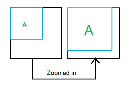
Zoom level of the browser: For the same device, a higher zoom level means more number of device pixels per CSS pixel, and hence a higher device-pixel ratio. For example, consider this figure:When you zoom in on your browser (Ctrl + Plus), the number of CSS pixels for your div remains the same, but the number of device pixels it occupies increases. So, you have a higher number of device pixels per CSS pixel.
浏览器的缩放级别:对于同一设备,更高的缩放级别意味着每个CSS像素更多的设备像素,因此,更高的设备像素比率。 例如,考虑下图:放大浏览器(Ctrl +加号)时,divCSS像素数保持不变,但是它占用的设备像素数却增加了。 因此,每个CSS像素具有更多的设备像素。
When you want to display separate images (or usually, a separate asset of the same image) based on the device-pixel ratio, you’d go with basic srcset implementation:
如果要基于设备像素比率显示单独的图像(或者通常是同一图像的单独资产),则可以使用基本的srcset实现:
<img src="data:images/space-needle.jpg"
srcset="images/space-needle.jpg 1x, images/space-needle-2x.jpg 2x,
images/space-needle-hd.jpg 3x">
x descriptor in the srcset attribute is used to define the device-pixel ratio. Hence,
srcset属性中的x描述符用于定义设备像素比率。 因此,
- for a device-pixel ratio of 1, the image space-needle.jpg will be used.对于设备像素比率为1的图像,将使用image space-needle.jpg。
- for a device-pixel ratio of 2, the image space-needle-2x.jpg will be used.对于2的设备像素比率,将使用image space-needle-2x.jpg。
- for a device-pixel ratio of 3, the image space-needle-hd.jpg will be used.对于3的设备像素比率,将使用image space-needle-hd.jpg。
src attribute is used as a fallback for the browsers which do not yet support srcset implementation.
src属性用作尚不支持srcset实现的浏览器的后备。
This works well. Using the x descriptor, you’ll always get the same image on the devices with similar device-pixel ratio – even if this means that you get the same image on a 13.5 inch laptop and a 5 inch mobile phone which have the same device-pixel ratio.
这很好。 使用x描述符,您将始终在具有类似设备像素比的设备上获得相同的图像-即使这意味着您在具有相同设备的13.5英寸笔记本电脑和5英寸移动电话上也会获得相同的图像,像素比例。
Now suppose we want a different size (height, width) image on a larger or smaller viewport. This is where the w descriptor in srcset and a new attribute – sizes comes into play.
现在,假设我们希望在较大或较小的视口上显示不同大小(高度,宽度)的图像。 这就是w descriptor中srcset和一个新的属性- sizes的用武之地。
w descriptor: This describes the width of the image being referenced. Consider this example:
w描述符:描述被参考图像的宽度。 考虑以下示例:
<img src="data:images/space-needle.jpg"
srcset="images/space-needle.jpg 200w, images/space-needle-2x.jpg 400w,
images/space-needle-hd.jpg 600w">
This mentions that the width of the first image is 200px, second image is 400px, and third image is 600px. Also, if the user’s screen is 150 CSS pixels wide, this equates to the following in terms of
x descriptors:这提到第一幅图像的宽度为200px,第二幅图像为400px,第三幅图像为600px。 另外,如果用户的屏幕为150 CSS像素宽,则在
x descriptors方面等于以下内容:<img src="data:images/space-needle.jpg" srcset="images/space-needle.jpg 1.33x, images/space-needle-2x.jpg 2.67x, images/space-needle-hd.jpg 4x">(Remember, device-pixel ratio is just number of device pixels/CSS pixels.)
(请记住,设备像素比率只是设备像素/ CSS像素的数量。)
sizes属性: (The sizes Attribute:)
The actual implementation where you’d want a different size image (different height, width) on different screen sizes is accomplished by using sizes attribute along with the w descriptor of srcset attribute. Let’s again learn through a couple of examples:
您想要在不同屏幕尺寸上使用不同尺寸的图像(不同的高度,宽度)的实际实现是通过将sizes属性与srcset属性的w descriptor一起使用来实现的。 让我们再次通过几个示例学习:
例子1 (Example 1)
Say you want the image to be viewed in half of the viewport width. You’ll type:
假设您要以视口宽度的一半查看图像。 您将输入:
<img src="data:images/space-needle.jpg" sizes="50vw"
srcset="images/space-needle.jpg 200w, images/space-needle-2x.jpg 400w,
images/space-needle-hd.jpg 600w">
The browser will now decide which image to download based on the browser width and the device pixel ratio. For example:
现在,浏览器将根据浏览器的宽度和设备像素比率来决定下载哪个图像。 例如:
If the browser width is 500 CSS pixels, the image will be displayed 250px wide (because of 50vw). Now, this is equivalent to specifying:
如果浏览器宽度为500 CSS像素,则图像将显示为250px宽(因为50vw)。 现在,这等效于指定:
srcset="images/space-needle.jpg 0.8x, images/space-needle-2x.jpg 1.6x,
images/space-needle-hd.jpg 2.4x"
So, for a 1.5x display,
images/space-needle-2x.jpgwill be downloaded by a browser, since it gives a device-pixel ratio of 1.6x (which is most suitable for a 1.5x display).因此,对于1.5倍的显示器,
images/space-needle-2x.jpg将由浏览器下载,因为它的设备像素比率为1.6倍(最适合于1.5倍的显示器)。
例子2 (Example 2)
You want the image to be displayed in half of the viewport width when the viewport width is greater than 40em, but the image should occupy the complete width when the viewport width is less than or equal to 40em. This is how you’ll approach it:
当视口宽度大于40em时,您希望图像以视口宽度的一半显示,但是当视口宽度小于或等于40em时,图像应占据整个宽度。 这是您的处理方式:
<img src="data:images/space-needle.jpg" sizes="(max-width: 40em) 100vw, 50vw"
srcset="images/space-needle.jpg 200w, images/space-needle-2x.jpg 400w,
images/space-needle-hd.jpg 600w">
This is very similar to media queries. So, for a viewport which is 39em wide, (max-width: 40em) evaluates to true, which means 100vw, that is, the image is as wide as the viewport. If the viewport is the browser window and if the browser width is 500 CSS pixels, the image will be displayed 500px wide. This is equivalent to specifying:
这与媒体查询非常相似。 因此,对于39em宽的视口, (max-width: 40em)评估为true,这意味着100vw ,即图像与视口一样宽。 如果视口是浏览器窗口,并且浏览器宽度为500 CSS像素,则图像将显示为500px宽。 这等效于指定:
<img src="data:images/space-needle.jpg" sizes="(max-width: 40em) 100vw, 50vw"
srcset="images/space-needle.jpg 0.4x, images/space-needle-2x.jpg 0.8x,
images/space-needle-hd.jpg 1.2x">
Similar to above, the browser will decide which image to pick from above for a specific display.
与上面类似,浏览器将决定从上方为特定显示选择哪个图像。
For a viewport which is 41em wide, (max-width: 40em) evaluates to false, which means 50vw, that is, the image is half as wide as the viewport.
对于41em宽的视口, (max-width: 40em)评估为false,这意味着50vw ,即图像的宽度是该视口的一半。
The next element we’ll see is the picture element, but before that I need a quick recap :)
我们将看到的下一个元素是picture元素,但是在此之前,我需要快速回顾一下:)
| Use-case | Solution |
|---|---|
| I want the same image to be displayed across all devices, but I want to display it in a higher resolution on devices which can support it. The height and width of the image should remain fixed. |
Make multiple assets of the same image (space-needle.jpg, space-needle-hd.jpg). Use srcset with x descriptor.
|
| I want the same scenario as above, but I should be able to customize height and width of the image based on the viewport. |
Use sizes and srcset with w descriptor (again, make multiple assets of the same image)
|
| I’m doubtful that if I use the same image for a smaller screen size, the primary subject of my image may become too small in size. I want to display a different image (more focused on the primary subject) in a different screen size, but I still want to display separate assets of the same image based on device-pixel ratio, and I want to customize height and width of the image based on viewport. | ? |
| 用例 | 解 |
|---|---|
| 我希望在所有设备上显示相同的图像,但是我想在可以支持该图像的设备上以更高的分辨率显示它。 图像的高度和宽度应保持固定。 |
使同一张图片具有多个资产(space-needle.jpg,space-needle-hd.jpg)。 将srcset与x描述符一起使用。
|
| 我需要与上述相同的方案,但是我应该能够基于视口自定义图像的高度和宽度。 |
将sizes和srcset与w描述符一起使用(再次使同一图像具有多个资产)
|
| 我怀疑如果在较小的屏幕尺寸上使用相同的图像,图像的主体可能会变得太小。 我想以不同的屏幕尺寸显示不同的图像(更侧重于主要主题),但是我仍然想基于设备像素比率显示同一图像的单独资源,并且我想自定义图像的高度和宽度基于视口的图像。 | ? |
The solution to ‘?’ is picture element!
解决方案“?” 是picture元素!
picture元素 (The picture Element)
As we saw above, picture element is used when you want to show a different image depending on the rendered size of the image. The picture element is a container which contains other elements that control the image to be downloaded. Let’s look at an example:
正如我们在上面看到的,当您要根据图像的渲染大小显示不同的图像时,会使用picture元素。 picture元素是一个包含其他元素的容器,这些元素控制着要下载的图像。 让我们看一个例子:
<picture>
<source media="(max-width: 20em)" srcset="images/small/space-needle.jpg 1x,
images/small/space-needle-2x.jpg 2x, images/small/space-needle-hd.jpg 3x">
<source media="(max-width: 40em)" srcset="images/medium/space-needle.jpg 1x,
images/medium/space-needle-2x.jpg 2x, images/medium/space-needle-hd.jpg 3x">
<img src="space-needle.jpg" alt="Space Needle">
</picture>
The first source element whose media attribute’s media query holds true is chosen. So, if the max width of viewport is 20em, the corresponding image source is selected from the images/small directory, based on the device-pixel ratio. All the images within one srcset are usually multiple assets of the same image.
选择其media属性的媒体查询为true的第一个source元素。 因此,如果视口的最大宽度为20em ,则根据设备像素比从images/small目录中选择相应的图像源。 一个srcset中的所有图像通常是同一图像的多个资产。
The picture element itself does not display anything. Even the source element within the picture element does not represent anything of its own. The source element must contain the srcset attribute and it may have sizes, media and type attributes. It’s necessary to add img element within picture. You won’t see any image without the img element. All the source elements within the picture element are just there to feed the image a source.
picture元素本身不显示任何内容。 甚至picture元素中的source元素也不代表其自身的任何内容。 的source元素必须包含srcset属性且其可具有sizes , media和type属性。 有必要在picture添加img元素。 没有img元素,您将看不到任何图像。 picture元素中的所有source元素都在那里,将图像作为源。
You can also do an image selection based on the image format supported by the browser. This is especially useful when there are good savings on the image size just based on the format. For example, JPEG-XR, an efficient image format, which usually takes less image size as compared to JPG, is supported by Microsoft Edge and IE9+. Using type attribute within the source element, you can test for this format:
您还可以基于浏览器支持的图像格式进行图像选择。 仅根据格式节省大量图像时,此功能特别有用。 例如,Microsoft Edge和IE9 +支持JPEG-XR(一种高效的图像格式,通常比JPG占用更少的图像大小)。 使用source元素中的type属性,可以测试以下格式:
<picture>
<source media="(max-width: 30em)" type="image/vnd.ms-photo"
srcset="images/small/space-needle.jxr 1x, images/small/space-needle-2x.jxr 2x,
images/small/space-needle-hd.jxr 3x">
<source media="(max-width: 30em)" type="image/jpg"
srcset="images/small/space-needle.jpg 1x, images/small/space-needle-2x.jpg 2x,
images/small/space-needle-hd.jpg 3x">
<img src="space-needle.jpg" alt="Space Needle">
</picture>
When it is used, both the attributes: media attribute and the type attribute should resolve to true for that source element to be chosen. If the browser can’t understand any of the formats, it falls back to img.
使用该属性时,对于要选择的该source元素,两个属性: media属性和type属性都应解析为true。 如果浏览器无法理解任何格式,则可使用img 。
放在一起 (Putting It All Together)
After understanding how responsive images work, let’s look at a complete example which utilizes all the three together – srcset, sizes and picture.
-了解如何响应图像的工作,让我们来看看它利用所有三个一起一个完整的例子之后srcset , sizes和picture 。
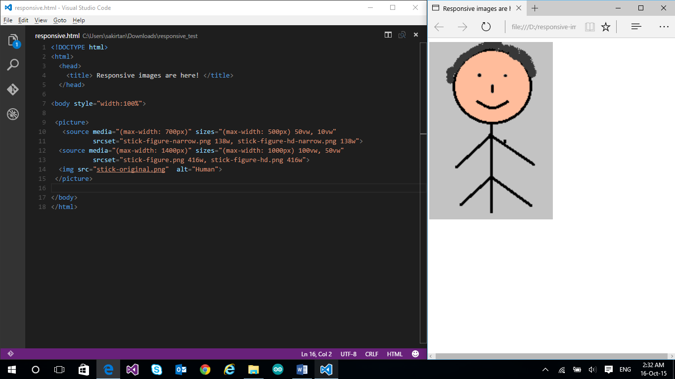
<!DOCTYPE html>
<html>
<head>
<title> Responsive images are here! </title>
</head>
<body style="width:100%">
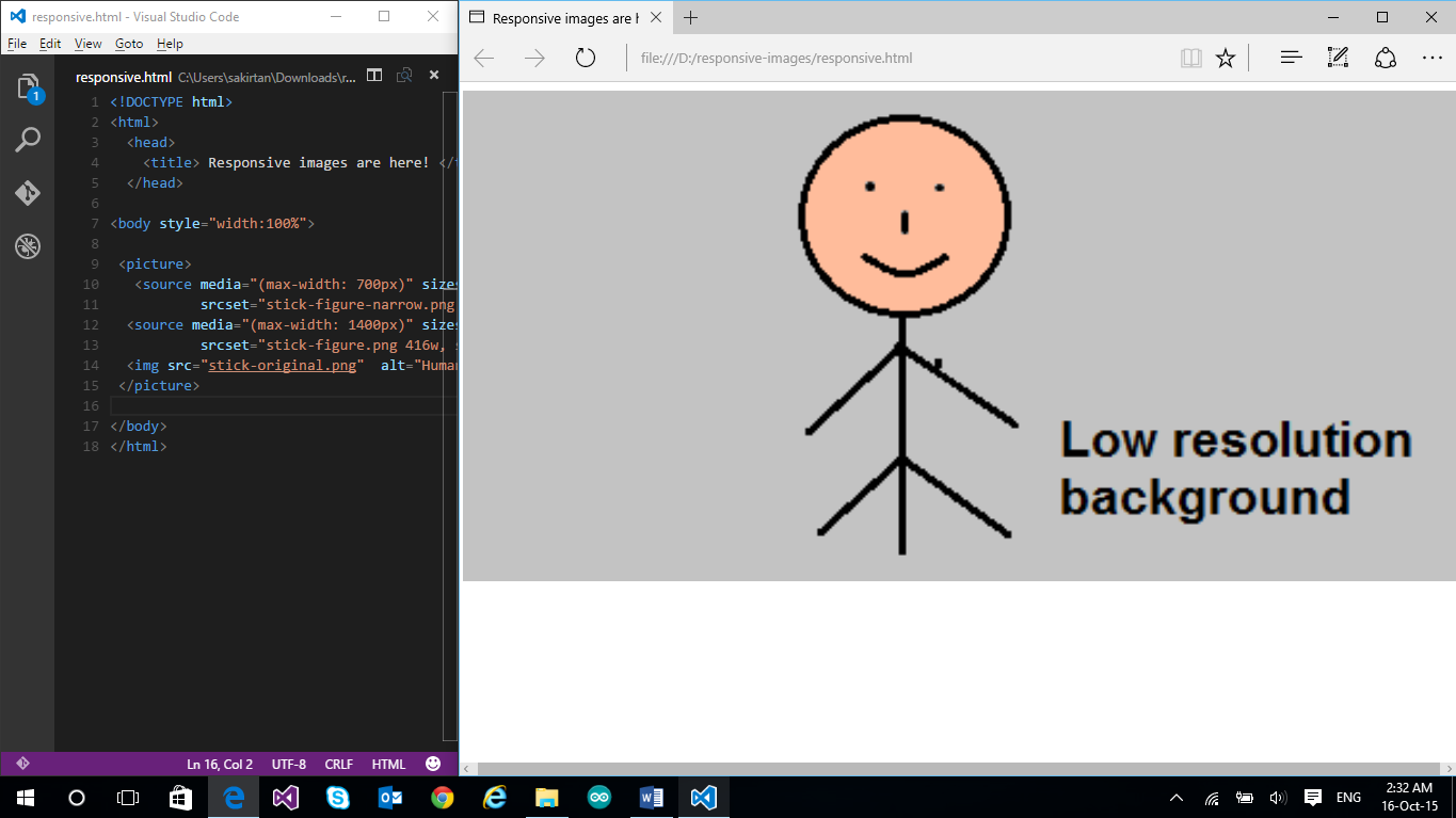
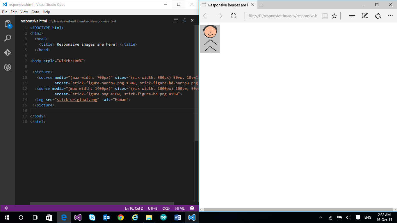
<picture>
<source media="(max-width: 700px)" sizes="(max-width: 500px) 50vw, 10vw"
srcset="stick-figure-narrow.png 138w, stick-figure-hd-narrow.png 138w">
<source media="(max-width: 1400px)" sizes="(max-width: 1000px) 100vw, 50vw"
srcset="stick-figure.png 416w, stick-figure-hd.png 416w">
<img src="stick-original.png" alt="Human">
</picture>
</body>
</html>In this example, we’ve used picture which contains multiple source elements. The first one is chosen if the max width is 700px. If this is chosen, the sizes attribute then decides the size of the image to be displayed based on the width breakpoints we have mentioned. The implementation is exactly similar to what we have seen in sizes attribute. So, if the max width is 500px (width ranges from 0px-500px), the image will occupy half of the viewport. And the image source is chosen based on the device-pixel ratio. However, if the viewport width is greater than 500px (but <=700px, because we are within the first source element), then the image will occupy just 1/10 of the viewport.
在此示例中,我们使用了包含多个source元素的picture 。 如果最大宽度为700px,则选择第一个。 如果选择此选项,那么sizes属性将根据我们提到的宽度断点来决定要显示的图像的大小。 该实现与我们在sizes属性中看到的完全相似。 因此,如果最大宽度为500px(宽度范围为0px-500px),则图像将占据视口的一半。 然后根据设备像素比选择图像源。 但是,如果视口宽度大于500px(但<=700px ,因为我们在第一个source元素之内),则图像将仅占据视口的1/10。
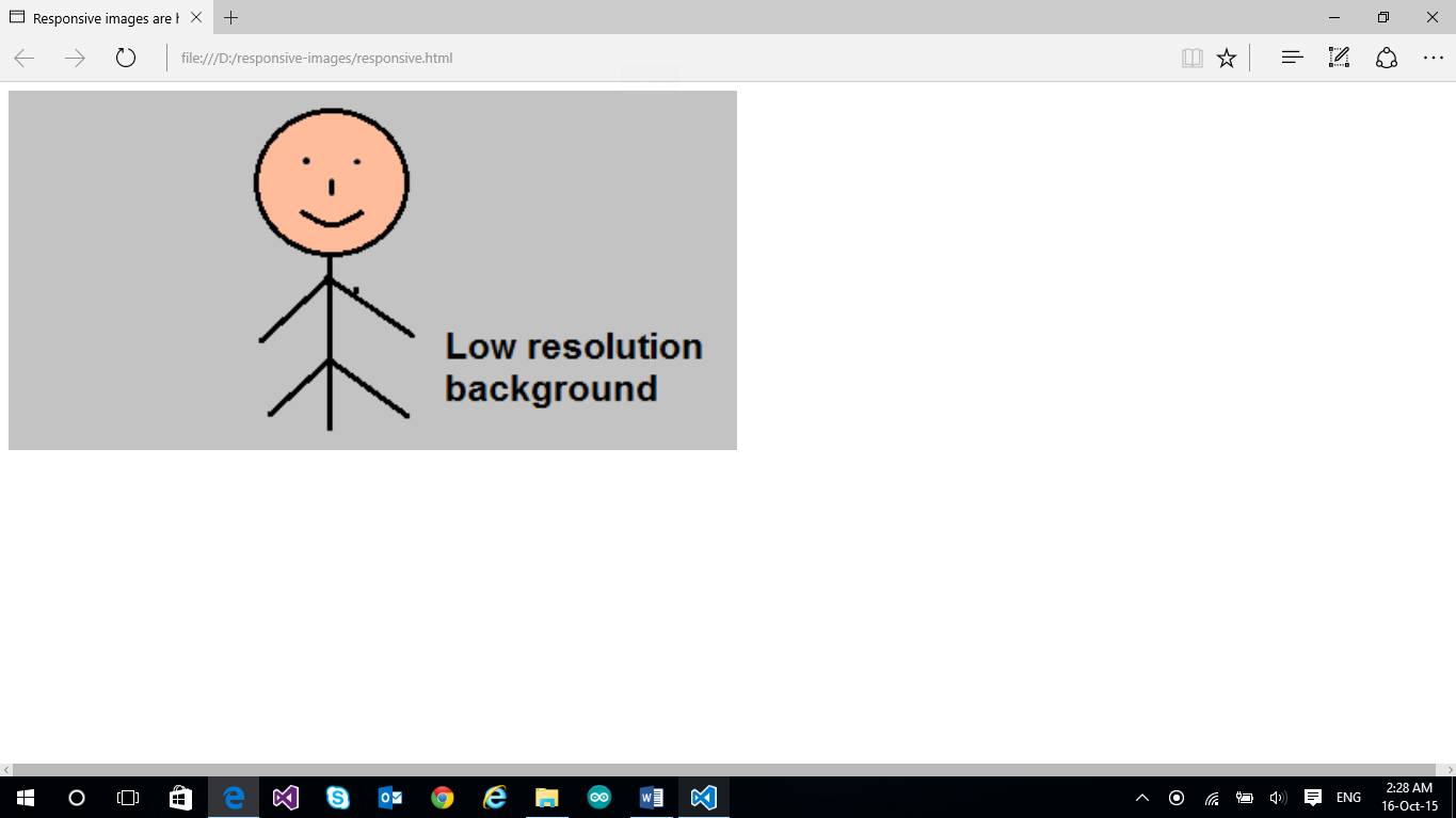
Similarly, the second source element is chosen if the max width is 1400px (which means now the width ranges from 701px to 1400px). The sizes attribute ensures that if the viewport width ranges from 701px to 1000px, the image’s width is same as the viewport width, and if the viewport width ranges from 1001px to 1400px, the image occupies half of the viewport width. To verify all the cases, I simply resize the browser and check. In real-world use, your website will be accessed through different devices and that is where you’ll see the actual use of responsive images. Here is the output:
同样,如果最大宽度为1400像素,则选择第二个source元素(这意味着现在的宽度范围为701像素至1400像素)。 sizes属性可确保如果视口宽度在701px至1000px之间,则图像的宽度与视口宽度相同;如果视口宽度在1001px至1400px之间,则图像将占据视口宽度的一半。 为了验证所有情况,我只需要调整浏览器的大小并检查即可。 在实际使用中,将通过不同的设备访问您的网站,在这里您将看到响应式图像的实际使用。 这是输出:
(Please note all the image sources and the image width set here are just for the demo, and as you can see, I make some funny stick figures!)
(请注意,此处设置的所有图像源和图像宽度仅用于演示,如您所见,我制作了一些有趣的简笔画!)
Viewport width set between 1001px and 1400px: the image width is half of the viewport width (Image source being used is stick-figure.png)
视口宽度设置在1001像素和1400像素之间:图像宽度是视口宽度的一半(使用的图像源是stick-figure.png)
Viewport width set between 701px and 1000px: the image width is same as the viewport width. (Image source being used is stick-figure.png)
视口宽度设置在701px和1000px之间:图像宽度与视口宽度相同。 (正在使用的图像源是stick-figure.png)
Viewport width set between 501px and 700px: The image width is 1/10 of the viewport width. (Image source being used is stick-figure-narrow.png)
视口宽度设置在501px和700px之间:图像宽度是视口宽度的1/10。 (正在使用的图像源是stick-figure-narrow.png)
Viewport width set between 0px and 500px: The image width is half of the viewport width. (Image source being used is stick-figure-narrow.png)
视口宽度设置在0像素到500像素之间:图像宽度是视口宽度的一半。 (正在使用的图像源是stick-figure-narrow.png)
而且我们快完成了! (And We’re Almost Done!)
Responsive images give you, the developer, an option to give the best experience to your users across the multiple devices they use to view your website. It’s a good time to start integrating it into your website if you haven’t yet.
响应图片给你,开发商的选项给跨他们用来浏览您网站的多个设备的用户提供最佳体验。 如果您尚未将其集成到您的网站,则是个好时机。
I hope you had fun reading this! Reach out to me on Twitter if you want to discuss more!
希望您阅读愉快! 如果您想讨论更多内容,请在Twitter上与我联系。
Web开发更多动手 (More Hands-on with Web Development)
This article is part of the web development series from Microsoft tech evangelists on practical JavaScript learning, open source projects, and interoperability best practices including Microsoft Edge browser and the new EdgeHTML rendering engine.
本文是Microsoft技术传播者开发的Web开发系列文章的一部分,内容涉及实用JavaScript学习,开源项目以及互操作性最佳实践,包括Microsoft Edge浏览器和新的EdgeHTML呈现引擎 。
We encourage you to test across browsers and devices including Microsoft Edge – the default browser for Windows 10 – with free tools on dev.modern.IE:
我们鼓励您使用dev.modern.IE上的免费工具跨浏览器和设备进行测试,包括Microsoft Edge(Windows 10的默认浏览器):
Scan your site for out-of-date libraries, layout issues, and accessibility
扫描您的站点以查找过期的库,布局问题和可访问性
Use virtual machines for Mac, Linux, and Windows
在Mac,Linux和Windows上使用虚拟机
Remotely test for Microsoft Edge on your own device
在您自己的设备上远程测试Microsoft Edge
Coding Lab on GitHub: Cross-browser testing and best practices
GitHub上的编码实验室:跨浏览器测试和最佳实践
In-depth tech learning on Microsoft Edge and the Web Platform from our engineers and evangelists:
我们的工程师和宣传人员在Microsoft Edge和Web平台上进行了深入的技术学习:
Microsoft Edge Web Summit 2015 (what to expect with the new browser, new supported web platform standards, and guest speakers from the JavaScript community)
Microsoft Edge Web Summit 2015 (新浏览器,新支持的网络平台标准以及来自JavaScript社区的嘉宾演讲者会期待什么)
Woah, I can test Edge & IE on a Mac & Linux! (from Rey Bango)
哇,我可以在Mac和Linux上测试Edge和IE! (来自Rey Bango)
Advancing JavaScript without Breaking the Web (from Christian Heilmann)
在不中断网络的情况下推进JavaScript (来自Christian Heilmann)
The Edge Rendering Engine that makes the Web just work (from Jacob Rossi)
使Web正常工作的Edge渲染引擎 (来自Jacob Rossi)
Unleash 3D rendering with WebGL (from David Catuhe including the vorlon.JS and babylonJS projects)
使用WebGL释放3D渲染 (来自David Catuhe,包括vorlon.JS和babylonJS项目)
Hosted web apps and web platform innovations (from Kevin Hill and Kiril Seksenov including the manifold.JS project)
托管的Web应用程序和Web平台创新 (来自Kevin Hill和Kiril Seksenov,包括歧管 .JS项目)
More free cross-platform tools & resources for the Web Platform:
Web平台的更多免费跨平台工具和资源:
Visual Studio Code for Linux, MacOS, and Windows
适用于Linux,MacOS和Windows的Visual Studio代码
Code with node.JS and free trial on Azure
使用node.JS进行代码和Azure上的免费试用
翻译自: https://www.sitepoint.com/how-to-build-responsive-images-with-srcset/
srcset
srcset_如何使用srcset构建响应图像相关推荐
- 响应式图像_如何为响应图像使用HTML5“图片”,“ srcset”和“大小”
响应式图像 <picture>是HTML5元素,旨在为我们提供更多的功能和性能更好的响应图像功能. Picture标签不会加载单个图像并尝试调整其大小以适合所有可能的视口尺寸和布局,而是加 ...
- 一盒用于构建响应式电子邮件的技巧
photo: fishbulb1022 照片:fishbulb1022 In my previous article on newsletter authoring we've seen how a ...
- bone骨骼转换为cs骨骼_使用骨骼构建响应式布局:从入门开始
bone骨骼转换为cs骨骼 Dave Gamache的Skeleton Boilerplate为快速,可靠地构建响应式网站提供了完美的基础. 最近,我们将使用Skeleton并根据Webdesignt ...
- 小菜鸡的html初步教程(第十二章 初步构建响应式网站)
小菜鸡的第三篇博客 今天是3/19,天气不错,跑到自习室来更新博客. 本系列文章仅仅是对基础的HTML5以及CSS进行讲解,更加详细的内容均会附上链接,以便查阅和版权保护. 昨晚我思考了下,决定对 ...
- 分享九款构建响应式网站的最佳PHP框架
目前,网上有大量的框架供大家选择,本文作者分享了9款各方面都兼具优势的PHP框架,主要用来构建响应式网站,开发人员可以根据自己的需求来选择下面的某一个框架. 1.Symfony 2 Symfony是一 ...
- 人脸检测中,如何构建输入图像金字塔
目录 写在前面 人脸检测中的图像金字塔 代码实现 MTCNN Seetaface 总结 参考 博客:blog.shinelee.me | 博客园 | CSDN 写在前面 在文章<特征,特征不变性 ...
- vue如何获取年月日_BootstrapVue——Vue和Bootstrap的相结合,构建响应式应用更简单...
介绍 BootStrap是世界上最受欢迎的构建响应式移动优先网站的框架,Vue是当前最流行的前端框架之一,BootstrapVue则是将两者相结合,使用BootstrapVue,可以使用Vue.js和 ...
- Skeljs – 用于构建响应式网站的前端开发框架
skelJS 是一个轻量级的前端框架,用于构建响应式站点和应用程序.让设计人员和开发人员可能够使用四个强大的组件:CSS 网格系统,响应式处理程序,CSS 的快捷方式和插件系统. 您可能感兴趣的相关文 ...
- 使用 Responsive Elements 快速构建响应式网站
Responsive Elements 可以使任何元素来适应和应对他们所占据的区域.这是一个轻量的 JavaScript 库,你可以轻松嵌入到你的项目.元素会更具自己的宽度,自动响应和适应空间的增加或 ...
最新文章
- python中类和对象的内容_python中的类和对象
- vs2008界面查看
- ios 获取控件高度
- python的基本数据结构_Python学习笔记——基本数据结构
- 怎么知道Win10的电脑是否满足Win11的硬件要求
- 7-104 6翻了 (15 分)
- 智慧发电厂+智能发电厂web端平台管理系统+Axure高保真智慧电厂系统+能耗管理+告警管理+生产监控+安防设备管理+运维设备管理+监控面板+系统管理+智慧电厂+电厂系统+axure源文件+rp原型
- 一步一步使用阿里云容器服务部署基于.NET的JEXUS网站 (转)
- 按键精灵手机助手之实战篇(四)项目源码
- 2021强网杯 LongTimeAgo
- 【文献翻译神器推荐】DeepL
- 有哪些好用的App云测试平台
- Echo,Linux上最忧伤的命令(故事)
- html中如何访问ftp中的图片,CSS FTP上传网页图解教程
- 能力素质有所欠缺_如何提高孩子动手能力?
- 数据结构实战(十)——家谱管理系统
- 正斜杠(/)和反斜杠(\)的区别
- 谷粒商城项目搭建思路
- Android视频开发进阶(part2-MP4文件的解析)
- P1365 WJMZBMR打osu! / Easy (期望dp)