SQL Server Reporting Services最佳做法
介绍 ( Introduction )
In past chats, we have had a look at a myriad of different business intelligence techniques that one can utilize to turn data into information. In today’s “get together” we are going to try to pull all these techniques together, rationalize our development plans, and moreover, look at some good habits to adopt or for the want of better words utilize SQL Server Reporting Services Best Practices.
在过去的聊天中,我们了解了无数种可以用来将数据转换为信息的不同商业智能技术。 在当今的“聚在一起”中,我们将尝试将所有这些技术结合在一起,合理化我们的开发计划,此外,还要考虑一些良好的习惯来采用或希望更好地利用SQL Server Reporting Services最佳实践 。
During today’s discussion, we shall be touching upon the following issues.
在今天的讨论中,我们将涉及以下问题。
- Discussing the pros and cons of utilizing shared datasets.
讨论利用共享数据集的利弊。 - The ‘pluses’ and pitfalls of utilizing embedded reports.
利用嵌入式报告的“利弊”。 - Report utilization logging.
报告利用率日志记录。 - Utilization of graphics.
图形的利用。 - Caching of data.
缓存数据。
So let us get to it!
因此,让我们开始吧!
数据集的使用(共享与嵌入式) ( Utilization of datasets (shared vs. embedded) )
To refresh our minds as to what a dataset is, I prefer to utilize a metaphor.
为了让我们重新了解数据集是什么,我更喜欢使用隐喻。
In ‘attaching’ any report to the data from the database, one requires two critical components.
在将任何报告“附加”到数据库中的数据时,需要两个关键组件。
- A data source
资料来源 - A data set
数据集
Imagine that we have a house (our database) that has an outside water tap. This water tap will be used to water five house plants 20 m from the house. What we really need is a water hose (data source) to get the water to the plants. The five pot plants (datasets) are watered with the water from the hose. The datasets provide data for our reports, charts, and matrices and these datasets are populated at runtime.
想象一下,我们有一所房子(我们的数据库)的外部水龙头。 该水龙头将用于为距房屋20 m的五种房屋植物浇水。 我们真正需要的是水软管(数据源),用于将水输送到植物。 用软管中的水浇灌5个盆栽植物( 数据集 )。 数据集为我们的报告,图表和矩阵提供数据,并且在运行时填充这些数据集。
There are two ways that our plants may be watered. I fill each pot separately (create five embedded or local datasets) or utilize a big bucket and fill each pot from the big bucket (shared datasets). Shared datasets are global dataset and may be utilized for all reports within the project. Embedded or local datasets are available exclusively to the current report.
我们的植物可以通过两种方式浇水。 我分别填充每个锅(创建五个嵌入式 或本地 数据集 ),或利用一个大存储桶并从大存储桶中填充每个锅(共享数据集)。 共享数据集是全局数据集,可用于项目内的所有报告。 嵌入式或本地数据集仅可用于当前报告。
In order to decide which method of report data storage is most optimal (for our current needs), we must look at a scenario where both are utilized and then ask ourselves some very important questions.
为了确定哪种报表数据存储方法最适合(针对我们当前的需求),我们必须研究一种同时使用两者的情况,然后问自己一些非常重要的问题。
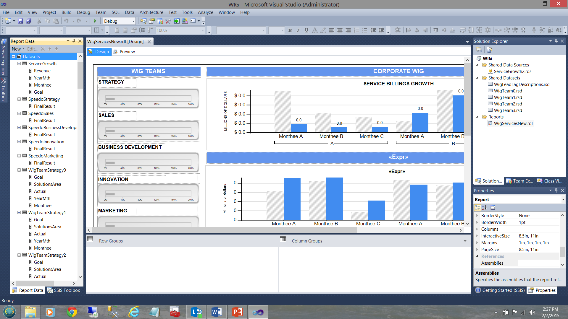
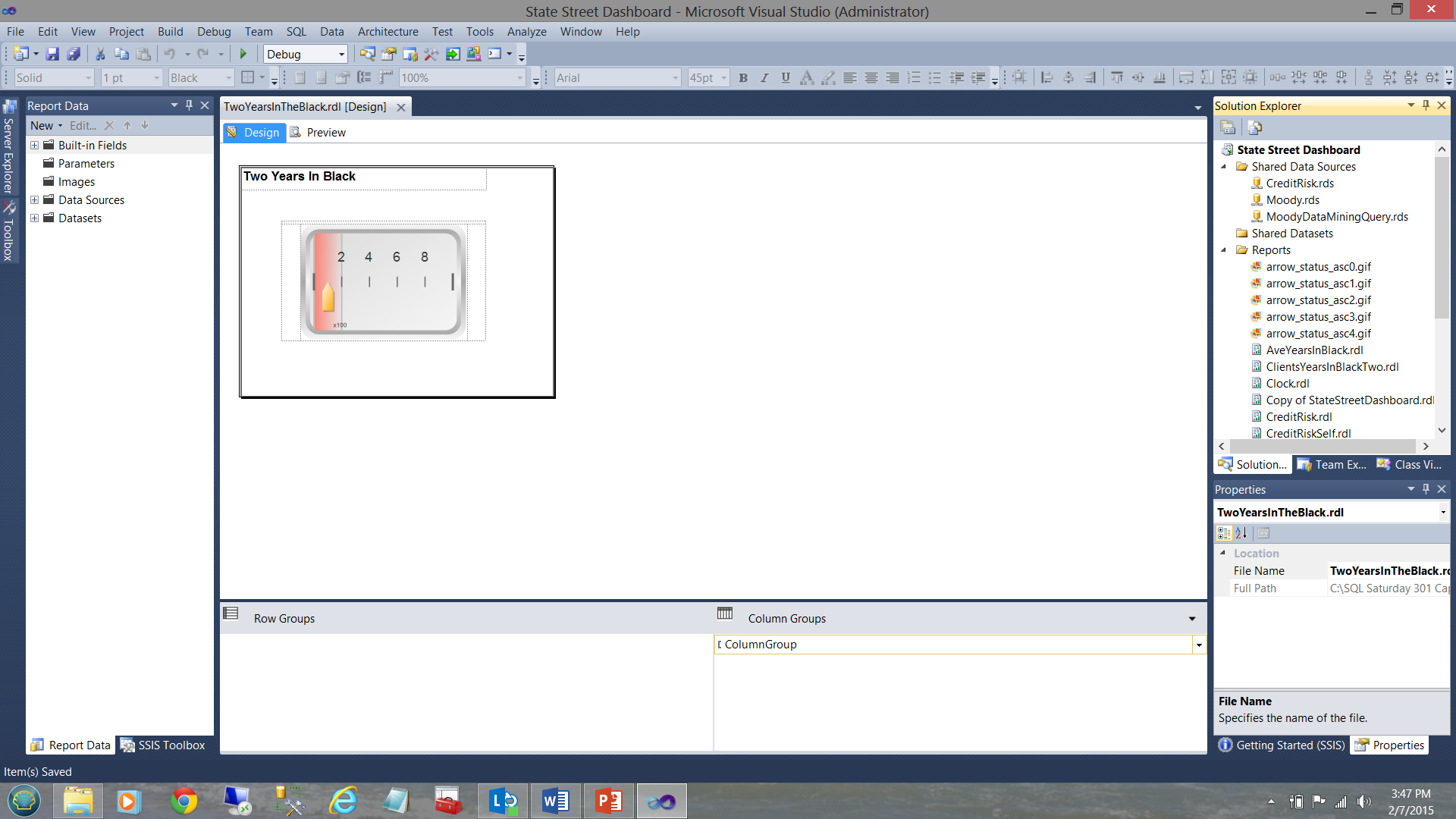
In the screen dump below, we see a typical report, (created for a user) that shows the varied goals and performance results for a period of time.
在下面的屏幕转储中,我们看到了一个典型的报告(为用户创建),该报告显示了一段时间内各种目标和性能结果。
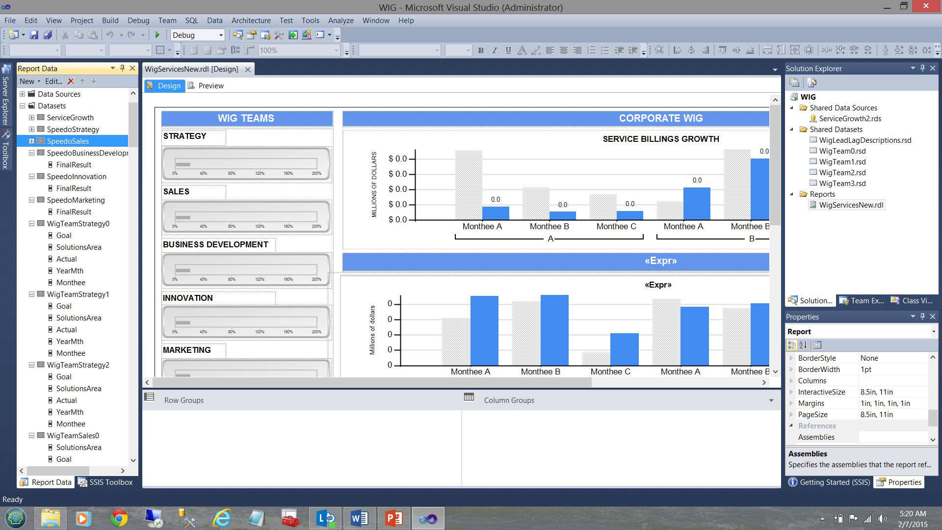
A WIG (see the term in the screen dump above) is a “wildly important goal”.
WIG(请参阅上面的屏幕转储中的术语)是“极为重要的目标”。
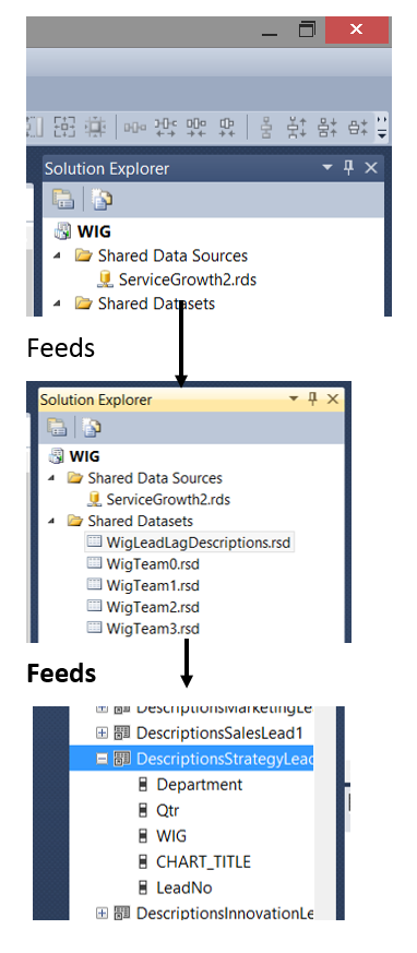
Note that we have five shared datasets in the upper right-hand side of the screen dump. Note too, the datasets in the “Report Data” window on the left-hand side of the screen dump. The trick is to understand how the pieces fit together. Armed with this knowledge we can make some intelligent decisions as to what type of dataset should be utilized for each of our charts shown in the screen dump above.
请注意,我们在屏幕转储的右上角有五个共享数据集。 还要注意,屏幕转储左侧的“报告数据”窗口中的数据集。 诀窍是了解各个部分如何组合在一起。 有了这些知识,我们就可以针对上面的屏幕转储中显示的每个图表做出一些明智的决策。
Below, we see a data source created to tap data from the WIG database.
在下面,我们看到一个创建的数据源,以从WIG数据库中提取数据。
The connection information is stored within the data source (see below).
连接信息存储在数据源中(请参见下文)。
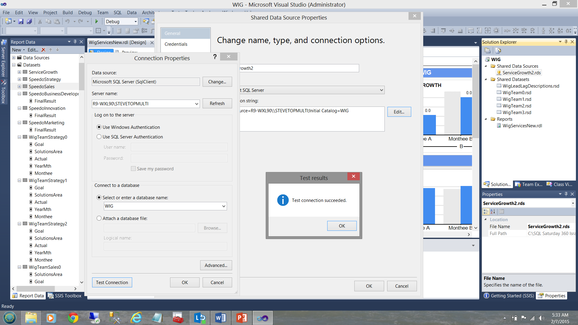
Our shared dataset “WigLeadLagDescriptions” (see above and to the top right under the “Shared Datasets” Folder) is connected (“filled”) by our datasource ”ServiceGrowth2” (see below).
我们的共享数据集“ WigLeadLagDescriptions”(请参见上方和“共享数据集”文件夹的右上角)由我们的数据源“ ServiceGrowth2”(请参见下文)连接(“填充”)。
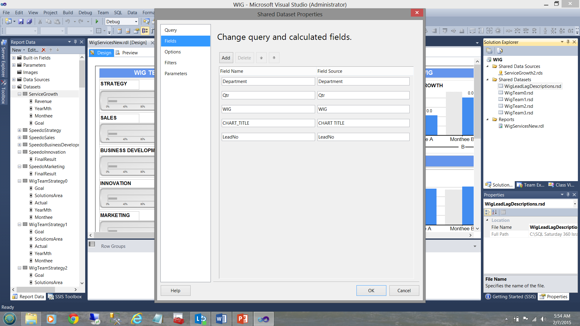
Finally, our “DescriptionStrategy” local / embedded dataset (see below and left) derives its data from the shared “WigLeadLagDescription” dataset (see below to the top right).
最后,我们的“ DescriptionStrategy” 本地 /嵌入式 数据集 (请参见下面和左图)是从共享的“ WigLeadLagDescription”数据集(请参见下面的右上图)中导出其数据的。
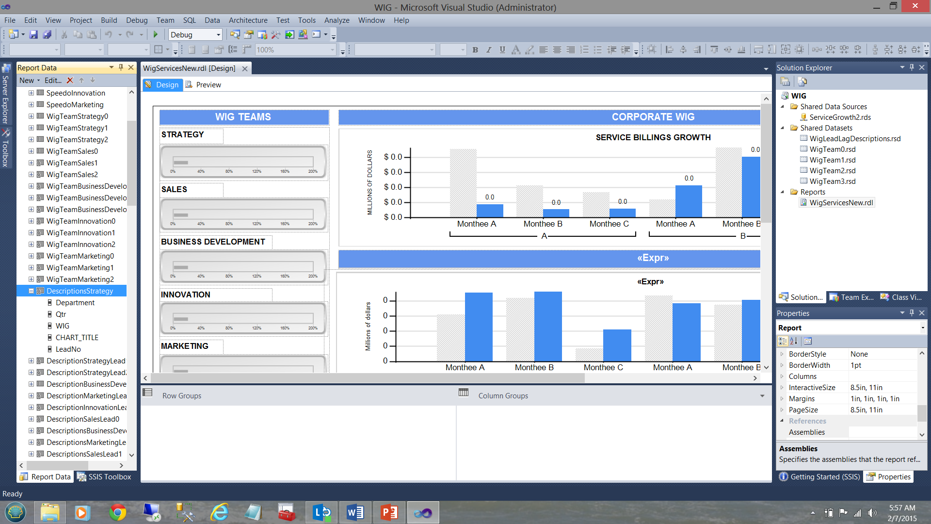
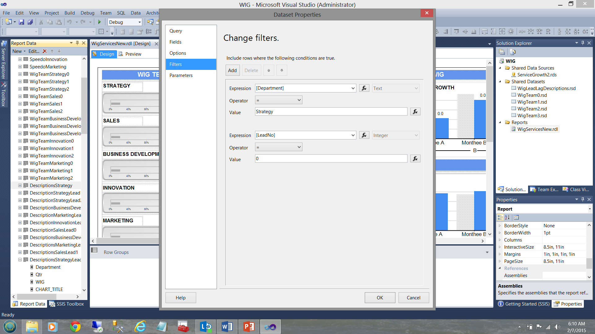
Now as this local dataset is exclusively utilized by the Strategy team charts and as the data in the shared dataset contains the descriptions for all the departments, we needed to apply the filter to the local dataset to ensure that the only data within that dataset, is related solely to strategy. This was achieved as follows:
现在,由于该本地数据集被策略团队图表专用,并且共享数据集中的数据包含所有部门的描述,因此我们需要将过滤器应用于本地数据集,以确保该数据集中的唯一数据是仅与策略有关。 达到以下目的:

Stepping back from all this garble, this is how the data distribution was organized looking at it from a “bird’s eye view”.
从所有这些乱七八糟的步骤开始,这就是从“鸟瞰”来看数据分布的组织方式。
In short, each local dataset or “embedded” dataset will contain a subset of the shared dataset. This subset is obtained by FILTERING the data pulled from the shared dataset. This is achieved by placing a filter constraint in the local dataset definition (see below).
简而言之,每个本地数据集或“嵌入式”数据集将包含共享数据集的子集。 通过过滤从共享数据集中提取的数据获得此子集。 这是通过在本地数据集定义中放置过滤器约束来实现的(请参见下文)。
So how do we decide which type of dataset is appropriate? Much depends upon how much data will be pulled and DO YOU REQUIRE it all for each chart and/or matrix within the report.
那么我们如何确定哪种数据集合适呢? 在很大程度上取决于要提取多少数据,并且您是否需要为报告中的每个图表和/或矩阵都需要这些数据?
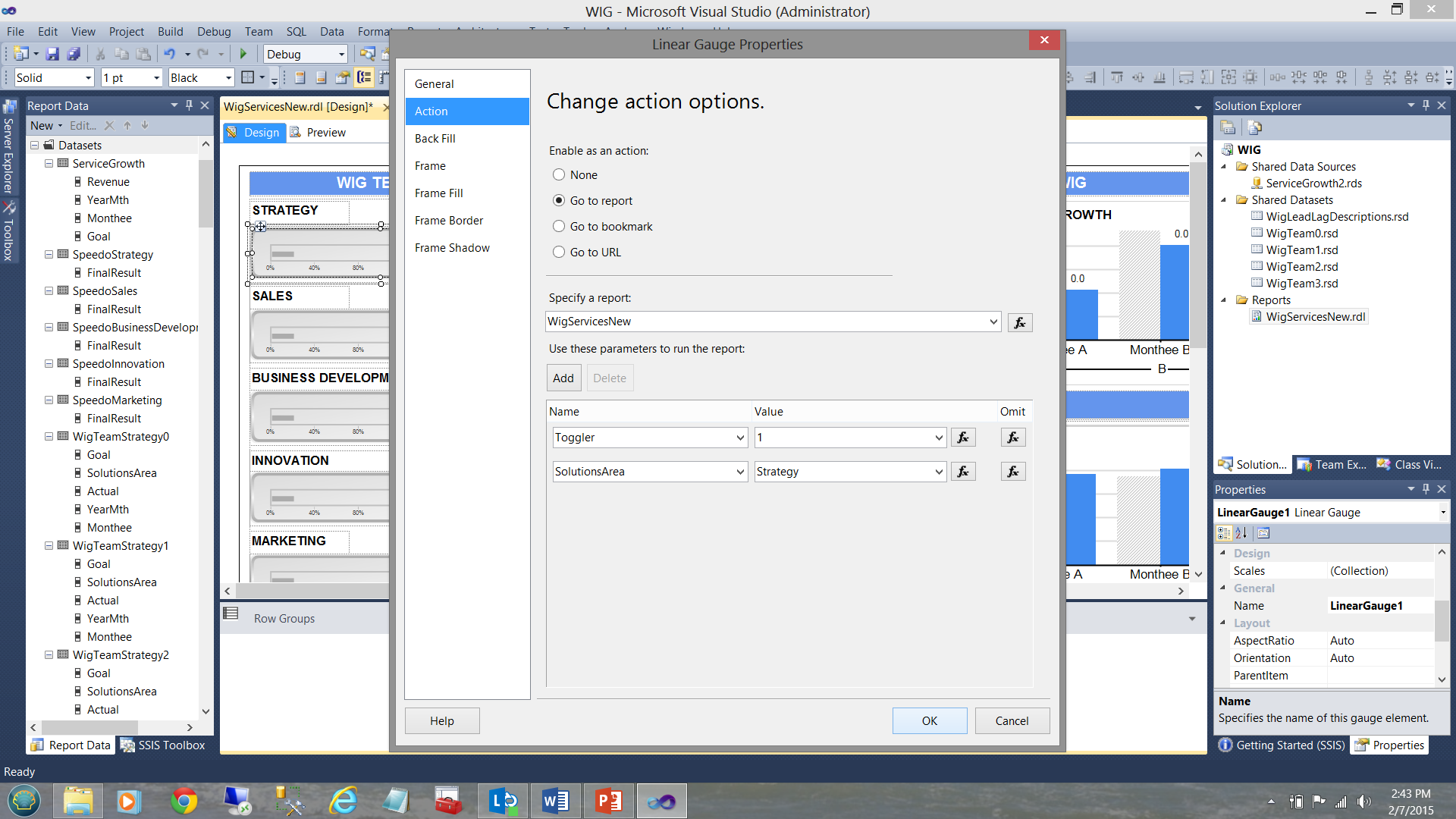
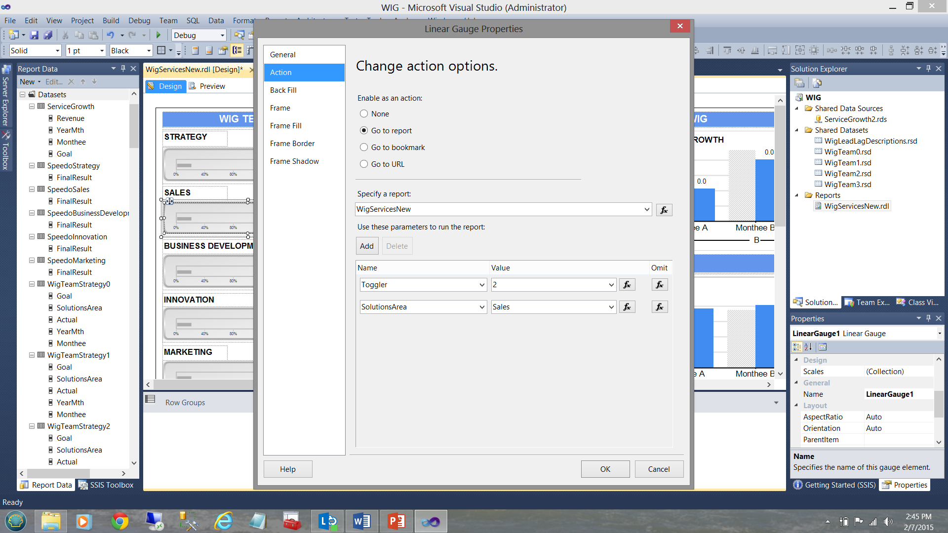
What I have not disclosed until now is that WIG team horizontal gauges (see below) have an ‘action’ attached to them.
到目前为止,我还没有透露WIG团队的水平仪(见下文)附有“操作”。
Clicking on one of these horizontal gauges results in a recursive call to the same report and passes an integer value to the report. Had we clicked upon the Strategy gauge (see above), the same report is called and a value of 1 is given to a variable called “Toggler” and the name of the solutions area is also passed via the variable SolutionsArea (see below).
单击这些水平仪表之一会导致对同一报告的递归调用,并将整数值传递给报告。 如果我们单击了“策略”量表(请参见上文),则将调用同一报告,并且将名为“ Toggler”的变量的值设置为1,并且还将通过变量SolutionsArea(请参见下文)传递解决方案区域的名称。
Now had we clicked upon the “Sales” horizontal gauge, once again a recursive call is executed however this time “Toggler” is set to “2” and the “SolutionsArea” is set to “Sales” (see below).
现在,我们单击“ Sales”水平标尺,再次执行递归调用,但是这次将“ Toggler”设置为“ 2”,而“ SolutionsArea”设置为“ Sales”(请参见下文)。
There are 4 more “WIG Teams” in addition to the two that we just discussed making 6 in total.
除了我们刚刚讨论的两个小组外,还有另外四个“ WIG小组”,总共六个。
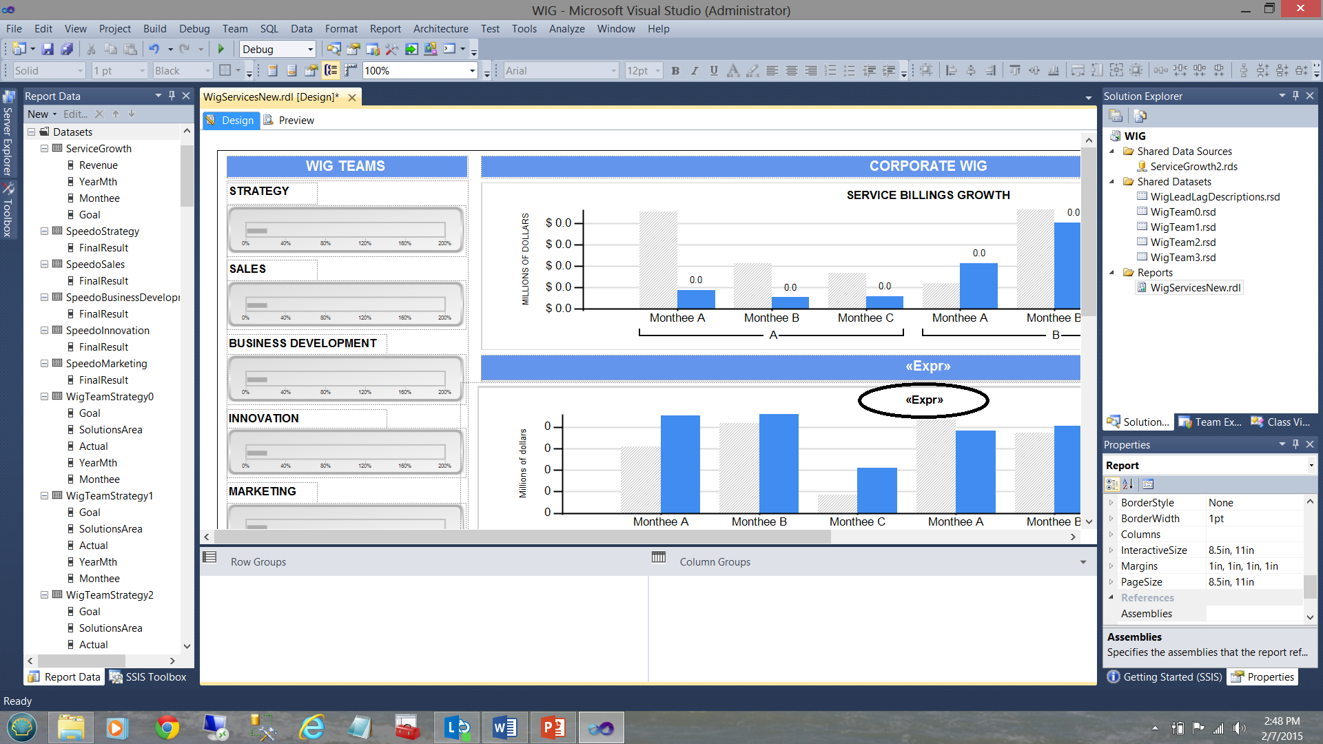
The astute reader will note that in the screenshot above that the bottom bar chart has a title “<Expr>” (see the circle in the screenshot above). What is not immediately apparent is that there in fact 6 bar charts superimposed upon each other (as shown diagrammatically below):
精明的读者会注意到,在上面的屏幕截图中,底部的条形图的标题为“ <Expr>”(请参见上面的屏幕截图中的圆圈)。 尚不明显的是, 实际上有6个条形图相互叠加 (如下图所示):
This said, when the user clicks upon the Strategy gauge, the “solutions area” variable is set to ‘Strategy’ and the toggle variable set to 1. The trick is that at any one time only one chart may be visible and utilizing the visibility property of the charts we are able to show or hide the chart depending upon which “Toggler” value is passed by the user’s solutions area selection.
这就是说,当用户单击“策略”量表时,“解决方案区域”变量设置为“策略”,切换变量设置为1。 窍门是,在任何时候,只有一张图表可见,并且利用了可见性图表的属性,我们可以显示或隐藏图表,具体取决于用户的解决方案区域选择传递了哪个“ Toggler”值。
To learn more about how this is technique is handled, please do have a look at an article that I recently published on SQLShack entitled “Now you see it, now you don’t”
要了解有关如何处理该技术的更多信息,请看一下我最近在SQLShack上发表的一篇文章“现在就知道了,现在您不知道了”
For this report, we chose to utilize embedded or local datasets (local to this report), as each dataset is solely utilized and attached to one and only one vertical bar chart. The important point is that we take a runtime hit ONCE by having the individual data sets populated from the shared datasets and these local or embedded datasets are being persisted within the cache. As we saw above, each is filtered for a particular solutions area. Once again, the astute reader will note that it would be most difficult to implement an equivalent and efficient filtering mechanism on the shared data set (especially should this shared dataset contain hundreds of thousands of records).
对于此报告,我们选择使用嵌入式或本地数据集(对于此报告而言是本地的),因为每个数据集都是单独使用的,并且仅附加到一个垂直条形图上。 重要的一点是,我们通过从共享数据集中填充各个数据集来对运行时产生影响,并将这些本地或嵌入式数据集持久化在缓存中。 正如我们在上面看到的,每个过滤器都针对特定的解决方案区域进行过滤。 再次,精明的读者将注意到,在共享数据集上实现等效且有效的过滤机制将是最困难的(尤其是此共享数据集应包含成千上万条记录时)。
Many people say that a picture is worth a thousand words and with regards to the lengthy discussion that we have just had, we can summarize it all, in the slide shown below:
许多人说一张图片值一千个单词,关于我们刚刚进行的冗长的讨论,我们可以在下面显示的幻灯片中总结一下:
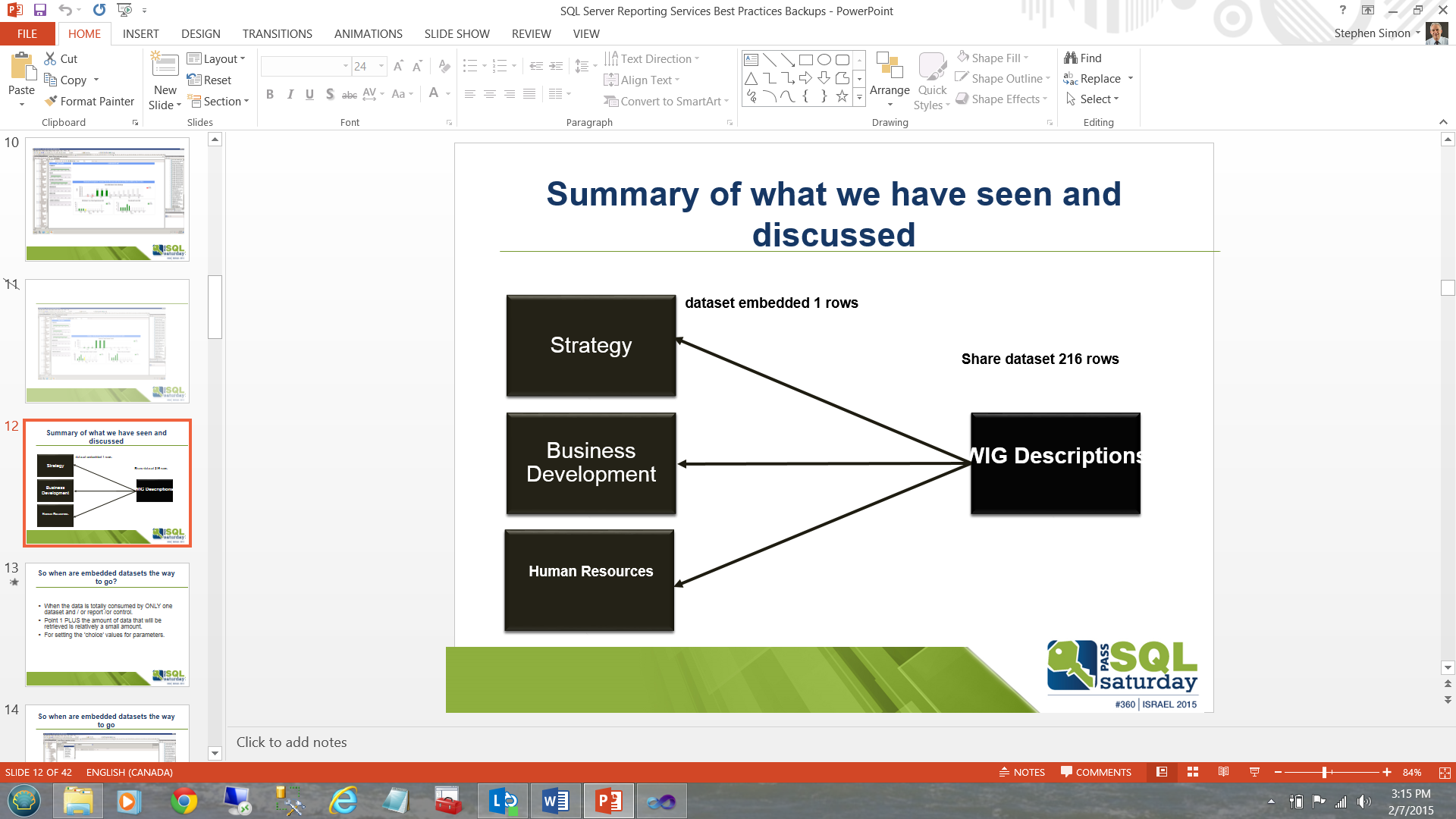
Instead of executing a major table based query or stored procedure six times to populate each of boxes (local datasets) on the left and potentially have to do a table scan or at best and indexed scan on the ALL the table records (looking for these six solutions areas from the myriad of subject areas present in the table), we pull once into the “WIG Descriptions” box/dataset on the right and then populate the left hand boxes utilizing 6 queries drawn from the subset dataset “WIG Descriptions”.
不必执行六次基于主表的查询或存储过程来填充左侧的每个框(本地数据集),并且可能必须对所有表记录进行表扫描或充其量并进行索引扫描(查找这六个表)从表格中存在的众多主题区域中找到解决方案区域),我们一次将其拉入右侧的“ WIG描述”框/数据集,然后利用从子集数据集“ WIG描述”中提取的6个查询填充左侧框。
共享数据集就是答案的情况 ( Cases in which shared datasets are the answer )
In our next example, we shall be looking at a dashboard that I created for a major financial institution (as a prototype) a few years back. The dashboard may be seen below:
在下一个示例中,我们将研究几年前我为一家大型金融机构(作为原型)创建的仪表板。 仪表板如下所示:
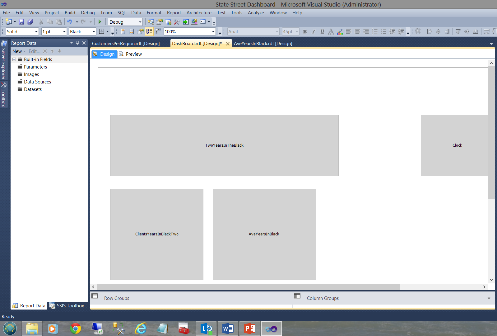
The dashboard functions with numerous subreports as may be seen above. Each sub-report has its own shared datasets and NO local nor embedded datasets as may be seen in the screen dump below.
仪表板具有许多子报表,如上所示。 每个子报表都有自己的共享数据集,没有本地或嵌入式数据集,如下面的屏幕转储所示。
Opening the dataset tab on the left, the reader may see that the dataset providing the data originates from the shared dataset “SQLShackYeaarsInBlackIsTwo” (see below).
打开左侧的数据集选项卡,读者可能会看到提供数据的数据集源自共享数据集“ SQLShackYeaarsInBlackIsTwo”(请参见下文)。
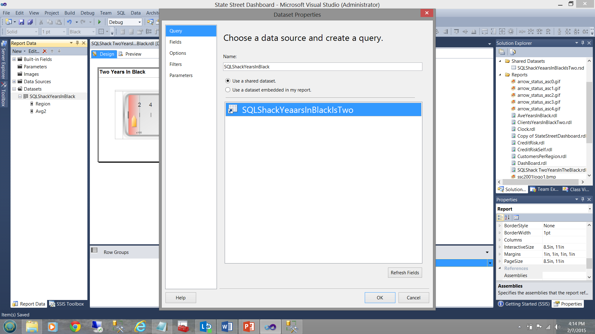
The important point to understand is that while a local dataset “SQLShackYearsInBlack” is stubbed off, no further query is defined to pull the data from the database tables and there is merely a connection made between the “local dataset” (which will be utilized by the gauge see above) and the shared dataset.
要理解的重要的一点是,虽然本地数据集“SQLShackYearsInBlack” 被存根断 ,没有进一步的查询被定义为拉从数据库表中的数据和有仅“本地数据集”之间进行的连接(其将通过被利用量规,请参见上方)和共享数据集。
The differences are fine and subtle. More over the correct decision is vital to insure maximum efficiency in rendering the report results.
差异是细微的。 此外,正确的决定对于确保呈现报告结果的最大效率至关重要。
清除报告缓存 ( Clearing of the report cache )
One of the pitfalls or gotcha’s (for want of better words) when it comes to developing our reports within the Visual Studio environment, is the caching of data within the system generated “.rdl.data” file. The nuances of this are fine in that we may make cosmetic changes to the report with regards to the filtering etc. and when we preview the report after having made these changes, what is rendered is definitely NOT what we expected to see. This may include changes that we may have made to the stored procedures that feed the datasets. Whilst running them within the SQL Server Management Studio environment the correct results are obtained, the instant that your report is run and is rendered, one notes that the results are the “same old, same old”. This can be most disconcerting at times.
在Visual Studio环境中开发报表时,陷阱之一(需要更好的用词)是在系统生成的“ .rdl.data”文件中缓存数据。 这样做的细微差别是,我们可能会在过滤等方面对报表进行外观上的更改,并且在进行这些更改后预览报表时,呈现的内容绝对不是我们期望看到的。 这可能包括我们可能对提供数据集的存储过程进行了更改。 在SQL Server Management Studio环境中运行它们时,可以在运行报表和呈现报表的那一刻获得正确的结果,但请注意,结果是“相同,相同,相同”。 有时这可能最令人不安。
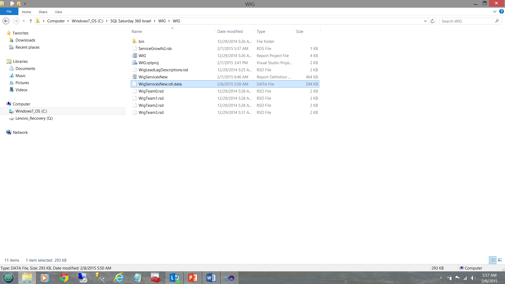
The reason for this is that our report is sourcing its data from a cached disc file (see below).
这样做的原因是我们的报告从缓存的磁盘文件中获取其数据(请参见下文)。
This Reporting Services generated file must be removed and regenerated by Reporting Services in order for the changes to be rendered. A build or rebuild of the project does NOT achieve this!
此Reporting Services生成的文件必须被Reporting Services删除并重新生成,以便呈现更改。 项目的构建或重建无法实现此目的!
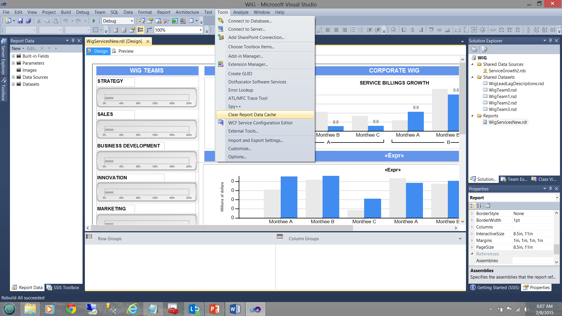
Jason Faulkner has a super little routine that he wrote that helps us find a quick and dirty way of purging this data file.
杰森·福克纳(Jason Faulkner)编写了一个超级小例程,可以帮助我们找到一种快速而肮脏的方式清除此数据文件。
- Go to Tools > External Tools
转到工具>外部工具 - Add a new tool and set the parameters as follows:
添加新工具并按如下所示设置参数: - Title: Clear Report Data Cache
标题:清除报告数据缓存 - Command: "%WinDir%\System32\cmd.exe“
命令:“%WinDir%\ System32 \ cmd.exe” - Arguments: /C DEL /S /Q "$(SolutionDir)\*.rdl.data
参数:/ C DEL / S / Q“ $(SolutionDir)\ *。rdl.data - Check options: Use Output window & Close on exit
检查选项:使用“输出”窗口并在退出时关闭
http://jasonfaulkner.com/ClearDataCacheBIS.aspx
http://jasonfaulkner.com/ClearDataCacheBIS.aspx
The “Clear Report Data Cache” feature (once constructed) may be seen in the screen dump below:
在下面的屏幕转储中可以看到“清除报告数据缓存”功能(一次构建):
报表利用率记录 ( Report Utilization Logging )
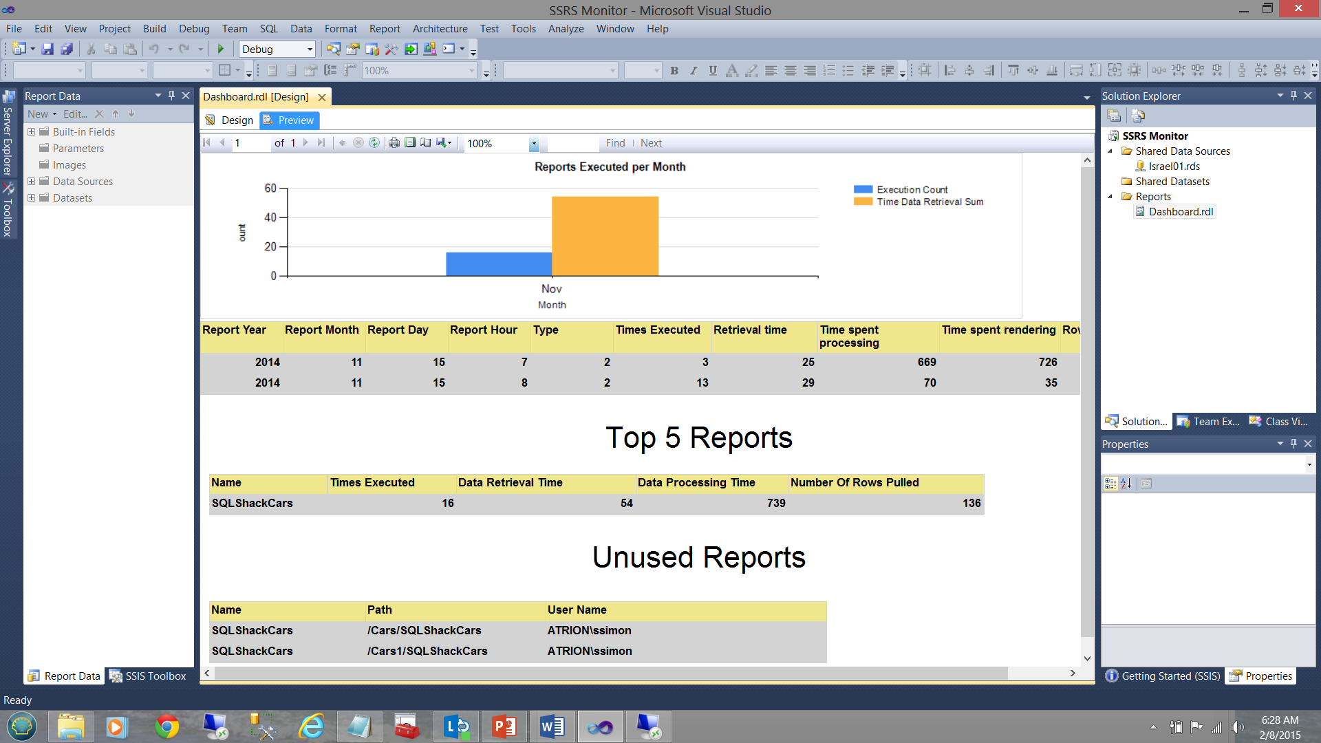
How often have you been asked to create a report which is so important that the report is required, “yesterday or sooner” only to find out that the report was used once and never again? In fact, your Visual Studio Reporting Services project may look similar to the one shown below:
要求您多久创建一次如此重要的报告,以至于“昨天或更早”需要该报告,才发现该报告曾经被使用过一次且从未被使用过? 实际上,您的Visual Studio Reporting Services项目可能类似于以下所示的项目:
This project has a plethora of unused/redundant/obsolete reports. In short, the project should be cleaned up and report server refreshed. The tough question is just how do we ascertain which reports are being utilized and which are not.
该项目有大量未使用/冗余/过时的报告。 简而言之,应该清理项目并刷新报表服务器。 棘手的问题是,我们如何确定正在使用哪些报告,哪些没有使用。
One manner to obtain these statistics is to construct a quick and dirty SQL Server Reporting Services monitoring application (see below).
获取这些统计信息的一种方法是构造一个快速且肮脏SQL Server Reporting Services监视应用程序(请参见下文)。
In fact, this is the topic for my next article and we shall be going through the steps to create this application / report.
实际上,这是我下一篇文章的主题,我们将逐步完成创建此应用程序/报告的步骤。
In the interim though, please note that
在此期间,请注意
- The vertical bar chart (above) shows the number of reports executed for the current month.
垂直条形图(上方)显示了当月执行的报告数。 - The matrix (immediately below the vertical bar chart) shows the execution times etc. for all reports that were run this month.
矩阵(紧邻垂直条形图的下方)显示了本月运行的所有报告的执行时间等。 - The “Top 5 Reports” matrix shows the five most executed report during the current month.
“排名前5位的报告”矩阵显示了当月执行次数最多的五个报告。 - The “Unused Reports” feature is what is of interest to us in our present exercise and this will tell us which reports have not been used for some time and are therefore candidates for removal and clean up.
“未使用的报告”功能是我们当前练习中感兴趣的功能,它将告诉我们哪些报告已经使用了一段时间了,因此可以删除和清除。
报告中图形的使用 ( The use of graphics within reports )
Let us ask ourselves the question “Why should we consider the use of graphics as a best practice?” If we are honest with ourselves, the following points should come to mind.
让我们问自己一个问题:“为什么我们应该考虑使用图形作为最佳实践?” 如果我们对自己诚实,则应注意以下几点。
- information in a minimal amount of time.信息 。
- Anomalies become immediately apparent.
异常立即变得明显。 - No decision maker has the time to sift through reams of data.
没有决策者有时间筛选大量数据。 - A picture is worth 1000 words. In short: Information, NOT data is required.
一幅图片值一千字。 简而言之:信息,而不是数据。
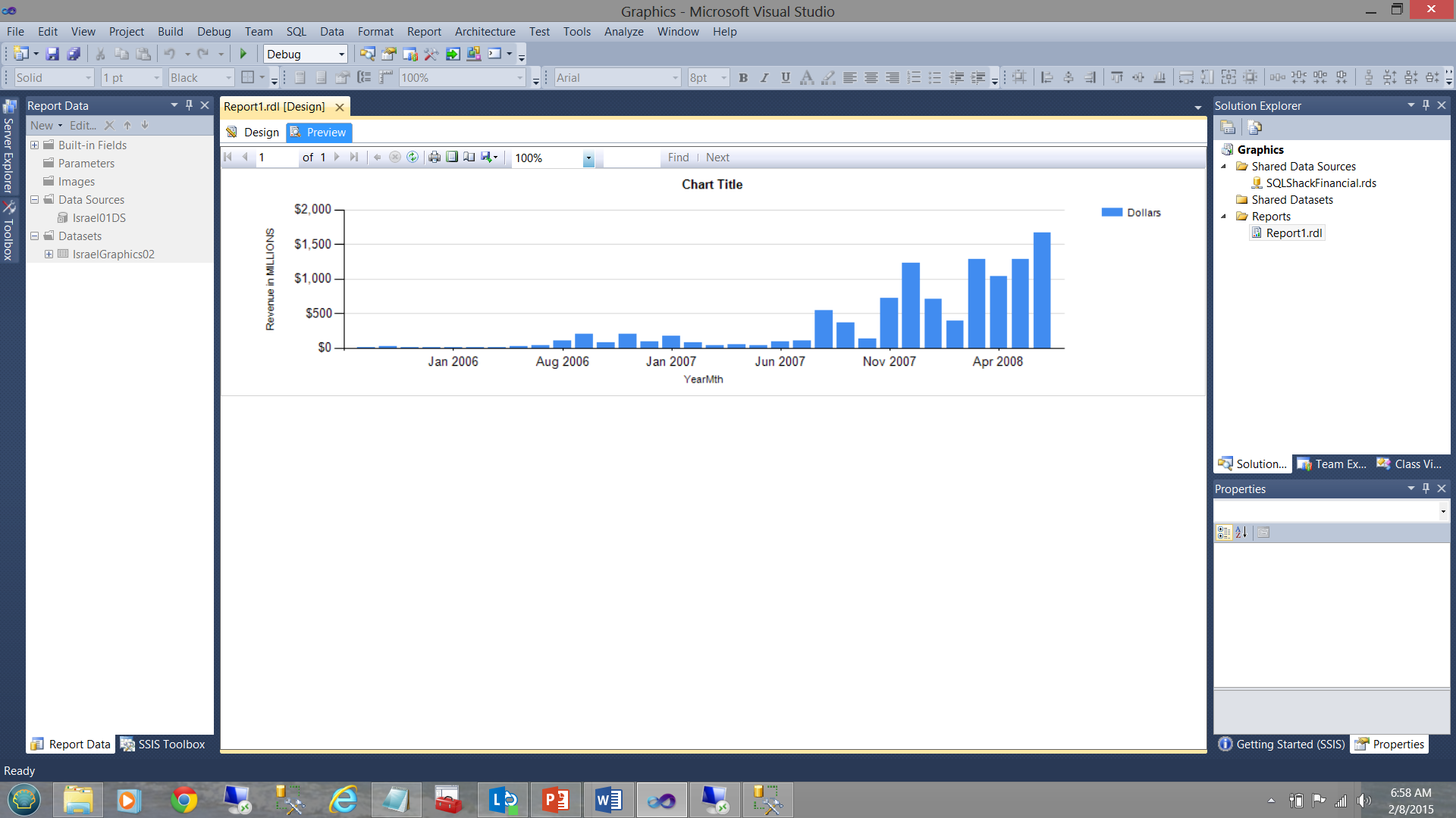
In the screen dump shown below, the financial results for SQLShackFinancial’s past few years are shown. In the first screen dump, the vertical bar chart’s fill color is generated by the system. In our case the colour blue. While the vertical bar chart does show income increasing with time, it does not tell us anything about how the “actuals” compare with the “planned”.
在下面显示的屏幕转储中,显示了SQLShackFinancial过去几年的财务结果。 在第一个屏幕转储中,垂直条形图的填充颜色由系统生成。 在我们的例子中,颜色是蓝色 。 尽管垂直条形图确实显示了收入随时间增加,但它并没有告诉我们“实际情况”与“计划的”情况之间的关系。
In our next screen dump, which is generated from the same query and from the same SQL Server Reporting Services project, the data becomes more informative. Note the usage of “our selected colours” to tell us the whole story (see below).
在我们的下一个屏幕转储中,该数据转储是从相同的查询和相同SQL Server Reporting Services项目生成的,数据变得更加有用。 注意使用“我们选择的颜色”来告诉我们整个故事(请参阅下文)。
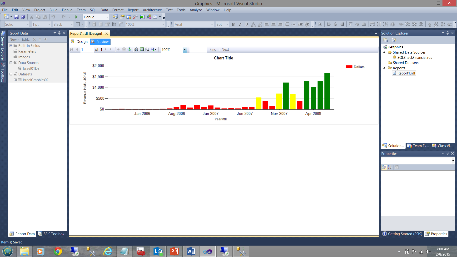
Up until July 2007, we were doing extremely poorly HOWEVER business started to ‘turn around’ going forward.
直到2007年7月,我们的经营状况都非常糟糕,然而业务开始“转头”发展。
The business rules for the color fill for the vertical bars were defined as follows.
垂直条的颜色填充的业务规则定义如下。
For each month
每个月
| Amount | <$500000000 |
>= $500000000 and < $1000000000 |
>= $1000000000 |
| Fill colour | Red | Yellow | Green |
| 量 | <$ 500000000 |
> = $ 500000000,并且 <$ 100,000000000 |
> = $ 1000000000 |
| 填充颜色 | 红 | 黄色 | 绿色 |
In terms of coding:
在编码方面:
=Switch (isnothing(Fields!Dollars.Value) , "LightGrey",Fields!Dollars.Value < 500000000, "Red" ,Fields!Dollars.Value >= 500000000 and Fields!Dollars.Value< 1000000000, "Yellow",Fields!Dollars.Value >= 1000000000, "Green")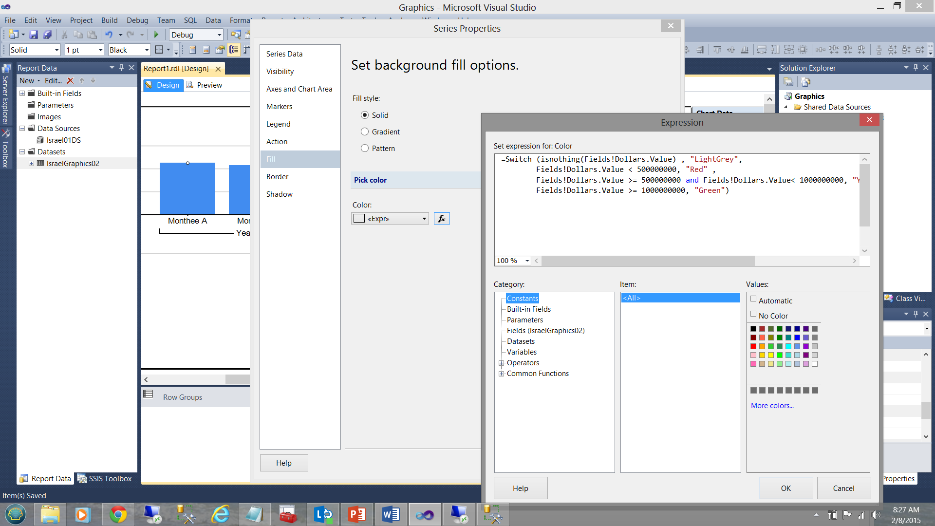
结论 ( Conclusions )
SQL Server Reporting Services has its quirks and may often seem a difficult tool to utilize to obtain efficient and effective information from our data. Knowing how to best work with the product is important as are the ways to work around the varied “gotcha’s”.
SQL Server Reporting Services有其独特之处,并且似乎常常很难用来从数据中获取有效信息。 知道如何最好地使用产品非常重要,解决各种“陷阱”的方法也很重要。
Datasets are the key to efficient rendering of reports. Local datasets help us when we are taking a “narrow view” of the data. “Show me the one record out of 100,000,000 that must be shown for the title of my vertical bar chart”.
数据集是有效呈现报告的关键。 当我们对数据进行“细化”时,本地数据集可以为我们提供帮助。 “请向我显示1亿条垂直条形图标题中必须显示的记录”。
The shared dataset is more conducive to environments where all the extracted data will be utilized by all the matrices and charts, where filtering is done on initial data extraction from the table and the resulting data set contains all that is needed.
共享数据集更有利于所有矩阵和图表都将利用所有提取的数据的环境,其中对从表中提取的初始数据进行过滤后,结果数据集将包含所有需要的数据。
As everything else in life generalizations are never 100% true.
就像生活中的其他一切一样,概论从来都不是100%正确的。
Happy programming!
编程愉快!
翻译自: https://www.sqlshack.com/sql-server-reporting-services-best-practices/
SQL Server Reporting Services最佳做法相关推荐
- python slicer_报表筛选:Excel Slicer与SQL Server Reporting Services(SSRS)参数
python slicer This article explores the report filtering using Excel Slicer and SQL Server Reporting ...
- sql2012 ssrs_如何使用SQL Server Reporting Services(SSRS)增强报告
sql2012 ssrs 介绍 (Introduction) A few months ago, I was working on a few SQL Server reports for a cli ...
- 安装和配置SQL Server Reporting Services (SSRS)
目录 什么是SQL Server报告服务(SSRS)? 先决条件 安装SQL Server报告服务(SSRS) 配置SQL Server报告服务 结论 在本文中,我们将在Windows机器上配置Mic ...
- sql server 监视_使用SQL Server Reporting Services进行快速,肮脏的服务器监视
sql server 监视 介绍 (Introduction) A few month back, I found myself in a position where the client want ...
- 如何在SQL Server Reporting Services中自动创建KPI
关键绩效指标(KPI) (Key Performance Indicator (KPI)) A Key Performance Indicator aka KPI is a metric which ...
- 如何使用SQL Server Reporting Services将数据格式转换为有价值的数据集
介绍 ( Introduction ) Oft times we are forced into situations where we must clearly think outside of t ...
- 如何在SQL Server Reporting Services中使用表达式来创建有效的报告
介绍 (Introduction) As many of you by now know, I am a fan of utilizing expressions within Reporting S ...
- 如何使用SQL Server Reporting Services创建图像分类系统
介绍 (Introduction) With Christmas just around the corner, in today's "get together" I thoug ...
- Microsoft SQL Server Reporting Services 初探
1.安装 SQL Server Reporting Services (SQLServerReportingServices.exe) 下载: Microsoft SQL Server 2017 Re ...
最新文章
- ecshop 2.x/3.x sql注入/任意代码执行漏洞
- Triangle Leetcode
- AD9516/AD9517时钟芯片寄存器参数配置说明
- 8.在idea中配置maven
- taro更新页面数据_Taro 全局数据状态管理
- 【工具使用】SecureCRT的下载、安装图文详细过程介绍
- 确保着法合规:象棋通用规则解析
- 29个用于石油和天然气等行业的最佳 GIS 软件
- 前端数据可视化插件(一)图表
- 从0到1学搜索:搜索引擎的基本技术逻辑(一)
- 大学物理实验计算机仿真 光电效应,大学物理实验报告模版
- callee、caller、call、apply、bind这些方法的含义和使用
- 【数据库】用户管理---君权神授
- 第7章第31节:四图排版:四张图片两两一组并行排列 [PowerPoint精美幻灯片实战教程]
- 加装机械硬盘后如何给磁盘分区
- Css3中align-content,深入理解css中的align-content属性
- python画图实践(超级简单)
- python降版本的影响_降低python版本的操作方法
- python实现的淘宝自动发货脚本
- 成都奔驰加装原厂无钥匙舒适进入 成都名车汇
热门文章
- vba 窗体单选框怎么传回sub_EXCEL表格VBA中函数的日常使用
- 共用体变量不能在定义时初始化_【C语言资料更新】共用体联合体
- 深度学习backbone是什么意思_CNN是靠什么线索学习到深度信息的?——一个经验性探索...
- html5 上海,【上海校区】HTML5新特性
- 10分钟python游戏_牛得一批!10分钟用Python编写一个贪吃蛇小游戏
- Dining POJ - 3281
- hadoop-0.20.2完全分布式集群
- springmvc错误java.lang.IllegalArgumentException
- WinForm如何控制ShowDialog()的返回值,并且可以判断是否会弹出主窗体
- MS CRM如果在Tab页中有Iframe选项,原来速度不慢,突然速度变慢