Flutter 基础目录结构介绍、入口自定义widget、等相关组件使用
提示:此文章为前端学习flutter过程,如有歧义期望各位大大的宝贵意见
学习Dart 基础知识 移步这里
安装flutter环境相关 移步这里
flutter基础组件使用相关 移步这里
文章目录
- 一、Flutter 目录结构介绍 入口
- 1.Flutter 目录结构介绍
- 2.Flutter 入口
- 二、Flutter 自定义Widget
- 三、Flutter 组件使用
- 0.main.dart 基础结构;
- 0.1. 自定义组件
- 注意 构造方法里一般只处理传过来的参数;
- 1. Icon 图标使用
- 2. Text组件 `类似前端span`
- 3.Flutter中 Container组件 `类似前端div`
- 4. Flutter中图片Image组件使用(远程、本地)
- 4.1.网络图片
- 4.2. 使用container实现圆形图片 4种方式
- 4.3. 使用本地图片
- 5. listView 垂直列表布局 、 水平布局
- 6. Flutter ListView 和ListView.builder 动态列表 矩阵列表
- 6.1 通过循环语句实现动态列表
- 6.2 通过方法遍历widget;
- 6.3 ListView.builder 的使用 ,抽离Widget 自定义方法;
- 7. Flutter GridView组件及动态GridView
- 7.1 GridView.count 实现网格布局
- 7.2 GridView.builder 实现网格布局
- 8.Flutter页面布局 Padding Row Column Expanded组件详解
- 8.1 Flutter Paddiing 组件
- 8.2 Flutter Row 水平布局组件
- 8.3 Flutter Column 垂直布局组件
- 8.4 Flutter Expanded 类似 Web 中的 Flex 布局
- 9. Flutter 页面布局 stack 层叠组件 stack 与 align stack 与 positioned 实现定位布局
- 9.1. stack 层叠组件
- ***从上向下越是后写的越会出现在顶部,后写的会遮挡先写的参数,如下如中的 text 就把 container 遮挡了***
- 9.2. stack 与 Align 实现组件布局
- 9.3. stack 与 Positioned 实现定位布局
- 10. Flutter AspectRatio、Card 卡片组件
- 10.1 Flutter 中AspectRatio 组件
- 10.1 Flutter 中Card 卡片组件
- 10.3 常用卡片样式布局
- 11.Flutter 中 button 组件 使用。
- 11.1 Flutter 中 TextButton
- 11.2 Flutter 中 IconButton
- 11.3 Flutter 中 ElevatedButton
- 11.4 Flutter 中 floatingActionButton
- 11.5 Flutter OutlinedButton
- 11.6 Flutter 中DropdownButton按钮(待完善)
- 11.7 自定义按钮组件
- 12.Flutter 中 Wrap 组件 。
- 12.1.横向排班 换行
- 12.2.纵项排班 换行
- 13.Flutter StatefulWidget 有状态组件、页面上绑定数据、改变页面数据
- 13.1 StatefulWidget 有状态组件,页面上绑定数据
- 13.2 改变页面列表数据
- 14.Flutter BottomNavigationBar 自定义底部导航条、以及实现页面切换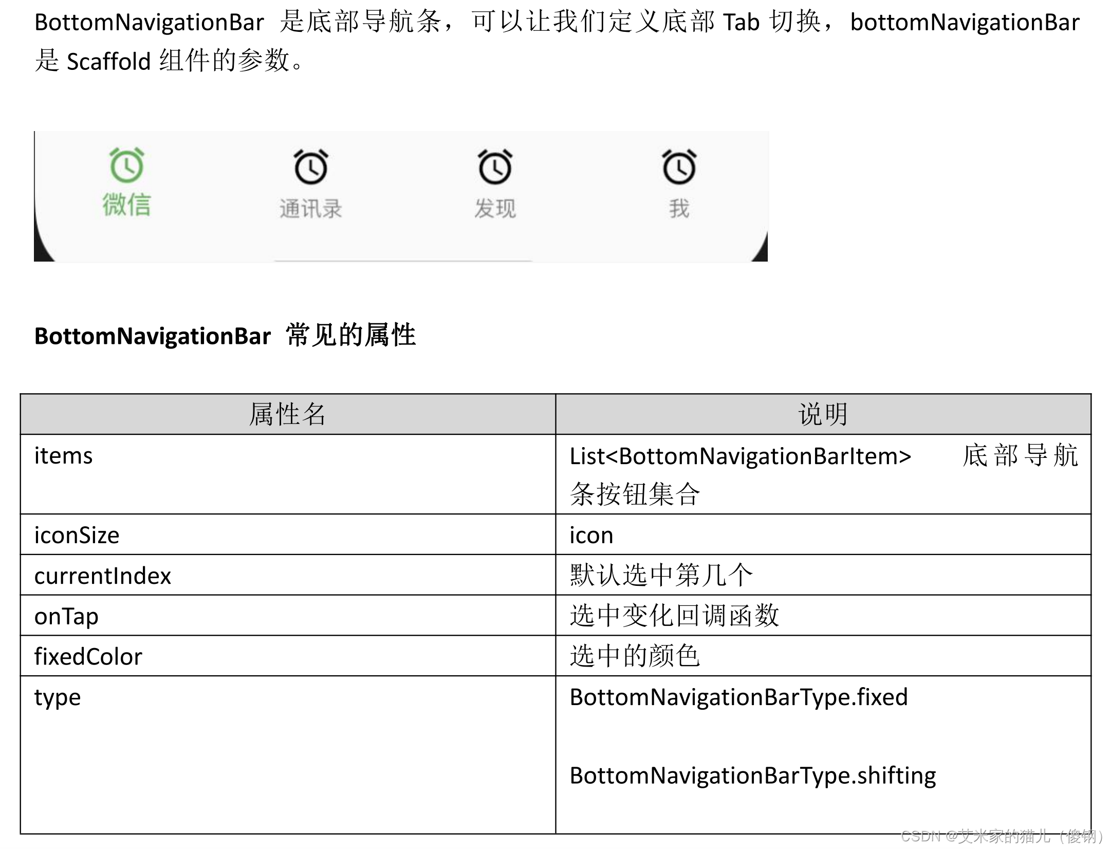
- 14.1 基础使用
- 14.2 正规应用项目拆分底部
- 15.Flutter 中的路由
- 15.1 普通路由跳转
- 15.2 普通路由返回
- 15.2 普通路由携带参数跳转及接收参数,与自定义组件传参方法一致;
- 16. Flutter 中的普通路由、普通路由传值、命名路由、命名路由传值
- 16.1 Flutter 中的普通路由
- 16.2 Flutter 中的普通路由传值
- 16.3 Flutter 中的命名路由
- 16.4 Flutter 中的命名路由传值 -这里直接把整个路由抽离出去,
- 16.5 Flutter 中返回到上一级页面
- 16.6 Flutter 中替换路由
- 16.7 Flutter 返回到根路由
- 18.Flutter AppBar 自定义顶部导航按钮图标、颜色以及 TarBar定义顶部 Tab 切换;
- 18.1 Flutter AppBar 自定义顶部按钮图 标、颜色
- 18.2 TarBar定义顶部 Tab 切换
- 19. Flutter Drawer滑动侧边栏及侧边栏内容布局
- 19.1 标准使用侧边栏
- 19.2 Flutter DrawerHeader
- 19.3 Flutter UserAccountsDrawerHeader
- 19.4 Flutter 侧边栏路由跳转
- 19.5 实现如下图片效果
- 20. Divider()组件 横线,用法类似与 SizeBox .
- 21. Flutter 中表单 TextField,CheckBox,CheckBox、Radio、Switch CheckboxListTile、RadioListTile、SwitchListTile、Slide.`
- 21.1 TextField 表单常见属性
- 21.2 TextField 表单初始化值,及监听数值变化
- 21.3 Checkbox、CheckboxListTile 多选框组件
- 21.4 Flutter 中 Radio、RadioListTile 单选按钮组件
- 21.5 futter 中 switch开关的使用
- 22. Flutter 官方自带日期组件 和 第三方日期组件
- 22.1 Flutter 日期和时间戳
- 22.1 Flutter 第三方库 date-format 的使用
- 22.2 Flutter 调用自带日期组件和时间组件;
- 22.3 调用 flutter 自带日期组件和时间组 件改为中文
- 23. Flutter 中InkWell 带水波纹可以点击的组件
- 24 .`弹窗处理`showDialog AlertDialog
一、Flutter 目录结构介绍 入口
1.Flutter 目录结构介绍
2.Flutter 入口
二、Flutter 自定义Widget
三、Flutter 组件使用
0.main.dart 基础结构;
import 'package:flutter/material.dart';void main() {runApp(const MyApp());
}class MyApp extends StatelessWidget {const MyApp({Key? key}) : super(key: key);@overrideWidget build(BuildContext context) {return MaterialApp(home: Scaffold(appBar: AppBar(title: const Text('hello flutter demo'),),body: const MyContent()),);}
}class MyContent extends StatelessWidget {const MyContent({Key? key}) : super(key: key);@overrideWidget build(BuildContext context) {return const Text('data...');}
}
0.1. 自定义组件
就是将组件抽离出来且可以接收参数
自定义普通组件
class MyContent extends StatelessWidget {const MyContent({Key? key}) : super(key: key);@overrideWidget build(BuildContext context) {return const IconContent(); //调用自定义组件}
}// 自定义子组件
class IconContent extends StatelessWidget {const IconContent({Key? key}) : super(key: key);@overrideWidget build(BuildContext context) {return Container(width: 100,height: 100,padding: const EdgeInsets.all(8.0),color: Colors.red.shade900,child: const Icon(Icons.search,color: Colors.white70,size: 34,),);}
}
自定义动态组件
class MyContent extends StatelessWidget {const MyContent({Key? key}) : super(key: key);@overrideWidget build(BuildContext context) {return const IconContent(Icons.home,color:Colors.red,size:22); //调用自定义组件}
}// 自己定义的自定义组件
class IconContent extends StatelessWidget {final double size;  // 接收传过来的参数当做常量且不能更改,这样减少损耗final Color color;  // 接收传过来的参数当做常量且不能更改,这样减少损耗final IconData icon;  // 接收传过来的参数当做常量且不能更改,这样减少损耗const IconContent(this.icon, {Key? key,   // 继承自 statelesswidget 就这样写就可以this.color = Colors.pink, // 默认赋值this.size = 50, //默认赋值}) : super(key: key);// 继承自 statelesswidget 就这样写就可以@overrideWidget build(BuildContext context) {return Container(width: 100,height: 100,padding: const EdgeInsets.all(8.0),color: color,//  新版本不需要使用 this.color 调用child: Icon(icon, //  新版本不需要使用 this.icon 调用color: Colors.white,size: size,),);}
}
**
注意 构造方法里一般只处理传过来的参数;
**
1. Icon 图标使用
样式库地址:https://www.fluttericon.com/
const Icon(/// list 引导图标是个iconIcons.set_meal_sharp,/// icon名称size: 60,/// icon 大小color: Colors.white,/// icon 颜色textDirection: TextDirection.ltr,
),
2. Text组件 类似前端span
Text("Text组件的使用",style: TextStyle(// 文字颜色color: Color(0xfff0000),// none 不显示装饰线条,underline 字体下方,overline 字体上方,lineThrough穿过文字decoration: TextDecoration.none,// solid 直线,double 双下划线,dotted 虚线,dashed 点下划线,wavy 波浪线decorationStyle: TextDecorationStyle.solid,// 装饰线的颜色decorationColor: Colors.red,// 文字大小fontSize: 15.0,// normal 正常,italic 斜体fontStyle: FontStyle.normal,// 字体的粗细fontWeight: FontWeight.bold,// 文字间的宽度letterSpacing: 1.0,// 文本行与行的高度,作为字体大小的倍数(取值1~2,如1.2)height: 1,//对齐文本的水平线://TextBaseline.alphabetic:文本基线是标准的字母基线//TextBaseline.ideographic:文字基线是表意字基线;//如果字符本身超出了alphabetic 基线,那么ideograhpic基线位置在字符本身的底部。textBaseline: TextBaseline.alphabetic),// 段落的间距样式strutStyle: StrutStyle(fontFamily: 'serif',fontFamilyFallback: ['monospace', 'serif'],fontSize: 20,height: 2,leading: 2.0,fontWeight: FontWeight.w300,fontStyle: FontStyle.normal,forceStrutHeight: true,debugLabel: 'text demo',),// 文字对齐方式textAlign: TextAlign.center,// 文字排列方向 ltr 左到右,rtl右到左textDirection: TextDirection.ltr,// 用于选择区域特定字形的语言环境locale: Locale('zh_CN'),// 软包裹 ,文字是否应该在软断行出断行softWrap: false,// 如何处理视觉溢出:clip 剪切溢出的文本以修复其容器。ellipsis 使用省略号表示文本已溢出。fade 将溢出的文本淡化为透明。overflow: TextOverflow.clip,// 文字的缩放比例textScaleFactor: 1.0,// 文本要跨越的可选最大行数,maxLines: 2,// 图像的语义描述,用于向Andoid上的TalkBack和iOS上的VoiceOver提供图像描述semanticsLabel: 'text demo',textWidthBasis: TextWidthBasis.longestLine,)
3.Flutter中 Container组件 类似前端div
margin:内边距,和子Widget有关系
padding:外边距,和父Widget有关系
alignment:子Widget对齐方式
默认是Alignment(0,0),子Widget居中。取值范围是(-1,1)。
child:子部件
clipBehavior:裁剪方法
color:背景颜色,如果foregroundDecoration设置的话,可能会遮盖color效果。
constraints:边界约束
decoration:用来设置特殊背景、边框。绘制在child后面的装饰。设置了decoration的话,就不能设置color属性
foregroundDecoration:用来设置特殊背景、边框。绘制在child前面的装饰
key:一个唯一标记,仅仅用来更新widget->key相同的小部件的状态
transform:矩阵变换 过度 旋转等
transformAlignment:设置矩阵变换的对齐方式
Container(child: Image.network('http://pic.616pic.com/ys_bnew_img/00/17/41/RGxKWmyJIK.jpg'),height: 300.0,width: 300.0,margin: const EdgeInsets.fromLTRB(20, 20, 20, 20),padding: const EdgeInsets.fromLTRB(20, 20, 20, 20),alignment: Alignment.bottomCenter,transform: Matrix4.skewX(0.1),decoration: BoxDecoration(color: Colors.white,borderRadius: const BorderRadius.all(Radius.circular(10),),border: Border.all(color: tTextColor999.withOpacity(.2),width: 1,),boxShadow: const [BoxShadow(color: Colors.black12,offset: Offset(0.0, 15.0), //阴影xy轴偏移量blurRadius: 15.0, //阴影模糊程度spreadRadius: 1.0 //阴影扩散程度)],// 渐变色gradient: LinearGradient(colors: [tMainRedColor, Colors.red, tMainRedColor],),),
),
4. Flutter中图片Image组件使用(远程、本地)
4.1.网络图片
Image.network('https://gimg2.baidu.com/image_search/src=http%3A%2F%2Fb-ssl.duitang.com%2Fuploads%2Fitem%2F201609%2F07%2F20160907125722_LF84P.thumb.700_0.jpeg&refer=http%3A%2F%2Fb-ssl.duitang.com&app=2002&size=f9999,10000&q=a80&n=0&g=0n&fmt=auto?sec=1653146319&t=a23832fe5477d1841073d48a644ad6e6',alignment: Alignment.topLeft, // 图片位置color: Colors.blue, // 图片颜色colorBlendMode: BlendMode.color, // 颜色混合模式fit: BoxFit.cover, //剪切图片repeat: ImageRepeat.noRepeat, // 图片重复
),
4.2. 使用container实现圆形图片 4种方式
方式1 container 的背景图片处理图片圆角
Container(width: 300.0,height: 300.0,decoration: BoxDecoration(color: Colors.red,border: Border.all(color: Colors.purple,width: 4.0,),borderRadius: BorderRadius.circular(150.0),image: const DecorationImage(image: NetworkImage('https://gimg2.baidu.com/image_search/src=http%3A%2F%2Fb-ssl.duitang.com%2Fuploads%2Fitem%2F201609%2F07%2F20160907125722_LF84P.thumb.700_0.jpeg&refer=http%3A%2F%2Fb-ssl.duitang.com&app=2002&size=f9999,10000&q=a80&n=0&g=0n&fmt=auto?sec=1653146319&t=a23832fe5477d1841073d48a644ad6e6'),fit: BoxFit.cover,repeat: ImageRepeat.noRepeat,),),),
方式2 container 下的子组件处理圆角显示
Container(width: 50,height: 50,child: ClipRRect(borderRadius: const BorderRadius.all(Radius.circular(200)),child: Image.network('https://gimg2.baidu.com/image_search/src=http%3A%2F%2Fb-ssl.duitang.com%2Fuploads%2Fitem%2F201609%2F07%2F20160907125722_LF84P.thumb.700_0.jpeg&refer=http%3A%2F%2Fb-ssl.duitang.com&app=2002&size=f9999,10000&q=a80&n=0&g=0n&fmt=auto?sec=1653146319&t=a23832fe5477d1841073d48a644ad6e6',fit: BoxFit.cover,),),
),
方式3 处理头像
leading: CircleAvatar(backgroundImage: NetworkImage("https://www.itying.com/images/flutter/1.png",),),
方式4 使用container 结合ClipOval实现原型图片
Container(child: ClipOval(child: Image.network('https://gimg2.baidu.com/image_search/src=http%3A%2F%2Fb-ssl.duitang.com%2Fuploads%2Fitem%2F201609%2F07%2F20160907125722_LF84P.thumb.700_0.jpeg&refer=http%3A%2F%2Fb-ssl.duitang.com&app=2002&size=f9999,10000&q=a80&n=0&g=0n&fmt=auto?sec=1653146319&t=a23832fe5477d1841073d48a644ad6e6',width: 100,height: 100,fit: BoxFit.cover,),),
),
4.3. 使用本地图片
1.根目录创建文件images 下创建 2.0x 3.0x 4.0x把文件分别放入文件夹 且再images下也要有;
2.然后,打开pubspec.yaml 声明一下添加的图片文件,注意要配置对 格式统一 对其
3.在代码中使用
Image.asset('本地路径。。。',alignment: Alignment.topLeft, // 图片位置color: Colors.blue, // 图片颜色colorBlendMode: BlendMode.color, // 颜色混合模式fit: BoxFit.cover, //剪切图片repeat: ImageRepeat.noRepeat, // 图片重复
),
5. listView 垂直列表布局 、 水平布局
class MyStatelessWidget extends StatelessWidget {const MyStatelessWidget({Key? key}) : super(key: key);@overrideWidget build(BuildContext context) {return ListView(scrollDirection: Axis.horizontal, // 垂直布局,高固定,宽自适应scrollDirection: Axis.vertical, // 水平布局 ,宽固定,高自适应padding: const EdgeInsets.fromLTRB(20, 20, 20, 20),children: <Widget>[ListTile(leading: const Icon(            /// list 引导图标是个iconIcons.set_meal_sharp,         /// icon名称size: 60,                     /// icon 大小color: Colors.white,        /// icon 颜色textDirection: TextDirection.ltr,), tileColor: Colors.blue[600],  /// listTile 背景色title: const Text(              /// 标题是个text'东北华北华南',                /// text内容style: TextStyle(             /// text样式fontSize: 24.0,color: Colors.white,),),subtitle: const Text('武汉浙江长将等地发生特大洪灾武汉浙江长将等地发生特大洪灾武汉浙江长将等地发生特大洪灾武汉浙江长将等地发生特大洪灾',style: TextStyle(color: Colors.white38),),),],);}
}
6. Flutter ListView 和ListView.builder 动态列表 矩阵列表
6.1 通过循环语句实现动态列表
class MyStatelessWidget extends StatelessWidget {const MyStatelessWidget({Key? key}) : super(key: key);List<Widget> getData() {// 在这个位置必须要声明返回值的类型是数组且值为Widget类型 ,如果调用的地方是明确类型的数据List<Widget> lists = []; // 同上 类型必须明确for (var i = 0; i < 20; i++) {lists.add(ListTile(title: Text('这是($i+1)条数据啊', // 变量直接加$style: TextStyle(color: Colors.blue.shade400,),),));}return lists;}@overrideWidget build(BuildContext context) {return ListView(scrollDirection: Axis.vertical,children: getData(),// 这个位置需要<Widget>类型的List所以在getData方法声明的时候必须要明确类型是Widget); }
}
6.2 通过方法遍历widget;
class MyStatelessWidget extends StatelessWidget {const MyStatelessWidget({Key? key}) : super(key: key);List<Widget> getData() {// 在这个位置必须要声明类型 ,如果调用的地方是明确类型的数据List list = [ // 此处必须明确声明类型否则报错{"name": '张三',"age": '12',   // text只能接受字符串 数字不行报错"src": 'https://www.juliangip.com/index/static/pc/img/pro_pic2.png'},{"name": '张三',"age": '12',"src": 'https://www.juliangip.com/index/static/pc/img/pro_pic2.png'},{"name": '张三',"age": '12',"src": 'https://www.juliangip.com/index/static/pc/img/pro_pic2.png'},];var lists = list.map((item) {return ListTile(title: Text(item['name']), // 获取对象的值leading: Image.network(item['src']),subtitle: Text(item['age']),);});return lists.toList();}@overrideWidget build(BuildContext context) {return ListView(scrollDirection: Axis.vertical,children: getData(),); // 这个位置需要<Widget>类型的List所以在getData方法声明的时候必须要明确类型是Widget}
}
6.3 ListView.builder 的使用 ,抽离Widget 自定义方法;
class MyStatelessWidget extends StatelessWidget {List list = [];MyStatelessWidget({Key? key}) : super(key: key) {list = [{"name": '张三',"age": '12',"src": 'https://www.juliangip.com/index/static/pc/img/pro_pic2.png'},{"name": '张三',"age": '12',"src": 'https://www.juliangip.com/index/static/pc/img/pro_pic2.png'},{"name": '张三',"age": '12',"src": 'https://www.juliangip.com/index/static/pc/img/pro_pic2.png'}];}// 自定义方法用于抽离组件部分Widget _getDataList(context, index) {return ListTile(title: Text(list[index]['name'],),leading: Image.network(list[index]['src']),subtitle: Text(list[index]['age'] + '岁数le '),);}@overrideWidget build(BuildContext context) {return ListView.builder(itemCount: list.length,itemBuilder: _getDataList,);/// 这个位置需要<Widget>类型的List所以在getData方法声明的时候必须要明确类型是Widget}
}
7. Flutter GridView组件及动态GridView
7.1 GridView.count 实现网格布局
| 名称 | 类型 | 说明 |
|---|---|---|
| scrollDirection | Axis | 滚动方法 |
| padding | EdgeInsetsGeometry | 内边距 |
| resolve | bool | 组件反向排序 |
| crossAxisSpacing | double | 水平子 Widget 之间间距 |
| mainAxisSpacing | double | 垂直子 Widget 之间间距 |
| crossAxisCount | int | int 一行的 Widget 数量 |
| childAspectRatio | double | 子 Widget 宽高比例 |
| children | [ ] | |
| gridDelegate |
SliverGridDelegateWithFix edCrossAxisCount(常用) SliverGridDelegateWithMax CrossAxisExtent
|
控制布局主要用在 GridView.builder 里面 |
import 'package:flutter/material.dart';void main() {runApp(const MyApp());
}class MyApp extends StatelessWidget {const MyApp({Key? key}) : super(key: key);@overrideWidget build(BuildContext context) {return MaterialApp(home: Scaffold(appBar: AppBar(title: const Text('hello flutter'),),body: MyGridViewCount(),),);}
}// ignore: must_be_immutable
class MyGridViewCount extends StatelessWidget {List lists = [{"title": 'goto其实很优雅',"url":'https://pics4.baidu.com/feed/03087bf40ad162d9f89f23927bf594e68b13cdfb.jpeg?token=c4a6b12d01a8ea4272c90772bec72e10',},{"title": 'goto其实很优雅,居然一直被摒弃',"url":'https://pics4.baidu.com/feed/03087bf40ad162d9f89f23927bf594e68b13cdfb.jpeg?token=c4a6b12d01a8ea4272c90772bec72e10',},{"title": 'goto其实很优雅,居然一直被摒弃',"url":'https://pics4.baidu.com/feed/03087bf40ad162d9f89f23927bf594e68b13cdfb.jpeg?token=c4a6b12d01a8ea4272c90772bec72e10'},{"title": 'goto其实很优雅,居然一直被摒弃',"url":'https://pic.rmb.bdstatic.com/bjh/down/f1aa1dbb6e0d2eeabd1bcba92a3a67cf.jpeg@wm_2,t_55m+5a625Y+3L+WmmeS6ulNIT1c=,fc_ffffff,ff_U2ltSGVp,sz_26,x_17,y_17'},{"title": 'goto其实很优雅,居然一直被摒弃',"url":'https://pic.rmb.bdstatic.com/bjh/down/f1aa1dbb6e0d2eeabd1bcba92a3a67cf.jpeg@wm_2,t_55m+5a625Y+3L+WmmeS6ulNIT1c=,fc_ffffff,ff_U2ltSGVp,sz_26,x_17,y_17'},{"title": 'goto其实很优雅,居然一直被摒弃',"url":'https://pic.rmb.bdstatic.com/bjh/down/f1aa1dbb6e0d2eeabd1bcba92a3a67cf.jpeg@wm_2,t_55m+5a625Y+3L+WmmeS6ulNIT1c=,fc_ffffff,ff_U2ltSGVp,sz_26,x_17,y_17'},{"title": 'goto其实很优雅,居然一直被摒弃',"url":'https://pic.rmb.bdstatic.com/bjh/down/f1aa1dbb6e0d2eeabd1bcba92a3a67cf.jpeg@wm_2,t_55m+5a625Y+3L+WmmeS6ulNIT1c=,fc_ffffff,ff_U2ltSGVp,sz_26,x_17,y_17'},{"title": 'goto其实很优雅,居然一直被摒弃',"url":'https://pic.rmb.bdstatic.com/bjh/down/f1aa1dbb6e0d2eeabd1bcba92a3a67cf.jpeg@wm_2,t_55m+5a625Y+3L+WmmeS6ulNIT1c=,fc_ffffff,ff_U2ltSGVp,sz_26,x_17,y_17'},];MyGridViewCount({Key? key}) : super(key: key);List<Widget> _getData() {return lists.map<Widget>((item) {return Container(padding: const EdgeInsets.all(10),// container 样式decoration: BoxDecoration(  // container 边框样式border: Border.all( color: Colors.grey.shade100,),// container rediusborderRadius: const BorderRadius.all(Radius.circular(4),),),child: Column(crossAxisAlignment: CrossAxisAlignment.center,// 垂直居中mainAxisAlignment: MainAxisAlignment.center, // 水平居中mainAxisSize: MainAxisSize.max,children: [Container(decoration: const BoxDecoration(borderRadius: BorderRadius.all(Radius.circular(4),),),child: ClipRRect(borderRadius: const BorderRadius.all(Radius.circular(10)),child: Image.network(item['url'],height: 110,width: 400,fit: BoxFit.cover,),),),const SizedBox(height: 10,),Text(item['title'],style: const TextStyle(color: Colors.black87,fontSize: 14,),maxLines: 1,overflow: TextOverflow.ellipsis,textAlign: TextAlign.center,),],),);}).toList();}@overrideWidget build(BuildContext context) {return GridView.count(padding: const EdgeInsets.all(10),crossAxisSpacing: 10, //  水平子 widget 之间间距mainAxisSpacing: 10, //  垂直子 widget 之间间距crossAxisCount: 2, // 一行的 widget 数量// childAspectRatio: 0.7, // 宽度和高度比例children: _getData(),);}
}
7.2 GridView.builder 实现网格布局
import 'package:flutter/material.dart';void main() {runApp(const MyApp());
}class MyApp extends StatelessWidget {const MyApp({Key? key}) : super(key: key);@overrideWidget build(BuildContext context) {return MaterialApp(home: Scaffold(appBar: AppBar(title: const Text('hello flutter'),),body: MyGridViewCount(),),);}
}// ignore: must_be_immutable
class MyGridViewCount extends StatelessWidget {List lists = [{"title": 'goto其实很优雅',"url":'https://pics4.baidu.com/feed/03087bf40ad162d9f89f23927bf594e68b13cdfb.jpeg?token=c4a6b12d01a8ea4272c90772bec72e10',},{"title": 'goto其实很优雅,居然一直被摒弃',"url":'https://pics4.baidu.com/feed/03087bf40ad162d9f89f23927bf594e68b13cdfb.jpeg?token=c4a6b12d01a8ea4272c90772bec72e10',},{"title": 'goto其实很优雅,居然一直被摒弃',"url":'https://pics4.baidu.com/feed/03087bf40ad162d9f89f23927bf594e68b13cdfb.jpeg?token=c4a6b12d01a8ea4272c90772bec72e10'},{"title": 'goto其实很优雅',"url":'https://pic.rmb.bdstatic.com/bjh/down/f1aa1dbb6e0d2eeabd1bcba92a3a67cf.jpeg@wm_2,t_55m+5a625Y+3L+WmmeS6ulNIT1c=,fc_ffffff,ff_U2ltSGVp,sz_26,x_17,y_17'},{"title": 'goto其实很优雅,居然一直被摒弃',"url":'https://pic.rmb.bdstatic.com/bjh/down/f1aa1dbb6e0d2eeabd1bcba92a3a67cf.jpeg@wm_2,t_55m+5a625Y+3L+WmmeS6ulNIT1c=,fc_ffffff,ff_U2ltSGVp,sz_26,x_17,y_17'},{"title": 'goto其实很优雅,居然一直被摒弃',"url":'https://pic.rmb.bdstatic.com/bjh/down/f1aa1dbb6e0d2eeabd1bcba92a3a67cf.jpeg@wm_2,t_55m+5a625Y+3L+WmmeS6ulNIT1c=,fc_ffffff,ff_U2ltSGVp,sz_26,x_17,y_17'},{"title": 'goto其实很优雅,居然一直被摒弃',"url":'https://pic.rmb.bdstatic.com/bjh/down/f1aa1dbb6e0d2eeabd1bcba92a3a67cf.jpeg@wm_2,t_55m+5a625Y+3L+WmmeS6ulNIT1c=,fc_ffffff,ff_U2ltSGVp,sz_26,x_17,y_17'},{"title": 'goto其实很优雅,居然一直被摒弃',"url":'https://pic.rmb.bdstatic.com/bjh/down/f1aa1dbb6e0d2eeabd1bcba92a3a67cf.jpeg@wm_2,t_55m+5a625Y+3L+WmmeS6ulNIT1c=,fc_ffffff,ff_U2ltSGVp,sz_26,x_17,y_17'},];MyGridViewCount({Key? key}) : super(key: key);Widget _getListData(context, index) {return Container(padding: const EdgeInsets.all(10),decoration: BoxDecoration(border: Border.all(color: Colors.grey.shade100,),borderRadius: const BorderRadius.all(Radius.circular(4),),),child: Column(crossAxisAlignment: CrossAxisAlignment.center,mainAxisAlignment: MainAxisAlignment.center,mainAxisSize: MainAxisSize.max,children: [Container(decoration: const BoxDecoration(borderRadius: BorderRadius.all(Radius.circular(4),),),child: ClipRRect(borderRadius: const BorderRadius.all(Radius.circular(10)),child: Image.network(lists[index]['url'],height: 110,width: 400,fit: BoxFit.cover,),),),const SizedBox(height: 10,),Text(lists[index]['title'],style: const TextStyle(color: Colors.black87,fontSize: 14,),maxLines: 1,overflow: TextOverflow.ellipsis,textAlign: TextAlign.center,),],),);}@overrideWidget build(BuildContext context) {return GridView.builder(padding: const EdgeInsets.all(10),itemCount: lists.length,gridDelegate: const SliverGridDelegateWithFixedCrossAxisCount(crossAxisSpacing: 10, //  水平子 widget 之间间距mainAxisSpacing: 10, //  垂直子 widget 之间间距crossAxisCount: 2, // 一行的 widget 数量),itemBuilder: _getListData,);}
}
最终效果:
8.Flutter页面布局 Padding Row Column Expanded组件详解
8.1 Flutter Paddiing 组件
Padding 组件与 container 组件类似都相当于组件的 div
| 主要常用参数 | 说明 |
|---|---|
| child | 子组件 |
| padding | 内边距 |
Padding(padding: const EdgeInsets.all(8.0),child: ClipOval(child: Image.network("https://www.itying.com/images/flutter/2.png",fit: BoxFit.cover,),),
),
8.2 Flutter Row 水平布局组件
row 使用方法与 listview 的区别:listview 是铺满整个屏幕,flutter中row 根据父组件的宽有多宽就铺多宽
| 主要常用参数 | 说明 |
|---|---|
| mainAxisAlignment | 主轴排序方式 |
| crossAxisAlignment | 次轴排序方式 |
| children | 子组件 |
import 'package:flutter/material.dart';void main() {runApp(const MyApp());
}class MyApp extends StatelessWidget {const MyApp({Key? key}) : super(key: key);@overrideWidget build(BuildContext context) {return MaterialApp(home: Scaffold(appBar: AppBar(title: const Text('Flutter 的 Row组件'),),body: const MyContent()),);}
}class MyContent extends StatelessWidget {const MyContent({Key? key}) : super(key: key);@overrideWidget build(BuildContext context) {return Container(height: 500,width: 350,color: Colors.pink,child: Row(mainAxisAlignment: MainAxisAlignment.spaceEvenly,crossAxisAlignment: CrossAxisAlignment.center,children: const [IconContent(Icons.home,color: Colors.blue,size: 30,),IconContent(Icons.search),IconContent(Icons.usb_rounded),],),); //调用自定义组件}
}// 自己定义的自定义组件
class IconContent extends StatelessWidget {final double size;final Color color;final IconData icon;const IconContent(this.icon, {Key? key,this.color = Colors.green,this.size = 50,}) : super(key: key);@overrideWidget build(BuildContext context) {return Container(width: 100,height: 100,padding: const EdgeInsets.all(8.0),color: color,child: Icon(icon,color: Colors.white,size: size,),);}
}
8.3 Flutter Column 垂直布局组件
水平布局相当于 flex的 column 使用方法与 listview 的区别:listview 是铺满整个屏幕,flutter 是 row 是有多宽就铺多宽
| 主要常用参数 | 说明 |
|---|---|
| mainAxisAlignment | 主轴排序方式 |
| crossAxisAlignment | 次轴排序方式 |
| children | 子组件 |
import 'package:flutter/material.dart';void main() {runApp(const MyApp());
}class MyApp extends StatelessWidget {const MyApp({Key? key}) : super(key: key);@overrideWidget build(BuildContext context) {return MaterialApp(home: Scaffold(appBar: AppBar(title: const Text('Flutter 的 Column组件'),),body: const MyContent()),);}
}class MyContent extends StatelessWidget {const MyContent({Key? key}) : super(key: key);@overrideWidget build(BuildContext context) {return Container(height: 500,width: 350,color: Colors.pink,child: Column(mainAxisAlignment: MainAxisAlignment.spaceEvenly,crossAxisAlignment: CrossAxisAlignment.center,children: const [IconContent(Icons.home,color: Colors.blue,size: 30,),IconContent(Icons.search),IconContent(Icons.usb_rounded),],),); //调用自定义组件}
}// 自己定义的自定义组件
class IconContent extends StatelessWidget {final double size;final Color color;final IconData icon;const IconContent(this.icon, {Key? key,this.color = Colors.green,this.size = 50,}) : super(key: key);@overrideWidget build(BuildContext context) {return Container(width: 100,height: 100,padding: const EdgeInsets.all(8.0),color: color,child: Icon(icon,color: Colors.white,size: size,),);}
}
8.4 Flutter Expanded 类似 Web 中的 Flex 布局
expanded 可以使用在 Row 和 Column 布局中
| 属性 | 说明 |
|---|---|
| child | 子组件 |
| flex | 元素站整个父组件 Row、Column 的比例 |
Row(mainAxisAlignment: MainAxisAlignment.spaceEvenly,crossAxisAlignment: CrossAxisAlignment.center,children: const [Expanded(flex: 1,child: IconContent(Icons.home,color: Colors.blue,size: 30,),),Expanded(flex: 2,child: IconContent(Icons.usb_rounded,size: 30,),),],)
9. Flutter 页面布局 stack 层叠组件 stack 与 align stack 与 positioned 实现定位布局
9.1. stack 层叠组件
(有点像 ps 中的图层的意思,后写的参数会遮挡之前写的参数)
从上向下越是后写的越会出现在顶部,后写的会遮挡先写的参数,如下如中的 text 就把 container 遮挡了
import 'package:flutter/material.dart';void main() {runApp(const MyApp());
}class MyApp extends StatelessWidget {const MyApp({Key? key}) : super(key: key);@overrideWidget build(BuildContext context) {return MaterialApp(home: Scaffold(appBar: AppBar(title: const Text('hello flutter demo'),),body: const MyContent()),);}
}class MyContent extends StatelessWidget {const MyContent({Key? key}) : super(key: key);@overrideWidget build(BuildContext context) {return Center(child: Stack(alignment: Alignment.center, // 定义组件在什么位置// alignment: const Alignment(0, -1),//或者这种00 是xy 的中心店,xy 的最大值为1,最小值为-1children: [Container(color: Colors.red.shade400,width: 300,height: 500,),const Text('我是后写的字段',style: TextStyle(color: Colors.white,fontSize: 24,),),],),);}
}
注意:alignment 会控制所有组件,出现位置,是 stack 下的所有子组件,
9.2. stack 与 Align 实现组件布局
注意:因为 stack 下的 alignment 属性会操作 stack 下的所有子组件,想要每个子组件都有不同的位置,那就使用 Align 有 child 和 alignment(通过这个属性来实现子组件位置的变化)
import 'package:flutter/material.dart';void main() {runApp(const MyApp());
}class MyApp extends StatelessWidget {const MyApp({Key? key}) : super(key: key);@overrideWidget build(BuildContext context) {return MaterialApp(home: Scaffold(appBar: AppBar(title: const Text('hello flutter demo'),),body: const MyContent()),);}
}class MyContent extends StatelessWidget {const MyContent({Key? key}) : super(key: key);@overrideWidget build(BuildContext context) {return Center(child: Container(width: 200,height: 400,color: Colors.green,child: Stack(children: const [Align(alignment: Alignment.topLeft,child: Icon(Icons.home, size: 39, color: Colors.white),),Align(alignment: Alignment.center,child: Icon(Icons.search, size: 40, color: Colors.white),),Align(alignment: Alignment.bottomRight,child: Icon(Icons.architecture, size: 60, color: Colors.white),),],),),);}
}
9.3. stack 与 Positioned 实现定位布局
注意 有四个值 left right top bottom 跟 js 中的 position 很像,默认值为0
import 'package:flutter/material.dart';void main() {runApp(const MyApp());
}class MyApp extends StatelessWidget {const MyApp({Key? key}) : super(key: key);@overrideWidget build(BuildContext context) {return MaterialApp(home: Scaffold(appBar: AppBar(title: const Text('hello flutter demo'),),body: const MyContent()),);}
}class MyContent extends StatelessWidget {const MyContent({Key? key}) : super(key: key);@overrideWidget build(BuildContext context) {return Center(child: Container(width: 200,height: 400,color: Colors.green,child: Stack(children: const [Positioned(left: 10,top: 100,child: Icon(Icons.home, size: 39, color: Colors.white),),Positioned(right: 10,top: 100,child: Icon(Icons.search, size: 40, color: Colors.white),),Positioned(bottom: 100,child: Icon(Icons.architecture, size: 60, color: Colors.white),),],),),);}
}
10. Flutter AspectRatio、Card 卡片组件
10.1 Flutter 中AspectRatio 组件
class MyContent extends StatelessWidget {const MyContent({Key? key}) : super(key: key);@overrideWidget build(BuildContext context) {return AspectRatio(aspectRatio: 3.0 / 2.0, // 宽高比child: Container(color: Colors.red,),);}
}
10.1 Flutter 中Card 卡片组件
class MyContent extends StatelessWidget {const MyContent({Key? key}) : super(key: key);@overrideWidget build(BuildContext context) {return ListView(children: [Card(margin: const EdgeInsets.all(10),child: Column(children: const [ListTile(title: Text('洛基',style: TextStyle(color: Colors.black87),),subtitle: Text('高级软件工程师'),),ListTile(title: Text('电话:xxx'),),ListTile(title: Text('邮箱:xxx'),),]),),Card(margin: const EdgeInsets.all(10),child: Column(children: const [ListTile(title: Text('洛基',style: TextStyle(color: Colors.black87),),subtitle: Text('高级软件工程师'),),ListTile(title: Text('电话:xxx'),),ListTile(title: Text('邮箱:xxx'),),]),),],);}
}
10.3 常用卡片样式布局
import 'package:flutter/material.dart';
import './res/listData.dart';void main() {runApp(const MyApp());
}class MyApp extends StatelessWidget {const MyApp({Key? key}) : super(key: key);@overrideWidget build(BuildContext context) {return MaterialApp(home: Scaffold(appBar: AppBar(title: const Text('hello flutter demo'),),body: const MyContent()),);}
}class MyContent extends StatelessWidget {const MyContent({Key? key}) : super(key: key);// 把自定义组件拆出去且遍历List<Widget> _getData() {return listData.map((val) {return Card(margin: const EdgeInsets.all(10.0),shadowColor: Colors.black12,child: Column(children: [AspectRatio(aspectRatio: 16.0 / 9.0,child: Image.network(val["imageUrl"],fit: BoxFit.cover,height: 300,),),ListTile(leading: CircleAvatar(backgroundImage: NetworkImage(val["imageUrl"],),),title: Text(val["title"],overflow: TextOverflow.ellipsis,maxLines: 1,),subtitle: Text(val["description"],maxLines: 1,overflow: TextOverflow.ellipsis,),)],),);}).toList();}@overrideWidget build(BuildContext context) {return ListView(children: _getData(),);}
}
数据
List listData=[{"title": 'Candy Shop',"author": 'Mohamed Chahin',"imageUrl": 'https://www.itying.com/images/flutter/1.png',"description": 'Flutter is Google’s mobile UI framework for crafting high-quality native experiences on iOS and Android in record time. Flutter works with existing',},{"title": 'Childhood in a picture',"author": 'Google',"imageUrl": 'https://www.itying.com/images/flutter/2.png',"description": 'Flutter is Google’s mobile UI framework for crafting high-quality native experiences on iOS and Android in record time. Flutter works with existing',},{"title": 'Alibaba Shop',"author": 'Alibaba',"imageUrl": 'https://www.itying.com/images/flutter/3.png',"description": 'Dart is a client-optimized language for fast apps on any platform... Dart is a client-optimized language for fast apps on any platform Optimizedfor',},{"title": 'Candy Shop',"author": 'Mohamed Chahin',"imageUrl": 'https://www.itying.com/images/flutter/4.png',"description": 'Dart is a client-optimized language for fast apps on any platform... Dart is a client-optimized language for fast apps on any platform Optimizedfor',},{"title": 'Tornado',"author": 'Mohamed Chahin',"imageUrl": 'https://www.itying.com/images/flutter/5.png',"description": 'Flutter is Google’s mobile UI framework for crafting high-quality native experiences on iOS and Android in record time. Flutter works with existing',},{"title": 'Undo',"author": 'Mohamed Chahin',"imageUrl": 'https://www.itying.com/images/flutter/6.png',"description": 'Flutter is Google’s mobile UI framework for crafting high-quality native experiences on iOS and Android in record time. Flutter works with existing',},{"title": 'white-dragon',"author": 'Mohamed Chahin',"imageUrl": 'https://www.itying.com/images/flutter/7.png',"description": 'Dart is a client-optimized language for fast apps on any platform... Dart is a client-optimized language for fast apps on any platform Optimizedfor',} ];
11.Flutter 中 button 组件 使用。
11.1 Flutter 中 TextButton
TextButton(child: Text("TextButton按钮"),//添加一个点击事件onPressed: () {},//设置按钮是否自动获取焦点autofocus: true,//定义一下文本样式style: ButtonStyle(//定义文本的样式 这里设置的颜色是不起作用的textStyle: MaterialStateProperty.all(TextStyle(fontSize: 18, color: Colors.red)),//设置按钮上字体与图标的颜色//foregroundColor: MaterialStateProperty.all(Colors.deepPurple),//更优美的方式来设置foregroundColor: MaterialStateProperty.resolveWith((states) {if (states.contains(MaterialState.focused) &&!states.contains(MaterialState.pressed)) {//获取焦点时的颜色return Colors.blue;} else if (states.contains(MaterialState.pressed)) {//按下时的颜色return Colors.deepPurple;}//默认状态使用灰色return Colors.grey;},),//背景颜色backgroundColor: MaterialStateProperty.resolveWith((states) {//设置按下时的背景颜色if (states.contains(MaterialState.pressed)) {return Colors.blue[200];}//默认不使用背景颜色return null;}),//设置水波纹颜色overlayColor: MaterialStateProperty.all(Colors.yellow),//设置阴影  不适用于这里的TextButtonelevation: MaterialStateProperty.all(0),//设置按钮内边距padding: MaterialStateProperty.all(EdgeInsets.all(10)),//设置按钮的大小minimumSize: MaterialStateProperty.all(Size(200, 100)),//设置边框side:MaterialStateProperty.all(BorderSide(color: Colors.grey, width: 1)),//外边框装饰 会覆盖 side 配置的样式shape: MaterialStateProperty.all(StadiumBorder()),),
);
11.2 Flutter 中 IconButton
IconButton(onPressed: () {},icon: const Icon(Icons.search),
),
11.3 Flutter 中 ElevatedButton
ElevatedButton(onPressed: () {},child: const Text('ElevatedButton'),
),Container(width: 200,height: 50,child: ElevatedButton(onPressed: () {},child: Text('ElevatedButton',),style: ButtonStyle(backgroundColor: MaterialStateProperty.all(Colors.red), // 背景色shadowColor: MaterialStateProperty.all(Colors.black), // 阴影elevation: MaterialStateProperty.all(4), // 阴影范围),),
),
// 按钮前面加上icon
ElevatedButton.icon(onPressed: () {},icon: Icon(Icons.search),label: Text('图标按钮'),
),
 // 圆角按钮
shape: MaterialStateProperty.all(RoundedRectangleBorder(borderRadius: BorderRadius.circular(20)),
),
// 圆形按钮shape: MaterialStateProperty.all(CircleBorder(side: BorderSide(color: Colors.white))),
// 描边
side: MaterialStateProperty.all(BorderSide(width: 4, color: Colors.blue)),
注意:
想改变 button 按钮大小,建议外面包一个 container 就可以了改变按钮大小了,
设置按钮阴影同时要设置 evevation,否则无效果;
11.4 Flutter 中 floatingActionButton
floatingActionButton: FloatingActionButton(onPressed: () {// Add your onPressed code here!},backgroundColor: Colors.green,child: const Icon(Icons.navigation),
),
floatingActionButtonLocation: FloatingActionButtonLocation.startFloat, // 按钮位置
注意:放在 与 body 和 appBar同级,且在 Scaffold下;同样修改按钮大小用 container 包裹起来设置 container就相当于设置了按钮大小;
注明样例写法,如下
import 'package:flutter/material.dart';
import 'package:flutter_app_3/pages/search.dart';import '../pages/tabs/chat.dart';
import '../pages/tabs/find.dart';
import '../pages/tabs/mine.dart';
import '../pages/tabs/tel.dart';
import '../pages/search2.dart';class BottomTemplate extends StatefulWidget {final int index; // 接到的参数可以为 nullconst BottomTemplate({Key? key, this.index = 0}) : super(key: key);@overrideState<BottomTemplate> createState() => _BottomTemplateState(this.index);
}class _BottomTemplateState extends State<BottomTemplate> {List pageList = [ChatPage(),TelPage(),Search2Page(),FindPage(),MinePage()];int currentIndex = 0;String navigationBarName = '微信聊天页面';_BottomTemplateState(index) {this.currentIndex = index;}@overrideWidget build(BuildContext context) {return Scaffold(drawer: Drawer(child: Center(child: ElevatedButton(onPressed: () {Navigator.of(context).pop();Navigator.of(context).pushNamed('/search2');},child: Text("跳转到 myapp 页面"),),),),appBar: AppBar(title: Text(navigationBarName),),floatingActionButton: Container(width: 60,height: 60,padding: EdgeInsets.all(8),decoration: BoxDecoration(borderRadius: BorderRadius.circular(60.0),color: Colors.white,// border: Border.all(width: 1, color: Colors.green),),child: FloatingActionButton(child: Icon(Icons.search),backgroundColor:this.currentIndex == 2 ? Colors.blue : Colors.grey.shade500,onPressed: () {setState(() {this.currentIndex = 2;});},),),floatingActionButtonLocation: FloatingActionButtonLocation.centerDocked,body: pageList[currentIndex],bottomNavigationBar: BottomNavigationBar(type: BottomNavigationBarType.fixed, // 超过两个必须要写 typecurrentIndex: currentIndex, // 当前是第几个页面下标从零开始fixedColor: Colors.blue, // 默认选中的颜色onTap: (int index) {setState(() {currentIndex = index;switch (index) {case 0:navigationBarName = "微信聊天页面";break;case 1:navigationBarName = "我的通讯录页面";break;case 2:navigationBarName = "搜索";break;case 3:navigationBarName = "发现页面";break;case 4:navigationBarName = "我页面";break;}});},items: const [// 底部按钮每一项BottomNavigationBarItem(icon: Icon(Icons.home_mini_sharp),label: "微信",),BottomNavigationBarItem(icon: Icon(Icons.home_mini_sharp),label: "通讯录",),BottomNavigationBarItem(icon: Icon(Icons.home_mini_sharp),label: "搜索",),BottomNavigationBarItem(icon: Icon(Icons.home_mini_sharp),label: "发现",),BottomNavigationBarItem(icon: Icon(Icons.home_mini_sharp),label: "我",),],),);}
}
11.5 Flutter OutlinedButton
OutlinedButton(onPressed: () {},child: Text('OutlinedButton'),
),
11.6 Flutter 中DropdownButton按钮(待完善)
 DropdownButton(value: 'One',icon: const Icon(Icons.arrow_downward),elevation: 16,style: const TextStyle(color: Colors.deepPurple),underline: Container(height: 2,color: Colors.deepPurpleAccent,),dropdownColor: Colors.red,items: <String>['One', 'Two', 'Free', 'Four'].map<DropdownMenuItem<String>>((String value) {return DropdownMenuItem<String>(value: value,child: Text(value,style: const TextStyle(color: Colors.white,),),);}).toList(),onChanged: (String? s) {print(s);},
),
11.7 自定义按钮组件
1.定义按钮组件
class MyButton extends StatelessWidget {final double height;final double width;final text;final onPressed;MyButton({this.height = 0, this.width = 0, this.text = '', this.onPressed = null});@overrideWidget build(BuildContext context) {return Container(width: width,height: height,child: ElevatedButton(onPressed: onPressed,child: Text(text),),);}
}
2.使用
MyButton(width: 300,height: 50,text: '我是自定义的按钮1',onPressed: () {print('我是自定义按钮被触发了点击事件');
}),
12.Flutter 中 Wrap 组件 。
12.1.横向排班 换行
spacing: 10, //横轴 元素与元素之间的距离
runSpacing: 0, //纵轴 元素与元素之间的距离
// alignment: WrapAlignment.end, // 主轴对齐方法 基本不用
import 'package:flutter/material.dart';void main() {runApp(const MyApp());
}class MyApp extends StatelessWidget {const MyApp({Key? key}) : super(key: key);@overrideWidget build(BuildContext context) {return MaterialApp(home: Scaffold(appBar: AppBar(title: const Text('hello flutter demo'),),body: const MyContent(),),);}
}class MyContent extends StatelessWidget {const MyContent({Key? key}) : super(key: key);@overrideWidget build(BuildContext context) {//这是一个文本按钮 未设置点击事件下的样式return Wrap(spacing: 10, //横轴 元素与元素之间的距离runSpacing: 0, //纵轴  元素与元素之间的距离// alignment: WrapAlignment.end, // 主轴对齐方法  基本不用children: const [myButton('lisi'),myButton('lisi2'),myButton('lisi3'),myButton('lisi4'),myButton('lisi5'),myButton('lisi6'),myButton('lisi7'),myButton('lisi8'),myButton('lisi9'),],);}
}class myButton extends StatelessWidget {final String name;const myButton(this.name, {Key? key}) : super(key: key);@overrideWidget build(BuildContext context) {return ElevatedButton(onPressed: () {},child: Text(name),);}
}
12.2.纵项排班 换行
import 'package:flutter/material.dart';void main() {runApp(const MyApp());
}class MyApp extends StatelessWidget {const MyApp({Key? key}) : super(key: key);@overrideWidget build(BuildContext context) {return MaterialApp(home: Scaffold(appBar: AppBar(title: const Text('hello flutter demo'),),body: const MyContent(),),);}
}class MyContent extends StatelessWidget {const MyContent({Key? key}) : super(key: key);@overrideWidget build(BuildContext context) {//这是一个文本按钮 未设置点击事件下的样式return Container(width: 300,height: 500,color: Colors.green.shade100,padding: const EdgeInsets.all(10),child: Wrap(spacing: 10, //横轴 元素与元素之间的距离runSpacing: 10, //纵轴  元素与元素之间的距离direction: Axis.vertical, // 横向排步,还是纵项布局,默认横向alignment: WrapAlignment.end, // 主轴对齐方法  基本不用children: const [myButton('lisi'),myButton('lisi2'),myButton('lisi3'),myButton('lisi4'),myButton('lisi5'),myButton('lisi6'),myButton('lisi7'),myButton('lisi8'),myButton('lisi9'),myButton('lisi'),myButton('lisi2'),myButton('lisi3'),myButton('lisi4'),myButton('lisi5'),myButton('lisi6'),myButton('lisi7'),myButton('lisi8'),myButton('lisi9'),],),);}
}class myButton extends StatelessWidget {final String name;const myButton(this.name, {Key? key}) : super(key: key);@overrideWidget build(BuildContext context) {return ElevatedButton(onPressed: () {},child: Text(name),);}
}
13.Flutter StatefulWidget 有状态组件、页面上绑定数据、改变页面数据
13.1 StatefulWidget 有状态组件,页面上绑定数据
在 Flutter 中自定义组件其实就是一个类,这个类需要继承 StatelessWidget/StatefulWidget。
StatelessWidget 是无状态组件,状态不可变的 widget ,
StatefulWidget 是有状态组件,持有的状态可能在 widget 生命周期改变。
通俗的讲:如果我 们想改变页面中的数据的话这个时候就需要用到 StatefulWidget
import 'package:flutter/material.dart';void main() {runApp(const MyApp());
}class MyApp extends StatelessWidget {const MyApp({Key? key}) : super(key: key);@overrideWidget build(BuildContext context) {return MaterialApp(home: Scaffold(appBar: AppBar(title: const Text('hello flutter demo'),),body: MyContent(),),);}
}class MyContent extends StatefulWidget {MyContent({Key? key}) : super(key: key);@overrideState<MyContent> createState() => _MyContentState();
}class _MyContentState extends State<MyContent> {int count = 0;@overrideWidget build(BuildContext context) {return Center(child: Column(children: [const SizedBox(height: 200,),Text("$count"),const SizedBox(height: 20,),ElevatedButton(onPressed: () {setState(() {count++;});},child: const Text('增加'),),],),);}
}
13.2 改变页面列表数据
import 'package:flutter/material.dart';void main() {runApp(const MyApp());
}class MyApp extends StatelessWidget {const MyApp({Key? key}) : super(key: key);@overrideWidget build(BuildContext context) {return MaterialApp(home: Scaffold(appBar: AppBar(title: const Text('hello flutter demo'),),body: const MyFriendsList(),),);}
}class MyFriendsList extends StatefulWidget {const MyFriendsList({Key? key}) : super(key: key);@overrideState<MyFriendsList> createState() => _MyFriendsListState();
}class _MyFriendsListState extends State<MyFriendsList> {List friendList = [];@overrideWidget build(BuildContext context) {return ListView(children: <Widget>[Column(children: friendList.map((e) {return ListTile(leading: Image.network('https://gimg2.baidu.com/image_search/src=http%3A%2F%2Fb-ssl.duitang.com%2Fuploads%2Fitem%2F201609%2F07%2F20160907125722_LF84P.thumb.700_0.jpeg&refer=http%3A%2F%2Fb-ssl.duitang.com&app=2002&size=f9999,10000&q=a80&n=0&g=0n&fmt=auto?sec=1653146319&t=a23832fe5477d1841073d48a644ad6e6',alignment: Alignment.topLeft, // 图片位置color: Colors.blue, // 图片颜色colorBlendMode: BlendMode.color, // 颜色混合模式fit: BoxFit.cover, //剪切图片repeat: ImageRepeat.noRepeat, // 图片重复),title: Text(e),subtitle: const Text('我是新闻的描述'),);}).toList(),),Center(child: ElevatedButton(onPressed: () {setState(() {friendList.add('我是新闻${friendList.length + 1}');friendList.add('我是新闻${friendList.length + 1}');});print(friendList);},child: const Text('新增'),),)],);}
}
14.Flutter BottomNavigationBar 自定义底部导航条、以及实现页面切换
当底部导航页面超过三个时,必须要添加type属性(BottomNavigationBarType.fixed),否则的话底部导航会全白,看不到效果
items中是一个BottomNavigationBarItem的集合,里面包含图片及文字标签,在视频教程中给的文字使用的是title属性,我在使用时提示被弃用,用烂了替换title为 label !!!
currentIndex是BottomNavigationBar 中的属性,是为底部导航页面编的号,从零开始
我们要改变页面时在onTap中获取点击页面的编号
onTap: (int index) { setState(() { currentIndex = index; }); },
- body中是我们展示的页面,我们将所有页面放在一个集合中,通过上一步中获取到的下标定位到指定页面
14.1 基础使用
bottomNavigationBar: BottomNavigationBar(type: BottomNavigationBarType.fixed, // 超过两个必须要写 typecurrentIndex: 0, // 当前是第几个页面下标从零开始fixedColor: Colors.green, // 默认选中的颜色onTap: (int index) {},items: const [BottomNavigationBarItem(icon: Icon(Icons.home_mini_sharp),label: "微信",),BottomNavigationBarItem(icon: Icon(Icons.home_mini_sharp),label: "通讯录",),BottomNavigationBarItem(icon: Icon(Icons.home_mini_sharp),label: "发现",),BottomNavigationBarItem(icon: Icon(Icons.home_mini_sharp),label: "我",),],
),
14.2 正规应用项目拆分底部
1.创建文件夹 及文件夹对应文件,且 bottomTips.dart 装的文件用于处理底部几个文件;
w_chat.dart /
import 'package:flutter/material.dart';// ignore: camel_case_types
class wChatPage extends StatelessWidget {const wChatPage({Key? key}) : super(key: key);@overrideWidget build(BuildContext context) {return const Text('我是 wChatPage');}
}
tel.dart/
import 'package:flutter/material.dart';// ignore: camel_case_types
class telPage extends StatelessWidget {const telPage({Key? key}) : super(key: key);@overrideWidget build(BuildContext context) {return const Text('我是 telPage');}
}
found.dart/
import 'package:flutter/material.dart';// ignore: camel_case_types
class findPage extends StatelessWidget {const findPage({Key? key}) : super(key: key);@overrideWidget build(BuildContext context) {return const Text('我是 findPage');}
}
mine.dart
import 'package:flutter/material.dart';// ignore: camel_case_types
class minePage extends StatelessWidget {const minePage({Key? key}) : super(key: key);@overrideWidget build(BuildContext context) {return const Text('我是 minePage');}
}
bottomTips.dart
import 'package:flutter/material.dart';import './bottom_componts/found.dart';
import './bottom_componts/w_chat.dart';
import './bottom_componts/mine.dart';
import './bottom_componts/tel.dart';class BottomTemplate extends StatefulWidget {const BottomTemplate({Key? key}) : super(key: key);@overrideState<BottomTemplate> createState() => _BottomTemplateState();
}class _BottomTemplateState extends State<BottomTemplate> {List pageList = [const wChatPage(),const telPage(),const findPage(),const minePage()];int currentIndex = 0;String navigationBarName = '微信聊天页面';@overrideWidget build(BuildContext context) {return Scaffold(appBar: AppBar(title: Text(navigationBarName),),body: pageList[currentIndex],bottomNavigationBar: BottomNavigationBar(type: BottomNavigationBarType.fixed, // 超过两个必须要写 typecurrentIndex: currentIndex, // 当前是第几个页面下标从零开始fixedColor: Colors.blue, // 默认选中的颜色onTap: (int index) {setState(() {currentIndex = index;switch (index) {case 0:navigationBarName = "微信聊天页面";break;case 1:navigationBarName = "我的通讯录页面";break;case 2:navigationBarName = "发现页面";break;case 3:navigationBarName = "我页面";break;}});},items: const [ // 底部按钮每一项BottomNavigationBarItem(icon: Icon(Icons.home_mini_sharp),label: "微信",),BottomNavigationBarItem(icon: Icon(Icons.home_mini_sharp),label: "通讯录",),BottomNavigationBarItem(icon: Icon(Icons.home_mini_sharp),label: "发现",),BottomNavigationBarItem(icon: Icon(Icons.home_mini_sharp),label: "我",),],),);}
}
第二步在 mian.dart 中调用封装的 底部
import 'package:flutter/material.dart';
import './bottomTips/bottomTips.dart'; // 引入自己封装的外部组件void main() {runApp(const MyApp());
}class MyApp extends StatelessWidget {const MyApp({Key? key}) : super(key: key);@overrideWidget build(BuildContext context) {return const MaterialApp(home: BottomTemplate(), // 调用自己封装的外部组件);}
}
15.Flutter 中的路由
15.1 普通路由跳转
ElevatedButton(onPressed: () {Navigator.of(context).push(MaterialPageRoute(builder: (BuildContext context) {return SearchPage();}));},child: Text('跳转到搜索页面'),
),
15.2 普通路由返回
FloatingActionButton(onPressed: () {Navigator.of(context).pop();},// enableFeedback: true,child: Icon(Icons.backspace_outlined),
)
15.2 普通路由携带参数跳转及接收参数,与自定义组件传参方法一致;
1.首先在跳转位置,import 引入 formPage组件协商自己要传参的内容
ElevatedButton(onPressed: () {Navigator.of(context).push(MaterialPageRoute(builder: (context) => FormPage(title: '我是通过传参传过来的列表标题'),),);},child: Text('跳转到表单页面并传值'),
)
2.接收参数 - 通过构造函数来接收参数,且规定是必传参数还是非必传参数,放在{}就是非必传参数
import 'package:flutter/material.dart';// ignore: must_be_immutable
class FormPage extends StatelessWidget {String titleGet;  // 通过构造函数来接收参数,且规定是必传参数还是非必传参数,放在{}就是非必传参数FormPage({Key? key, this.titleGet = '我是个默认表单'}) : super(key: key);@overrideWidget build(BuildContext context) {return Scaffold(appBar: AppBar(title: Text("表单..."),),body: Container(color: Colors.green,child: ListView(children: [ListTile(title: Text(titleGet)),ListTile(title: Text(titleGet)),ListTile(title: Text(titleGet)),ListTile(title: Text(titleGet)),ListTile(title: Text(titleGet)),],),),);}
}
16. Flutter 中的普通路由、普通路由传值、命名路由、命名路由传值
16.1 Flutter 中的普通路由
1.首先在跳转位置,import 引入 formPage组件协商自己要传参的内容
ElevatedButton(onPressed: () {Navigator.of(context).push(MaterialPageRoute(builder: (context) => FormPage(title: '我是通过传参传过来的列表标题'),),);},child: Text('跳转到表单页面并传值'),
)
16.2 Flutter 中的普通路由传值
2.接收参数 - 通过构造函数来接收参数,且规定是必传参数还是非必传参数,放在{}就是非必传参数
传参
onPressed: () {Navigator.of(context).push(MaterialPageRoute(builder: (BuildContext context) {return SearchPage(title: '普通传参过来搜索标题');}));},
接参
import 'package:flutter/material.dart';// ignore: must_be_immutable
class FormPage extends StatelessWidget {String titleGet;  // 通过构造函数来接收参数,且规定是必传参数还是非必传参数,放在{}就是非必传参数FormPage({Key? key, this.titleGet = '我是个默认表单'}) : super(key: key);@overrideWidget build(BuildContext context) {return Scaffold(appBar: AppBar(title: Text("表单..."),),body: Container(color: Colors.green,child: ListView(children: [ListTile(title: Text(titleGet)),ListTile(title: Text(titleGet)),ListTile(title: Text(titleGet)),ListTile(title: Text(titleGet)),ListTile(title: Text(titleGet)),],),),);}
}
16.3 Flutter 中的命名路由
1.在 main.dart 根目录下定义路由
Widget build(BuildContext context) { return MaterialApp( // home:Tabs(), initialRoute: '/',  // 默认跳转路由routes: {  // 定义路由'/':(contxt)=>Tabs(), '/search':(contxt) =>SearchPage(), '/form': (context) => FormPage(), },
);
2.跳转路由
ElevatedButton( child: Text("跳转到搜索页面"), onPressed: (){ Navigator.pushNamed(context, '/search');},
)
16.4 Flutter 中的命名路由传值 -这里直接把整个路由抽离出去,
1.新建一个 Routes.dart 文件
import 'package:flutter/material.dart';
import '../tabs/tabs.dart';
import '../pages/search2.dart';// 这个位置写路由final Map<String, Function> routes = {'/': (contxt, {arguments}) => BottomTemplate(),'/search2': (contxt, {arguments}) => Search2Page(arguments: arguments)
};// 这个位置固定写法,无需担心,新手可以不用理解
var onGenerateRoute = (RouteSettings settings) {// 统一处理final String? name = settings.name;final Function? pageContentBuilder = routes[name];if (pageContentBuilder != null) {final Route route = MaterialPageRoute(builder: (context) =>pageContentBuilder(context, arguments: settings.arguments));return route;}
};
2.在需要main.dart文件夹下引入
import 'package:flutter/material.dart';
import 'routes/Routes.dart';
void main() => runApp(MyApp());
class MyApp extends StatelessWidget { @overrideWidget build(BuildContext context) { return MaterialApp( // home:Tabs(),   // 引入底部按钮initialRoute: '/', // 默认跳转路由onGenerateRoute: onGenerateRoute ); // 路由跳转}
}
3.在需要引入跳转的地方使用
ElevatedButton( child: Text("跳转商品详情页面 并传参 id"), onPressed: (){ Navigator.pushNamed(context, '/search2',arguments: { "title":20 });},
)
4.接收参数
方法一,是 StatelessWidget无状态组件接参数
import 'package:flutter/material.dart';class Search2Page extends StatelessWidget {final Map? arguments; // 接到的参数可以为 nullSearch2Page({this.arguments});@overrideWidget build(BuildContext context) {return Scaffold(appBar: AppBar(title: Text("${arguments != null ? arguments!['title'] : '0'}"),),);}
}
方法二,是StatefulWidget有状态组件接收参数
import 'package:flutter/material.dart';
class Search2Page extends StatefulWidget {final Map? arguments;Search2Page({Key? key, this.arguments}) : super(key: key);@overrideState<Search2Page> createState() => _Search2PageState(arguments: arguments);
}class _Search2PageState extends State<Search2Page> {Map? arguments;_Search2PageState({this.arguments});@overrideWidget build(BuildContext context) {return Scaffold(appBar: AppBar(title: Text("${arguments != null ? arguments!['title'] : '0'}"),),);}
}
16.5 Flutter 中返回到上一级页面
Navigator.of(context).pop();
16.6 Flutter 中替换路由
比如我们从用户中心页面跳转到了 registerFirst 页面,然后从 registerFirst 页面通过 pushReplacementNamed 跳转到了 registerSecond 页面。这个时候当我们点击 registerSecond 的返回按钮的时候它会直接返回到用户中心。
Navigator.of(context).pushReplacementNamed('/registerSecond');
16.7 Flutter 返回到根路由
比如我们从用户中心跳转到 registerFirst 页面,然后从 registerFirst 页面跳转到 registerSecond 页面,然后从 registerSecond 跳转到了 registerThird 页面。这个时候我们想的是 registerThird 注册成功后返回到用户中心。 这个时候就用到了返回到根路由的方法。
切记这里 Tabs()必须提前引入;
Navigator.of(context).pushAndRemoveUntil( new MaterialPageRoute(builder: (context) => new Tabs(index:1)), //跳转路径携带参数 index(route) => route == null // 清空路由
);
tabs 中处理接到的参数
import 'package:flutter/material.dart';import '../pages/tabs/chat.dart';
import '../pages/tabs/find.dart';
import '../pages/tabs/mine.dart';
import '../pages/tabs/tel.dart';class BottomTemplate extends StatefulWidget {final int index; // 接到的参数const BottomTemplate({Key? key, this.index = 0}) : super(key: key); // 赋初始值@overrideState<BottomTemplate> createState() => _BottomTemplateState(this.index); // 传参给构造函数
}class _BottomTemplateState extends State<BottomTemplate> {List pageList = [const ChatPage(),const TelPage(),const FindPage(),const MinePage()];int currentIndex = 0;String navigationBarName = '微信聊天页面';_BottomTemplateState(index) {  // 处理构造函数接到的参数this.currentIndex = index;}@overrideWidget build(BuildContext context) {return Scaffold(appBar: AppBar(title: Text(navigationBarName),),body: pageList[currentIndex],bottomNavigationBar: BottomNavigationBar(type: BottomNavigationBarType.fixed, // 超过两个必须要写 typecurrentIndex: currentIndex, // 当前是第几个页面下标从零开始fixedColor: Colors.blue, // 默认选中的颜色onTap: (int index) {setState(() {currentIndex = index;switch (index) {case 0:navigationBarName = "微信聊天页面";break;case 1:navigationBarName = "我的通讯录页面";break;case 2:navigationBarName = "发现页面";break;case 3:navigationBarName = "我页面";break;}});},items: const [// 底部按钮每一项BottomNavigationBarItem(icon: Icon(Icons.home_mini_sharp),label: "微信",),BottomNavigationBarItem(icon: Icon(Icons.home_mini_sharp),label: "通讯录",),BottomNavigationBarItem(icon: Icon(Icons.home_mini_sharp),label: "发现",),BottomNavigationBarItem(icon: Icon(Icons.home_mini_sharp),label: "我",),],),);}
}
18.Flutter AppBar 自定义顶部导航按钮图标、颜色以及 TarBar定义顶部 Tab 切换;
18.1 Flutter AppBar 自定义顶部按钮图 标、颜色
appBar: AppBar(backgroundColor: Colors.red,//导航背景色leading: IconButton(  // 左侧替换返回图标icon: Icon(Icons.menu),tooltip: "Search",onPressed: () {print('menu Pressed');}),title: Text('FlutterDemo'),centerTitle: true,  // 是否居中显示actions: <Widget>[ // 定义右侧显示图标IconButton(icon: Icon(Icons.search),tooltip: "Search",onPressed: () {print('Search Pressed');}),IconButton(icon: Icon(Icons.more_horiz),tooltip: "more_horiz",onPressed: () {print('more_horiz Pressed');})],
),
18.2 TarBar定义顶部 Tab 切换
TabBarView下的数量与 tibs 下的数量对应
import 'package:flutter/material.dart';class Register3Page extends StatelessWidget {const Register3Page({Key? key}) : super(key: key);@overrideWidget build(BuildContext context) {return DefaultTabController(length: 5,child: Scaffold(appBar: AppBar(title: Row(mainAxisAlignment: MainAxisAlignment.spaceEvenly,children: <Widget>[Expanded(flex: 1,child: TabBar(enableFeedback: false,isScrollable: true,tabs: <Widget>[Tab(text: "热门1"),Tab(text: "推荐2"),Tab(text: "推荐3"),Tab(text: "推荐4"),Tab(text: "推荐5"),],),)],),),body: TabBarView(children: [ListView(children: [ListTile(title: Text("hello1")),ListTile(title: Text("hello")),ListTile(title: Text("hello")),],),ListView(children: [ListTile(title: Text("hello2")),ListTile(title: Text("hello")),ListTile(title: Text("hello")),],),ListView(children: [ListTile(title: Text("hello3")),ListTile(title: Text("hello")),ListTile(title: Text("hello")),],),ListView(children: [ListTile(title: Text("hello4")),ListTile(title: Text("hello")),ListTile(title: Text("hello")),],),ListView(children: [ListTile(title: Text("hello5")),ListTile(title: Text("hello")),ListTile(title: Text("hello")),],)],),),);}
}
19. Flutter Drawer滑动侧边栏及侧边栏内容布局
使用在Scaffold下,默认是左侧侧边栏
19.1 标准使用侧边栏
在 Scaffold 组件里面传入 drawer 参数可以定义左侧边栏,传入 endDrawer 可以定义右侧边 栏。侧边栏默认是隐藏的,我们可以通过手指滑动显示侧边栏,也可以通过点击按钮显示侧 边栏。
return Scaffold( appBar: AppBar( title: Text("Flutter App"), ),drawer: Drawer(child: Text('左侧边栏'),),endDrawer: Drawer( child: Text('右侧侧边栏'), ),
);
19.2 Flutter DrawerHeader
drawer: Drawer(child: Column(children: <Widget>[DrawerHeader(decoration: BoxDecoration(color: Colors.yellow,image: DecorationImage(image: NetworkImage("https://www.itying.com/images/flutter/2.png"),fit: BoxFit.cover)),child: ListView(children: <Widget>[Text('我是一个头部')],),),ListTile(title: Text("个人中心"),leading: CircleAvatar(child: Icon(Icons.people)),),Divider(),ListTile(title: Text("系统设置"),leading: CircleAvatar(child: Icon(Icons.settings)),)],
)),
19.3 Flutter UserAccountsDrawerHeader
drawer: Drawer(
child: Column(
children: <Widget>[
UserAccountsDrawerHeader(accountName: Text("luoji"),accountEmail: Text("luoji@qq.com"),currentAccountPicture: CircleAvatar(backgroundImage:NetworkImage("https://www.itying.com/images/flutter/3.png"),),decoration: BoxDecoration(color: Colors.yellow,image: DecorationImage(image: NetworkImage("https://www.itying.com/images/flutter/2.png"),fit: BoxFit.cover)),otherAccountsPictures: <Widget>[Image.network("https://www.itying.com/images/flutter/4.png"),Image.network("https://www.itying.com/images/flutter/5.png"),Image.network("https://www.itying.com/images/flutter/6.png")],
),
19.4 Flutter 侧边栏路由跳转
onTap: (){Navigator.of(context).pop();// 阻止侧边弹窗一直显示Navigator.pushNamed(context, '/search');
}
19.5 实现如下图片效果
import 'package:flutter/material.dart';class Register3Page extends StatelessWidget {const Register3Page({Key? key}) : super(key: key);@overrideWidget build(BuildContext context) {return DefaultTabController(length: 5,child: Scaffold(//左侧侧边栏drawer: Drawer(child: Column(children: [// 侧滑头部样式Row(children: [Expanded(child: DrawerHeader(child: Column(crossAxisAlignment: CrossAxisAlignment.center,mainAxisAlignment: MainAxisAlignment.center,children: [Text('hello zdx',style: TextStyle(color: Colors.white,fontSize: 22,fontWeight: FontWeight.w900),),SizedBox(height: 10,),Container(width: 60,height: 60,child: ClipOval(child: Image.network("http://www.itying.com/images/flutter/1.png",fit: BoxFit.cover,),),),],),// 背景图片decoration: BoxDecoration(image: DecorationImage(image: NetworkImage('https://www.itying.com/images/flutter/2.png'),fit: BoxFit.cover,opacity: .6,),),),)],),ListTile(leading: CircleAvatar(child: Icon(Icons.home)),title: Text('我的电脑'),),ListTile(leading: CircleAvatar(child: Icon(Icons.home)),title: Text('我的电脑'),),],),),// 右侧侧边栏endDrawer: Drawer(child: Column(children: [ListTile(leading: CircleAvatar(child: Icon(Icons.home)),title: Text('我的电脑'),),ListTile(leading: CircleAvatar(child: Icon(Icons.home)),title: Text('我的电脑'),),],),),appBar: AppBar(title: Row(mainAxisAlignment: MainAxisAlignment.spaceEvenly,children: <Widget>[Expanded(flex: 1,child: TabBar(enableFeedback: false,isScrollable: true,tabs: <Widget>[Tab(text: "热门1"),Tab(text: "推荐2"),Tab(text: "推荐3"),Tab(text: "推荐4"),Tab(text: "推荐5"),],),)],),),body: TabBarView(children: [ListView(children: [ListTile(title: Text("hello1")),ListTile(title: Text("hello")),ListTile(title: Text("hello")),],),ListView(children: [ListTile(title: Text("hello2")),ListTile(title: Text("hello")),ListTile(title: Text("hello")),],),ListView(children: [ListTile(title: Text("hello3")),ListTile(title: Text("hello")),ListTile(title: Text("hello")),],),ListView(children: [ListTile(title: Text("hello4")),ListTile(title: Text("hello")),ListTile(title: Text("hello")),],),ListView(children: [ListTile(title: Text("hello5")),ListTile(title: Text("hello")),ListTile(title: Text("hello")),],)],),),);}
}
20. Divider()组件 横线,用法类似与 SizeBox .
跟 html 中的 hr 一个意思
Divider(),
21. Flutter 中表单 TextField,CheckBox,CheckBox、Radio、Switch CheckboxListTile、RadioListTile、SwitchListTile、Slide.`
Flutter 中常见的表单有 TextField 单行文本框,TextField 多行文本框、CheckBox、Radio、Switch CheckboxListTile、RadioListTile、SwitchListTile、Slide.
21.1 TextField 表单常见属性
child: Column(children: [Text('表单组件'),TextField(),SizedBox(height: 29),TextField(maxLength: 150, // 文字最长maxLines: 3, // 最多显示三行decoration: InputDecoration(hintText: "请输入文本内容", // 提示语的表单border: OutlineInputBorder(borderRadius: BorderRadius.all(Radius.circular(4.0),),),prefixIcon: Icon(Icons.search), //输入框内加图标icon: Icon(Icons.home), // 输入框前面输入图标),),SizedBox(height: 29),TextField(decoration: InputDecoration(border: OutlineInputBorder(),labelText: "用户名",),),SizedBox(height: 29),TextField(obscureText: true,obscuringCharacter: '*',decoration: InputDecoration(border: OutlineInputBorder(),labelText: "密码",),),],),
21.2 TextField 表单初始化值,及监听数值变化
1.有默认值必须这样写·
var username = new TextEditingController(text: '洛基是个猫'); // 初始化给表单赋值
或者这样写··
var username = new TextEditingController(); // 初始化给表单赋值@overridevoid initState() {super.initState();username.text = '张三';}
2.没有默认值这样写 var password; // 初始化不赋值
注意:理解定义方式为这个类(组件)的全局变量;
import 'package:flutter/material.dart';class TextFieldDemoPage extends StatefulWidget {TextFieldDemoPage({Key? key}) : super(key: key);@overrideState<TextFieldDemoPage> createState() => _TextFieldDemoPageState();
}class _TextFieldDemoPageState extends State<TextFieldDemoPage> {var username = new TextEditingController(text: '洛基是个猫'); // 初始化给表单赋值var password; // 初始化不赋值@overrideWidget build(BuildContext context) {return Scaffold(appBar: AppBar(title: Text("调试文本"),),body: Container(padding: EdgeInsets.all(20),child: Column(children: [TextField(onChanged: (value) {setState(() {this.username.text = value;});},decoration: InputDecoration(border: OutlineInputBorder(),label: Text('用户名'),),controller: username, // 接收初始化的值),SizedBox(height: 10),TextField(obscureText: true,onChanged: (value) {setState(() {this.password = value;});},decoration: InputDecoration(border: OutlineInputBorder(),label: Text('密码'),),),SizedBox(height: 30),ElevatedButton(onPressed: () {print(username.text);print(password);},child: Container(width: double.infinity,height: 50,alignment: Alignment.center,child: Text('下一步'),),)],),),);}
}
21.3 Checkbox、CheckboxListTile 多选框组件
shape: CircleBorder(), //圆形 checkbox
import 'package:flutter/material.dart';class CheckBoxDemo extends StatefulWidget {CheckBoxDemo({Key? key}) : super(key: key);@overrideState<CheckBoxDemo> createState() => _CheckBoxDemoState();
}class _CheckBoxDemoState extends State<CheckBoxDemo> {var flag;// @overridevoid initState() {super.initState();flag = true;}@overrideWidget build(BuildContext context) {return Scaffold(appBar: AppBar(title: Text('CheckBoxDemo'),),body: Column(children: [Text('checkBox'),Divider(),Checkbox(shape: CircleBorder(),activeColor: Colors.red, // 选中颜色value: flag,onChanged: (val) {setState(() {this.flag = val;});}),Divider(),CheckboxListTile(shape: CircleBorder(),title: Text('洛基是猫',style: TextStyle(fontSize: 18,fontWeight: FontWeight.bold,),),secondary: Container(width: 50,height: 50,child: ClipOval(child: Image.network('https://www.itying.com/images/flutter/1.png',fit: BoxFit.cover,),),),value: flag,onChanged: (val) {setState(() {this.flag = val;});},),Divider(),],),);}
}
21.4 Flutter 中 Radio、RadioListTile 单选按钮组件
注意:要有相同的 radiogroup 值;
import 'package:flutter/material.dart';class RadioDemoPage extends StatefulWidget {RadioDemoPage({Key? key}) : super(key: key);@overrideState<RadioDemoPage> createState() => _RadioDemoPageState();
}class _RadioDemoPageState extends State<RadioDemoPage> {int flag = 1;@overrideWidget build(BuildContext context) {return Scaffold(appBar: AppBar(title: Text('radio test'),),body: Container(padding: EdgeInsets.all(30),child: Column(children: [// radioRow(children: [Text('男'),Radio(value: 1,groupValue: this.flag,onChanged: (val) {print(val is int);setState(() {this.flag = (val as int);});},),SizedBox(width: 20),Text('女'),Radio(value: 2,groupValue: this.flag,onChanged: (val) {print(val);setState(() {this.flag = (val as int);});},)],),SizedBox(height: 30)],),),);}
}
21.5 futter 中 switch开关的使用
Row(children: [Text('开始禁言该群'),Switch(value: agree,activeColor: Colors.green,onChanged: (value) {setState(() {this.agree = value;});},)],
)
22. Flutter 官方自带日期组件 和 第三方日期组件
22.1 Flutter 日期和时间戳
日期转化成时间戳:
var now = new DateTime.now();
print(now.millisecondsSinceEpoch);//单位毫秒,
时间戳转化成日期:
var now = new DateTime.now(); var a=now.millisecondsSinceEpoch; //时间戳 print(DateTime.fromMillisecondsSinceEpoch(a));
22.1 Flutter 第三方库 date-format 的使用
date_format 可以格式化日期 文档:https://pub.dev/packages/date_format
第一步.找到文件安装版本,flutter pub get 一下;
2.引入需要使用的地方
import 'package:date_format/date_format.dart';
3.使用找到官网文档的 example 下,查看使用方法
22.2 Flutter 调用自带日期组件和时间组件;
以下实现效果
import 'package:date_format/date_format.dart'; // 调用第三方时间格式化库
import 'package:flutter/material.dart';class DateFormatDemoPage extends StatefulWidget {DateFormatDemoPage({Key? key}) : super(key: key);@overrideState<DateFormatDemoPage> createState() => _DateFormatDemoPageState();
}class _DateFormatDemoPageState extends State<DateFormatDemoPage> {var _nowDate = DateTime.now(); // 获取当前时间var _nowTime = TimeOfDay(hour: DateTime.now().hour, minute: DateTime.now().minute); // 获取当前时分秒// 日期选择器调用方法_getDate() async {// 方法一showDatePicker(context: context,initialDate: this._nowDate,firstDate: DateTime(2022),lastDate: DateTime(2100),).then((value) {setState(() {this._nowDate = value!;});});// 方法二// var result = await showDatePicker(//   context: context,//   initialDate: this._nowDate,//   firstDate: DateTime(2022),//   lastDate: DateTime(2100),// );// setState(() {//   this._nowDate = result!;// });}// 时间选择器调用方法_getTime() async {// 方法一// showTimePicker(//   context: context,//   initialTime: this._nowTime,// ).then((value) {//   print(value);//   setState(() {//     this._nowTime = value!;//   });// });// 方法二var result = await showTimePicker(context: context,initialTime: this._nowTime,);setState(() {this._nowTime = result!;});}@overrideWidget build(BuildContext context) {return Scaffold(appBar: AppBar(title: Text('使用第三方格式化时间库')),body: Center(child: Row(mainAxisAlignment: MainAxisAlignment.center,children: [InkWell(child: Row(mainAxisAlignment: MainAxisAlignment.center,children: [// 强制转化为年月日Text(formatDate(_nowDate, [yyyy, '年', mm, '月', dd, '日'])),Icon(Icons.arrow_drop_down_outlined),],),onTap: () {_getDate();},),InkWell(child: Row(mainAxisAlignment: MainAxisAlignment.center,children: [// 强制转化为时分上午下午Text('${_nowTime.format(context)}'),Icon(Icons.arrow_drop_down_outlined),],),onTap: () {_getTime();},)],),),);}
}
22.3 调用 flutter 自带日期组件和时间组 件改为中文
https://blog.csdn.net/qq_731335498/article/details/124618629
23. Flutter 中InkWell 带水波纹可以点击的组件
有个 child 属性和点击属性,有点类似与 html 中 block
InkWell(child: Row(mainAxisAlignment: MainAxisAlignment.center,children: [Text('选择日期'),Icon(Icons.arrow_drop_down_outlined),],),onTap: () {},
)
24 .弹窗处理showDialog AlertDialog
showDialog(context: context,builder: (context) {return AlertDialog(title: const Text('提示'),content: const Text('是否确认签到'),actions: [ElevatedButton(onPressed: () {Navigator.pop(context); // 关闭弹窗},child: const Text('确认')),ElevatedButton(onPressed: () {Navigator.pop(context);// 关闭弹窗},child: const Text('取消')),],);},);
Flutter 官网 : https://flutter.dev/Flutter 插件下载地址 : https://pub.dev/packagesFlutter 开发文档 : https://flutter.cn/docs ( 强烈推荐 )官方 GitHub 地址 : https://github.com/flutter
Flutter 中文社区 : https://flutter.cn/
Flutter 实用教程 : https://flutter.cn/docs/cookbook
Flutter CodeLab : https://codelabs.flutter-io.cn/
Dart 中文文档 : https://dart.cn/
Dart 开发者官网 : https://api.dart.dev/
Flutter 中文网 : https://flutterchina.club/ , http://flutter.axuer.com/docs/
Flutter 相关问题 : https://flutterchina.club/faq/ ( 入门阶段推荐看一遍 )
GitHub 上的 Flutter 开源示例 : https://download.csdn.net/download/han1202012/15989510
Flutter 实战电子书 : https://book.flutterchina.club/chapter1/
Flutter 基础目录结构介绍、入口自定义widget、等相关组件使用相关推荐
- 帝国cms目录结构介绍
帝国CMS目录结构介绍 / 系统根目录 ├d/ 附件和数据存放目录 (data) │├file/ 附件存放目录 │├js/ JS调用生成目录 │└tx ...
- Linux常用命令(本篇包括,Linux目录结构介绍、Linux Shell介绍、9个常见命令介绍、文件的概念、文件的操作(20个)、目录的操作、文件和目录的权限、文件压缩及解压缩)
Linux常用命令(本篇包括,Linux目录结构介绍.Linux Shell介绍.9个常见命令介绍.文件的概念.文件的操作(20个).目录的操作.文件和目录的权限.文件压缩及解压缩) ...
- 原生Android开发基础项目结构介绍
原生Android开发基础项目结构介绍 1.软件整体结构 2.具体的页面书写 3.实例分析 4.后续 下面先来总结一下软件的基本目录结构,这一般是开发的关键,只有明白了软件的目录结构,才能更加 ...
- 【Vue】—项目的目录结构介绍
[Vue]-项目的目录结构介绍
- Kettle教程(二):Kettle目录结构介绍
文章目录 前言 一.Kettle的Spoon/Pan/Kitchen/Carte 简介 1.Spoon 2.Pan 3.Kitchen 4.Carte 二.Kettle的目录结构介绍 三.总结 前言 ...
- Vue项目目录结构介绍(三)
前言 本章我们会对一个 Vue 项目的目录结构进行讲解,解释各子目录以及文件的作用,前端的模块化,Vue 单文件组件规范等. 1.基础目录和文件介绍 在上一章,我们通过 vue-cli 创建了一个新的 ...
- Android系统源码学习——源码目录结构介绍
2019独角兽企业重金招聘Python工程师标准>>> Android 4.0源码目录结构: 本文介绍Android源码目录结构,以便读者理清Android编译系统核心代码在Andr ...
- Ice飞冰目录结构应用入口工程配置路由配置《四》
建一个icestark微前端项目的情况下,来看这些配置(搬官网) 目录结构: ├── .ice/ # 运行时生成的临时目录 ├── build/ # 构建产物目录 ├── mock/ # 本地模拟数据 ...
- Spring Boot 主类及目录结构介绍
Spring Boot 与传统项目最大的区别是,传统项目都是打成 WAR 包部署到服务器上面,需要额外的 Servlet 容器, 而 Spring Boot 则可以直接打成 jar 包,并内置集成了 ...
最新文章
- MySQL事务隔离级别详解
- MAT之ELM:ELM基于近红外光谱的汽油测试集辛烷值含量预测结果对比
- 如何分析堆外内存使用情况_堆上与堆外的内存使用情况
- 函数式编程 -- 测试题集
- 104_Power Query 数据库条件查询
- u盘安装linux 7.4,U盘自动化安装CentOS7.4
- 火爆全网的《李焕英》通过 AI 还原“复活”了
- [Grid Layout] Use auto-fill and auto-fit if the number of repeated grid tracks is not to be def
- 《深入理解Android2》读书笔记(五)
- 七个常见队列的简单学习
- 无法启动此程序 因为计算机中丢失msvcr71.dll,win7系统弹出对话框提示“msvcr71.dll丢失”如何解决...
- [渝粤教育] 许昌学院 英语公共演讲 参考 资料
- [jzoj 4722] [NOIP2016提高A组模拟8.21] 跳楼机 解题报告 (spfa+同余)
- 【第005问 Unity中如何显示三角形中心法线?】
- 《经济学通识》九、汇率和货币制度
- 计算机内部的物理运行机制,许多人具有应用物理、计算机、经济、心理学以及运筹学的背景,因...
- vue2中vuex状态管理的理解(菜单面包板)
- matlab反插值,matlab反距离权重插值
- windows中 mysql修改密码
- 计算机原理考研题库,计算机组成原理考研题库_圣考资料网